23/04/2012

Waffles for a Design Hangover

Waffles for a Design Hangover

Deep breath. Salone 2012 is over, and now Milan can go back to her usual beguiling, mysterious, grey self. It’s been a massive overdose of design shot straight to the veins, louder and more brashly than the years before, as marketing continues to merge wholesale with what was once an unrestricted orgy of ideas. Parties and plastic, kitchens and corporate sponsors. So, the stark lull that usually follows design’s biggest event here – a time at which Milan seems like a ghost town in comparison – is the perfect time to reflect upon the state of design behind the flash and fashion that inevitably has massive implications for both the built and natural environments. Did any instant classics emerge this time out? What does Milan mean nowadays? And, can we be hopeful for the near-future of design?
Our design editor, Rujana Rebernjak, waded through every last inch of the city over the course of the week and was almost universally disappointed. The lo-fi events at the Fabbrica del Vapore were a breath of fresh air, led by Alessandro Mendini’s Milano si autoproduce, and were a welcomed escape from the buzzing commercialism of the fiera and Zona Tortona. But overall, these events were conspicuous in their infrequency, and in their being relegated to a ghetto in a far corner of the city. This was reinforced by the myriad exhibitions by Europe’s top design schools, which led us (but certainly not only us) to question the sorry state of Italian design education. Standout schools from Switzerland, Scandinavia, the UK and elsewhere are producing far and away better designers, and while the great majority of these objects are still produced in Italy’s world-class factories, it has never been clearer that the country is lightyears away from its golden years of frequent lightning bolts of genius. Where are today’s Olivetti Valentine, Lancia Stratos or Fiat Panda, Castiglioni’s gorgeous utilitarianism and off-the-wall genius in the style of the Memphis Collective?
But beyond Italy’s malaise, it seems a dismay at the throwaway, fast fashion zeitgeist of the modern furniture industry we ranted about in last week’s editorial were spot on. Among the more contrarian designers at this year’s event, there was tangible sense of dissatisfaction at the status quo, and several projects made snarky reference to the system they seem to feel trapped within.

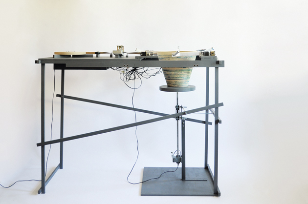
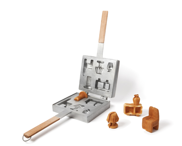
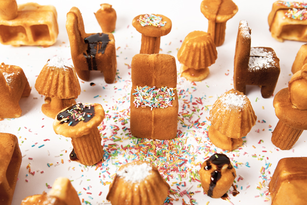
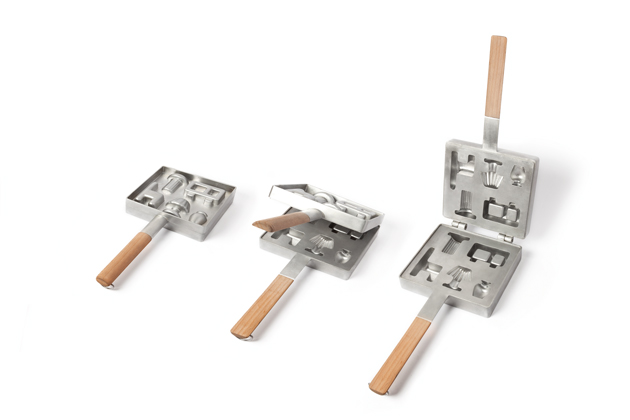
At Ventura Runway in Lambrate, we found a tasty tongue-in-cheek project whose commentary probably best captured the discontent , “Sapore dei Mobili” by a Japanese/Portuguese partnership of Ryosuke Fukusada and Rui Pereira. Billed “furniture tasting,” the project is essentially a clever waffle iron that allows its users to crank out (yummy) furniture in series (your own little countertop fabbrica). The designers say that “in this way, when the user gets full of his furniture, he just eats it.” No waste. No guilt. And then he can “start all over again using a different recipe.” That’s certainly some mass production we can deal with. Chocolate! Cinnamon! Berry furniture! With frosting! Or sprinkles!
In any case, the impetus of the Sapore dei Mobili project is part of a wider discourse on design that seems at last to be catching on. It’s one thing for jaded consumers to feel both overwhelmed by the frenetic pace and underwhelmed at the lack of innovation, but designers themselves are even rebelling against their system. Milan has two more years to make a massive impression on the design world before Expo 2015 will force in onto the global stage outside the insular universes of fashion and design. It’s doubtful that those without an emotional connection to the city’s design legacy will be quite as forgiving as every year’s crop of design tourists are. And frankly, this year’s Salone just didn’t do it. Now it’s hangover time. Eat your waffle furniture with tons of butter and syrup, and perhaps next year Salone will have come to its senses.

Tag Christof
Share: Facebook,  Twitter  
21/04/2012

Salone 2012 – State University

Salone 2012 – State University

Yesterday was the last day of the busy Design Week, opening the dances for even busiest Salone weekend. Without even setting our foot on the actual fair at Rho, it is almost impossible to take a peak at all of the events that are happening around Milan. So, one has to choose, where the choice is usually based on other people’s recommendations, famous or new prodigious designers you see on the event flyer, or the inevitable Fuorisalone Guide. As the guide is being promoted by one of the most influential Italian architecture and design magazines, we faithfully went on to see their clamorous event at the State University.

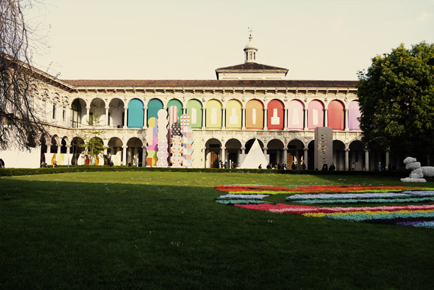
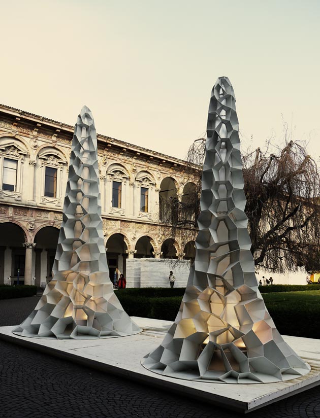
The beautiful architecture of the University’s courtyard offered an incredible background where even the most un-intelligent or ugliest of projects would acquire a certain power or authority.

At least that’s what it seemed at first sight. Interni Legacy, the project they were presenting at the State University, puts together a number of design and architecture superstars with different companies which resulted in a series of installations.

So you could find installations such as Monica Arman’s tower done in the collaboration with the Province of Trento, Massimo Iosa Ghini with FMG Fabbrica Marmi e Graniti or a special project as a tribute to Richard Meier done with Italcementi Lab. What actually struck us what that, after the initial fascination with these monumental sculptures, the sense of the exhibition was a senseless commercial promotion.

We are all conscious that design week doesn’t always present design excellence, but what Interni had shown wasn’t nor formally interesting nor conceptually elegant or intelligent. So, fortunately yesterday was quite a lovely day and our walk around the historical courtyard was pleasant. Actually, the courtyard’s 18th century beauty is all we remember, and that should say a lot.

Rujana Rebernjak 

Share: Facebook,  Twitter  
20/04/2012

Salone 2012 – Brera Design District

Salone 2012 – Brera Design District

As Friday has already arrived, faster than we thought it would, there are still quite a few things we feel shouldn’t be missed. In order to manage to get at least a peak at all of them we have planned a tight schedule. So, while we have put on our most comfortable shoes and continued our marathon around the streets of Milan, this time heading to the busy Brera Design District.

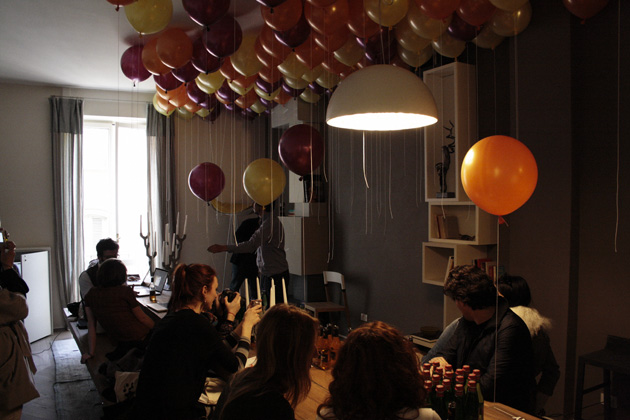
We started from the Appartamento Lago, a well known design venue, that last year received more than 20000 visitors. Instead of creating a highly artificial environment such as a fair stand, Lago has decided to communicate with people on a more intimate level, creating a cosy environment that at the same time points out different living environments.

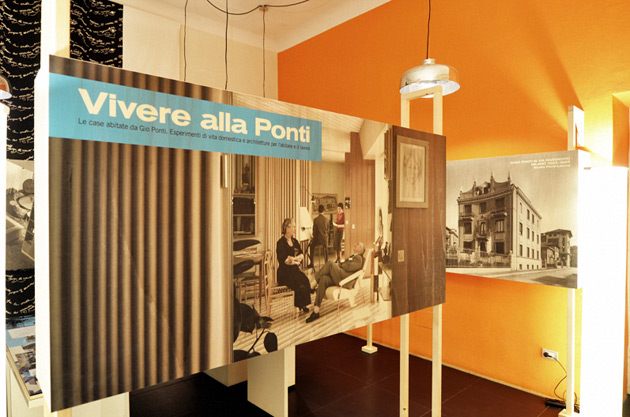
The second place that we had to visit on our Grand Tour around Brera was the exhibition Vivere alla Ponti held at Ordine degli Architetti della Provincia di Milano, celebrating the experiments in domestic living and architecture of living and working by Gio Ponti. Curated by Francesca Molteni and Franco Raggi, the show is paying tribute to the great modernist master whose timeless designs have been re-made by Molteni&C (currently being presented at their flagship store).

Among other interesting showrooms and new design companies, you should also stop by Austrian design – raw and delicate exhibition. There you can see the work of Augarten, Lobmeyr, Wittman, Polka and mischer’traxler, that tries to discuss the relation between the austrian nature and their culture and design.

As our marathon goes on on a tight schedule, we’re heading for our next design destination hoping that the annoying rain will finally stop bothering us.

Rujana Rebernjak

Share: Facebook,  Twitter  
19/04/2012

Salone 2012 – Tom Dixon & MOST

Salone 2012 – Tom Dixon & MOST

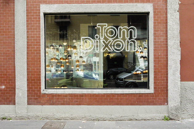
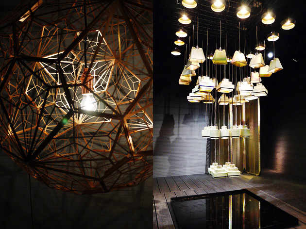
Tom Dixon is one of those design entrepreneurs that manages to turn into gold everything he touches (in some cases literally). Most, the bombastic event promoted by Dixon held at National Museum of Science and Technology, is one of the highlights of this year’s Salone. Most is a collective exhibition whose goal was to transform the museum’s scientific environment in what resembles a design research center. The juxtaposition of historical transportation exhibition with contemporary design, stood almost as a reminder for today’s designers of what actually good design should be like, offering a perfect situation for sharp confrontation and critique.

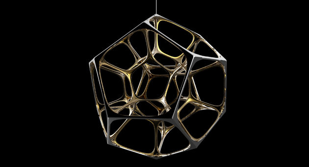
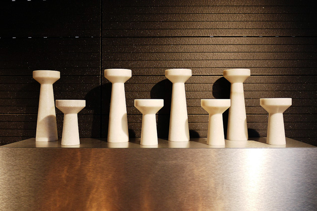
As far as single exhibitors are concerned, they were distributed between five of the museum’s buildings. The first part of the exhibition was obviously Tom Dixon’s show called Luminosity where he presented new lighting and furniture projects. With an eye on new production methods as well as materials, the project that struck us most was the Lustre lamps collection that uses glazed ceramics in order to create an effect reminiscent of hidden colours in nature. Also Dixon’s Eclectic collection of everyday objects was eye candy, showing how big design companies haven’t forgotten the simple daily pleasures we all can find ourselves in.

Among other exhibitions, Studio Toogood‘s La Cura project has to be mentioned. Designed as a shelter place from the chaos of the Salone, it offers a series of performances that serve as a retreat for our senses. There you can find the sound installation by Kite&Laslett, a re-energizing elixir created by Arabeschi di Latte while the air is filled with a scent by the scent designer 12.29.

One of the most interesting stands is the one by a new french design company called La Chance. Presenting its first ambitious collection called Jekyll and Hyde where each piece comes in two versions, the company has inaugurated a hopefully long collaboration with designers like Pierre Favresse, Luca Nichetto, Susane de Graef and Note Design Studio.

The astonishingly enormous museum space actually offered a lot more than we could possibly summarize in these few lines. If you’re into work like the one produced by Areaware or want to discover companies like Resident from New Zealand, take at least a few hours to wander around these beautifully designed spaces and check what Most has to offer.

Rujana Rebernjak

Share: Facebook,  Twitter  
18/04/2012

Salone 2012 – Ventura Lambrate

Salone 2012 – Ventura Lambrate

In the last few years the more independent young designers as well as universities of design have been moving away from the center of Milan to Lambrate. This year the Lambrate fever has reached its higher peak as far as number of participants is concerned. Distributed between Via Ventura, Via Massimiano and Via Oslavia, this year’s exhibitors have included both the usual young as well as superstars like Jaime Hayon and established companies such as COS and Ikea.

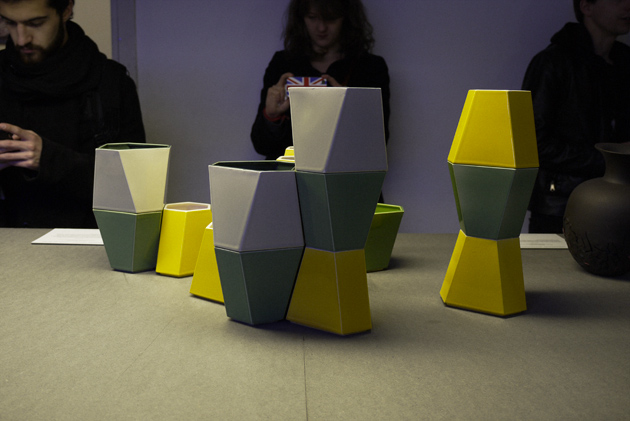
As far as design schools are concerned, The Royal College of Art has made an almost impeccable exhibition. In a long series of experimental projects entitled Paradise, the strongest impression was made by ‘Fan Table’ by Mauricio Affonso, ‘Red & Blue Stacking Vessels’ by Pia Wustenberg.

The University of Bolzano was also there, with less projects but a nicely designed exhibition space curated by the school’s professors.

The most interesting young and independent designers would make an endless list, so we’ll only point out a few: “Edition of 9″ curated by Something Good that explored the relation between local crafts and contemporary design, “Think +” by Studio 248 which concentrated on the exploration of gestures and usability in design, Nino & Svenja that concentrated their research on the use of simple materials with innovative production and assembling methods.

Rujana Rebernjak

Share: Facebook,  Twitter