27/04/2015

Vis-à-Vis by Moroso: the Power Between Art and Design

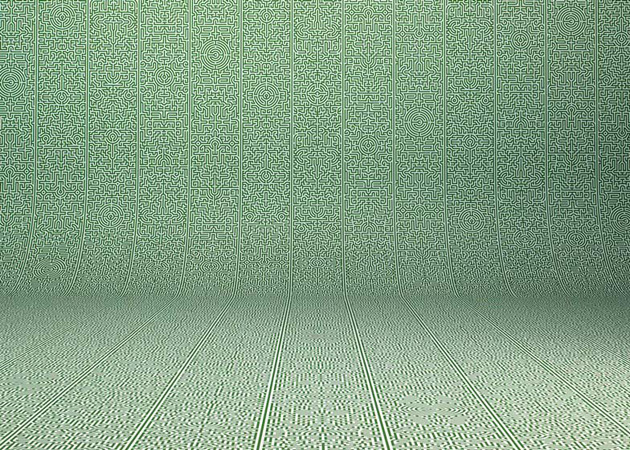
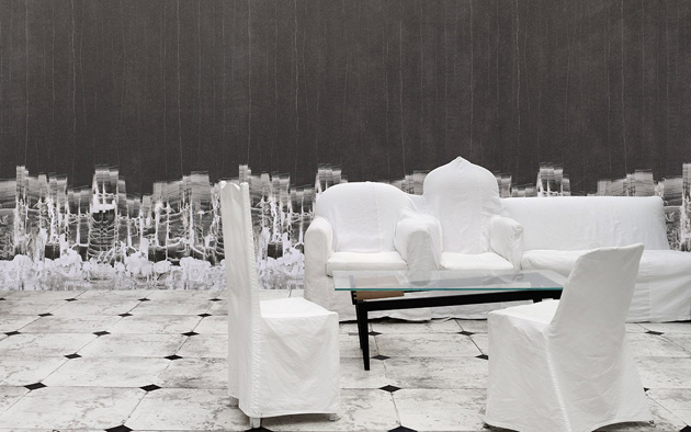
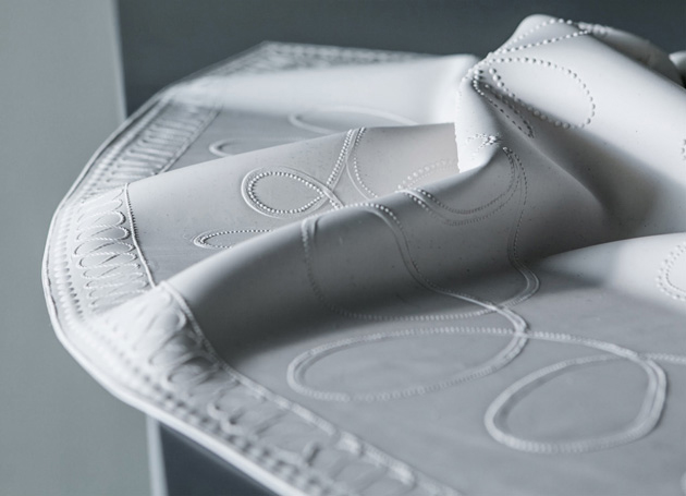
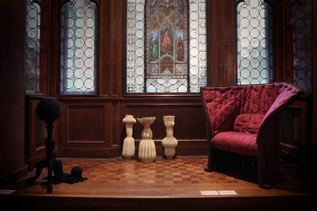
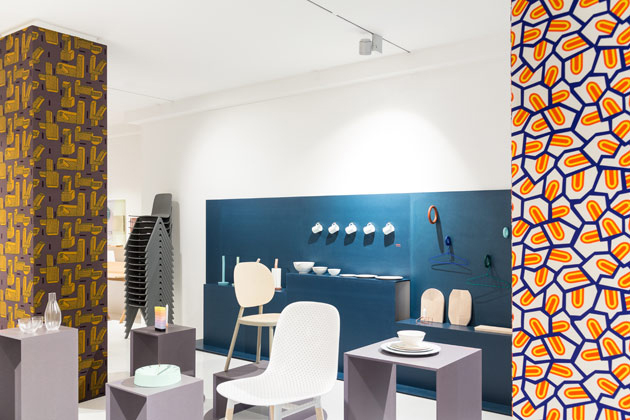
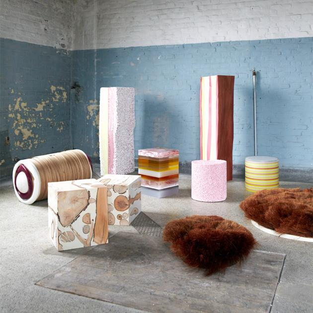
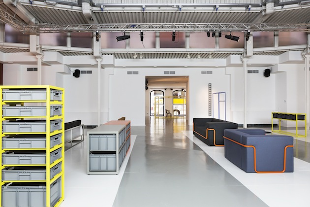
Recently, design got us used to frequent intrusions in the domain of art. Party because of consumers’ growing desire of bespoke objects, partly because of the encouraging economic results of the limited-edition market, designers have become more willing to give birth to projects that flirt with an artistic approach and soon become too narcissist and redundant. To this end, the recent debate aroused by Hella Jongerius and Louise Schouwenberg’s manifesto “Beyond the New. A Search for Ideals in Design” is a necessary warning about the excesses of what is commonly defined as art-design. This is the reason why Moroso’s latest project – “Vis-à-Vis: design meets art” – presented during latest Salone del Mobile, is a curios yet significant U-turn between the disciplines balance of power. In fact, the preconception of a déjà-vu, a seductive yet reverential gesture that sees design bowing in the presence of art, is subverted as soon as we encounter Jörg Schellmann’s new collection of furniture in the ground floor of via Pontaccio showroom.
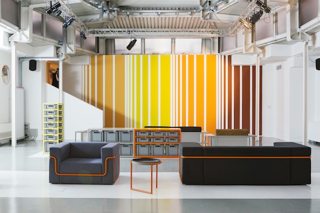
Jörg Schellmann’s profile is peculiar. Well-known internationally for his editions of contemporary art (his company Edition Schellmann, now Schellmann Art, was founded in New York in 1969), Schellmann converted to furniture design in 2008, putting in production furniture by artists, as well as his own designs. Despite an artistic background, his sensitivity doesn’t move away from the requirements of serial production: all his pieces are industrially reproducible, respectful of ergonomic principles, and share an orthogonal aesthetics that, at a first sight, seems to be inclined to the ideal of “good form”. However, his artistic sensitivity appears here and there, through a series of loans and quotes, such as the archetypical plastic boxes used in the “Storage” containers, or in the clear reference to the minimalistic aesthetics of Sol LeWitt and Donald Judd.
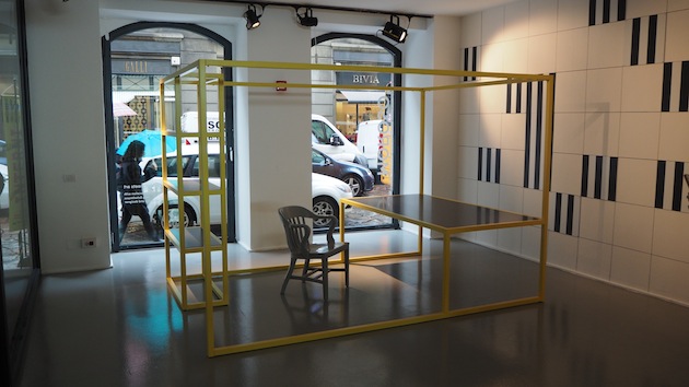
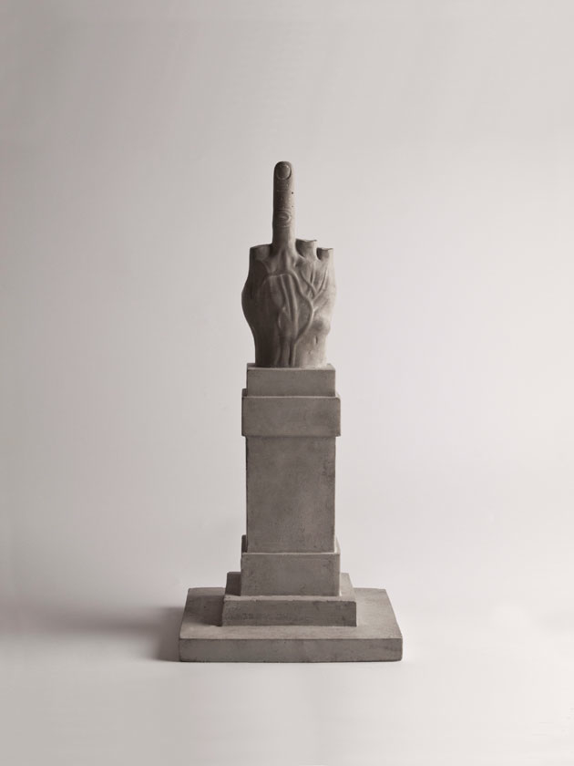
“Vis-à-Vis” artistic influence, indeed, is not relegated to Schellmann’s background. Around his collection and other Moroso’s pieces, the works of acclaimed contemporary artists are displayed on the walls, such as, among others, Daniel Buren, Gilbert&George, Cindy Sherman, Rosemarie Trockel. These works seem to restore a boundary that, after too many abuses, we were missing and suggest, by the way, that it is possible to promote a dialogue without recurring to an inevitable contamination of genres.

Giulia Zappa 
Share: Facebook,  Twitter  
17/04/2015

Salone del Mobile 2015: Nilufar Depot

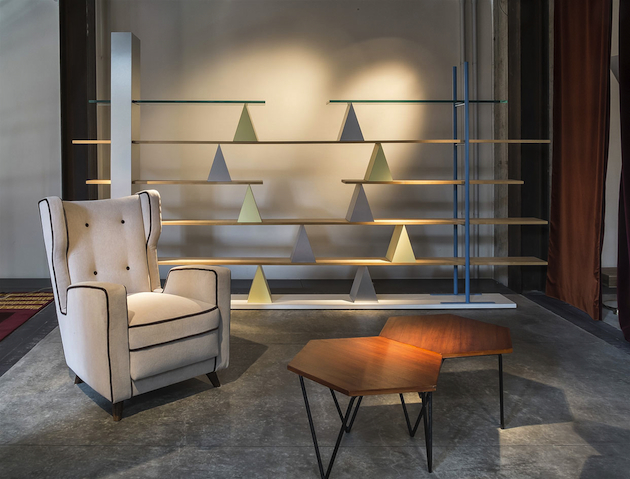
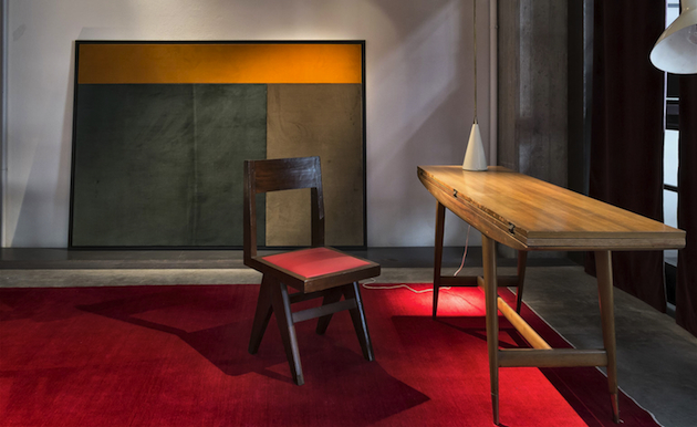
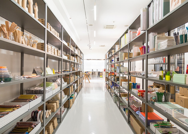
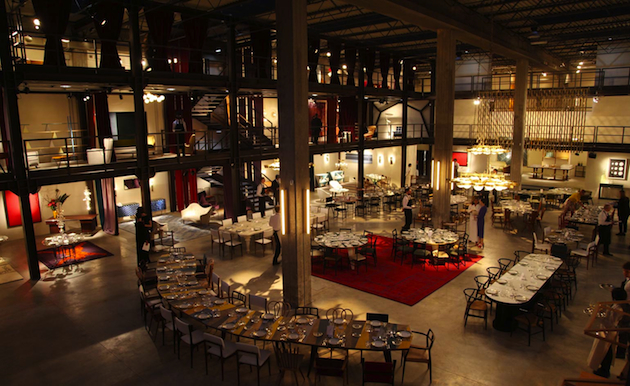
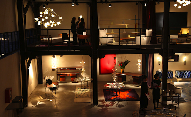
Milan’s hectic Salone del Mobile week is slowly coming to a close. While the events in the city are surely much more than one can ostensibly see in a week, some exhibitions are undoubtedly more worthy than others. Therefore, rather than talk about a new sofa by a fresh design brand or a new chair by a contemporary designer, we thought it was better to choose a truly Milanese destination as our final suggestion: Nilufar Depot. For those who may not know it, Nilufar is the ultimate design destination in Milan. The gallery founded by Nina Yashar has, through the years, developed collaborations with some of the most exciting contemporary designers, as well as displaying modern masters. For this year’s Salone, Mrs. Yashar has decided to give a glimpse ‘behind the scenes’ of her incredible gallery. Nilufar Depot is, in fact, an ex-industrial warehouse where Mrs. Yashar stocks her incredible pieces, open for the first time for the public who can browse more than 3,000 pieces of modern and contemporary design.

The Blogazine 
Share: Facebook,  Twitter  
16/04/2015

Salone del Mobile 2015: Design Academy Eindhoven

Design education is one of the last tenets of critical approach to design, nurturing liberated exploration of different possibilities and areas of life where design can make a significant impact. Yet, some schools are better at offering possibilities for such reflective exploration than others. Perhaps one of the most ground-breaking educational institutions is Design Academy Eindhoven, which, at this year’s Salone del Mobile confirms its central position in expanding the dialogue in design practice. The protagonist of its already traditional showcase in Milan is its newly established department, Food Non Food, guided by the brilliant Marije Vogelzang.

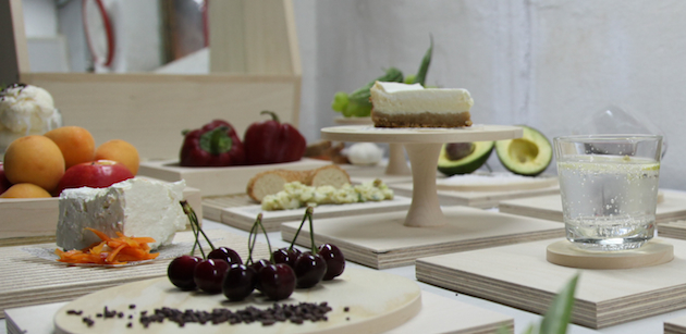
For the exhibition, provocatively titled “Eat Shit”, Design Academy Eindhoven decided to blur the boundaries between teaching and exhibiting by transferring the entire department to Milan and fusing their activities with some of today’s most interesting practitioners. The show “delves into the politics of how, where and why we eat”, since “nothing deserves our attention more than food – it binds us, it fuels us, and the myriad of issues concerning its production, distribution and consumption touch on some of humanity’s most fundamental problems.” From a timeline documenting more than 400 projects focusing on food and feces from 1976 until now, to a project that examines waste in Khatmandu, the exhibition shows the complexity of one of the most banal, ordinary aspects of everyday life.

The Blogazine 
Share: Facebook,  Twitter  
15/04/2015

Salone del Mobile 2015: Atelier Clerici

With many critics arguing Salone del Mobile has become a marketing fair and denouncing its lack of criticality and connection to developments in design outside of the realm of furniture, it is refreshing to see that Milan can still offer a space for debate and dialogue. For the second year in a row, the most radical platform for experimentation takes shape at Atelier Clerici, an independent exhibition and event held in a historical palazzo in Milan, palazzo Clerici. Organized by Joseph Grima’s Space Caviar in collaboration with Z33, Atelier Clerici offers the chance to some of the most leading contemporary design institutions to “define and represent themselves as agents in the field of design”, thus offering a new vision for Salone itself while also engaging with developments in design in a way that is far removed from simply displaying novel projects. Therefore, this year’s exhibitors include some of the most groundbreaking and thought-provoking individuals and organisations, from Design Academy Eindhoven and Domus Academy, to Hella Jongerius and last year’s participants Minale-Maeda.

Visit Atelier Clerici at Via Clerici 5, until April 19th 2015 from 10 AM to 8 PM.

The Blogazine 
Share: Facebook,  Twitter  
14/04/2015

Salone del Mobile 2015: Max Lamb’s Exercises in Seating


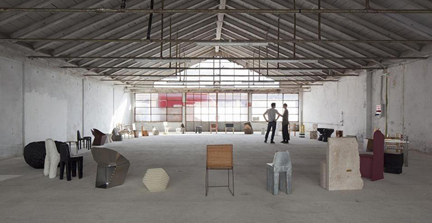
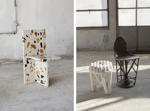
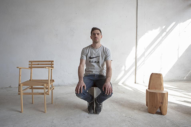
There are certain events during the hectic Salone del Mobile week in Milan, that just cannot be missed. This year, one of those events is Max Lamb’s retrospective at Spazio Sanremo titled “Exercises in Seating”. Known for his emphasis on process and tireless experimentation with materials, Max Lamb brings together a rich selection of his seating projects displayed in a rough industrial setting. Each piece is an exploration of the material and the possible formal qualities that emerge from it, developed with the intent of exploring the material or production process’ limits, rather than formal qualities of the object. “Exercises in Seating”, in fact, displays not the final product in itself but the inquiry and ideas of the designer in material, three-dimensional form.

The Blogazine 
Share: Facebook,  Twitter  
10/04/2015

Salone del Mobile: an Excuse for Agenda Setting

When an important tradeshow slowly transforms itself into a chaotic media circus, the rules that make it work change drastically. Rarely, in an overcrowded scenario of supposed novelties, final users have the chance to check personally what truly deserves a medal for quality and innovation, but are rather guided by the image and the agenda that devilish communication professionals have set for them. “Dura lex, sed lex”, we may say, especially since the digital domain has started to reward indefinite events and to rebound their echoes through social media buzz. This is particularly true for the imminent Salone del Mobile of Milan, the leading international design event that every years gets in town more than 200.000 disoriented professionals, over stimulated by the offer and often incapable to recognize the boundaries of what was, and has now become, a matter of design. Of course, the marketing rules that are engaged in Milan design week are not different to those that govern other worldwide design events. Nevertheless, remaining Milan the biggest tradeshow, it maintains the most hyperbolic and dazed dimension.

But what are the tips that nowadays determine the success of a product or an event at the Salone? Those who had the chance, or the misfortune, to work as journalists, content editors, and PRs for the Salone del Mobile, generally know them quite well:

Anticipate competitors: Salone del Mobile is all about timing. Be the first to unveil your new products – no matter if the prototype you shot does not even work – and you’ll make them memorable for your public before it gets tired and confused by hundred previews.

A good image is better than a good product: nothing is worth as much as a good shooting, because the first filter that any media professional applies is that of an eye-candy visual impact. No matter if the written description that gets along, or the product itself, are not equally enchanting.

Involve edgy bloggers: making a reputed, trendy blogger speak about you is definitively the way to impose your agenda setting to the design community.

Story is better than technique: if a product does not have a concept or a story, please fabricate one. Just a very few people –and definitively not the right ones – get involved by the description of any technical innovation, even if relevant and astonishing.

Build exclusivity: a new design district, a new format or a new “design something” needs to be communicated as an initiation for a privileged few.

Finally, should we ask ourselves if this all makes sense? Of course we should, but we actually don’t, because if this is all simply about participating in a circus, nobody wants to be the first to leave the party.

Giulia Zappa 
Share: Facebook,  Twitter  
09/05/2014

Design of surfaces or superficial design?

The relationship between design and decoration is like the motion of a pendulum: sometimes it swings towards an intense complicity, sometimes towards rejection. Let’s think of all the major stages in design history: from Morris to Loos, from rationalism to Radicals, this tension has always been considered as a powerful indicator of any incoming weltanshaung.

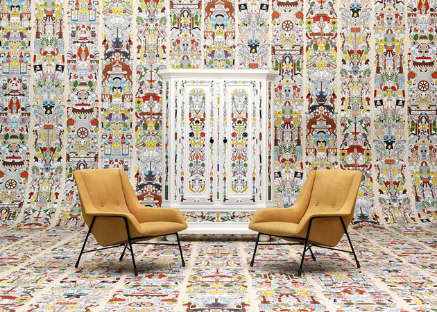
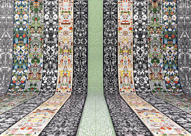
Today, the interest in the potential of a surface seems to be increasing. Let’s think about wallpapers as a paradigmatic case study: more and more common in every imaginable interior, they are now the test bench of new collaborations between unsuspected designers and producers. Generally appreciated for its understated and conceptual touch, Maison Margiela has recently launched a new collection for the Belgian brand Omexco with the aim of reinterpreting the genre through uninhibited experimentations with colors and images. Studio Job chose wallpapers as well, as a way to magnify surfaces and marginalize furniture. Worldwide known for an original decorative attitude which spans from cartoon-like language to surrealism, for the latest Salone del Mobile, the Flemish duo has opened up its own archives of drawings, icons, and patterns in order to recreate a hypnotic wallpaper limbo for the Dutch company NLXL.

However, even sophisticated research couldn’t resist to take on the issue of surfaces and coverings. “La Casa Morbida”, an exhibition curated by Beppe Finessi in the Milanese Pezzoli Poldi palace, has explored the ways furniture is transforming our domestic environments into a soft cocoon. But couldn’t the show be renamed as “La Casa Rivestita” [“the upholstered house”]? In fact, the common thread among the pieces has nothing to do with a concept, a function or an expected final user, but with the shared use of textiles as a way of recreating a private, reassuring universe.

At the same time, the Rijksmuseum by Droog exhibition – on show during the Salone del Mobile days, too – produced similar results starting from different premises: the final result of a research undertaken within the vast visual universe of a major Dutch museum was once again a project examining appealing, decorative surfaces, and not an investigation into new, unpredicted areas and ideas.

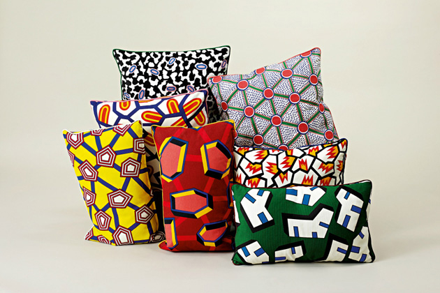
Nevertheless, the true apotheosis of this return to surface is a mania for Nathalie Du Pasquier’s textile designs from the ‘80s. Former member of the Memphis group now devoted to painting, Du Pasquier has recently been transformed into a hype phenomenon from both fashion and design companies. American Apparel and Hay, in fact, have sensed the renewed appeal of her geometric patterns and didn’t hesitate to recover its design with very little effort put in their transformation or restyling.

It is impossible not to wonder, then, if the comparison with the ideological fervour of the radical movement isn’t to harsh for our current design world. Isn’t the current Memphis revival an unconscious attempt to anaesthetize ideas and ideologies from that time? Surface, in the ‘80s, was definitively a way to go beyond conventions and bourgeois “good taste”. Nowadays, it just seems transformed into a vintage convention: with no strong beliefs, no challenge or claim, but just as way to reassure a trendy status quo.

Giulia Zappa 
Share: Facebook,  Twitter  
24/04/2014

From Salone to Expo: A Green Mimesis

Is there something more artificial than a booth set up? We hardly imagine that these temporary architectures, a fortunate result at the crossroad of contingency and marketing, could be perceived otherwise than the capsizing of a natural, primordial status. Thus, the impulse to integrate green simulacrums into trade shows, with the aim to fulfil, at least at a symbolic level, our desire for a more sustainable environment, is both unlikely and surprising.

The latest edition of Salone del Mobile offered many examples of this trend. Elica, worldwide leader in the production of kitchen hoods, commissioned to architectural studio stARTT the design of an innovative outfitting at the Rho Fair. Their design is a hybrid platform, where trees space out these hyper-technological intake devices and thus induce an implicit, reassuring effect. On the other hand, both the office furniture brand Tecno and Kinnarps have recurred to vegetation in their catalogues proposing an inedited hortus conclusus where furniture is surrounded by “spontaneous” vegetation.

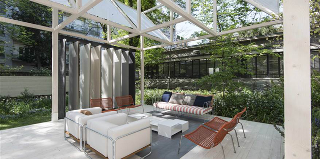
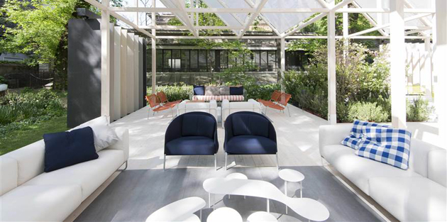
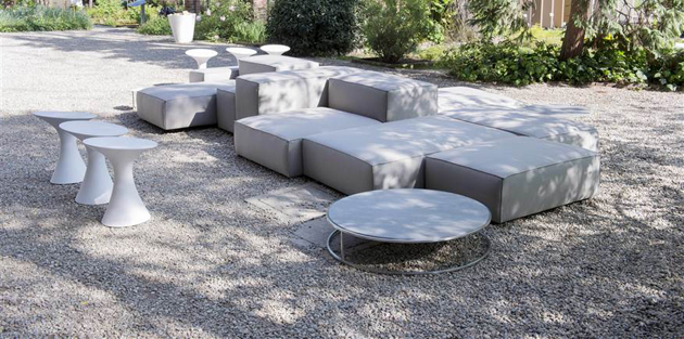
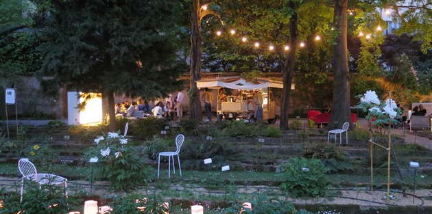
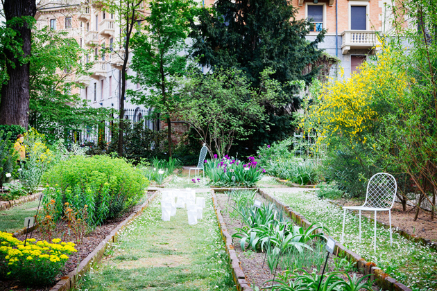
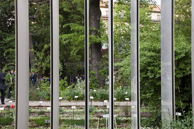
Nevertheless, the “Giardino Geometrico” presented by Laminam and Living Divani in Brera’s botanical garden is by far the apotheosis of this green revenge. Surrounded by buildings and walls and thus protected by indiscreet looks, the garden offers to the unaware visitor a true epiphany: outdoor furniture and ceramic coverings are just an excuse, at most a facilitator to favour new points of view in enjoying the space. Therefore, the undisputed protagonist is the garden itself and its precious balance between natural state and human intervention in the selection and care of plants.

This scenario cannot but anticipate, by analogy, what the 2015 Expo in Milan forecasts to satisfy. What are its future visitors really wishing to get back to? If the Salone is a reliable indicator, the Expo is expected not only to give answers on the issues of food production, but also to offer an erratic contemplation in new green spaces: more precisely, a green mimesis into innovative living solutions.

Giulia Zappa – Images courtesy of Living Divani 
Share: Facebook,  Twitter  
17/04/2014

Salone del Mobile: are schools the last reserve of ideas?

According to statistics and editorials, growing participation and increasing optimism are the two cornerstones of the last Salone del Mobile. This rosy vision encounters, nevertheless, a few cynical but grounded critics: the products on stage at the fair and the Fuorisalone’s events are more and more marketing and communication oriented, and thus design risks to lose its major role as technological evangelist and social innovator.

However, it was still possible to find here and there among Milanese design districts, a reserve full of insights and unbiased calling, browsing in what could be easily perceived as a parallel world: that of universities’ showcases. Voted by definition to research and open-mindedness, the best international design institutes have offered fresh points of view in rethinking functions, materials and needs according to a true social perspective.

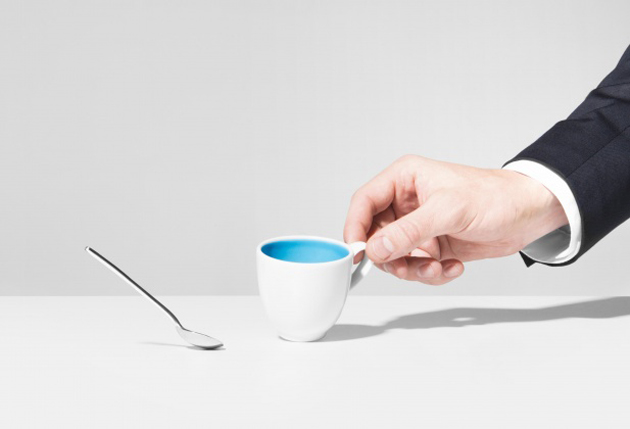
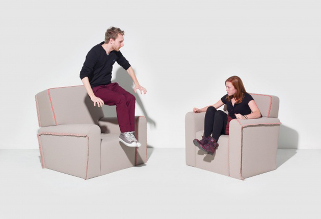
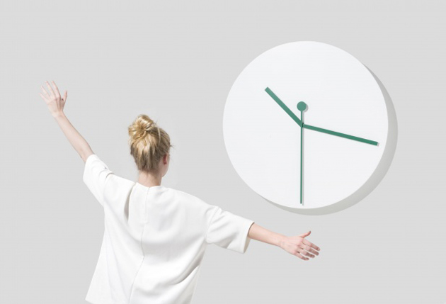
“Delirious Home”, an exhibition promoted by ÉCAL in the Brera Design District, has chosen to take on the issue of smart home and develop it through weapons of irony and grotesque. The results of this investigation are very funny indeed: a spoon follows slavishly the change of position of its small cup, twin armchairs replicate what’s happening to the other one, clock hands respond to the arms movements of those who stand in front to watch the hour. The projects succeed to make us think: at this stage of technology development, the functionalities that interactive furniture should fulfil are still unclear, and thus, being able to identify a wide range of opportunities, even through a sarcastic approach, is very important.

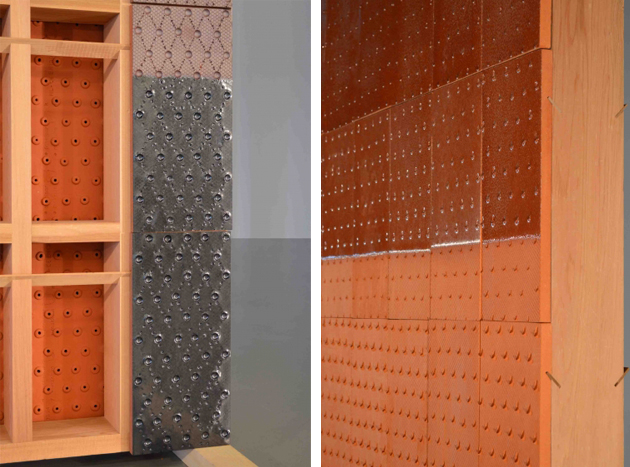
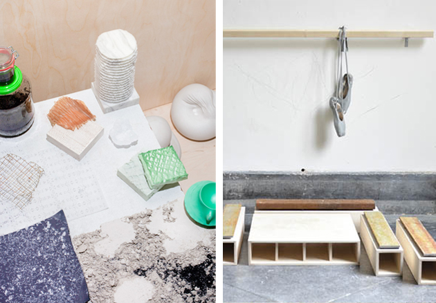
At Ventura Lambrate, the competition among many school showcases is pretty tough. Design Academy Eindhoven has been the leader in the field since a decade: its method, based on a “design in context” approach, is declined this year along the perspective of “Self Unself”, the unselfish vision of design that arises from students’ self-initiated projects. Smart intuitions are not rare, as in the case of “The Importance of the Obvious” by Matthias Borowski investigating materials as false friends, terracotta aired walls and their nice finishings (“Cool Shelter” by Franciska Meijers), or a web platform that transforms information overloading into an artwork (“News from Eternity” by Ward Goes). Nevertheless, when compared to the previous editions this one fails to engage the visitor: the works are less cohesive, and their inspiration is often too close to a pretext than a significant intuition.

A different approach is that of the Royal Academy of Art – The Hague and its speculative proposal, hanging in between an in-depth analysis and performance. Design, clearly seen as an innovative force, focuses on materials and their new applications: we are not in a R&D of a chemical corporation and thus the profile is necessarily low-tech, but the projects on show – like “Coexist” by Nynke Koster – identify a new aesthetics for the informal living, and the performative way students keep on consuming material surfaces – as in the Morphlab Growth by Morphlab – surpasses a mere communication activity. In the end, it is thanks to fantasy that design is able to open new scenarios: the idea of investigating what would happen if men shrunk to 50 cm is unlikely, but we shouldn’t underplay its imaginative power.

Giulia Zappa 
Share: Facebook,  Twitter  
14/04/2014

Saying Goodbye to Salone del Mobile 2014

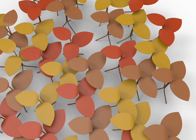
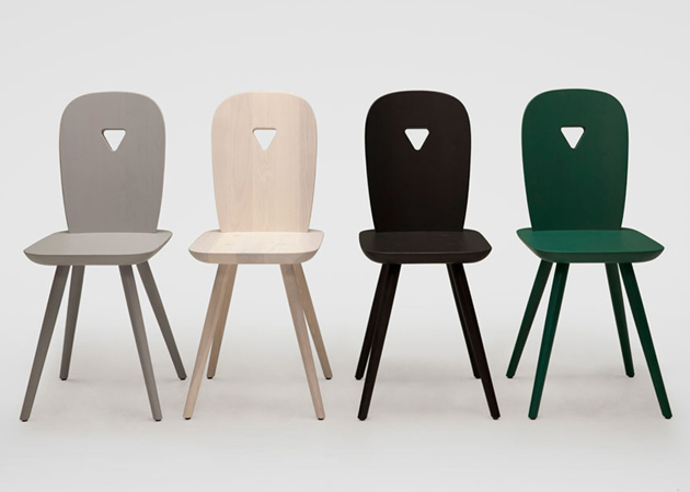
A sofa with an integrated blanket resembling Little Red Riding Hood’s cape, a series of tables reminscing leaves and stems, moiré effect-inspired jewellery, a ‘modern’ interpretation of a classic Tyrolean chair, a chubby foam armchair, a set of furniture customizable through a simple app: these are just a tiny part of an endless and almost entirely senseless list of products presented during last week’s Salone del Mobile. And yet, official figures show more than 360,000 people have visited the fair alone, a number which probably doubles for all the Fuorisalone dwellers, making us wonder what does the Salone actually mean for design practice. Other than spending a fun week trying to source a few clever projects and seeing a few amusing exhibitions, what does it bring to design research? Is the prime event of the design sphere still something we should look forward to?
Some designers, like Martino Gamper, have decided to test a new approach. While his furniture was shown at Nilufar gallery and his repair-shop was set up in front of La Rinascente, Gamper has also presented a new project, aimed directly at potential buyers and producers. The aim of “From-To”, developed as part of “Valore Artigiano” project, was to focus on the interaction between designers and artisans of the Veneto region. By choosing to leave the media out of the event, “From-To” wanted to create an environment for possible future collaborations between designers, artisans and their clients: be it a one-time buyer, an industrial reality or a gallery.

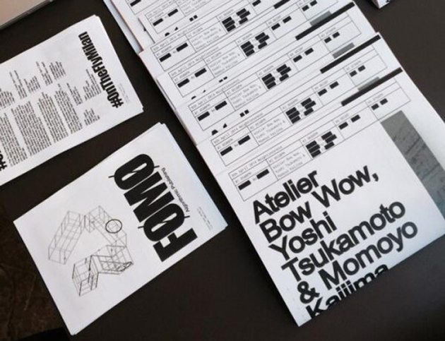
While “From-To” explored the relationship with market logics, other interesting projects were developed on the other part of the spectrum. Fear Of Missing Out (FOMO), is a project by Joseph Grima, founder of Space Caviar, which works as a mobile newspaper unit developing content through an algorithmic journalism machine using software that combines voice recognition technology, extracted from a series of conferences held at Palazzo Clerici, and social media content posted using the #OnTheFlyMilan hashtag.

Seeing projects like “From-To” and “FOMO” in Milan is a rarity, an almost extinct breed of design research, which raises questions about market systems, means of distribution, interaction, production and consumption. And yet, possibly we have got it all wrong, and design is supposed to be just pure fun.

Rujana Rebernjak 
Share: Facebook,  Twitter