11/07/2011

The Editorial: Trash Handcraft Treasure / Mexico

The Editorial: Trash Handcraft Treasure / Mexico

Mexican drugstores don’t sell rolls of film. Nice digital cameras, probably. But rolls of film, not so much. When you ask, shopkeepers seem always to give an expression that says “why on Earth would you still have any need for that?” It’s a surefire sign that the country is still pretty far from the cultural hegemony of hipster that we wondered about in May’s A Mexican Hipster & Her Acapulco Bike. Mexican culture marches on, as of yet diluted much less than most.

And like in India and China, two other nominally rich countries with exorbitant income disparities, handcraft in Mexico is alive and well. It’s an integral part of the country’s design patrimony – from musical instruments to pottery to hand-woven textiles. And there’s an honest unpretentiousness to all Mexican craft that makes even its cheapest examples something entirely different from the over-adorned, silky sparkly stuff in street markets around the world. Gorgeous hand-painted glassware, embroidered garments, hand-carved sculptures.

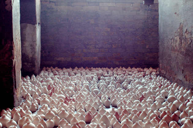
We came across a particularly upbeat artisan who makes elaborate decorative vases out of only scraps of meticulously cut-out paper from magazines. He spends his days creasing, placing, weaving at a table on a pedestrian sidewalk. Making pattern, form, shape and texture from former trash. And for his hours of hard work, he asks for almost nothing – one small piece that might take up to five hours is sold for no more than 3€.

He learned the technique from his father-in-law, but continues to develop it and play with new forms and ideas. Figurines. Perhaps water-tight paper weavings that could hold and keep flowers alive… Oh, possibility! His work has become more complex over time and he’s developed his own “style” (quite different from others who work with similar principles and material). And his trajectory seems uncannily like that of a classic designer-artisan like Lino Sabbatini: learn a material, experiment, then make it your own. Even if he works in as “poor” a material as recycled paper, good craft is good craft. And in a small way that this maker almost certainly doesn’t realise, his work is design.

Still, his son – who sat attentively by his side as we chatted – said he wants nothing to do with his father’s profession. He wants school. Knowledge. An improved life. His father wants it for him, too. And who can blame them? In a country relentlessly caught between rich and poor, upward mobility can be everything. Both of them have no doubt that there will be no paper folding in his future.

But we should hope that future generations don’t allow the tradition of Mexican handmade to fade away. If Mexico follows the pattern of other rich countries as its economic health continues to improve (and hopefully begins to be spread around more evenly), these one-man makers are likely to mostly disappear. But the country’s rich uniqueness is tied closely to these gorgeously lo-fi, refreshingly imperfect and unpretentious objects. They can be every bit as beautiful as a great number of good design pieces, but carry the extra validity of rich cultural context and skilled manual construction.

Their best hope for survival is probably a recognition by the rest of the world of their charm and distinctiveness, perhaps alongside a selling structure that would allow their makers a bit more to get by on. With a new generation of extraordinarily talented Mexican designers, artists and thinkers eager to steer a fresh course for their country’s cultural patrimony and place in the world, the question of handcraft’s should be a rather interesting one to tackle…

Tag Christof

Share: Facebook,  Twitter  
04/07/2011

The Editorial: Identità Virtuali

The Editorial: Identità Virtuali

We’ve talked here before about the changing typologies of objects thanks to revolutionary technologies that have made many separate objects obsolete (iFuture, iFatigue). We’ve talked about fine art and artisanal craft in the face of digital art’s low barriers to entry (Election Day / Every Day). We’ve even talked about quickening trend cycles and the impossible superficiality of pop culture in the internet age (Hugh Holland and the Lost Art of Living). But more importantly than any of these things, most of us haven’t truly stopped to consider that our very identities have been dramatically, irrevocably changed in the past few years. We are no longer singular “I,” but instead are plural “I.” We must exist temporally, and then we must also exist in the digital world to really exist.


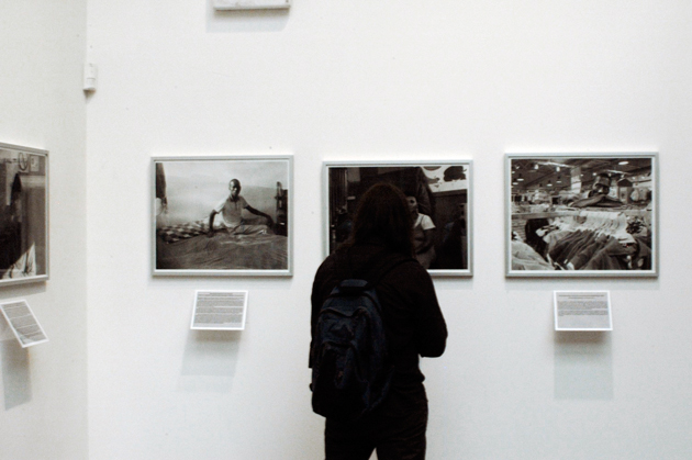
In a fantastic exhibition which opened last month, Florence’s CCC Strozzina (part of the Palazzo Strozzi museum) explores this phenomenon in depth. Without coming across as anti-utopian, the exhibition attacks questions of identity and self in the age of perpetual connectedness.

The exhibition begins with the striking works of Robbie Cooper and Evan Baden, who both explore users’ physical and mental connection to their virtual selves. Cooper’s video works record children playing video games from inside their television screens to brilliant effect: they are their virtual avatar, jumping and flinching and concentrating intensely on the task at hand. Baden’s photographs show users seemingly hypnotised by their His subjects’ fixed gazes seem to indicate an abandonment of their physical space for a complete mental transfer into their devices.

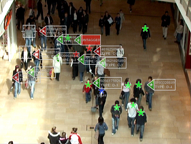
Michael Wolf’s work, which is a tongue-in-cheek mining of Google Maps Street View images around Paris asks this question brilliantly. When our spaces are completely inhabited by surveillance and recording, just what part does the individual have in it? His subjects are passers by who were (usually) unsuspecting subjects of Google’s surveying, thus creating an interesting look at the relationship between spaces, people and the digital world. Chris Oakley’s work takes this one step further, by showing a department store surveillance system which uses data from social networks to classify shoppers. And Christopher Baker’s cacophony of Skype video chats bewilderingly puts into perspective the enormity of the digital world.

But beyond the awkward disconnect between the digital and real, we also see the positive power of social networks for activism. Diana Djeddi‘s work on the infamous viral video of a woman murdered on the streets of Iran breaks down the phenomenon and reveals the power of strong symbols used over a network (even if in error). Nicholas Felton’s obsessive self-recording work, demonstrates the power of real insight onto your own life and habits and provides a glimpse into the growing desire for self-monitoring.


In any case, it seems clear: there is no escaping your virtual self. Even those staunch holdouts who refuse to join Facebook are being catalogued, analysed and measured up. There’s just no hiding. But instead of our digital and non-digital selves being diametrical opposites, they have instead become compliments. Chances are, in fact, that in time the two will only merge more completely.

The profound questions raised by this excellent exhibition are sweeping and will be debated by sociologists and anthropologists and economists (and everyone else) for the foreseeable future. But move wisely. As your two selves merge to become one “real” whole, remember that it’s already impossible to separate the two. Dress well, speak well. Share well, type well!

Tag Christof – Images CCC Strozzina 

Share: Facebook,  Twitter  
27/06/2011

The Editorial: Fashion Kids

.

The Editorial: Fashion Kids

Fashion is a canvas for wild experimentation. It is the single most tangible cultural lever by which we move forward in our relationship to the world. And in relation to ourselves and one another. Fashion is a harbinger of change, a powerful barometer of society’s mood, and a temporal definition of taste. Despite its seasonal direction changes, fashion opens the world progressively, and in a remarkably structured way. Compare the brilliant men’s collections we saw in Paris and Milan this season to the uniforms of the Mad Men era, or even Wall Street’s extroverted reign over the 1980s, and it becomes clear how drastically men’s role in society has evolved. Everyone’s role in society has evolved drastically. But, kids?

It goes without saying that fashion exists to break rules. We need fashion to fill that function. But as product design, architecture and other related worlds have progressed from styling-for-profit-driving to bastions of good ethics, fashion has stayed behind in several places it should be well ahead of the curve. Sweatshop labour abounds even today, fast fashion is raising serious issues of waste, and even the most prestigious labels can be less than forthcoming about their production practices. These are all, of course functions of the fierce competition brought on by globalisation.

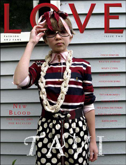
But in terms of fashion as a cultural force, the role of children has become a tenuous one. Not kids in sweatshops (although they are certainly a far more serious problem), but the junior fashionistas and talented young personalities who are capitalised upon by fashion for their recognizability and youth. The awkward and bespectacled mini-savant Tavi is, of course, the epitome. A few years after her she gained notoriety through her very well-written blog (she’s now 15 years old), she has become a full-fledged force unto herself (her “press” person once brusquely blew me off). And much to the chagrin of several of her (much) older colleagues, she has been snapped up by the industry as a sage and muse. But, did she ever have a childhood? She certainly didn’t have a long one. But her age creates buzz. She sells magazines. She’s good business.

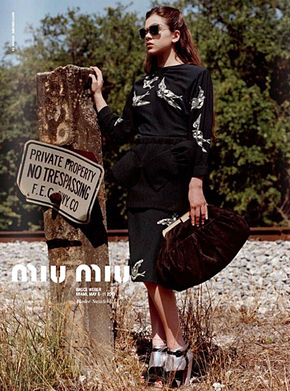
Prada has just made Hailee Steinfeld the new face of Miu Miu, and instantly at 14, she’s to become a full-fledged icon of her time. Now, exploited is certainly too harsh a word: these kids are anything but mistreated. They’re swathed in lavish outfits and marched around like the mini superstars they are. But the whole song and dance seems suspiciously like a highly calculated ploy in which marketers (and not designers) are grasping at anything out-of-the-ordinary for leverage in their brand-building wars. It’s like, “Flat, curvy, ethnic, strange, plain, ugly and extreme have all been done. So… um… how about kids?”

The problem is, using a kid as a marketing tool is slippery slope. Parents react strongly. And marketing tools, by nature, are designed to compel certain behaviours. Namely, consumption, adoration, reverence. What happens to the kids’ peers and their distorted worldview? Entirely separate from the wrongheaded Puritan diatribes about skinny models driving eating disorders and body image problems (that’s like saying advertising delicious food causes obesity, shitheads), throwing a kid into a mix changes the playing field. Tavi’s smart. Hailee’s a brilliant actress. Both are prodigies. But a prodigy in music or mathematics and a prodigy as marketing tool are drastically different. And precisely because fashion is a manifestation of our deep social and cultural conscious, maybe we should think a bit harder about what our new obsession means.

Maybe it’s just an uncomfortable inversion of the system. Maybe the beauty of youth is just too beautiful to ignore. Maybe we’re opening doors for new forms of expressions in fashion. But even in fashion, where most things should never be off-limits, there should be some room for the sacred. Maybe we should just let the kids be kids.

Tag Christof – Images courtesy Pop, Love and Miu Miu

Share: Facebook,  Twitter  
13/06/2011

The Editorial: Scally Drag, Dandy & Fashion Future

The Editorial: Scally Drag, Dandy & Fashion Future

Under the header “Let’s Push Things Forward” in the current issue of i-D, Jo-Ann Furniss gorgeously summed up the uneasy tension that is men’s fashion. Her jam-packed paragraph touches on fashion’s current state of flux, and brilliantly points out that “There are two big battles to fight here: against the ‘gentleman’s wardrobe’ and ‘scally drag.’” She goes on to say she’d like to say “fuck you” to them both.

Harsh words. Count us in.

So on the eve of Pitti, as Florence’s hotels and bars are filled with international dandies and their punctilious wardrobes, Scott Schuman is likely licking his chops. Florence (especially during Pitti) doesn’t have to worry much about scally drag (unlike London and Milan), but it’s clear on a Pitti stroll through the Fortezza that the dandy paradigm has stagnated. The gentleman’s uniform has gelled around a vague mixture of midcentury, and the requisite neatly buttoned shirts, rich fabrics, formal accessories, and a subscription to Monocle. Pitti is The Sartorialist’s day in the sun. And his photos of the event’s looks are exactly the same from year to year. Yawn.

Now, gentlemanly attire is lovely up to a certain point. The return to formal elegance after decades of slop has been a much-needed swing of the pendulum back in the right direction. And the inspirations for the gentleman’s wardrobe are truly eternal: they are the bedrock of men’s fashion, and the undiluted points of departure from which all mens fashion invariably draws. Just as the Leica rangefinder’s pure, functional form has survived countless iterations (and inspired gorgeous modern interpretations like the Olympus Pen and the Fujifilm X100), classic men’s fashion is a paragon of aesthetic balance.

And just imagine how much more lovely travelling would be if the dowdy, number-crunching, cheap-suit-wearing masses of businessmen roaming the world’s airports looked more like their grandfathers and less like they just hit the bargain bin at Coin or Primark or Sears… But is a constant succession of warmed-over and refracted rehashes the most we can hope for?

Bruna Kazinoti for Quest. Somewhere beautiful between sartorial between dark, dandy and flamboyant.
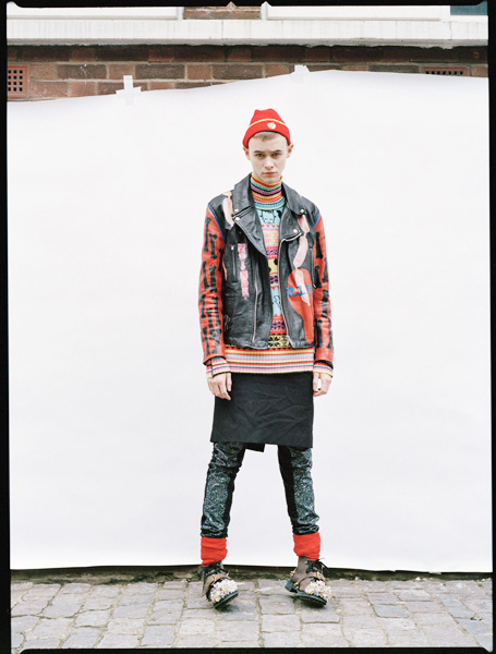
Scally drag – perhaps the most beautifully succinct way to describe the over-the-top looks endemic among party kids and rampant on Lookbook (bravo, Jo-Ann) – is quite another story. It is clearly symptomatic of our copy and paste culture. We appropriate and share anything from anyone in vain attempts to rise to popularity on networks driven by “hypes” and “likes” and “reblogs.” The new and false sense of individualism social networks bring counterintuitively makes us all less unique. And, logically, since flamboyance is generally the most effective means of standing out, scally drag is the unfortunate result of the whole world resembling a giant high school.

The cacophonous visual and cultural landscape of our generation means that fashion has fewer solid fountains of influence to draw from. Generations are no longer united by one cultural wave or by one group of influential artists. Fashion, by nature is iconoclastic and rebellious, but scally drag makes clear that fashion today isn’t quite sure what it might be rebelling against. And despite its supreme connection to the zeitgeist, scally drag is just too trashy to drive fashion forward . Ashes to ashes. Dust to dust. Trash to trash. Shock is dead.

But to its credit, the flamboyance is a powerful fight against the almost oppressive new elegance of its gentlemanly opposite.

Earlier in her mini-rant, Jo-Ann says, “I want to see something new that completely slaps me around the face and challenges me in the men’s world; a point of view that feels like it’s coming from a new generation and not just following an older one.” She goes on to cite a tension between auteurs and brands, but it’s rather this tension between beige dandy and flamboyance that could prove most important for fashion’s future.

Vicky Trombetta. Remix and masculinity for the future.
We hope that the two poles somehow begin to look forwards, instead of simply backwards (the dandies) and narcissistically inwards (the scallies). “There needs to be something else. Masculinity is more complex than that.”

Here’s hoping for some pleasant surprises from Pitti this year.

Tag Christof – Images courtesy 2DM / Bruna Kazinoti & Vicky Trombetta
 

Share: Facebook,  Twitter  
06/06/2011

The Editorial: This Is A Work Of Art. Why?

.

The Editorial: This Is A Work Of Art. Why?

“QUESTO È UN’OPERA D’ARTE.” “THIS IS A WORK OF ART.”

So says a blaring voiceover repeatedly as a small crowd gathers around two armchairs on wooden platforms designed by Gaetano Pesce. They appear to be straight out of Dr. Seuss, are highly derivative of his iconic 2010 “Senza Fine” line, and are occupied by two lounging nude models – a very busty blonde woman, and a muscular, long-haired man. Gaetano himself is there, mingling with the people who have gathered around mostly to catch a glimpse of the nudes, and perhaps to shake the hand of the celebrity designer who produced the pieces. But wait. “THIS IS A WORK OF ART,” the voice reassures us again. We’re not so sure…

As part of Italy’s pavilion at this year’s Biennale d’Arte di Venezia, Pesce’s contribution was among the included works of several hundred others in the canon of contemporary Italian art. The pavilion is supposed to be a celebration of Italian art at the country’s 150th anniversary of unity, but it is mostly just a confusing mess. Now, nobody should fault the noble attempt to include the entire scope of art of a massive and diverse country like Italy. But many works of dubious quality were included, and each being in the context of so many others ensures that the importance of all of them is lost.

Some are claiming that what I’m calling a mess is instead an appropriate representation of the difficulty of Italy itself. The Franco-Italian critic Philippe Daverio had this to say:

“They are all together, gorgeous and ugly, in a populist and transversal exhibition. A community where everyone is a happy, participating member of the family… It is an exhibition which helps us understand how one makes inroads in Italy, and for this, the pavilion is the most anthropologically appropriate that I’ve ever seen in my life.”

Perhaps. But Curation 101 dictates that a common thread – more elegantly a filo conduttore in Italian – is essential to any good exhibition. And when seen in the context of the American, Danish, Russian and several other strong pavilions this year, Italy’s misses the point entirely and is more likely representative of the lack of a clear idea for what Italian art should be. If this exhibition’s common thread is none other than “a bunch Italian of artists,” it says nothing.

Art itself has gone through quite a tumultuous period over the past several years. With infinitely easier access to images, art texts and art culture, it seems like everyone is calling everything art. The proliferation of e-art and the word “art” and vague ideas of flamboyancy as art appearing even in the most mainstream of pop culture, everyone is now “into art.” The problem is, pop culture is by definition superficial and transitory. Art cannot be – yes, pop art is art, but art is not pop.


The Italian pavilion – and the inclusion of a piece of design by Pesce, an easily recognisable name the curators believed might lend credibility to their show – is surefire proof that we are rapidly losing sight of the pivotal and important roles art plays. We frequently allow quantity to win out over quality and for art to be confused with several other things. In the case of Pesce and his work, we elevate a random piece of design to the exalted status of art. Why?

Design may sometimes do the same things as art, but its primary goal is practical. Design is none other than the improvement or changing or re-shaping if the environment with which we interact – aesthetics play a role, but only insofar as they affect experience. Design must change behaviour and enhance lives.

Art must change minds. Art must beg questions. Provoke. Challenge. It can be wholly impractical. It must provoke thought and discourse. Impractical, whimsical design is not art. It’s probably just bad design.

With that in mind, we have nothing against Pesce as a designer. His design work has been influential and imaginative. And his recent and very powerful installation for the Triennale “L’Italia in Croce” (“Italy Crucified”) was strong sociopolitical critique and a symbolic lament for a country he clearly loves – that was much closer to art. But with some odd-looking armchairs that are heavily related to pieces he’s already commercialised, he most certainly can’t accomplish both. Like the designer he is, while he mingled with the crowd, Pesce talked up the materials the chairs are made of – not the statement they make nor the significance of the piece itself. Despite what the voiceover said, they are not works of art.

Tag Christof

Share: Facebook,  Twitter  
30/05/2011

The Editorial: Type Is Personality / Matthew Carter

.

The Editorial: Type Is Personality / Matthew Carter

Humans have a strange relationship with type. We stare at it literally all day, yet it generally goes completely unnoticed – letters are letters are letters. Except that they aren’t. Subtle differences in their form means big differences in how we feel about what we read. About whether a text shouts or whispers. Some type is so functional it becomes invisible (Helvetica). Others luxurious. Some vulgar, maybe old-fashioned. We associate places, things, eras with type. Type is sacred. It would be nothing less than cruel to carve out a tombstone in Comic Sans.

Big Caslon and Georgia, designed by Matthew Carter.

And while we may not notice type much in day-to-day life, the subtle, calculated changes designers make to centuries-old letter archetypes speak to our deepest sensibilities. In the most human of senses, type is personality. Think of the highly stylised “R” in Prada, the formal rigour of Mercedes Benz‘s Kurt Wiedermann-designed “Corporate A,” the iconic script of Alfa Romeo, the cryptic typewriter-look of “Maison Martin Margiela.” The forms of these letters tell you exactly the attitude of the products behind them.

And since computers have infiltrated every facet of life over the past two decades, we’ve all become at least peripherally aware of type’s power. We are able to give style to our written content far beyond that of our own handwriting. Our letters are no longer written in the oppressive uniformity of the typewriter (even though, like using Hipstamatic to fake old film photography, we often insist on Courier to fake retro). We now have a huge degree of control over our written environment through the power of desktop publishing. And as publishing itself is revolutionised by the wireless mobile technology of instant gratification, our personal relationship to type will continue to become richer and more complex.

Type is inseparable from place.

Appropriately, type designer Matthew Carter was awarded the lifetime design achievement award by Cooper Hewitt national design museum this month. (And this comes on the heels of a 2010 MacArthur Genius Grant.) Among designers in all fields, his work’s importance was singled out for its huge impact. Like the good, invisible design of “Super Normal,” the book and 2006 Triennale exhibition by Naoto Fukasawa and Jasper Morisson, the power of Carter’s work lies in its unassuming functionality. It is ubiquitous and looked over, even though when measured by use, the infinite reproduction of the internet means he is probably the most prolific type designer of all time.

Chances are you didn’t notice that you’re reading a text set in Georgia. It’s a serif that looks nice both big and small, and without getting into technical mumbo jumbo like “x-height” and “stroke,” it is an absolute masterpiece. Matthew Carter designed it. He also designed Tahoma, Bell Centennial, Big Caslon, and the most widely-used typeface on the internet, Verdana, as well as several others. The names may or may not mean anything to you, but their effectiveness is extraordinary and you’ve most definitely interacted with all of them. As typography nerds who work extensively on the web, we’re very happy to see a type designer honoured with such an enormous award.


Big Caslon (Top) and Verdana (Above).

Earlier this year, we revealed a new logo as the beginning of a top-secret revolution that’s happening at The Blogazine. We spent weeks in the studio considering typefaces for the logo alongside expert calligrapher Luca Barcellona – we leafed through stacks of 20th century style books and drawers of Luca’s beautiful 19th century wooden type. We wanted a logo that was at once smart, worldly, fashionable, bold and clearly bespoke – essentially, our brand in logo form. Barcellona’s end product combines our signature hexagon with a hybrid B that brilliantly combines elements Gothic and modern type into a powerful whole.

Our identity has been thoroughly enriched.

The Blogazine’s Luca Barcellona-designed logo.

Earlier this year, I was stricken by a banner I saw in a newscast that was being brandished by several Egyptian protesters just before Mubarak’s fall. It was scrawled in bubbly characters and looked like it had come straight from a 1940s Warner Brothers cartoon. In its careless presentation, the protesters’ gravely serious message had lost all effectiveness.

Type is personality. Force. It speaks loud, just like fashion. And like fashion, its signs and significance must be taken seriously. Let’s all take a lesson from master Carter and listen to it – and use it – with care.

Tag Christof 

Share: Facebook,  Twitter  
23/05/2011

The Editorial: Fix It Up

.

The Editorial: Fix It Up

DIY has swept the world. Etsy has become a sprawling platform for thousands of micro creative endeavours. This weekend’s premier Maker Faire event in California’s Bay Area united thousands of do-it-yourself enthusiasts and set the blogosphere and Twitter on fire. And although the thrift shoppe/junk store has fallen out of favour as the prime shopping destination of the voracious hipster (as “hipster” is now merely another easily marketed-to ethnographic group), it is certainly fair to assume that we’ve made significant cultural inroads with this mass-revival of handicraft. But no matter how trendy DIY becomes, we remain a society of wasteful, wasteful children.

Let’s be honest: even the most staunch advocate of DIY lives in a world that is filled primarily with mass-produced objects. Furniture. Appliances. Electronics. Knicknacks. And certainly, we must! Most objects owe their existence in the first place, to the economies of scale and technical precision that is only possible through mass production. But, despite our best efforts, the “planned obsolescence” pioneered by the likes of designers Raymond Loewy and Brooks Stevens’ (and perfected in our generation by Steve Jobs and Jonathan Ives) will remain a major motor of the built economy for the foreseeable future. Simply, mass production isn’t the enemy – rather, it’s our reckless consumption of mass-produced things that is dangerous and unsustainable.

And, indeed, we throw some very nice things away. Our reflex to buy almost always seems to override any logical desire to repair. When something breaks – or starts to look less than perfect – we simply throw it away and replace it. That old espresso maker with a broken handle? Trash. The nice wooden table that would look stylish with a sand down and a new coat of varnish? Rubbish. The lamp that could use a new shade? Garbage. Instead of spending any time getting our hands a bit greasy (and brushing up our dexterity), we toss and re-buy.

While our society’s general propensity for buying cheap junk is part of the problem (throwing out objects designed to have short lives is inevitable), we tend to throw out nice things anytime they become démodé, too. Think of the countless classic rangefinders and Polaroids to be found for a few euros in any suburban junk shoppe that require only a thorough cleaning, a new battery and a roll of film. The beautifully-patterned old clothes waiting to be sewn into something new. The old books with lovely, lost typefaces.

Buying from “curated” vintage shops is concomitant recycling. But a real relationship with your objects – and a real, active contribution to sustainability – requires more than buying and consuming. And the deeper relationship you earn by maintaing older objects is therapeutic. You impose yourself upon them. They become personalised. And a mass object is transformed into a one-of-a-kind.


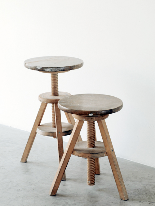
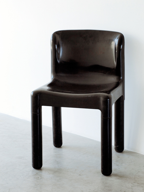
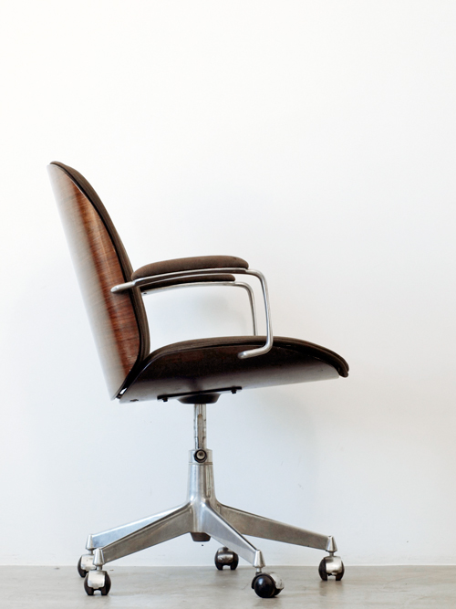
Our studio – a thoroughly modern, minimal place – is filled primarily with old, found and worked-over treasures: A recovered couch for guests, now painted pristine white. Several early 20th century Thonet chairs. Versatile height-adjustable found wooden stools and a sturdy old multipurpose table. A gorgeous MiM office chair from the line’s original 1960s Made in Italy range (MiM was back then a close relative of Fazioli grand pianos). An entire set of first-run 1974 Kartell 4875 chairs designed by Carlo Bartoli. Our most recent “acquisition,” is a circa 1995 drum scanner (complete with the requisite slightly yellow computer plastic of the era) whose superfluous quality kills that of expensive, much-newer flatbed scanners. Everything but the scanner was found – not searched for – after being thrown away by someone else.

Some of these objects could very well be museum pieces. But we use them, day in and day out because their inherent value is far from used up. And their inherent beauty, we feel, increases with age. Now, this isn’t an appeal for dumpster diving, nor is it a self-righteous lecture about recycling. But disposability is simply out of hand. This is broader than DIY: it’s foolish to think we can escape our manufactured world, so we must instead take steps towards truly engaging with it.

Tag Christof

Share: Facebook,  Twitter  
16/05/2011

The Editorial: Election Day / Everyday

.

The Editorial: Election Day / Everyday

There’s something about elections that inflames our sense of urgency. They bring concerns we let lie beneath the surface to the forefront, and we temporarily become activists. We engage in heated discussion. We evaluate our conditions, our place in our countries and cities, our values. Today, Milan is voting. Several candidates with drastically different agendas are vying for the future of this first-class world city, which has over the past two decades lost much of its lustre. Milan is, at the very least, ready for a renewal.

There have been drastic shifts in our way of life over the past several years, driven by an infinitely more dynamic generation and consumption of information. Much of this information is misguided, and clear voices have been subsumed by a general raucous. Advertising and marketing is slipped ever more sneakily into our daily routines. Cycles have sped up, trends live and die at lightening speed, and overarching cultural trends – i.e. the “decades” of the twentieth century – have in just a few years become unequivocally a thing of the past. In the midst of this, we face a major crisis of values. Our problems are no longer generational; they are systemic, huge and transcend age and geography.

But despite these apparently monumental changes, the real material issues we’ve faced for years remain. Problems of sustainability are accelerating. Food crises deepen. Current policy is neither adequate nor forward thinking enough to address the myriad socioeconomic, cultural and design problems we face. And if we were under-informed before the advent of blogs and Twitter (and slave to the whims of newspaper editors and TV anchormen), we now run the risk of being dangerously misinformed. All discourse, no matter how absurd, misguided or hateful, is now privy to its own platform. Sifting through the noise has therefore never been more imperative – politics, environment, everything depends on it.

So, where does your information come from? And by extension… what about your food? Your energy?

These questions address issues central to our happiness, our future, our health and even our continued existence. Their answers are values around which our generation must rally. We must remain informed (and that means much more than just spreading messages by social media), and learn to diligently curate and edit the information we consume in order to remain well-informed.

We must take a more active part in our food’s genesis, and at the very least understand where it comes from. From the simple mechanics of growing a few greens, we can better conceive of the massive shortcomings inherent in pure supermarket consumption, and then make smarter choices concerning the foods we will inevitably purchase. It takes neither an epic effort nor a huge plot of land to grow a sizable portion of the vegetables you would otherwise buy at a shoppe. Not to mention, maintaining a garden is spiritually (and gastronomically) quite rewarding.

If only a third of the citizenry with the financial means to do so would install solar panels in their homes, the impact on consumption over time would be monumental. A perceptual shift – by taking part in making energy – also would force us to understand that the electricity from the sockets we plug into everyday are not endless fountains of an intangible X that allows our objects to function.

And in much the same way, our politics must well-considered, honest and hands-on. Today is election day. Get out and vote if you’re able (and live in Milan). In addition to a recharged hope for a new era in the city, we hope for a brighter new era for everyone. Wherever on the planet you may find yourself, channel the energy and hope inherent in this day (and any election day) into these matters of substance everyday. Left, right or centre, they’re truly what matters.

Tag Christof

Share: Facebook,  Twitter  
09/05/2011

The Editorial: Sushi or Spaghetti?

.

The Editorial: Sushi or Spaghetti?

Sometimes it pays to be late to a party: after missing out on the early years of fast food, the now global Slow Food movement is wholly a product of Italy. And after mostly missing out on the dehumanising, smoke-belching factories of the Industrial Revolution which plagued the UK and other countries through the twentieth century, Italy’s fashionably late arrival to industrialisation saw the country become the world’s foremost producer of design goods (illustrated brilliantly in the Triennale’s current exhibition, Dream Factory), and it is one of the few western nations to maintain a solid manufacturing base. Still, at an ever increasing rate, the fads of the northern countries and the USA inevitably make their way here one way or another.

The country’s food culture has been particularly slow to change, with Italians generally sticking steadfastly to their simple, fresh and delicious food. Not coincidentally this inherent locavore attitude once made for one of the most sustainable (and healthy) food ecosystems on the entire planet. But with shifts of population, and shifts of taste (and for fear of being seen as provincial) Italians have begun to demand variety beyond the kebab and occasional dodgy Chinese restaurant. You can now find almost any ethnic food imaginable in some form around Milan, and while nowhere near as cosmopolitan in terms of food as Paris or New York, the food landscape has been altered drastically.

Sushi is among the most visible recent arrivals. While Los Angelenos and New Yorkers were eating the neat little morsels en masse by the mid 1980s, it was impossible to find it in any medium sized Italian cities even five years ago. Slowly but surely, though, sushi has arrived. Very recently, several all-you-can-eat Japanese restaurants have been springing up around Milan (the latest is a tacky black-lacquer affair in Porta Ticinese loudly proclaiming its unlimited sushi to passersby in an 80s kung-fu movie typeface). Sushi has gone mainstream in the Bel Paese, and despite its late arrival, chances are even your nonni have tried it.


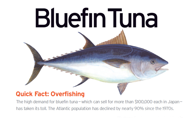
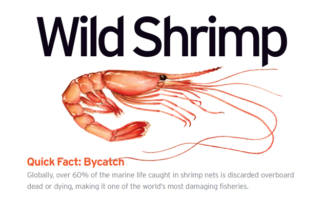
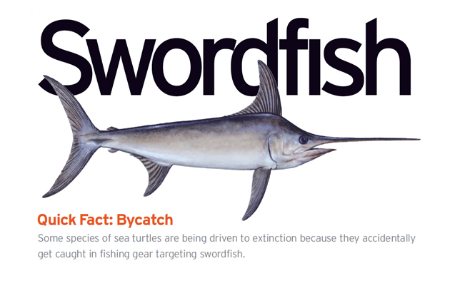
But this fad has far-reaching consequences. The simple fact is, the food (especially the seafood) that is sustainable to eat when you live on an island in the Pacific is not the same food that is sustainable to eat when you live on a peninsula on the Mediterranean. Full stop. And with exponentially increasing demand from industrialising countries on the ocean’s reserve, there is bound to be a massive collapse that will leave millions without any fish unless drastic steps are taken. Fish populations are dwindling – entire species are in danger of extinction – and sushi’s liberal use of shark, snapper, swordfish and all sorts of unsustainable tunas is a major source of the problem. As another country of tens of millions embraces the cuisine, demand will only increase. Not to mention the peripheral damage caused by irresponsible hunting: countless dolphins, sharks, octopi, fish, crabs and others killed as “bycatch,” destruction of coastal habitats and coral reefs and a general loss of equilibrium in the sea.

Fish are the last wild animals we hunt commercially for food, and as we approach the limits of their resiliency we must become much more responsible, lest we find ourselves with ruined oceans and no fish within a generation. Quite simply, the world cannot sustain a planet of several billion sushi eaters. This is by no means only an Italian problem, but with with any luck, the country’s late arrival to the sushi party and exceptional food patrimony can help transform it into a voice of reason.

Call it provincial, but while in Italy, doesn’t it sound much nicer to have a nice branzino al forno caught just off the coast than a frigid piece of tuna flown thousands of kilometers to your plate?

Visit Seafood Watch for a wealth of excellent information regarding responsible seafood and other initiatives for preserving our oceans.

Tag Christof – Images courtesy Seafood Watch

Share: Facebook,  Twitter  
02/05/2011

The Editorial: A Mexican Hipster & Her Acapulco Bike

.

The Editorial: A Mexican Hipster & Her Acapulco Bike

Hipsters haven’t been a cultural minority for quite some time now. In fact, the obnoxiously iconoclast-at-all-cost hipster of yore has ironically been subsumed by his own culture, with even legions of teen girls now burning Lucky Strike and sucking down cans of Pabst Blue Ribbon at “alternative” parties. The famous Adbusters cover of a couple years ago proclaiming the hipster dead proved prophetic, afterall: the term has ceased to mean much of anything, its loose connotations now falling somewhere between 1) the irreverent, self-glorifying eternal teenager embodied in hilarious blog Hipster Runoff (and its countless imitators), 2) suburban kids in garish vintage clothes who have “rediscovered” The Smiths and 3) the design-loving, false-Luddite, artisanal beer-drinking foodie snob embodied in every Brooklynite. Perhaps the one unifying factor among the three is an undying reverence for the fixed-gear bicycle.

Now that the whole world is one gigantic small town in which we all must compete with billions of others, the fight for individuality, however, has taken on special importance. We must all be hipsters at heart, lest we be lost permanently in the crowd. Nevertheless, like so many cultural trends with roots in America and Europe, the hipster’s effect on the world at large has been unpredictable and at times has pitted western cool against the very cultures embracing it. Hipster spread predictably from West Coast USA to western Europe and Britain, and from there onto everywhere else. Now there are Chinese hipsters, African hipsters, Russian ones and Brazilian ones.

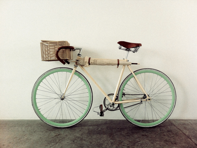
During Salone del Mobile, we had a chance run in with a promising young Mexican designer named Ana Gaby Gonzáles on the metro. We, being qualified type 3 hipsters (see above), approached her because of her particularly gorgeous sea-green fixed gear, which, fortunately for us, happened to have been designed by her. It turns out that the bike itself had a rather interesting story behind it, and since it was a clear sign of hipster’s world reach as well as an interesting design study, we invited Ana over for a conversation.

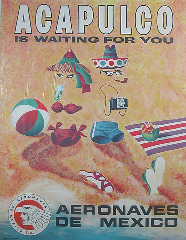
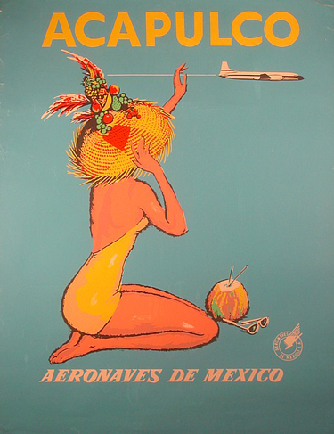
As part of an initiative from Mexico City-based espresso cycles for young Mexican designers to create several one-off bikes representing one of the country’s cities, Ana’s very 1950s colour scheme choice – together with detachable basket and portable umbrella – is an homage to Acapulco. The quintessential Mexican beach destination, which has declined precipitously in recent years, was the designer’s reach into the lost Mexico from her childhood. The problem is, one would never think immediately of Acapulco despite its colours: its essential form is fixed gear minimal and thus says “urban America” in the same way a Vespa painted in any colour says “Italy.”

Ana’s bike instead represents the new and strong cultural mixing that has erased borders in the internet age. Hipster has taken hold in Mexico, and as such, has itself become a part of Mexican culture. The fixed-gear community in the country is now large – check out Mexico Fixed – and well-established. And while the bike may be seen as yet another foreign colonisation of Mexican culture, for Ana it is instead a modernising of Mexico while keeping sight of its roots. And with the Acapulco bike’s well-intentioned mission, its importance ultimately lies in considering whether cultural preservation can be reconciled with progress in the first place.

Just like the dead hipster was overtaken by his own overdone individualism, entire cultures must make certain that they maintain a sense of individualism. Mexico, and Mexican designers especially, must therefore strive to mine their country’s energy and identity to truly preserve while making progress. With its incredible richness of imagery and rich tradition of transportation devices – from the humble improvised food cart to a deep love for vintage automobiles – there’s a lot of inspiration to be had… Ana and her peers are definitely moving in the right direction.

Ana’s bike (which is now permanently hanging around The Blogazine’s bureau) had previously been featured on Core 77 and in an exhibition from Our Cities Ourselves called Nuestras Ciudades Nuestro Futuro: “2030 Diez Ciudades Imaginando La Movilidad” – catch the video here.

Tag Christof 

Share: Facebook,  Twitter