05/07/2011

Hello, Carolina Melis!

Hello, Carolina Melis!

Dancer, illustrator, animator and most recently film maker, the latest talent to join the 2DM family sure has her fingers in many pies. Having worked for labels such as Hermes and Prada Carolina Melis is ridding one high wave. A wave she dose´nt seem to be getting off any time soon. With a recently released film “Le fiamme di Nule” and a wide array of animated works for the BBC this multitalented Sardinian native leaves us gasping for more.

Hands | NSPCC | Saatchi&Saatchi | Nexus Productions from Carolina Melis on Vimeo.

Based out of London, Carolina´s art has a distinct warm style that makes one go all warm and gooey on the inside. Featuring elements of and nature and dance like repetition her art has a mesmerizing, melodic almost poetic drama to it. Her warmth and cheers scorches through her work and we gladly share her cheers welcoming her to the fold.

You come from a dance background, how did you make the transition into art direction illustration and animator. Tell us about your beginnings in the field? 
I moved to the UK to study choreography, but I never wanted to become a dancer, I was mainly interested in composition and directing rather than the technique. I studied at the Dartington College of Arts – a place that in the past had hosted some great artists such as composer Stravinsky, dance-theatre funder Kurt Jooss and sculptor Henry Moore to mention a few. There I started to think about choreography beyond the physical dance performance, creating animations and illustrations which I saw almost as dances on screen and paper.

Later this became my main field. I moved to London and graduated at Central Saint Martins where I specialised in illustration, art direction and animation. At the moment my work is much more commercial and mainstream than my early stuff, yet weather on paper, on stage or on screen I still think about my compositions as potential dance scores.

Your art has an almost poetic, melodic feel. How much does dance influence your art?
I’m a dance fanatic. Living in London I have the privilege to see great shows all the time and attend classes with the best professionals. I get hugely inspired by this. In my work I use lots of repetitions and variations and in my animations I rarely use cuts. I think that comes from dance, I see movements and images evolving and transforming all the time, a constant flow. I also have a great passion for nature and I exploit motives such as flowers, insects, animals, yet I consider my work to be more dramatic than romantic. 

What is your creative process like? How does a beautiful Carolina Melis piece go from concept to reality?
YI often start from a simple motif: a combination of colours, a shape, a song, a story. I am a firm believer in the creative process, meaning that ideas generate ideas. It is very difficult to plan a final piece before even starting on it. My best work is often unplanned, I start with a simple element and then develop it until it becomes a piece of work – an animation an illustration or whatever fits right. Commercially it’s a different process..

What is the most personal project you’ve done so far?
It would probably be the video I did ¨Coleen on Leaf¨. It was my first video and I was questioning my taste and approach to art a lot at that point. I was listening to a lot of electronic music at that time, and for the first time I had to give that kind of music a visual. I spent ages on it, a very ambitious project as it’s full of tiny dots that move individually.  It’s had been a while since I did it but it´s still is one of my favourite pieces.

What is your relationship with fashion? How would you describe your style and how much does your art influence it?
My style is quite simple and feminine. I wear mainly black and pastel colours, which are also my favorite combinations in work.
I often collaborate with fashion labels. At the moment I’m directing an animated piece for Prada in collaboration with AnOther Magazine. It’s for a new fragrance they are about to launch…it´s a fantastic project as it’s about dance, unfortunately I can’t say any more as it’s not out yet. 
I also have an ongoing collaboration with french fashion label Sessun. For them I create original window art pieces for their 5 stores in France. Every piece is inspired by the collection of the moment and it’s entirely crafted. The first one I did was an installation of hundreds of butterflies all made of found little elements, such as beds, feathers, small pieces of wood. Beside these jobs I’ve also done quite a few editorials for fashion magazines, designed textiles etc.

You’ve worked with some big labels in the past. What do you think is the label that most shares your aesthetic? 
I am in love Balenciaga, it’s quirky, feminine yet super modern. Prada is always great, I always like their concepts and moods. I also really like the colours and textiles in Kenzo, I like what Antonio Marras is doing for the label and I feel very close to it it terms of style. 

You have your roots in Sardinia, and and now live in the UK. Do you think the Mediterranean flavor is imbedded in your art? How much is British and how much is simply Carolina coming through? 
The British have the great ability in mixing styles, combining vintage with the new, borrowing traditions from other cultures etc.. I love being in the UK as it is creatively a very daring country yet at times I get frustrated that everything is so ephemeral, fashion and trends here appear and disappear very quickly. For this reasons I often like to refer to my stronger italian roots, the traditional motives and and the more classic devices.

 You have a strong footing in many spheres: illustration, art direction, animation and dance. I get the feeling that you are always working on a ton of projects at once. How do you manage your time and which one is your first love?
Unfortunately that’s really true, I always work on far too many projects and at a time and it can become very complicated, but I have a number of very precious helpers that support me in most things I do. I love the balance of the the different projects and I think that’s what keeps me alive.
I see myself as a bit like a ‘concept store’, I use very different mediums but the philosophy behind it all is always coherent. Also I see many artist that concentrate on a very niche genre and after a while they struggle to stay relevant.  

9. Are there any illustrators/animators, past or present, whose work you really admire? 
I really like the art of Paolo Ventura, particularly the series ‘Winter Sories’ and the illustrations of Olaf Hajek.
In terms of animation, Fantasia has been the most influential piece for me. I still believe that Deems Taylor’s introduction in Fantasia is the best way to explain the relationship between music and image. Further to this I think that Oskar Fischinger animation in the film’s first segment, the Toccata and Fugue, is still so incredibly contemporary, something I wouldn’t be surprised to see as a back projection in a trendy summer festival like Sonar.

Tell us about your work for “Le fiamme di Nule.” Is there a bigger film making role in your future?   
‘Le fiamme di Nule’ is a short film combining live action and animation. After a visit to the village Nule in Sardinia I got very fascinated by their traditional ways of making textiles and I decided to write a story inspired by that place and their designs. There was something quite cinematographic in that scenario, an atmosphere that you rarely find in London. It’s a story of three weavers from taking part in a tapestry competition, the competition really happen but I told it with a very personal way. I wanted to portrait the context of a rural village with a stylish and nostalgic approach, so there is a strong sense of art direction and design in the film. 

Since the film I got commissioned to design some tapestries myself by the, the rugs where made but the artisans from Nule, it feel amazing.. I almost feel like I’m becoming part of my own film!

I would love to make a feature or a series, it has been in my mind for years. Last year I started working on some long formats with Warp X, everything is still in progress and to be honest I’m not rushing it.

Internet Warrior | Oh No Ono | Leaf from Carolina Melis on Vimeo.

Interview and Introduction – Daniel Franklin /  
 

Share: Facebook,  Twitter  
01/07/2011

Guest Interview n°30: Beatrice Fontana

.

Guest Interview n°30: Beatrice Fontana

Beatrice Fontana is a créatrice, in the strictest sense. She is considered a maven of taste and is a privileged consultant to the world’s premier luxury brands. In addition, she’s had a role in bringing high-luxury sensibility to very functional objects, and not long ago collaborated on a major project with Parker Pens. Hers is a life of invention and a constant search for inspiration.

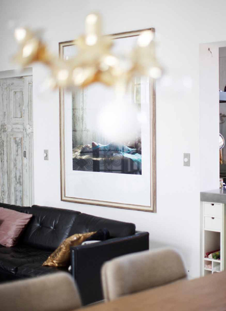
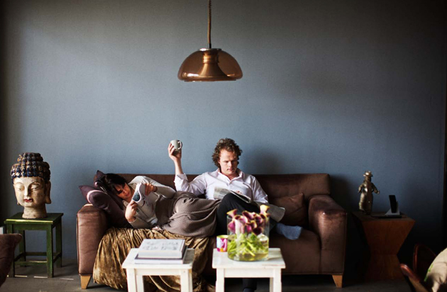
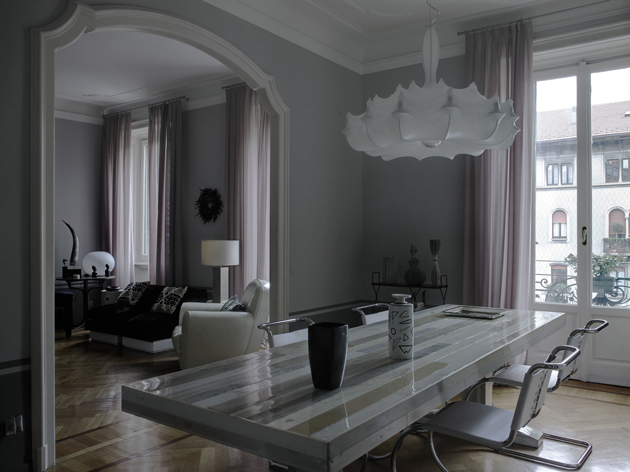
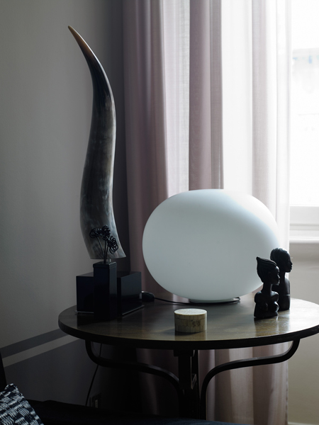
We visited her home earlier this year with 2DM photographer Lorenzo Nencioni, where she and her husband showed us their fantastically varied collections of objects, impeccable furniture, enormous music collection and the extraordinarily well-curated home in which it is all contained.

And what exactly does Beatrice Fontana studio do?
We are a consulting practice that studies trends in fashion and design, creating projects and products specially made for brands, our clients.

Your work for Parker pens is quite a departure from you work designing fashion accessories. Did you enjoy such a radical change?
When they called me I was seriously bowled over. But they told me they needed “style.” I accepted, driven by the fact that being charged as Artistic Director would mean that I would be given a new fountains of inspiration and ideas for any type of product.

You collect beautiful things. Tell us about that.
Yes. Mine is a search for style. To collect objects is both a fountain of inspiration and an indefatigable urge just to have them. And also, I like to live among things I love: some represent undying loves, some are a “flash in the pan,” and then, I give them away as gifts.

Your husband Corrado is also quite a collector. Has his love of hard rock influenced your creativity?
Certainly! That means that when we visit markets, we choose also the objects that are a little bit more “rock”… But in any case, in our living room we have racks of horns hanging over the room and the skull of a horned buffalo!

And together you and he have carefully curated your home here in Milan that Lorenzo Nencioni photographed recently. How has your personal space important for your creativity?
It’s fundamental! Some days when ideas don’t come to me, I work at home, and I lay out all my work material on our magnificent table by Piet Ein Heik. I pace back and forth on the creaky old parquet and I feel as if I’m in harmony…. It’s there that I find insiration.

Any particular pieces of furniture/decor that you treasure above others?
Memories from my childhood, like two armchairs from the 1970s that are in my living room which I had reupholstered in black calfskin. And a large crystal lamp that hangs over our bed that came from my parents’ room.

You studied at Istituto Marangoni in the 1980s when fashion was drastically different, and Milan was a radically different city. How have you seen fashion and luxury change over the years?
Milan has changed so much. Back then, everything was more simple… you proposed an idea, and it was considered solely based on its creative merit. I remember that I designed in complete liberty, following the inspiration of the moment. Then, the crises hit, minimalism became popular, people became much more cautious about their purchases, and every design is analysed from a marketing perspective. I think, though, that we “grew up” somehow, and that the distance from the frenetic 1980s have done us some good. Today, work is done in a more attentive and balanced manner, but there’s also a large-scale return to creativity as a catalyst for everything.

What was Milan like back then?
I remember it being more provincial and perhaps a bit more sorridente (smiley). In Milan we breathed an air of “anything is possible.”

How do you imagine Milan in 25 years?
A bit less liveable and more overcrowded. Unfortunately we are losing our soul bit by bit, even if it’s true that there is no city in Italy like Milan, in Italy we aren’t able to compete with other European metropolises in terms of stimuli, culture, minds…
I have architect and designer friends who come for Salone del Mobile every year and they go crazy for Milan. But sadly, Milan is only marvellous to live in during that one week in April.

What is true luxury, in your opinion?
Finding the answers to your own desires.

Interview and introduction Tag Christof – Italian translation Helga Tripi – Photos Lorenzo Nencioni / 2DM

Share: Facebook,  Twitter  
28/06/2011

Guest Interview n°29: Jack Skuller

Guest Interview n°29: Jack Skuller

Jack Skuller is on fire. He made waves last year with his toe-tapping, singalong single “Love Is a Drum” and has just followed it up with the every-bit-as-catchy “Secondhand Smoke.” His music is pop in original sense: engaging, approachable and instantly classic. The Ruckus hailed him as the “Anti Bieber,” and he certainly provides refreshing relief from the leagues of overproduced marketing machines that have ruled the international pop airwaves recently. He’s lightyears away, and is a stellar musician first and foremost.

Combined with his addictive rhythms, uncanny knack for songwriting and good looks, we’re convinced Jack’s going big places. 2DM photographer Roberta Ridolfi spent an afternoon with Jack – and they got on famously. With The Blogazine, Jack talked musical style, his favourite album of all time, and life in Jersey.

I hear a modern-day Ritchie Valens in your music… but you’ve been called a mini Jack White! So how would you define your style?
I am simply a rock and roll artist with a 50’s twist. There is a lot of blues incorporated into my writing and melodies and it mixes with modern rock and roll, which is what you are hearing.

And how do you feel about being called the “anti-Bieber”? (We’d feel pretty good about it!)
Well, I never know if it’s good or bad! (Haha) To be honest, I never really focused any of my aspirations on becoming the “anti-Bieber” nor the “next Bieber.” Our music is completely different from one another’s – we’re musically in separate galaxies!


And who do you consider your greatest musical influences?
There are so many that I can’t even name all of them! But some of my biggest influences are definitely Elvis Presley, Eddie Cochran, Little Walter, Black Rebel Motorcycle Club, and The Kills. A wide range of music I just covered, I know… Some may call me a hybrid!

Dream collaboration?.
A blues covers album with The Black Keys or Jack White.

How do you listen to music? Vinyls? iPod?
Great question! My family owns a lot of vinyl, but I usually use my iPod or my laptop.


What’s your favourite album of all time?
The Beatles’ Revolver

Let us in on your songwriting technique. Does inspiration flow when you sit down with your guitar, or do ideas strike more randomly?
It’s both. Sometimes I’ll think of a melody or a chord progression based on how I’m feeling and then the lyrics just write themselves. Other times, I’ll have an idea and just sit at my desk and go nuts on the paper. Most of my songs come from real experiences.

If you could choose to live in any era, when would it be?
Without a doubt, the 50’s – first generation of rock and roll!

Tell us a little about life in Jersey!
It’s splendid. I’m 10 minutes away from New York City, where most of my gigs are. I love school and my friends are so awesome and supportive.

How do you spend your time when you’re not rocking out?
I’m usually writing, rehearsing, running, playing basketball or baseball, or completing an assignment for school. But I don’t have to do that again for a while since I’m on summer break!!

Tag Christof – Very special thanks to Roberta Ridolfi / 2DM


Share: Facebook,  Twitter  
24/06/2011

Hello, Paul Barbera!

Hello, Paul Barbera!

With all the warmth and feeling of his photographs, we welcome photographer Paul Barbera into the 2DM family. The Australian (and recent New Yorker) with Italian roots has crisscrossed the planet on a career that, beginning behind the viewfinder of a bulletproof old Minolta, has gone on to take him to exhibitions around the world and work with an impressive client list. He’s also quite the accomplished portraitist.

Paul has also forged several impressive collaborations. He uses the web extensively to collect and curate, and is behind the sweeping and evocative internet projects “Love Lost” and “Where They Create” (and we learned in this interview that he’s also behind “Where We Collaborate” and “Stuff People Send Me”). It the effervescence of Paul’s work’s and warm energy, though, that best communicates his strength as an artist. And we’ve known few photographers who can better inject positive emotion into a place. We’re thrilled he’s joined us.

Describe your relationship with photography. What was your first camera?
My first memory is of a Polaroid camera at 8 or 9 years old. But it wasn’t until I was 15 or 16 that I tried to control what I was trying to put into the frame. I used a Minolta SRT 101. It was the first time I found something that made sense to me, because I struggled with school. The Minolta was actually my father’s camera and I am certain that I wouldn’t have a relationship with photography if it wasn’t for him. He was born in Sulmona and came to Australia at 24. He worked as a motorbike mechanic but in his little spare time he not only practiced photography but also painted, did woodwork and made metal sculptures. These were technical, creative and practical skills which my brother, who is a furniture designer, and I inherited. We were given the opportunity and chance my father never had, so the foundation of my craft is somewhat of a legacy that was seeded by my father and my relationship with photography is bigger than me.

And what are your weapons of choice these days?
When I was younger, I worked in a camera shop and spent all of my wages on new cameras and equipment. I don’t do that anymore. In fact, the camera is not the centre of my work – my kit is very minimal – but rather, it is part of a process that I have been refining over the years so that everything I deliver is consistent in quality.

You are primarily an interiors photographer, but you also do fantastic portraits. How did you arrive there instead of becoming, say, a fashion or landscape photographer?
I think interiors found me. I spent many years exploring different genres and I have a website of this work. However, interiors always seemed to follow me around and it always felt effortless and easy so I never took it seriously at first. My good friend Edson Williams (who was also my agent for ten years) always told me to focus on interiors but it wasn’t until three years ago that I felt I was comfortable doing this and everything has fallen into place ever since. Before, I was doing some great projects and traveling a lot but now there is a new calmness and focus in my life and work.

How are you able to infuse such energy into your interiors and still-lives? We’ve remarked that you have a rather warm sensitivity towards objects and spaces…
I have learnt to trust my instincts after 20 years of shooting and that allows me to work naturally and openly because I’m actually a very energetic person and I’m constantly seeking new experiences, people and spaces. I get bored easily!

Tell us a little bit about your side projects “Love Lost” and “Where They Create.” There’s a monograph in the future for at least one of them, right?
Both are personal projects that are very close to my heart which I have self-published online. I tend not to talk about Love Lost in terms of what it is about. But I do envisage it evolving in a new direction in which I use actors and singers to create intimate portraits which can be published as a book one day. Where They Create comes from a very natural place because it comes from my travels and my interactions with a city and the creatives that I meet. About a year ago, I went to Frame magazine to shoot them as part of the blog and they ended up offering to publish it. It’s now coming out to bookstores in July.

What’s it like to be a cosmopolitan Australian? Is there a certain mark your home culture has etched onto your creative spirit?
Nice question! I think Australia as a ‘new world’ country sometimes lacks a sense of heritage but there is also freedom in that. For me it was important to live abroad to understand what this heritage meant to me, so one of the first places I moved to was Italy. I’ve also lived in Berlin and Singapore and for the last 10 years I’ve been working between Amsterdam and Melbourne. I think most of my Australian friends have lived and worked abroad because you feel a bit disconnected from the cultural capitals of the world because of our geographic location and when you return home, you seek to bring the best of what you experienced back home. I think Melbourne is the cosmopolitan capital of Australia. It’s got some amazing restaurants and there is room for innovation.

You’ve done a lot of work around Milan’s design scene – you’ve photographed Rossana Orlandi, Rosselini Missoni, Tom Dixon, Ross Lovegrove and others here. How do you feel about the city?
I love Milan, I really enjoy it when I visit. Compared to Rome, Milan is less chaotic. However it is also weighted down by its past – you see it in the advertising, film and culture. There is good side and negative side to this. I feel in the years to come, Italy will have a big shake up, as the next generation fight for more opportunities and possibilities. Italians are capable of greatness because there is a such a strong history of innovation and exploration. That’s why the great designers you mention descend towards Milan.

Sources of inspiration? Favourite photographers (besides yourself)?
As far as inspirations go, it changes I tend to look outside of photography. But I love the work of Martin Parr and Richard Kern an Australian called TIM RICHARDSON, there is too many to mention, i keep everything i want to share and remember on a site called Stuff People Send Me.

And why the big move to New York? Where in the city will you be living?I just arrived yesterday but it’s taken 6 months of planning to make it happen. I wanted to move here for many years for professional and lifestyle reasons and we’ve found a cute place to live in the East Village.

What do you do when not behind the lens?
I am behind my computer! I’m always planning and editing, there’s so much to do behind the scenes. But outside of work, socializing, family, watching documentaries, listening to podcasts on science and culture, cooking, enjoying coffee and spending time with my partner fill what gaps are left. I have to say in many ways my life is my work and vice versa.

Tag Christof – Very special thanks to Paul Barbera


Share: Facebook,  Twitter  
22/06/2011

Guest Interview n°28: Rosaria Rattin / Kose
.

Guest Interview n°28: Rosaria Rattin / Kose
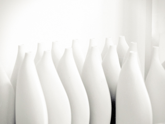
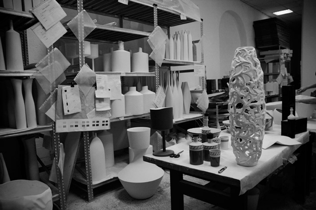
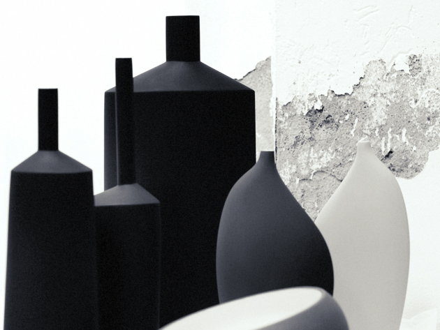
Rosaria Rattin is an intensely sentient being. Truly straddling the line between designer and artist, she charges her objects for Kose with deeply social, political and human questions. Their provocation, however, is brilliantly hidden behind their minimal forms and delicious tactility. Along with her partner Graziano Azzolini, she has built the entirely artisanal brand from the ground up based on a belief that the value of handcraft is an indispensable tool for humanity going forward. She began her design career at Max Mara in an era where fashion was an entirely different animal, and her work for Kose continues to be informed heavily by her roots in style.

Rosaria is proudly Italian and hopeful for her country’s future. She is a visionary, and like every great designer, is possessed of an intense curiosity and humanity: strong, single-minded, critical, intelligent, and a voracious connoisseur of knowledge.

The Blogazine had the pleasure of spending two afternoons in Kose’s Milan studio, where we talked everything from form-giving and the importance of materials in design to Italy’s future, humanity’s past and the power of childhood…

Kose pieces are entirely handmade, unique objects made using “ancient handicraft techniques.” Share with us a bit the story and idea behind the company.
I’ve always considered the “human animal” a marvellous wonder of Nature. A mammal that evolved being able to transmit a thought, a feeling, emotions through words and through doing. And throughout their history, humans invented and passed down through memory their discoveries, their personal thoughts, their personal experiences… the very essence of the experience of life. This all in a constant labour to continually evolve, for posterity’s sake… small beings for a big Being.

I wanted for this reason to recapture ancient memories of “artisanal technique.” Those that came about in the 3rd millennium and were such an integral part of human life .. The artisanal is considered old-fashioned in a society that tends to simplify an few groups and homogenise everything in the name of industrialisation and mass consumerism. A rebirth of the artisanal is, in my opinion, a recuperation of memory and history. The recovery of uniqueness of the individual, of thought, of emotion and of sentiments.

Every Kose object transmits a part of the person who designed it, worked-over and even loved it… because clay (earth), you must handle it with care. You must touch it with sensitive hands and care. Otherwise, it breaks.

Since handcraft is inherently “anti-design” because of its opposition to mass-production, what is Kose’s design process like?
I wanted to demonstrate that the “antique,” if brought up to date is modernity itself. Design. Because man’s evolution has been to constantly “modernise,” humans through their constant pushing forward make projects in the present that… well, they become the future!

Their pared down simplicity recalls Japanese and Scandinaian aesthetic – but also perhaps Lino Sabbatini’s metal work. What are the inspirations for their forms?
The simplicity of the objects in the Kose canon represent for me a love for the elemental. The nature of objects. The flow of thought without , and beauty that is always extremely natural.

The process that goes into creating objects for Kose is a storytelling of emotions. And Kose objects are principally cities. The Note line is New York, and the Geometrie line is Berlin… Their “peripheries” (in both a physical and contextual sense) represent an end to the industrial age…

And the materials used? Glass, wood… even gauze. Why these in particular?
We use earthen clay, wood, glass, gauze for texture… quite simply because they’re natural. Natural compliments people. Natural for the people.

What do you think the future holds for handmade?
I think that handmade is the future. For decorative products it is a gift of uniqueness to another uniqueness.
I also believe that for a more “correct” trajectory of our species – and I consider global to include both the world and the entire universe – we must re-appropriate, take back for ourselves “doing,” “making” in order to reacquaint ourselves with… ourselves! To recognise ourselves. And to truly create.

Tag Christof – Very special thanks to Rosaria Rattin & Graziano Azzolini

Share: Facebook,  Twitter  
15/04/2011

Guest Interview n°27: Hanna Albrektson

.

Guest Interview n°27: Hanna Albrektson

“I’m the kind of person who was born with a pen and a pair of scissors in hand,” says illustrator Hanna Albrektson – aka Weekendform. “My mum used to go crazy when the fruits in our kitchen became a victims of my markers…” The illustrator from the south of Sweden talks to us about her love for paper and how she made Chanel, Yves Saint Laurent and Hermès bags into something super recyclable.

She loves the feeling of complete freedom, and considers her work to be just that, free. With studies in graphic art and different printing techniques, she likes the fact that she doesn’t have to be limited by a specific method. And that she has the ability to mix paper collages with gouache and markers. Her studio is in Malmö, the Swedish city known for being the most artistic and inspiring. Below her sky-high ceiling and surrounded the humming from the pedestrian street just outside her window, she is content.

When starting new projects, she always begins by hand. To Hanna, it’s important that you understand the work that lies behind each drawing, and the fact that it’s made by an actual person, not just a computer. “I want my drawing to express honesty and direct, she says.”


She’s inspired by simplicity and optical illusions. She prefers a “less is more” style while also having a huge passion for patterns: they are endless and can go on forever.

What’s the most entertaining project you’ve done so far?
Hmm… Difficult to say! I enjoy the variations in my job! However, I did a super fun fashion story for the magazine Gravure. I illustrated clothes in watercolour, then I pasted it on top of a nude model. Time consuming and intricate but fun! I was so pleased with the feeling of the images! Emma Dysell, the photographer did an amazing job with the photos.

Tell us about the project of your dreams!
There are many of projects I would love to do. I want to illustrate porcelain, create wallpapers, textiles, book covers, you name it! I think I want to do as many different kinds of works as possible.


Your paper bags are fascinating! What’s the story behind the project?
The story of the paper bags is simple. I got a request to create a fashion relation job for The Block magazine. I liked the idea of building classic, expensive designer bags in a material as simple as paper. The bags were photographed by Emil Larsson. I’m amused by paraphrases. To create my own interpretation of already exiting pieces of art or other objects is a part of my artistry.

When not working, what do you prefer to draw?
When not working, I draw from my mind. Like possible new projects. Anything from new wallpapers to research of new kinds of papers.

Who are your personal favourite illustrators or designers?
That would be Jane Bark. David Shirgley. Toni Lewenhaupt. Stig Lindberg. Lovisa Burfitt. Poul Ströyer And probably another 100 people…

If you could have coffee with any one person, dead or alive, who would it be?
I would have my coffee with the DJ Larry Levan, but it would just be for an quick espresso since he is about to have a gig at “Paradis Garage.” So we knock back our coffees and hit the club! He DJs and I dance, drinking cocktails all night long! The year is 1982…

Thanks, Hanna!

Emelly Blomqvist
Share: Facebook,  Twitter  
12/04/2011

Guest Interview n°26: Lucas Kalda

.

Guest Interview n°26: Lucas Kalda

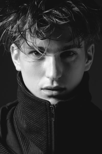
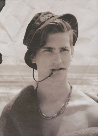
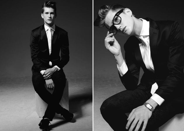
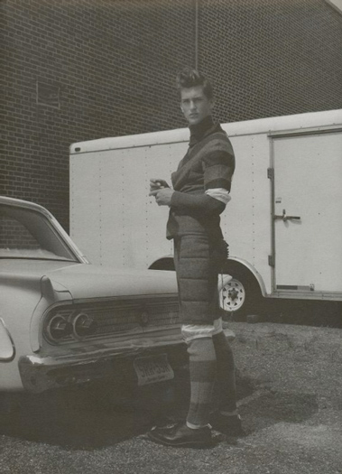
With clients like Valentino, Vogue, Galliano and Acne under his belt, the Swedish model Lucas Kalda is on the verge of becoming a model with a capital M. Born in Stockholm, he’d prefer to live out an American dream in New York City. Maybe someday with his own billboard in Times Square…

So… who is Lucas Kalda?
I’m a 21 year old model from Stockholm, Sweden. I have been modelling since I was 15, so I’ve been in the business for a while. I would say that now’s s the best time in my career. For the moment I live in Stockholm with my girlfriend Louise and my little dog Prince, working at the Swedish brand Tiger Of Sweden. I see myself as a very down to earth guy who is very easy to be around.

How did you get your start as a model?
I started off because a booker at the Swedish modelling agency Stockholmsgruppen approached me in a shopping mall in Stockholm. And the rest is history…

Did you ever have thoughts of modelling before being approached?
Yeah, I had. A lot of people around me, as my friends… and even my parents told me I should send some pictures to agencies, but I never made it before Stockholmsgruppen scouted me.

What was your first job?
It was a show for a couple of small boutiques in an area called SoFo, which is the trendy and fashionable area in Stockholm.

Which myth about being a male model would you like to kill?
That it’s a very glamorous life and a lot of money. As an example, before doing fashion shows there’s a lot of work! You do different castings for four days, and you have maybe around 6-10 castings per day. If you do both Milan and Paris Fashion Week, you have around 50-80 castings in eight days. Then, maybe, you get one show! When getting a show, your agency takes between 50-70% of your proceeds. But the thing with fashion weeks is that it’s the best place to show your face! So it’s important if you want to do the big campaigns. There’s the glamour and money, but getting there isn’t easy.

When it comes to your own sense of style, who is your favourite designer and why?
My favourite designer is Rick Owens. I don’t exactly know why but every time I look at his shows or his collections, I love it. There’s something mysterious about his design…

Try to describe the biggest moment in your career so far?
I think it has to be when I did the Galliano show in Paris. I had the chance to meet John Galliano in person.  I only had the chance to say hi! He just told me to walk boldly and quickly. But there was something special about him, for sure…

How do you prevent yourself from being dragged into the dirty side of the industry?
I have never personally experienced the “dirty side” but I’ve heard strange stories about it. Maybe I will in the future but I think that the industry is better now than before. I also think the female models have it much harder than male models. They get asked to do things they shouldn’t, and so on…

And when you’re not working, what do you do?
I love football so a lot of my time goes towards playing and watch games. And of course hanging out with my friends. And my wonderful girlfriend and dog!

Has modelling helped you find yourself as a person?
It has made me much more aware of who I am. I have learned so much from modelling and I’m really happy I’ve had the chance to do it. To get around all by yourself and managing situations you never would have if you didn’t model. That part is great. Before I was a bit shy but after the years as a model I’ve changed. Now I don’t have any problems with that.

Who’s the coolest person you’ve met?
If not John Galliano, I’d have to say Nicola Formichetti. He’s the main stylist and editor of Vogue Japan, but is probably more known as Lady Gaga’s stylist. The master behind the “meat-dress” and all the other crazy stuff she wears. I did a shoot for Vogue Japan and he was styling. He was very funny and easy to hang out with. One funny thing was that when I told him that I came from Sweden, he replied with ”I hate Sweden and it’s fucking cold there!”

What’s the weirdest thing you’ve done as a model?
I haven’t done anything too weird. However, when I did a presentation for Valentino, I had to stand still in the same position for four hours. We were six models who were placed in a room, wearing Valentino suits while people were watching us. I literally felt like a tailor’s dummy!

You’ve always been very interested in fashion, so what is your next step?
As a model, it’s to do my very best and develop my network! I see myself as a fashion buyer after my modelling career, so it’s a great opportunity for me to get to know people in the fashion business. My plan is to maybe study in Paris or in Sweden. But I don’t know when, time (and work) will tell!

Tell us about your dream job, modelling wise.
My dream would be to do one of the really big campaigns. If I hade to pick one it would be CK Jeans. Only me on a big billboard at Time Square in NYC!

Interview Swedish-English Translation Emelly Blomqvist – Images Courtesy DNA Models
Share: Facebook,  Twitter  
08/04/2011

Guest Interview n°25: Giuseppe Basile

.

Guest Interview n°25: Giuseppe Basile

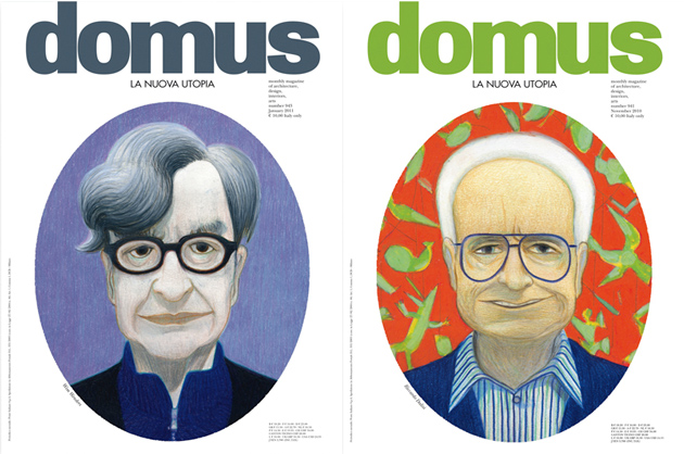
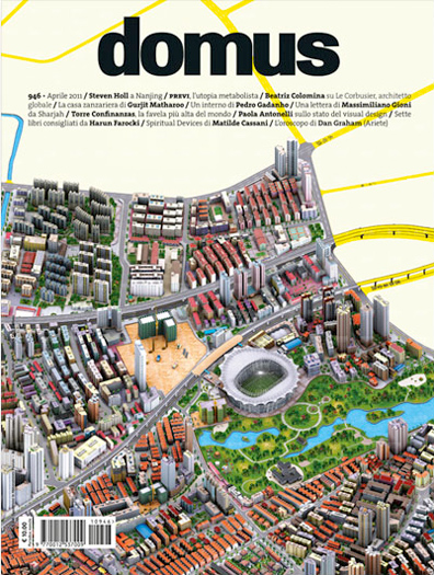
Domus is one of the world’s foremost design and architecture magazines. Founded by Gio Ponti and first published in 1928, it is an elemental part of Italy’s design and architectural worlds. It is also among the most iconic publications from Milan, having matured through the 20th century alongside its home city, and has experienced its ebbs and flows intimately. It remains a powerful symbol of Milan’s reign as world capital of design, and itself faces down a treacherous path in the coming decades as communication of every form faces radical shifts.


The magazine’s art direction has been on the cutting edge for decades thanks to Giuseppe Basile. From its high-contrast early 1990s look and deliberately “technological” feel of the 2000s through last year’s sweeping redesign, Mr. Basile’s work has always been exemplary. He is, indeed, one of today’s great art directors.

We had the pleasure of meeting with Basile just as Domus once again finds itself in the midst of a drastic redesign, and on the eve of Salone del Mobile – Milan’s defining event. His vast knowledge and sensibilities are a refreshing counterpoint to the transitory, superficial environment we often find ourselves in.

Tell us a bit about your beginnings. Your origins, your education, your career path. How did you get your start as an art director?
I studied at the ISA di Monza, the school wanted by Pagano and Persico to bring the Bauhaus experience to Italy. Those were fantastic years in which I had the possibility to get to know big names in the art world as a student… in the professional world, I gravitated instantly towards magazines, which had been a constant in my life, even if I never ignored other sectors of communication, I always held that the editorial world was and remains the “gym” for a graphic designer.
I arrived at Domus in the 1980s, just after Mendini’s first stint as director… the magazine was then run by Mario Bellini, Lampugnani and Di Battista with some of the most talented (then) young journalists in the world of architecture and design. Pierre Restany coordinated the art, and I had the great fortune of seeing Italo Lupi work as art director. From him I learned much, then little by little, the longer I stayed at the magazine, I met other major graphic designers like Simon Esterson, and most of all Alan Fletcher, which whom I collaborated for five amazing years.
The quick (and deliberate) turnover of directors at Domus meant that I never had to change magazines, because the magazine itself changed every three years. It remains like that to this day. For the future, we’ll see…

You’re the force behind last year’s stunning redesign of Domus, which coincided with Alessandro Mendini’s installation as director. Give us a bit of background on the drastic change.
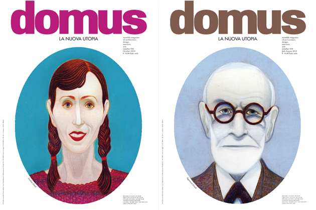
It happened one year ago, when the editor asked Alessandro Mendini to confront the massive changes we’re experiencing in communication. He accepted, with a rather monographic vision of the magazine, made up of of eleven publications with a 360° look at the state of planning, architecture, and design in the world: LA NUOVA UTOPIA (The New Utopia).
And it was a unique experience. It gave me the opportunity to get closer to one of the most illuminated minds in contemporary planning for a project we passed over twenty years ago, and that we assumed would never have the chance to reach fruition. Mendini prepared Domus for the “new era,” which is now being undertaken by the young, intelligent and determined architect Joseph Grima, who will have the difficult job of reinventing the magazine in the world of new technologies in communication.

Since Mendini’s deliberately short stay has come to its end with the last issue, #945, can we expect another complete redesign anytime soon?
Like I mentioned before, the change is already underway. Grima will bear the torch of Domus for the future with a sharp eye on the contemporary and on technologies that will have an impact on the world of architecture, design and planning.
Now we’re preparing the new project, and the premises are really very interesting. Salottobuono and the company directed by Grima are developing a project that is a real pleasure to be a part of. Naturally, there will be many changes – these last eleven issues were “one-offs.”
Grima’s vision is different, and it will be unveiled in the next few days within the context of the grand events of Salone del Mobile.

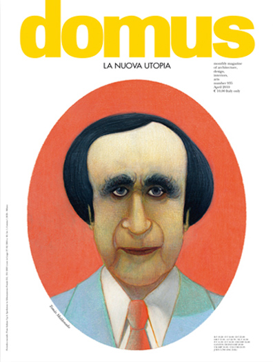
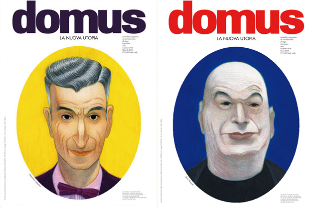
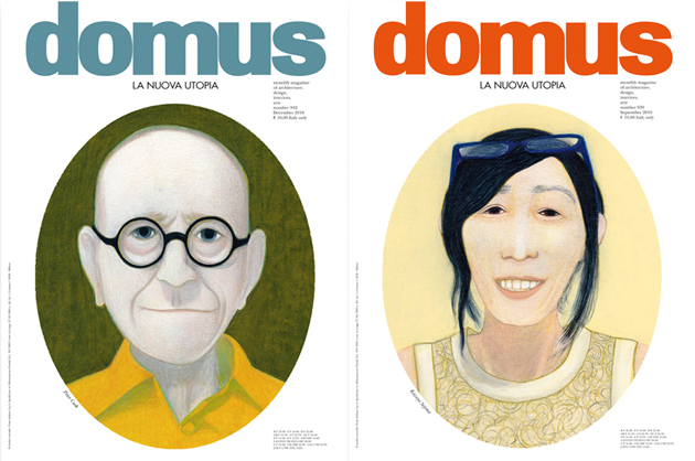
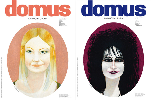
The most striking part of the last redesign remains the Lorenzo Mattotti portraits that have adorn the cover of the past year’s issue. Explain the decision to feature the portraits rather than imagery more directly related to contents?
Thirty years ago, when Mendini left Domus for the first time, he characterised his own direction with covers outside the “chorus,” which had lasting effects on art direction. In fact, he was the first to adopt the portrait in a systematic way for an architecture magazine. Back then they were photographs: pieces of artistically retouched “optical magic.” So, once again director, he wanted to revisit a discourse that had been abandoned as “suspect,” but with a new style. So he arrived at illustration, and the choice was made to commission Mattoti, probably the best-known Italian illustrator abroad.
The most interesting thing was the challenge of asking an artist whose style we liked, but who had never made portraits to make portraits! He accepted the experiment immediately, without hesitation and the result was perfect.
At the beginning the choice of these eleven portraits remained to be made, but once Maldonado was chosen (for the first of the issues), it became a natural progression.

What is working at Domus like? Is there a sense in the company that you’re the stewards of Gio Ponti’s legacy?
Of course. It has always been very gratifying to contribute to a project that has lasted for more than eighty years. Like I mentioned before, it gave me the opportunity to meet exceptional people, and that is the most that one can hope for from his profession because it permits you to keep growing.
Even today, with the this last experience with Alessandro Mendini, I was improved, enriched and surprised at the discoveries, and I don’t just mean on an intellectual level.
I consider this a real fortune.

Domus’ identity is wrapped up in the identity of Milan itself. Where do you see Milan in the grand scheme of things in today’s dramatically changed world?
Milano in the 1970s and 1980s was often referred to as the “Mecca” of design. That means that we have a heavy heritage to stack up to, and since we know when things are going well, the bad things are harder to see. Those things, which today are very present, leave it up to us to show that we deserve that heritage. And to do that, we must be even better than we were in the past.

What long-term impact do you think the 2015 Expo will have on the city? Its identity?
It’s difficult to express the difficulty with which everything is progressing for the Expo 2015 project. A huge opportunity has knocked on our door in a moment of extreme economic and social drama. This is a strong reason, thought that it must be overcome through our capacity for doing. Everything depends on how the operation will be managed, and only then can we really know anything about the impact it will have on the city.

Art direction can, paradoxically, be an invisible job. You’re charged at once with crafting a publication’s distinctive style while making sure that your work doesn’t distract or detract from contents. What do you consider your ‘signature’?
I don’t think it’s an invisible labour. I think the opposite: that we almost always tend to look solely at the aesthetic side to the detriment of content, and this puts us graphic designers in the front row. And in the line of criticism.
I think that art direction must be subordinate to communication, i.e. the content (nothing is really beautiful if its its separated from its contents, according to Charles Eames, but there’s a middle ground to be found). As in an orchestra, there are fundamental instruments that must be present and those that must be, let’s say, “discretely present” to play on their proper strengths. This is an ambitious result that is not always achieved… but when it’s like that, I’m happy with my work.

So, just how adventurous can an art director be while still effectively getting the publication’s message across?
Obviously, personal capacity is fundamental (this should be implicit in this question), but everything depends on the reader: the more illuminated he is, the more the art director can push himself forward. You’re lucky to have an audience that allows for uncensored possibilities, otherwise adventure would be downright reckless.

With everything from I.D.’s demise to the New York Times inevitable web-only future and a flooding of new tablet-based magazines, where do you see magazines a decade from now?
The calendar you’re asking me for is only in the agenda of people like Steve Jobs. It all depends on how technology will … . In fact, almost everything depends on this, so it will determine the acceleration of events. For our part, we can manage contents, but the case of NYT is simply a technological question. Giving news once a day obsolete when applications are updated in real time.
When you go deeper, it’s different. Criticism and research which naturally need time give the possibility of differentiation of mediums. The web has taken its place in the world, and will become powerful just like all the other means of communication in their own time… this of course will clean up the editorial world’s paper version.
But it is possible if well managed that magazines will become the reference point of these ten incredible years. This is a crucial point of the debates that are unfolding right now all over the world.

If you had to choose one typeface to use exclusively for the rest of your career, what would it be? (We’re stricter than Vignelli!)
Oh, Vignelli! I find that being able to express your own graphics using one or two fonts (like in the case of Vignelli, but also of Fronzoni and others) is naturally to make first-rate works. It is a measure of talent and capacity. It is one of the elements that characterises many of the “masters.” Still, many have shown an exceptional expressive capacity using as many as possible and exploiting huge creative possibilities in typography…Lubalin, Chermayeff, Fletcher, and Italo Lupi in Italy.
Me for my work, I have always followed and appreciated both schools of thought, but I have to say that I love all typographies. In every typeface, I find reason to fall in love, even in sheets of paper cut into characters… think of Matisse!

In your opinion, what is the most beautiful magazine in the world? (Other than Domus!)
I’m enticed by “mythical” magazines that have changed the world and our way of thinking…
Those which have the best contents, in all senses…

Introduction and Interview Tag Christof – Translations Helga Tripi & Tag Christof
Share: Facebook,  Twitter  
31/03/2011

Guest Interview n°24: Liselotte Watkins

.

Guest Interview n°24: Liselotte Watkins

You’ve seen her illustrations. If not in magazines like Elle or D Della Repubblica, then on the catwalk for Miu Miu or on her special-edition bottle of Absolut. With a fascination for the nude and Italian architecture, her work is captivating, crowd-pleasing and multifaceted. She could never imagine doing anything other than drawing, and is a busy bee, at the moment finalizing work for several publications and fashion clients.

The Blogazine was lucky enough to catch up with Liselotte Watkins for a long conversation, just a few weeks before Salone del Mobile where her collaboration with Valextra will debut.

Your illustrations are recognizable to the masses, yet your actual identity is quite enigmatic. You even have your own Absolut Vodka! So, who exactly is the real Liselott Watkins?
Haha! I didn’t know I was that mysterious! I’m an illustrator and the most important thing is that my drawings are visible. I have never felt the need to be seen personally. The fact that I have my own Vodka is a little crazy and very fun! However, it feels like the Vodka is for my drawings more than for me.

How did your success get its start?
Success is such a vague conception. I feel that every project I get and every drawing that I do is a success. I rarely feel nostalgic and I’m terrified of the day when I’ll feel content. What is most important is now, and what you do. To just sit and look at your work and feel satisfied is too counterproductive. Upward forward!

What does your creative process look like?
I have just started to photograph a lot as a basis for my images. Every occasion is a challenge. I usually work a lot with models and that collaboration is quite inspiring. What I’m trying to do is to convey a feeling to the models and explain a process. I’m not the greatest behind a camera but the models are extremely talented and make my job so much easier. Afterwards I draw by hand and if I need colour I use the computer. To tint, I always use Photoshop which is not too practical since it is designed for photographers. However, I do like that you can see my lines instead of the computer’s re-made ones.

You’re Swedish, but work from Italy. Are there noticeable differences between the Swedish and Italian creative industries?
I still work a lot with Sweden and other countries, but it has been great fun beginning to work here as well. It’s nice to have collaborations where you are based. It gets much more personal in a way. The fashion here has a much greater history and the craftsmanship is amazing. That’s very inspiring. It’s such a big part of Milan and the present, since you run into co-workers on your free time. The fashion in Sweden has become much stronger in recent years but is still small in comparison with Italy.


How much inspiration can one find in Milan?
A lot! I love the aesthetics in this city. I’ve started to draw plenty more architectural and surroundings since I arrived here. I share my office with two architectural firms, which might be one source of inspiration. Everyday I see things which leaves me speechless. Say, when opening the gates to a palazzo and being struck by these amazing, secret gardens. It’s just incredible how much beauty that lays hidden here in Milan. On the other hand, the fashion isn’t very eccentric or exciting. It’s very much “same old.” A bit more playfulness couldn’t hurt!

And about your collaboration with Miu Miu… how on Earth did your illustrations end up on the catwalk? What was it like to work with one of the world most influential Maisons?
Well, I wouldn’t call it a collaboration, that’s a bit exaggerated. They saw my drawings in a book I was in and chose some illustrations which they wanted to use in the collection. I sent them the drawings and they turned them all into magic! I’m not taking any cred for that. Then the relationship continued with some other things, and they have an incredible professional team.

Where do you go for your everyday escape?
I have never understood the idea of everyday. Is an everyday even necessary? And why would I have the need to escaping? Maybe I’m just lucky, having the most amazing husband and friends who make every day feel like a weekday. My job is also something that surrounds me almost constantly. It’s not like you leave the studio at six and feel pleased for the day.

What is the project of your dream?
The nicest feeling I know is starting a new project. When it’s all about the ideas in your mind and you’ve barely touched the pen. When I photograph a model and I see the image in my mind. I have a lot of freedom when working with my clients and that is a very nice thing. I hardly ever feel the need to compromise. My hope for the future is that it remains the same and that I keep improving at what I do!

What do you prefer to draw when you’re not working?
I mean, I draw whatever I want when working, so I guess it’s all the same thing. But when I do it all my way, I draw more nudity!

It’s a Monday morning, 2021. What does your day look like?
Oh, well my son will be 11 by then, which means that I won’t have to wake up at 06.00 a.m anymore, hopefully. That would be nice. Other than that, I hope everything is as fun as it is today and that I have an amazing office with millions of projects.

I guess that you receive tons of requests of all different kinds, but how do you choose which ones to do?
My agencies and I choose together among all the requests. I tend to say yes to a little too much and they know my schedule better than I do, so they can stop me when I already have a lot of things going on. It’s extremely nice to have agencies.

Could you tell us a little bit more about your collaboration with Valextra for Salone in April?
They had seen my images in D and wanted do have a meeting. I’m very impressed by the company and the quality of their products is just amazing. The craftsmanship is like a dream and I truly love a solid piece of work! So we met and talked about what we could do together. I recently made a couple of images for the window displays, which will be shown at their shop here in Milan, as well as a few images for their interior. They will be seen from the beginning of the week of Salone!


Where in Milan will we see you in the near future?
You will see my work in D of course. Then I hope for more fun collaborations to pop up!

You are extremely productive and I get the feeling that you always have a ton of projects at the same time. Do you never get tired of drawing?
No way!

Interview and Translation Emelly Blomqvist – Images courtesy LundLund Sweden

Share: Facebook,  Twitter  
22/03/2011

Guest Interview N°23: Arabeschi di Latte

.

Guest Interview n°23: Arabeschi di Latte

Arabeschi di Latte are a design collective who work across mediums, borders and, fortunately, palates. They are part art of a wave of new generation designers whose material considerations are without limits, and whose design work considers the entire spectrum of human existence. Nothing from development economics to death is outside the scope of design any longer.

Hailing from Florence, Arabeschi di Latte use food as their weapon of choice for design good. All women, and all armed with the sensibility and sensitivity womanhood brings, their work is eminently pragmatic and simply beautiful. From their trademark “Gnocchi Bars” and “Interactive Dinners,” all the way to their guerilla rethinks of city spaces and more traditional product, visual design and food styling work, their processes focus on or use food to shift perceptions and build awareness. They aim to bring ritual back into dining, educating about the processes which bring food to our tables, and genuinely engaging people with food’s transcendent power. Plus they make things (and help others make things) that taste really, really good!

We were lucky enough to catch up with Arabeschi’s Francesca Sarti, between one of the collective’s many projects.

How did you learn to cook?
Organising Christmas dinner for 40-50 friends at home for years! Crazy!

How important is your being Italian to your work?
The Italian and Mediterranean conviviality is a key factor in our work.
From this tradition we understood how food can help to create a welcoming, inclusive atmosphere and how to create human experiences that show you something about relationships.

Interactivity is key in your work. Interactivity is key to food! How are you working to re-engage people with the things they eat?
Food is taken for granted…you go to the supermarket and everything is available everyday. We need to recover the experience of food, touching it with our hands to become aware of its importance. We try to do this with a certain playfulness, reviving rituals from the past and from childhood as we did in projects like “Gnocchi Bar,” “Pastificio,” and “BQ _Interactive Dinner.” You can talk about urgent problems, but with a touch of happiness!

Can good design help combat the world’s food problems? Obesity, malnourishment, contaminated water…
Yes it does! The designer’s point of view on these urgent topics can help to find unexpected and powerful solutions. Follow Designobserver.com and you will agree!

What do think of Jennifer Rubell’s expansive, explosive food works?
I love the brunch she did at The Rubell Family Collection last year for the occasion of the Art Basel Miami opening!

You’ve worked quite a bit in London and Tokyo. How do their food scenes compare to Italy’s?
In London and Tokyo you have such a great variety of cafes and restaurants. Moreover the cafes are much better than the Italian ones, where the lack of quality and care is even evident when you order a simple tea! Also, people have recently become more aware of food, of the role food has in society, of the importance of food quality, and of recovering the conviviality of the past and are very open to new experiences as well.

In Italy we have a strong tradition that is a great heritage but then the everyday offers are so poor…Think about having a lunch in via Calzaiuoli in Florence, corso Vittorio in Rome or Corso Buenos Aires in Milan…just to give a few examples. It’s a nightmare! Sometimes even heritage can become a constraint…

Is your approach to design affected by the fact that you’re a collective of women?
A “girly” touch has always been quite evident in our work especially at beginning when we liked to play with household themes and topics…with a touch of irony of course!

Are you concerned about the influx of more and more processed food, commercial farms and genetic engineering?
Yes, I am…the actual global food system is failing; we all should become aware of this fact and strive to explore new routes.

Food a century from now?
…I can only think about the aim everybody should have in mind: recovering FOOD QUALITY.

Favourite ingredient? Favourite dish?
Bread with water and sugar! So simple, so sober, so humble, so tasty…

Thanks a million Francesca! We’ll see you at Salone!

Interview and introduction Tag Christof – Images courtesy Arabeschi di Latte and Festival Arte Contemporanea – Very special thanks to Francesca Sarti

Share: Facebook,  Twitter