03/04/2014

Style Suggestions: Fashion and Art

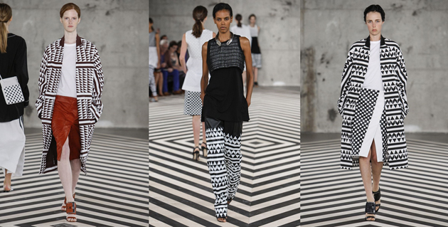
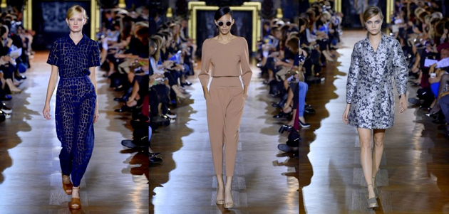
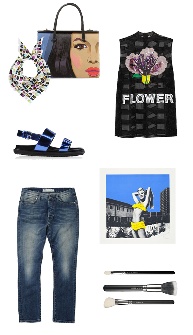
From Yves Saint Laurent’s famous Mondrian dress to Céline’s Brassaï graffiti prints fashion has often sought inspiration from art. This Spring/Summer 2014, the trend continues moving from the catwalk to your wardrobes so have fun this season with an art inspired statement piece.

Prada, Christopher Kane, Roy Rogers, Marni, Gary Hume, Sarah Hardacre, Mac Brushes

Styling by Vanessa Cocchiaro 

Share: Facebook,  Twitter  
02/04/2014

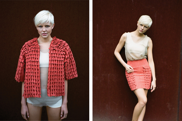
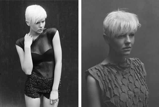
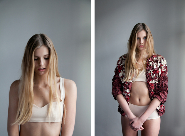
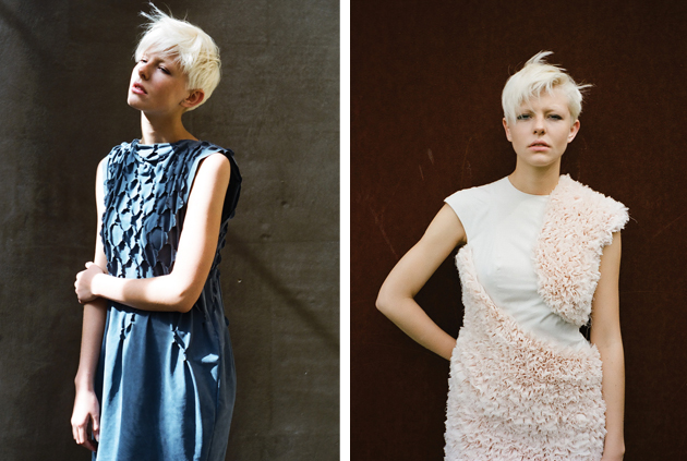
Sophie Rowley: Fashion for a Better Future

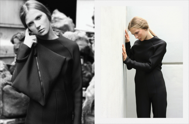
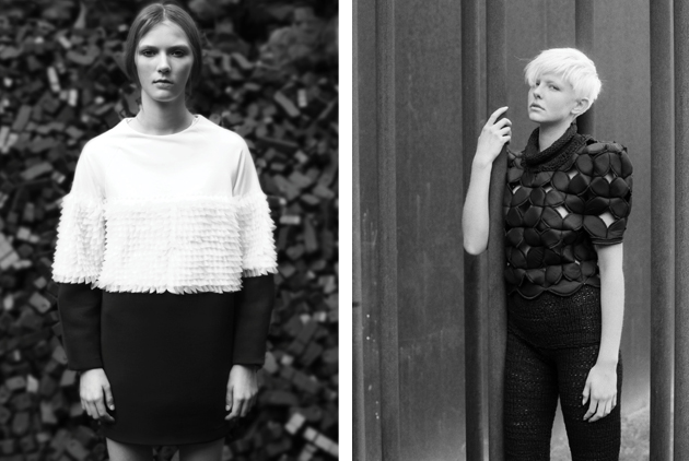
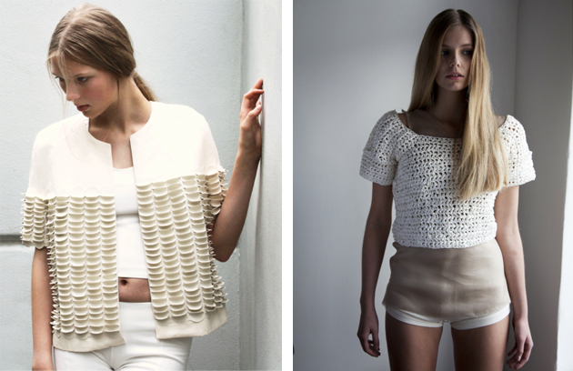
With innovative material combinations, eye-catching collections and great construction, the London-based designer, Sophie Rowley challenges our perception of fashion. After graduating with a BA from fashion in Berlin, Sophie Rowley moved to London to do an MA in textile and material at Central Saint Martins. She is now working as a freelance designer at the Studio Toogood and has collaborated with brands like Hermès, Diane von Furstenberg, and Alexander McQueen, but her own designs are as interesting as the brands she has worked for.

Rowley´s own collections are all influenced by the modern society and the topics of today. Her bachelor collection “Deepwater horizon” which was shown at Mercedes-Benz Fashion Week in Berlin 2011, was, for example, inspired by the oil catastrophe in the gulf of Mexico and the contrast between the beautiful underwater world and the environmental disaster caused by the oil. Her environmental interest is also shown in her choice of materials, which in this case were leftovers from the automobile industry. Her other collections share the same spirit, and are also made of unexpected or reused materials, an example of which is a sweater made of knitted paper.

In terms of materials, the structure of her creations and the great construction and sewing skills that lays behind them, Sophie Rowley is remaking the definition of what fashion is and what it should be made of. She is therefore an important and inspiring example of a designer who challenges both herself and the rest of the industry to seek new ways of interpreting the concept of fashion itself.

‏Hanna Cronsjö 
Share: Facebook,  Twitter  
28/03/2014

Guest Interview n° 54: Mismo

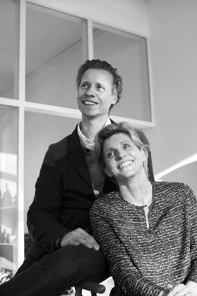
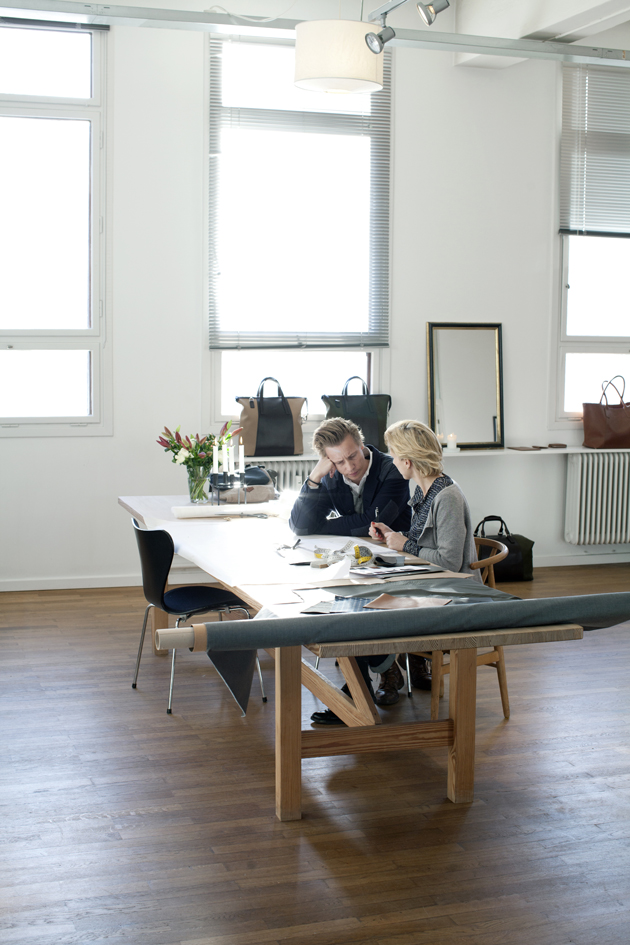
Mismo is the the silent player from the North, initially founded to oppose the flat selection of men’s luxury luggage. Starting from a small aspiration for something more, Adam Bach and Rikke Overgaard, brought their goods together and in 2006 launched their first collection of bags. Going from 2006 to 2014, even though still a ‘silent characther’, Mismo hasn’t passed by unnoticed. Carefully curated and thoughtfully designed, the brand brings an understated elegance to the menswear scene. Despite fabrics and materials coming from Italy as well as from Turkey, it is in Denmark that it all comes together. The Blogazine went to Copenhagen to meet with the couple who stands behind one of the most blooming brands of the season.

Hi Adam & Rikke! What are you up to in the studio today?
Framing the ideas that in a few months time will materialize into the SS15 collection. This time of year is the absolute best and most vibrant of the Mismo cycle. The SS14 deliveries have all been made, AW14 order book is closed and production orders have been passed on to suppliers and manufacturers. Now we can fully concentrate on the more creative part of our business – the part we both enjoy the most – product development. In the studio today we are having a general discussion on fabrics and colors all across the collection. That’s always the starting point before we dig in and become more product specific. Piecing together the collection in terms of styles, materials, and image is truly a strategic choice that requires much our energies to get it right.
The name Mismo doesn’t seem to have sidestepped anyone on the contemporary menswear scene. Is it frightening or fantastic to be, after years of hard work, where you are now?
A bit of both to be honest, but mostly fantastic! We’ve worked hard to be where we are today, having built an internationally recognized brand, a solid worldwide distribution and a trusted supply chain. That is fantastic and we’re very proud of this. But we constantly work on strengthening the brand and we still have gaps that must be closed and ambitions that we haven’t yet fulfilled. We’ve experienced growth over the last five years, but we are well aware that things can change in an instance. So, we take it all in stride and enjoy it as much as possible, while always being grateful to experience another season with good sales and more engaged and supportive customers.

Where does the name Mismo come from?
Mismo is a Spanish word that means “the same” or something that refers to yourself. We liked the simplicity of the word and the personal reference in the word.  Since we’ve always been working with these natural materials, being vegetable tanned full-grain leather or cotton canvas, that develops over time and becomes more personalized the more you use them, we felt the name was a good fit.

Even though Copenhagen is your point of departure, you work continentally from material to production. From where do you draw inspiration in the design process? What would you say your point of reference is?
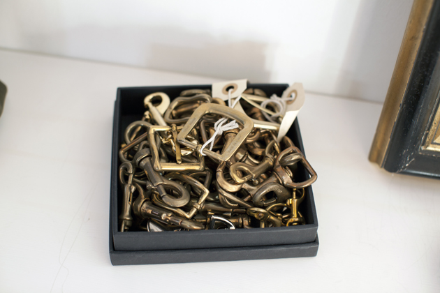
Tactility is always a great source of inspiration for us, which is why the choice of materials is the biggest point of reference and strategic choice for each collection. We draw inspiration from the environment that surrounds us, which offers a vast selection of colors, tones, materials, and natural elements. Tactility in furniture design is also a big inspiration; smoked oak, stained wood, crafted brass seen in the great designs of lamps and furniture design. The expanding scene of great crafted furniture that arises from the Danish design scene with Poul Kjærholm, Arne Jacobsen and Finn Juhl, but with a new Nordic generated design focus is a great key for inspiration for us, because of the high focus on tactility and craftsmanship.
Your products are defined by a subtle elegance, a ‘cleanliness’ that is underlined by strong design. Do you find it hard to edit your own work, to ‘strip it down’ to its very essentials?
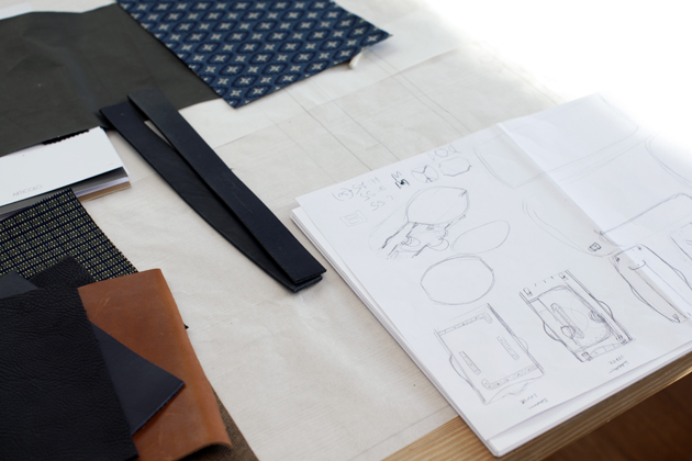
When it comes to the question of what is functionally really necessary and what is not – the choice is simple.  It all comes down to making very accurate choices in terms of which textiles to use and to respect the nature of each individual fabric and/or leather you are working with. We sometimes obviously have an idea about a specific bag and its functionality and we search a fabric that meets the demands for that specific style, but many times it’s the discovery of a new fabric and its capabilities that brings to life new designs for which the newfound fabric would be perfect. When you have the privilege of working with the finest possible materials from fabrics to leather and you have a production that you trust is capable of meeting your standards in terms of quality and finish, then your job is almost half done as a designer.

What is your idea of ideal Scandinavian design?
Scandinavian design is where luxury arises from the choices made (in production and in design) more than a visible statement. Understated design with a high focus on functionality. Honest and respectful handling of the materials used, a production emphasizing as much craftsmanship as possible – craftsmanship in its truest form, as in real hands doing a real craft! not some fancy word that everyone wants to use – timeless in design and ultimate quality in product and materials.
You recently launched your online store but you’re still keeping it low on social platforms. Is it a conscious choice to stay out of the social media frenzy?
Not really, it’s more a matter of getting the grip and feel of it before throwing ourselves in that game. We need to keep focus on the products we develop rather than on what surrounds it. I guess we’re a bit old fashioned and cautious when it comes to social media. It’s probably also a reflection of the persons we are in private, where social media plays a very little part of our life.

What’s the big difference between your SS14 collection and the one you are presenting for AW14-15?
Spring/Summer 14 is very natural, relaxed and playful which is reflected in the fabrics used such as linen, multiple nylon articles, PVC print and colors that reflects the many shades of the sea. We’ve mainly used green and blue tones for SS14.
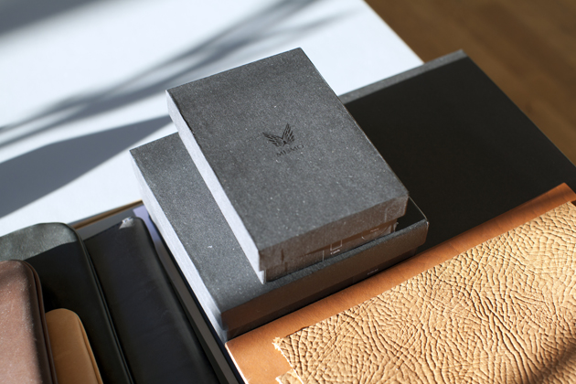
The AW14 collection is darker and more masculine compared to many of the previous seasons. Autumn always is a little harder and darker than Spring, but this season we’ll be introducing a new leather collection “The Wrinkle Collection” in a vegetable tanned shrunk cow leather that revolves around organic shapes accentuating the raw look and the natural draping of the very soft and richly textured full-grain wrinkle leather that we have developed.
We also introduce a couple of new seasonal styles inspired by the rough “Skagerak” sea and the sheer masculinity of surviving when surrendered by the pure forces of nature. In this collection, the fabric immediately set the mood for the designs; It is extremely light weight, water resistant, surprisingly sturdy and it has a masculine, raw, industrial appeal.
What do the future hold for Mismo? Any scoops to share with us?
We’ve always been rather frenetic about our distribution, but this season we’ve opened up a bit on strategic markets such as Japan where we have teamed up with a distributor, which will see the brand gain more awareness in Japan starting from next season (AW14). We look forward to that! AW14 will also be the season that sees the launch of our collaboration with a well-known American brand; can’t say more, sorry. We’re really excited about that and we’ve also got new and exciting print projects coming up with Danish type foundry Playtype.

Even though constantly growing as a “fashion city”, Copenhagen is still a bit “off shore” for buyers and press. How important are international fairs and events for you?
Copenhagen is home, and we’ll always be showing in our showroom here. But showing the collection abroad is vital for us and both Pitti in Florence and Capsule in Paris are key destinations on our seasonal tour. Pitti kicks off the season and is always great for meeting press and leaving first impressions with the buyers. We’ve had a great run with the Capsule fair, been doing it almost since its inception and we work closely with the team behind on our US distribution. But next season we’ll move a little out of the comfort zone, quit the fair and instead do our own private showroom in Paris. It’s been something we’ve wanted to do for a couple of seasons now, to get our own space where we’ll be able to present the collection in its right setting. Warm summer days, cold drinks and hopefully lots of customers in our own Parisian gallery is something we look much forward to in the near future!

Lisa Olsson Hjerpe – Images courtesy of Louise Damgaard 
Share: Facebook,  Twitter  
27/03/2014

Style Suggestions: Florals

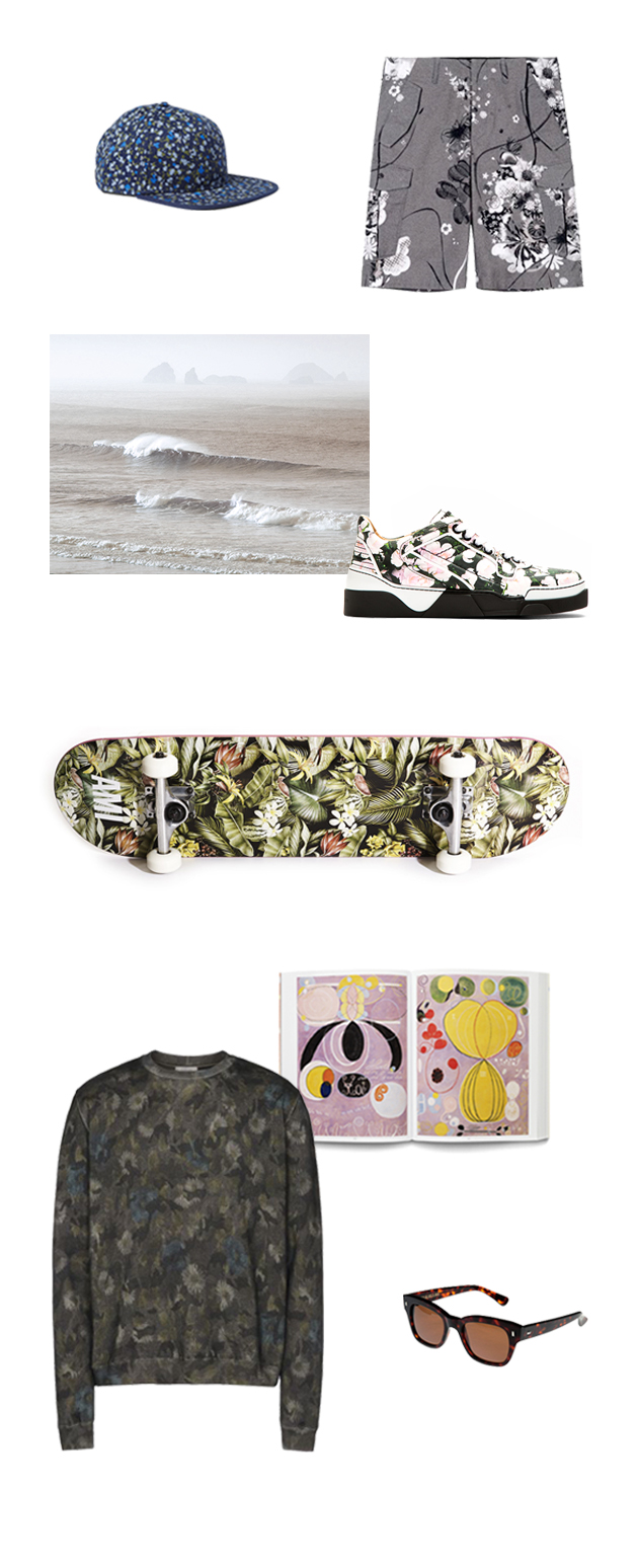
Spring is here and its time to smell the flowers. Ranging from hawaiian to romantic, floral prints are on the rise so start preparing your wardrobe now and let’s welcome summer with open arms.
Givenchy, Saturdays Surf NYC, Valentino, Cutler and Gross, Ami, Rag and Bone, Hilma af Klint book

Styling by Vanessa Cocchiaro 

Share: Facebook,  Twitter  
20/03/2014

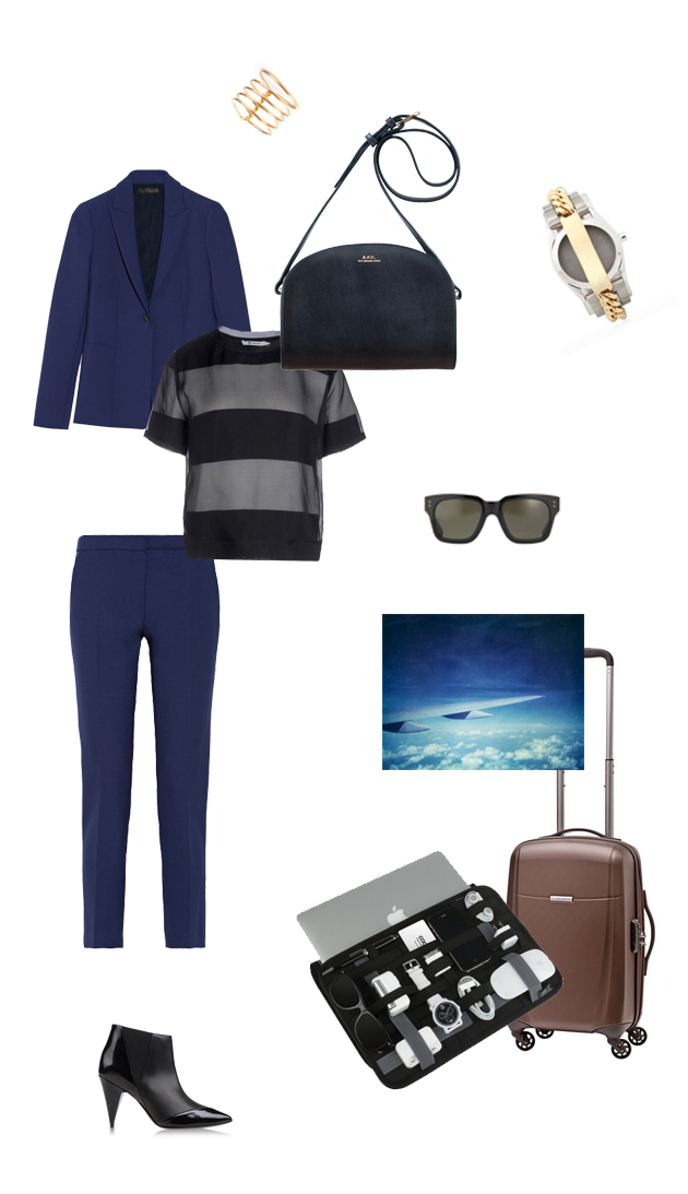
Style Suggestions: Business Trip

A business trip can be tricky to pack for but the secret is keeping it simple. Start with a base such as a simple suit and bring pieces that you can mix and match with it. Soft and crease-free does it when dressing for the plane and that first meeting straight off it!

The Row jacket, The Row pants, T by Alexander Wang, A.P.C., Ann Demeulemeester, Maison Martin Margiela, Linda Farrow, Pierre Hardy, Cocoon Grid it, Samsonite

Styling by Vanessa Cocchiaro 

Share: Facebook,  Twitter  
19/03/2014

Dries Van Noten Inspirations exhibition in Paris

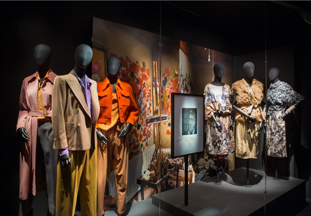
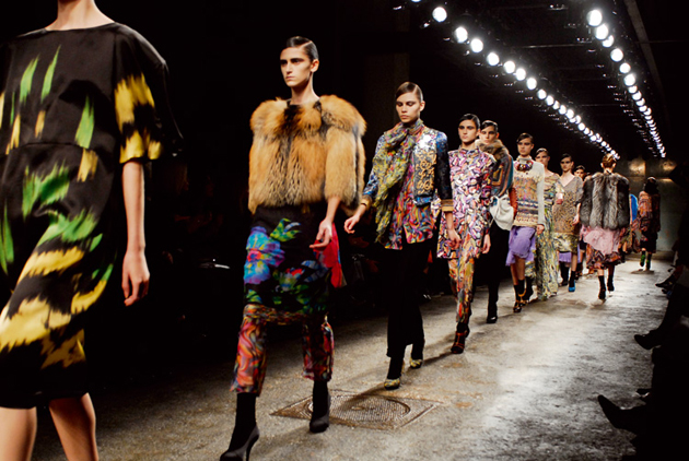
The Belgian fashion designer Dries Van Noten first established himself during the 1980s, when he famously exhibited his inventive and radical collection in London in 1986 as part of “The Antwerp Six” collective. Described by The New York Times as “one of fashion’s most cerebral designers”, Van Noten’s whimsical yet graceful outtakes have gained him worldwide recognition.

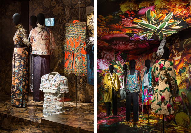
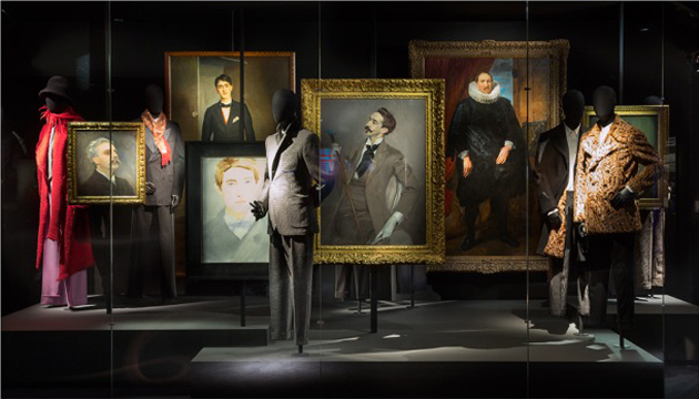
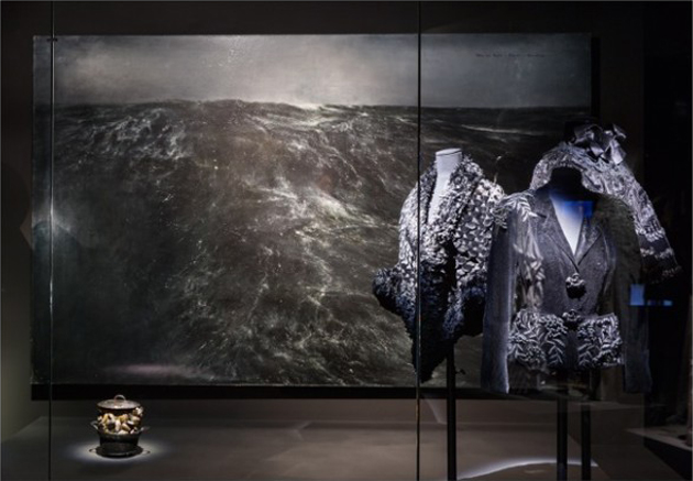
Les Arts Decoratifs museum in Paris has recently set up an exhibition that celebrates and traces the path of Van Noten’s intimate artistic universe, aimed at revealing numerous sources of inspiration that hide behind his creative process. Appropriately titled “Inspirations”, the exhibition will display the designer’s incredible clothing alongside a wide range of photographs, videos, musical references and artworks.

Borrowed both from private and public collections, as well as museum’s own pieces, the exhibition showcases objects that have triggered the designer’s imagination throughout his life and career: from the typical Renaissance “chambers of wonder” or “curiosity cabinets” full of souvenirs and knick-knacks, to selected pieces from emblematic couturiers such as Elsa Schiaparelli and Christian Dior, in addition to 1980s designers, included in the show to evoke subjects intimate to designer’s work such as youth, the archetype, ambiguity and passion.

Showing more than just a simple selection of a designer’s work, “Inspirations” has the aim of recreating the universe of Dries Van Noten’s creative force, where cultural icons, materials, styles and personal passions overlap in an eclectic mix of references: from important artists such as Bronzino, Kees Van Donge and Francis Bacon, to milestones of international cinema with Stanley Kubrick’s Clockwork Orange and Jane Campion’s The Piano.

“Dries Van Noten – Inspirations” will run until August 31st 2014 at Les Arts Decoratifs in Paris.

Francesca Crippa – Images courtesy of Les Arts Decoratifs 
Share: Facebook,  Twitter  
12/03/2014

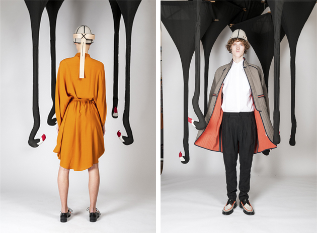
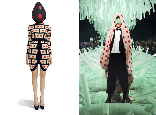
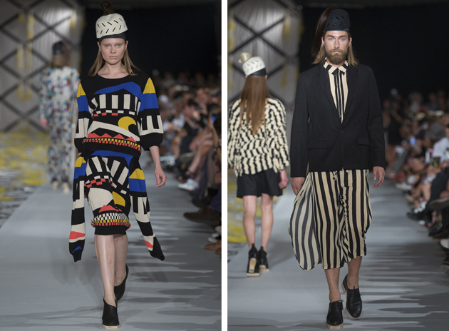
Henrik Vibskov at Design Museum in Helsinki

Northern European fashion designers have long honed a reputation for clean lines, hardy craftsmanship and meticulous attention to fabrics. But perhaps nowhere today is this Nordic ethos more creatively applied than in the work of Henrik Vibskov, a Denmark native and Central Saint Martins alumnus, whose work is currently being celebrated in an exhibition at the Design Museum in Helsinki.

Vibskov’s contrarian nature and singular approach to design have helped him establish a creative practice that goes well beyond fashion. Beyond successful women’s and men’s collections, he also dabbles in visual arts – his pieces have graced the walls of his own runway shows – and was the one-time drummer of the band Trentemøller.

The exhibition, curated by Suvi Saloniemi, aims to offer the public a window onto his creative process – a process that can certainly seem opaque considering its often breathtaking final results. According to Saloniemi, the show’s goal was “to delve inside the head of this designer. Sometimes we display only the results of a designer’s work, but with Vibskov we will show the endless abundance of his ideas and the machinery of his creativity. The exhibition is above all a celebration of creativity and creative thinking.”

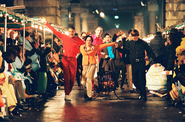
Vibskov himself once said, “creativity can not be forced or given boundaries.” And the show is, in a way, a tribute to this sort of openness of creative expression and covers the gamut of his current work: his latest collection will be on display (fresh off the Paris catwalk) alongside the more conceptual “Neck Plus Ultra,” which toured Europe earlier this year.

The show runs through 11 May 2014 at the Design Museum in Helsinki.

Francesca Crippa – Images courtesy of Design Museum 
Share: Facebook,  Twitter  
06/03/2014

Why Green has to be the New Black

In May 2006, the International Herald Tribune published an article by the legendary Suzy Menkes titled “Eco-friendly: Why green is the new black”. Almost 8 years later, the fashion industry has evolved a lot in embracing environmental sustainability. However, despite our better judgment, the so called fast fashion is still being overly consumed, and brands like H&M and Forever 21 produce collections which might be judged both in terms of ethics as well as sustainability.

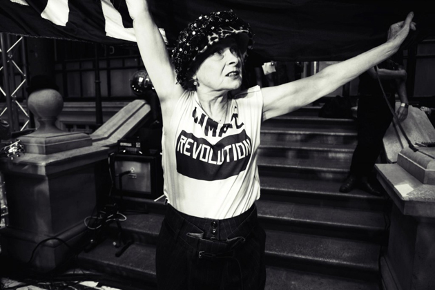
And yet, the notion of sustainability is nothing new to the fashion world. In fact, ever since Franco Moschino sent his models down the runway with T-shirts saying “Stop Using Our Oceans as a W.C.” back in 1989, there has been an on-going debate about eco-friendly fashion. Since then, many high fashion brands have been presenting different kinds of sustainable choices in their production, such as the grand Giorgio Armani who incorporated hemp in his suits back in 1995. The topic is constantly being discussed (albeit, with limited success) and brands such as Stella McCartney and Edun have taken a major stand in showcasing the ability to combine eco-friendly fabrics with high fashion flair.

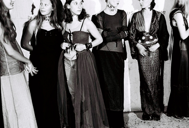
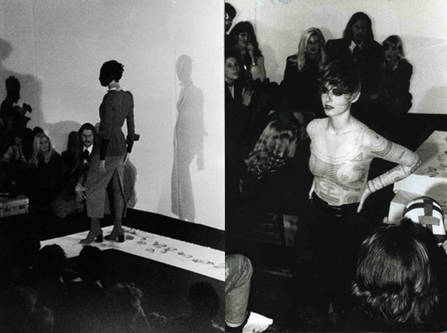
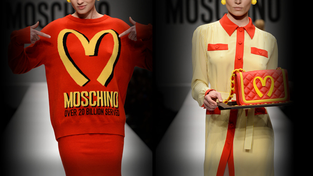
Martin Margiela, on the other hand, introduced a leather butcher’s apron repurposed into an evening gown back in 1988, starting the deconstructionist movement aimed at raising environmental awareness in fashion. In fact, his particular choices offer an interesting frame of reference when discussing the concept of McFashion: to re-use can mean staying green as well as chic. Last week, it was Moschino, again, adding fuel to the debate about McFashion industries, with its typically humorous flair. Models dressed in bright red and yellow clothes walked its runway, clearly referencing the fast food chain.

Nevertheless, we are now in March of 2014 and much still has to be done. Thus, it only seems fitting to present a new headline “Eco-friendly: Why green has to be the new black”. If we should rely on the individual consumer’s sensibility and awareness, it might not bring us anywhere. While design industry has done a lot in supporting eco-friendly brands, we still have to become fully aware that buying the often unsustainable fast-fashion might condition what we will face in the future.

Victoria Edman 
Share: Facebook,  Twitter  
28/02/2014

Style Suggestions: Pastels

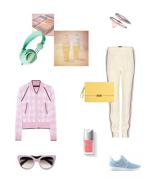
Pastel hues and sherbert shades have crept their way in this season and these exhuberent tones are on trend and easy to wear. You dont have to go the whole hog but it is nice to pair pastels with pastels and add some neutral accesories and jewllery to complete a perfect outfit for any occasion.

Prada, Nike, Fendi, Stella McCartney, Dior, WeSC, Katie Rowland

Styling by Vanessa Cocchiaro 

Share: Facebook,  Twitter  
26/02/2014

Age and Style in Tim Walker’s The Granny Alphabet

They way people dress, usually influences the way they are perceived. In fact, even the perception of our age can to some extent be influenced by the clothes we put on in the morning. While wearing something drab and unflattering might hide one’s personality and create the illusion of an older appearance, we are less and less restricted by the age-appropriateness of the clothes we wear. The rules of who can wear what are becoming more and more unclear, just as the notion that there is an age limit to fashion.

Finally, the fashion world seems to have grabbed this trend and is being influenced by older generations, both in their search for timeless lines, quality materials and impeccable finishings, as well as by their “granny-chic” flair. Even though it would be naïve to think that fashion has left its search for novelty and eternal youth, the recent trends as well as the use of older women for ad campaigns by fashion houses such as Lanvin, can be interpreted as a positive change of course. It might just demonstrate the effect a bold personal style, regardless of one’s age, has on the development of today’s fashion zeitgeist: it isn’t about what you wear, but how you wear it.

On the other hand, this recent reevaluation of “granny-style” showcases the complexity of fashion industry, adding yet another layer to its already articulated dynamics. It might show that fashion is about having a sense of self, a stronger relationship with one’s personality, which translates into an inimitable style.

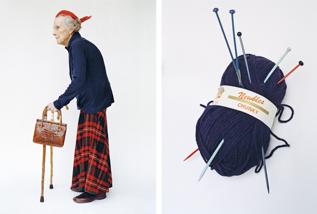
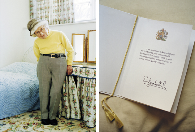
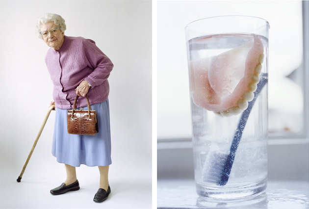
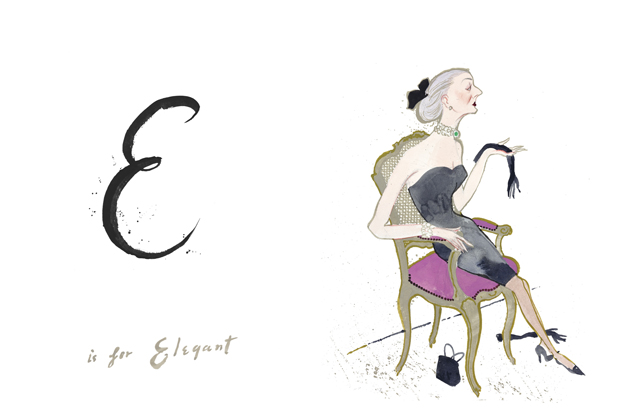
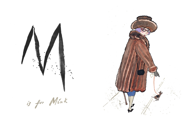
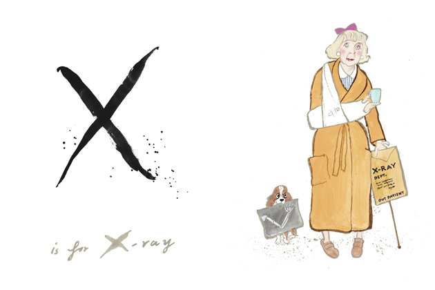
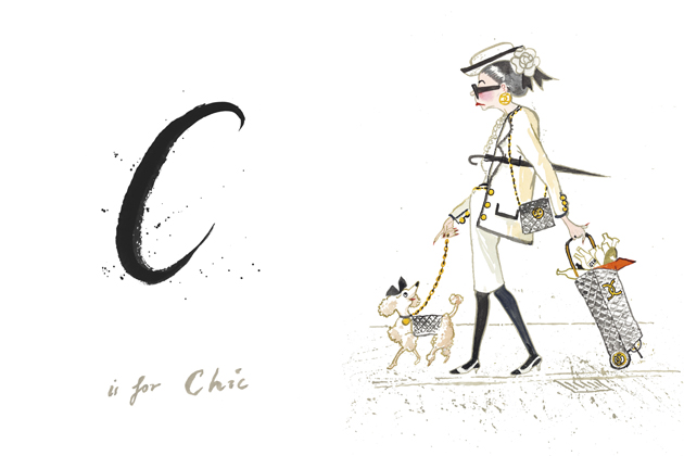
In fact, even the renowned photographer Tim Walker appears to be fascinated by the older age, and speaks about the way it brings back a childlike lucidity which allows for a clearer, more focused view on reality in his recently released book: “To retain a child’s eye when peering through the camera’s viewfinder is to see the world as half magic, half horror”. “The Granny Alphabet”, developed together with Kit Hesketh-Harvey, who wrote a series of gently humorous verses, and Lawrence Mynott, who created an illustrated dictionary of granny-style, is a “part photographic love letter to the elderly and part documentation of the dying breed of little old ladies who live down the lane”. “The Granny Alphabet”, published by Thames and Hudson, is a stylish and fashionable study on everyday life, which reaffirms the saying that style is eternal.

Victoria Edman – Images © Tim Walker and © Lawrence Mynott  
Share: Facebook,  Twitter