25/06/2014

Craig Green: Yin and Yang of Contemporary Fashion

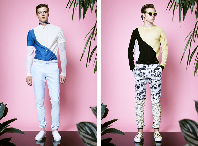
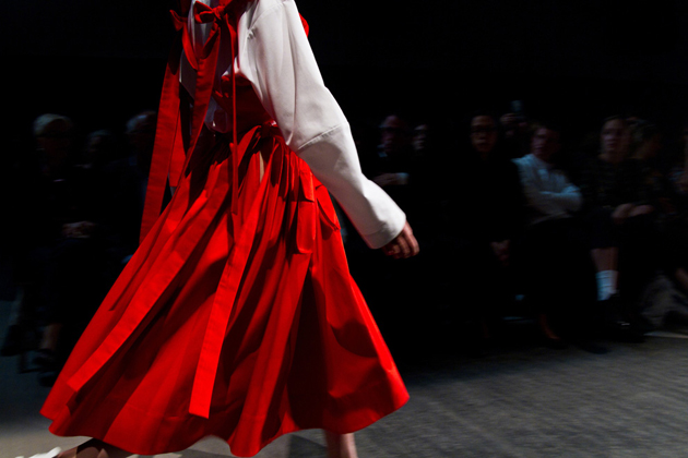
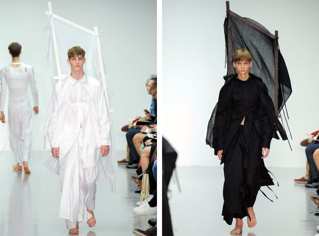
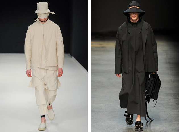
Craig Green’s latest collection for SS15 managed to move most of the fashionable crowd with a silent message of beauty: soft colors and yards of fabric, the ease of several of the runway looks was only partly contrasted with giant wooden sculptures on the back. The London native, who studied for a BA and MA in Fashion at Central Saint Martins, stood out with his own particular aesthetics. Nevertheless, this is not the first time that Green’s name comes up among fashion crowds. After graduating, Green won the L’oreal Professional Creative Award, which allowed him to launch his own line, characterized by research for innovation and risk. His first collection was presented during Men’s fashion week for autumn/winter of 2013 as part of Topman and Fashion East’s MAN initiative at London Collections.
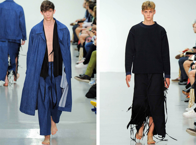
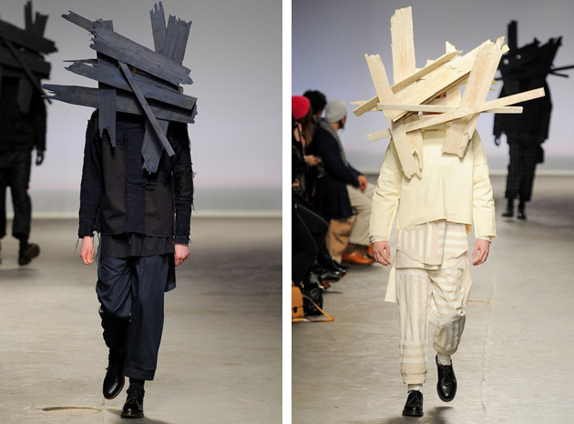
His designs featured carved masks and shirts with glossy waxed cotton in combination with easy shapes highlighted by adornments, turning the clothes into metaphoric objects and taking them beyond the stage of wearability. For his first few collections, Green played around with the notion of shadows and reflections which resulted in contrasting materials of the same color palette, experimenting at the same time with combinations of light and dark tones. These experiments created an in-between feeling for his designs making them harder to figure out and therefore keeping designs interesting. Even though every collection pushes further the notions of wearability and design, the results nevertheless appear serene and nothing is ever forced. Even though giant wooden sculptures and exploding prints – as seen at Green’s SS14 collection – might seem forced it is always done with a transcending ease.
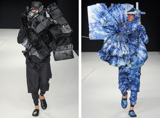
When viewing Green’s collections, Japanese fashion references are particularly clear, both when it comes to shape – seeing implicit salutes to the samurai and traditional robes – but also for an aesthetic reminiscing of Rei Kawakubo and Yohji Yamamoto. However it is always done with a Victor & Rolf flair, making it a true Craig Green original.
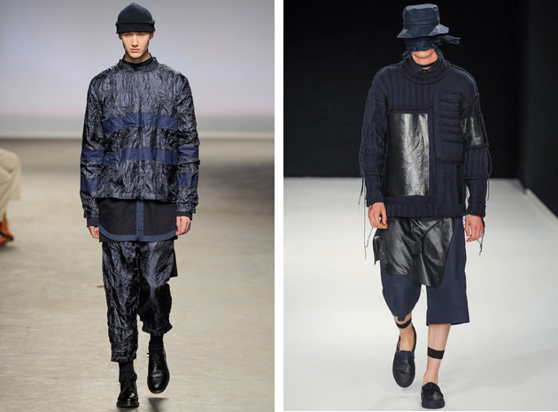
Craig Green’s work can be viewed as a juxtaposition of workwear and conceptual art, mimicking a quest for exploration – of cultures of East and West, of fabric and prints and of the fine line between fashion and art – resulting in delicate yin yang balance, that gives Craig Green’s designs a bold emotional state.
Victoria Edman 
Share: Facebook,  Twitter  
24/06/2014

The Law of Fashion and the Culture of Copying

Where is the fine line between inspiration and copying? That is the question everyone is asking themselves with the latest copyright lawsuit fresh in mind. The footwear company New Balance is filing a lawsuit against fashion icon Karl Lagerfeld, claiming he ripped off their trademark trainer logo when he designed a sneaker for his own brand.

Lagerfeld bridged the streetwear trend for trainers when he in January showed Chanel’s couture collection in Paris, and sent every model down the catwalk wearing sneakers. This statement contributed to the trend from which New Balance have benefitted. However the sneaker for Lagerfeld’s own brand made New Balance react. The company claims that the use of the letter K on a pair of trainers from Lagerfeld’s collection is too similar to New Balance’s distinctive N, and is causing confusion for costumers.

Karl Lagerfeld has very likely taken inspiration from New Balance and made some changes in the design to fit his own esthetic. This is a common method in fashion, and designers are often finding inspiration from each other. In this seasons streatwear trend, it is especially obvious that many designers have been influenced by the streets as well as by other brands. Givenchy made for example a double-buckle version of the Birkenstock sandal and the pool sliders which were featured on the spring/summer 2014 catwalks of Christopher Kane to Prada, are probably inspired by the originally plastic leisure footwear from Adidas and Nike. Maybe that is a consequence of seeking new influences from the same sources.

Many bloggers have already written about the similarity between Lagerfeld’s and New Balance’s trainers, doubting it is a coincidence that they look so much alike. The accusation of copying can hurt a designer’s image which is depending on inovation and originality. However, other than the juridical judgment, there is no right and wrong when it comes to how and where designers find their inspiration. The truth is, regardless we like it or not, that fashion partly depends on improving and updating already existing products. Although the line between improving and copying someone’s design completely, might be drawn when costumers confuse a pair of trainers for $360 with the originals for $112.

Hanna Cronsjö 
Share: Facebook,  Twitter  
23/06/2014

Style Suggestions: Accessories for Men

As men’s fashion week is well on its way choosing the right accessories is not always an easy task. Here are some of our suggestions for a classic man.

Scarf: The Elder Statesman, Shoes: Grenson, Bag: Roy Roger’s

Styling by Vanessa Cocchiaro 

Share: Facebook,  Twitter  
20/06/2014

Some Notes On: CSM and RCA Graduation Shows

As every year, this is the time for graduation shows. All over the globe, fashion schools unveil their practice to put on stage the results of a year of research, experimentations and hard work. Two of the most celebrated schools, the Royal College of Art and the Central Saint Martins, catalysed the attention of the fashion world, presenting their graduates: 40 for the BA course at CSM and 30 for the MA course at RCA.

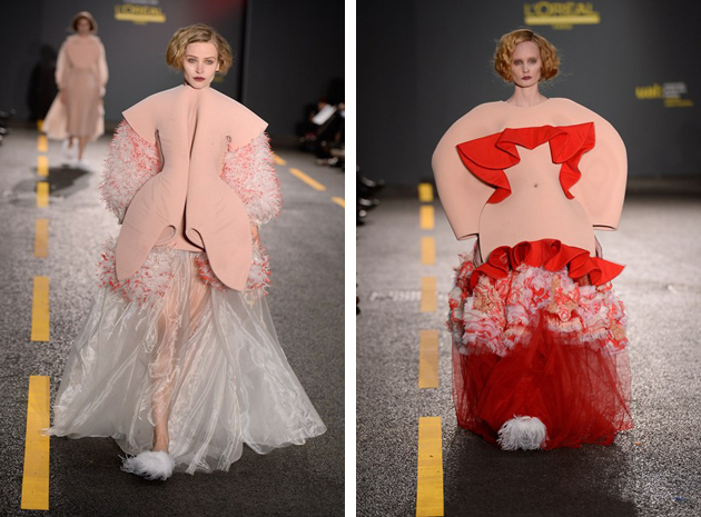
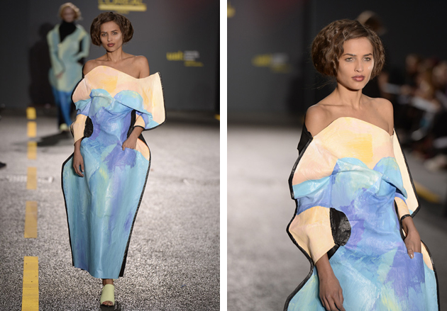
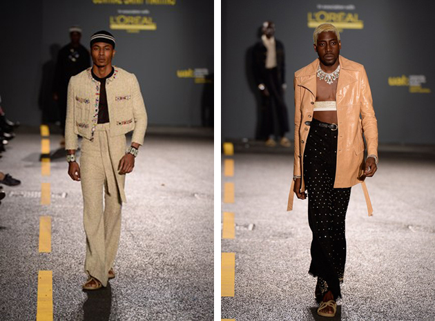
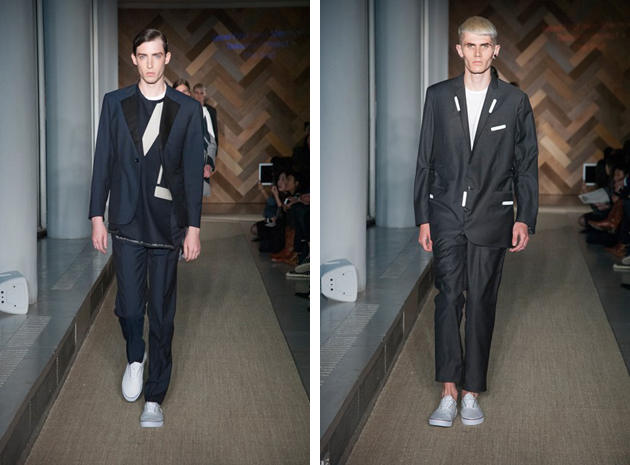
Central Saint Martins’ collections are varied in colours, techniques and shapes; nothing seems left unsaid, and all the collections, while different from one another, share the same loudness. All the messages the students wanted to send are communicated in a clear way and are well unfolded in the sequence of eight outfits. Boldness and clarity might be the criteria used to name Gracie Wales-Bonner winner of the L’Oréal Professionel Talent Award. Her collection, almost an archive of iconic pieces of a classy woman’s wardrobe, was shown worn by brawny black men, all styled with big jewels and headgears. The sharp contrast between dress and wearer wants to put the attention on various themes, such as identity, gender and appearance, and underline the possible discrepancies between the surface and inner feelings. Another collection with a strong communicative power was that of Fiona O’Neill. She based her work on distortion: uncomfortable dresses, hand painted to recreate the image of the body itself, blurring the boundaries between body and dress. Technical and elasticated fabrics are teamed with canvas-like materials, modifying the posture and restricting the movements.

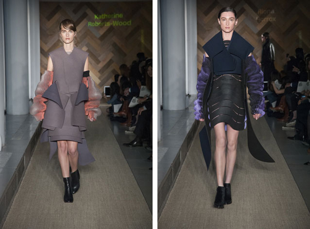
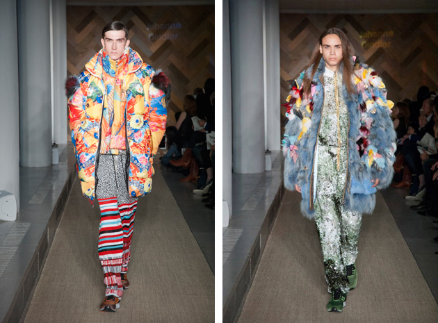
As for the RCA, even though the level of techniques shown by all the graduates was high, menswear collections distinguished themselves visually for their play with dimension and scale. Oversized jackets, plain or with flashy applications, and even full-length furs blossoming with flowers and butterflies: this is what we got from Johanne Dindler’s collection, which played with the ideas of shamelessness and audacity, denying the usual delicacy of some elements in juxtaposition with clashing materials and volumes. In womenswear, discretion was surely introduced as a wholly feminine value: Katherine Roberts-Wood based her collection on the slight contrast between the elegance of colours and fabrics and the three-dimensional embroidery falling from the shoulders and amassing near the hemlines.

Looking at both fashion shows, we can surely pinpoint the main trend behind design practice taught in English schools: the freedom of creativity, disciplined only by the need of having something to say.

Marta Franceschini 
Share: Facebook,  Twitter  
19/06/2014

London Collections Men: Digital colours and kimonos

The most varied of major international fashion weeks, London Collections: Men is a very creative market where you can really breathe fashion innovation and extravaganza. In London, typical tailoring suits come together with yeti fur and feminine details, in a unique and totally British way. During the last three days of shows, we saw several micro trends, but the ones that caught our eye the most were basically two: kimono shape and digital colorful inserts.

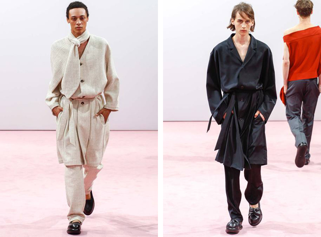
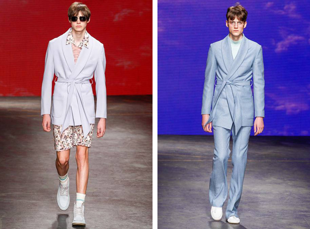
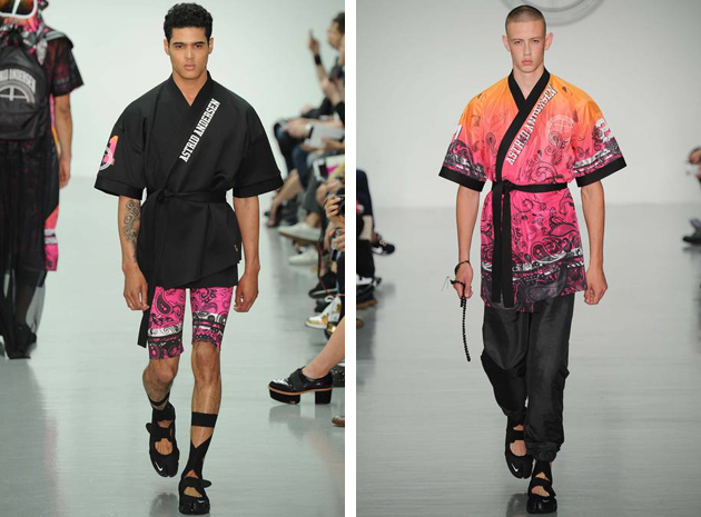
The kimono shape appeared on many runways: Topman Design went for a Seventies flower power mood and surprised with pastel coloured bathrobes worn as cardigans. King of the third sex, J.W. Anderson, played a little bit with the waistline too, by giving an unexpected twist to very simple bottomed tunics. Finally, we cannot but mention Astrid Andersen’s sportive-aggressive approach, presented through a series of martial-arts inspired looks, with a mix of black and vivid warm colours.

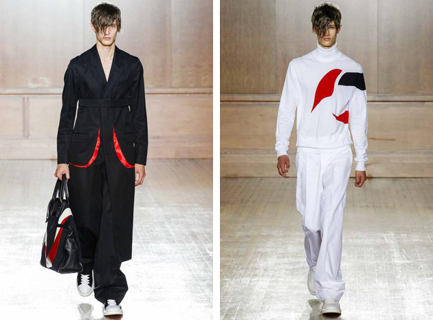
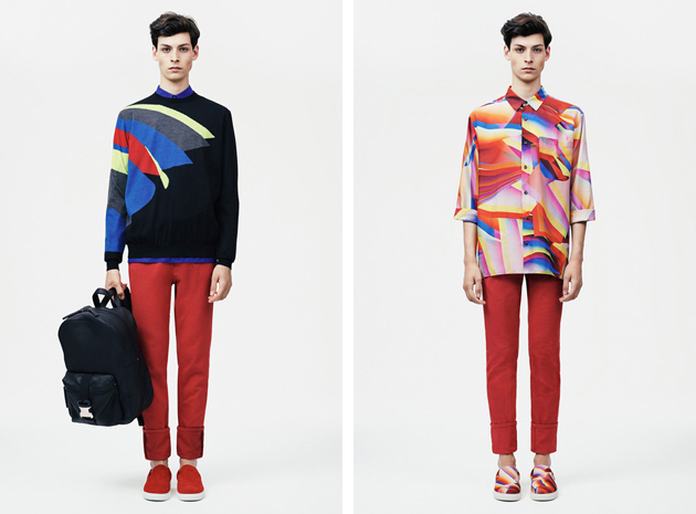
Alexander McQueen SS 2015 runway showcased an attempt to recreate a sort of a higher midriff, with Sara Burton declaring a willingness to break up with the brand’s history and past collections. Her newly proposed path introduced spots of vivid colors in contrast with black and white, recalling a traditional Kabuki mask. A richer colorway and a more digital approach was spotted at Christopher Kane, where a classic black sweater was turned contemporary by adding bright tones in geometric shapes.

Opening Ceremony, on the other hand, went for softer and bigger shapes and a richer colour palette. Paired with psychedelic prints, Opening Ceremony’s vision underlined an innovative way to see men and their wardrobe. All in all, this season’s runways gave digital coloring a foothold in the field, becoming, together with a soft and refined silhouette, a true season staple.
Francesca Crippa 
Share: Facebook,  Twitter  
18/06/2014

The Talented: Yulia Yefimtchuk

Fashion designer and founder of her eponymous brand, Yulia Yefimtchuk is reluctant to speak about the future. It might be that her Slavic origins and the tumultuous past and present of her home country – Ukraine – have instilled an innate sense of suspicion and doubt and taught her to not take anything for granted. And yet, Yefimtchuk’s recent rampant success – following her special Opening Ceremony victory at Hyères Fashion Festival – might well persuade her to think otherwise.

Yulia Yefimtchuk started her career as a fashion designer fresh out of Kiev’s Institute Of Decorative And Applied Art And Design, where she graduated in 2010. Since 2011, Yulia Yefimtchuk+, the official name of her brand, has been producing limited edition womenswear collections entirely in Ukraine. You can easily see the influence of Yefimtchuk’s favourite designers – Yohji Yamamoto, Rei Kawakubo and Raf Simons – on her carefully drawn, discreet and almost humble collections. Inspired by everyday life, Yefimtchuk’s creations are particularly harmonious, clear and linear, with minimalistic cuts, straightforward classical silhouettes and constructive details, such as cut-outs or bows, usually placed on the back.

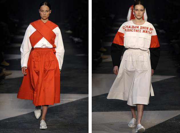
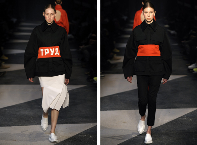
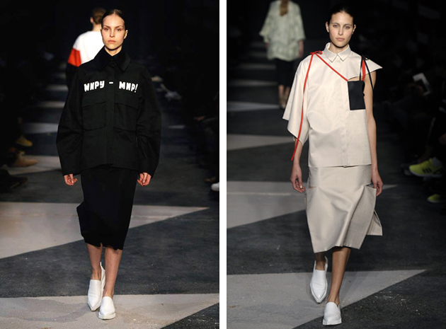
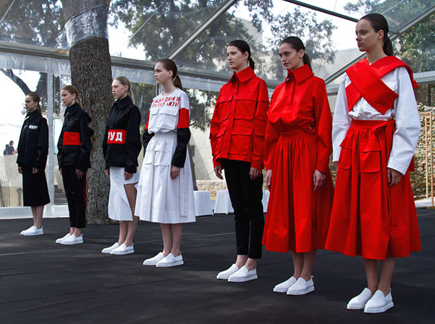
While her previous collections drew from the designer’s inspirational themes in a more subtle and veiled way, the series that won her the recognition of Hyères committee, was much more bold and outspoken towards its rich set of references. Drawn from the Russian Constructivist Movement of the 1920s, the collection sports geometric cuts, pure forms and a stripped down aesthetics – deriving both from the iconic graphic and visual arts imagery of the time, as well as the Soviet-era restrained lifestyle. Conceived both as an ode and as a playful critique to her country’s past, this collection might be the fashion world’s best reminder that beauty can often be found through difficulty and constraint.

Rujana Rebernjak 
Share: Facebook,  Twitter  
17/06/2014

Ever Changing Stripes

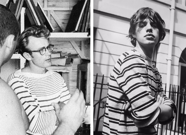
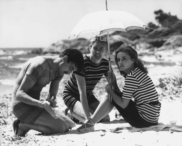
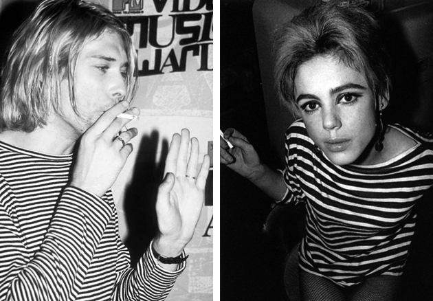
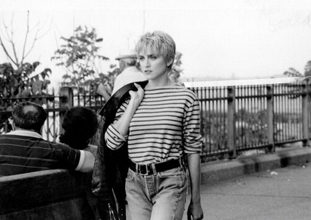
Stripes are considered both a fashion classic and a fickle trend. Right now light blue and white stripes are the stripe to strive for. In the resort collections of 2015, stripes were seen on the runways of Mulberry, 3.1. Philip Lim and Gucci who updated the famous Breton sweater by introducing embroideries and different colors. However the novelty and classical aspect of the stripe does not change its tragic past: a history of décor that originates in politics and death.

During the Middle Ages – when the striped pattern first appeared – a discontent for the chaos the stripes mimicked grew, thus leading to a restriction in their use. Stripes became known as the pattern of evil, even causing people to be killed simply for wearing stripes, with the only people allowed to wear them being criminals and prostitutes. Then, during the late 1800s a fashion shift occurred and the nautical stripes became widely popular after Queen Victoria dressed her four year old son in a sailor suit with stripes. The Queen’s popularity brought the stripe out of the shadow.

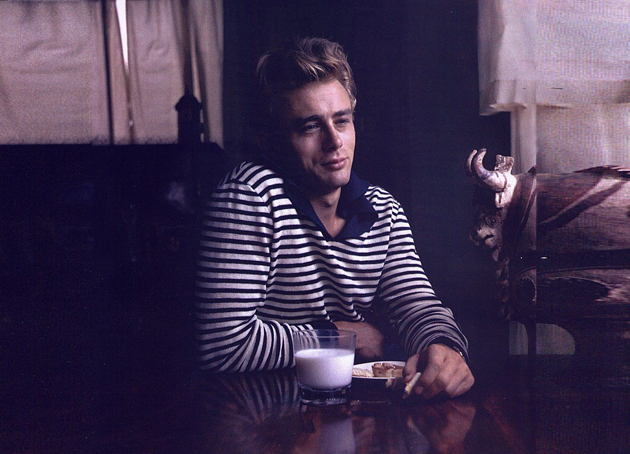
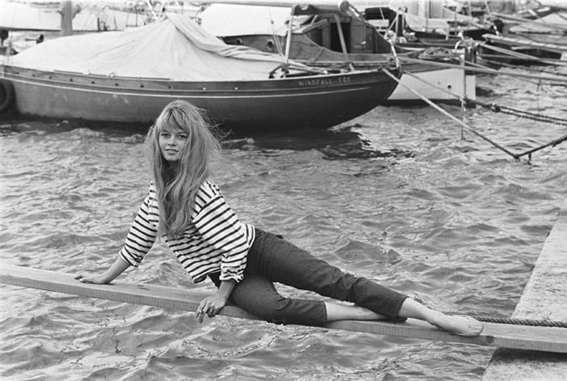
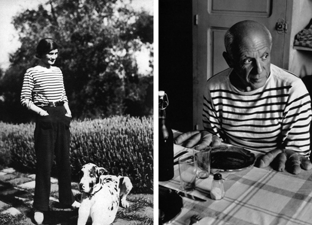
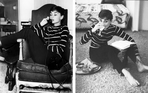
However, we had to wait for the fashion genius Coco Chanel to bring the stripe into the 20th century. Referencing the French marine uniforms, Chanel created a collection which made the stripe a pattern of elegance and sophistication during the 1920s. Artists such as Picasso and Warhol helped immortalize the pattern further, reviving it in the male wardrobe. During the 1960s the stripe became the pattern of choice for hippies and movie stars alike and would become a symbol of the Beatnik Generation. In the 1990s the stripe made a statement of professionalism as it made its way into the business world. However, even though the sophisticated, slender version of stripes could even be seen on suits, its iconic flair remained a symbol of subculture groups, especially when paired with plaid shirts for the grunge-obsessed.

Based on its rich history and stratified evolution, the versatility of stripes makes it interesting even today. From catwalk to street style, the stripe has become timeless, minimalistic and elegant while still representing subtle rebellion, creating unity across genres and styles. The appeal resides in the simplicity and adaptability of this everlasting pattern, undoubtedly keeping it around for many more seasons to come.

Victoria Edman 
Share: Facebook,  Twitter  
16/06/2014

Style Suggestions: Sports

Summer has arrived and its time to get in shape. Here are some key pieces that we suggest to help you on your way.

Top: Adidas by Stella McCartney, Shoes: Nike, Shorts: T by Alexander Wang

Styling by Vanessa Cocchiaro 

Share: Facebook,  Twitter  
13/06/2014

Bare – the Quest for Truth in Fashion

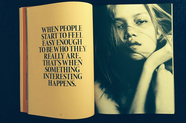
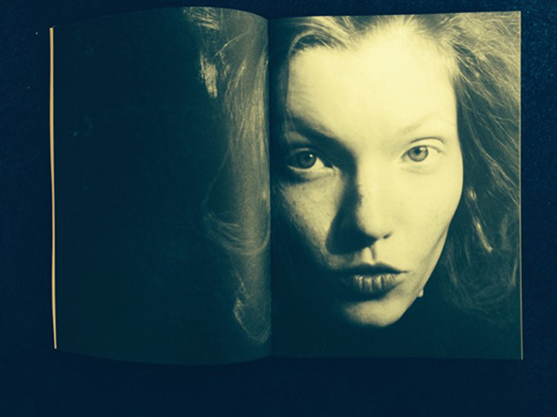
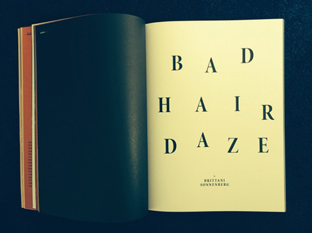
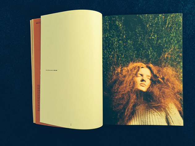
Fashion can, as most subjects, be seen through different perspectives. Some people categorize fashion as a commercial matter, others believe it to be so much more. Bare, a new magazine about the culture of fashion, takes on the second stance. The goal of the magazine is to offer an alternative to the traditional view of fashion as a highly polished, guided and mediated environment, by proposing a publication that explicitly seeks the raw storytelling, liberty of expression, imperfection and, most of all, reality.

The willingness to distance itself from the superficiality of traditional fashion magazines, permeate the publication: from Bare’s layout to its selection of articles, photographic essays and interviews, the magazine as a whole is dedicated to “the unadorned moment of truth”. For this reason, the magazine has no brief, leaves their contributors – photographers, architects, designers, filmmakers – tell their own stories, where the process becomes as fascinating as the product and the readers are free to draw their own conclusions, participate in the story or even re-tell it in their own words. From a technical point of view, Bare does not use retouching or the artificial manipulation of photography typical of the traditional fashion media – an admirable and ambitious goal in a world full of mediated imagery and false representations.

The quest for rawness and reality might feel almost as a political stance in the competitive world of fashion media, where authenticity, imperfection, realism and verity are often concealed. In a difficult world of publishing, where so many quality publications are destined to die even before they are born, what might be the future of Bare? Hopefully, its readers will recognize its honesty and genuine touch as not only a fresh alternative, but a necessary shift for a brighter future of the fashion industry.

Hanna Cronsjö 
Share: Facebook,  Twitter  
11/06/2014

There Is Something About Thomas Tait

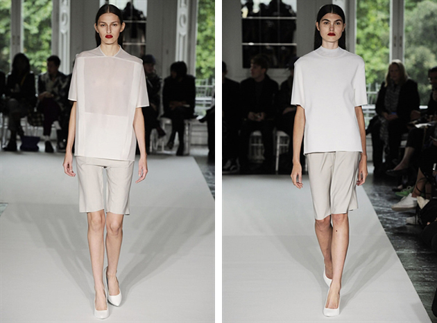
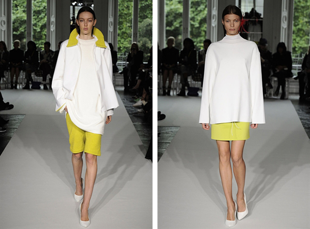
Last week Thomas Tait was announced winner of the inaugural LVMH prize sealing his position as fashion world’s newest darling. Being selected as winner among 12 creative finalists by a prestigious jury that included designers Karl Lagerfeld, Raf Simons, Nicolas Ghesquière and Marc Jacobs, must mean there is clearly something about the clever Mr. Tait. But what?

The native Canadian has previously attained a technical diploma from Collage La Salle in Montreal. He began his career in 2010 after graduating as the youngest graduate ever from London’s Central Saint Martins, an indisputable hub of fashion talents. Tait’s graduation collection was shown in London during AW 2010 runway shows and introduced his particular focus on geometric shapes and basic colors. While he often restrains to black and white, Tait’s designs are made playful and frisky by slightly oversized shapes and exaggerated lines. The play with geometry of the garments became Tait’s signature trait, seen on his later collections where the color scheme remained unchanged, but different materials and processes were applied to create movement and structure – such as pleats mixed with smooth counterparts on skirt designs.

In his first spring collection the designer added more colors, with pastels and a mix of materials used to create a layered yet relaxed sportswear look – with sports as the operative word for all of Tait’s collections. With each season, bolder colors and more exaggerated shapes were used in direct reference to the neon trend and the idea of merging future with the present. However, just as we managed to wrap our mind around Tait’s designs, the new SS 2014 collection showcased an unpredictable and entirely new train of thought. The features he previously treated separately – namely, colors and shapes – were fused together under his distinctive aesthetics, perpetually reinventing pieces that have become staples in his work.

Thomas Tait has a certain je ne sais quoi, as the French put it, that charges his apparently simple designs with a bold personality – a personality able to tell a story in many different languages and styles. The constant ability to rework what has already been done, might just be the characteristics that made him stand out among the 12 finalists. Turning something expected into an unexpected treat is a very special kind of gift – almost as if you were spinning straw into gold.

Victoria Edman 
Share: Facebook,  Twitter