10/04/2015

Salone del Mobile: an Excuse for Agenda Setting

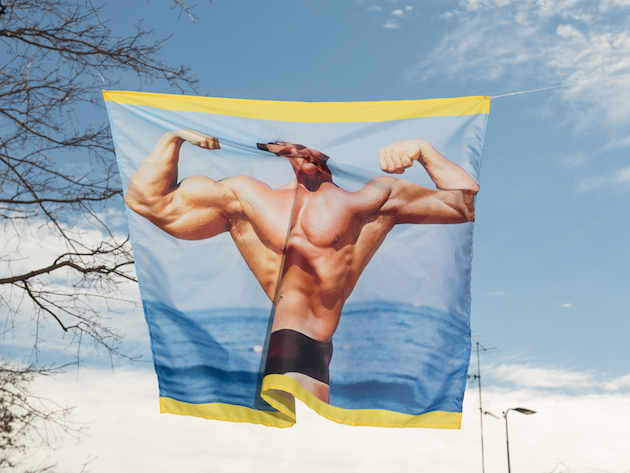
When an important tradeshow slowly transforms itself into a chaotic media circus, the rules that make it work change drastically. Rarely, in an overcrowded scenario of supposed novelties, final users have the chance to check personally what truly deserves a medal for quality and innovation, but are rather guided by the image and the agenda that devilish communication professionals have set for them. “Dura lex, sed lex”, we may say, especially since the digital domain has started to reward indefinite events and to rebound their echoes through social media buzz. This is particularly true for the imminent Salone del Mobile of Milan, the leading international design event that every years gets in town more than 200.000 disoriented professionals, over stimulated by the offer and often incapable to recognize the boundaries of what was, and has now become, a matter of design. Of course, the marketing rules that are engaged in Milan design week are not different to those that govern other worldwide design events. Nevertheless, remaining Milan the biggest tradeshow, it maintains the most hyperbolic and dazed dimension.
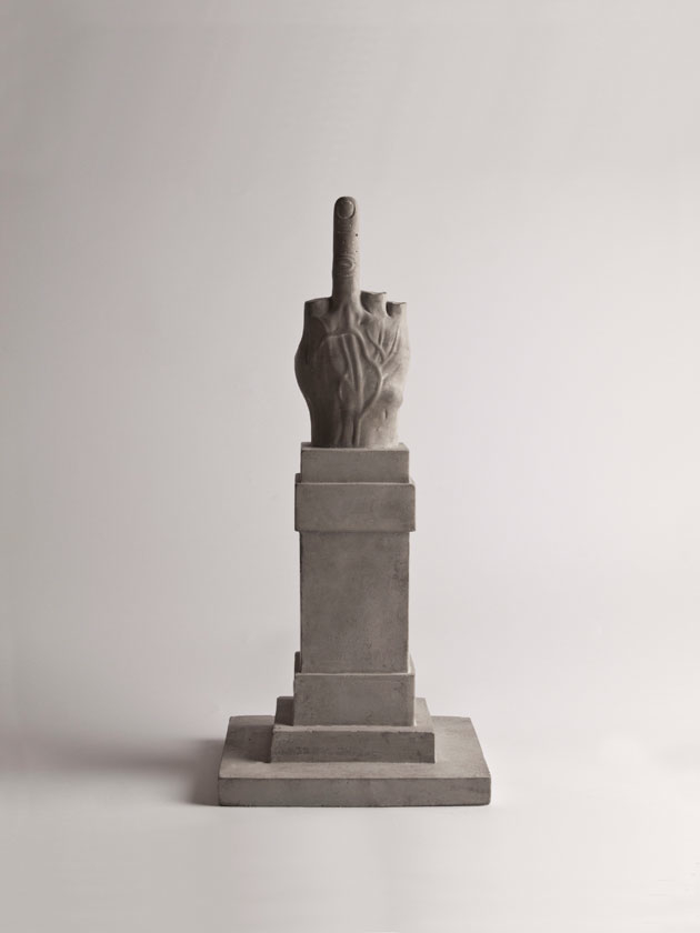
But what are the tips that nowadays determine the success of a product or an event at the Salone? Those who had the chance, or the misfortune, to work as journalists, content editors, and PRs for the Salone del Mobile, generally know them quite well:

Anticipate competitors: Salone del Mobile is all about timing. Be the first to unveil your new products – no matter if the prototype you shot does not even work – and you’ll make them memorable for your public before it gets tired and confused by hundred previews.

A good image is better than a good product: nothing is worth as much as a good shooting, because the first filter that any media professional applies is that of an eye-candy visual impact. No matter if the written description that gets along, or the product itself, are not equally enchanting.

Involve edgy bloggers: making a reputed, trendy blogger speak about you is definitively the way to impose your agenda setting to the design community.

Story is better than technique: if a product does not have a concept or a story, please fabricate one. Just a very few people –and definitively not the right ones – get involved by the description of any technical innovation, even if relevant and astonishing.

Build exclusivity: a new design district, a new format or a new “design something” needs to be communicated as an initiation for a privileged few.
Finally, should we ask ourselves if this all makes sense? Of course we should, but we actually don’t, because if this is all simply about participating in a circus, nobody wants to be the first to leave the party.

Giulia Zappa 
Share: Facebook,  Twitter  
07/04/2015

Shapes of Modernity: Architecture in Latin America

What was modernity and how can we understand it today? Can modernity even be firmly located in the past? If we consider architecture and design, the disciplines’ modernity inevitably encompasses a wide range of practices, many of which responded to similar theoretical frameworks – rejection of the past and utopian visions of the future, self-consciousness, progressive belief in human power to shape their environment through rational experimentation, knowledge and technology – yet took on entirely different forms. Modernity escapes narrow definitions and limited geographic and temporal frames; in fact, the elusive nature of modernity allows for varied iterations and shapes, which are not represented by how it has been theoretically approached. Turning to the discourse on architecture and design, modernity – broadly paralleled to International Style – seems to conform to a monolithic view of the period, inevitably West-centric and not at all international.

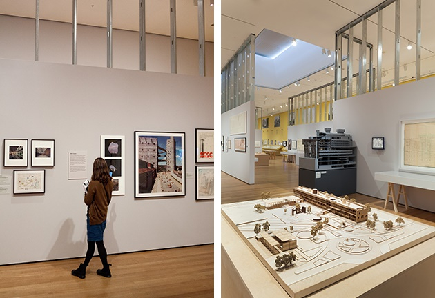
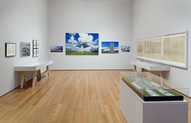
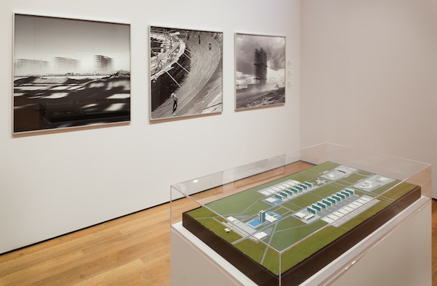
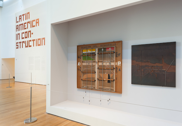
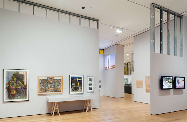
With the attempt of broadening the understanding of modernity in architecture today and defying such a limited view of the discipline’s past, the Museum of Modern Art in New York takes an in-depth view at architecture of South America with a new exhibition: “Latin America in Construction: Architecture 1955-1980”. Opening 50 years after MoMA’s last survey of the continent’s architectural practice – Latin American Architecture since 1945, held in 1955 – the exhibition curated by Barry Bergdoll, Patricio del Real, Jorge Francisco Liernur and Carlos Eduardo Comas, takes on a quarter of the century of architectural history, tracing its most significant developments, ideas and protagonists. Far from a view of Latin America’s architecture as a playground for European architects or a showcase of its already well-known stars (such as Oscar Niemeyer or Lina Bo Bardi), the show is structured around five central themes: “Urban Laboratories”, “Cities in Transition”, “Housing”, “Export” and “Utopia”. Each of these sections shapes a unique architectural discourse, specific to the continent, while also highlighting its connection to wider modern developments and modes of thinking.

Latin America in Construction, an incredibly revealing and thorough exhibition, brings together more than 500 original works that have largely never been exhibited: from architectural drawings and models, vintage photographs, and films from the period collected from architecture and film archives, universities, and architecture offices throughout the region. “I was stunned by how Latin America had been systematically not part of my own historical education in architecture—despite the fact that I have three degrees in art and architectural history,” says Barry Bergdoll, the lead curator of the show. “Most history books on modern architecture in the English language assign a subordinate role to Latin America, and I was intrigued if it might be possible to see whether, in the postwar period, the region had been a full actor in a transatlantic development along with North America and Europe. Not simply as a place where the pupils of Le Corbusier went to build, but a place of origins of ideas.” In fact, this exhibition comes as a signal of a wider effort to read modernity as a period and space of thought defined by pluralism of ideas that deserve to be understood, than by canonic interpretations of theory and styles.

“Latin America in Construction: Architecture 1955-1980” runs until July 19th 2015 at the MoMA in New York.

Rujana Rebernjak – Images by Thomas Griesel, courtesy of the MoMA 
Share: Facebook,  Twitter  
27/03/2015

“Presenze”, Transitional Objects on Show

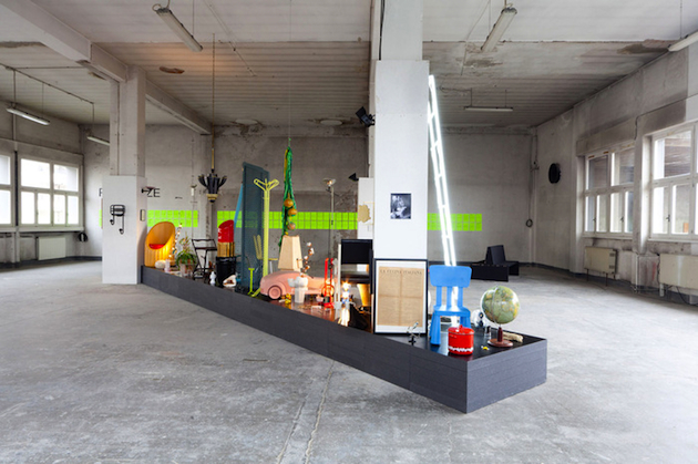
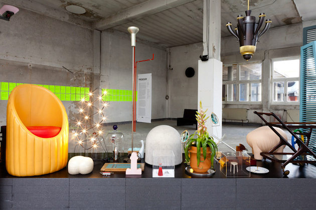
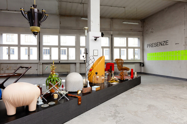
One hundred objects crowd a black platform put diagonally in the middle of a room. Their heterogeneous nature is striking: form, function, scale, materials, geographical origin; they seem to have nothing in common. Some of them are famous design icons, others are cheap, mass-market products, while more than a few are old and anonymous. Others are weird: they are rare and incomprehensible, but they are far from being precious.

Among them we find a teddy bear. We read what its owner, the anonymous Giampiero T., has written about it: “Who knows if Donald Winnicott ever had a transitional object? It is said that he had a piece of blanket, a rag or perhaps a teddy bear like me. Who knows if this object was for him the connection with his mother and if it helped him to gently separate from his mother figure”. And thus we find a key to understand the very essence of “Presenze. Biografie inedite” [“Presences. Inedited Biographies”], the exhibition on show at Allestimenti Portanuova in Milan – just next to the construction site of the new Fondazione Prada – which gathers a selection of artefacts chosen by Milanese design protagonists, in order to showcase the favourite thing they keep at home.

Despite their identity, in fact, all the objects belong to the category of transitional objects. They reveal the emotional identity of their owner, and establish a vehicle, a sentimental transfer, with the rest of the world. At the same time, they transform themselves into a symbol, and promise to offer unconditional comfort when we are in troubles, or simply feel blue. A short text explains the history of each of these relationships, confirming once again how storytelling has become a powerful means to engage with the public. And it’s exactly this flowing narration, this form of collective stream of consciousness we may say, that suggests how design is more than ever “a state of mind”.

Giulia Zappa 
Share: Facebook,  Twitter  
23/03/2015

Nathalie Du Pasquier: Don’t Take These Drawings Seriously

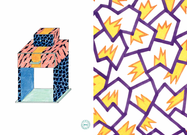
It could be said that one of Nathalie Du Pasquier’s greatest virtues is patience. Though she is publicly mainly known as a founding member of Memphis, that short-lived yet hugely influential Italian radical design collective headed by Ettore Sottsass, Nathalie has never designed objects. For more than twenty years, she has gone to her studio every morning, tirelessly transforming our material reality into a series of works of art. Her particular form of expression has captured the essence of those small and apparently unimportant things into subtle visual poetry, capable of brining to life a world of ‘stuff’, vibrant, alive and much more significant than we are usually brought to believe.

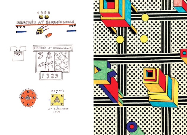
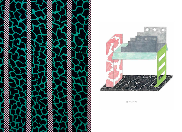
Until recently, though, this myriad of compositions and worlds was kept silent, hidden in the drawings of Nathalie’s studio in Milan. Now, a new book published by PowerHouse Books, edited by Omar Sosa together with Nathalie Du Pasquier, collects drawings created between 1981, the year she became a member of Memphis, and 1987. “Don’t Take These Drawings Too Seriously.” is the first and definitive compilation of all the unpublished drawings from those years, organized by the smallest objects to the biggest and divided into chapters.

These drawings explore that peculiar relationship between what is real and what is not, between what we would like to believe in and what the reality is actually made of. As such, they are, perhaps, more real than the reality itself, also because now, thirty years after their initial creation, they can be seen as a document, a testament to that particular moment of unyielding creativity and uncompromising disruption with the past. Nathalie Du Pasquier is, indeed, patient. As is the essence of her work, steadily resisting the test of time.

Rujana Rebernjak 
Share: Facebook,  Twitter  
20/03/2015

Earth matters: When Natural and Creative Forces Meet

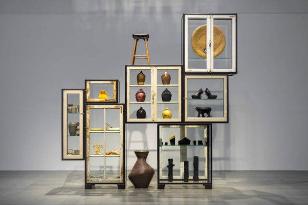
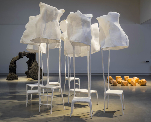
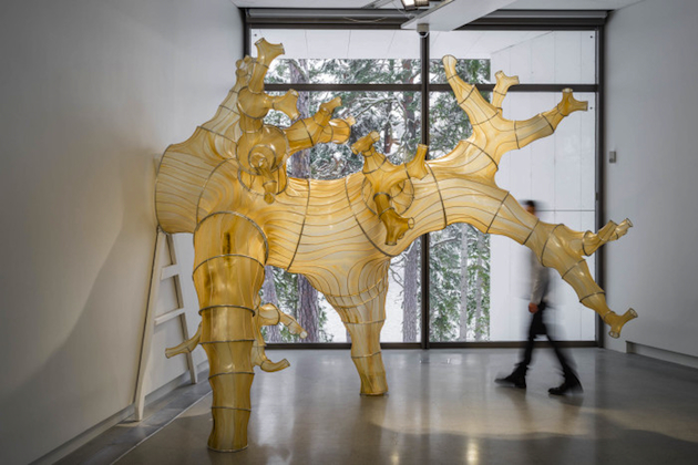
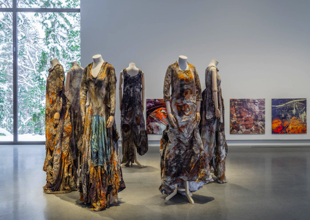
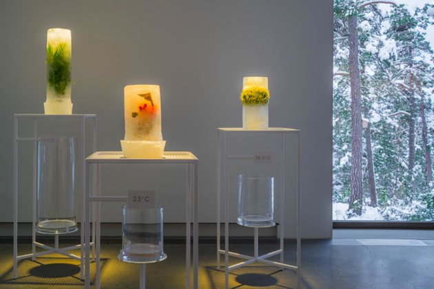
One of our time’s biggest and most important topics, our environment, is the theme of the current exhibition Earth Matters, When Natural & Creative Forces Meet at Artipelag in Stockholm. The two curators - Lidewij Edelkoort and Philip Fimmano – have put together pieces by over 40 different artists and designers from areas such as photography, fashion, design and art, with the purpose of drawing attention to the environmental problems caused by years of overconsumption and a selfish and irresponsible attitude towards the planet. Therefore, one of the exhibition’s key points is the fact that we can’t survive without our planet while the planet might be just fine without us. This plain and simple acknowledgment should leads us to another question, why aren’t we taking better care of it?

The German artist Jurgen Lehl, asked himself the same question. Lehl used to walk down the beach close to his home in Japan, but one day he suddenly found plastic particles mixed with grains of sand. For Earth Matters, he has created lamps made of bigger plastic objects which Lehl found on the beach after they had drifted to the shore Now they can be seen both as incredible art pieces and symbols of the dark side of years of overconsumption. Another designer who is showing her work in the exhibition is Vivienne Westwood, who has contributed with her famous manifesto which speaks out against climate change and the effects of capitalism and overconsumption.

This exhibition is relevant for everyone to see, because the topic is of the sort that everyone can not only relate to, but urgently get to grips with. In the same time, the exhibition does not only aim to repeat the old song about climate change, but it aims to show it in a visually powerful and impacting way, while, at the same, time offering exciting, creative and contemporary solutions through the means of art and design. By paying attention to new creative energy that is inspired by natural materials and sustainability, the exhibition succeeds to give the topic of sustainability a new dimension – the creative one. By interpreting the topic in many different creative shapes and forms, it becomes more real, and you are left with a feeling of both sadness and hope.

Hanna Cronsjö – Images courtesy of Artipelag 
Share: Facebook,  Twitter  
16/03/2015

Design, Art and Play: from Castiglioni to the Present

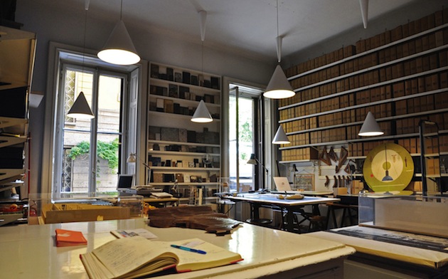
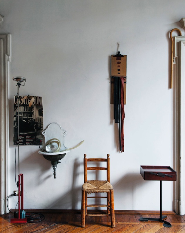
Achille Castiglioni was a tireless collector: throughout his career, the great Italian designer gathered an impressive collection of objects that ranged from mechanical toys to water bottles, from foldable cups to lightbulbs. Objects filled the vitrines of his studio at Piazza Castello in Milan, two steps aways from the temple of Italian design, the Milan Triennial. Nearly fifteen years after his death, the famous workshop of design still remains intact, left just as it was on display for curious visitors who want to experience what everyday life of this grand master looked like.

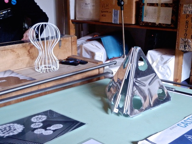
Fondazione Achille Castiglioni, created by his family after his death with the aim of preserving this cornerstone of Italian design heritage, is the location of a new exhibition which hopes to weave the work of Castiglioni within contemporary culture, much indebted to his ironic, acute and inspiring work. “Le regole del gioco”, an exhibition curated by Luca Lo Pinto and coordinated by Edoardo Bonaspetti, puts on display a series of artworks created as a reflection on the work of Castiglioni by a series of contemporary artists. The works shown build a dialogue between the past and present through an close analysis of the designer’s work, rather than simply by emulating of his formal syntax.

Pieces created by 18 artists and designers were exhibited around the studio, creating a visual as well as conceptual narrative between Castiglioni’s energy and the impulses and ideological frameworks of contemporary creative disciplines. From Céline Condorelli to Martino Gamper, from Max Lamb to Amalia Pica, this eclectic mix of contemporary artists and designers shapes a new perspective on his great legacy, as well as on the ways in which past can give shape to the present.

Rujana Rebernjak – Images courtesy of Fondazione Achille Castiglioni 
Share: Facebook,  Twitter  
13/03/2015

Biennale Saint Etienne, For a New Sense of Beauty

What is the relationship between form and function? We would be wrong if we think that the legacy of these two undisputed protagonists of design culture remains confined to the 20th century. At least, this is what the Biennale International Design Saint-Etienne, the most illustrious design event in France, just inaugurated on March 11st, seems to suggest. The headline of this ninth edition, “Le sens du beau” [“The Experiences of Beauty”], guides us to understand the vision that the numerous exhibitions and events in town share: form goes beyond appearance, and thus has a decisive role to define usages and meanings of everyday objects.

The focus of the Biennale’s ambitious and multifaceted investigation, however, is not keen to pinpoint the new, relevant aesthetics that individual designers have expressed in the recent years. On the contrary, the role of form is always attributed to a social, collective dimension. What does form say about our identity in a time of globalization? Can it be a means to recognize and enjoy plural, diverse experiences? How can it transcend our obsessive desire for consumption? Far from being a decorative expression, aesthetics is considered as a performative statement.

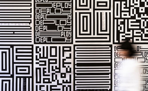
The will to openness, pluralism and search for new perspectives clearly emerges when we consider in particular some of the exhibitions that will animate the French town till April 12th. “Tu nais, tuning, tu meurs” explores the political dimension of tuning seen as a break point between established and popular culture. “Vous avez dit bizarre” investigates the social implications of grotesque, suggesting that its hyperbolic sense implicitly defines the values, the virtues and the vices of our times. “Ça aurait pu”, instead, examines the 15 proposals that have been evaluated and then left apart in the development of the Biennale 2015 visual identity. All, thus, confront themselves with the reign of possibilities and choices but, whether fringe or mainstream, they always all show an ethic dimension that design needs to question and take into account.

Giulia Zappa 
Share: Facebook,  Twitter  
04/03/2015

Scholten & Baijings: Reproducing the Shape of Thought

In the past decades, many attempts have been made to systematically organize and describe design practice. Questions about purpose, context, media, tools or use are often brought up with the hope of answering what design is and fitting its multifaceted realities into precisely defined categories. Yet, it is unlikely that design is ever going to adapt to any of those laborious categorisations, for it is in its very nature to remain elusive and continue to transform. In fact, design practice is at its best precisely when it refuses to be moulded, shaped and contained. Nevertheless, should we be determined to penetrate the complexity of design’s geography today, we’d have to look at how designers design. Design process – a medium in itself – offers a glimpse at how thoughts, ideas and concerns are transformed into material shapes, how they become the landscape of ‘things’ that define the world today.

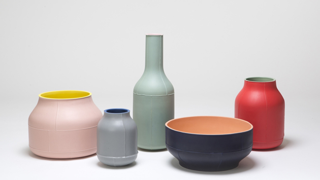
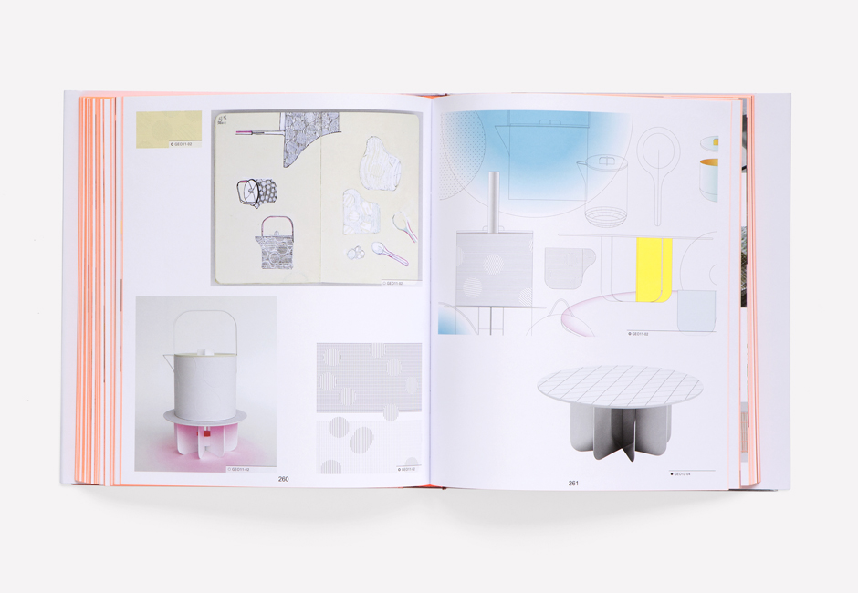
Design process is at the centre of a new book, published by Phaidon, that attempts to categorize the work of Stefan Scholten and Carole Baijings, the Dutch design duo founded in 2000. In fifteen years of practice Scholten & Baijings have given shape to a particular kind of design, concerned with the visual language and transformation of conceptual vocabularies into three-dimensional patterns. Though reluctant to engage with social or political concerns inherent in any designed product, their work is valuable as it transforms design process into tangible, material forms. One of their most famous projects, a series of porcelain tablewares for Japanese manufacturer 1616/Arita Japan, is a systematic transformation of design thought into a collection of objects. Questions of colour, materials and form and their relationship to tradition, purpose and manufacture were translated into three different series of porcelain services – minimal, colourful and extraordinary – each becoming a synthesis of a specific approach to design.

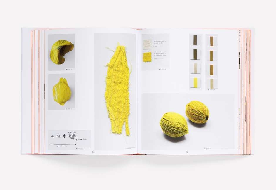
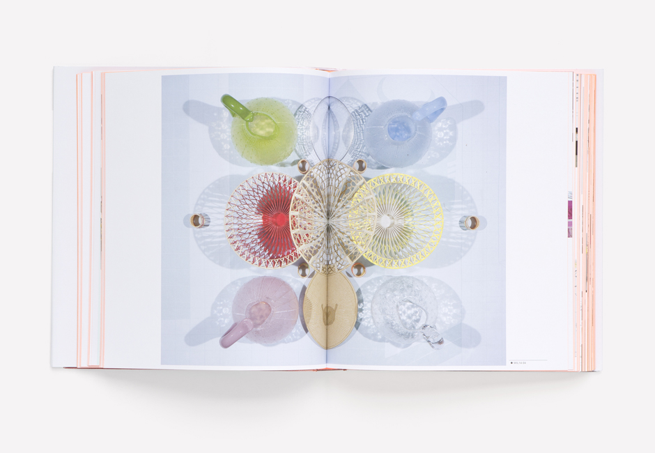
Thus, it is no wonder, that “Reproducing Scholten & Baijings” attempts to bring this material discussion on design process into a two-dimensional space. Created in collaboration with Maharam, one of Scholten & Baijings’ most interesting clients, the volume gives shape to a reconstruction of design process, seen as the most authentic and unmediated way of engaging with and understanding their work. By flipping the pages – a collection of drawings, sketches, colour swatches, samples, models and photographs – a clear and straightforward visual pattern of thought emerges as a story, not so much about objects in themselves, as about how and why they need to exist. As Michael Maharam says, “Apart from the quality, thoughtfulness and utility of their output, Carole and Stefan have succeeded in creating a highly legible and cohesive embodiment of their vision.” Scholten & Baijings‘ work is significant because its material reality displays the shape of thought.

Rujana Rebernjak – Images courtesy of Scholten&Baijings and Phaidon 
Share: Facebook,  Twitter  
27/02/2015

Stilnovo: Lights for Italian Practical Grace

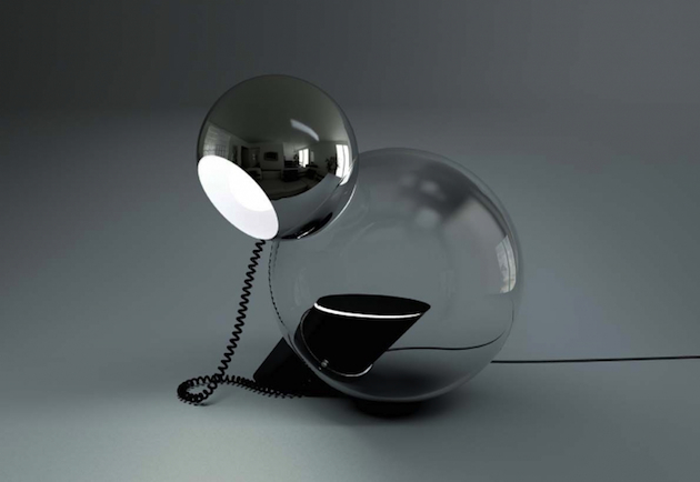
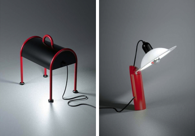
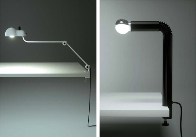
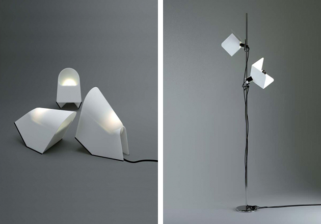
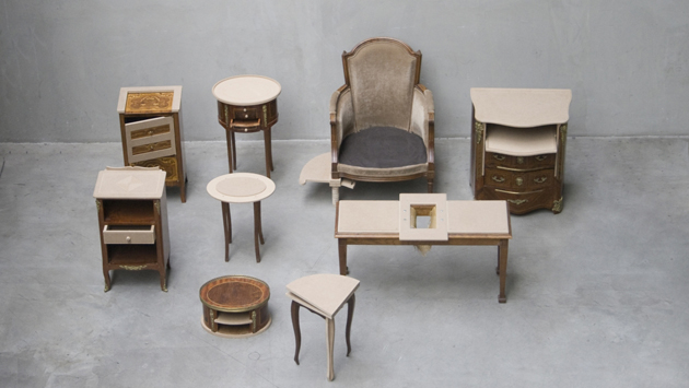
Re-editions in design are the new black. No matter if this happens because our times seem unable to express a new, totalitarian total look, or because they are enchanted by a reassuring, long-lasting vintage mania: in any case, an increasing number of companies – Molteni with Gio Ponti, e15 with Ferdinand Kramer, and Vitra with Jean Prouvé, just to mention a few – have been seduced by the idea of updating the past as an effective and desirable strategy for attracting new business niches. Lighting companies are not excluded from the fray. After Le Corbusier’s Projecteur 365 by Nemo Cassina, it is up to an Italian icon from the Maestri generation, Stilnovo, to officially unveil its upgrades with an exhibition at Galleria Carla Sozzani in Milan. Here the numerous, nostalgic public of this protagonist of the “bel design” has the chance to discover a new collection of re-editions and new prototypes finally gone into production after forty years.

Founded in 1946 by Bruno Gatta, Stilnovo rose to prominence as one of the most successful Italian lighting companies of the post war period. In a time of great economic and social rebirth for the Belpaese, Stilnovo stood out with its search for a new bourgeois taste, both practical and sophisticated, and yet keen to experiment the ultimate technological innovations. After being confined to the realm of auction market for a long time, the company has been relaunched by two Italian entrepreneurs, Massimo Anselmi and Roberto Fiorato, who aim at protecting its great cultural heritage. A scientific committee, composed of design historians, sociologists and architects, has been established to enhance its industrial heritage and to lead its brand values to the XXI century. Stilnovo’s revival, thus, is not limited to a technical update but becomes – as the committee has written in the company’s manifesto – an “advanced laboratory and cultural stimulus: a facilitator of and testimony for Italian design around the world.”

This transformation, by no accident, reflects the very meaning of the company’s name. In the history of Italian literature, Dolce Stilnovo is the most prominent movement of XIII century, which refined the Italian “volgare” (the language spoken in the peninsula after Latin disappeared) transforming poetry into a sophisticated and symbolic linguistic expression. Thus, is Stilnovo the new “angelic woman”, a new model for inspiration and contemplation in the contemporary age? It is hard to say, but for sure its “sweet new style” – what the name literally means – represents a new inspiring protagonist for Made in Italy desirability.

Giulia Zappa – Images courtesy of Stilnovo 
Share: Facebook,  Twitter  
23/02/2015

Designs of the Year 2015

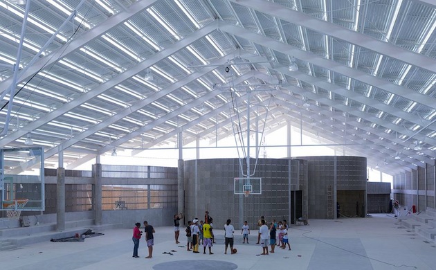
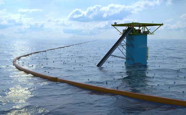
For the eighth year in a row, the Design Museum in London has revealed 76 projects for its “Designs of the Year” award. From architecture to digital design, the projects included range from socially responsible, environmental systems like “The Ocean Cleanup” or “Air-Purifying Billboard” to monumental buildings such as Frank Ghery’s Foundation Louis Vuitton or Herzog & de Meuron’s gymnasium in Brazil. Divided into 6 disciplinary categories – architecture, digital, fashion, graphics, transport and product – the shortlisted projects were chosen by the Design Museum’s team among 200 nominations put forward by industry experts. Commenting on the breadth of the award and its accompanying exhibition, the curator Gemma Curtin explains: “We want to show the whole spectrum. For every huge designer they started off as a smaller, new person on the block with a great idea or a new technique or vision. I think when we whittled down these selections to what we have in the exhibition, it was to give an inspiring and innovative showcase of design.”

Perhaps as any other award, Designs of the Year is known for its controversial choices which, in the past, divided both critics and professionals. Most notably, last year’s overall winner, Zaha Hadid’s Heydar Aliyev Center in Baku, Azerbaijan, was widely criticized for its reluctance to engage with the context within which it was commissioned, designed, built and is now used. Awarding the top prize to Hadid meant that Designs of the Year had somewhat departed from its previous dedication to ‘design for the greater good’. As Patrick Burgoyne wrote in his review of the last year’s awards, “Briefing for the nominees was always somewhat, er, brief with an admirable degree of trust bestowed on nominators to come up with appropriate suggestions. […] Whether by accident or (sorry) design, it has carved out a position for itself with successive winners rooted in social causes or design for the public good. […] The emphasis was on the aspirational: design as we may like it to be rather than as it is for the majority of practitioners.”

Read through this lens, it is easy to understand why Designs of the Year often brings together such diametrically oposed projects. To emphasise this eclectic approach, Curtin has decided to arrange this year’s selection around loose themes in order to reflect the way these projects would be perceived in everyday life – where each element of the artificial landscape shapes relations and connections to other objects that surround it. “I think there are actually great similarities between some projects in their intent, if not in what they are trying to do. Obviously a magazine that comes out twice a year is very different to a piece of architecture that may have taken ten years from idea to finished building. But, I think that some of the processes, some of the intentions, some of the desires, unify these projects”, Curtin says. In fact, this curatorial choice is a step forward in reflecting how design is experienced today. Nevertheless, it poses a question as to how such a juxtaposition might contribute to the understanding of meaning, context and significance of each of the selected projects. In fact, can we even speak of a design of the year today?

Rujana Rebernjak – Images courtesy of the Design Museum 
Share: Facebook,  Twitter