27/02/2012

Deconstructing The Thing
Deconstructing The Thing

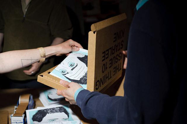
The Thing Quarterly is, in the words of the founders, a periodical in the form of an object. The object is typically functional and designed by celebrities and people otherwise notable in their line of work. Contributors in the past have included writer Jonathan Lethem, media artist Anne Walsh, and experimental geographer Trevor Paglen. They make things like military mugs, blank books with shoelaces sewn into them, and flags embedded with instructions on how to fold a flag.

It’s called art, and it’s brilliant.

It works like this: You pay them money ($65 an issue, or $200 a year), and at the dawn of each season you’ll receive a Dominos-shaped cardboard box with the contributors name stamped boldly in Helvetica. It’s clean and would look nice on top of a coffee table. It’s also minimal, as much as an offshoot of the absurd humor of Marcel Duchamp as it is with the craft aesthetic of something like Ready-Made, a crafty monthly rag that tells its readers how to build their own living spaces without having to go to Ikea. But where Ready-Made tells you how to build things, The Thing has celebrities build things, and you pay money to have their objects sent to you. The thing is, you don’t know what they’re going to put in the box until it arrives. One publication described what they do as part MacGuffin, and part… something else. The MacGuffin is the only part I can remember now that I’m thinking it over.

But it’s what’s inside that counts, right?


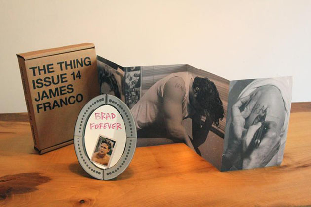
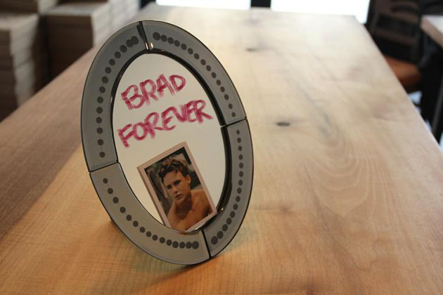
It depends on who’s putting what inside, and why. The most recent issue is an original Dave Eggers short story printed on a shower curtain. From the perspective of a shower curtain, too. If you’re a die-hard shower curtain fan, you can’t live without it. But James Franco’s tribute to Brad Renfro is downright ridiculous, arriving complete with lipstick, mirror, and a photo book of Franco getting “Brad” carved into his shoulder. If you want a piece of glass that has the words (written by Franco himself) “Brad Forever” smeared on glass in front of a neatly-tucked pocket photo of Renfro, Issue 14 is for you. It’s tacky, vain, and wildly pretentious even for a project where pretentious and indulgence are entry requirements.

But The Thing is heady like that. The people who produce it, visual artists Jonn Herschend and Will Rogan, promote the project as a surprise of sorts, something fun, like finding an object you weren’t looking for in the leftover bin at the local thrift store. Maybe a wolf t-shirt, maybe a set of hand-made wine glasses with a message inscribed on the bottom, maybe a Brad Renfro knife or something. Brad forever.

Wait, that knife exists and costs $650? These guys are full of surprises!
At least it seems like the contributors are having quite the time. Who wouldn’t want to, like Starlee Kine did in Issue 10 (sold out), write a short story about an onion on a cutting board designed for cutting onions? Or silk-screen a post-it-note on a functional shade says, “If this shade is down I’m begging your forgiveness on bended knee with tears streaming down my face,” like Miranda July did in the inaugural issue? This, too, is sold out, though I can’t imagine those words having the same kick the second time the shade is drawn.

But like Duchamp’s urinals, it’s the idea of The Thing is more important than what’s inside the box. And the objects sometimes are surprising, at least in the degree of incompetence they assume of their subscribers. But hey, it’s not like you’re forced to buy into this thing. I mean, if you’re the type of person who thinks it’s cool to spend $65 on a Dave Eggers shower curtain, I’m certainly not going to stop you.
Lane Koivu – Images courtesy of The Thing & Lenny Gonzalez

Share: Facebook,  Twitter  
14/02/2012

Please Don’t Forget Aldo Novarese

Please Don’t Forget Aldo Novarese

In the early nineties, design historians had re-discovered the long forgotten graphic design history. After this long period of glossy manuals, where design history hasn’t been written, but shown, in the last few years designers have decided to take the matter into their own hands. A new history of revivals began with countless exhibitions on this-or-that, accompanied by myriads of independent publications and, as the latest trend inescapably dictates, hundreds of re-designs of long forgotten fonts.

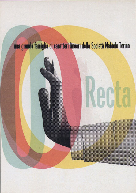
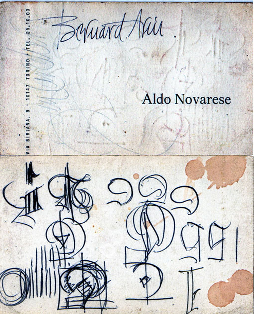
One of the latest musts in the typographers’ field is Recta, a bit goofy Italian contribution to the sans serif families of the sixties. The prolific designer of the above mentioned 1958 font is Aldo Novarese.


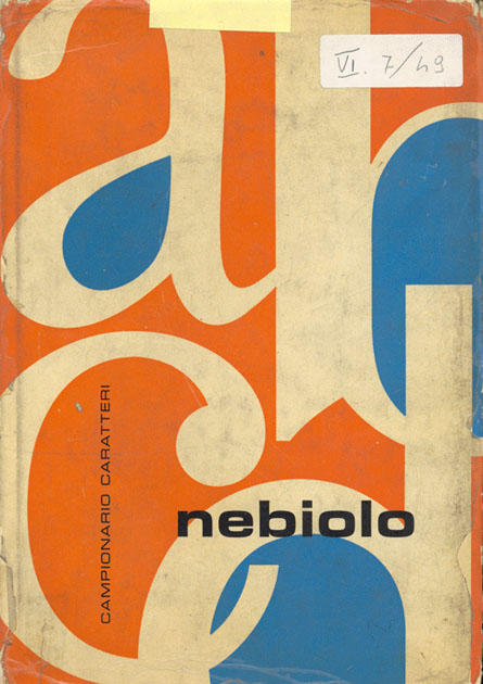
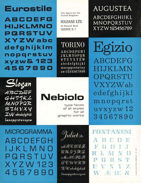
Aldo Novarese has worked for almost all of his life for Nebiolo foundry in Torino. In forty years of passionate dedication he has created more than one hundred fonts, existing not only as sketches, but entire families of characters, alongside of two books and a well known character classification.
In 2011‚ Canada Type foundry digitalized Recta, which immediately became a graphic must, and Aldo Novarese a worshipped hero. In the meanwhile the Italians haven’t yet realized the importance of this master. Not even a single word has recently been heard about him, only a few design students can accidentally see his name while flipping through the old glossy ‘international’ design manuals. Hopefully they’ll soon realize that the grass isn’t always greener on the other side.

Rujana Rebernjak – Images courtesy of Aldo Novarese & Nebiolo

Share: Facebook,  Twitter  
10/02/2012

Scandinavian Fashion, Function & Compassion

Scandinavian Fashion, Function & Compassion

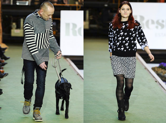
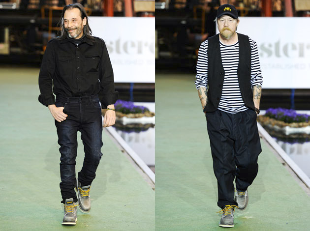
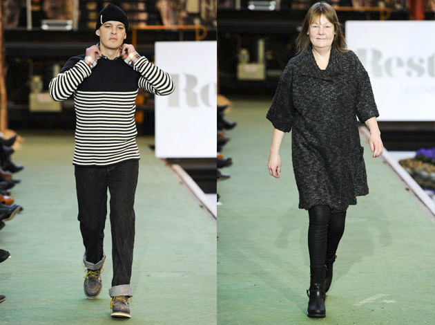
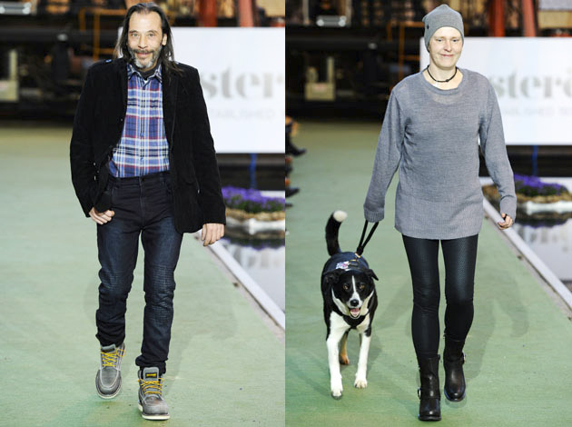
Amidst the glamour, bliss and cold hard business of Copenhagen Fashion Week, the Swedish brand Resteröds made an unconventional and powerful set of statements. First, its runway presentation opened with a spoken poem about life on the street. Then, a collection of well-designed, everyday apparel with a sharp focus on usable quality was presented on the catwalk, worn by the very same people that the opening poem referenced: the homeless.

The brand, which is not a regular on the catwalk, was presenting a fully new collection for AW12 – a collection that otherwise has remained more or less untouched over the past 70 years. And raising eyebrows with its unconventional show has turned out to be a rather smart PR move, and it has raised money for a cause that often gets relegated to the gutter, so to speak. It also gave the brand a chance to show off a new edge in its designs, made all the more powerful in combination with an issue that left a mark in the minds of the audience.


We could continue by discussing Corporate Social Responsibility and the imperative for companies to take actions. We could reflect over whether the show was born of genuine concern for ethics or whether it was a publicity stunt. But it might be more important just to highlight the fact that the fashion industry holds a tremendous amount of power. And unconventional initiatives like this are a way to leverage that power to call attention to just causes.

Maybe it was the presentation or maybe it was the hefty knits, but the Resteröds AW12 catwalk show made the otherwise cold Scandinavian winter feel just a few degrees warmer.

The Resteröds AW12 charity show was organized in co-operation with Hus Forbi, a Danish newspaper for the homeless.

Lisa Olsson Hjerpe – Images Copenhagen Fashion Week®

Share: Facebook,  Twitter  
06/02/2012

Made In Italy – A Label Or A Concept?

Made In Italy – A Label Or A Concept?

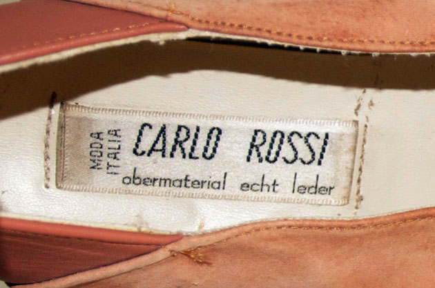
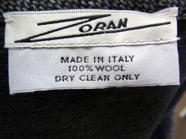
When a class of Fashion Marketing & Communication students got the question of what first comes to their mind when thinking of the phrase “Made in Italy”, most of them answered quality, followed by other affirmative expressions. The following question, if a label spelling Made in Italy today brings out the same favourable words with the same level of certainty, got a more inconsistent reaction from the group. The matter is, as of today, does a label promising Made in Italy truly equal high-end quality?

It’s a fact that the Italian craftsmanship and production quality have had a rough ride during the recent years, and questions regarding what actually constitutes Made in Italy have been intensely discussed. Renowned and prestigious fashion houses, such as Gucci and Fendi, are trying to keep up with their legacy, sustaining the quality level and maintaining the reputation as true Made in Italy companies. By the end of 2010, Fendi published the book “The Whispered Directory of Craftsmanship: A Contemporary Guide to the Italian Hand Making Ability” and on Gucci.com the visitor can find a section dedicated to the subject, communicating their focal point; “Made in Italy is an integral part of the essence of Gucci and goes beyond being a mere slogan.” Part of the problem lies in the fact that many brands have moved a great deal of the production overseas, while keeping the label marking “Made in Italy”. Borders are being pushed and the difficulty lies in determine how big part of the goods have to be manufactured in Italy to earn the right for the label.


Further hitches have been found for example in the situation of Prato, the famous Italian production district. In the late 1980’s, Chinese labourers began to settle down in this little city, right outside the legendary fashion city Florence, transforming the textile centre into a fast-fashion and low-end production area. Today Prato holds more than 3000 businesses using Chinese workers to produce low-end garments, shoes and accessories. Materials are often imported from China and products are sold through mid-price and low-end retailers. The line between Made in Italy and Made in China has become very fine, and high-end manufacturers are having a hard time competing with the Chinese factories’ low prices.

In the middle of this discussion it is refreshing to discover young, small companies who still have the inspiration and boldness to start up Made in Italy businesses. These are creative young people who are taking their Italian heritage with them into the future. Organizations such as Mad in Italy and Cento per cento Italiano are actively working to protect the status of Made in Italy. The question that we find important for the future is what we want to do with this legacy. Protect it, or protect and re-launch it in a way that is adaptable to how the market is looking today. Is Made in Italy a label, or is it a concept and a way of thinking and feeling “I wear quality”?

Lisa Olsson Hjerpe – Photos courtesy of HALO Labels


Share: Facebook,  Twitter  
13/12/2011

Where They Create by Paul Barbera – Book Launch

.

Where They Create by Paul Barbera – Book Launch

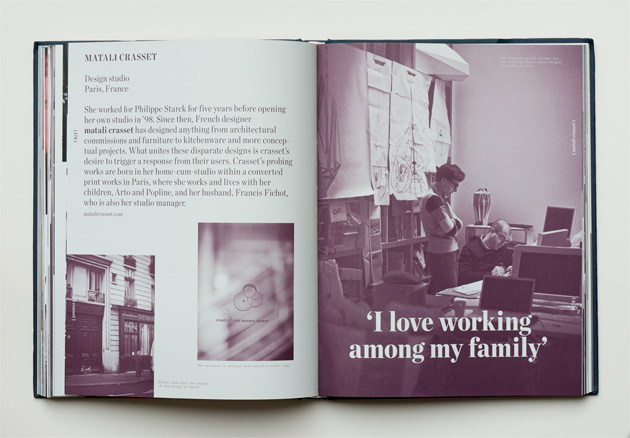
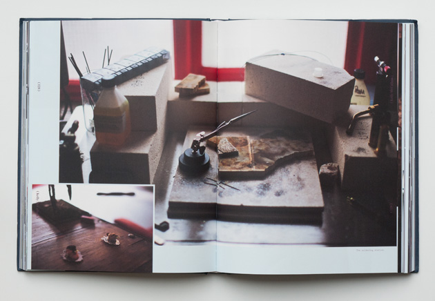
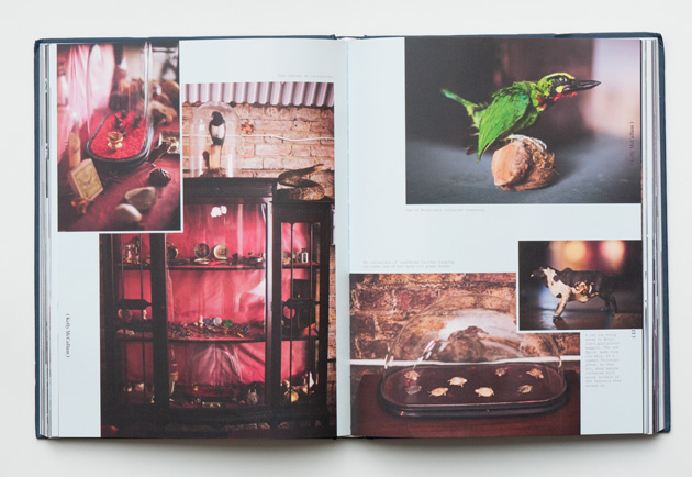
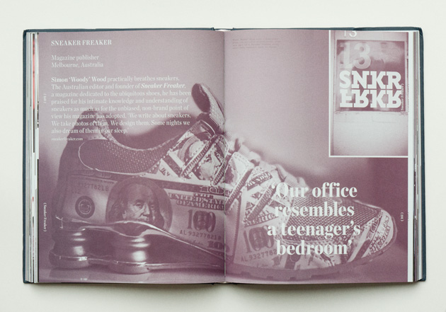
Does space influence the way people work? This is the issue behind Paul Barbera’s project that documented, through images and interviews, creative working spaces all around the world. With Where They Create, the Australian photographer – who started taking pictures of interiors almost by accident: “it’s the thing I do without thinking” – changed his voyeurism into a sort of anthropological research. Looking for absurd and hidden things, Barbera entered 32 studios of international creative people – artists, AD, architects, designers, stylists, editorials – and captured all the details of their personal stories and artistic processes.

From Wallpaperand Fantastic Man studios to Matali Crasset design space, Olaf Breuning’s atelier or fashion house Acne (and many more), the Australian photographer peeked into different places with their peculiarities: organised, chaotic or dominated by a chaotic order, empty or with people working, sober or recalling a teenage bedroom.

Barbera’s curiosity, naturalness and good eye for interiors, together with his ability to transmit emotions and warmth make this project unique. Creatives need to transform their offices into intimate spaces (like a home), and to keep his/her own things close to be able to create. Other could work anywhere, travelling with the bare essentials as does Paul. But everybody, even if for a while, leaves personal traces, aspects that don’t pass unnoticed… if you are able to catch them.


Initially thought only as a blog, Where They Create turned into a book thanks to the interest of Frame Publishers.

Presented in NY on September 2011, this sort of diary will be presented in Italy, for the first time, at DesignLibrary (via Savona, 11 Milano) on December 14, from 6 to 10pm.

Monica Lombardi – images courtesy Frame Publishers

Share: Facebook,  Twitter  
19/07/2011

Fashion Illustration/Naja Conrad Hansen

Fashion Illustration/Naja Conrad Hansen

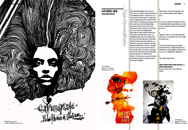
Artist, designer and fashion illustrator, 2DM’s Naja Conrad Hansen has been quite the busy bee as of late. Not only was she recently included among the 200 Best illustrators In The World for the third consecutive year by Lürzer’s Archive, Naja’s work has been making waves in commercial and editorial circles the world over for quite some time now. Her uniquely seductive, yet approachable style is steadily making her one of the most sought after illustrators in fashion. And if the growth in her her body of work over the last two months is any indication of her future trajectory, this could not ring any truer…


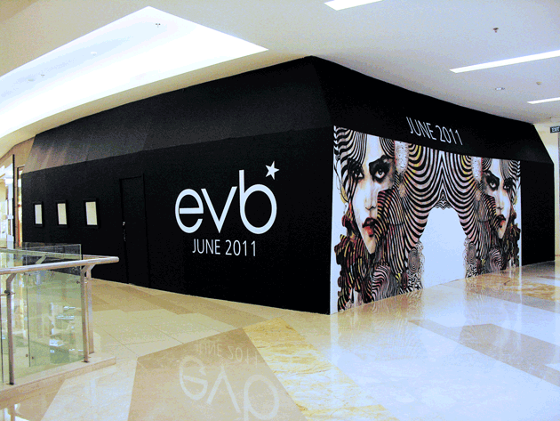
Recently Indonesian shoe brand EverBest sought some of the artist’s charm for the design of their latest store lunch in Jakarta. Pure, beautiful and spunky as ever, Naja’s art brings this new store in Gandharis City to life. But probably the biggest feather in her cap is the recent illustration she created for Spin magazine. The latest Lady Gaga issue the go-to music magazine released on the iPad features a one of a kind Naja Conrad illustration of the starlet.

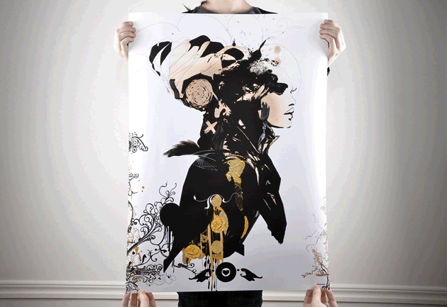
From pokerfaced pop powerhouses to absolute darkness, Naja’s art seems to cover it all. Under the tagline “Is It Dark Yet?” Naja is also exploring the haunting depths of the colour black for a collectable poster. The funky poster is now on sale at artypeople.se, the hot Swedish arts portal.


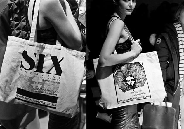
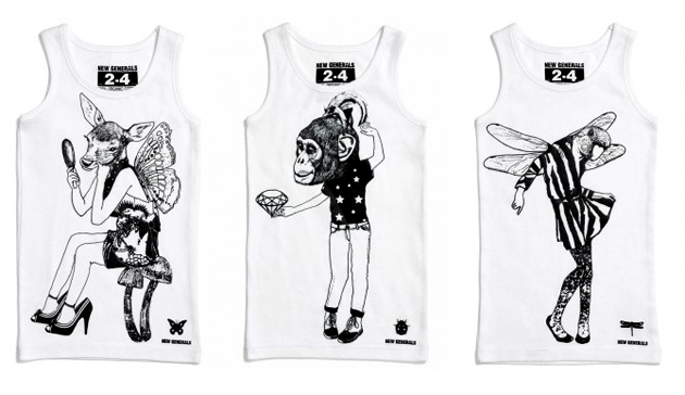
And to top it off, attendees at London Fashion Week got a special slice of the artist as her designs were featured on goodie bags from designer Aza Zanditon and Six Magazine. Now out with her own t-shirt line Meannorth, the artist has sealed the deal, making her one powerhouse of multifaceted creativity.

We’re big fans, Naja. Now, what’s next?

Daniel Franklin 

Share: Facebook,  Twitter  
11/07/2011

The Editorial: Trash Handcraft Treasure / Mexico

The Editorial: Trash Handcraft Treasure / Mexico

Mexican drugstores don’t sell rolls of film. Nice digital cameras, probably. But rolls of film, not so much. When you ask, shopkeepers seem always to give an expression that says “why on Earth would you still have any need for that?” It’s a surefire sign that the country is still pretty far from the cultural hegemony of hipster that we wondered about in May’s A Mexican Hipster & Her Acapulco Bike. Mexican culture marches on, as of yet diluted much less than most.

And like in India and China, two other nominally rich countries with exorbitant income disparities, handcraft in Mexico is alive and well. It’s an integral part of the country’s design patrimony – from musical instruments to pottery to hand-woven textiles. And there’s an honest unpretentiousness to all Mexican craft that makes even its cheapest examples something entirely different from the over-adorned, silky sparkly stuff in street markets around the world. Gorgeous hand-painted glassware, embroidered garments, hand-carved sculptures.

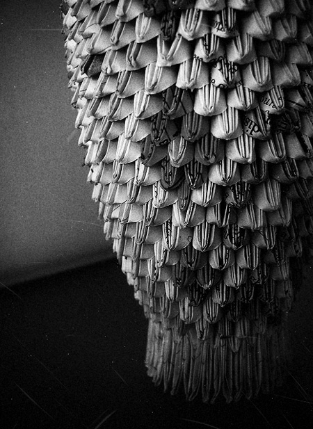
We came across a particularly upbeat artisan who makes elaborate decorative vases out of only scraps of meticulously cut-out paper from magazines. He spends his days creasing, placing, weaving at a table on a pedestrian sidewalk. Making pattern, form, shape and texture from former trash. And for his hours of hard work, he asks for almost nothing – one small piece that might take up to five hours is sold for no more than 3€.

He learned the technique from his father-in-law, but continues to develop it and play with new forms and ideas. Figurines. Perhaps water-tight paper weavings that could hold and keep flowers alive… Oh, possibility! His work has become more complex over time and he’s developed his own “style” (quite different from others who work with similar principles and material). And his trajectory seems uncannily like that of a classic designer-artisan like Lino Sabbatini: learn a material, experiment, then make it your own. Even if he works in as “poor” a material as recycled paper, good craft is good craft. And in a small way that this maker almost certainly doesn’t realise, his work is design.

Still, his son – who sat attentively by his side as we chatted – said he wants nothing to do with his father’s profession. He wants school. Knowledge. An improved life. His father wants it for him, too. And who can blame them? In a country relentlessly caught between rich and poor, upward mobility can be everything. Both of them have no doubt that there will be no paper folding in his future.

But we should hope that future generations don’t allow the tradition of Mexican handmade to fade away. If Mexico follows the pattern of other rich countries as its economic health continues to improve (and hopefully begins to be spread around more evenly), these one-man makers are likely to mostly disappear. But the country’s rich uniqueness is tied closely to these gorgeously lo-fi, refreshingly imperfect and unpretentious objects. They can be every bit as beautiful as a great number of good design pieces, but carry the extra validity of rich cultural context and skilled manual construction.

Their best hope for survival is probably a recognition by the rest of the world of their charm and distinctiveness, perhaps alongside a selling structure that would allow their makers a bit more to get by on. With a new generation of extraordinarily talented Mexican designers, artists and thinkers eager to steer a fresh course for their country’s cultural patrimony and place in the world, the question of handcraft’s should be a rather interesting one to tackle…

Tag Christof

Share: Facebook,  Twitter  
07/07/2011

Kenneth Grange / Design Museum London

.

Kenneth Grange / Design Museum London

Anyone even remotely interested in design knows Jasper Morrison. Tom Dixon. Zaha Hadid. Philippe Starck. But as talented as they all are, they are celebrities before they are designers. Rockstars. That’s why everyone knows them – not because they’ve managed to transform the world. (Check out Design Observer’s fantastic article “The Poverty of Starchitecture” for some interesting perspective.) Kenneth Grange, on the other hand, has worked for decades in relative obscurity yet has probably impacted lives more profoundly than any other designer of his generation (especially if you find yourself in Grange’s home country of the UK).

It’s easy to take for granted that everything in our built environment was designed. Everything from the Jonathan Ives-designed computer you’re probably reading this on down to more institutional things such as the sturdy benches lining your local park. Those things, like the park bench, which hide in plain sight are arguably the most important designed objects that make up our built environment. Endlessly more than the conceptual, witty, exquisite “design” trinkets we all-too-often think of as design, these things actually have shaped our lives.

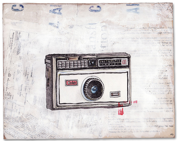
This month, Design Museum London is at long last opening an exhibition on Grange and his long career’s work. And while he doesn’t necessarily have a signature style, his chunky, function-above-all ethic shines through in all of his enduring work. He was the designer of Kodak’s seminal Instamatic cameras, the iconic London Taxi, the Intercity 125 train, and several household appliances like irons and mixers that every British household once (and sometimes still) uses, as well as postboxes, park benches (!), computer monitors and others. He even designed the UK’s first parking metres (which must be why he never reached star status…). Oh yeah, and he co-founded the Holy Grail of design firms, Pentagram.

Opening July 20th at Design Museum London, and running through October 30th. Not to be missed!

Tag Christof – Images courtesy Sprungseven & Olivier Goupil

Share: Facebook,  Twitter  
01/07/2011

Direktorenhaus / New Textile Craft

Direktorenhaus / New Textile Craft

Next Tuesday Direktorenhaus will present a fresh exhibition of textile works. We last visited Direktorenhaus in November during Illustrative, and in the spirit of that event “New Textile Craft” is to be a celebration and exploration of a particular craft. New technologies and the the revival of old techniques has breathed new life into the medium, and it is showing enormous potential as a creative canvas.

It will be the first time Berlin outing for designers Signe Emdal from Copenhagen, Hao-Ni Tsai of London, Ruth Duff of Glasgow and Izumi Sato of Stockholm. It’s being called a labyrinthine “wintergarten of knitted materials, woven textiles, organic objects and hand-stitched fabrics – sounds lovely!

Opening party on Tuesday, July 5th starting at 8:30pm with DJ Siopis and Kyros, with the exhibition running through the 30th. (And since it’s during fashion week, it’s running alongside the Fashion Week Opening Party at Münze Berlin next door!) If you’re in Berlin, the event is not to be missed!

From the Bureau 

Share: Facebook,  Twitter  
30/06/2011

Wheel Of Nutrition

.

Wheel Of Nutrition

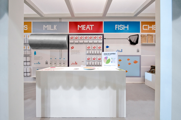
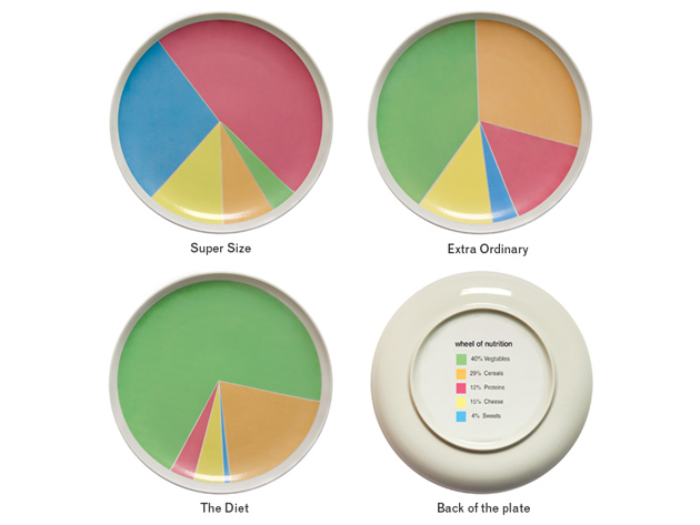
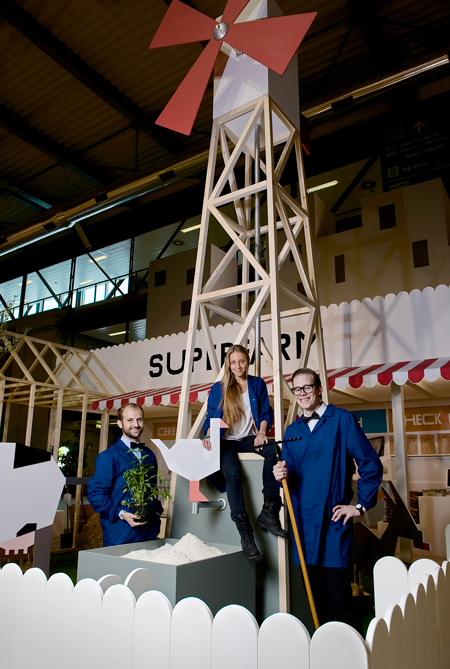
We first came across Wheel of Nutrition at this year’s Fuorisalone as part of the excellent Superfarm project. A novel and deceptively simple idea, Wheel of Nutrition is a plate whose pie-chart decoration makes for a clever dietary guideline and game. While it might seem counterintuitive that a straightforward graphical solution can compel change, designers have recently found, for instance, a huge behaviour-bending potential with engaging graphical interfaces to encourage drivers to use their cars more economically (driving becomes a race to ‘green’). So, it stands to reason that when a meal feels like a game, there is increased incentive to eat according to the rules. And because the plate’s guidelines are more a playful suggestion than a forced imposition, the fun of eating remains fully intact.

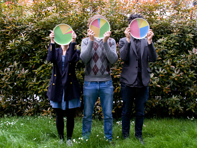
As diabetes and obesity ravage both developing and rich nations, the imperative to create creative, engaging solutions for the world’s dismal eating habits is intensifying. Designers Rui Pereira and Hafsteinn Juliusson (whose intriguing growing jewellery we saw at Instant Design in February) in collaboration with Joana Pais, who are behind the plate (and Superfarm) are leading a charge for their generation. With Wheel of Nutrition, they’ve had very positive feedback from around the web, and the plate has even been given the thumbs-up by nutritionists and doctors. (Well done!)

And in a rare feat for a design introduced at Fuorisalone, Wheel of Nutrition is going into production in Diet, Extra-Ordinary and Supersize. The designers will get their hands on the first factory prototype by weeks’ end, and beginning in September it will be produced in Portugal and distributed by Iceland-based HAF.


From now on, it’s definitely okay to play with your food.

Tag Christof – Images courtesy Rui Pereira and Superfarm

Share: Facebook,  Twitter