13/04/2012

Delfina Delettrez – Metalphysic

Delfina Delettrez – Metalphysic

We’ve seen and fallen for the jewelry work of Delfina Delettrez, the globetrotting fourth-generation Fendi, on The Blogazine before. But as the seasons tick by, her uncommonly intelligent and sophisticated brand of design always manage, however impossibly, to turn up the wow factor. Each collection is boldly, drastically different from its successor, as well as both subversive and beautiful.

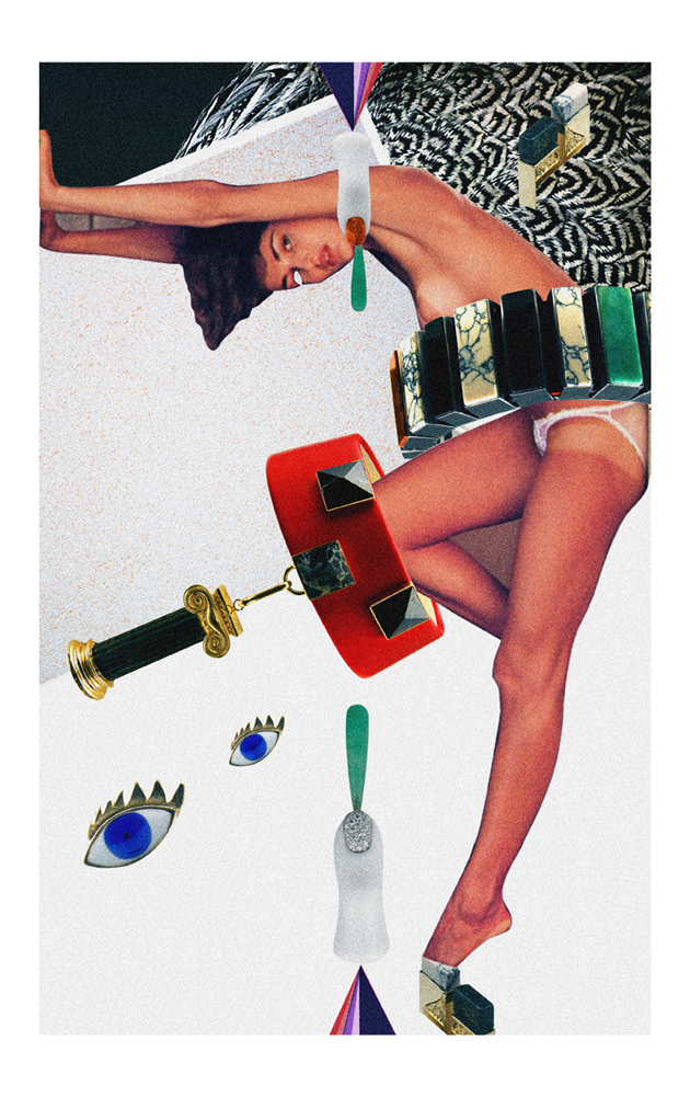
This newest collection, called Metalphysic is Rome in jewel form. “Metalphysic celebrates the miraculous architecture in Rome’s churches and palaces from antiquity and the modern day, blending these two radically different eras. The neoclassicism of Canova and Piranesi combined with the intriguing metaphysics of Giorgio De Chirico.” And in spite of the usual grandiose marketing speak, we really do see it – the pieces not only look say “Rome” through their shapes and compositions, they also make fantastic use of materials not generally used in jewelry to solidify the image. By going back to her Roman roots, Delettrez has mined some powerful inspiration to imagine a collection that we daresay might be her best yet.

For the occasion of the new collection, 2DM’s illustrator Diego Soprana went way Dada for a collaboration with Delfina. Soprana’s trademark style proves a perfect match for Metalphysic, bringing out its Romanesque character while injecting it into a canvas charged with absurdity and decadence: a perfect foil to the collection’s rigorous neoclassical/metaphysical bent.

Excellent job, Delfina and Diego!

Tag Christof – Images Diego Soprana

Share: Facebook,  Twitter  
10/04/2012

DIY – Can We Make It On Our Own?

DIY – Can We Make It On Our Own?

There’s no need to say that the modern man is a lazy beast. While our brains are getting more and more fuzzy, our hands are becoming a mouse shaped claws. While our lives were getting more and more comfortable, we were left our homo habilis nature sink into oblivion. While our fathers were able to build houses from scratch, we get anxious at changing a lightbulb. The materialist culture has taken away our autonomy, depriving us of the happiness only crafting things with our hands could bring.

The recent ‘revival’ of DIY culture is only a myth or pure fashion, as we still rush to Ikea as soon as we need a simple shelf or a working desk. Even though probably we are all fed up with the DIY preaching, it doesn’t seem to have taken real effect on us. As the spring cleaning sessions have already begun, it should be important to remember that you can actually re-use stuff we want to get rid of and maybe even make something by ourselves.

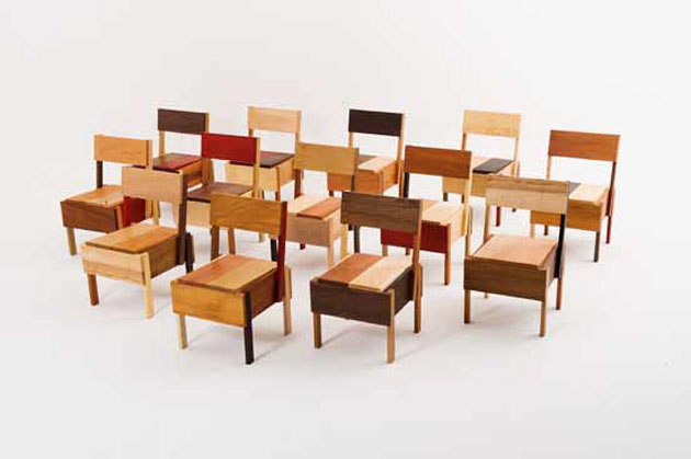
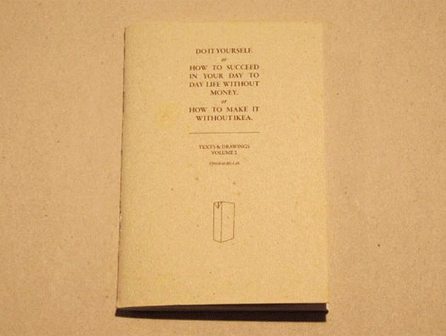
Among the endless DIY book list, there are three we feel you should be looking at. The first in order of appearance, given its recent publication, is Thomas Bilass‘s “How to Make it Without Ikea”. The second volume in the series isn’t that much about actual practical advice, but more about teaching us how to think outside the box, doming our materialist impulses and rethinking our daily routines.

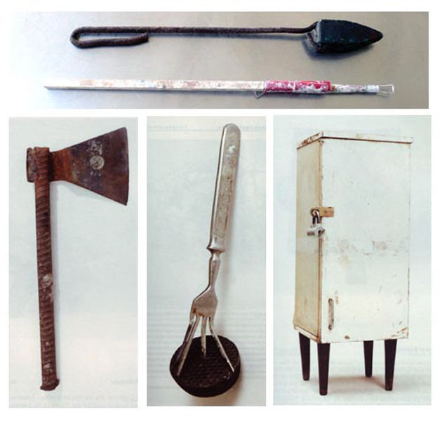
Scaling up on the list, we can’t but remember Vladimir Arkhipov‘s “Home-Made: Contemporary Russian Folk Artefacts” book. The russian collector has gathered an enormous archive of anonymous objects that people made for themselves, conditioned by limited resources and an overabundance of problem-solving spirit.

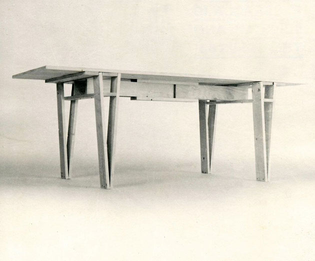
Last but not least, even though you might have it over the top, Enzo Mari‘s “Autoprogettazione” can’t be left out. With the recent “Autoprogettazione Revisited” and “Autoprogettazione 2.0″ (to be presented this year during the Salone in Milan) it remains a true Bible. Not only because of the quality of Mari’s projects, but because its true intent was building awareness regarding the process of design while crafting these beautiful objects.

Arrived at this point, we cannot avoid quoting Richard Sennett: “craftsmanship names the basic human impulse to do a job well for its own sake, and good craftsmanship involves developing skills and focusing on the work rather than ourselves.”

Rujana Rebernjak

Share: Facebook,  Twitter  
03/04/2012

Richard Hollis- A Lifetime of Visual Storytelling

Richard Hollis- A Lifetime of Visual Storytelling

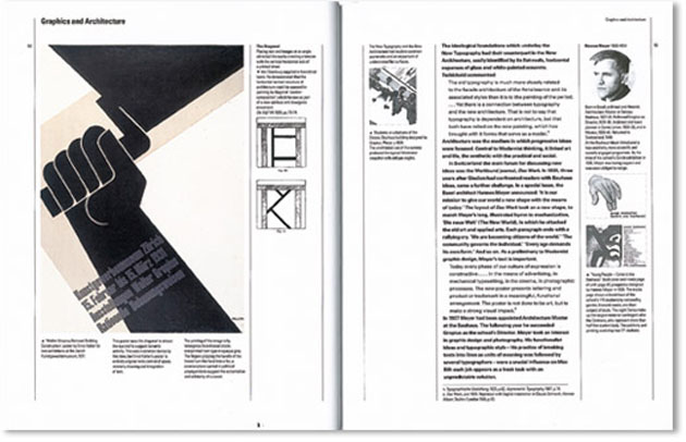
Richard Hollis is one of the first names you hear when studying graphic design. “Graphic Design: A Concise History” is one of those treasures young graphic designers hungrily soak in. Even though each generation of designers tend to rediscover the book year after year, its author, Richard Hollis, has been on the scene for more than fifty years.

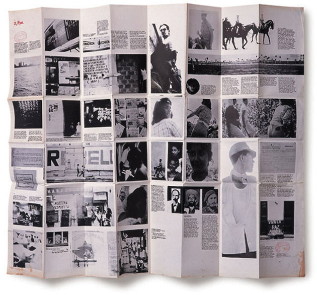
Starting as a part of John Berger‘s team that transformed the well known television show into “Ways of Seeing” book, Richard Hollis has become an absolute genius in storytelling with words and images. It may come as a banality speaking about graphic design, but Hollis’s layouts have actually made generations more aware of how much politics can be hidden in even the most ingenuous image.

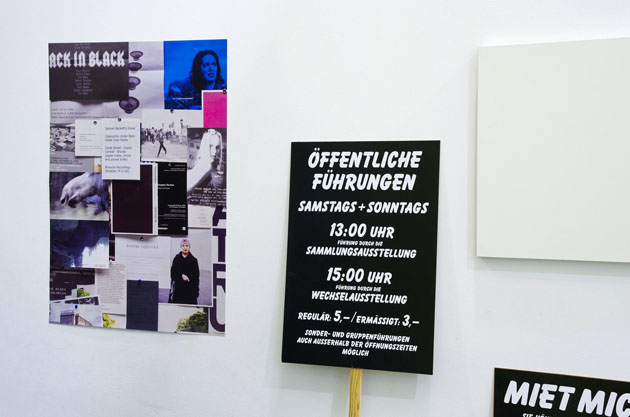
Having chosen anonymity in a world of design superstars, Richard Hollis has never been properly appreciated. Fortunately Emily King, the wittiest of design historians, has dug into Hollis’s archives in search of these overly disregarded gems to be put on display in a show curated for the Gallery Libby Sellers in London.


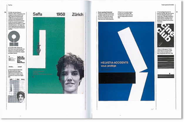
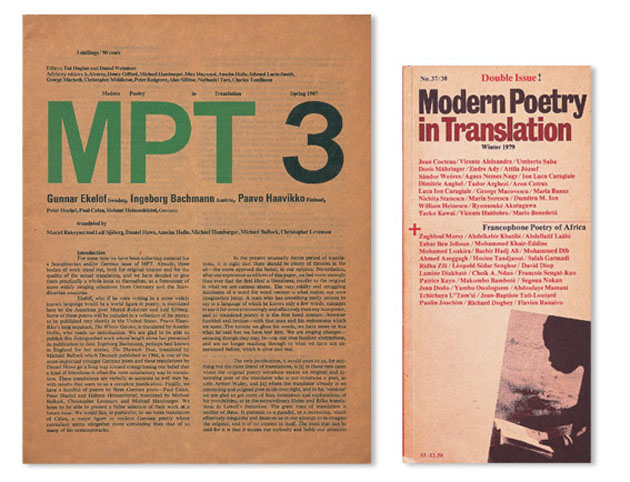
After what must have been a demanding but gratifying work, the author-curator pair pulled out more than hundred items from Hollis’s prolific career. Besides the above mentioned cornerstones of design and art critics, in half a century of work handling words and images, Hollis has produced catalogues, flyers and posters for the Whitechapel Gallery (from the late sixties to the mid eighties), graphic work for artists Steve McQueen and Bridget Riley, as well as work related to radical politics of the 60s and 70s and those developed during his travels to Cuba, Zurich and Paris.

The show, running until April 28th, is being accompanist by the book “Writings About Graphic Design” published by Occasional Papers. Collecting a comprehensive selection of Hollis’s essays, interviews and texts is due to become a new textbook must.


Rujana Rebernjak

Share: Facebook,  Twitter  
28/03/2012

The Editorial: Robin Hood Gardens, Modernist Murder

The Editorial: Robin Hood Gardens, Modernist Murder

Modernism, especially in brutalist form, is an understandably misunderstood beast: its unfriendly concrete and absolutely unadorned exteriors are lightyears away form classical notions of beauty. Its major works are relics from a simpler time, when it was believed that human behavior could be easily influenced, predicted and planned for. And while many were poorly executed dilutions of their grand ideological underpinnings, others remain supremely important places that despite their controversy are key pieces of world architectural patrimony: more than Stonehenge or the Sydney Opera House, they are important because they reveal deep truths about the realities of human society.

Robin Hood Gardens, a social housing estate in London’s Poplar neighborhood designed in the 1960s by Alison and Peter Smithson, is a prime example of just such a place: its design was remarkably innovative and still distinctive and had a huge impact on successive architecture. And in a blow to the design community around the world, its definitive demolition was announced just this week. The news comes after a drawn out battle between a local council strapped for money and eager to shed its ghetto image and many prominent voices such as Zaha Hadid within the architectural community who have been outraged at the prospect of its demolition. The place was even a subject of a book, Robin Hood Gardens: Re-Visions, in which several practices pitched in ideas for its renovation and preservation.

But today in London, with the exception of the Barbican, the Commonwealth Institute (slated to become the Design Museum‘s future home), the Goldfinger towers and a small handful of others who have managed to achieve “protected” status, Robin Hood Gardens is now among many major modernist sites that are systematically being demolished to make way for other, less-offensive and less visionary projects meant to solve urban problems as cheaply and unremarkably as possible.

Still, the overwhelming truths about places like these have been well documented. From Pruitt-Igoe’s colossal failure in St. Louis, Missouri to the continued plight of South London’s rotting, crime-infested Aylesbury Estate and the notorious United Nations Plaza in San Francisco, gang violence, disproportionate poverty and blight all seem to be the standard aftermath of modernist solutions to urban problems. Apart from those which have been heavily gentrified and/or colonized by architectural connoisseurs like the Barbican and, more recently, Trellick Tower, the places are just dismal. Peter Pan Gardens is no exception: it is today in a shambles, with tons of blown-out glass and its lower floors entirely boarded up. But that’s a product of decades of neglect – what would these spaces have become under better circumstances? Perhaps models for an equally optimistic 21st century modernism?

It’s no great wonder that many want these places demolished, but it’s a nevertheless a shame that the grand ideas will be destroyed to make way for anonymous cookie cutter houses. But in the end, architecture’s role in society is that of open-minded innovator rather than sentimental preservationist. But I just can’t help but believe that many of these these last, iconic, exotically beautiful brutalist spaces can’t be preserved and responsibly updated. They could stand for centuries as reminders of the last time we humans fancied ourselves all-powerful creators…


Tag Christof – Images courtesy ArchDaily

Share: Facebook,  Twitter  
27/03/2012

Uglycute: Questioning Modernism
Uglycute: Questioning Modernism

If somebody mentions Scandinavian design, you’ll surely be picturing its most prominent modernist examples. Born after the second World War and ideologically based on a particular form of social democracy, Scandinavian modernist design stands for simplicity, functionality and equality. If we take these premises into account, modernist design can’t simply be considered as a stylistic etiquette, on pare with other twentieth century -isms. It should actually be thought of as a forma mentis – a way of thinking that goes beyond any stylistic classifications.

Although this approach to design, promoting low cost materials and mass production, characterized by simplicity of form and pursue of functionality, might seem infallible, it did come to a crisis. Without even realizing it, around 1990s, Scandinavian design forgot its forma mentis and got lost in stylistic mannerism, thus openly inviting for criticism.
This apparently invisible call for renewal was caught by a group of four young creatives, that started their career in 1999 with a show mocking Bruno Matthsson‘s design. The group named themselves Uglycute and the creatives are respectively Andreas Nobel, interior designer, Fredrik Stenberg, architect, Markus Degerman and Jonas Nobel, artists.
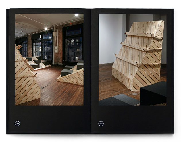
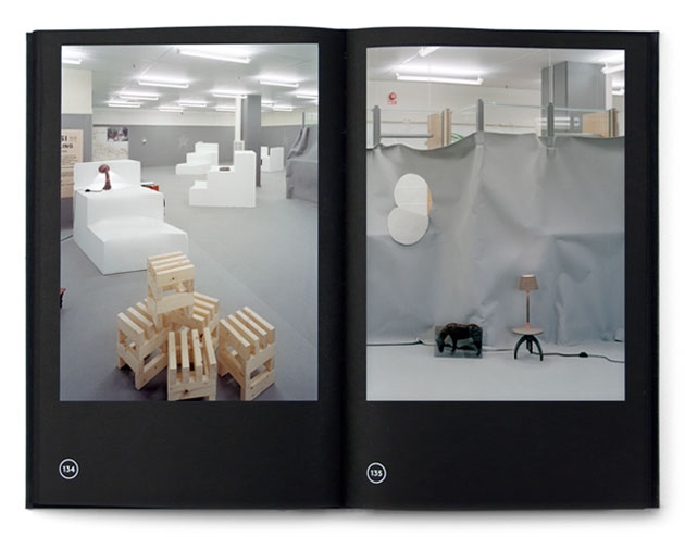
Even though their different backgrounds may seem a sheer coincidence, Uglycute actually bases its practice on the idea of expanding the concept of design by crossbreeding it with different disciplines. This approach is being manifested through a series of edgy projects that question the common idea of form, beauty, proportions and materials in design. Uglycute tries to put a particular accent on the production process, questing for value in the most common objects and materials. Even though their chunky furniture and exhibition design might seem subversive and postmodernist, if you manage to capture the processes and meaning underlying each of their projects, you should catch more than a glimpse of modernist spirit.

Although it may have started as a young designers’ utopia, Uglycute’s work has through time grown into an impressive list of projects; to name a few: Cheap Monday headquarters’ interior design, exhibition installation for Onomatopee project space in Eindhoven, furniture collection for Kiosk shop in New York and “Sonic House” project for Utopia Station at Venice Biennale in 2003.
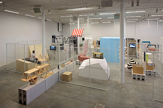
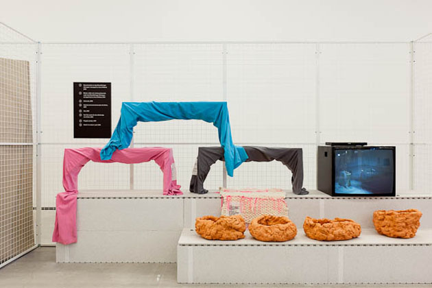
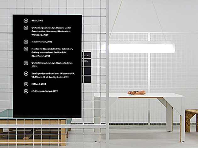
If their initial intent might have been shaking things up in the sleepy Sweden, seeing their retrospective at Marabouparken art gallery in Sundbyberg, you can’t but think that things got a bit out of hand. A 500 square meet maze-like exhibition not only shows their highly ironical and almost rebellious way of working, but also offers the opportunity to question the dogmatic separation between art and design and their respective social and political influences.

If Sundbyberg seems out of reach and you can’t make it to the show (running until the 13th of May), you should at least spoil yourself with “Uglycute” catalog, carefully designed by Research and Development and published by Revolver.
Rujana Rebernjak
Share: Facebook,  Twitter  
20/03/2012

White Zinfandel

White Zinfandel

When speaking about White Zinfandel, the last thing that would come to your mind is that the name was the first random thing its founders came up with. Fortunately, the casually chosen name was a too special foreplay to be wasted on a sloppy project.

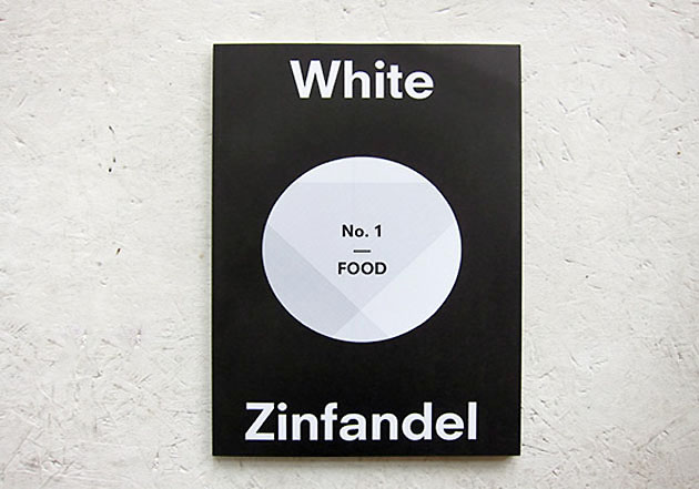
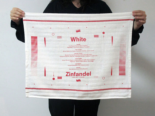
White Zinfandel is a New York based magazine founded by Jiminie Ho (the mind behind W/– project space) and Dominic and Chris Leong (of Leong Leong Architecture), after a series of fortunate coincidences, of which the first one was obviously the name itself. This self-styled magazine explores the visual manifestation of food and culture produced within the lives of creative individuals through a variety of media and means of expression. Each number is based on a culturally or historically relevant menu interpreted by various creatives.


To underline the boldness of their intentions, the editors dedicated the first number of White Zinf to Food, the SOHO restaurant from the 70s founded by Gordon Matta-Clark, Caroline Goodden and Tina Girouard.

The second number, issued past december, was called “TV Dinners”, paying a hommage to the simplest and most common American dining habit. As combining high and low profile content is one of White Zinf‘s stronger sides, the apparently simple subject evolves in a surprising product. Therefore some of the articles are “Searching for Rirkrit” by Pete Deevakul that feature the artist Rirkrit Tiravanija‘s portraits made out of food or abstract compositions made with steaks by Ruby Sky Stiler. Besides the witty articles and enviable artists’ collaborations, each issue of White Zinfandel is comprises an equally important dinner party, that celebrates the menu the magazine itself was based on.

After Gordon Matta-Clark’s “Food” and “TV-Dinners”, two themes that couldn’t be more different, we can’t but eagerly expect what will the threesome produce in their next issue. Just another reason why we can’t wait for summer to come!


Rujana Rebernjak

Share: Facebook,  Twitter  
13/03/2012

Studio Formafantasma at Designs of the Year

Studio Formafantasma at Designs of the Year

Every year around April the global design community freaks out. As Salone del Mobile approaches steadily and inevitably, we can’t avoid asking ourselves a few questions. Are these hundreds of fairs taking place each year, where Salone is the most prestigious one, really necessary? If one of design’s fundamental premisses is sustainability, how can these fairs be justified?

While the Salone fever is getting wilder and wilder in Milan, Design Museum in London is hosting quite a different event. During the first week of February the nominees of the annual “Designs of the Year” award have been shyly presented. Sorted up in seven categories (architecture, digital, fashion, furniture, graphics, product, transport) this year’s nominees have all an extremely socially aware and technologically experimental character in common, which differs considerably form designs appraised each year during the Salone.


Among the other eighteen nominees in ‘product’ category you can find a name that may ring a bell: Studio Formafantasma.

Formafantasma is an Italian design duo, Andrea Trimarchi and Simone Farresin, that was formed and is currently based in Eindhoven, Netherlands. Formafantasma has been nominated for the award for their project “Botanica” developed in 2011. “Botanica” is only the latest creation in a series of projects, developed after their graduation from Eindhoven in 2009, that address the following issues: “the role of design in folk craft, the relationship between tradition and local culture, a critical approach to sustainability and the significance of objects as cultural vectors”.

Hence, “Botanica” explores the possibility of producing natural polymers extracted from plants, as if the oil era has never existed; “Autarchy” proposes a series of objects made from a bio-material composed of flour, agricultural waste and natural limestone, further developing their previous project “Baked”; “Moulding Tradition” explores the importance of craft in witnessing the past.

MoMA‘s senior curator Paola Antonelli has already declared Studio Formafantasma one of the most important designers of the 21st century. Hopefully someone will take note for this year’s Salone. We’re keeping our fingers crossed!

Rujana Rebernjak – Images courtesy of Formafantasma

Share: Facebook,  Twitter  
08/03/2012

A Generation in Motion: The Ungovernables

A Generation in Motion: The Ungovernables


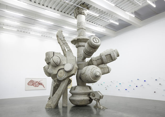
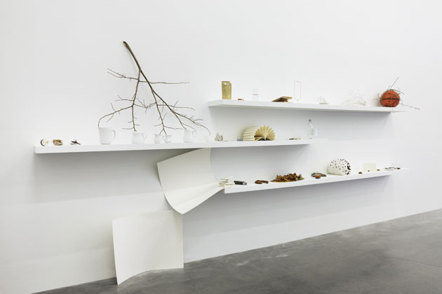
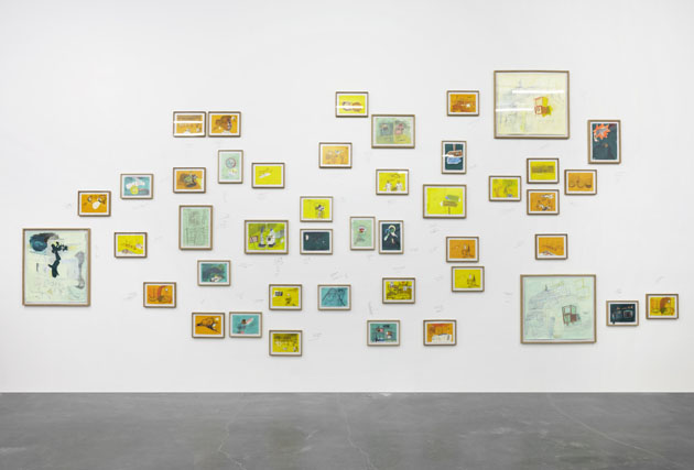
“The Ungovernables” does its best to define the intentions of a generation (X) that, for all intents and purposes, grew up in the shadow of its baby-booming parents. That this new showcase comes while Gen X is in the midst of paying for the baby-boomers’ missteps is no small irony, and the mood here captures the sentiment well: The whole giant heap of mismatched work on display can be seen as an effort to blow-up that looming shadow. The results are fun to watch in a oh-my-god-did-you-see-that-crash! kind of way, but would you expect anything less from a group that brought you Nirvana, the Macarena, and Cher’s first number one hit in 24 years? Me neither.

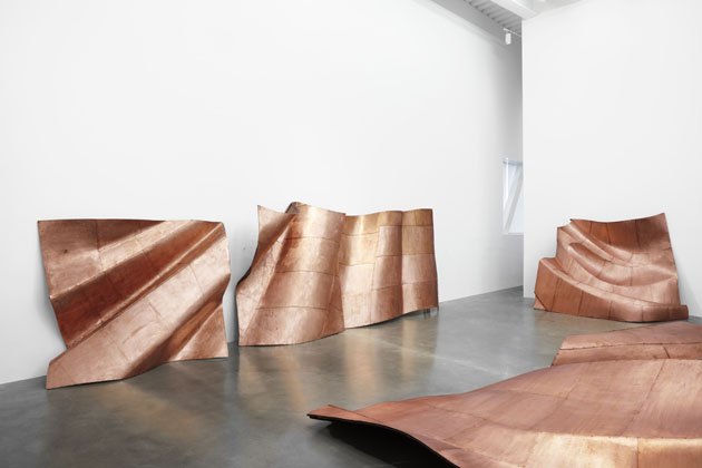
Being the doomed/undervalued generation they are, the works on display largely box around the concept of decay (most notably Adrián Villar Rojas’ sculpting work, which takes up nearly an entire floor), with a calculated optimism―one that doesn’t seem quite ready to take itself seriously―splashed on top for good measure. The only common thread here is a shared sense of confusion, and “The Ungovernables” has plenty of identity crises to latch onto. Danh Võ’s “We The People” strips the Statue of Liberty of its history and its symbolism, focusing instead on recreating the copper panels that gave it shape. Jonathas de Andrade’s “Ressaca Tropical” (Tropical Hangover) uses a found diary to paint a strangely intimate picture of a conflicted youth, so much so that you fail to notice the voyeuristic overtones that run through the work.

But it’s Brian Bress’ “Status Report”, a short film that finds the artist struggling to do everyday tasks while dressed in absurd outfits that beg for attention, that best sums up the current universal sigh: “Because it’s the depression.” His film is a brilliant piece of black comedy, an obvious highlight (the curators must of known: It nearly takes up the entire basement), but he’s not certainly alone in his disassociation with the world around him. In this day and age you’d have to be deaf and dumb not to relate.

Cinthia Marcelle’s “O Sécula” (The Century) features trash―tires, fluorescent bulbs, barrels―being methodically thrown on the street for five minutes. Anyone who lives in New York knows this is a significant part of one’s daily routine. Hassan Khan’s “Jewel” was one of the few things that had an actual pulse, mixing paranoid Cairene music against a backdrop of flashing black-and-white images. You could hear the frantic drumming from deep in the stairwell; by the time you got to the room you could barely control your own body. I got stuck in there against my own better judgment for 20 minutes, until one of my friends came in and slapped me back to my senses. “The exhibit’s closing in fifteen minutes,” he told me. “We have to leave.” I shook my head in agreement, though more confused than ever―a fitting epitaph for our generations’ ramshackle statement of intent.

A Generation in Motion: “The Ungovernables” at New Museum, through April 22nd

Lane Koivu – Images courtesy of Benoit Pailley

Share: Facebook,  Twitter  
06/03/2012

Zak Kyes working with…

Zak Kyes working with…

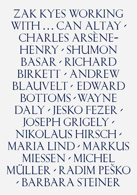
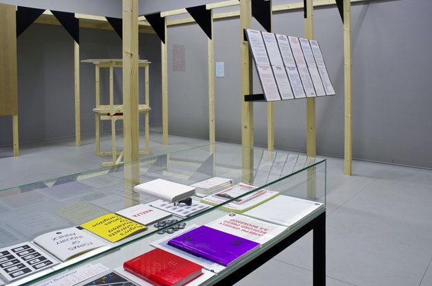
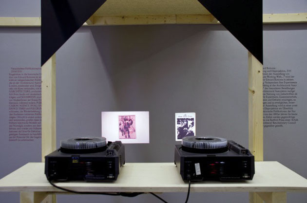
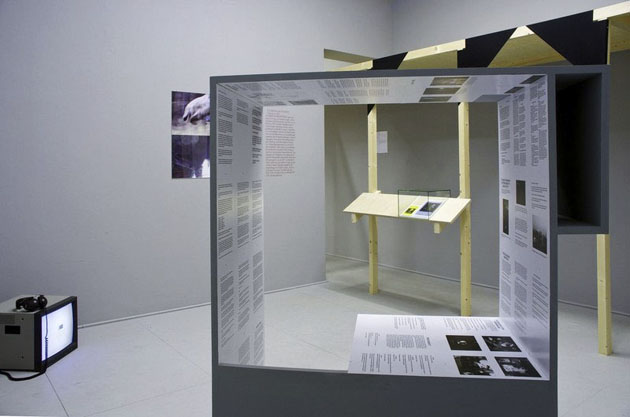
Since becoming art director of Architectural Association at the age of twenty-four, Zak Kyes has done so many incredible works and won so many prizes that counting them might give you a headache. And if you think that having a major retrospective means being at least forty, you are wrong. As the doors of “Zak Kyes working with…” exhibition open, he is still in his twenties. The head spinning show is being hosted by Galerie Für Zeitgenössische Kunst in Leipzig as part of the annual “Inform Award” given to prominent designers that develop work within the context of applied and contemporary art. Zak, who was rewarded with the prize in 2010, has developed the exhibition together with curator Barbara Steiner and a long list of artists and designers. 

More interested in editorial, curatorial and publishing activities, Zak uses graphic design as a medium, a conveyor of content. The type of content Zak is interested in is arising from collaborations between disciplines and practitioners – artist, designers, architects, theoreticians. Citing Zak’s declaration: “The studio’s approach is defined by its active collaborations in ever-changing constellations. The studio is engaged in complex projects that integrate graphic design, publishing, research, strategy and architecture.”


This approach should emerge clearly in the exhibition in course in Leipzig. Conceived as a participatory event, the exhibitions sees involved Can Altay, Charles Arsène-Henry, Shumon Basar, Richard Birkett, Andrew Blauvelt, Edward Bottoms, Wayne Daly, Jesko Fezer, Joseph Grigely, Nikolaus Hirsch, Maria Lind, Markus Miessen, Michel Müller, Radim Peško and Barbara Steiner in production of site specific work, as well as in a series of talks and lectures. The exhibition and the following catalogue (published by Sternberg Press) didn’t only show examples of incredible graphic design work from one of its most interesting practitioners, but also shed light on new kinds of collaborative and highly critical working methods that have become central for contemporary design practice.


Rujana Rebernjak
Share: Facebook,  Twitter  
28/02/2012

Christien Meindertsma Knows Sustainability

Christien Meindertsma Knows Sustainability

Although sustainability has become quite a catchy word when speaking about design, it seems rather difficult to understand what it should actually mean. As the undiscussed master Dieter Rams said already in 1987 “Good design conserves resources and minimizes physical and visual pollution throughout the lifecycle of the product,” it is rather difficult to accept the expression ‘sustainable design’ as a 21st century neologism.

Fortunately not all designers apply sustainability as a marketing etiquette. Christien Meindertsma takes the fact for granted, as an obvious quality of every designed product. Since her first projects Christien has put particular accent on the importance of understanding the whole industrial process, from the recovery of raw material to distribution and the final cost of the product.

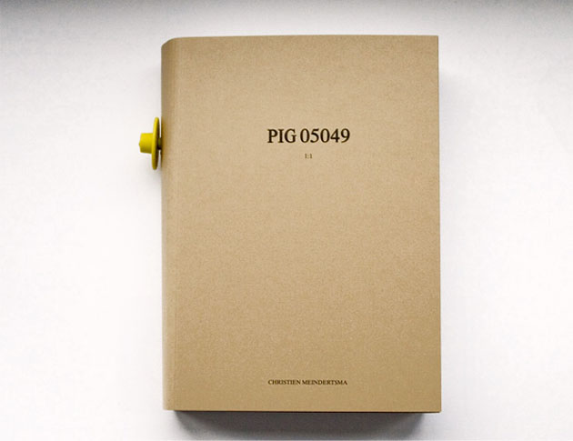
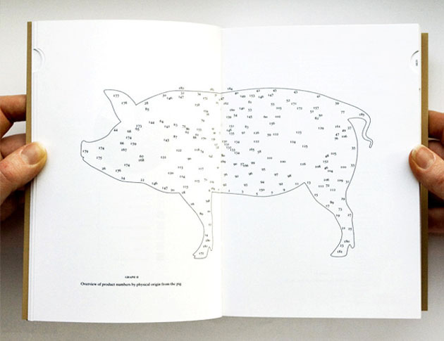
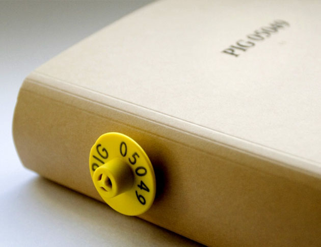
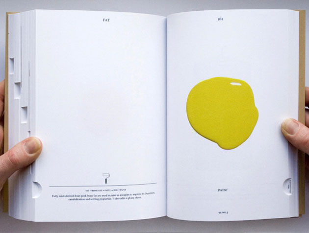
One of Christien’s most acclaimed projects is the book “PIG 05049” that catalogues 185 worldwide products which contained various parts of a single dutch pig. The book can be taken as a manifesto of Christien’s work as she always tries to make visible the link between traditional local production and contemporary industrial design; the relationship often considered taboo in design culture. As Christien declares “I’d like to make transparent the product that also makes sense. It’s kind of a documentary way of designing, and that’s become my working method”.

Taking this path isn’t as simple as it seems, though. Selling locally produced objects often doesn’t walk hand in hand with the capitalist market. In order to avoid that the work of designers like Christien becomes just a utopian dream, while we as consumers should become more aware and finally stop falling off our feet hearing the word ‘sustainability’.


Rujana Rebernjak – Images courtesy of Christien Meindertsma
Share: Facebook,  Twitter