20/11/2012

Offprint Book Fair

Offprint Book Fair

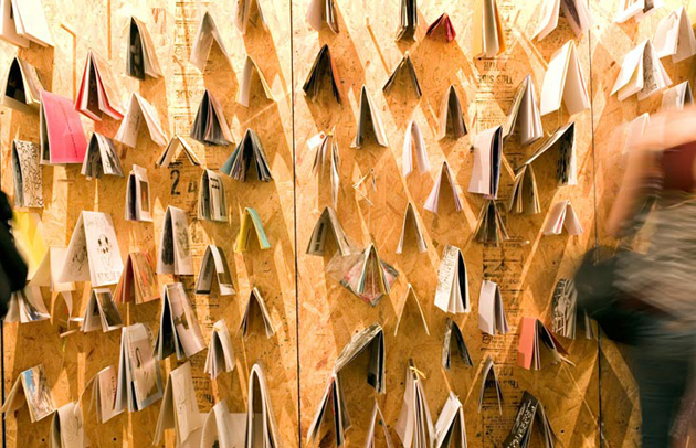
Glossy or rough, hardcover or paperback, black and white or printed in colour: books can take endless shapes and sizes and can contain a myriad of different contents. From Tauba Auerbach sculptural pop-up books to almost dictionary-like ones filled with tiny writing, this historical object still manages to surprise us. For those circling in the contemporary art and design sphere, speaking about independent book publishing and the countless forms it may take (oh, yes, again) may come as a bore. So from here on, you may decide to skip this article or otherwise indulge in another book-lover’s praise.
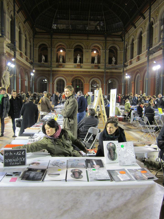
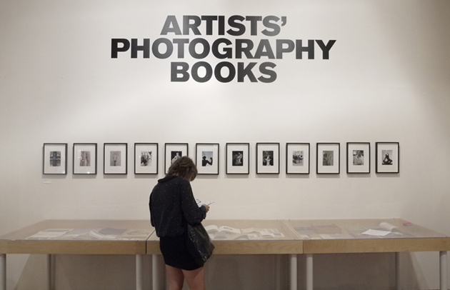
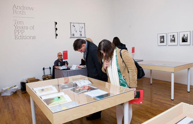
Offprint book fair was held in Paris from 15th to 18th of November in conjunction with Paris Photo, that widely acclaimed international photo fair. Set in a beautiful location, the études hall of Beaux-arts in Paris, Offprint offered the particular setting for confrontation and exchange between artists, photographers, publishers and their passionate public.

Among all the publishers present, we were taken aback by quite a few. The cheerful Mr. Dino Simonett has delighted everyone with the new book by Lucas Wassman. Titled “L”, this large format publication is a real treat for anyone interested photography. Another stand that was always crowded was Mack Books‘ one. They, by the way, have recently re-published Luigi Ghirri’s “Kodachrome”.
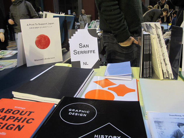
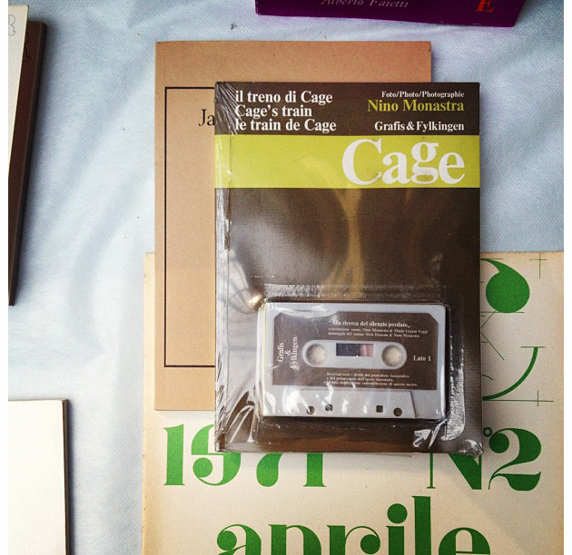
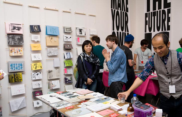
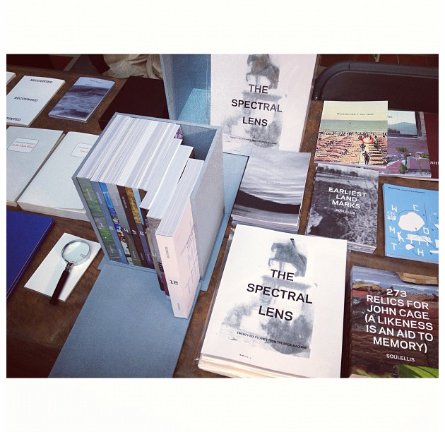
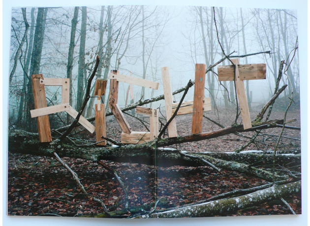
Among other tables you could find extremely rare artists’ books, small fanzines, photography books and graphic design gems. But the most interesting part of Offprint fair wasn’t exactly the large selection of books it presented. It was the last component of the above mentioned book-related rectangle that was particularly surprising for a habitué of independent publishing fairs. Usually visited almost exclusively by insiders – artists, photographers and publishers themselves, this was not the case with Offprint. Crowded with hundreds of people every afternoon, you could see parents with their children, grannies and grandpas, browsing numerous around the stands amongst young intellectuals (otherwise known as hipsters). We heard that France is the only country where print book publishing has been growing even after the introduction of digital publishing. Both this fair and the city itself, crowded with bookshops and libraries, has resolutely confirmed it.
Rujana Rebernjak

Share: Facebook,  Twitter  
14/11/2012

The Editorial: The Ballad is Back

The Editorial: The Ballad is Back

Before Flickr, before the unnavigable mess that is Tumblr, we saw fine art photos primarily in three ways: in galleries, in magazines, and in monographs. Dusty old volumes on messily stacked shelves in art school libraries, lone hardbound bricks proudly displayed on coffee tables. You knew someone with a Mapplethorpe or Ruscha book had style, just like you knew someone with Robert Frank or Ed Weston had taste. Dentists’ offices and old people always had an Ansel Adams lying about, and every shutterbug ever had some bound collection of the same iconic Cartier-Bresson snaps. They were precious commodities, not lest because they normally cost a small fortune, but because they were published in relatively limited quantities and were objects their owners pored over.


And while legions of small publishers, as well as the most culturally savvy big players like Phaidon and Taschen have succeeded in keeping the genre very much alive in the Instagram age, the newer crop of monographs simply cannot escape their time. They are all inevitably web-influenced, sleek, hyper literate collections that lack the clarity, the humble naïveté of their forbears. And while not to disparage the web’s amplification and democratisation of fine photography (we may have never known Vivian Maier without it!), there is something else in those pre-web books that hasn’t been recaptured in recent years.

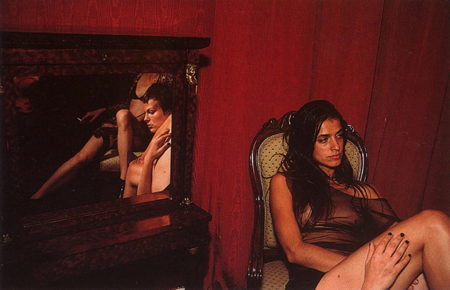
So in a nod to those heady days of yore, it’s with great happiness that we learned of Aperture Foundation’s re-release of Nan Goldin’s Ballad of Sexual Dependency, a fantastic collection of photos if there ever was one. In the short year or so, since I’ve been taking photographs seriously, no other collection has been more useful for inspiration. But my relationship to Ballad – and certainly that of many photographers – is much more complicated than that.

Once upon a time, as a misfit teenager in rural America, I indulged in strange transgressions. Not drugs or … , but rather in a collection of cultural artefacts: I bought and hid designer clothes and art books in my bedroom as if they were contraband. The photo books were the most important: Garry Winogrand, Minor White, Jakob Holdt, Diane Arbus… and, most importantly, Nan Goldin. Her work, most saliently in Ballad was a revelation: its images were the first time I saw the camera’s potential to dig uncomfortably under the skin. Past social mores, through put-on artifice down to a soft, compromised, imperfect humanity. It wasn’t the deer-in-the-headlights I’m doing this because I know it’s provocative discomfort of Diane Arbus, but a far more honest, far less pretentious “other-ness.” I identified with these photos. And feel better about being human when I see them.
As a footnote, 2DM’s Skye Parrott was once Goldin’s protégée – check out her work for a more youthful, yet still very Goldin-esque eye.


Tag Christof

Share: Facebook,  Twitter  
06/11/2012

Penguin – The Beauty Of The Book

Penguin – The Beauty Of The Book

A few days ago a big news has come up in book publishing. Two major publishers, Penguin and Random House, are merging to form one of the biggest contemporary publishing houses. Besides the economical and market outcomes (they might control one fifth of the UK book market), the operation might have an implication even on design.

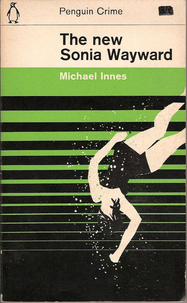
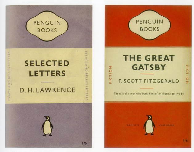
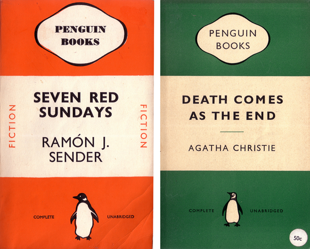
Penguin Books has made its name in timid history of design for its subversive book covers. Guided by the illuminated impresario Allen Lane, the founder of Penguin, the first book covers designed for Agatha Christie’s novels have immediately become a classic. Following the idea that “Good design is no more expensive than bad”, Mr. Lane has created not only a publishing empire, but even a design one.


While it all began with Mr. Lane, the person who gave unity to Penguin’s visual expression was Jan Tschichold, a Swiss designer born in Germany. Tschichold is widely known for his revolutionary manifesto-book “The New Typography” published in 1927, which anticipated Swiss modern design by nearly two decades with its idea of ‘universal’ typography, rigid grid structure and almost no decorative elements. After the second World War, Mr. Tschichold retreated himself in the UK, where he turned back to his origins as traditional typographer and set the iconic corporate image for Penguin. As well as the impeccable composition guidelines.

Besides Tschichold, a long series of world class designers has offered their services and wit in designing one of the most beautiful and intriguing book covers ever. Among them you can find Alan Fletcher, Colin Forbes, Derek Birdsall and Germano Facetti, all notorious design figures. As the last accords between Penguin and Random House are being signed, we all hope the new publishing house might treasure their and our design history.

Rujana Rebernjak

Share: Facebook,  Twitter  
30/10/2012

30 Designed Reasons to Vote Obama

30 Designed Reasons to Vote Obama

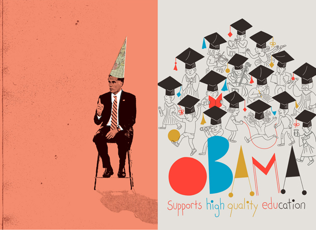
As the USA presidential elections get closer and closer, we can all witness an almost frightening hustle and bustle going on around us. Every minute of each day, hundreds of web posts, articles, statistical analysis and other types of information are being poured in our heads with the one and only intention – to gain some precious votes. It is reasonable to believe that this information overload is surely confusing and that we might appreciate it much more if it was handed out in a different way.


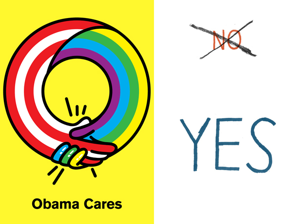
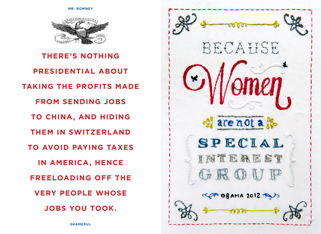
This is where designers step in, reunited under the initiative called 30 reasons – an email and internet poster campaign due to last 30 days (with more or less 10 days left to go). The campaign isn’t an un-biased source of information, but gives an intimate interpretation of why we all hope the Americans might re-elect Mr. Obama. It is well known that, by the very nature of the profession they serve, graphic designers are left-wing oriented. A socio-democratic political orientation stands at the very foundation of their work, coherently based on Modernist ideals of democracy and equal distribution of means and resources.

30 posters shown on the initiative’s website don’t try to make a rational political evaluation of pros and cons for voting a candidate, but let us peak inside an intimate designer’s world. More importantly it also shows how this profession, often seen as extremely frivolous, might actually serve quite urgent causes in our society. Hence, the works promote Obama’s attention for women and gay rights, social service and health care, education and social equality. While we aren’t going to judge graphic quality of these works, we completely agree with the founders of the project who believe that “designers have the duty to stand up, speak out and help promote social justice”.


Rujana Rebernjak – Images courtesy of 30 Reasons and respective authors

Share: Facebook,  Twitter  
24/10/2012

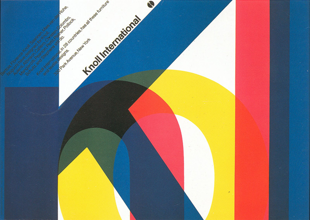
The Editorial: I Vignelli / Design Is One

The Editorial: I Vignelli / Design Is One

It’s difficult not to speak reverently about Massimo Vignelli. He’s one of the living greats and a reminder that Italy was once ground zero for good design. You know his work, even if you don’t know him. And every student of design, graphic or otherwise, (at about the same time he or she falls madly in love with the “rationality” of Helvetica) has fleetingly considered him an idol.

And while his design’s appropriateness for today is not so clear, it’s been sad to see it systematically begin to disappear from the common landscape. Most recently, his logo for department store JCPenney – pure nostalgia for tons of 80s and 90s kids – was recently jettisoned in favour of a bizarre reinterpretation of the American flag. American Airlines, for which he designed their once revolutionary identity, is bankrupt with many speculating that it will be eaten up by another company and disappear in short order. And the gorgeous 1960s and 1970s Vignelli designed and/or inspired signage still visible in Italy’s tube stations, streetcars, roads and public spaces is decaying, busted or covered by graffiti. Arrivederci once again, modernism.

His NYC Subway map is long gone, and while it could have used some tweaks, it is in my opinion the only transit map in the world that ever approached the level of functional, iconic simplicity as Harry Beck’s London Tube map. (Those things must be hell to design: have you looked at the tiny Milan metro’s pitiful spaghetti pot?)

Although his designs were striking, beautiful and salient, they were almost always in the service of massive corporate clients. His works were thus stamped out by the millions and became synonymous with the unthinking, relentless profit mongering of late 20th century capitalism. Many, including a great many designers, are ecstatic to see it go. (Ironically enough, University of the Arts London – of which Central Saint Martins is a part – have rebranded under a new, Vignelli-inspired logo earlier this year. Everyone hates it.)

But as his ubiquity fades, Vignelli is gaining a new sort of cultural traction that he had always lacked. He’s spoken candidly about his work, most notably with Debbie Millman on her seminal show, Design Matters, and has revealed a great deal about his integrity as a designer. And a new film, which premiered just this week at the Architecture & Design Film Festival in New York aims to tell the lesser known personal story about Vignelli, his wife Lella and their extraordinary collaborative legacy. (It’s about time someone crafts a narrative to give the Eames’ some real design power couple competition!)

Love or hate his work, the man is a genius. He – together with Lella – has left a mark on modern society that we’re only beginning to understand.

Tag Christof

Share: Facebook,  Twitter  
23/10/2012

From A Non-Place To A Public Library

From A Non-Place To A Public Library

Every day we are confronted with the left-overs of our overly designed, but not always functional, corporate world. If you’re turning your eyes on the idea of reading another article against the big bad corporate guys, maybe at the end of these lines you’ll understand why, in cases like this one, it’s really hard not to be political. But let’s get to the point: what we are speaking about here, are the non-places built, and often abandoned soon after, by various corporations and short-sighted impresarios. Naturally, this scenario is usually staged in the USA, even though the rest of the world isn’t quite immune to the phenomenon.


Fortunately, there are a few examples that show how these abandoned buildings, ghosts of our consumerist culture, can be given a completely new life. The latest project is a public library in McAllen, Texas, built in an ex-Walmart store. The forgotten warehouse, one of the 130 empty former Walmart stores available throughout United States, has been transformed by the architectural firm Meyer, Scherer & Rockcastle, an office specialized in designing libraries, in a beautiful public space.

The architects have maintained the original outer shell, dividing the internal zones in a glass-enclosed space and adding rows and rows of bookshelves. The McAllen Public Library is claimed to be the largest single-story library in the country, since it’s two football fields large. To confirm the project’s excellence, McAllen Public Library has been awarded the 2012 Library Interior Design Competition prize. Even though design prizes don’t always guarantee the excellence of a project, in this case, the conversion from a vast warehouse to a perfectly functioning library was rightly awarded. But what is even more important than posh design judges’ opinion, is the feeling of local public, who has clearly expressed its preferences with new user registration rise in 23% within the first month of library’s opening.


Rujana Rebernjak

Share: Facebook,  Twitter  
16/10/2012

Changing Design in China

Changing Design in China

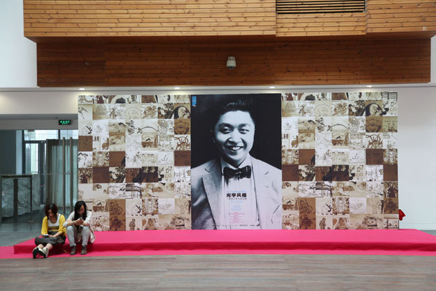
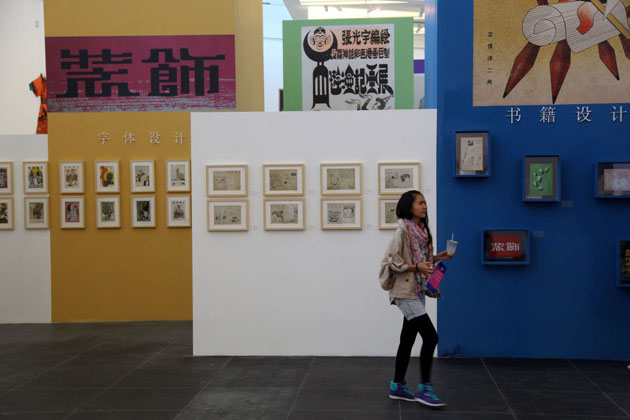
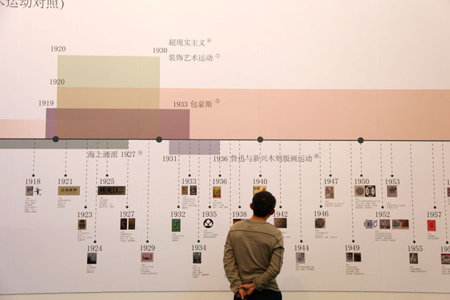
Speaking about design in the West has become an ubiquitous subject. Everyone in some way, more or less passionately, is involved in the discourse. The idea of ‘design’ itself as a discipline has become widespread and commonly shared. The same thing cannot be stated as firmly about design in the Orient, especially China.


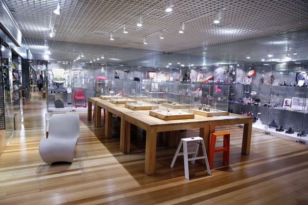
After decades of growth as a productional power-force (with all its good and bad sides that we cannot engage in discussing in this particular context), China is strongly intent in changing its production methods as well as the public image. The recent hustle and bustle of grand design events confirms the country’s determination in shifting from ‘Made in China’ to what should become ‘Designed in China’. Hence, the recent Beijing Design Week tried to focus its activities in promoting and discussing the importance of craft in design process – stressing on the urgent need of both industrials as well as designers in China to engage in producing authentic projects, more than merely copying European or American design pieces.


The desired shift is surely a tough task and, as Justin McGuirk swiftly points out, BDW hasn’t quite made it in making a strong statement about what should be done, neither has it shown examples of successful collaborations between young Chinese designers and enlightened Chinese manufacturers. The highly ambitious design week, unfortunately, still seems kind of copycat of European events, without authentic projects that try to put in practice the theoretical goals. Presenting a series of events, exhibitions and talks, together with the main fair, even the ones with a keen eye on Chinese design weren’t able to really find much to be impressed by.

Even though our ‘Western’ design fairs don’t have much to envy, too, a bit of criticism might help passionate Chinese designers to find the right way to embrace the peculiarities of their fascinating culture and both promote an authentic idea of contemporary design.


Rujana Rebernjak

Share: Facebook,  Twitter  
09/10/2012

Ampersand by Ryan Gander

Ampersand by Ryan Gander

If you get hold on texts, articles and interview featuring Ryan Gander, one word will pop-up in particular – storyteller. Through his work he always tries to narrate in form of objects or actions particular feelings or actions, pose questions and maybe sometimes give loose answers. His initial projects involved public lectures and performances, but lately it has evolved into creating articulated stories and emotions through the use of sculpture, real estate projects, architecture or (sometimes) technically complex installations. If you have seen his work for the latest dOCUMENTA in Kassel, “Airflow-velocity Study for I Need Some Meaning I Can Memorise (the Invisible Pull)”, you are surely aware of the complexity of the questions his projects pose to the user, questioning the notions of “language and knowledge, a reinvention of the modes of the appearance and creation of the artwork”.


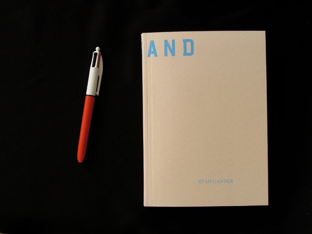
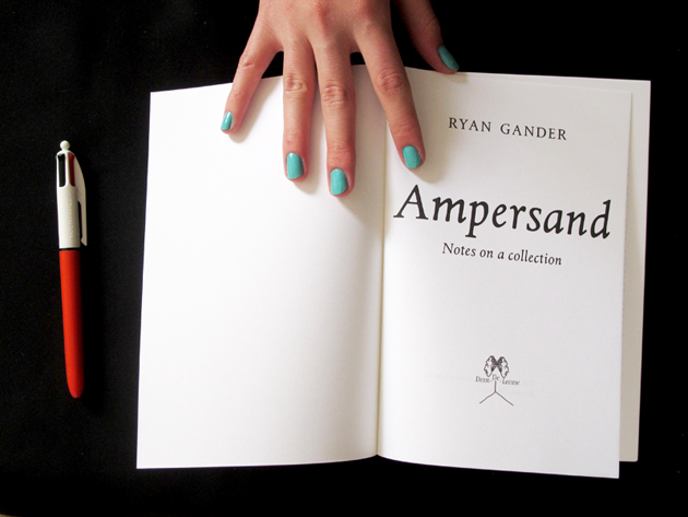
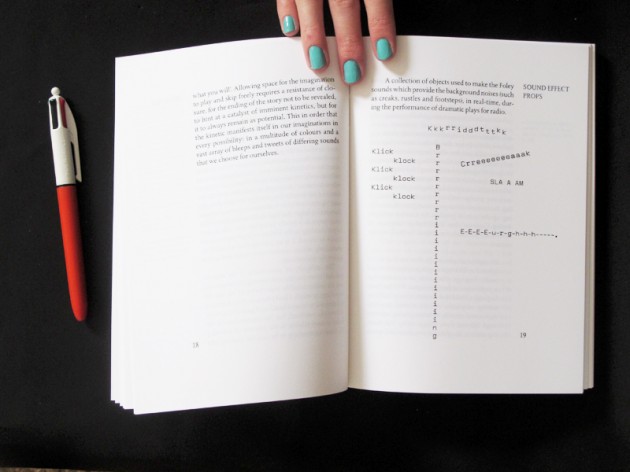
Nevertheless, Gander is also keen on using more ‘traditional’ and simple media, like books, where his ability to tell stories finds the perfect output. These projects are often equally challenging, mixing reality and fiction, playing with our perception and rules we are used to take for granted. This is exactly the case with his latest print project, “Ampersand”, a book published by Dent-De-Leone, a small publishing house founded by Martino Gamper, Kajsa Ståhl and Maki Suzuki, and usually designed by åbäke.

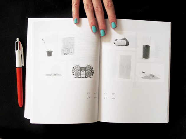
This edition of “Ampersand” is actually the fifth one, even though the first, second, third or fourth were never printed. It was made as a prelude for the current solo show by Gander, “Esperluette”, currently held at Palais de Tokyo a Parigi. “The present publication crystallises, for a fleeting moment (books are not eternal, you know), the ever expanding collection of Ryan Gander and the stories for which objects of all pedigree — artworks alongside coloured toilet paper – are the catalysts of.” Hence, the series of short essays contained in this book try to explore our surroundings in a typically ‘Ganderian’ way and play with our perception and the beauty of the everyday.

Rujana Rebernjak – Images courtesy of Dent-De-Leone

Share: Facebook,  Twitter  
02/10/2012

New York Art Book Fair

New York Art Book Fair

It takes only a short stroll in the Internet to figure out that September and October are tightly packed with various book fairs around the globe. From Paris and London, to Brussels and New York, the art book market seems to grow like mushrooms after a long rain. Was it because of a dry summer with no events, it’s hard to judge, but the autumn/winter book publishing season definitely seems to be quite demanding. With all the love we nourish towards books and independent publishing, it’s difficult not being critical about the current state of the game.

From being a shy events for a niche of book-lovers, the art book fairs have grown to become a major cultural happening. Even though sharing the ideas, developments, historical insights and beautiful craftsmanship that underpins book-making is surely a great thing, maybe a more critical approach should be taken towards the whole idea of the book fair and independent publishing. This is precisely why the New York Art Book Fair is to be admired.


The ‘Queen of the fairs’, New York Art Book Fair is almost a historical event promoted by Printed Matter, a non-profit organization devoted to promotion and distribution of artists’ books and independent art publishing, founded back in the days by a group of acclaimed artists. Held from the 28th until the 30th of September, this year’s edition, as usual, was packed with events, exhibitions and talks, while allowing a long list of international publishers (precisely 283 of them) to exhibit their production. Among the events, the lucky visitors at MoMA PS1, could see three exhibitions of “individuals whose contributions have enriched the field of artists’ books”: “An Homage to Mike Kelley”, “In Memoriam: The Book Catalogs of Steven Leiber” and “In Memorium: the Publications of John McWhinnie”. If this wasn’t enough, the tireless visitors had the chance to participate in the Contemporary Artists’ Books Conference, a two day event focused on emerging practices and debates within art-book culture, with Lucy Lippard and Paul Chan as keynote speakers.

If the array of events offered by NY Art Book Fair didn’t quite fill-up the most passionate ones, don’t worry we will keep you posted on the next not-to-be-missed-but-not-that-incredible book fairs, which definitely still have a lot to learn from our beloved Long Island ‘queen’.


Rujana Rebernjak

Share: Facebook,  Twitter  
25/09/2012

Building Private Cities in Honduras

Building Private Cities in Honduras

Living in Europe, ‘the old lady’, we are surely often overwhelmed by the history every inch of our beloved cities may recount. We are used to seeing old blocks, narrow streets, churches and monuments all imbued with the past that has gradually shaped them, making them become what they are today, with all the consequent complexities it may carry. So it is no surprise that the Europeans can be quite shocked when seeing cities that spring out of nothing even in the USA, more so in other countries of the world, such as China, where the historical heritage seems of no importance. Thus, hearing that Honduras government has recently approved a master-plan for building three ‘private’ cities has been a complete shock.


The news, reported on several websites, states that Honduras “is set to host one of the world’s most radical neo-liberal economic experiments under a plan to build from scratch the rules, roads and rafters of a ‘charter city’ for foreign investors”. What is described as ‘Silicon Valley’ of Honduras, build with the initial 15million dollars worth of financial support coming from the USA, is supposed to enable a higher standard of living for Hondurans, by means of scientific research, for a country where organized crime and political instability touch extremely high levels. Even if the news may seem quite progressive, given the fact that the official statement proposes a solution for economic growth of the country, it may be a bit more complex than that.

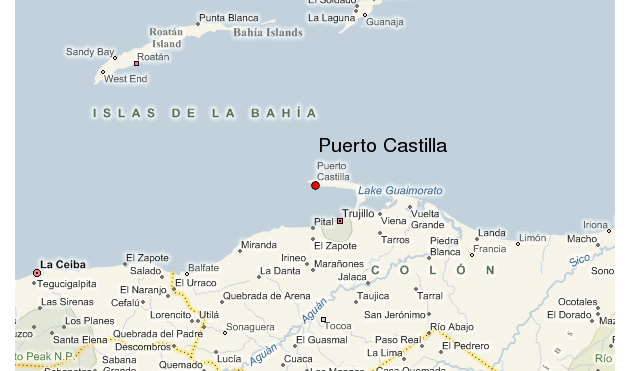
The cities, to be built near Puerto Castilla on the Caribbean coast, are to have their own police, government, laws and tax systems, a solution that may be leading more towards a ‘tax haven’ situation, than that of independent cities like Singapore, Dubai or Hong Kong, which are being discussed as an incredible model of trade and growth. What the opponents rightly fear is the creation of a “state within state”, a modern day enclave of inequality and injustice.

Rujana Rebernjak

Share: Facebook,  Twitter