10/06/2013

The Charm of the Discreteness

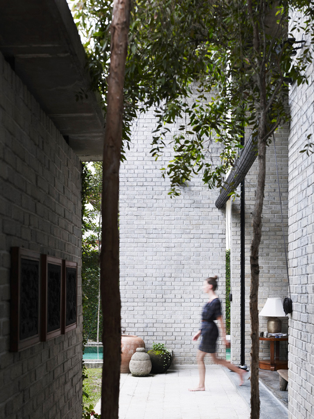
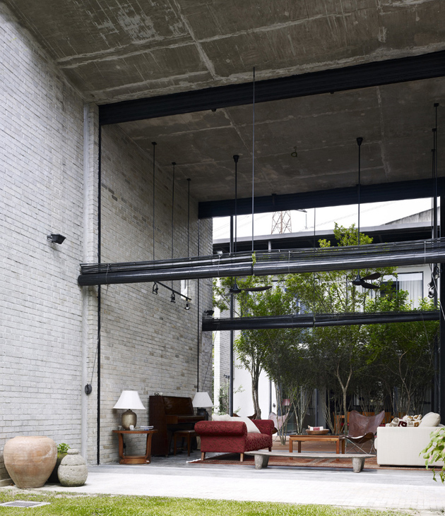
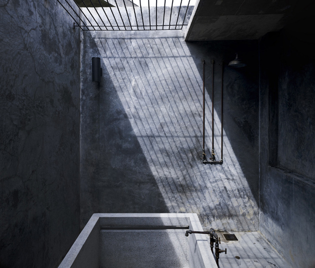
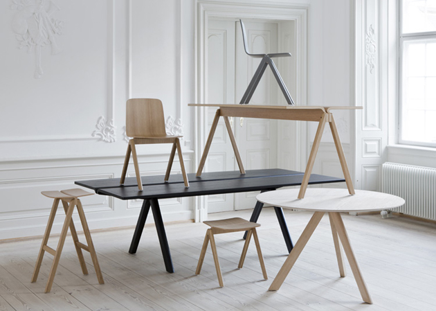
Flipping through the magazines we see that the projects of new buildings, but also of the design objects of daily use, are losing character. Intensive use of “cold” materials and hightech, the oversize has separated us from the spiritual property of our sites, our spaces and objects. This is why designers like Kevin Low seem to be able to save what remains of a design well-made, calibrated, that can relate back to our things, big or small they are.


Kevin Low, despite the studies in the United States, returned to his native land Malaysia, and proposes a design rooted in its origins, local, using basic materials that are handed down over time and with a certain tactile charm, wood and iron above all. His projects are small, as he tells us with the name by which it occurs – “Small Projects” -,
 but are heard and followed by a manual approach, they’re always right.

The result that follows – objects, details, buildings with a special charm, wonderfully discreet and complementing spaces poetically – is certainly not big impersonal architectures. Low’s method could serve as a model for the transformation of design, being thin and camouflage instead of bold and impetuous. We should reflect on the work of the people like Kevin Low, and take a look at the studies of this type. For example Studio Mumbai in India, or many others in Europe – especially in Switzerland and Scandinavia – want to make us realize that design still means manual work, models, prototypes, evidence, making samples, intervening only at the end, trying to create discreet order and not distorting the places where we live. Maybe we need less automation and more low-tech materials and mechanical movements.


Giulio Ghirardi 
Share: Facebook,  Twitter  
04/06/2013

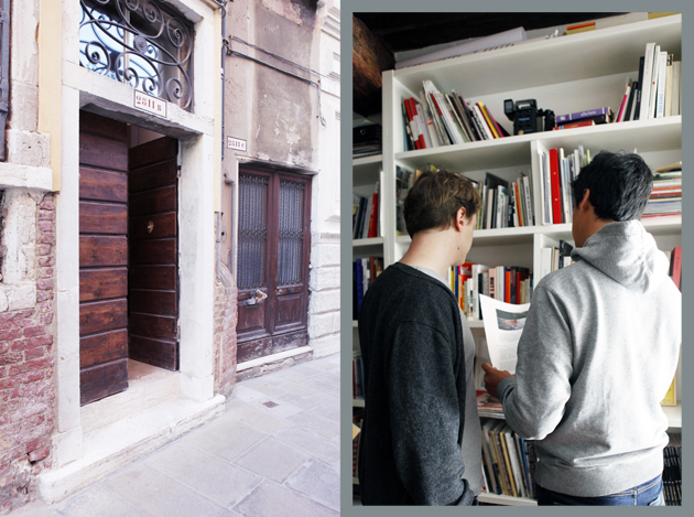
The Book Affair at Venice Art Biennale

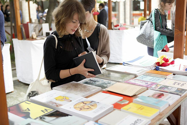
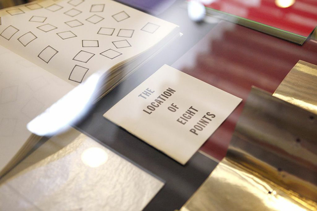
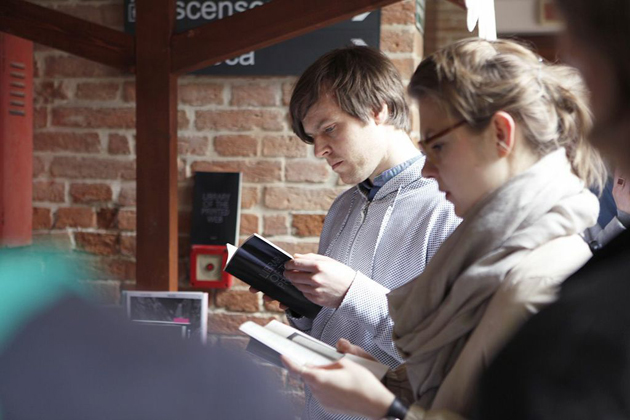
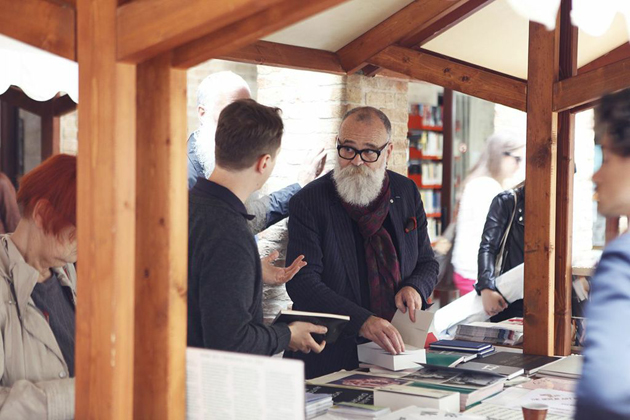
Even though for quite some time now we are being told that books are dead, a shy but particularly passionate niche of producers tries to demonstrate the mainstream media that they are wrong. In fact, if you are even a tiny bit into design and art, you must have noted the resurgence of particularly well-produced magazine and books, printed matter and ephemera, together with the incredible growth of exhibitions and fairs exploring the phenomenon. It is in this particular context that The Book Affair, an event curated by a small Venetian publishing house – Automatic Books – was born.


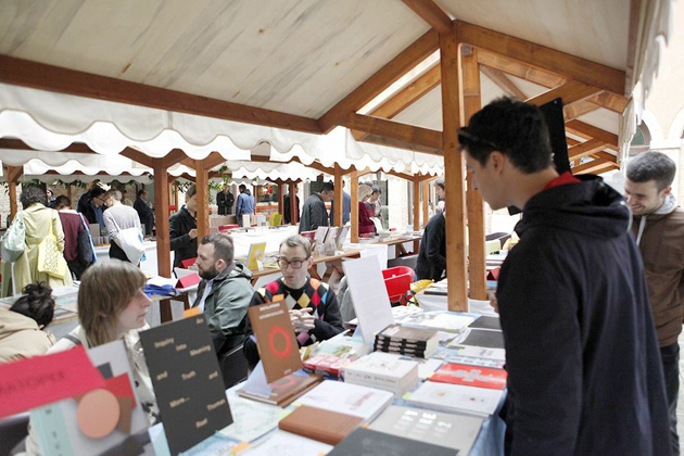
Organized in the occasion of the 55th Venice Art Biennial, The Book Affair was founded with the idea of creating a platform for exchange and discussion about the contemporary production of artists’ books, situated in an intersection of disciplines — namely the visual arts, literary arts and/or critical design. A highly stimulating and fertile environment offered by one of the most significant art events in the world, La Biennale di Venezia, has allowed The Book Affair to propose a unique space of inquiry complemented by interdisciplinary practice, collaboration or coproduction. In fact, the event brought together numerous contemporary independent art and design publishers, graphic designers and artists, collectors and curators to confront their work and thoughts.


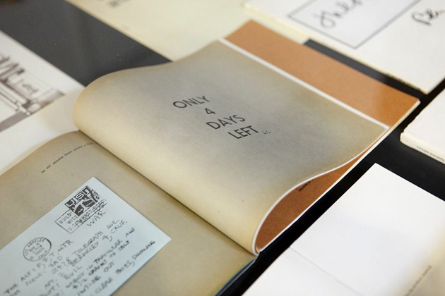
Thus, visitors were able to observe the history of art through the book media, in an exhibition curated by Giorgio Maffei, participate in conferences held by Dexter Sinister and David Horvitz, actively discuss contemporary publishing with Joshua Simon, Paul Soulellis or the founders of San Rocco magazine, check new books published by Valiz, Roma Publications, Rollo Press or Onomatopee, as well as simply enjoy the beautiful location of San Lorenzo library, proving the skeptics that books will probably never go out of style.


Rujana Rebernjak 
Share: Facebook,  Twitter  
04/06/2013

Inner Body Design: Design In a Capsule

In different cities, apart from one another, yet almost simultaneously, different designers have left our tangible, materialistic, outside world for what it is. They have started to develop ideas and to design products for our inside, our inner body. And once these products are ready to be produced and utilized, we would have to swallow them to ‘activate’ the purchased product.

Dutch designer Daan Roosegaarde – artist/ innovator/engineer – is “obsessed to customize the world around us” and in many ways he has accomplished to materialize the rather inconceivable ideas he has in his brain, mostly by using technology. Right now he is working on a project that goes – at least for many of us – beyond our common sense and more towards a sci-fi scenario: a pill that makes us glow, shine and luminous. Within a year from now Roosegaarde expects his project to be finalized and then, once we absorb the pill, light will shine through the skin of our hands (“let’s start with the hands”, Roosegaarde suggests). In order to create his “luminous pills” Roosegaarde looked closely at the animal world, at a jellyfish for example, and how to hack nature’s techniques.

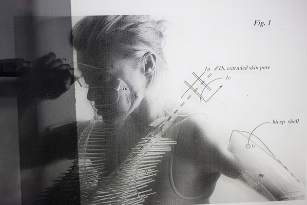
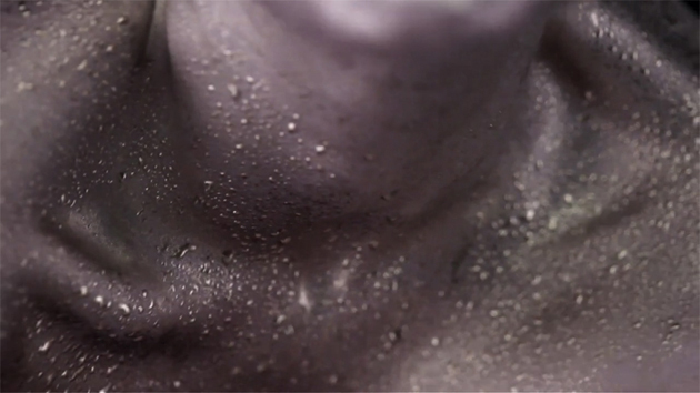
Another project that shows striking similarities but that builds on the body’s own enzymes is the project “Swallowable Parfum” of Australian body-architect Lucy McRae. Together with synthetic biologist Sheref Mansy, McRae is developing a capsule that contains “synthesized fragrant lipid molecules that mimic the structure of normal fat molecules naturally found in the body”. Without going into the biological details, this means that after we eat the capsule our body will emit a unique fragrance through the skin’s surface when we perspire.


These two projects are still in their research phase, but going a few years back in time, 2009 – 2011 to be exact, you will find another project (a drinkable yogurt this time) that has to go through our body to perform its function. British designers James King and Alexandra Daisy Grinsberg developed in close collaboration with undergraduates from the Cambridge University in London the E-chromi project: the idea of a drink laced with bacteria, which “react with the enzymes, proteins and other chemicals present in our gastrointestinal tract and turn into different colours for different diseases”, where after our stool and a colour swatch provide us with an easy health check.

Merging their creative fascinating ideas with biology and technology brings these designers to an unusual working area: our inner body. This is normally something we regard as only belonging in the hands of doctors, dentists and biologists. Without a doubt soon there will occur more inner body design projects and laboratories that challenge the idea that our human bodies are a platform for technology and that we can (re)program it to what we desire, need or want to avoid in the future.

Lisanne Fransen – Images Lucy McRae, Tobias Titz 
Share: Facebook,  Twitter  
28/05/2013

Donald Judd Home And Studio Restoration

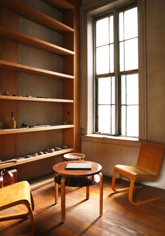
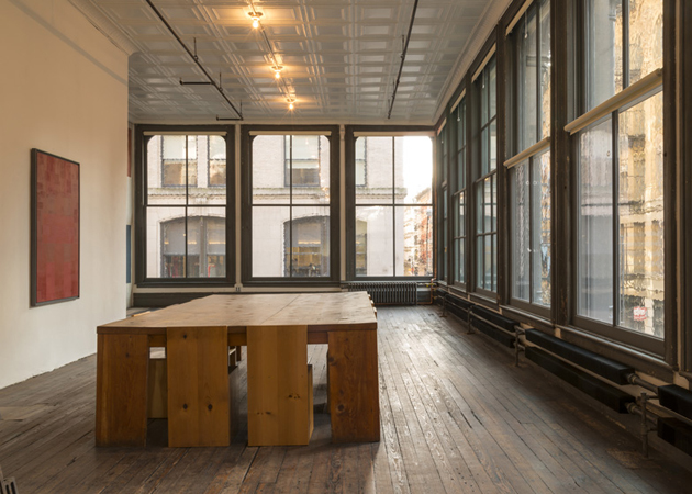
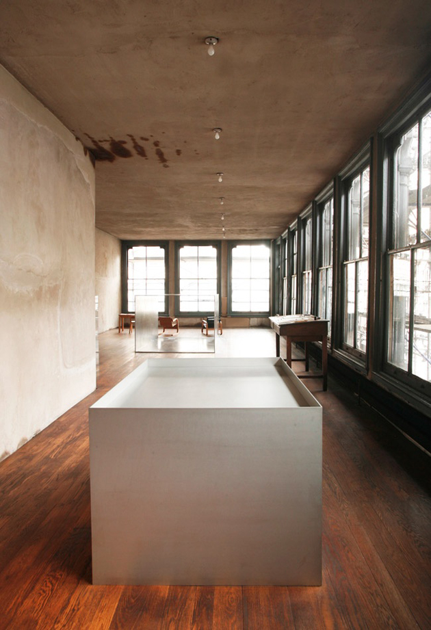
It is a well-known truth that the environment that surrounds us, necessarily defines both who we are as well as what we do. And it is even more true that our environment influences our perception of things and objects, a well known fact to the late American artist Donald Judd. In fact, when he bought a five-storey building in New York, Judd started to place his work in a more permanent manner, which would later lead him to refuse temporary exhibitions and the art system that gave major relevance to the environments designed by the curator, and less to the artwork itself.


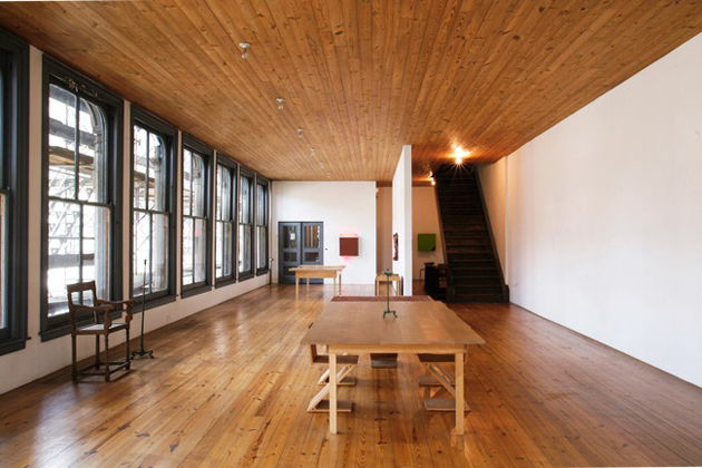
For this very reason, the opening of Donald Judd’s New York studio and home, following a three-year restoration process, comes as a significant event in the contemporary art world, not least because it houses a collection of over 500 artworks created by the artist. The restoration was lead by New York-based Architecture Research Office, whose goal was to maintain and preserve the open-plan layout designed by Judd (who has, at the end of his career, also designed a series of wood and metal furniture, embracing industrial production).

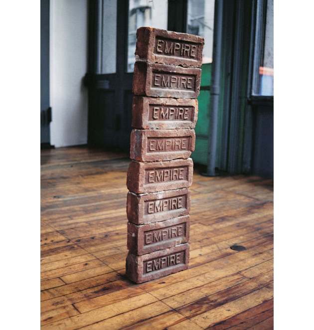
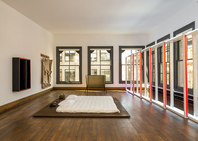
The team meticulously catalogued the situation of every sculpture, painting and object in the house, including pieces by Judd himself (among which must be noted not only his artworks but the interior design as well) as well as works gifted by artist-friends such as Claes Oldenburg, Carl Andre and Dan Flavin, together with older artworks by Marcel Duchamp, Ad Reinhardt and more. Following the restoration, each object was returned to its exact position.

The building is currently the home of Judd Foundation, who will offer its visitors a unique insight into Judd’s life and work, experience the home and studio as originally installed by the artist, with the goal of promoting not only his material legacy, but also his ideas and beliefs of how art should be experienced, seen and, ultimately, understood.


Rujana Rebernjak 
Share: Facebook,  Twitter  
24/05/2013

4 Questions To – Jack Dahl

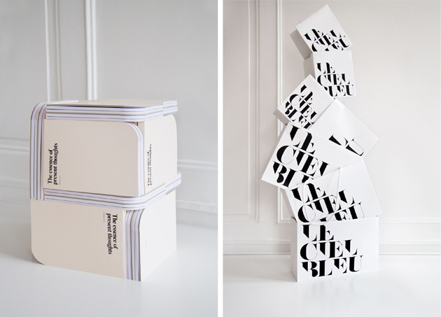
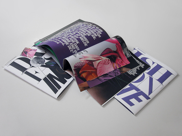
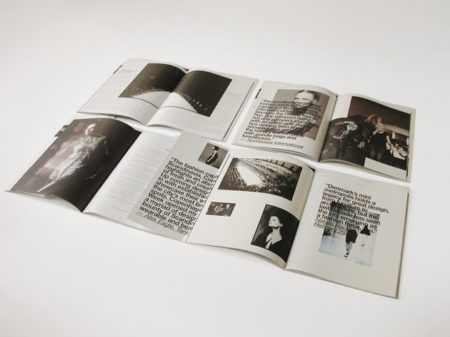
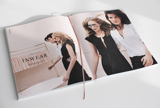
Heavy books intruding our free time – to make positive associations with the word homework might not come naturally to everyone. Luckily we found a place that changes the scenario: Homework is also the name of a Copenhagen-based creative studio founded in 2002, bringing forth associations of timeless yet contemporary design, ambitious work and Scandinavian flair. The studio, specialized in brand expression and communication, has since the start built up a portfolio showcasing brand identity projects, packaging, image campaigns and editorial work across printed and digital media. The Blogazine had a chat with founder Jack Dahl – creative director who has worked with some of the most prestigious names within the field of fashion, beauty and luxury design.


Your studio is located in Copenhagen, a city that over the passed years has gained a lot of attention internationally. Has Copenhagen’s position as a recognized fashion city affected your work in any way?
Well, we are working in a competitive market, definitely, but I don’t really think that it has anything to do with Copenhagen’s newly-gained position as a fashion capital. Denmark is and has been famous for its rich design culture and heritage, so I would rather say that with the Internet and the whole online social world, it has become much easier to reach and maintain a strong relationship to customers even though they are based on the other side of the world.

Homework has actually been very fortunate in many ways – we have worked with some very interesting international clients, which again, attract other international companies. We have done a great handful of collaborations with Japanese clients like GAS interface, Addition Adelaide, A.P.J, Jun, Le Ciel Bleu, Franc Franc and Isetan, a few projects in the Middle East, Lady Gaga Parfums/COTY in France, Comme des Garçons/PUIG in Spain, and Galerie Perrotin in Paris and Hong Kong – they have all been amazing clients of Homework.


Your signature aesthetics is about simplicity and about letting the essentials be in focus, something that very much can be said about Scandinavian design over-all. Would you say that Scandinavian graphic design and art direction, just like Scandinavian fashion, is democratic and minimalistic?
I wouldn’t say that democratic and minimalistic describe Scandinavian design and art direction the same way as the fashion industry. The Scandinavian fashion companies are known for balancing nice contemporary designs at reasonable prices whereas it’s true that the graphic design and art direction are very streamline, minimalistic and distinct. For Homework it’s a way of always searching to highlight core values, key message or distinct personality in a company or in a product. I would like to think of Homework as having a design approach with an international appeal.


We’ve heard that you have a certain obsession for typography and typefaces. What is that is so fascinating about type?
It’s true – we do have a special place in our hearts reserved for type. Working with type is like working with an infinite amount of styles and ways of expression. When thoughtfully executed, typography can be both timeless and contemporary, both illustrative and understated.

You have a long list of prestigious references in your portfolio but what are you still dreaming about doing?
I, and Homework, dream of many good things still to come. We have never worked with an Italian client and it’s something we would love in particular – it’s about time! Other than that, fragrance, furniture and interior brands have a focus in our team these days. Personally, I’m also interested in the people behind a brand – the product in itself is not always the most important thing. Our most successful work has been with brands who also share our aesthetic and approach. Big brands such as B&B Italy, Vitra, H&M or Madonna would also be interesting as major commercial players.


Interview by Lisa Olsson Hjerpe – Image courtesy of Homework 
Share: Facebook,  Twitter  
23/05/2013

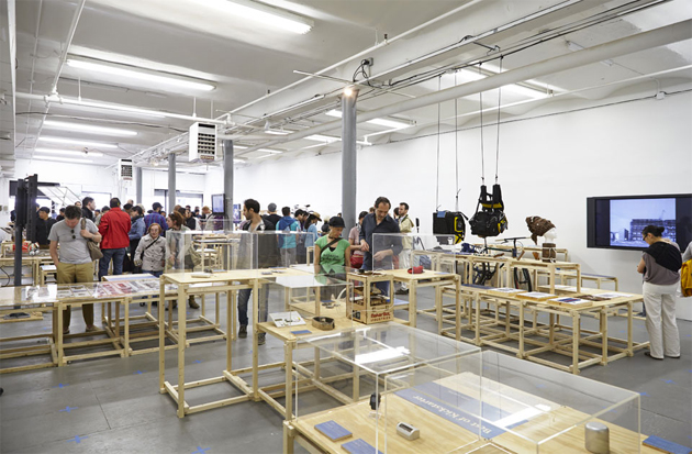
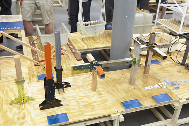
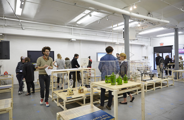
Adhocracy at the New Museum

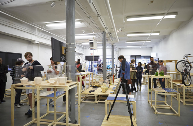
Adhocracy is “a structureless organization used to solve various problems. It is a type of organization that operates in opposite fashion to a bureaucracy”. The term was borrowed by Joseph Grima for the title of an exhibition first presented at last year’s Istanbul Design Biennale and currently displayed at the New Museum in New York. “Adhocracy” eloquently discusses the current shift in creation, production and consumption of consumer goods, fuelled by new materials, automation and 3D printing. Focussing particularly on “open systems, tools that enable self-organization, and platforms driven by collaboration”, this show tries to pinpoint one of the most radical developments in production that Joseph Grima characterizes as the “maximum expression of design”.


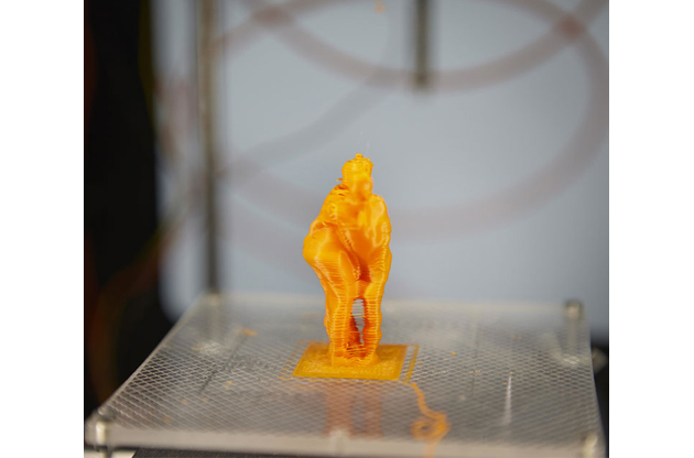
To understand exactly what all this means, one has to dive into the displays presented at the show, designed itself as a sort of a science lab where anyone has the chance to “design for everyone”, where imperfection rather than industrial perfection is seen as an evidence of an emerging force of identity, individuality and non-linearity in design. Through twenty-five projects, mainly artefacts, objects and films, the exhibition tries do offer an inspiring view on the epochal changes, often questioning the very definition of design practice. In fact, the show includes several projects centred around on-site laboratories of production, such as Blablablab’s “Be Your Own Souvenir” project, where visitors to the exhibition can have their body scanned and reproduced in miniature by 3-D printers, or Unfold’s “Stratigraphic Manufactury,” in which New York–based ceramists (Jen Poueymirou, Larisa Daiga, and Eric Hollender) will create 3-D-print porcelain artefacts on-site.


Even though it sometimes may appear that the only point of the show is exploring new production technologies, without discussing the initial premisses, “Adhocracy” clearly makes us understand that the industry is not the only solution to contemporary production. Even though a recent ‘resurgence’ of traditional crafts has brought our attention back from eccentric formalism to quality and honesty in design production, “Adhocracy” also reminds us that design should laregly benefit from an open dialogue within a larger society.

Rujana Rebernjak 
Share: Facebook,  Twitter  
16/05/2013

Guest Interview n°48: Automatic Books

Even though a new art publishing fair opens almost every week in some angle of the planet, Italy has been quite slow in keeping up with the rest of the world. One of the few, if not the only, art publishing fairs in Italy is The Book Affair, held in Venice every two years in the occasion of Art Biennale. We have had a pleasant chat about this year’s edition with The Book Affair’s founders, Marco Campardo and Lorenzo Mason, whose curiosity, enthusiasm and wit animate both their graphic design studio Tankboys as well as Automatic Books, a publishing house they co-founded in 2009.

How and why have you decided to organize The Book Affair two years ago? What were your goals and interests?

We decided to organize the fair two years ago, since at that time there were no other art publishing fairs in Italy. Since we founded our own publishing house in 2009, we felt there was a need to promote this kind of production, especially in the context of Art Biennale, an extremely important event in our home town, Venice. It was the perfect occasion to bring together our small ‘independent’ world with what was happening in Venice at that time, opening this kind of production to the visitors of established art environment.

Could you tell us something more about this year’s edition of the fair?

This year’s edition will be much bigger and ‘serious’ than the edition of two years ago, when our resources and experience was much more limited. This year, we will have 30 accurately selected international exhibitors, together with three conferences discussing the role of artists’ books delivered by speakers like Dexter Sinister and David Horvitz. We will also have a series of short lectures and book presentations delivered by artists, designers and photographers like Peter Sutherland with Wonder Room and Studio Blanco, Paul Soulellis or Joshua Simon. In addition to that, there will also be an exhibition about artists’ books curated by Giorgio Maffei, with the goal of examining not only the contemporary production, but also discussing the role of artists’ books throughout the history.

What do you think is the role of publishing in contemporary art world?

There are two basic roles of publishing in the art world. The first role is that of educating and disseminating notions through catalogues, historical books and magazines. The second ‘modus operandi’ sees books as an instrument in promoting and communicating the work of an artist in an economical and, thus, potentially wide-spread way. This is the basic reason why artists throughout the history have produced books, since it was a fairly economical way to disseminate their work.

Looking at today’s production, how can we distinguish artists’ books from just nicely printed books? What is the quality that allows us to classify them as artists’ books?

The interesting thing about our fair is that it brings together collectors like Giorgio Maffei and contemporary young publishers, allowing a direct confrontation between some of the most significant artists’ books produced in the last 50 years with contemporary production. By comparing these two worlds, one cannot but wonder how some books have become widely known without being particularly well produced. This demonstrates how you cannot be certain in judging this kind of production, it depends a lot on the instinct of a curator or a publisher.

Why do you think there is a renewed interest in artist’s books? How do you contribute to this discussion with your event?

Probably it relates to the fact that the more we live in a digital environment, the more we feel the need to touch physical objects. Our involvement with these kinds of topics is due to the fact that we as publishers needed to find possible answers to some of the questions we had regarding the role of artists’ books. It was necessary for us to create a discussion around this topics with protagonists who have witnessed its evolution since the ’60, like Giorgio Maffei or Franco Vaccari.

Your main occupation is graphic design with Tankboys studio, what is the interest behind your occupation with projects like this fair that don’t enter directly in your professional sphere?

We believe that a graphic design as profession cannot exist without a concrete connection with other contingent worlds, like art, publishing or product design. Graphic design isn’t an isolated sphere; a book cannot exist without the contents that form it; a poster cannot exist without an event that it refers to. We feel the need to be directly involved with many different projects to be able to successfully produce our work, be it as authors, curators or publishers.

Why do you think so many young designers seek alternative venues and self-produced projects?

Well, we don’t believe this is uniquely a contemporary condition. Designers like Bruno Munari, Enzo Mari or Bob Gill have always produced books and other projects that didn’t strictly relate to their day-to-day activities.

What would be your ideal project to work on as Tankboys?

We would like to cite Enzo Mari who, when asked the same question, replied that he would have loved if someone had commissioned him to design the first ball ever. So, we would like to be the first ones to design something that is both brilliant, timeless and perfect at the same time.

Who would be your ideal client as Tankboys and what would be your ideal book to publish as Automatic Books?

One interesting book that we would have loved publishing is Guy Debord’s book “Mémoires”, bound with sandpaper so that it would destroy other books placed next to it on the bookshelf.

Rujana Rebernjak 
Share: Facebook,  Twitter  
14/05/2013

Ronan and Erwan Bouroullec: Momentané

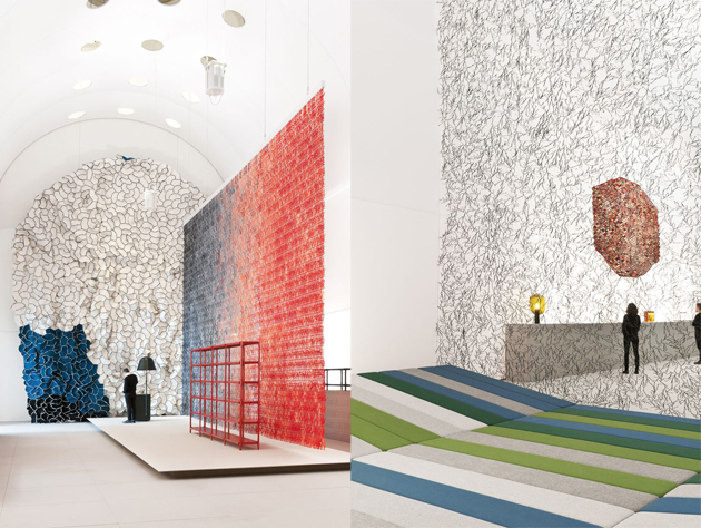
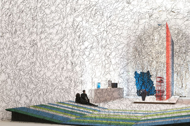
Musée des Arts Décoratifs in Paris has recently opened the doors of a 1000-square-meter show dedicated to the beloved brothers of international design: Ronan and Erwan Bouroullec. Even though here in Italy they might be defined ‘young’ talents, the two brothers have already been working together for fifteen years and this show puts together the variety and complexity of their production.

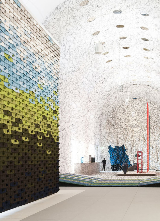
Titled “Momentané” the show is structured in three different sections. The vault of the exhibition space is dedicated to their extensive production of lightweight screens: modular designs created for Vitra, Kvadrat and Cappellini create a giant installation of Twigs, North Tiles, Algues and Clouds. One side of the nave, on the other hand, gives space to more than one hundred objects, ranging from different scale original models as well as final products. The other side of the nave is the set of office and collective space projects, together with a long wall showcasing numerous delicate drawings created by the designers (that have recently become protagonists of a book).


It might seem that this show is an ode to modularity, sequence and repetition, qualities that often characterize the Bouroullec brothers’ work. In fact, they declare themselves great admirers of Charlotte Perriand, whose combination of distinctively rigorous modular elements and playful colouring made her work stand the test of time. Fifteen years might not be enough time to know with certainty that the most famous brothers of the design world will be remembered in half a century, but it does seem like a pretty sure bet.

Rujana Rebernjak 
Share: Facebook,  Twitter  
07/05/2013

Florence Knoll Bassett’s Modern Design

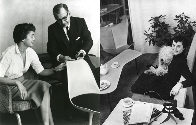
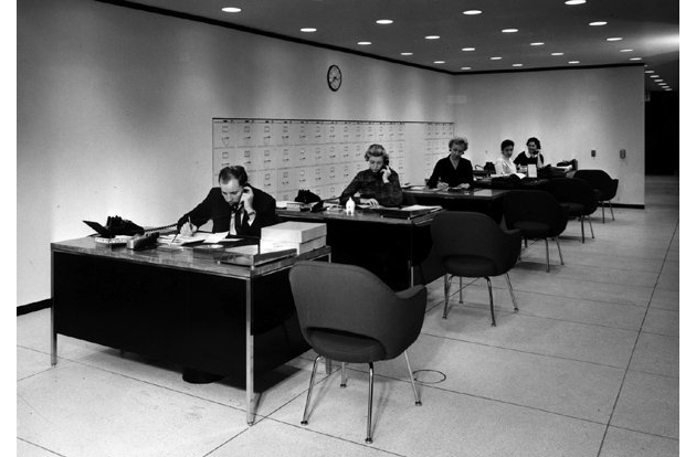
If you think about Modernist designers, there probably won’t be any women among the names that pop in your mind. We might think about Mies van der Rohe, Charles Eames or Eero Saarinen, but, as Alice Rawsthorne stated in a recent article published by the New York Times, history rarely remembers female protagonists of the Bauhaus or designers like Eileen Gray, Charlotte Perriand or Florence Knoll Bassett.


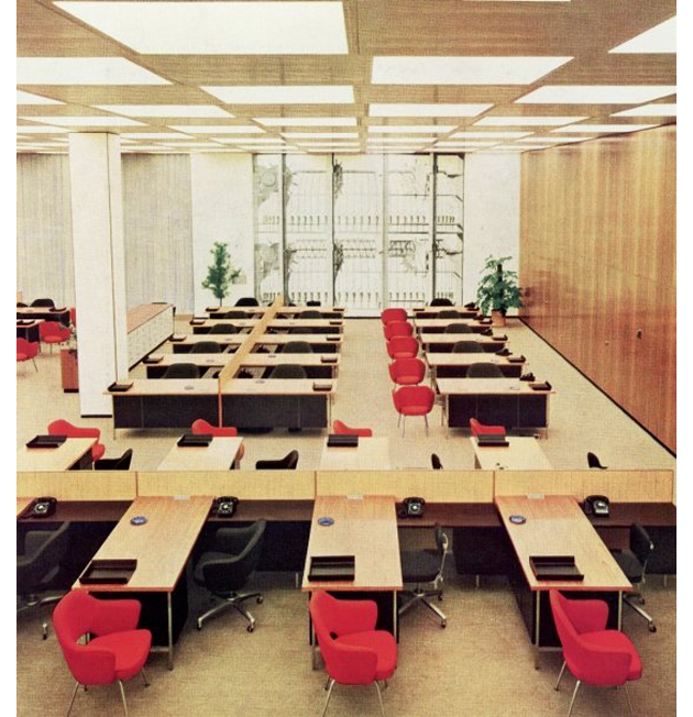
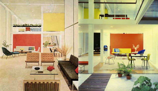
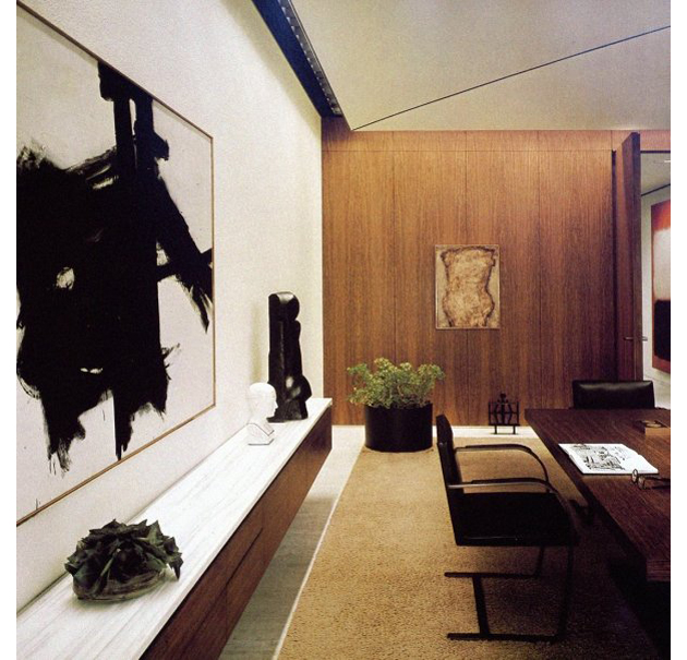
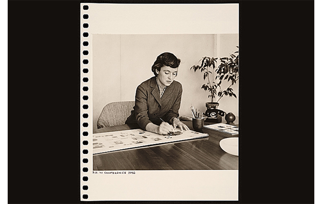
The latter, who in less than a month will be turning 96, has silently influenced both the company that carries her name as well as what we regard as modern office design. Florence Knoll Bassett was born on the 24th of May 1917 and has studied to become an architect under Mies van der Rohe and Eliel Saarinen, two protagonist of Modernist design whom she would later refer to as her masters. In 1943 she met Hans Knoll, who would become her husband, and started working at his furniture company creating the Knoll Planning Unit, a sort of in-house design office that would develop specific projects for a long list of international clients.


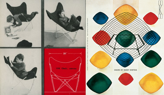
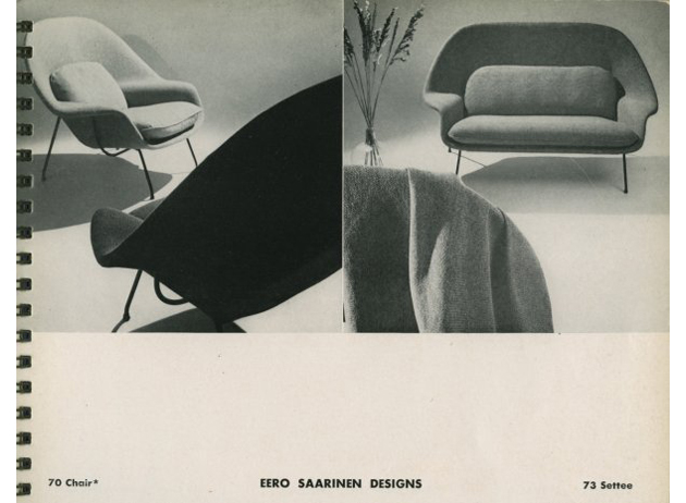
Even though her work is highly influential for the contemporary design of the office space (where we pass much of our time every single day), she stated “I never considered myself a furniture designer, and still don’t. I designed furniture because it was needed for a specific plan. It was really people like Saarinen and Bertoia who created very sculptural pieces. Mine were architectural”. In fact, it was she who convinced a long list of Modernist designers to work with Knoll, like Mies van der Rohe, who surrendered after her promise that his furniture would never be produced in outrageous colours or materials.

Even though Florence Knoll Bassett left the professional design sphere in 1965, her approach to design as a practice still remains highly significant of a particular historical climate and should be reconsidered in the complex contemporary corporate design work. In fact, speaking about her work, Mrs. Knoll Bassett says: “I was fortunate to have good clients. The success of a good project depends upon the compatibility of client and designer”. Nevertheless, if you look back at her career you understand that it would have never happened without her dedication, profound knowledge and wit.


Rujana Rebernjak 
Share: Facebook,  Twitter  
29/04/2013

Guest Interview n°47: Studio Blanco

The Blogazine met Sara and Valerio Tamagnini – the founders of Studio Blanco – to discover their personal recipe to deal with art and creative direction of commercial, editorial and cultural projects, linking together freshness and unconventionality, along with an international network of creative minds.
Creative crossroads and artistic bonds, along with an extremely professional and distinctive approach are just some keywords of your activity. What led you to form a team and which are the common and different aspects of your personalities?
The studio began in a very simple and natural way. We basically felt the need to start doing something by our own – at that time I was mainly a promoter of events and club-nights while Sara was a freelance graphic designer. We decided to split a small space (around 30 sqm) and to try start doing something together: I used to do parties and consultancies for entertainment brands, so sometimes I needed also some graphics and I involved Sara – that’s how it started. Then step by step we had the chance to start developing real projects together: the first years were very hard as we used to work from 10 to 10 trying to mix commercial assignments (for the money) and cultural projects (for the soul or at least the pleasure). This was not a marketing thing but more the way we intended (and still intend) our work.

In your statement you underline your choice “to be placed on the margin – both geographically and mentally”. What does it mean for you from a professional and personal point of view?
Our studio is in Reggio Emilia, which is a small town in the North of Italy between Milan and Bologne, so we are not in the centre of anything: our area is more about doing than appearing or talking and we’re in the middle of the “Pianura Padana”, so everything’s flat, quiet and there’s always a sense of nostalgia – the one that Luigi Ghirri magically stole to his images.

So we are on a margin (as we are not in Milan or Rome) of a margin (Italy is not really the centre of the world), but at the same time we like the fact that Reggio Emilia is very well-located, so you can easily move to Milan, Bologne, Mantova, Verona, Florence (…) and it’s stimulating. Ok, to be honest with you, we are not in love with our town, but growing here helped us to understand the basic needs and sometimes after the Milan – Paris – New York and the “arty farty” circuit, the back to basic of our town – the fog, the ordinary life, the local food, the friends – is a great way to come back to reality.
And then, as Godard said “the margin holds together the page” which means that you can look to the text and the contents on the main area but without the border you can’t have the whole page. We like the approach in which the details are important as the most direct things. And we also like to be one step back, behind the curtains, not in the front row.
Have you ever considered of moving to another place anywhere in the world?
Yearly! But in the end we remain here so it must say something. Anyway, staying here is a struggle sometimes because we felt the need for more pressure, life and energy as you may have in a big town. But then again, being here means that you don’t lose your time in too many PRs or events and you focus your time on doing a good work, on developing a new project – and this is really important for us.

You established your studio in 2005, so it’s now your 8th birthday. If you would make a recap of your experiences until now, which are the main events/projects that influenced your professional growth?
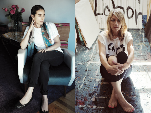
I would say that the Carte Blanche capsule collection project for Sportmax is a good example of a small indie project born in 2008 that now has arrived at its fifth edition and it’s very well considered. Carte Blanche started as a collaboration with Christophe Brunnquell (former art director of Purple magazine) and then – year after year – we involved a lot of interesting personalities such as Kim Gordon, Lola Schnabel and Ambra Medda. It’s also really interesting because we are giving “carte blanche” to the artist in his/her collaboration for the project, but we also received a “carte blanche” from the brand as we curate the project from A to Z – from the identity to the selection of the personalities and so on. We grew up with Sportmax and this is a collaboration that make both of us proud of.

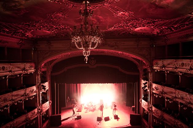
Then there are a lot of other projects we remember with pleasure: Control+C in Carpi (MO), a musical-based festival we art directed with Corrado Nuccini for 5 or 6 editions and in which we involved musicians such as Broadcast, Prefuse 73, Plaid, Nathan Fake, Apparat, Junior Boys, Sylvain Chauveau, Swod, Hauschka, Dustin O’Halloran, Johann Johannsson, Josephine Foster, The Field and many others.

And then the first italian exhibitions of Mark Borthwick or Christophe Brunnquell, the Recession editorial project in which we asked 35 international artists to interpret the recession theme through words, images, artworks and music with participants such as Richard Kern, Ed Templeton and Ari Marcopoulos.
Is there any creative person – old master or contemporary artist that you’d still love to work with?
Luigi Ghirri, Daido Moriyama and the Provoke members, Max Richter, Ennio Morricone, Ed Ruscha… But the list could go on and on and on.

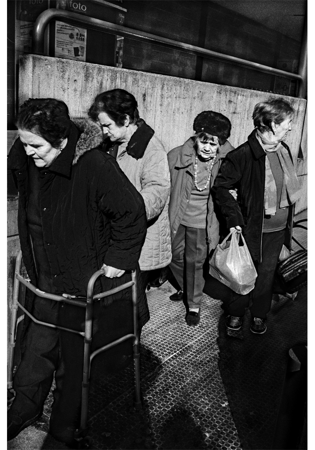
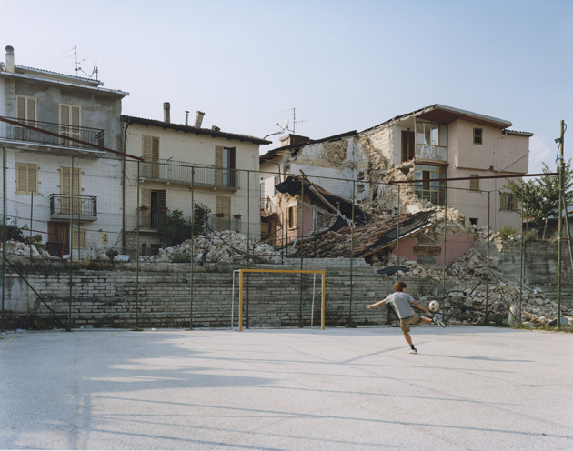
You’ll soon be at “Fotografia Europea” (Ed. Note: the yearly international event devoted to photography held in Reggio Emilia) presenting TO BELONG, the project  - arranged with the Swedish photographer Anders Petersen, in collaboration with SlamJam – which is strictly connected to your home town and the earthquake that hit the area in 2012. Could you tell us something about the exhibition?
The earthquake of the last year really hit very hard our region. It was not only about the dead people, the damaged buildings and all the other scary things you can associate to each earthquake. It was also about the sense of impotence, the ordinary life as a gift and not as something that you can take for granted. Me and Sara had our first baby last May and for me it was strange to think about how life and death are very close to each other.

Anyway, we decided we had to do something, but we wanted to help in our own way, with our language, not trying to organize another benefit event or something that could sound like a fake. We wanted to do a project about the memory and saw this beautiful book called “Un Paese” by Paul Strand and Cesare Zavattini about the small town of Luzzara – near Reggio Emilia. The book was done in the fifties and then celebrated again with other photographers such as Ghirri and Stephen Shore. We thought of doing something similar starting from the earthquake and trying to shoot people and places from the hit area, involving someone that was not italian, that we appreciated and that had a special sensibility in portraying people in trouble: Anders Petersen.

I’m copying here parts of the beautiful text that our friend Cosimo Bizzarri wrote about the project – which is far better than all my words:

“On May 20th, 2012, at 4:03:52, a crack opened in the earth’s crust under a village near Modena called Finale Emilia, where for more than a thousand years the territory of Emilia has ended and the rest has begun. It lasted for twenty seconds. Then the streets quickly filled with men and women in their pajamas, scared to death. All but seven, who would never come out.

Over two months, 2,300 aftershocks left almost thirty people dead and a society in shock. Cars were smashed by the debris of the buildings under which they had been parked. Jackals stole uniforms from rescue teams in order to pillage the evacuated houses. Those who had been evacuated screamed at the other jackals: the TV crews. Palaces without facades, whose furniture could be seen from the street. Castles and bells towers torn down without dignity with dynamite. Everywhere, barriers and dust.

A people that wakes every morning on a broken land can have only one goal left: pull it together. So week after week, doctors went back to heal their patients, factory workers to cast their girders, cheese makers to sell their cheese and builders to erect houses.

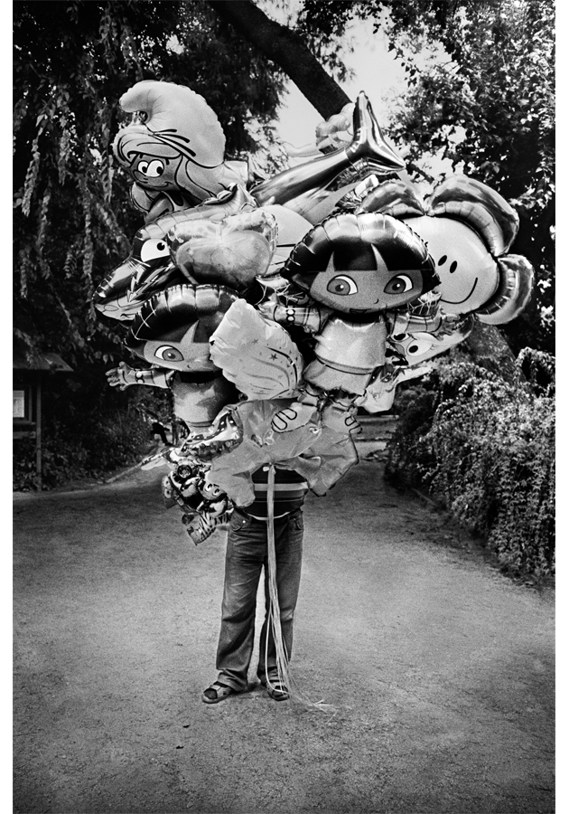
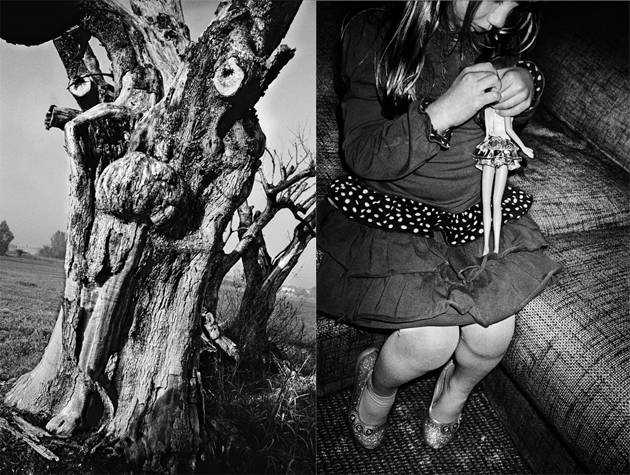
Studio Blanco contributed with what they do best: a visual story to join together Emilia’s faces and places, as if to ward off the possibility that the crumbling of the land could be followed by the crumbling of the people who lived on it. To tell this story, they invited Swedish photographer Anders Petersen, a man who has nothing to do with these places, but who has made raw and moving reportages about vulnerability for more than forty years. Over eight days in November 2012, Studio Blanco brought Petersen to toll roads and museums, riversides and devastated squares, letting him photograph wherever, whomever, however he liked, with the idea that only an outsider could find and capture the spirit that keeps these lands together.

A young contortionist, a knotty tree trunk, two elderly people dancing in a ballroom. One year after the earthquake, Petersen’s photos create a small poem about Emilia, which sews up that deep crack and returns this land, whole, to the humanity that has always belonged here.”
Monica Lombardi – Images courtesy of Studio Blanco, Anders Petersen, Sportmax, Estelle Hanania, Carlotta Manaigo, Matteo Serri, Ari Marcopoulos 
Share: Facebook,  Twitter