01/10/2013

Monthly reads: PIN-UP Interviews

If you are not an architect or a designer and you were to read the payoff “A magazine for architectural entertainment”, wouldn’t you be at least a little bit intrigued? Wouldn’t you want to know what is it exactly that those serious architects find entertaining and what does actually crack them up? Well, if you are going for nerdy inside jokes and puns about form and function, probably you are looking at the wrong magazine. Aside from its clever catchphrase, PIN-UP is a publication that actually takes the matter seriously, albeit often quite unorthodoxly.
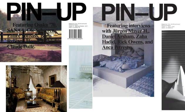
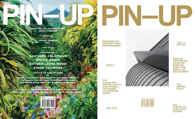
Founded in 2006 and published twice a year, PIN-UP has grown to become one of the most significant publications about design and architecture. Standing up against all those apparently serious and deep, but also kind of dull, established publications, it has tried to develop a critical discourse about contemporary architecture. Aided by a hint of irreverent graphic design, it has surely made its point: architectural magazine can actually be fun and engaging even for the general public. This is why it should only be right that they immortalized their eight years of work with a more serious, yet equally interesting publication.
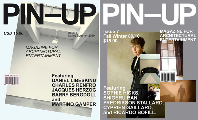
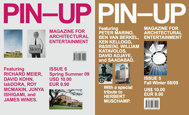
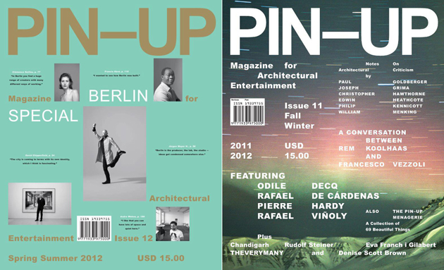
Simply named “PIN-UP Interviews”, this book is a collection of all the feature interviews published in the magazine since its first issue. Properly re-edited to fit their new purpose, this book features interviews with architects David Adjaye, Shigeru Ban, Ricardo Bofill, David Chipperfield, Zaha Hadid, Junya Ishigami, Rem Koolhaas, Peter Marino, Richard Meier, and Ettore Sottsass; artists Daniel Arsham, Cyprien Gaillard, Simon Fujiwara, Boris Rebetez, Oscar Tuazon, Andro Wekua, and Robert Wilson; and designers Rafael de Cárdenas, Martino Gamper, Rick Owens, Clémence Seilles, Hedi Slimane, and Bethan Laura Wood. Even though we would not go as far as Hans-Ulrich Obrist and state that this is “A mesmerizing book of interviews that reads as addictively as a thriller”, it nevertheless appears a timeless form of architectural entertainment, perfect to read (or re-read) just any time.
Rujana Rebernjak 
Share: Facebook,  Twitter  
30/09/2013

The Bitrot Project by Valentino Bellini

In her latest book, “Hello World. Where Design Meets Life”, Alice Rawsthorn speaks about the qualities of ‘good design’. For Rawsthorn, the definition of good design gets down to one thing: integrity. In fact, she writes: “Unless it has integrity, no design project can be deemed to be good, however useful, beautiful or innovative it may be. ‘Good design enables honest and effective engagement with the world’, wrote the American philosopher Robert Grudin in his book Design and Truth. ‘If good design tells the truth, poor design tells a lie; a lie usually related, in one way or another, to the getting or abusing of power.’”


If this is the criteria that separates good design from bad, then we must not only take into account the use, the physical aspect or the manufacturing process of a design object to evaluate it. One fundamental component of that equation is also how the objects we use are later disposed of, and it does not only concern the ecological implications of such disposal, but also the human condition it involves. Thus, if we consider the idea of good design from this point of view, many of our praised products, mainly the electronic ones, will immediately step on the other side of the equation.


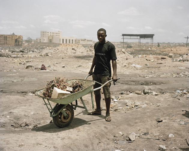
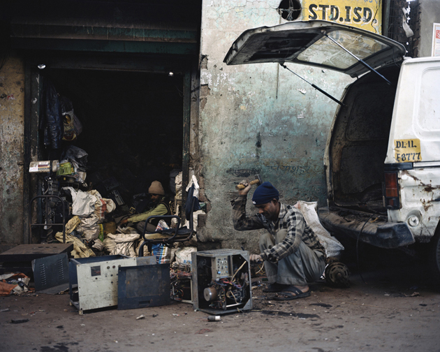
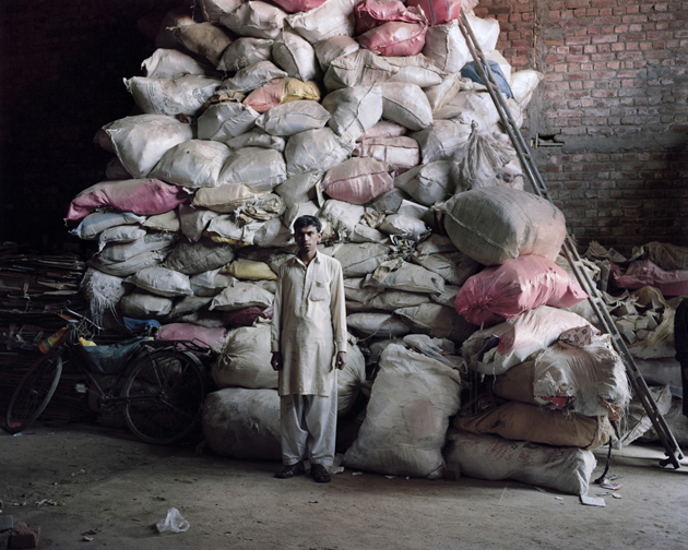
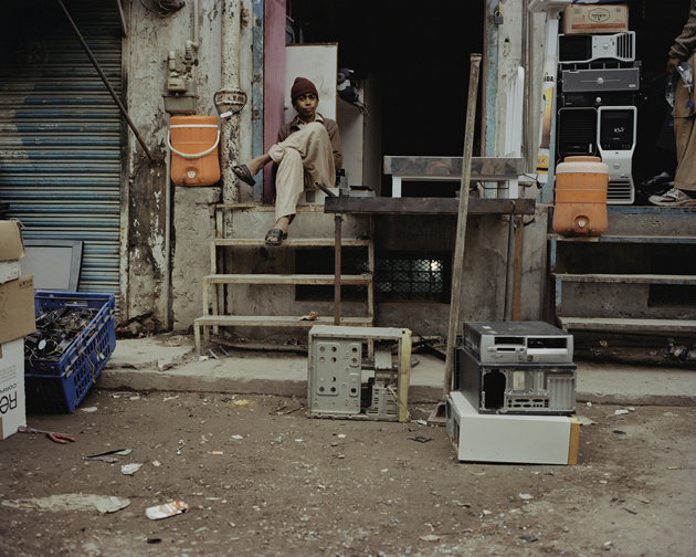
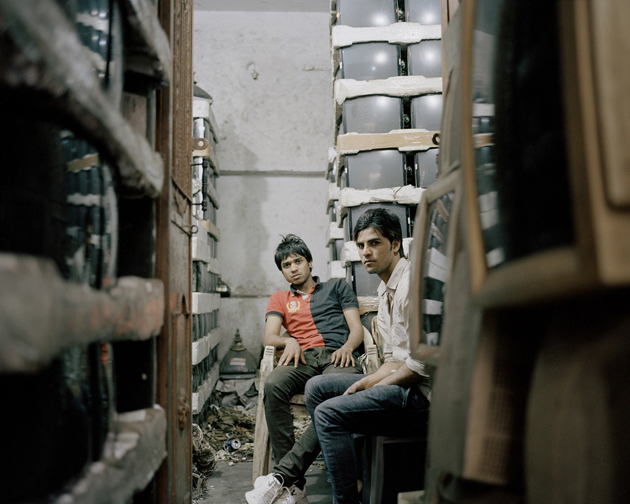
In fact, it is exactly what Valentino Bellini, a young Italian photographer, tries to point out with his Bitrot Project. Bellini has delved into the world of hazardous e-waste disposal, which, mainly produced in developed countries, is not disposed of in situ, but shipped, most of the time illegally, to developing countries on cargo ships, where it is illegally disposed. Containing dozens of substances dangerous to human health and to the environment, our lovely electronic products are hard to be sustainably disposed of and they need a costly processing technique to make it recyclable. His photographic research focuses on the extreme consumerism of the society we live in, enquired through the images of e-waste disposal sites, contemporarily showing how ‘bad design’ can be really, really bad.


Rujana Rebernjak – Images courtesy of Valentino Bellini 
Share: Facebook,  Twitter  
24/09/2013

New York Art Book Fair 2013

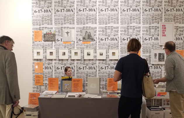
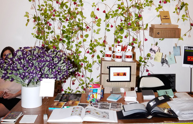
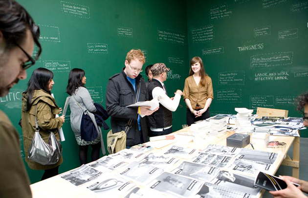
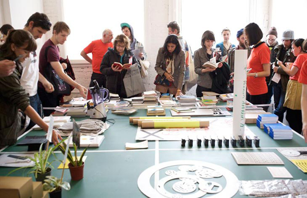
If you were anywhere near New York this weekend and you didn’t stop by MoMA PS1, you might have missed one of the greatest publishing events of the year. Yes, it is the fabulous New York Art Book Fair we are talking about and, yes, beyond the trendy people, beyond the myriad of not-so-great publications and a few dozens of only so-so books, we still do love it.


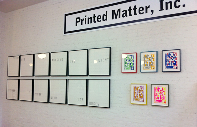
Organized by Printed Matter, an institution that does not need a special introduction, the NY Art Book Fair was presented for the eighth year in a row. This year, the event featured a series of particularly delightful presentations and a beautiful exhibition of an Italian design master, Bruno Munari, who was at the centre of this year’s edition with a series of classic books he has made throughout his extraordinary career. Brought to New York in collaboration with Corraini, the publishing house which edited most of his books, this show was a comprehensive survey of his influential career, including a collection of rare and out-of-print artist and design books by Munari.


Other featured events of this year’s edition were a small exhibition of drawings, diagrams and notes made by Hans Ulrich Obrist brought together by Badlands, Paperwork, an exhibition of artists’ scrapbooks featuring works by Brigid Berlin, Jimmy de Sana, John Evans, Hans-Peter Feldmann, Al Hansen, Richard Hawkins, Geoffrey Hendricks, Ray Johnson, Leigh Ledare, Gerhard Richter and Jean-Michel Wicker, a presentation of Ray Johnson’s “Book of Death” and a satellite exhibition, hosted by See.Me, containing more than 200 posters spanning 40 years, including work by Ed Ruscha, Kathryn Andrews, Peter Coffin, Eve Fowler and Allen Ruppersberg.

If you weren’t anywhere near New York this weekend, but are still desperate to see such an amazing group of young creatives, artists, illustrators, designers and photographers all in one place, you may find them in a few months (precisely January 31st) in Los Angeles, since Printed Matter is currently working on the second edition of this amazing event in the sunny land of California.


Rujana Rebernjak 
Share: Facebook,  Twitter  
21/09/2013

London Design Festival 2013 Highlights

It’s that time of the year again when your favourite websites are taken over by not only the images of latest trends, skinny models and posh front row outfits, but also by hundreds of design projects that range from the hundredth new chair produced this year to flashy one-off installations. Yes, London Design Festival has opened its gates quite a few days ago and we have had the time to wander around some of its hot-spots and bring you a not-so-detailed, but yet very accurately selected list of projects we have liked, loved or even slightly hated in this year’s edition of the Festival.

Scholten&Baijings “The Dinner Party” at V&A

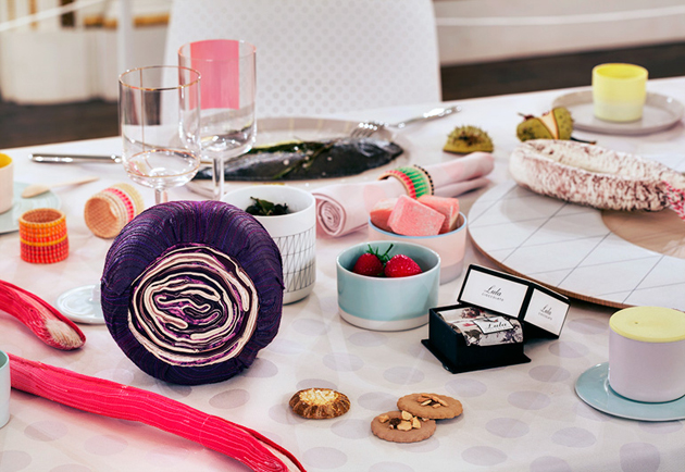
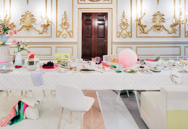
We have often wondered if there will come a time when design museums might actually give a more realistic view of design practice than the currently used ‘look and adore, but do not touch’ mode of display. This time hasn’t actually arrived yet, even though Dutch design duo Scholten&Baijings have come quite close. “The Dinner Party” is an installation that tries to create both a dialogue between the historical setting of V&A’s Norfolk House Music Room, as well as propose a lived-in setting for their trademark tableware projects.


Typographic Circle’s Circular Magazine

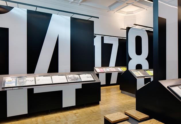
Another event at the V&A is worth mentioning: the exhibition showcasing issues 8-18 of Typographic Circle’s Circular Magazine. Founded with the goal of creating a community of type-lovers as well as promoting graphic design – and especially typographic – culture, each issue of the magazine was completely different both in style and content, evolving with the passing of time.
So Sottsass at Darkroom

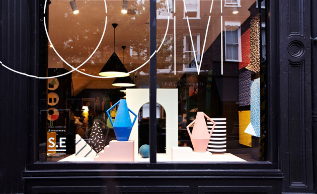
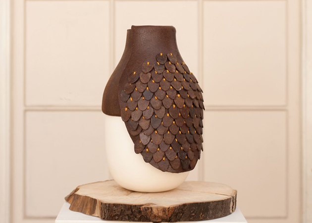
If it weren’t for our unconditional love for everything even slightly related to Ettore Sottsass, we would have dismissed this project in a second. “So Sottsass” is a collection of objects that stylistically interpret the designs of the grand Italian master, giving a quirky touch to the shop’s selection. So, if you can’t afford a real Sottsass piece, you can maybe temporarily satisfy your needs with a quirky pillow, a totem light by Jamie Julien-Brown or a Studiopepe Kora vase.

Wonderland at 19 Greek Street

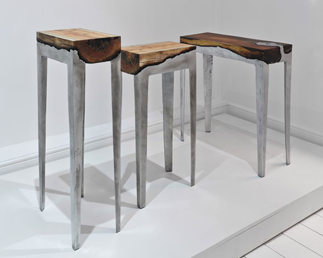
Even though the premises of this exhibition seemed actually far more interesting than what we got to see in there, this Soho space is worth visiting. With the goal of (once again) inquiring into that ambiguous space between art and design, Wonderland brings about 18 pieces by 12 designers, which range from furniture made combining wood and cast aluminium to lamps made combining industry and hand-craft. Even though the idea of exploring the boundaries of design practice is always interesting, we didn’t find many encouraging takes on that thought in this display.

Faye Toogood for Established and Sons

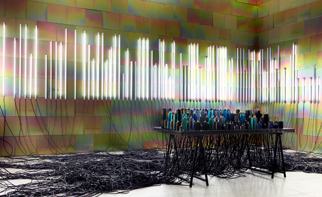
English brand Established and Sons has invited Faye Toogood, London-based designer, to create an installation for their showroom. Named “The Conductor”, the installation is made up of a series of fluorescent lights controlled by analogue toggle switches, embedded in blocks of coloured resin, through which the cables can be seen, interpreting the brand’s new collection of colourful resin furniture by Jo Nagasaka. Playful and visually somewhat mystical, this project is to be read under the ‘just for fun design’ label.

Rujana Rebernjak 
Share: Facebook,  Twitter  
18/09/2013

In Barcelona with Ana Mirats

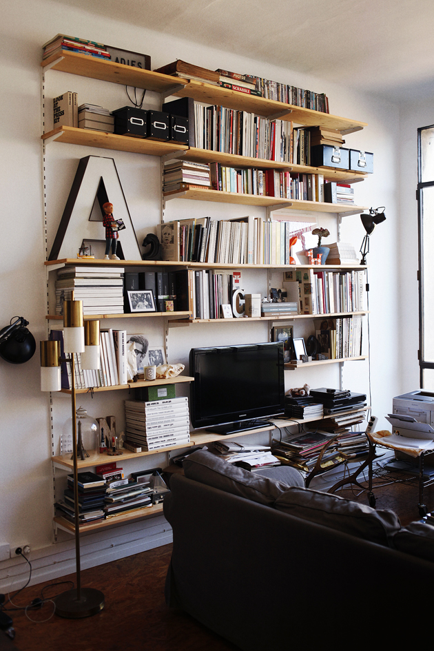
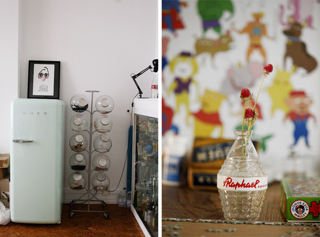
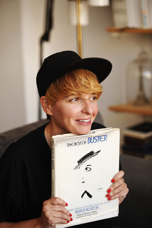
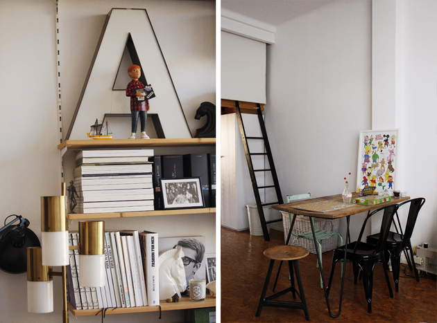
“It’s a little big city.” Ana Mirats, graphic designer and art director, talks about Barcelona – the city of Gaudí and the second largest city in Spain. This is where she after years of working for others, from home and in shared co-working spaces, decided to set up her own studio: a place where ideas become reality. The Blogazine did a stop in the capital of Catalonia to pay her a visit.


Ana Mirats is easygoing. “Come by whenever you want to! Just call before to see that I’m here!” is her answer when we get in contact to make an appointment. The attitude mirrors the ambience around her. Like her website, the studio breathes simplicity. Yet, the scent of creativity cannot be mistaken. “Looking at my profession, being located in Barcelona is a good choice, seen from both inside and outside of Spain. It’s an inspiring city and many good publications are born here.” Ana has worked as a graphic designer for 12 years, whereas six of them she also spent working with art direction. “I had been working for small studios for four years when I was offered a position in a Spanish multinational company dedicated to fashion. I stayed there for a few months in the same time as doing some freelance jobs, but I had always thought about working on my own and eventually I made it.”


While the part of being a graphic designer calls for the actual handwork, the role of an art director requires the ability to conceptualise the collective thoughts of a team and translate the desired ideas, moods and messages into visual material. To the subject of which part of her job she enjoys the most, she replies: “That’s a difficult question! I like everything! The part I enjoy the most though is the development of an idea, which happens all along the process – from that the initial idea takes shape until its final result.” While going through the printed material of Ana’s portfolio, we also pick her brain about the differences of working for print versus new media. “A lot has changed – the digital world has overwhelmed us very fast. This has resulted in both small and large companies following an increased pace that obviously affect us all. Nevertheless, I believe the work is the same, just translated to other media. The point here is to understand the new languages and know how to use them.”


In the universe of Ana Mirats, the dream job isn’t narrowed down to that one account. “Doing what I do now, in different cities around the world, for a long time, is the dream.” And if travelling around the world is the dream, where does she go to find inspiration? “Any place is OK, the importance lies in being open to new things. I travel, go to the cinema, listens to music. I love travelling abroad and to shop in second-hand bookstores. You can find unexpected wonders!”

Lisa Olsson Hjerpe – Images Coke Bartrina 
Share: Facebook,  Twitter  
18/09/2013

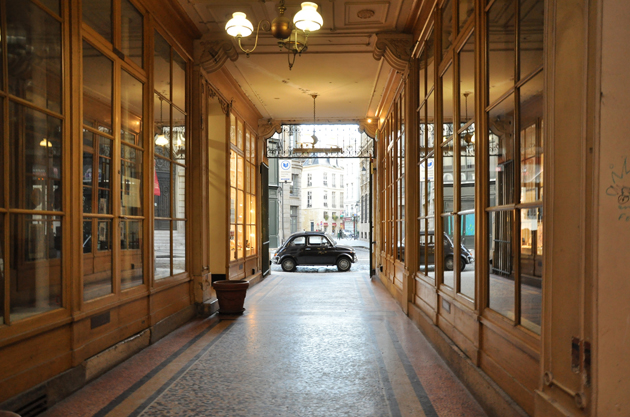
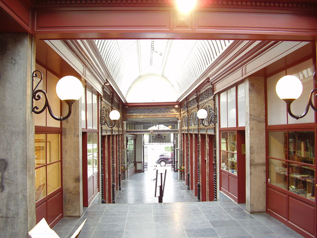
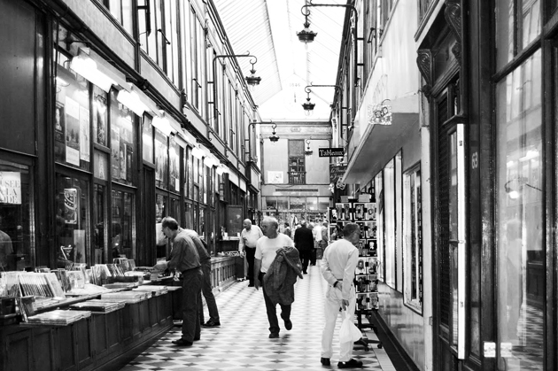
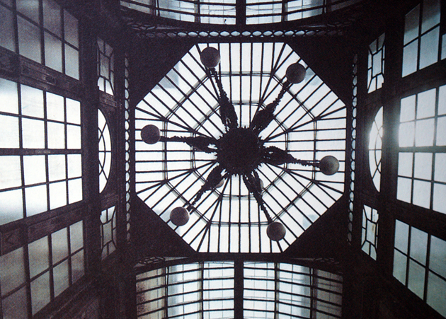
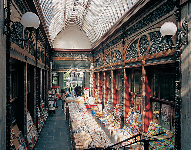
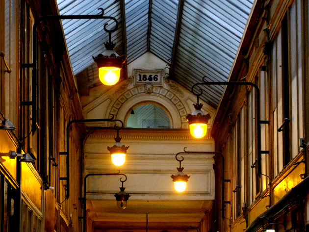
Rediscovering an Indoor Walk

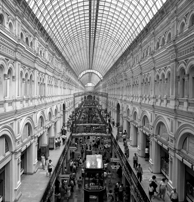
The tunnels and covered walkways were born during the French Revolution and they experienced a period of flowering until the First World War. These “roads in a road” increased their splendor, and thanks to them the cities became centers of trade and were inspiring greatest architectural achievements. The presence of theaters from the early days, in more than one arcade wordwide, is no accidental detail, for the arcades themselves created a new form of spectacle. Idling, window-shopping and observing became an art form, summed up in the French verb “flâner”, meaning to stroll, which, with its derivatives “flâneur” (stroller) and “flânerie” (the activity of strolling), became inextricably bound with this special form of urban space. 
The gallery is a structure, which in many parts of Europe helped make alive the city centers. Having emerged as attractive places in which it’s hard not to come in contact with other people, even the most lonely person felt inexplicable attraction for having to go walking through these places, amid a flurry of passers-by and an endless parade of shops.


During the last century of history emerged also objections and criticism against this new urban spatial system. The German philosopher and writer Walter Benjamin wrote from 1927 to 1940 The Arcades Project (in German, Das Passagen-Werk), his last giant masterpiece as an effort to represent and to critique the bourgeois experience of nineteenth-century history and as an allegory of the new modern age.
 But, in spite of Benjamin’s social investigation – where he labeled the passages in a negative way – the gallery is in general loved and located in the most crucial place of the city. And it doesn’t matter how you call it: gallery, store, pass, stoa, colonnade, corridor or arcade. 
Whether you go in a hurry or not, the tunnel should be fun, but its use has lost importance for the hundreds of malls in every city.


As a recent example one could look at “The Allen Lambert Galleria” – a 6-storey pedestrian avenue designed by Santiago Calatrava in Toronto, Canada – an attempt to build an arcade in a modern city center, to give people a new covered shopping street. The construction has a very futuristic architectural form that goes back to the Gothic cathedrals, and it becomes at the same time, in a symbolic way, the cathedral of shopping. Today, as the German architectural historian J.F. Geist wrote, “we are living in a time when the arcade is seen not only as a historical object but also as a contemporary possibility” and there are so many examples that could be restored and revitalized to ensure that the gallery will become again, a special stop-in-transit to experience the city.


Giulio Ghirardi 
Share: Facebook,  Twitter  
17/09/2013

3D Printed Gun and the Ethic of Design Production

When last year an essay published in The Economist described the evolution of 3D printers as the beginning of the third industrial revolution, most designers were already thinking about how this technology might be formally exploited. Hence, a myriad of 3D printed furniture marched out, displaying all the wonderful stylistic and formal quirks allowed by this production technique. The second issue soon discussed in design circles concerned the economic value of the new technology and how design objects would be bought and consumed in the near future. From tiny do-it-yourself 3D printers that allowed you to produce anything you wanted at your house to online projects like OpenDesk that store technical drawings for neat chairs, tables and shelves, design world seemed concerned about how far our imagination might go in coming up with objects we would be able to produce at home.
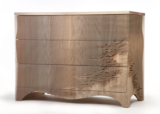

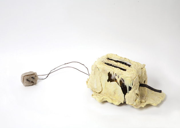
But last week’s acquisition by Victoria and Albert Museum in London shows deeper implications of these new means of production. As part of their Design Fund acquisition, the curators of the museum have decided to add a 3D printed gun to their collection. In fact, in comparison to The Liberator gun, other objects added to the collection this year – which include Formafantasma‘s Botanica collection, The Toaster Project by Thomas Thwaites, Ear Chairs by Studio Makking & Bey and the George chest of drawers by Gareth Neal – seem innocuous and almost dull.

The Liberator gun was developed and assembled earlier this year by Cody Wilson, a Texas-based law student, through the use of separate printed components entirely made of ABS plastic, with the exception of a metal nail used as a firing pin. While the technical drawings of the project were taken off the internet, The Liberator project nevertheless poses urgent moral and ethical questions about the use of technology in everyday life. In fact, Kieran Long, V&A’s senior curator discusses that “so far people have focused on the ability to print out things at home, such as toys, but this seems to be only part of it. In my view, the gun blew all that away. It showed the fuller implications of the dissemination of the means of production. Everybody is now potentially a manufacturer.” And while the ability to design, produce and build objects by ourselves appears liberating, hopefully this project will show the design world it should finally start being more concerned about issues that go far, far beyond the poetics of form, colour and structure.
Rujana Rebernjak 
Share: Facebook,  Twitter  
12/09/2013

Visiting Villa Sucota

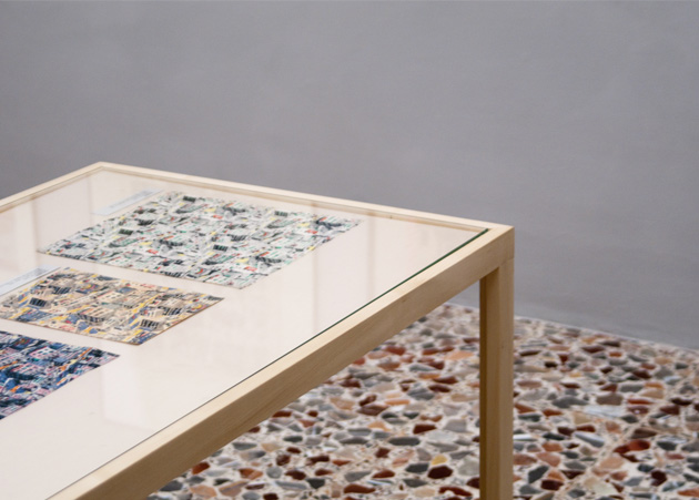
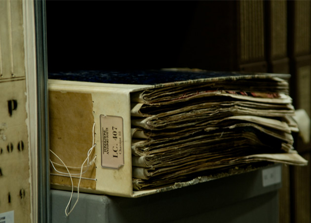
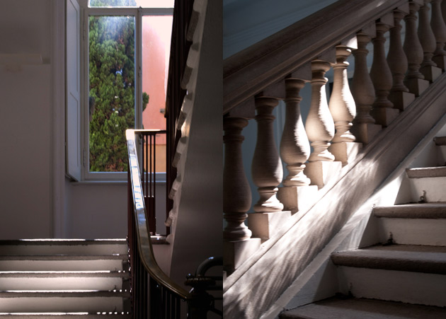
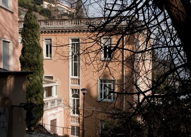
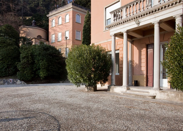
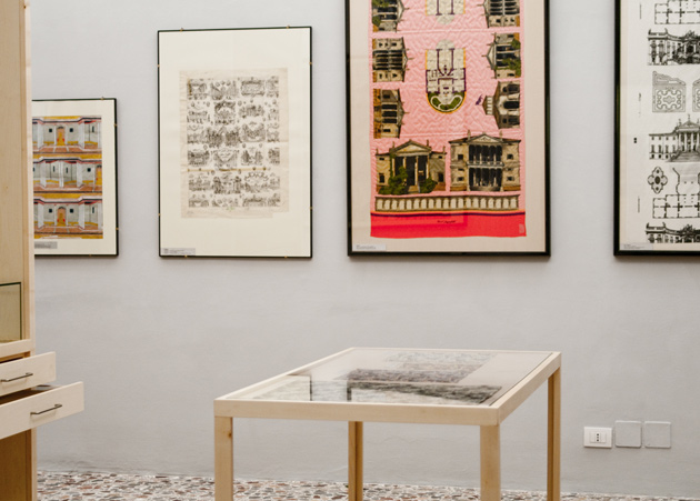
On a sunny afternoon it still feels like summer in the north of Italy. Como, where one would feel the holiday mood all the year around, is famous for silk and textiles industries. On the shores of the lake, only 50 km away from Milan, we are about to enter the courtyard of Villa Sucota. The historical villa built in the middle of nineteenth century is nowadays well known in the world of culture as Fondazione Antonio Ratti.

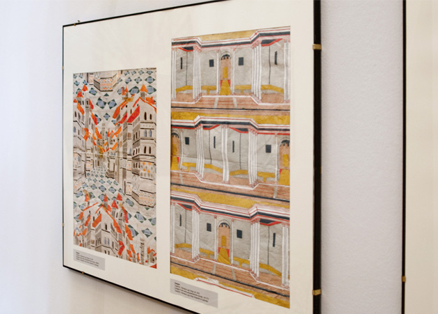
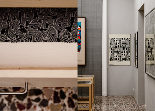
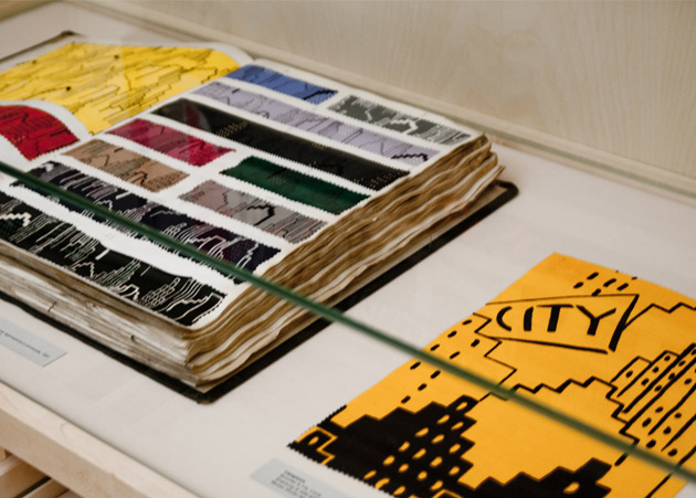
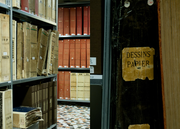
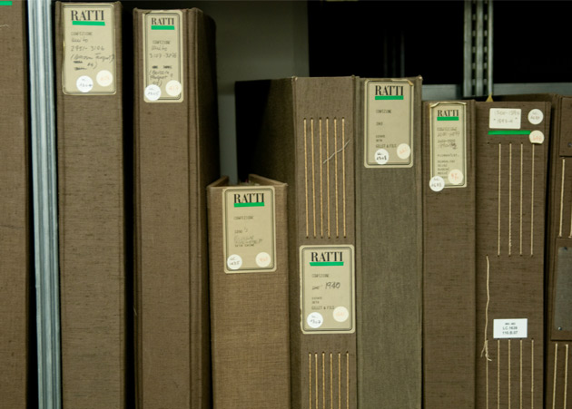
Welcomed by the curator Francina Chiara, we are brought to visit a rare fabrics exhibition, a collection of ancient textiles. Collected by Antonio Ratti throughout his life with passion and accuracy – an exhibition on rotation is hosted in two rooms on the ground floor. Archive that consist of more than three thousand single textile items and more than two thousand pattern books was gathered over a period of forty years. The Museum of Textiles (Studio Museo del Tessuto) organizes not only exhibitions and lectures but also holds the Advanced course in Textile Design – a course for young talents from around the world.

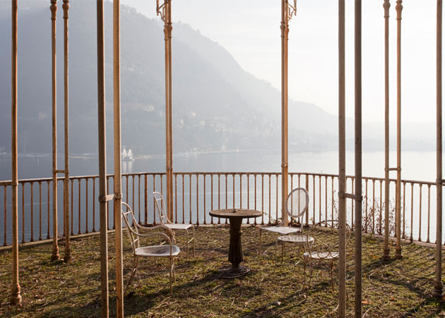
Climbing up to the next floors we pass by the offices of administration and arrive to a cosy library with a “postcard view” over the lake. Open to public since few years it holds more than five thousand volumes specialized in textiles, fashion, visual arts and crafts. The purpose of the foundation is to promote the initiative and studies of artistic, cultural and technological interests not only in the field of textile production but also in contemporary art. Many events are hosted by the foundation like advanced courses in visual arts, exhibitions and lectures.

A great source of inspiration not only for textile designers but everyone interested in fashion and its history – the collection’s database is available for everyone on the foundation website.


Agota Lukytė – A part of the images from Giovanna Silva 
Share: Facebook,  Twitter  
10/09/2013

Richard Rogers: Inside Out

What makes the work of an architect great and why? Isn’t this the question an exhibition about an architect’s work should answer? Isn’t it supposed to glorify his achievements and hide his failures? Or isn’t it supposed to show what impact his work has had on a larger social scheme and how it interacts with what we know and understand about our living structures? The latest exhibition displayed at Royal Academy of Arts in London, dedicated to Richard Rogers and his 50-year-long career, answers the second set of questions, leaving the first set to the visitors’ imagination.


Titled “Richard Rogers RA: Inside Out”, the exhibition is structured in four different sections, each one tackling one particular aspect of Rogers’ work. Known for his involvement in political discussion through architecture, the show tries to pinpoint how his creations have been shaped by political, social and ethical concerns, as well as popular culture, technology, art and urbanism. In fact, the structure of the exhibition, designed by Rogers’ son Ab and curated by Jeremy Melvin, tries to analyse how his projects exist, influence and are influenced by exactly those forces.

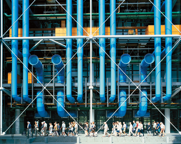
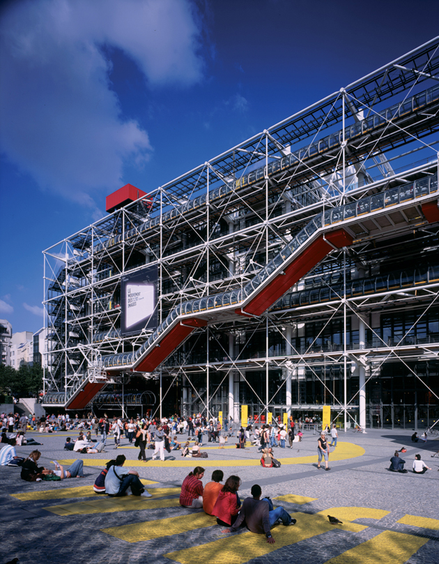
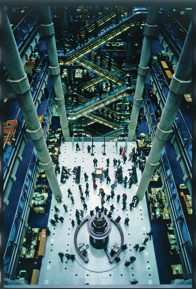
In fact, even though the exhibition explores his practice from different points of view (from his personal influences to his political engagement) the most important part of it is seeing how his work engages with the aforementioned issues, starting from Rogers’ ethical principles: fairness, politics, the city, aesthetics and collaboration. Even though his most famous projects, like Centre Pompidou (designed together with Renzo Piano) in Paris and Lloyd’s Building in London, might be criticized as lacking in various aspects of those points, it is nevertheless important to note Rogers’ intention to promote architecture as a practice that needs “to be a politically engaged and sustainably responsible profession, which recognises its agency to affect positive change on society”.

Rujana Rebernjak 
Share: Facebook,  Twitter  
03/09/2013

Monthly reads: Forget All the Rules

Have you ever admired the colours of a poster without noticing the event it was supposed to promote? Have you ever found yourself lusting over a beautiful letter set in an even more wonderful typeface, without noticing the message it spelled? You probably haven’t, because graphic design can never be separated from the message it is supposed to convey. Its ultimate function is communication, as obvious as it might seem.


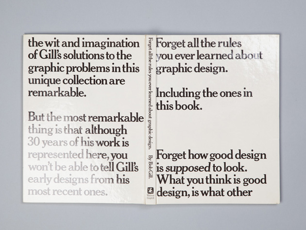
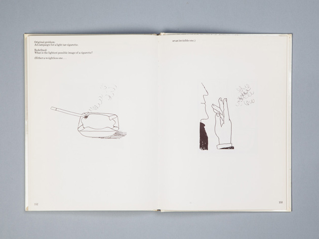
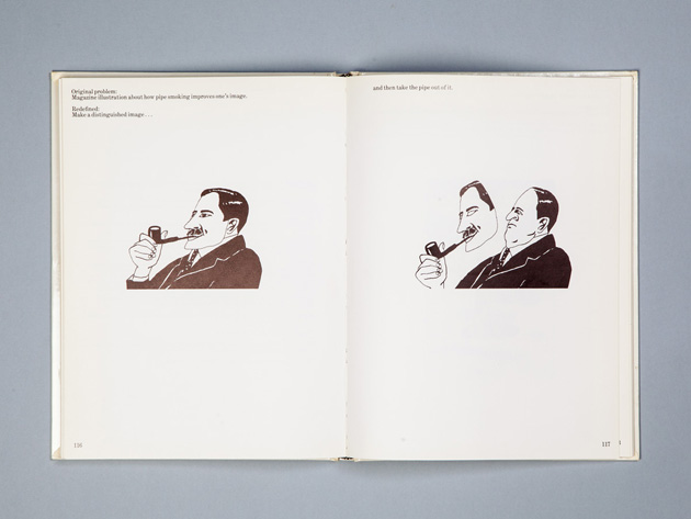
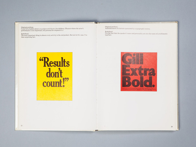
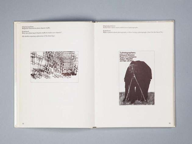
Yet, there are probably thousands of designers right now browsing thousands of other blogs looking for ‘inspiration’ for their new project. Looking for the ‘looks’, the style, the image, and not the solution. And if you may be one of those designers, or spot one sitting right next to you, please note that a design can only be taken so far by an aesthetically driven solution. This apparently blatant phrase comes as a conclusion after reading a tremendously significant (at least, as far as we are concerned) book “Forget All The Rules You Ever Learned About Graphic Design. Including The Ones in This Book.” written by one of the most genius graphic designers of all times – Bob Gill.


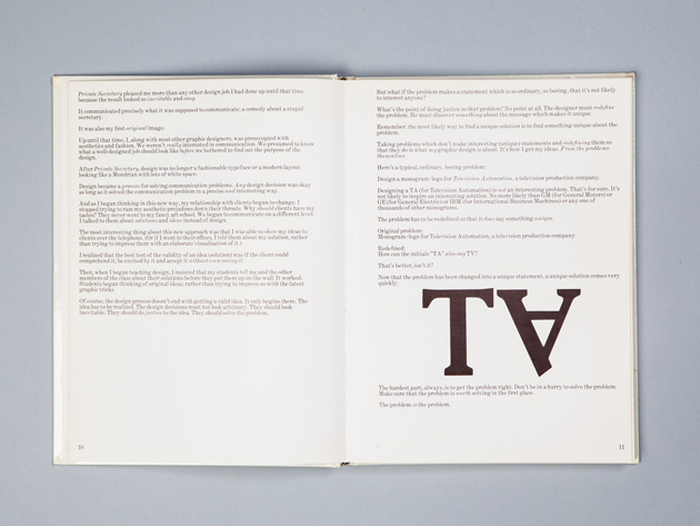
Even though it was published more than thirty years ago, in 1981, its lesson still remains an essential one to learn. In fact, what Bob Gill tries to explain throughout the book departs from a single, simple piece of advice: “Unless you can begin with an interesting problem, it is unlikely you will end up with an interesting solution.” Starting from the problem, trying to turn each task in an interesting problem, is what, in Gill’s words, can make even the most boring brief an interesting one and even the worst client a possibly nice one to work with. And this simple piece of advice (along with its further elaborations and a series of illustrated examples included in the book) is possibly the most important one any designer may ever receive.


Rujana Rebernjak 
Share: Facebook,  Twitter