23/12/2015

Enzo Mari: Discarding the superfluous to get back to the essence

Gesamtkunstwerk is a German word, the utopian concept of a total work of art. The first time I encountered it was in Zurich, at the Kunstmuseum, where Harald Szeeman had organized an exhibition around this goal. There was a wide range of artworks from every year in the century, contrasting currents, different materials, mutually exclusive viewpoints, irreconcilable approaches, unexpected results, startling formalisms. A hodgepodge on the one hand, all-encompassing on the other. Exhibitions get forgotten, films go up in smoke, novels fade in memory, essays slip away. But in the end (close to the end) one realizes that all these layers, these heaps of information, pile up somewhere in our brains or souls and come to shape our view of the world, which also has some long compound name in German.
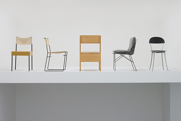
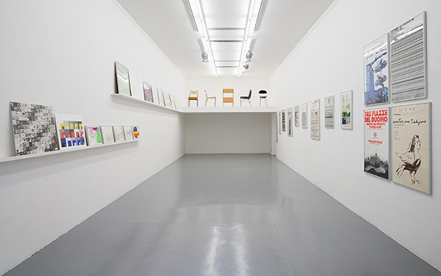
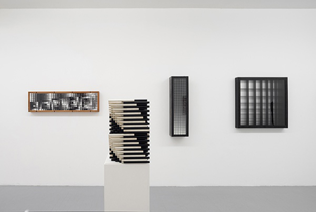
Over the course of his long life, Enzo Mari has accumulated experiments, drawings, designs, objects both found and made, artworks and multiples, printed manifestos and conceptual manifestos, handcrafted items and industrial products, obsessions and metaphors. All allegories of a method that seems to be the scaffolding of the total work of art to which he aspires. It is hard to define his approach; Mari is an artist, a designer, a graphic designer, an architect, a theorist, an idealist, a philosopher, but what is immediately clear is that he is a human who has always been impelled to invest and channel his entire life—and even those of the other humans who know and are close to him—into a single project. Mari has performed simple actions, like slightly bending an iron beam; extremely complex ones, like imagining a diagonal slice through the Palazzo dell’Arengario in Milan; and an idea that may be even more utopian and crazy: that of transforming the world by influencing the condition of his fellow humans. Everything he has managed to achieve or even just conceive, using a complex method that would be incomprehensible and inapplicable for anyone else, has been organized, classified and diligently preserved in his endless, paroxysmal and perhaps paranoid archive. An archive I visited for the first time a few months ago, at 10 Piazzale Baracca, a space that was Enzo Mari’s home and then became his studio, an all-encompassing Wunderkammer of gathered, accumulated, catalogued and stored memories, where he has worked for over fifty years; a place where objects wait, with dusty impatience, to be put into action, brought back to light; an archive that is a Renaissance workshop, a place imbued with visions, dangers, curses, treasures for those who can to see them, little shifts in meaning carried out by this moody maestro, both gentle and austere.
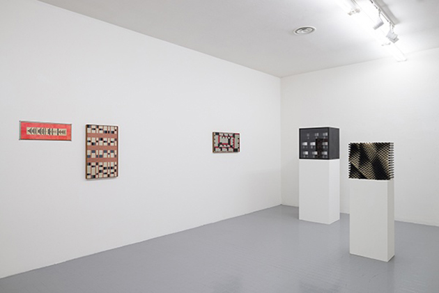
A man of another era? No, a man of his own era, a man outside of any era, never afraid to reshape the basic ideas underneath it all, switching them around and coming up each time with a new group aesthetic, though he gives you to understand that he doesn’t believe in groups. Eras change, storms subside, and these ideological approaches from the “roaring years” now seem sweet and still utopian, ridiculous and yet tragic. But the works, objects and texts of his poetic vision remain as proof of a complex mental construct, which is not satisfied with details, but aspires to create a total work of art.
The Blogazine – Images and words courtesy of Massimo Minini 
Share: Facebook,  Twitter  
16/12/2015

Italian Radical Disco at the ICA

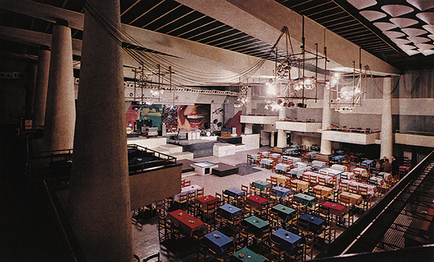
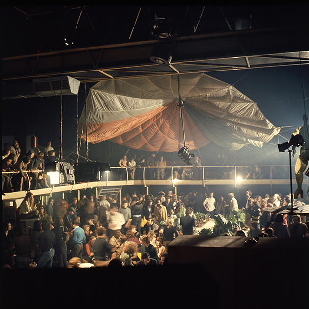
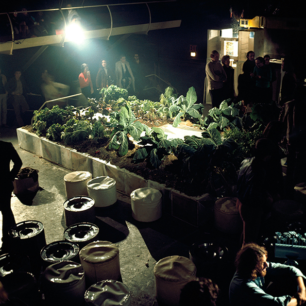
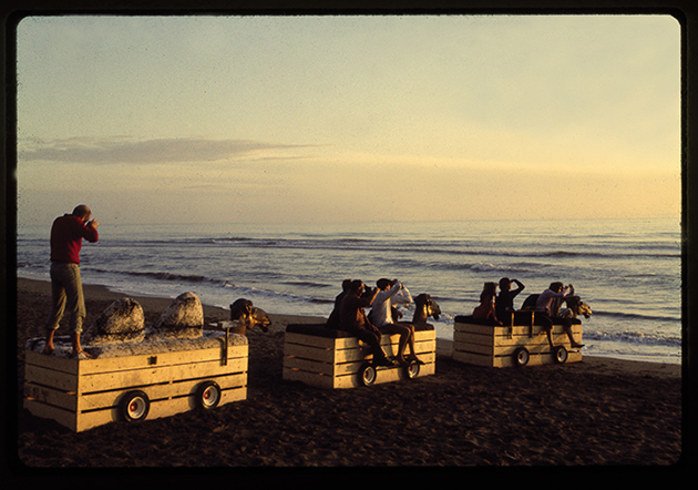
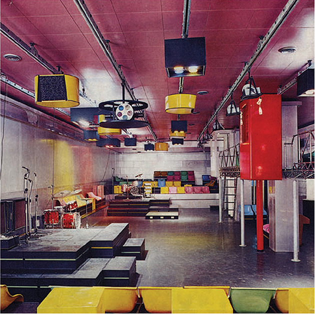
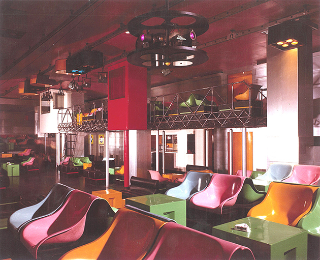
A presentation exploring the relationship between architecture and nightlife in Italy during the 1960s and 1970s has opened at the ICA in London recently. The years in question saw a number of discotheques open across Italy, including several designed by architects of Radical Design, a movement active in the 60s and 70s populated by architects such as Gruppo 9999, Superstudio and UFO. Dissatisfied by the limitations and ineffectiveness of post-war modern design, these architects sought to use their profession as a tool for societal change and to challenge the idea of architects’ role in society. In a period of change and contestation in Italy more generally, these socially orientated, politicised architects saw discos as a new type of space for multidisciplinary experimentation and creative liberation. The display explores this little-known phenomenon through archival photographs, architectural drawings, film, music and articles from the international design press. Italy’s discos were known as Pipers, named after the first such venue, which opened in Rome in 1965. Designed by Manilo Cavalli, and Francesco and Giancarlo Capolei it featured reconfigurable furnishings, audio-visual technologies and a stage for Italian and British acts from Patty Pravo to Pink Floyd, who performed against a backdrop of works by artists including Piero Manzoni and Andy Warhol.

The Blogazine – Images courtesy of the ICA 
Share: Facebook,  Twitter  
01/12/2015

Paulin, Paulin, Paulin – An Artful Design Dialogue

One of the main difficulties in displaying objects of design in an exhibition setting is how out of context they often feel. Taken out of their everyday setting, where they are given meaning through use, and placed in the silent environment of a white gallery objects are unable to tell stories about their purpose and role in the world. Aware of this unexpected muteness, curators of design try to offer contextual clues through descriptions, drawings, photographs, documents, yet objects can often resist theoretical talk in favour of a more tactile, multisensory dialogue. A recent exhibition at Galerie Perrotin attempts to diffuse such complexities by constructing a dialectical relationship between objects of design and works of art.
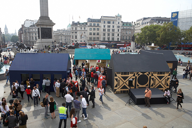
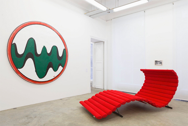
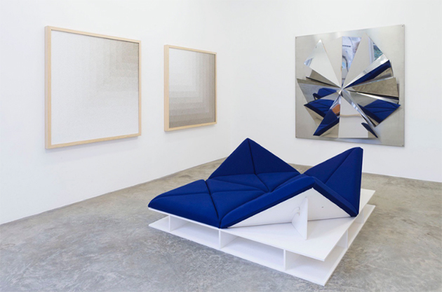
Titled “Paulin, Paulin, Paulin” the exhibition brings together the work of Pierre Paulin, one of the most significant French designers of the past century, with a series of artworks that share a vision and affinity, or production context and contextual reference with his work. Paulin’s most significant work was produced during the 1960s, in an era signed by technological innovation, creative imagination and liberation from social constraints. His work, marked by an organic, de-structured formal composition, exploited technological innovation in order to display non-conformity towards social rules, while participating in exponential expansion of consumer culture, just like works of pop-art included in the show.

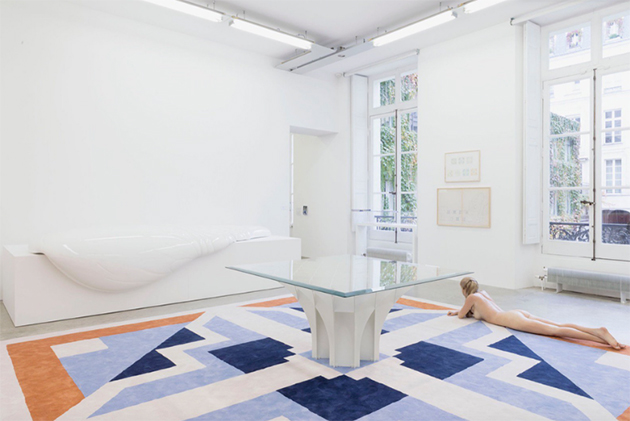
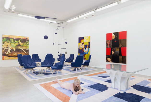
Similarly, “Dune” and “Tapis-Siège” pieces, designed by Paulin in 1970 for Herman Miller, are brought to life through the work by John De Andrea, that shows a hyperrealist figure of a languorous naked woman, sitting on a “Dune,” highlighting its sensuality, as does another figure, lying in the middle of a “Tapis- Siège” which is made half of origami and half oriental carpets. Halfway between fiction and reality, the shows brings together the ironic seriousness of works like Elmgreen & Dragset’s Untitled (Home is the Place You Left) with Paulin’s objects designed for everyday, timeless use. But what is the point of this dialogue? If exhibitions of design put objects out of context, how can their mingling with art contribute to any better understanding of what design is? By placing Pierre Paulin’s innovative work alongside iconic artworks, the curator of the exhibition, Cloé Pitiot, tells us about the cultural and ideological context of their creation, points to possible interpretations of the domestic environment of their use, and shows what is their place in the world today.

The Blogazine – Images courtesy of Galerie Perrotin 
Share: Facebook,  Twitter  
23/11/2015

Can Design find Happiness? Sagmeister at MAK

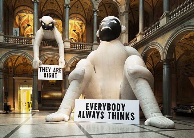
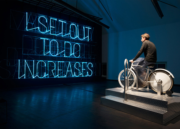
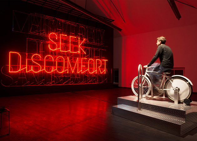
What makes us happy or at least happier? Stefan Sagmeister, the “grand master of graphic design,” embarked on intensive research into personal happiness, omitting no possible means in the process. Meditation, cognitive therapy, mood-altering drugs — Sagmeister tested everything that promised happiness on his own body and then translated his experiments into the exhibition The Happy Show, which has now arrived at MAK in Vienna after previously being on display in North America and Paris. Running until 28 March 2016, STEFAN SAGMEISTER: The Happy Show pervades the MAK with the designer’s captivating search for happiness.

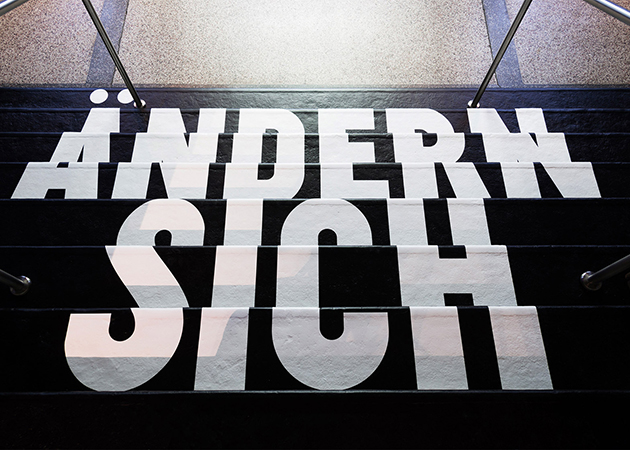
Is it possible to train the mind to be happy? Or at least happier? Can the mind be trained in the same way as the body? These are only some of the core questions in the show, which can be answered with an unequivocal “yes.” The Happy Show demonstrates quite clearly that there are things we can do that will make us happier. It all depends on our attitude, our habits, and our behavior, according to one of Sagmeister’s messages. However, what we expect will make us happier will not always do so. “I normally find definitions rather boring. But happiness is such a huge topic that it is perhaps worth a try,” is Sagmeister’s comment on his own happiness research. In handwritten commentaries on walls, railings, and in the bathrooms of the museum, he explains his ideas and reasons for the projects on display. Social scientific data by the psychologists Daniel Gilbert, Steven Pinker, and Jonathan Haidt, the anthropologist Donald Symons, and important historians, who position his experiments in a broader context, supplement his personal notes. Sagmeister addresses a colorful panoply of parameters for happiness, such as religion, money, marriage, sex, activities like surfing on the internet or reading the newspaper, as well as the relation between the number of sexual partners and levels of satisfaction.

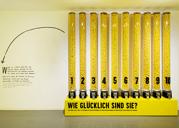
The search for a symbol for happiness will be a collective affair: visitors can push buttons, draw lucky symbols on small strips of paper, draw cards with tasks, and are invited to withdraw money from an ATM while donating 20 cents. A display with silver plates offers visitors Sagmeister’s favorite candies. At the installation How happy are you? visitors can answer with their own “level of happiness” on a scale from 1 to 10 by taking a piece of chewing gum from the respective place. In turn, this action will visualize the collective happiness level of the visitors to the exhibition.

The Blogazine 
Share: Facebook,  Twitter  
03/11/2015

Punkt – Re-designing Use

When the first telephone was patented by Alexander Bell in 1876, despite all imagination and possible futurologist thinking of the time, scarcely anyone could have predicted that – a hundred and forty years later – it would have become such an epoch-defining device. In many aspects, telephones are currently at the forefront of innovation, with their use spanning areas like medicine, for early diagnosis and to help patients attain to therapies, to everyday life, to order food, book train tickets and flights or engage with artwork in museums. Telephones and related technologies are central to economic growth, while sheer existence of infrastructure necessary for their use speaks volumes about the level of development in society.

Due largely to Apple’s revolutionary yet secretive attitude towards product development, telephone design seems almost an alchemical process involving careful combination of perfectly studied curves, subliminal sounds and elusive tactile qualities. The resulting concoction gives origin to not only a beautiful material product, but – as we are able to witness daily – to a whole set of new habits, social relationships and values, that were morphed by and evolve with our phones’ titanium, glass and plastic shells.

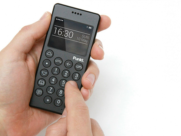
Despite smartphones’ addictiveness – both on social, cultural, economic and personal levels – a brave new product aims at reforming the very culture of telephone use we have acquired over the years, bringing it back to its original – and today archaic – functionality. Punkt, designed by Jasper Morrison, is the simplest of mobile phones. Its design could be described as minimal, defined by a black plastic shell, rectangular shape, well-rounded edges and round, easily identifiable keys. Were it not for the year of its release, Punkt would be nothing else but an unassuming mobile – or cordless – phone. And thus, what is revolutionary in Punkt is not its design per se, but the context within which it is being framed, that allows its design to make a subtle, ironic point about its use. Namely, it shows that products like Punkt have for a long time been obsolete.

For such a product, it was only natural that the company would commission Jasper Morrison to develop its design. Know for his “supernatural” approach to designing, Jasper Morrison is a proponent of undesigned design as creation of objects that look immutable, as if they’d been the same for centuries. He is the designer of archetypes – objects that will unlikely require a redesign in the near future and which seem to stand at the origin of an object category and their specific form. Punkt was designed to defy the current trends on the market. It can only serve two functions – make calls or send text messages – and such reduced, austere functionality – austere, that is, if compared to current smartphones and their functional exuberance – is reflected in its strict black shell. Punkt mobile phone, in fact, looks as if it were almost physically uncomfortable to use. And yet, when you pick it up, its carved volume and slightly rugged surface fits perfectly, seamlessly into your hand, anticipating the straightforwardness of its ‘archaic’ use. It invites you to hold it up close to your ear, rather than blankly stare at its screen.
But what is the point of Punkt beyond an obvious defiance of current market trends? Can its users surpass contemporary social pressures? Can its design help to make us a bit less intoxicated by all that is digital? Morrison’s intent was certainly not to make ‘classic’ telephone use appear sexy, glamorous or fashionably appealing; Punkt’s shell is not bright yellow or clad in rose gold. As such, Punkt is perhaps bound to remain just a utopian proposition – an object designed to speak about design and the values it confers when it is nothing more than what it is.

Rujana Rebernjak – The Blogazine 
Share: Facebook,  Twitter  
26/10/2015

The World of Charles and Ray Eames

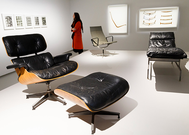
“For Charles and Ray Eames, design was not simply a professional skill, it was a life skill—more than that, it was an essential attribute of life itself.” Design as a way of life, a state of mind, a personal philosophy – from the opening words of Eames Demetrios, the director of the Eames Office to Martino Gamper, one of the most important contemporary designers – it seems that design, for both designers and the general public alike, can hardly be separated from life. It is through this lens that visitors to the recently opened exhibition “The World of Charles and Ray Eames”, are introduced to the legacy of, possibly, the most famous design couple. In fact, had it not been for their personal relationship, the exhibition points out, perhaps their world of timeless, essential, fundamental, designs would never had existed.

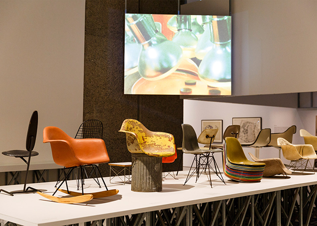
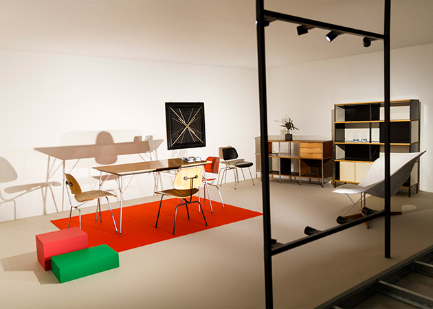
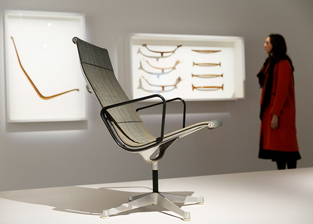
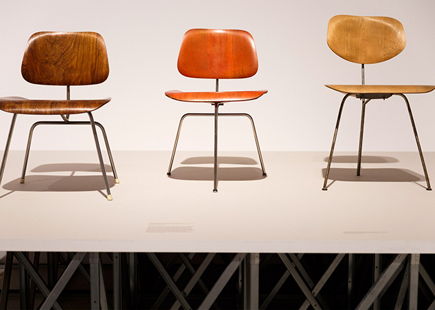
Held at the Barbican, itself the landmark of positive, utopian, modernist design thinking, the exhibition opens – perhaps a bit too uncritically – with Charles and Ray’s early experimentation with plywood – the material that is central to their careers. From wartime plywood leg splints – a modular, inexpensive, ergonomic, mass-produced object – to post-War focus on domesticity, with plywood chairs, tables, children’s toys and furniture, the exhibition traces the history of design from technological innovation to the comfort of the home – apparently, the ultimate design destination. Yet, while Charles and Ray started their career by designing products, the exhibition surveys the evolution of their work towards creating installations and exhibition designs that pre-date the multimedia environments of today. In fact, the story of the Eames Office is that of the trajectory of visual and material culture in the post-war period of the last century as Charles and Ray Eames moved fluidly between the mass-production of objects for everyday use and the transmission of ideas through exhibition, film or installation, in anticipation of the global ‘information age’.

From their modular house, “Case Study House #8”, to their sweet love letters, the exhibition focuses on showing how Charles and Ray moved seamlessly through formats, types of production, events, or even geographies, time and contexts – from their intimate life to the public sphere – by using the tools of design as a media for approaching life. Bringing together over 380 works, the exhibition presents the world of Charles and Ray Eames through objects and projects produced during their lifetime, offering an opportunity to re-examine their work and legacy, and the legacy of post-war modernism. It also features a wealth of documentation and contextual material from the professional archive of the Eames Office as well as artefacts from their personal collections, that highlight their relationship with the leading artistic figures of the 20th century – their immediate circle included Buckminster Fuller, Alexander Girard, Sister Corita Kent, George Nelson, Isamu Noguchi, Eero Saarinen, Saul Steinberg and Billy Wilder – and show the importance of these relationships to the Eameses’ life, philosophy and working processes. In fact, even their friendships cannot but reveal how the imperative of design in their everyday life. “The World of Charles and Ray Eames” runs until 14 February 2016 at the Barbican in London.

The Blogazine – Images courtesy of the Barbican 
Share: Facebook,  Twitter  
06/10/2015

The Voice of Things

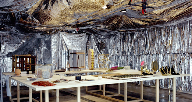
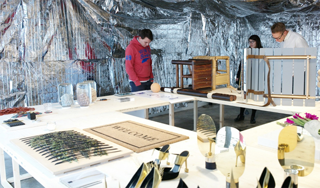
In an unassuming garage in Brompton Design District, sits a room apparently filled with futuristic incongruences. For London Design Festival, Platform 18 – a group of students from the Royal College of Art, led by tutors Sarah van Gameren and Philippe Malouin – presented The Voice of Things, an exhibition exploring the subject of reproduction. The Voice of Things is a celebration of Platform 18′s activity in the Design Products Department and the group of talented designers that it has nurtured. As the platform completed its third and final year, graduates from across the three years come together to complete a common brief for an exhibition curated by platform tutors.

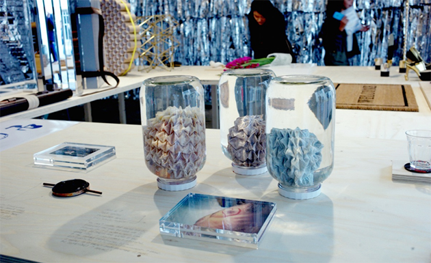
The participating designers have been asked to find a person who can describe a functional object to them solely through spoken word. The designers cannot see, touch, smell or taste the authentic object but are expected to recreate it according to the descriptions received. Visitors to the exhibition had the opportunity to view both the originals and their interpretations, which were be presented side by side – creating unexpected juxtapositions and offering an insight into what reproduction, translation, imagination might mean.

In fact, the Voice of Things is an exhibition about description, translation and interpretation. It also aims to showcase the common qualities developed by graduates of the platform developed through the tutoring by Van Gameren and Malouin, who expected their students to be thinkers and makers; meticulous, methodical, adventurous and fanatical individuals with a sensibility to both artistic and aesthetic values.

The Blogazine 
Share: Facebook,  Twitter  
17/09/2015

London Design Festival 2015

Armed with a new director and a whole new set of design challenges, London Design Festival takes over the British capital with an exciting programme of events that challenge – or perhaps perpetrate – the notion of design today. But while temporary events like the one in London, or even the Salone in Milan, continue to proliferate, can we still doubt their validity? Or should we just embrace their richness and exuberance? For once, we are not being critical about the purpose of such events, and are instead celebrating this year’s edition of London Design Festival with a selection of events you should not miss.

A major part of the London Design Festival’s programme is the presentation of Landmark Projects in various locations in London. Conceptual artist Alex Chinneck, renowned for elevating everyday structures into the extraordinary, created an installation titled “A Bullet from a Shooting Star” which takes the form of a regular electricity pylon but is given an unconventional design.

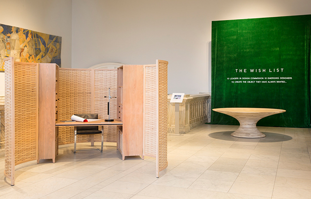
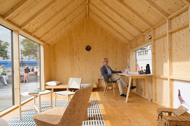
At the V&A, the classic stop on the festival’s tour and the core of its rich programme, a series of installations, exhibitions, talks and explorations will take place – from an installation by Grafton Architects to temporary exhibitions dedicated to British icons like Robin Day. The Somerset House, on the other hand, is an entirely new location for the Festival, and will be properly introduced with an exhibition of ten incredible international designers.

A number of large group-shows will take place across the city where
new and established exhibitors from the UK and around the world will debut their designs. These ‘Design Destinations’ are crucial for designers and manufacturers wanting to reach new markets and provide excellent platforms for new and emerging designers and makers to present their products and innovations – and perhaps also form the most viral and spontaneous way for the public to try and understand what contemporary design is. London Design Festival runs from 19 to 25 September 2015.

The Blogazine 
Share: Facebook,  Twitter  
07/09/2015

Remembering Robin Day

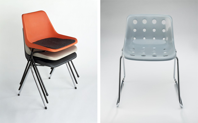
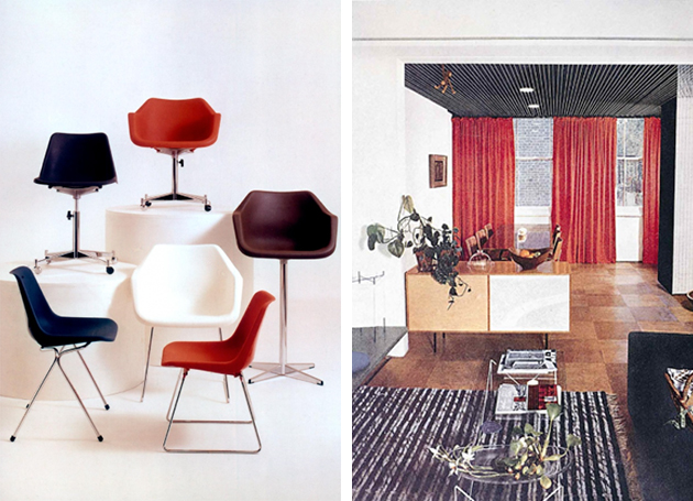
If you were asked to choose the most iconic chair in the world, odds are that the choice would fall on one of the greatest classics – Eames DSW chair, Harry Bertoia’s Side Chair, Verner Panhon’s all-plastic moulded chair or Thonet’s revolutionary bentwood chair. And yet, the most iconic chairs may not be those that populate our everydayness – pieces that silently define how we relate to objects through memory. When his Polypropylene chair was first released in 1963, Robin Day may not have imagined that it would both leave a mark on the world of design as the first mass-produced, injection-moulded chair in the world, as well as capture the collective memory as one of the most widespread, ubiquitous yet unobtrusive objects, that almost everyone has, at least once, used.

“In my long years of designing, the thing that has always interested me is the social context of design and designing things that are good quality that most people can afford,” Day observed in 1999. “It was always my mission to mass-produce low-cost seating, because I do think that clarity and what we call “good design” is a social force that can enhance people’s environments.” That ethos, perhaps, was reflected the commissions he would work on throughout the years, becoming an expert on public seating design, as some of his most memorable projects included seating for the Barbican, Royal Festival Hall or London Underground, the latter two still in use today.

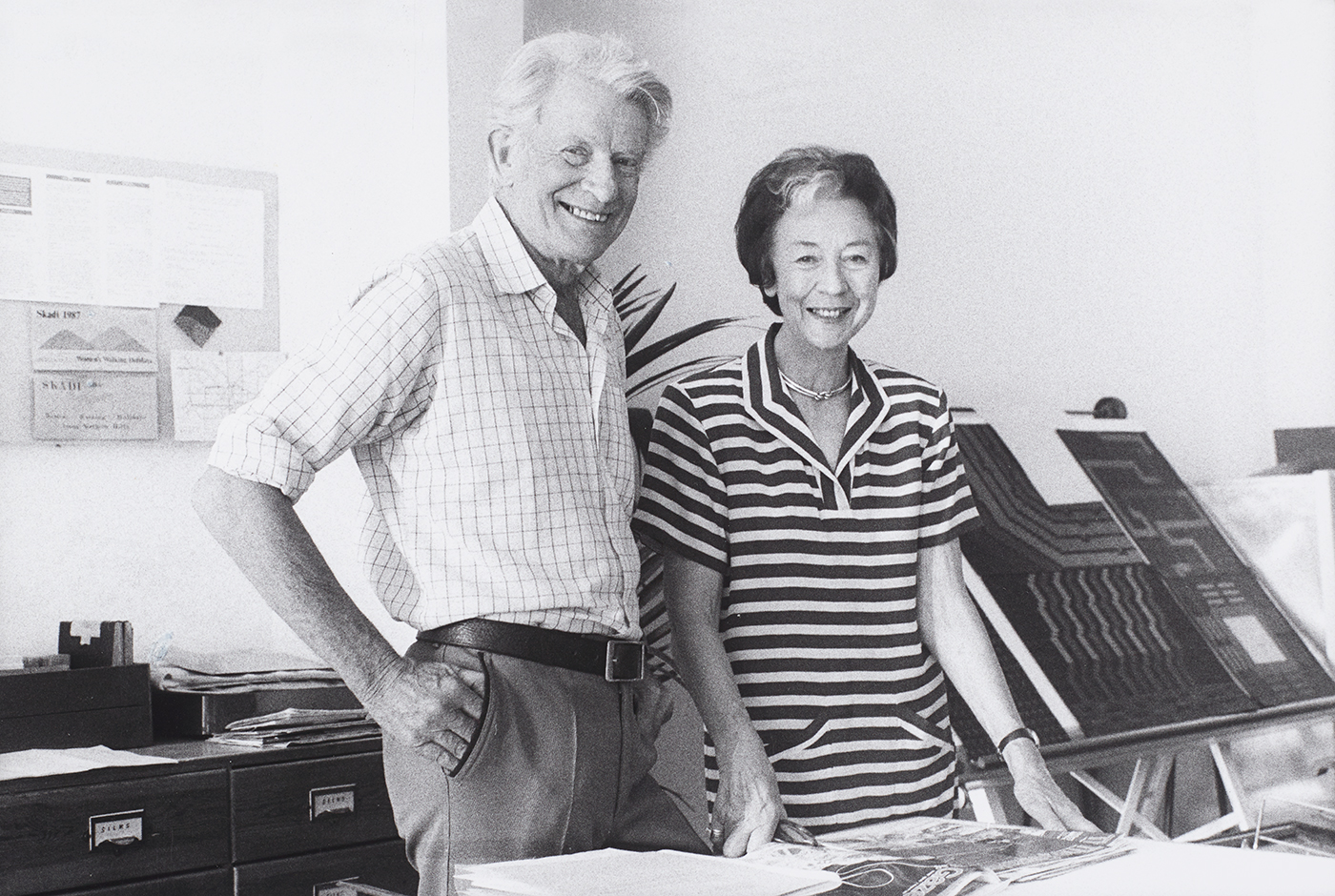
This year marks the centenary of birth of Robin Day, born on 25 May 1915, creating the perfect opportunity to examine his legacy as one of the most important British designers, in a series of events and exhibitions, that culminate in a special installation staged at London’s V&A Museum in the occasion of this year’s London Design Festival. While Day was known for his experimentation with at-the-time novel materials and inventive use of technology, the installation – titled “Robin Day Works in Wood” – is focussed on objects and furniture design made of wood. Juxtaposing his designs with personal objects, the exhibition will be set in a specifically commissioned installation created by Turner-prize nominated collective Assemble. Taking the form of a ‘forest’ – as a reference to the landscape of Day’s childhood – the exhibition will remain on show until 27 September 2015.

The Blogazine – Images courtesy of Robin and Lucienne Day Foundation 
Share: Facebook,  Twitter  
03/09/2015

A Bigger Park: Celebrating Difference

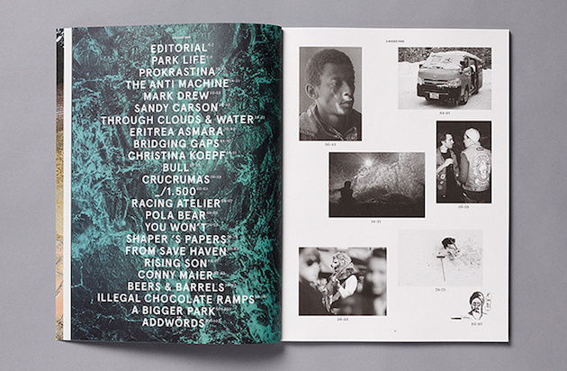
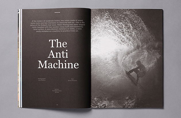
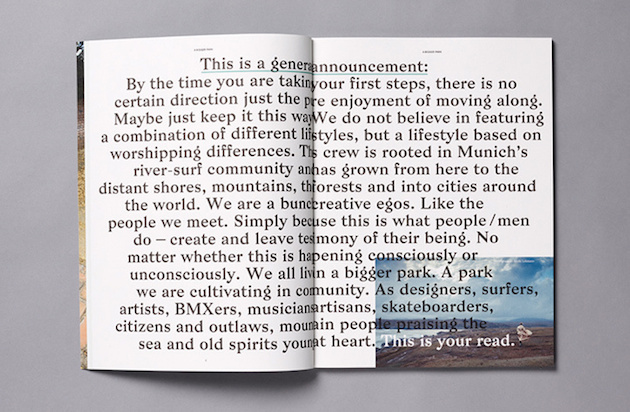
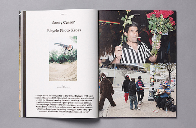
Over the past 10 years, skateboarding and surfing magazines have evolved to become a particular niche of independent publications, mostly characterized by endless rows of images featuring palm trees, sunsets, angsty youth or abandoned, suburban streets. If there is anything like an overexploited genre, than these ‘subculture’ magazines – in their wish to escape the canons of ‘normal’ life – have become its prime example. With a desire to approach and talk about this coveted lifestyle with in a more honest note, the German creative director Christian Hundertmark has created A Bigger Park magazine. With a beautiful design, the magazine serves not only a space to sharpen one’s creativity, it is also a platform for like-minded individuals – designers, surfers, artists, skateboarders, musicians or artisans – to build a community based on exchange of ideas, thoughts and stories told through the pages of the magazine. As such, A Bigger Park smartly avoids the clichés of the genre as it doesn’t worship “a combination of different lifestyles, but [shows] a lifestyle based on worshipping difference”.

The Blogazine – Images courtesy of A Bigger Park 
Share: Facebook,  Twitter