12/06/2014

When Hiroshi Sugimoto Does Good Architecture

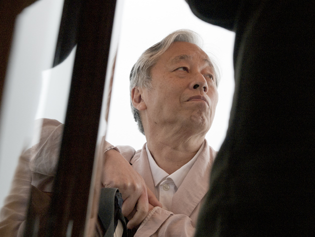
The Japanese artist and photographer Hiroshi Sugimoto made his first architectural work for Le Stanze del Vetro on San Giorgio Maggiore island in Venice that opened on June 6. Known throughout the world for his photographic works in black and white, Sugimoto for the first time in Venice designing a structure after opening his architectural firm just few years ago.
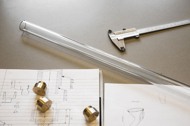
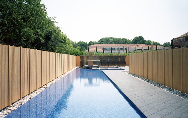
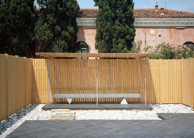
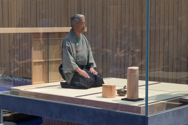
“Glass Tea House Mondrian” is inspired by the tradition of the Japanese tea ceremony, as it was reformed by the master Sen no Rikyu. The pavilion consists of two main components, one outdoor and one indoor. The uncovered structure (about 40 meters long and 12.5 meters wide) winds through a path that includes a long pool of water, which leads the visitor into a glass cube (2.5 x 2, 5 meters), where on a regular basis, there a Japanese tea ceremony will be held. The glass cube welcomes, together with the master of ceremony, two visitors at a time, while the public may attend and take part in the ceremony gathering at the sides of the glass cube. The tools that will be used for the tea ceremony were all designed by Hiroshi Sugimoto and produced by artisans in Murano.
The flexible structure of the pavilion and its temporary nature, will also transform the garden where it was built, so far unused, in a versatile space, able to accommodate meetings and debates, and encourage visitors to freely determine their own experience with the pavilion. The innovation of “Glass Tea House Mondrian” lies in its ability to suggest a space for exhibiting and experiencing architecture, where the pavilion itself becomes exposure – innovation to which is added the autonomy of the artist to propose a theme and a project free from restrictions, but rather open to the possibility of experimenting with shapes, place, building technologies and materials.
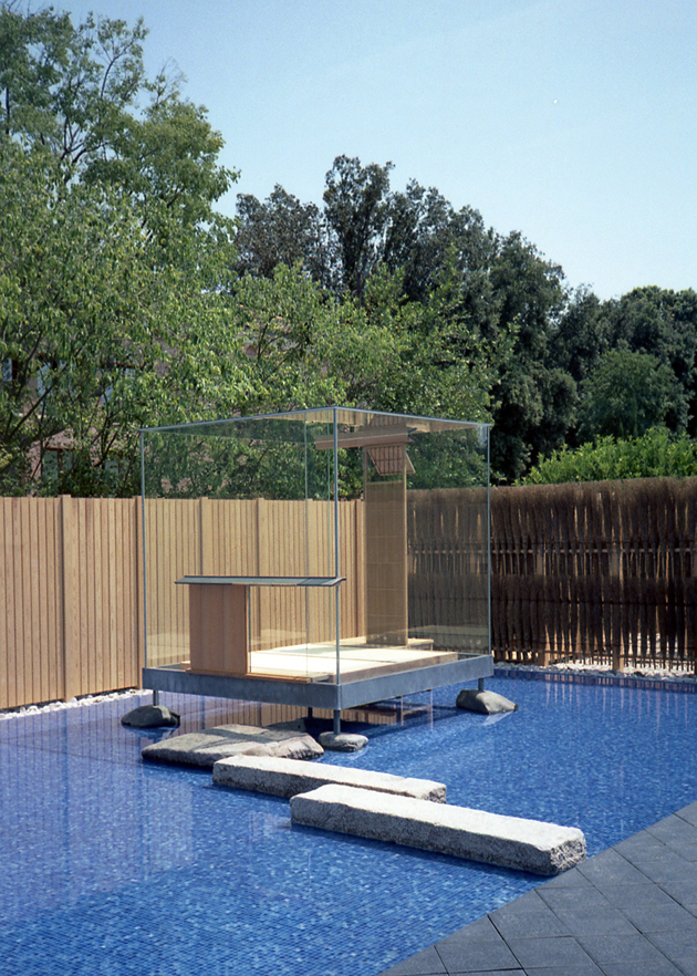
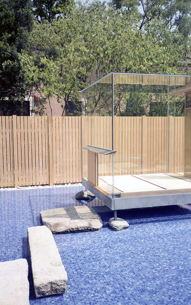
The external structure is built entirely of cedar wood from Japan, and realized by Sumitomo Forestry Co. Ltd. Chosen by Hiroshi Sugimoto for their efforts in contributing to the reconstruction of the areas devastated by the Tōhoku earthquake and tsunami of 2011 and instrumental in the construction of “Glass Tea House Mondrian” and the external enclosure, which is inspired by the Shrine of Ise. In the frame of the Island of San Giorgio Maggiore, the “Glass Tea House Mondrian” also acquires a symbolic value by encouraging the visitor to interact freely with the place, and also requiring you to find the right balance between personal and artifice architectural and the natural environment that surrounds it.
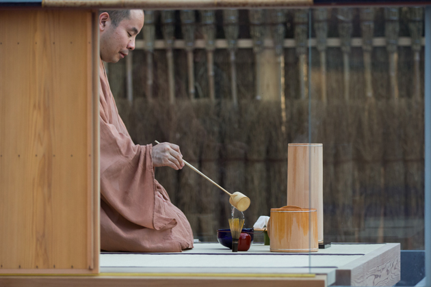
“Glass Tea House Mondrian” builds a strong dialogue between interior and exterior, nature and artifice, closed and open, light and heavy, water and land, a relationship that results in the use of timber from Japan – for the external path – , mosaic – for the hot water – and glass – for the deputy to the experience of Japanese tradition.
Images and words Giulio Ghirardi 
Share: Facebook,  Twitter  
06/06/2014

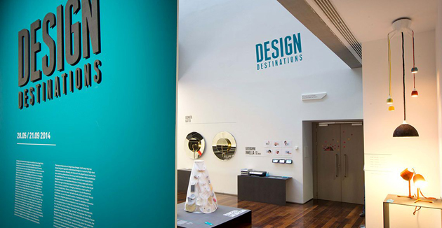
Design Destinations, Italians going Dutch at MAXXI

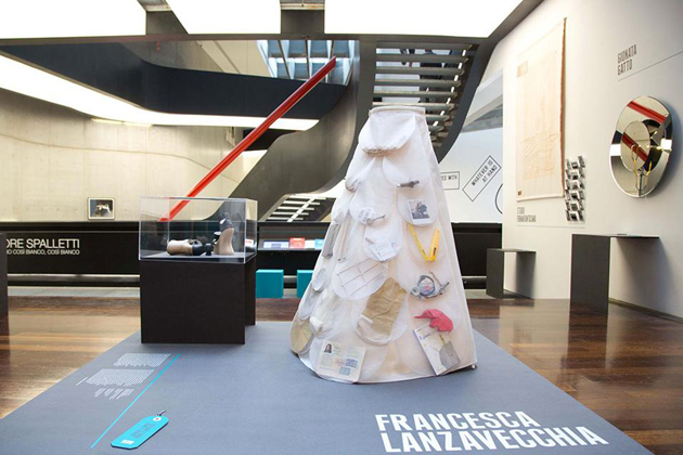
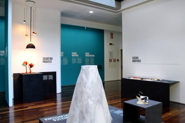
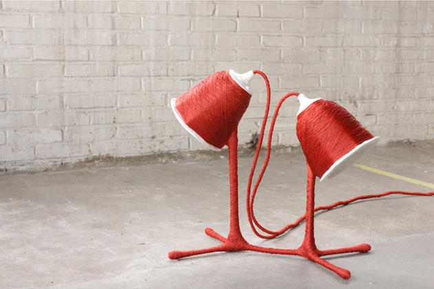
“Design Destinations” is the title of the exhibition dedicated to the new frontiers of contemporary design research by the Roman museum of XXI century arts – MAXXI. The insight developed by curator Domitilla Dardi is curious and fertile: to give voice to a new generation of young Italian designers that studied at Design Academy Eindhoven and then remained to live and work in Holland. Their means of expression: an inedited collection commissioned by MAXXI together with the City of Eindhoven, institutional partner in the project.

The whole show outdoes the value of single pieces and subtends, instead, a few crucial questions on the future of this discipline: how a “made in Holland” education influences the outcome of every personal research? How is Italian design changed by the new phenomenon of cultural migrations? And, above all, does the idea of a “national design” still make sense?

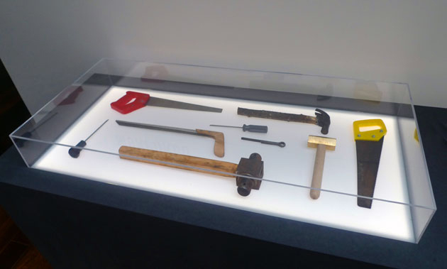
The exhibition does not offer any definitive answers. It’s up to single works to express, each in its own way, an idea of cross-contamination among different cultures. With “Perspectives”, Gionata Gatto gets inspired by Jan Van Eyck’s “Arnolfini Portrait” to design an enlightened mirror that multiplies refractions and points of view. Studio Formafantasma transforms the Bel Paese into a new barycentre between Ethiopia and Holland, updating the cartography of migrations into a new collection of blankets, “Asmara”. On the other hand, “Re-tools” by Eugenia Morpurgo explores the potential of ‘maker’ culture to transform production into a grassroots and transnational opportunity.

Heterogeneous at first sight, the works nevertheless share a common multiple which bypasses single peculiarities that characterize every designer: the predominance of a concept with a biographical or geopolitical background, which remains the very essence of the Dutch approach to project development. Beyond method, however, these “design destinations” seem above all a matter of liberty, which is the freedom to go through a globalized geographical dimension, but also to overstep the role of companies as commissioners and privileged speakers – that’s to say, the very essence of Italian design since the post-war period. That’s what this young generation seems to have unconsciously learnt: not to put aside the great resources of the Italian productive background, but simply to enlarge our host of opportunities, going beyond the problem-solving method proposed by companies and practising design through new forms and content.

Giulia Zappa 
Share: Facebook,  Twitter  
30/05/2014

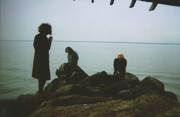
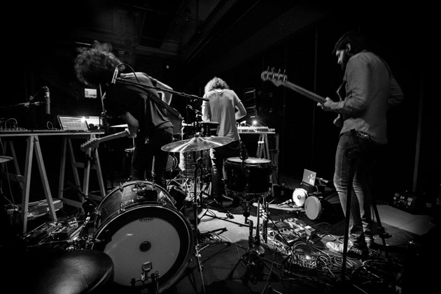
Upcoming Artists: Sunflower Bean

You are very young and the Sunflower Bean were born only a year ago, however, it seems that you know each other for much longer. Maybe you attended the same clubs. Am I wrong?
Yes! The Sunflower Bean is almost a year old, which is on the younger side for a band. We’ve known each other for a little more than a year. We all met through the music scene in Brooklyn, playing shows and hanging out.

Have you found harmony between your musical tastes immediately or do you have completely different preferences?
There’s a harmony between all of our tastes I think, we all love Black Sabbath, NEU!, The Velvet Underground, etc. We share a lot of the same influences.

Now, on your Bandcamp there are only 2 songs, but your sound is already well defined. Do you work hard on this, or just let yourself be inspired by the moment?
Our sound can be a little difficult to describe exactly, but we have dubbed it “neo-psychedelia for the digital age” which actually sums up what we do pretty well. When we write a song, we try to tap into the greatness of our influences without rehashing the past or being “retro.” We are looking into the future by marking the present, like in our single 2013, where we pay homage to the culture that surrounds us, for better and for worse. We record most of our songs at our friend Christian’s home studio, Fox 5 studios. We’ll go over on a Saturday or something and record our new stuff.

Are there any new bands that you really like or someone similar to you style that you appreciate?
One of our favourite bands around is Tonstartssbandht. They are the most inspiring, most talented, and have THE most fun live show around.

You all live in New York – how’s playing in a big city like? Is it easy for a new-born bands as Sunflower Bean to find a place where to perform? How do you prepare for shows?
Being from NYC and living here is the best. There are always bands to play with, and there are always shows to play at. There’s a really good community here. The problem is that most of the all ages venues are closing, which makes it a lot harder for people under 21 to hear new bands, and sometimes it’s really difficult for venues to let you play, just because you’re under 21. We practice a couple times a week in order to stay well rehearsed for the shows we play.

I suppose that playing in a band is not the only job that you do. What do you do in your “real” life? School? Work?
We are all students. I (Julia) am still in high school and I also work at the Museum of Modern Art in Manhattan. Nick and Jacob just finished their first years of college. But music is really what we do everyday, and it is the only thing we really want to do. It’s the dream.

Are you recording new material? Do you have nice surprises set aside for this 2014 ? Releasing an EP maybe?
We have a lot of surprises planned for 2014, new songs, new videos, and hopefully, more shows all over the world!

Enrico Chinellato 
Share: Facebook,  Twitter  
29/05/2014

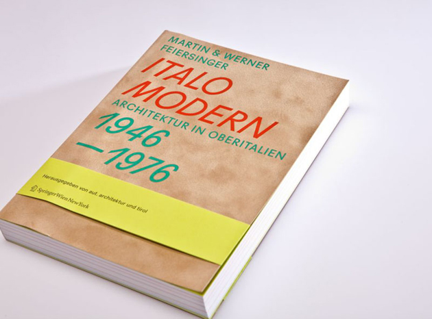
Italo Modern: Post-War Architectural Gems in Italy

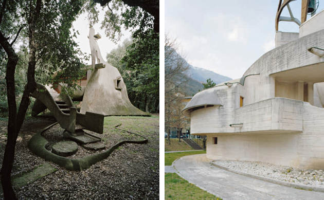
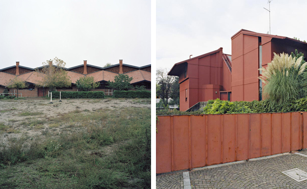
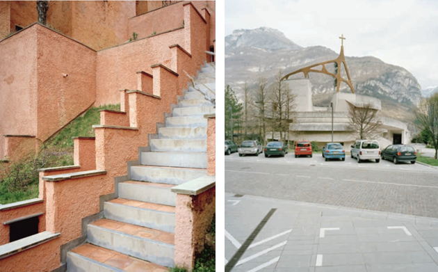
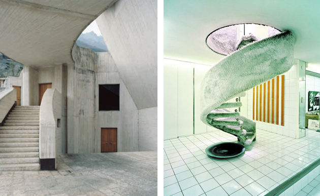
After returning from their Le Corbusier ‘pilgrimage’ in France in 2004, the Feiersinger brothers – Werner, sculptor and photographer, and Martin, architect – came across the austere but magnificent church of Mater Misericordiae. Located near Milan and designed by Angelo Mangiarotti and Bruno Morassutti, in Baranzate in 1956, the church has in the recent years been restored to its original artistic value.

Facing the minimalist white cube of the church, framed with embroidery on the top of the concrete structure, appeared as a real shock to the Feiersingers: it was an utter counterpoint to Le Corbusier’s plastic exuberance as well as an unexpected discovery and the origin of a their research. One brother concerned with the sculptural qualities of the buildings, the other of the spatiality and landscape integration, they systematically began to travel through a considerable part of Italy, in the heart of the country’s post-war reconstruction heritage.

They chose to follow the path of the American Kidder Smith who, in 1955, stunned the world with a guide book, Italy Builds, which showed a defeated country emerging from war, miraculously blooming into a multitude of architectures that anticipated the future rather than nostalgically regretting the past. More than a half century later, the Feiersingers came out with a very striking portrait of the Italian miracle – a demonstration of creativity bordering with anarchy, not attributable to current patterns of international architectural historiography. Their account showed an Italy of separate but interconnected ‘talents’: the exaltation of a series of ‘differences’, constructed with a passion for experimentation that is now hard to beat.

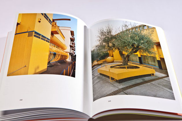
The Feiersinger brothers’ ‘guide’ includes masterpieces – condos in Milan by Magistretti and Caccia Dominioni, the expressionistic vortices of Michelucci, the terse, almost rough, functional elegance of the factories by Gino Valle, the icy obsession of Rossi and Aymonino in Gallaratese – but also a myriad of uncrowded if not unknown ‘goodies’. The houses in ‘cubes’ in Gambirasio near Bergamo, for example, or Pizzigoni’s structural geometry; abstract expressionism of Henry Castiglioni and organic and almost zoomorphic work by Vittorio Giorgini (with a holiday house in Baratti comparable to the American master Bruce Goff); the ease of a master Gio Ponti, who designed the ‘house under the leaf’ in the province of Malo in Veneto, brilliantly liberated from the 60s internationalism. Italo Modern – with Werner Feiersinger’s unusual and beautiful photographs – is a little gem, but also a visionary essay on invisible monuments of the Twentieth century. The result of a meticulous obsession and fascination au pair with academically based research, this book reminds us that we should not forget our responsibility and commitment in continuing to explore.

Giulio Ghirardi 
Share: Facebook,  Twitter  
28/05/2014

Visiting Milan: Brera Botanical Garden

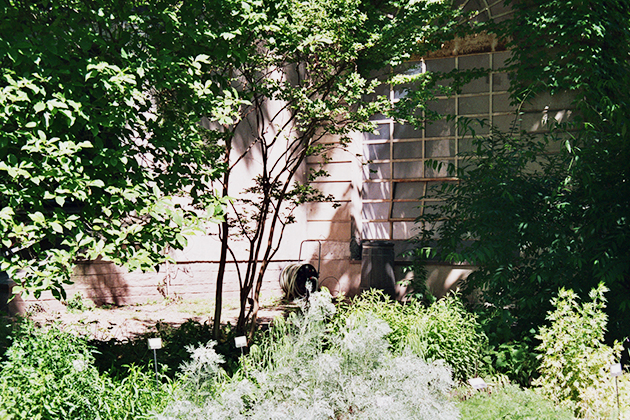
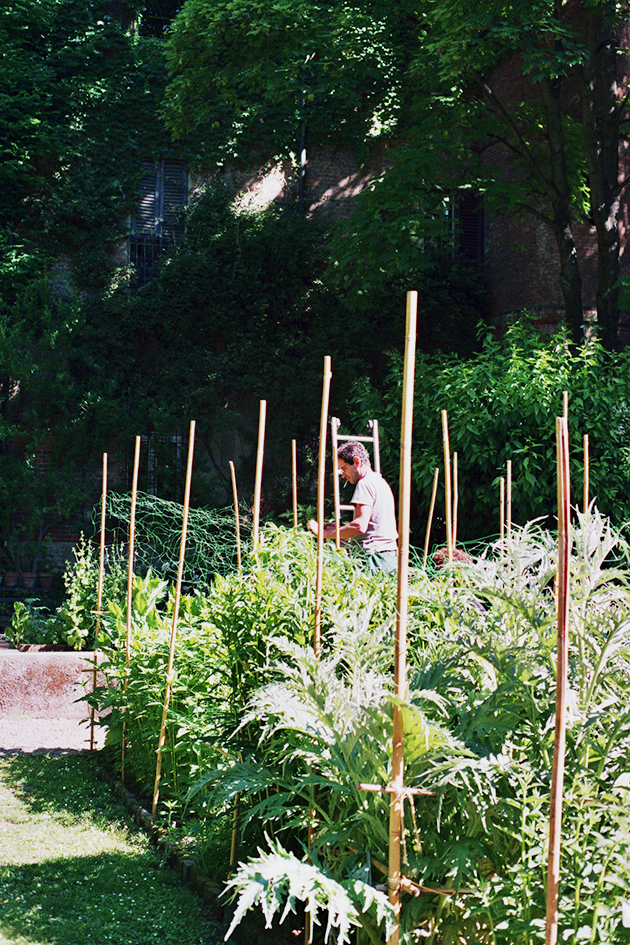
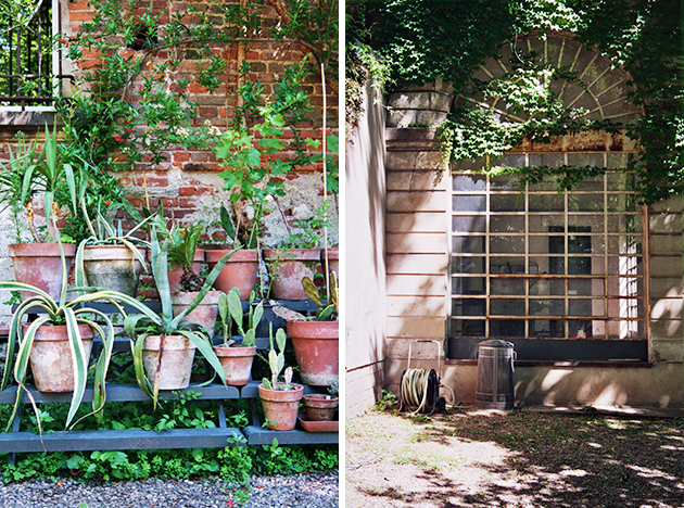
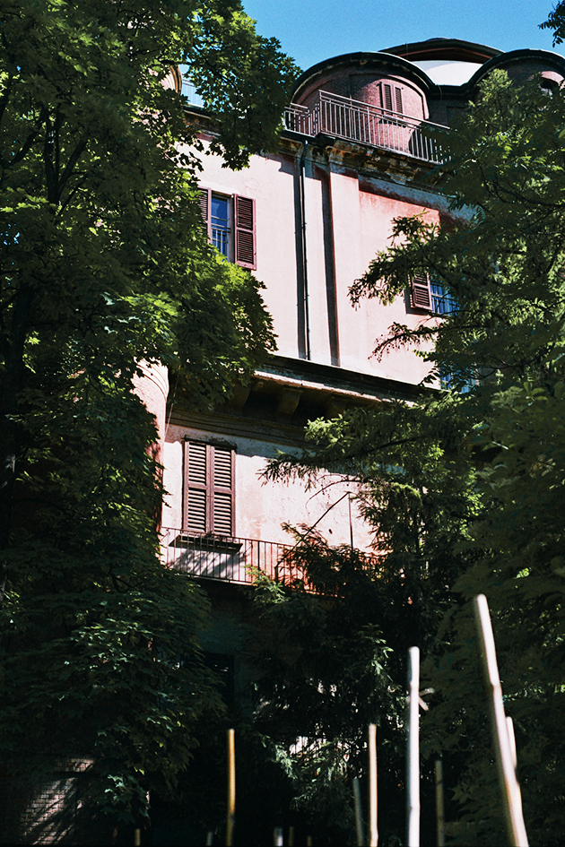
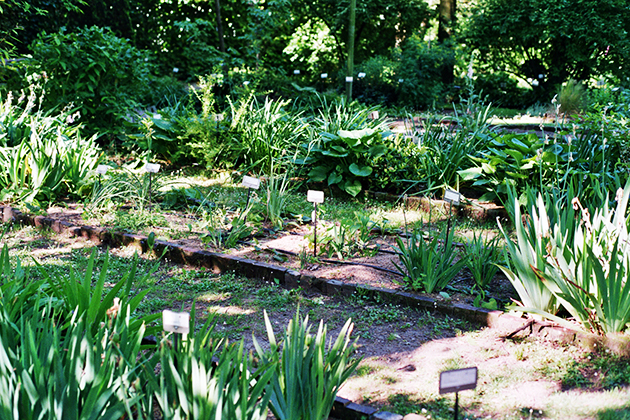
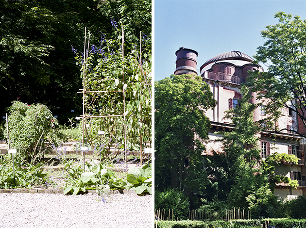
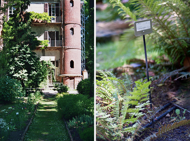
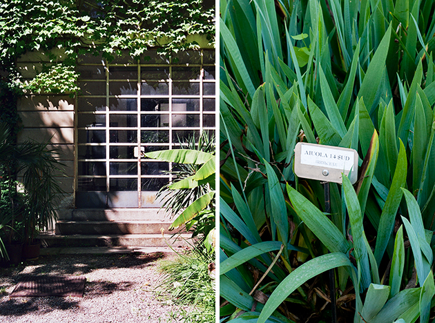
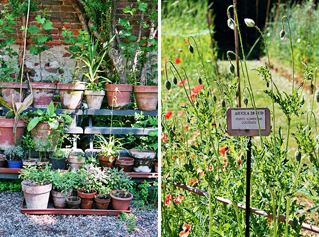
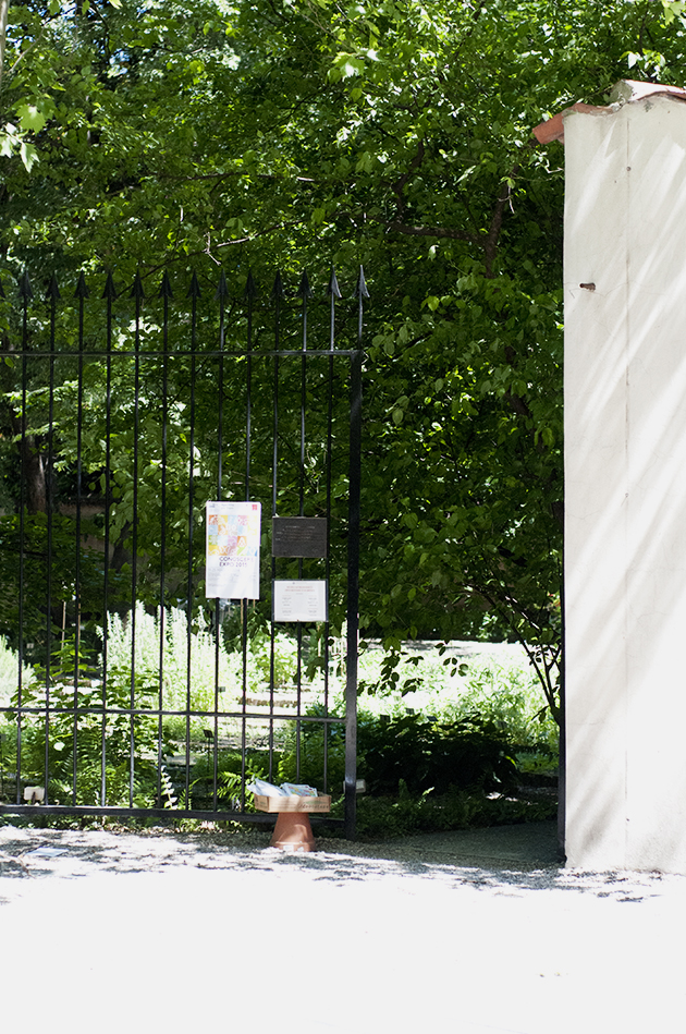
It is always nice to discover something hidden and unexpected in the middle of a big city. If you find yourself in Milan, it might be that just around the corner, there is an old little garden which has been there for a few centuries and preserves a rich variety of botanical heritage as well as many testimonies of the past. We paid a visit to this historical open air museum – the Brera Botanical Garden – part of a large cultural compound housed in the nearby Brera Palace which includes the Brera Art Gallery, the Astronomical Observatory, the “Braidense” Library and the Academy of Fine Arts.

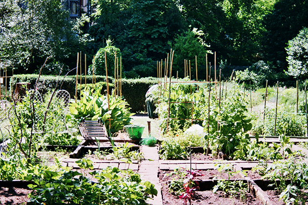
The garden is pretty small and we can trace its existence back to the Sixteenth century. The main purpose of the garden was to cultivate medicinal plants for pharmacy and medicine students at the nearby Brera university. Divided into flowerbeds with original bricks – today restored – you can browse among several hundred species of botanical heritage. In fact, walking through the garden, you may have the impression that it is pretty wild. In fact, the aim is to preserve quite a natural environment for many of the species, like wild herbs. It is also possible to follow different stages of greenery growth in a little vegetable garden as well as chill under the splendid ginkgo biloba tree-couple (yes, these trees are divided into a male and female plant, a rarity in the plant world).

Today the gardens also hosts cultural events like this year’s Salone del mobile, as well as school visits and guided tours for the wider public. It is open from monday to sunday and you can find it hidden behind ‘palazzos’ in Milan at via Brera 28.

Images and words Agota Lukyte 
Share: Facebook,  Twitter  
16/05/2014

Upcoming Artists | Warias

How and why did the Warias project come about?
Warias was born after our last year’s summer tour, where we collected ides, recorded samples, percussion loops, vocal melodies and other stuff that has been looming in our minds during those long hours in our tour van. Other than those random ideas, Warias was born out of my specific need to give space to a parallel project that would be coherent with what I’ve been hearing lately.

Why have you decided to create a brand new band, completely different from your previous experiences?
It all happened quite naturally. For quite some time now, Giulio has been venturing into electronic music and I have been collecting new ideas and experimenting with different things during the last summer. We have been widely influenced by the places visited on tour, which have largely influenced our ideas. After the tour, when I proposed a new project to Giulio, he immediately got on board, without even thinking twice.

Warias has been defined in many different ways – dark, new wave, post punk – how would you categorize it?
If we have to characterize it, I would surely say it has a strong, dark component deriving from new wave and post punk, with a bold experimental and psychedelic side. Even if it may sound as a cliché, I must say that I am not really fond of labelling a band’s work with precise definition. Much of what has been said about Warias is surely right, but, for us, it is first and foremost an experience.
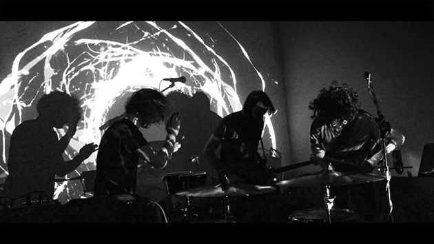
Which bands have influenced your sound during the recording of Wools EP?
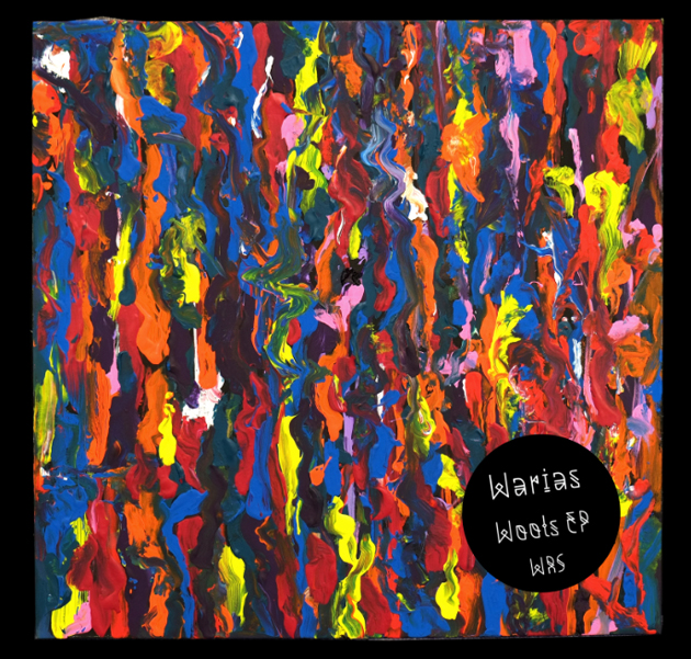
While Warias was still taking shape as a project, we were listening to a lot of African music, Tuareg and electronic. As far as the EP is concerned, it was certainly influenced by our passion for analogue instruments, synths, guitars, drum machines – we have used and recorded all those instruments in our studio.

During your live concert, the visual part seems to be meticulously articulated. Who is in charge of your visuals?
Yes, we believe the visuals are a fundamental part of a live experience. There are many artists that put a lot of attention into this aspect and we believe it adds a lot of value to the performance. Our visuals in particular are developed by Mirco Cotugno, a dear friend of ours.

One of you also plays with The Soft Moon. How much has Luis Vasquez influenced Warias?
Well, Luis has certainly influenced a lot of our work since we respect him greatly. It is sort of a natural process when you play with someone and hang out with them in your everyday life.

Do you have a tour in mind for 2014?
Yes, we will be playing around Italy this Summer. We have received a few offers for a European tour this Autumn, but we will still need to figure it out.

Are you working on an album?
Yes, we are working on it right now and we already have a few pieces ready. It is a work in progress since it will be quite different from the EP, as the whole writing process is a lot more deeper, less conventional, with a much more emotional and visionary approach.

Enrico Chinellato 
Share: Facebook,  Twitter  
14/05/2014

Visiting Villa Necchi in Milan

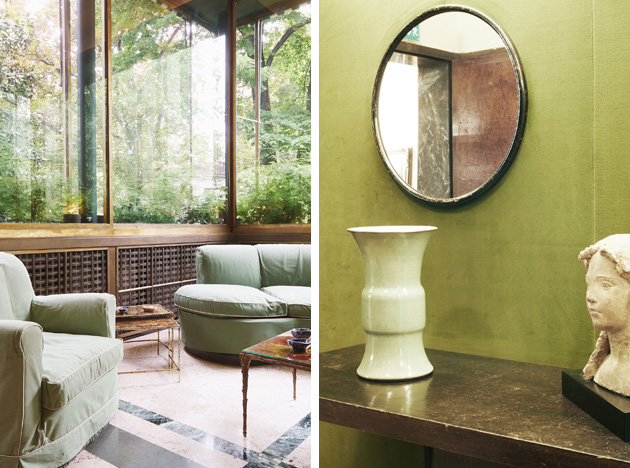
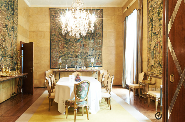
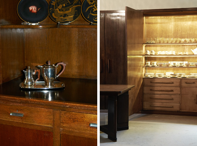
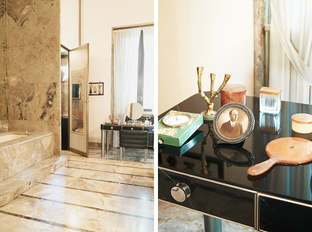
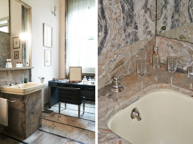
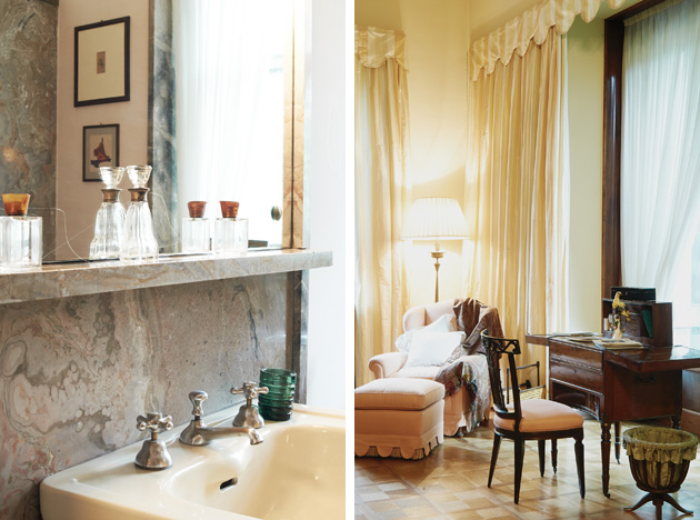
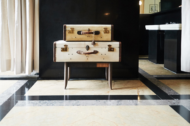
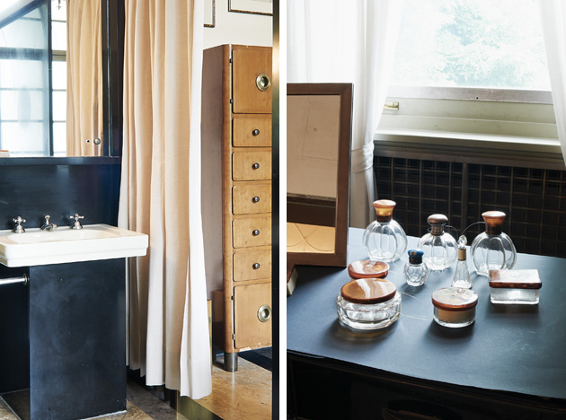
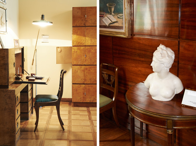
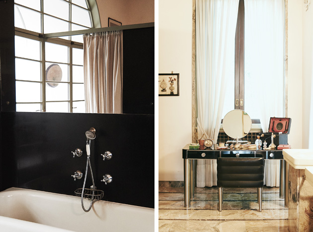
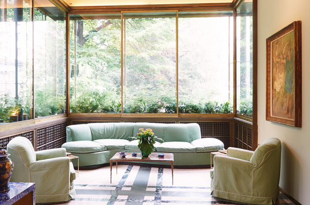
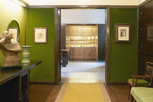
Last week we have had the chance to visit Villa Necchi Campiglio, one of the four historic house museums in Milan. All situated on different locations, more or less around the centre of Milan, the four houses are guarded by FAI – Fondo Ambiente Italiano, the Italian National Trust, devoted to the promotion of Italy’s natural heritage, art, history and traditions. The four historic residences, all built between the end of the 19th and the beginning of the 20th century, by noble milanese families which collected objects, artworks and furniture, are still preserved with their original furnishings and are currently open to the public.

Surrounded by old trees in a calm, yet pretty, central district, the location of the house appeared to be particularly attractive for its owners, sisters Gigina and Nedda Necchi and Angelo Campiglio, exponents of the lombard industrial bourgeoisie. Villa Necchi Campiglio was built during 1932-1935 by famous Italian architect Piero Portaluppi, and subsequently Tomaso Buzzi who will give the villa a more classic and monumental appeal. Conceived as a stylish yet comfortable and modern architecture in both style and equipment, the house was equipped with an elevator dumbwaiter, inter comps and telephones and even a heated swimming pool.

Still preserved in an excellent condition, the house’s architecture, decorative arts, furnishings and collections expresses harmony whole the high living standard of living of its owners. Important to mention are pieces like a Field desk by Bottega di Giovanni Socci from the first quarter of the 19th century or the Centrepiece with Fish (1930-1935) by Alfredo Ravasco. Two major art donations enrich the visit: the collection of paintings and decorative arts of the Eighteenth century by Alighiero De’ Micheli and a collection of the important milanese gallerist Claudia Gian Ferrari. The collection, donated to the Foundation before her death, consists of forty-four paintings, drawings and sculptures of Italian artists from the early Twentieth century.

Villa Necchi Campiglio is open from Wednesday to Sunday from 10am – 6pm, at Via Mozart 14, Milan.

Images and words by Agota Lukyte 
Share: Facebook,  Twitter  
08/05/2014

Library in the Aisle

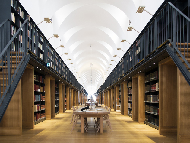
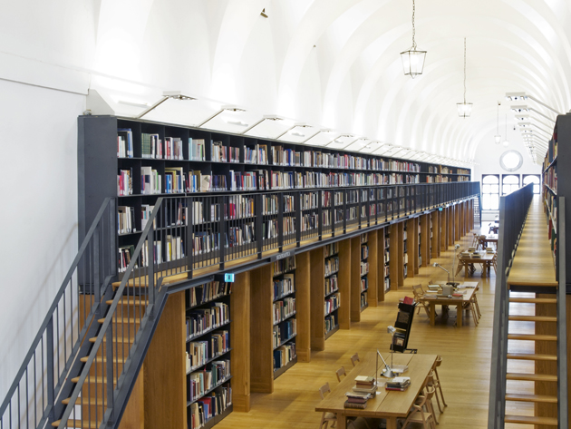
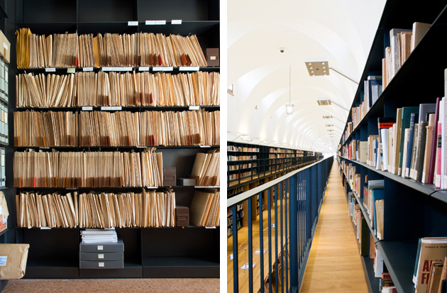
On the quiet island of San Giorgio Maggiore, in front of San Marco square in Venice sits the Giorgio Cini Foundation, an institution whose mission is to promote the redevelopment of the monumental complex on San Giorgio and encourage the creation of educational, social, cultural and artistic institutions in its surrounding territory. In the last decade, the foundation has transformed the old Benedictine dormitory, known as “Manica Lunga” and originally built by Giovanni Buora at the end of ’400, into a modern and functional library that houses more than 150,000 volumes. The “long wing” is an extraordinary space: in the course of time it has housed monks’ cells, military accommodation, public dormitories and classrooms.

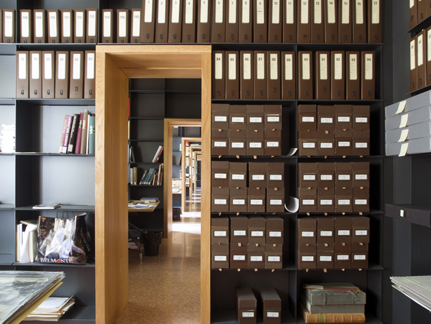
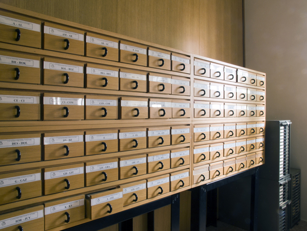
The restorative intervention was developed by architect Michele De Lucchi, who won an international design competition in 2005, transforming the old cells in reading and working areas. The restoration project of the long wing involved the creation of shelving systems both on the ground floor and an added balcony, with reception, workstations for multimedia material, lounge areas, meeting and conference rooms all placed on the ground floor, together with a recovered treasure room, office of the curator and cells used for archival purposes. With over 1400 meters of shelving, including 1000 open shelves, the new long wing is now the heart of the History of Art library complex at Giorgio Cini Foundation.
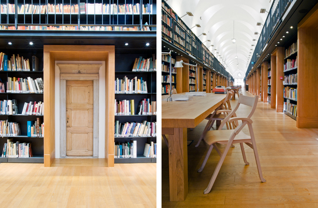
“What used to be a large living room was transformed into a library taking inspiration from Longhena – explains Michele De Lucchi – with open shelving covering the whole extent of long walls, while tables for consultation occupy the room’s the centre. A second level was added to the space with a balcony easily accessed by stairs placed on northern and southern sides of the central transept. The supporting structure and the shelves are made of metal. The perspective effect is amplified by adding a second line leading to the horizon, without further charging the visual impact of the room.”
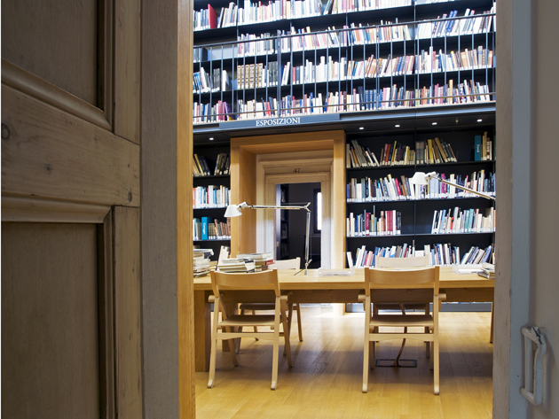
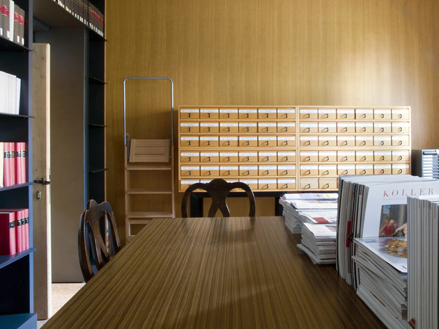
The small doors of the monastery cells were additionally framed with wooden portals, which both support the balcony of the second level and add a curious visual appearance to the portals, where a smaller door seems to be inscribed within a larger one. The central space is thus left empty and plain, with only a few long tables left for consultation: other reading space, together with meeting, conference and event rooms can be found inside the cells.

The cells oriented towards Bacino di San Marco host the library’s service functions: librarian’s offices and consultation tables are placed in the central area for obvious reasons of safety and control. The cells are all similarly conceived, leaving the original monastic effect intact, even though they are variously connected according to different needs. Many walls of the cells are covered with shelving as well, leaving only doors and passages bare. The shelves arranged around each room aid a feeling of historical continuity and environmental unity to the space, while also maintaining the architecture’s static balance, since all the weight is placed against the walls.

The lighting of the new long wing was designed following the criteria of “territoriality” – adding light only where needed and avoiding direct light that precludes the concentration and study. The LED lighting adopted for the shelving is integrated directly into furnishings, concealing the fire extinguishing system, leaving a comfortable solution for consultation and reading. The restoration of the “Manica Lunga” is a particularly correct project in all of its aspects, respecting both the monastic history of the space, as well as calibrating functional and architectural additions with maniacal attention to details. Starting from an existing space of extreme quality, De Lucchi has succeeded in giving a new functional and cultural life to an architecture that otherwise would not be easily accessible.

Words and photos by Giulio Ghirardi 

.

Share: Facebook,  Twitter  
06/05/2014

Fotografia Europea 2014 in Reggio Emilia

During the long weekend from 2nd to 4th of May the 9th edition of Fotografia Europea, the international photography marathon held in Reggio Emilia since 2006, opened its gates. Dealing with different topics every year, this edition’s well-structured program of exhibitions and installations was guided by a reflection on the importance of the gaze: “Vedere. Uno sguardo infinito” (Seeing. An infinite gaze).

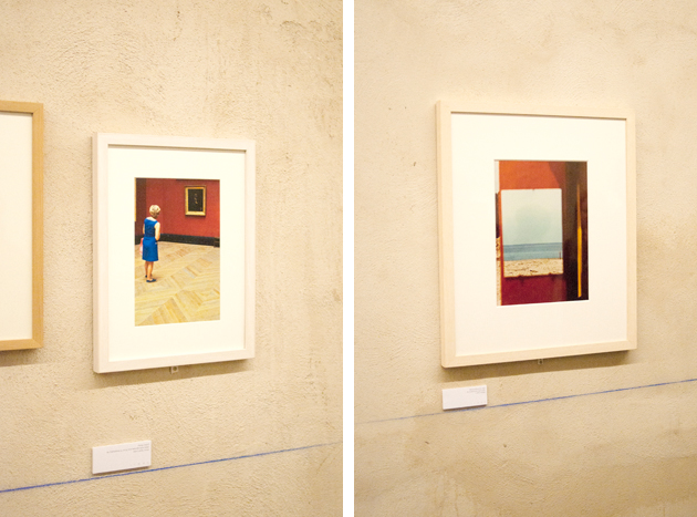
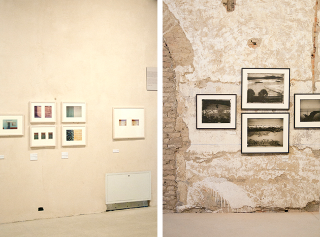
The main event of the festival was the huge retrospective devoted to the Italian master of contemporary photography Luigi Ghirri, entitled “Pensare per immagini. Icone, Paesaggi, Architetture” (Thinking in images. Icons, Landscapes, Architectures), and previously presented in Rome at Maxxi. The exhibition was based on three hundred shots, album covers, mock-ups, books, postcards and magazines retracing the amazing career of one the most eminent observers of our age.

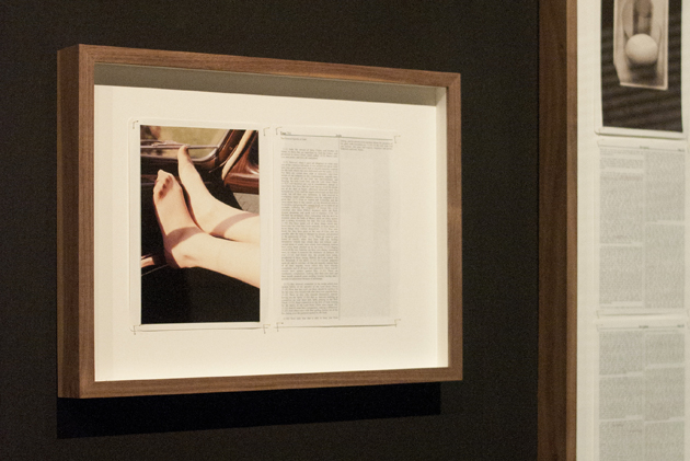
“Divine Violence”, a show by Adam Broomberg and Oliver Chanarin presenting here their latest work – “Holy Bible” – was also definitely worth a visit. Following their personal research that plumbs depths of the recent past to assemble stereotyped images representing conflicts, the photographer duo chose to reinterpret the holy book. The result is a publication which combines words of the original text and images taken from the Archive of Modern Conflict, a London publishing house which released the book, showing violent and illogical periphery of human beings.

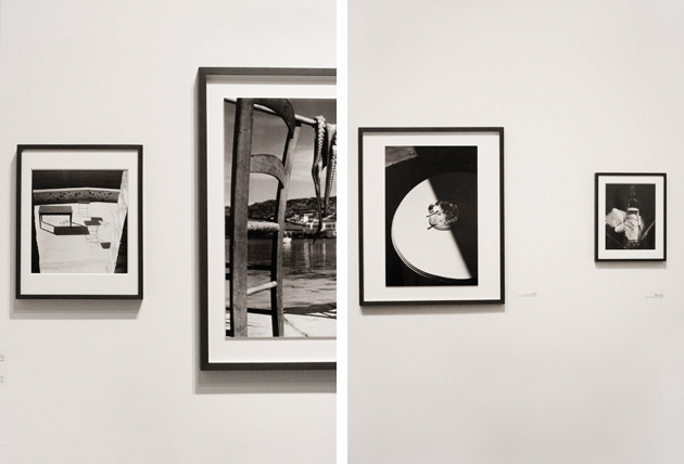
Among other numerous proposals hosted in different venues scattered around the city, the shows by two Magnum photographers Herbert List and Erich Lessing brought the viewers back to a black and white past made of refined still lives, landscapes and images of normal people contributing to the reconstruction after the Second World War.

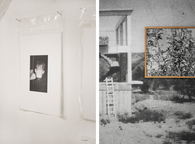
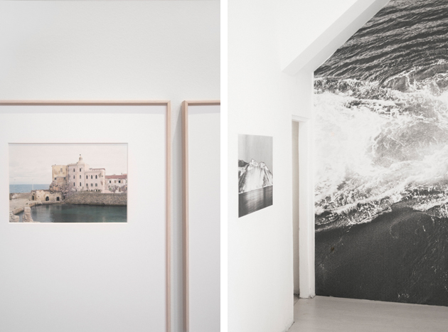
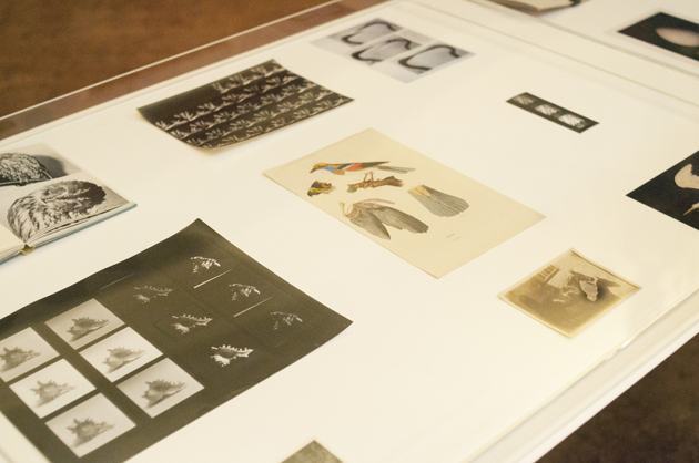
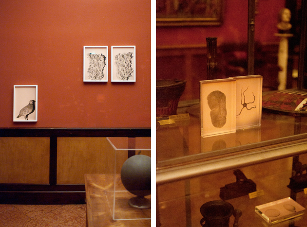
Jumping from past to present, the festival, as usual, kept an eye on the young generations, presenting the gazes of Silvia Camporesi with her ghost places and their poetic desolation, Andrea Ferrari and his animals that observed the observers by blending in with the rich naturalist collection of the Lazzaro Spallanzani gallery, and Massimiliano Tommaso Rezza, who records ordinary things, negligible and ephemeral details of our everyday life through xeroxes glued directly on walls and pictures gracefully arranged in vacuum-sealed envelopes.

Once again Fotografia Europea proved the high quality of its agenda, proposing a series of main shows and collateral events that liven up the pleasantly relaxing town of Reggio Emilia, allowing people from all over the world to discover its charming, and in some cases hidden, locations. See you there next year!

Monica Lombardi – Images courtesy of Agota Lukyte 
Share: Facebook,  Twitter  
01/05/2014

The Complex Beauty of Wes Anderson’s World

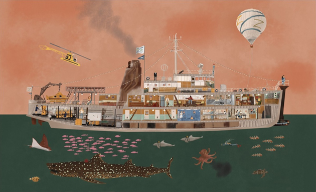
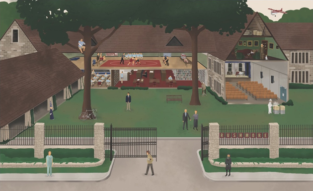
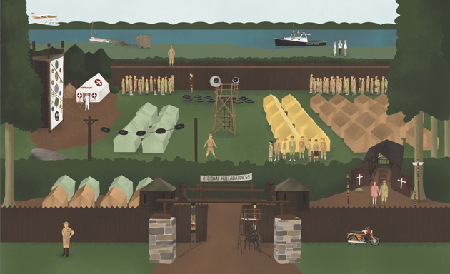
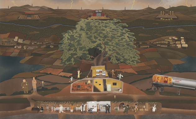
If you had ever seen a Wes Anderson movie, the most obvious feature you remember it by is surely its soft, retro visual feel and particularly melancholic poetics. From the universally loved “The Royal Tenenbaums” to the animated “Fantastic Mr. Fox”, each Anderson’s movie is designed to the last detail. Annie Atkins, the graphic designer who worked on Anderson’s last feature, “The Grand Budapest Hotel”, states that the director “is completely involved in every aspect of his filmmaking”, so much so that he even “wrote all the articles of the newspaper featured in the film, even though, on screen, you only get a chance to read the headlines”.

While Anderson’s overtly controlled and ultimately ‘constructed’ filmmaking doesn’t appeal to everyone, his particular aesthetics has evolved into a complex and recognizable language, characterized by an elaborated visual artistry, inimitable tone, and idiosyncratic characterizations. Even though some elements of his visual code have already been analysed and classified by his loyal admirers, a book released last Summer, “The Wes Anderson Collection” is the first in-depth overview of his work. Bringing together interviews, previously unpublished photos, drawings and original illustrations, it reveals – step by step – the process that guides the creation of each of Anderson’s movies. Meticulous and particularly rich, “The Wes Anderson Collection” perfectly captures the spirit of his films: melancholic and playful, wise and childish—and thoroughly original. “The Wes Anderson Collection” was written by Matt Zoller Seitz and published by Abrams Books.

Rujana Rebernjak 
Share: Facebook,  Twitter