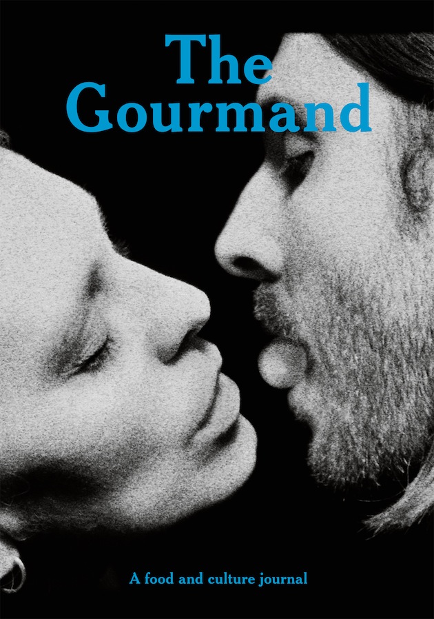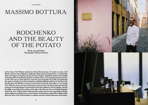
Among the avalanche of contemporary food magazines taking over the shelves of independent bookstores in the past couple of year, The Gourmand stands as a particularly compelling example of eloquent use of food as an excuse to speak about ‘culture, design, politics, society and even food itself’. Founded in 2012, The Gourmand serves as “a testament to the communicative power of food, and its inherent relationship with the arts”, as its editors Marina Tweed and David Lane justify the magazine’s wide range of topics that cover everything, even remotely food related: from overheard restaurant conversations to hippophagy (the practice of eating horsemeat), from an interview with Milton Glaser, the grand master of graphic design, to a day in the life of Massimo Bottura. The latest issue of The Gourmand, published last week, might just be the perfect treat for this food-centric month.
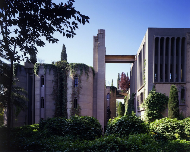
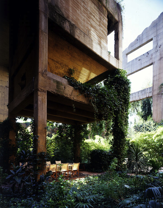
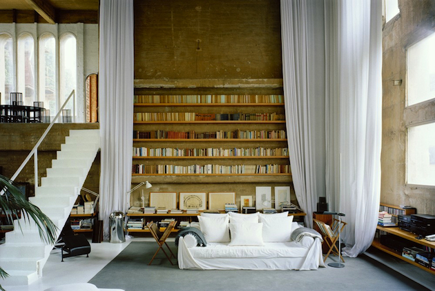
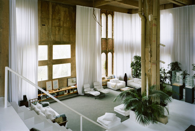
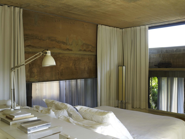
The BlogazineOriginally an industrial complex dating from the turn of the century, with over 30 silos, subterranean galleries and huge machine rooms, the Factory by Ricardo Bofill turned an old cement production plant into the headquarters of his firm, Taller de Arquitectura. “The factory, abandoned and partially in ruins, was a compendium of surrealist elements: stairs that climbed up to nowhere, mighty reinforced concrete structures that sustained nothing, pieces of iron hanging in the air, huge empty spaces filled nonetheless with magic.” In fact, the story of Bofill’s factory is an incredible tale of a magnificent home that lies north west of Barcelona, Spain’s cultural and artistic capital.
Turrets, archways and a wild, rampant garden: when Ricardo Bofill installed his living and working spaces amidst an abandoned cement factory in 1973, instead of restoring the industrial turn of the century monument in an overly clean manner, he turned it into a urban fairy tale castle. He left eight silos, which became offices, a models laboratory, archives, a library, a projections room and a gigantic space known as “The Cathedral”, used for exhibitions, concerts and a whole range of cultural functions linked to the professional activities of the architect. The complex stands in the midst of gardens with eucalyptus, palms, olive trees and cypresses, standing as evidence of the fact that an imaginative architect may adapt any space to a new function, no matter how different from its original use.
Draped in lush vegetation and offering an abundance of open spaces, this building is impressive not only in size but also in style. However, this was not always a scene of domestic bliss and creative outlet. This towering building once housed the industry that produces the material we use to create most modern structures – cement. Expansive ceilings and crawling green plants, make this restored factory building an architectural masterpiece with a great deal of charm, showing how a visionary architect might turn a long forgotten and disregarded space into a modern dream.
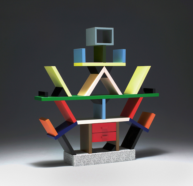
Giulio GhirardiAs the holiday season steadily approaches, Design Miami delights modern design enthusiasts with a selection of collectible pieces, just in time for some well-deserved Christmas shopping. Among a list of international galleries showcasing unbearably desirable pieces, our eyes fell on the fair’s new section: Curio. Curio is Design Miami’s new exhibition platform which invites designers, curators, innovators and gallerists to present ‘total environments’ – special cabinets of curiosity that offer an immersive experience of design practice. Among this year’s four exhibited projects, Joe Sheftel Gallery and Koenig&Clinton present a selection of rare and fairly well-known work by Ettore Sottsass and the Memphis group. Shifting radical to established, Sottsass’ designs should, by now, be on everyone’s gift lists.
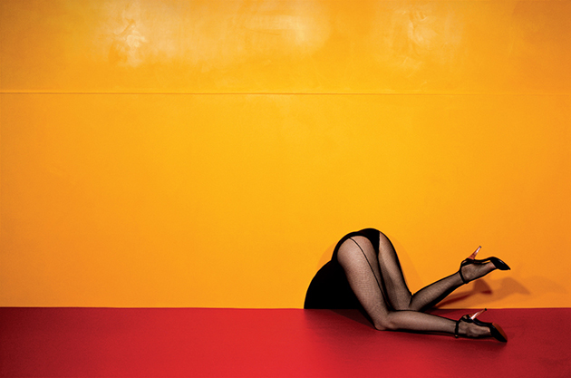
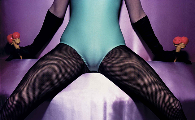
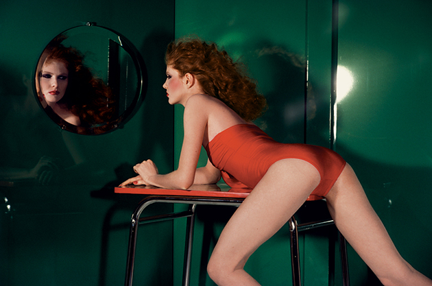
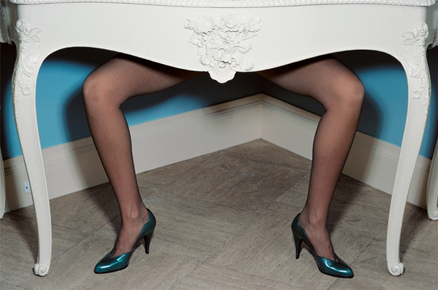
The BlogazineIn 1979, a pair of body-less, elegant female legs was seen travelling from London to Brighton on board of a cadillac, stopping, occasionally, at several iconic locations: from Battersea Power Station to delightfully decorated Brighton seafront, from rough taxi ranks to soft English rose gardens. Through a surrealist operation, those lifeless plastic legs became animated stars of vivid imaginary stories, told through the most uninspiring of all the media – an advertising campaign – shot by Guy Bourdin for Charles Jourdan. Throughout his career, spent within the fashion system, Bourdin tried to subvert its very core by producing images that overlooked fashion’s subject matter in favour of subliminal, marginal and often violently unexpected narratives that loomed at its margins. Known for his work for Vogue Paris, Guy Bourdin (1928 – 1991) is mostly associated with colourful “rich and strange” photographs which explored the realms between the “absurd and the sublime”.
And yet, much of Bourdin’s work still remains unknown, as nearly half of his oeuvre – shot in black and white – got completely neglected in favour of his powerful colourful imagery. “Guy Bourdin: Image Maker”, a new retrospective at the Somerset House in London, aims at revealing those largely hidden aspects of Bourdin’s work. Curated by Alistar O’Neill and Shelly Verthime, the exhibition “charts Bourdin’s distinguished 40-year career from Man Ray’s protégé to photography revolutionary in his own right and explores his pursuit of perfection”. In an attempt to reconstruct the secretive photographer’s work and approach – the story of Bourdin determined not to leave a trace of his work has become a widely favoured anecdote – the exhibition includes different body of work – from colour prints to early and late works in black and white, from Polaroid tests to double spread layouts, paintings, working drawings, sketches, notebooks and Super-8 films – that openly tell the story of an image-maker whose photographic craftsmanship sought to defy the very image of fashion.
“Guy Bourdin: Image Maker” runs until March 15th 2015 at Somerset House in London.
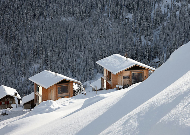
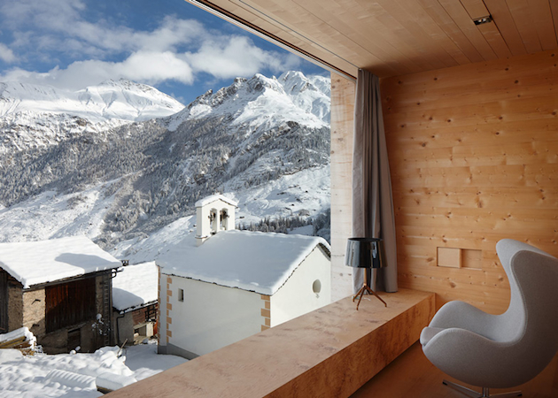
Where could a more blissful Christmas celebration take place than in a snowy white mountain resort? And yet, there are some winter holiday homes that are more special than others. Take, for example, Peter Zumthor’s Oberhus and Unterhus houses built in the mountain hamlet of Leis in Vals, Switzerland. Two neighbouring timber houses, one for his wife and one for him, built in 2009, propose an impeccably rational fusion of nature, architecture and life in a true ‘Zumthor-like’ manner. Fortunately, Oberhus and Unterhus are not only Zumthor’s to cherish, as the Swiss master, recipient of the Pritzker Prize, has decided to let his holiday homes to those who want to try on the architect’s shoes and experience “the solid timber’s tangible presence”, that, “soft and close to the body, gleams gently and silkily in the light.”
The BlogazineNot far from Milan, right after crossing the Italian border and entering Switzerland, you can find Bellinzona, a city situated in the Canton Ticino. Nested between lakes and mountains, this small city is worth visiting for its three main architectural projects which have transformed its public face and brought a new approach to revitalization of historical architecture and the fusion of buildings with the natural environment.
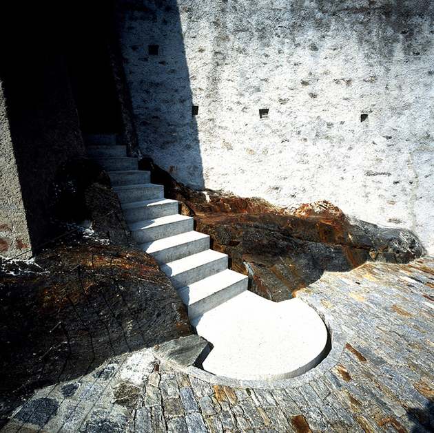
Castelgrande
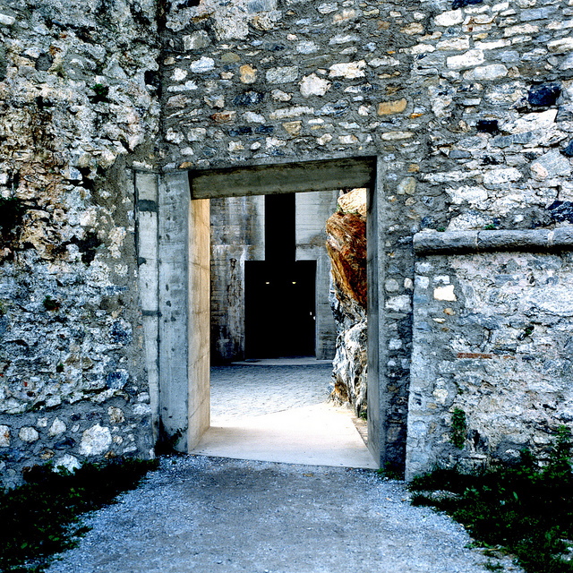
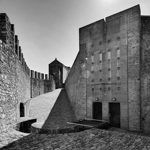
Built on a hill, the oldest of three castles in Bellinzona, Castelgrande was mentioned in 590 by Gregor von Tours as “Castrum”. Between 1486 and 1489 the Sforza family from Milan extended the castle in order to repel the Swiss advancing from the north. Castelgrande has been restored between 1982 and 1992 and can nowadays be reached by an elevator from the city’s Piazza del Sole. Aurelio Galfetti, the architect in charge of the most recent restoration, combined modern architecture with a sense of Medieval pride, in order to create an “Acropolis of Light”. Aurelio Galfetti is one of the leading architects of Ticino’s local scene, and his transformation of the ruined remains of the Castelgrande in Bellinzona into a contemporary museum and culture centre provides us with a provisional resume for decades of architectural work. While Galfetti proposed a series of typological corrections to Bellinzona’s diffused townscape, he was also concerned in sharpening the public awareness of the genius loci and the town’s history, as well as with its future, of which the rebuilding of Castelgrande was a central point. Galfetti’s effort produced one of the most significant conversion projects since Carlo Scarpa’s legendary work on Castelvecchio in Verona. Galfetti had neither restored nor conserved Bellinzona’s ‘Acropolis’. At the most – as Neapolitan architect Francesco Venezia would say – he joined together pieces that form spaces in which light, objects and landscape carry a silent communication. He was concerned in the first place with transforming an extraordinarily damaged historical situation into an analogue reality that would be able to speak for itself again.
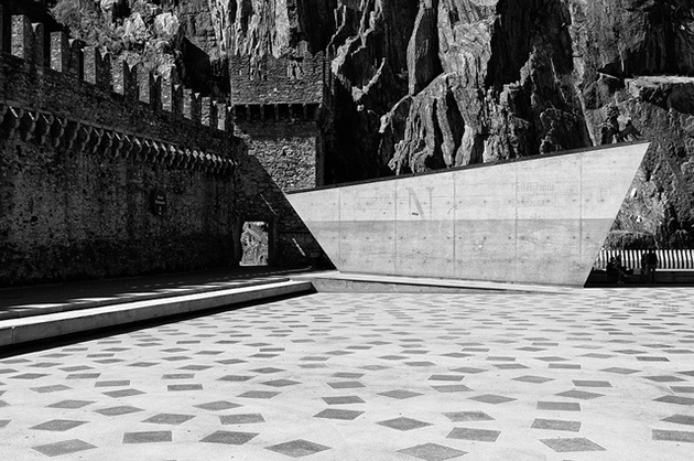
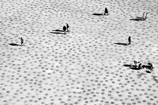
Piazza del Sole
The Square of the Sun, also known as Piazza Porta Ticinese, was built only in the XVIII century. The buildings that have marked the square were progressively removed starting from the 50s: the so-called island placed in the middle of the square was demolished first, then the houses close to the rock, and finally those constructions that concealed the city’s medieval walls. Today, Piazza del Sole can be viewed in its restored design carried out by architect Livio Vacchini. The linearity of the design, simplicity of access shafts and ventilation of the car park under the square, the dialogue instilled between the new architectural composition, the rock and walls recall, in a way, the city’s old spaces and size.
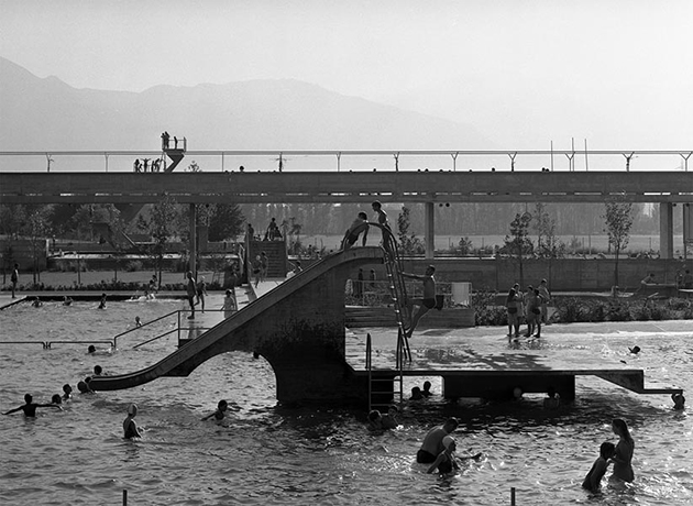
Lido di Bellinzona
It is Aurelio Galfetti, again, who transcends the proposed program creating a simple but ambitious infrastructure for the pools of Bellinzona. Thus, Galfetti uses all the factors involving the commission in order to design a piece of architecture prepared to take on future programs that complement each other. The route of access is embodied in a concrete structure, which organizes the built landscape and territory, through a pedestrian walkway raised 6 feet above the level of the river, connecting visually the empty valley of Ticino, the Castelgrande hill, the city, the mountains and the sky. All functional aspects of the pool have been resolved by subordinating them to a spatial vision, meant to merge the city with the river through a pedestrian walkway, a structure that provides the open expansion of a city character, a projected landscape, ready to accommodate new activities and functions.
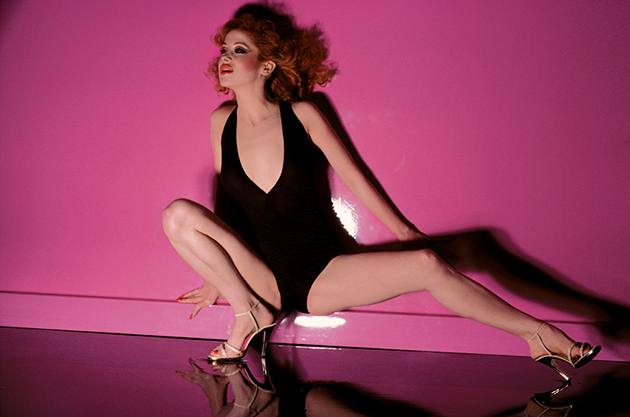
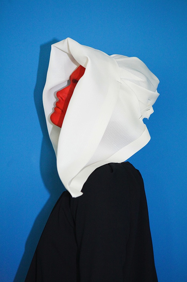
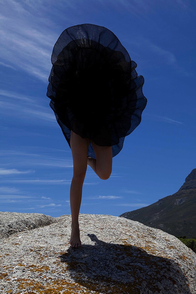
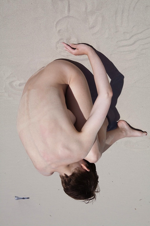
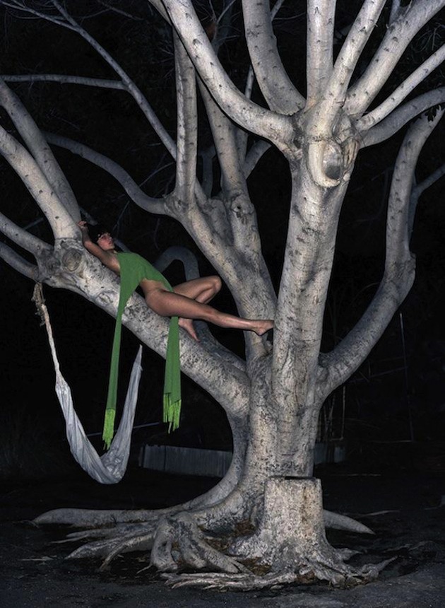
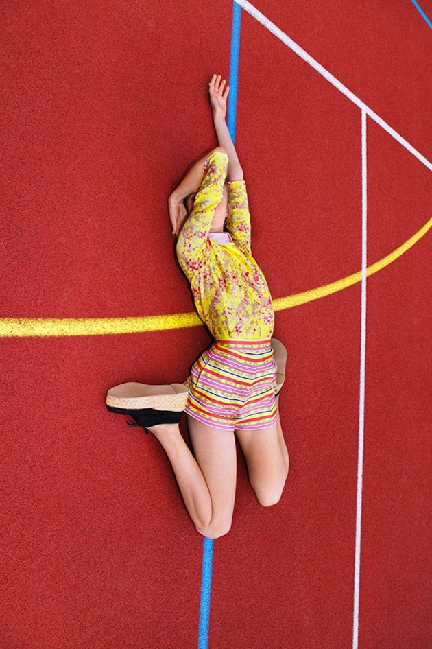
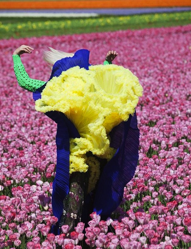
Analemma: Fashion Photography 1992 – 2012 at The Photographer’s Gallery is the first London presentation of works by Dutch-born photographer Viviane Sassen (b. 1972), one of the most exciting and creative figures working across contemporary art and photography today. Her highly distinctive style reflects an innovative and dynamic approach to the medium, producing images that foreground an expressive use of colour and tone, unusual viewpoints and a sculptural concern with form and shape that often lends a surreal quality to her compositions. This exhibition focuses on her fashion work and features around 350 images that subvert the limits and conventions of this genre. Sassen has conceived an immersive installation for The Photographers’ Gallery, presenting her images as a series of dynamic looped projections which sweep over and across the Gallery walls and floor. Mirrors and specially defined projection areas dissect the photographed bodies and disturb the viewers’ sense of gravity and viewing expectations.
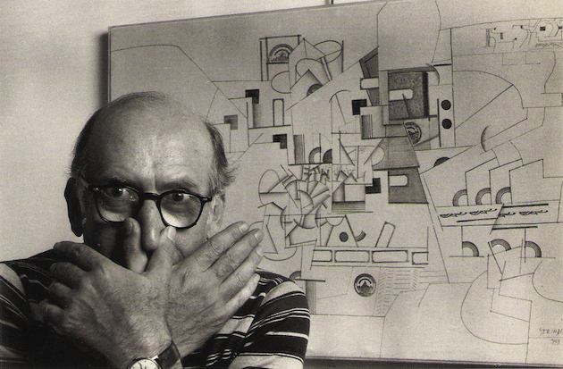
Rujana RebernjakDrawing is the perfect medium to shape and express ideas and viewpoints on architecture without using words. Lines come together to make forms, which in turn become coherent images that enable the viewer to grasp even the most complex intentions and meanings. The American artist Saul Steinberg (1914-1999), well known for his long collaboration with The New Yorker, considered himself to be a ‘writer who draws’. A ‘speechless writer’ perhaps, but one who had a great deal to say about the buildings and cityscapes that came under the scrutiny of his critical eye. In this sense, he was a forerunner of postmodernism, and although he did not write essays many theorists of architecture see him as an important critic of design and construction.
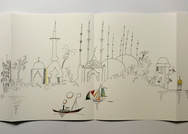
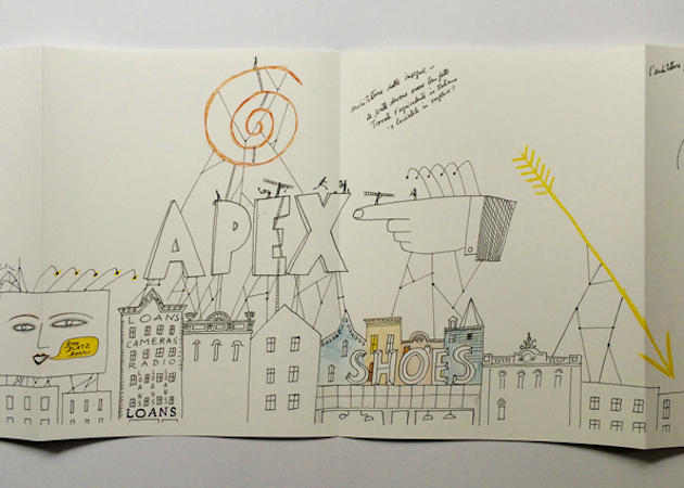
Architecture by Line exhibition at Archizoom exhibition space in Lausanne weaves links between Steinberg’s two-dimensional oeuvre and architecture. In 1954, Steinberg’s four long drawings were produced for the Children’s Labyrinth, a spiraling, trefoil wall structure at 10th Triennial of Milan. The Line, which begins and ends with a hand drawing, is Steinberg’s manifesto about the conceptual possibilities of the line and the artist who gives them life. The Line occupied one of the structure’s three leaves, while the other two hosted Types of Architecture, Shores of the Mediterranean, and Cities of Italy. Types of Architecture is a satirical survey of world architecture (Steinberg was trained as an architect in Milan), from America’s log cabins to Bauhaus exaggerations to fragile skyscrapers. Shores of the Mediterranean presents a sailor’s-eye-view of the Mediterranean coastline, filled with the ruins and renascences of successive civilizations. The Italy Steinberg knew as a student in the 1930s resonates in Cities of Italy, as the inked line, drawn with the artist’s usual spare elegance, imagines an urban sprawl of campaniles, factories, piazzas, apartment houses, curlicued domes, and a water tank that seems to have escaped from a carnival. The four drawings were collected and published together for the first time by Nieves in the form of an artist’s book with four individual leporellos.
The exhibition also includes works by a selection of international artists – Ingo Giezendanner, Nathalie du Pasquier, Nigel Peake, Medelon Vriesendorp and Wesley Willis - who do not necessarily share any filiation with him but who, by their use of drawing, question the way people see and inhabit the places that architects design. The exhibition shows how visual impressions captured by artists may anticipate architectural thought, and even short circuit it. In doing so it poses a vital question: is art the vehicle by which architecture is set free?
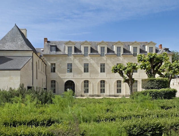
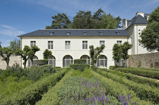
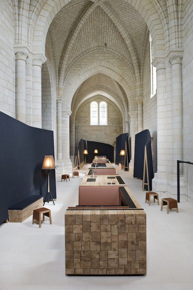
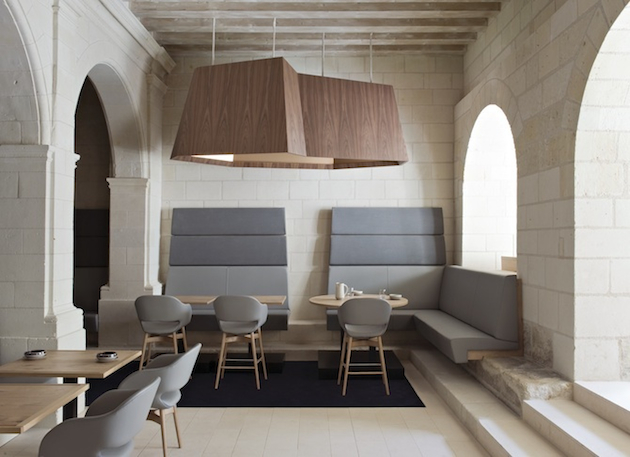
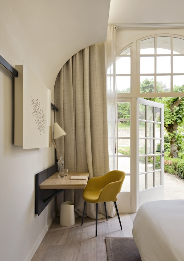
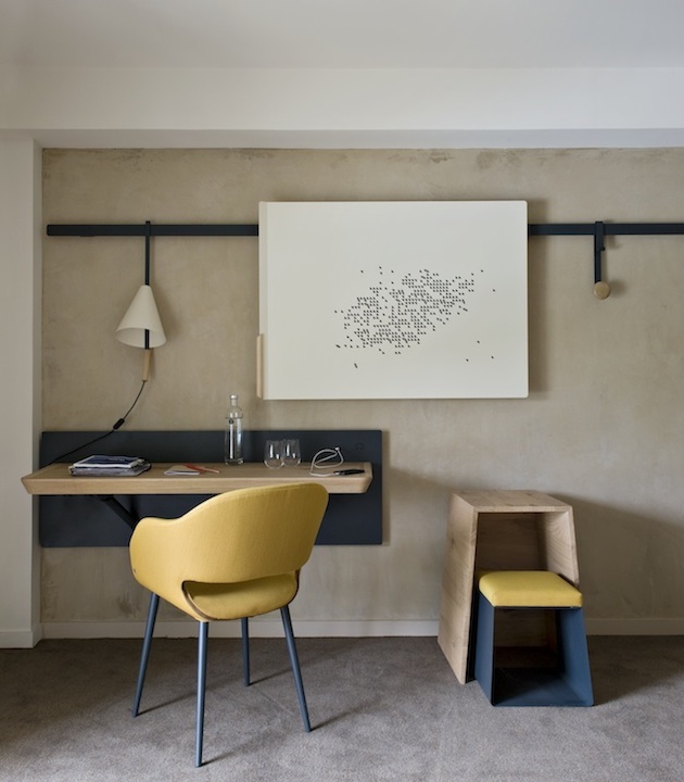
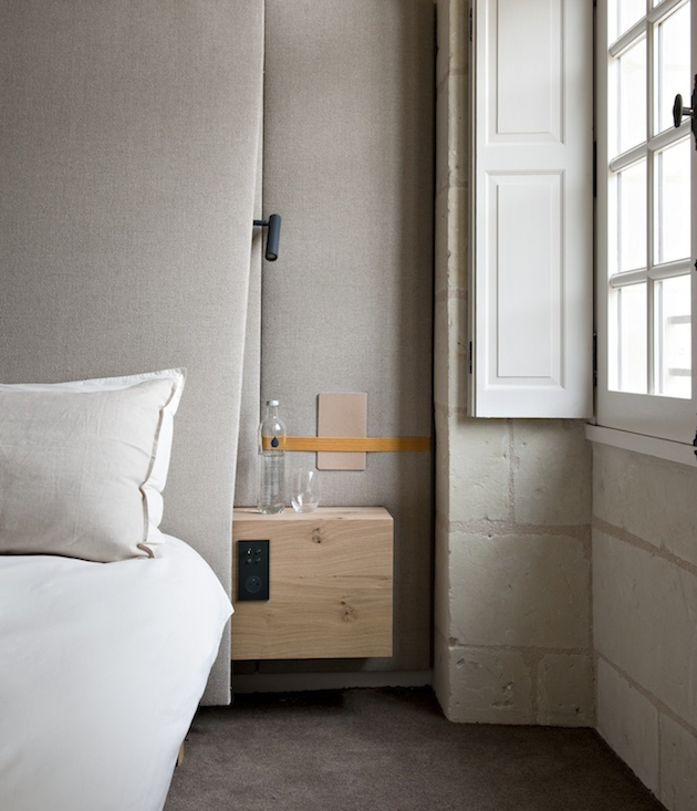
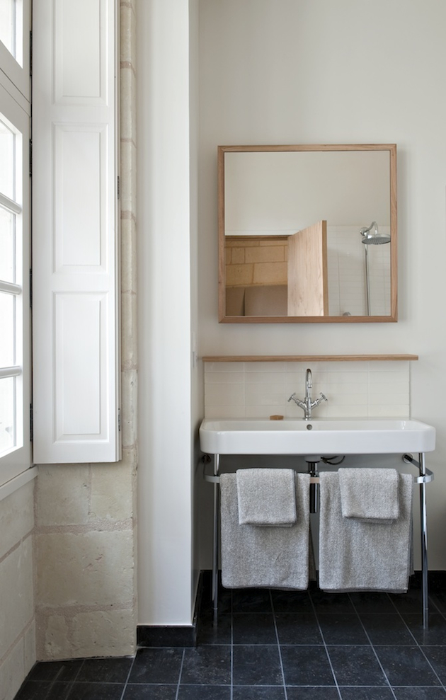
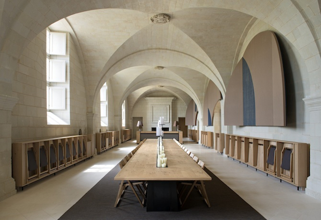
Rujana RebernjakTaking shelter in the Loire Valley stands one of the largest monastic sites remaining from the Middle Ages. Converted to a modern hotel by a team led by Abbey Director David Martin and designer Patrick Jouin, creative director of Jouin Manku, the Fontevraud L’Hôtel has become a historical location with a future, rather than simply a site that reflects on the past. Patrick Jouin and Sanjit Manky is a design tandem whose works meet at the crossroads of industrial production and craftsmanship. In all of their projects they seek to maintain a balance between innovation and grace. Their latest project is a fine example of this rule. “What we wanted for Fontevraud was not the classic hotel and restaurant experience, but something unique; a journey between tradition and modernity that reinterprets the story of Saint-Lazare for the future, marrying emotion, sensual pleasure and poetry,” said the designers.
Built in 1101, the Abbey was open to both men and women from all backgrounds, including aristocrats and penitent prostitutes. In the early 19th century, Napoleon converted the monastery to a prison, saving it from certain destruction. It remained a prison and hospital until 1963, when it underwent a series of restorations which paved the way for its current incarnation. In 1980s it was first transformed into a hotel. Corresponding with the space which avoids unnecessary stylistic effects, the designers introduced their own pared-down and elegant style. This resulted as a sensual and refined interior of a mystical, ancient monastery.
The vision for the Fontevraud L’Hôtel is that of a ‘Cité Idéale’ where cultural, intellectual, residential and commercial interests coexist through a commitment to hospitality, providing unique experiences for guests. The ability to inhabit history within the centuries old walls while enjoying modern comforts and haute cuisine is truly remarkable. Jouin’s contemporary design asserts itself amidst the breathtaking masonry of the Abbey in a contained yet striking manner. Martin describes the Fontevraud and it’s mission quite elegantly: “Between parchment and touch screen, we have written a new page, opened a new historical period, one where we can experience a vibrant living heritage, which, as well as celebrating its past, is forging itself a future!”
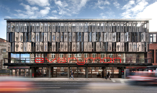
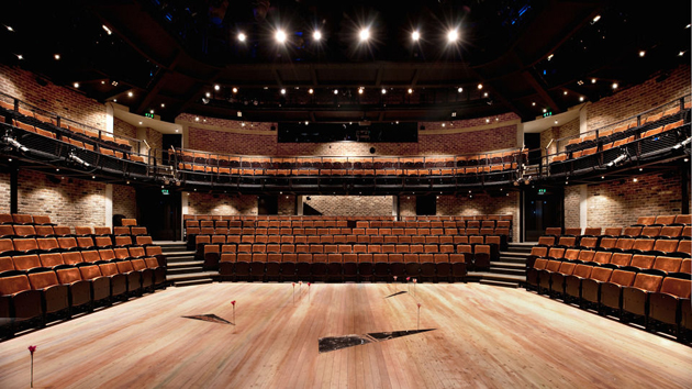
Giulio GhirardiThe new Everyman Theatre in Liverpool by Haworth Tompkins has won the coveted RIBA Stirling Prize 2014 for the best building of the year. Now in its 19th year, the RIBA Stirling Prize is the UK’s most prestigious architecture prize and this year’s award is given out by a panel of judges that was led this year by Spencer de Grey, senior partner at architectural practice Foster + Partners.
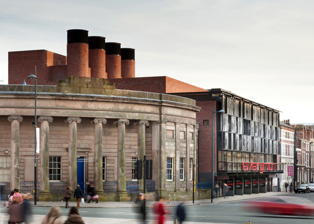
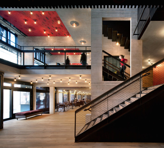
The old Everyman Theatre opened in 1964 in the shell of a nineteenth century chapel on one of Liverpool’s main streets. Although a much-loved institution, the building itself was in a state of disrepair. The decision to pull the theatre down and replace it with a new one has been a nine-year project for the architects Haworth Tompkins. They have expertly met a difficult challenge: that of creating an entirely new and sustainable building, whilst retaining and revitalising the best-loved features of its predecessor. The architects were tasked with ensuring that the soul of the old Everyman, one of informality and community ownership – the ‘theatre of the people’ – was carried into the new building. The result is a new building with a striking exterior and elegant interior, all with exceptional attention to detail and sustainability credentials.
This is the first time Haworth Tompkins has won the RIBA Stirling Prize. They were previously shortlisted in 2007 for London’s Young Vic theatre. The Everyman is their first new-build theatre, amongst a portfolio of over a dozen theatres from the Royal Court in 2000 to the recent temporary ‘Shed’ outside the National Theatre. The theatre’s Artistic Director Gemma Bodinetz and Executive Director Deborah Aydon described the building: ‘The Everyman was built with humanity at its heart, an intent embodied by the 105 people of Liverpool on its façade. Haworth Tompkins have delivered us a building that is sustainable, technically first rate and with unparalleled levels of accessibility for a theatre. On a small site with many competing needs and technical necessities they overcame every challenge with zeal and imagination to create something which is a beautiful as it is functional. But most of all they have transformed a building that lacked so much into a building that embodies what the Everyman’s ethos has always been: world-class theatre in our auditorium, nurturing new writing, great food in convivial spaces, and somewhere for young people to dream of a future where nothing is impossible.’
Rujana Rebernjak