01/06/2011

Essen: Tonno Sardo / Sardinian Tuna

.

Essen: Tonno Sardo / Sardinian Tuna

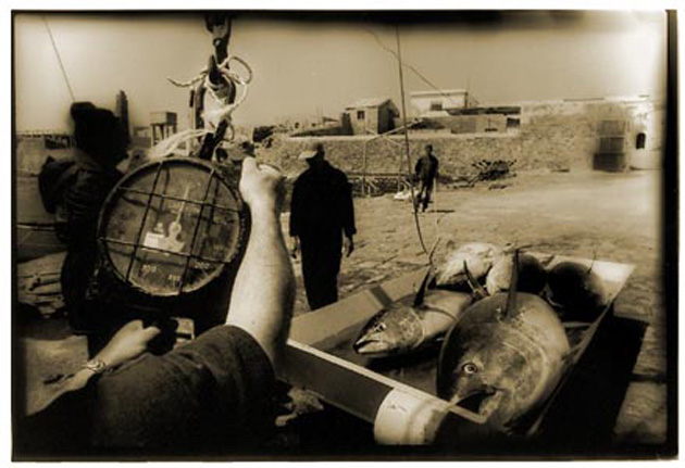
This week, we join photographer Vittore Buzzi on the tiny island of San Pietro off the coast of Sardinia. Here in this city, Carloforte – where you’re just as likely to hear Ligurian as Italian among the citizenry – Vittore captured scenes of a bustling fish market where hauls of some of the world’s finest tuna are brought in, and where fisherman still operate like they did generations ago.
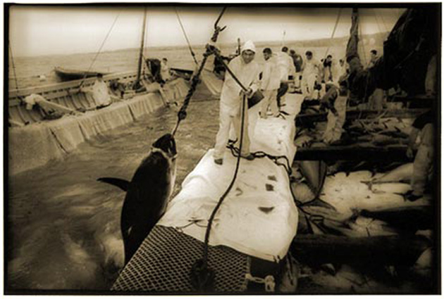

This particular series of photos is special. They were shot in film and developed and handprinted by Giancarlo Vaiarelli on Forte fibre paper using an atypical process typically reserved for graphics. A graphic plate and cross-processing makes for an otherworldly effect – warm, evocative, distant – and timeless, with a sienna tone that evokes Sardinia.

Essen takes us up the western Sardinian coast to Alghero for our food feature of the week:

In the extreme heterogenity of the island of Sardinia, Alghero has lately charged itself with uniqueness. An enclave for the of the seafaring republic of Barcelona for centuries, it was for very long linked more closely to Spain than to the Italian “continent.” Clearly, this cultural and political exposure couldn’t help but leave traces in the local gastronomy.
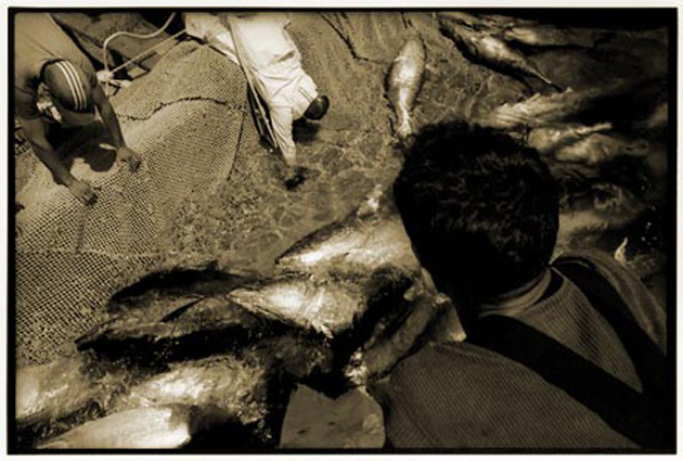
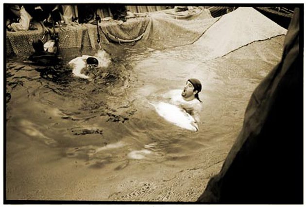

Characterised by fresh, simple food that tends to revolve heavily around fish, algherese dishes mix the fruit of Sardinia’s crystal blue sea with a few leitmotifs of Spanish cuisine, like Paella Algherese.

Although the city’s signature dish is lobster, a much more simple fish – yet every bit as versatile – is notably important: the tuna. Here we’re sharing a simple, flavourful recipe that is quick and easy to prepare, and that in its simplicity brings all the flavours of Alghero to the table.
Tonno all’Algherese (Algherese Tuna)
Feeds 4

Ingredients:
1kg fresh tuna filets
3 glasses of Torbato D’Alghero (Doc) (May be substituted for an airy, dry white)
4 tablespoons of extra virgin olive oil
30 grams of pitted black olives
1 celery stick
1/2 white onion
1 lemon
2 bay leaves
salt

Submerge the tuna in water infused with the lemon, and let marinate for a at least a couple of hours. In the meantime, chop the onion, celery and bay leaves finely. Brown them in a terracotta saucepan – if you don’t have one, a non-stick pan will work fine.

When the greens have browned, add the fish to the pan and cook on slow heat for around 20 minutes making sure to brown it on both sides. Don’t use a fork and instead use wooden utensils. Halfway through cooking, add the white wine, allowing it to dissolve slowly over the tuna. Add the black olives, then salt. Cover the pan and finish cooling. Serve hot, laid out over its juices.
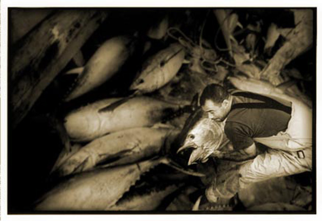
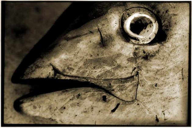
Photos Vittore Buzzi – Text & Recipe Cristina Zaga – Intro & Translation Tag Christof

Share: Facebook,  Twitter  
23/05/2011

The Editorial: Fix It Up

.

The Editorial: Fix It Up

DIY has swept the world. Etsy has become a sprawling platform for thousands of micro creative endeavours. This weekend’s premier Maker Faire event in California’s Bay Area united thousands of do-it-yourself enthusiasts and set the blogosphere and Twitter on fire. And although the thrift shoppe/junk store has fallen out of favour as the prime shopping destination of the voracious hipster (as “hipster” is now merely another easily marketed-to ethnographic group), it is certainly fair to assume that we’ve made significant cultural inroads with this mass-revival of handicraft. But no matter how trendy DIY becomes, we remain a society of wasteful, wasteful children.

Let’s be honest: even the most staunch advocate of DIY lives in a world that is filled primarily with mass-produced objects. Furniture. Appliances. Electronics. Knicknacks. And certainly, we must! Most objects owe their existence in the first place, to the economies of scale and technical precision that is only possible through mass production. But, despite our best efforts, the “planned obsolescence” pioneered by the likes of designers Raymond Loewy and Brooks Stevens’ (and perfected in our generation by Steve Jobs and Jonathan Ives) will remain a major motor of the built economy for the foreseeable future. Simply, mass production isn’t the enemy – rather, it’s our reckless consumption of mass-produced things that is dangerous and unsustainable.
And, indeed, we throw some very nice things away. Our reflex to buy almost always seems to override any logical desire to repair. When something breaks – or starts to look less than perfect – we simply throw it away and replace it. That old espresso maker with a broken handle? Trash. The nice wooden table that would look stylish with a sand down and a new coat of varnish? Rubbish. The lamp that could use a new shade? Garbage. Instead of spending any time getting our hands a bit greasy (and brushing up our dexterity), we toss and re-buy.

While our society’s general propensity for buying cheap junk is part of the problem (throwing out objects designed to have short lives is inevitable), we tend to throw out nice things anytime they become démodé, too. Think of the countless classic rangefinders and Polaroids to be found for a few euros in any suburban junk shoppe that require only a thorough cleaning, a new battery and a roll of film. The beautifully-patterned old clothes waiting to be sewn into something new. The old books with lovely, lost typefaces.

Buying from “curated” vintage shops is concomitant recycling. But a real relationship with your objects – and a real, active contribution to sustainability – requires more than buying and consuming. And the deeper relationship you earn by maintaing older objects is therapeutic. You impose yourself upon them. They become personalised. And a mass object is transformed into a one-of-a-kind.


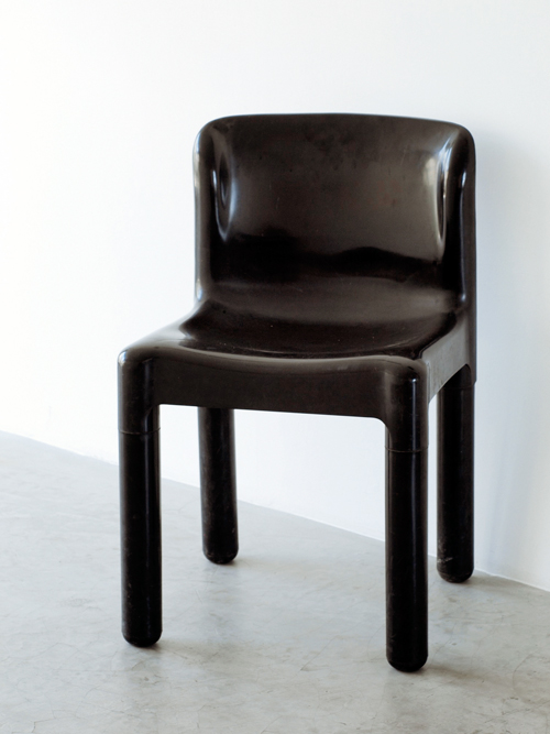
Our studio – a thoroughly modern, minimal place – is filled primarily with old, found and worked-over treasures: A recovered couch for guests, now painted pristine white. Several early 20th century Thonet chairs. Versatile height-adjustable found wooden stools and a sturdy old multipurpose table. A gorgeous MiM office chair from the line’s original 1960s Made in Italy range (MiM was back then a close relative of Fazioli grand pianos). An entire set of first-run 1974 Kartell 4875 chairs designed by Carlo Bartoli. Our most recent “acquisition,” is a circa 1995 drum scanner (complete with the requisite slightly yellow computer plastic of the era) whose superfluous quality kills that of expensive, much-newer flatbed scanners. Everything but the scanner was found – not searched for – after being thrown away by someone else.
Some of these objects could very well be museum pieces. But we use them, day in and day out because their inherent value is far from used up. And their inherent beauty, we feel, increases with age. Now, this isn’t an appeal for dumpster diving, nor is it a self-righteous lecture about recycling. But disposability is simply out of hand. This is broader than DIY: it’s foolish to think we can escape our manufactured world, so we must instead take steps towards truly engaging with it.

Tag Christof

Share: Facebook,  Twitter  
18/05/2011

Terence Malick / The Tree of Life

.

Terence Malick / The Tree of Life

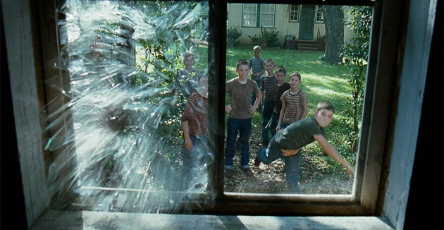
Terence Malick’s new film, The Tree of Life has caused plenty of media buzz over the past several weeks. In a career spanning four decades, this is only the fifth film he has directed, so the anticipation has understandably been massive.

With hardly any buzz around his directorial work since 1998’s “The Thin Red Line”, this film – which is the only film he’s both written and directed besides 1973’s “Badlands” – was almost sure to be a revelation. But beyond its star-studded cast, epic story and the hype, the cinematography is sublime. Full stop. Cinematographer Emmanuel Lubezki – who was also behind the gorgeous photography in Burn After Reading, Y Tu Mamá Tambien, Like Water for Chocolate and several others – certainly had his work cut out for him, and despite differences in opinion among critics, the film is sure to be a feast for the eyes.


So since photography is at the heart of what we do, we just couldn’t help but share and spread our affection and anticipation for the film. Now that it’s been dissected and pored over by the critics at Cannes, all there is left to do is wait for Italian release on May 27th. We’re already queuing…

From the Bureau – Images courtesy Fox Searchlight Pictures & twowaysthroughlife.com

Share: Facebook,  Twitter  
18/05/2011

Essen: Delhi Chicken / Mysore Pack

.

Essen: Delhi Chicken / Mysore Pack

India is an infinite tapestry of overlapping cultures and opposing traditions, miraculously held together by inclusive policy and a long history. In the sprawling metropolis of Delhi alone, at least eleven languages are commonly spoken. Modernisation is widening the already massive gap between rich and poor, and international fashion, music and art is pouring into Indian culture at increasing speed. It comes as no surprise that India’s food culture is equally as diverse, both in terms of the dishes themselves, as well as the religious and social customs that go into each cuisine’s preparation.


Sikh diets differ markedly from those of hindus or buddhists, and all can differ markedly even within the groups. Islam openly encourages vegetarianism, but for muslim carnivores Koran law requires that the meat they eat be slaughtered as humanely as possible. Factory farming is out of the question. India’s vast muslim population, therefore, requires an alternative.

Somewhere deep inside the pulsating Delhi metropolis, hidden in plain sight adjacent to a massive food market, chickens are slaughtered in accordance to Koran tradition. This is a sophisticated operation despite its apparent lack of machinery, with upwards of two billion chickens passing through every year.

Italian photographer Vittore Buzzi managed the difficult feat of capturing these heroic scenes. Blood. Overpowering smells. His recounting of the story is both disorienting and revealing: this food preparation for a modern society, even when regulated by a religious law that forbids cruelty, is a gory, dirty affair. This type of work is livelihood for many and chicken is an excellent source of protein for millions, but the violence inherent in the process is something we usually don’t give much thought to.

“The inner section of the market pulsates. Millions of terrorised chickens stare at you from cages, and the bitter odour of their excrements mixes with the sickly sweet smell of blood.”

While they may be unsettling, Vittore’s images provocatively raise the awkward issue of our tenuous relationship with food. Muslim or otherwise, most food crusaders today tirelessly advocate a more intimate relationship with everything we eat. But there is undoubtedly an awkward disconnect between informed consumerism and honest acknowledgement of our food’s origins: knowing where your vegetables come from is one thing. Coming to terms with where your meat comes from is much more difficult.

“In Europe it isn’t quite so easy to take these kinds of photographs… We seem to act as if the animals we eat grew on trees and didn’t have to be killed to be eaten. We distance ourselves from reality to sanitise our existence: cellophane and already cleaned chickens…”

In honour of the chickens, today we bring you a conspicuously meatless Indian treat from the canon of 19th century royal gastronomy.

Mysore Pack

The dish was prepared for the first time by Kaakasura Madappa, one of the chief Mahatmas of the royal court. The chefs of the kingdom were required to prepare sweets everyday for the court. One day, Madappa invented Mysore Pack by accidentally mixing besan (gram flour) with butter. It was loved by the royals, and subsequently by the common people.

The Maddappa family kept the secret of its preparation for years, until the grandchildren of Madappa opened a kiosk in Ashoka called Sweet Guru. Today, the fourth generation of the family runs the business and Mysore Pack has become part of Indian gastronomic patrimony.

Watch out – this is a recipe that can get quite sticky!

200 grammes besan (gram flour)
400 grammes sugar
200 grammes ghee
300 ml water

In a saucepan, heat the sugar in the water until when almost at boil, it attains a pastelike consistency. Slowly add the flour, mixing constantly making sure to avoid lumpiness. Once everything is well mixed, add the heated ghee and continue to mix.


Cook until the mixture becomes frothy and the ghee begins to separate. Pour evenly onto a plate coated in ghee. When it solidifies, cut into pieces and serve.

Visit Essen for more fantastic insight into the world of food.

Photos Vittore Buzzi – Text Tag Christof – Recipe Christina Zaga
Share: Facebook,  Twitter  
16/05/2011

The Editorial: Election Day / Everyday

.

The Editorial: Election Day / Everyday

There’s something about elections that inflames our sense of urgency. They bring concerns we let lie beneath the surface to the forefront, and we temporarily become activists. We engage in heated discussion. We evaluate our conditions, our place in our countries and cities, our values. Today, Milan is voting. Several candidates with drastically different agendas are vying for the future of this first-class world city, which has over the past two decades lost much of its lustre. Milan is, at the very least, ready for a renewal.

There have been drastic shifts in our way of life over the past several years, driven by an infinitely more dynamic generation and consumption of information. Much of this information is misguided, and clear voices have been subsumed by a general raucous. Advertising and marketing is slipped ever more sneakily into our daily routines. Cycles have sped up, trends live and die at lightening speed, and overarching cultural trends – i.e. the “decades” of the twentieth century – have in just a few years become unequivocally a thing of the past. In the midst of this, we face a major crisis of values. Our problems are no longer generational; they are systemic, huge and transcend age and geography.

But despite these apparently monumental changes, the real material issues we’ve faced for years remain. Problems of sustainability are accelerating. Food crises deepen. Current policy is neither adequate nor forward thinking enough to address the myriad socioeconomic, cultural and design problems we face. And if we were under-informed before the advent of blogs and Twitter (and slave to the whims of newspaper editors and TV anchormen), we now run the risk of being dangerously misinformed. All discourse, no matter how absurd, misguided or hateful, is now privy to its own platform. Sifting through the noise has therefore never been more imperative – politics, environment, everything depends on it.

So, where does your information come from? And by extension… what about your food? Your energy?

These questions address issues central to our happiness, our future, our health and even our continued existence. Their answers are values around which our generation must rally. We must remain informed (and that means much more than just spreading messages by social media), and learn to diligently curate and edit the information we consume in order to remain well-informed.

We must take a more active part in our food’s genesis, and at the very least understand where it comes from. From the simple mechanics of growing a few greens, we can better conceive of the massive shortcomings inherent in pure supermarket consumption, and then make smarter choices concerning the foods we will inevitably purchase. It takes neither an epic effort nor a huge plot of land to grow a sizable portion of the vegetables you would otherwise buy at a shoppe. Not to mention, maintaining a garden is spiritually (and gastronomically) quite rewarding.

If only a third of the citizenry with the financial means to do so would install solar panels in their homes, the impact on consumption over time would be monumental. A perceptual shift – by taking part in making energy – also would force us to understand that the electricity from the sockets we plug into everyday are not endless fountains of an intangible X that allows our objects to function.

And in much the same way, our politics must well-considered, honest and hands-on. Today is election day. Get out and vote if you’re able (and live in Milan). In addition to a recharged hope for a new era in the city, we hope for a brighter new era for everyone. Wherever on the planet you may find yourself, channel the energy and hope inherent in this day (and any election day) into these matters of substance everyday. Left, right or centre, they’re truly what matters.

Tag Christof

Share: Facebook,  Twitter  
12/05/2011

The Lowrider Coloring Book / Dokument Press

.

The Lowrider Coloring Book / Dokument Press

LA is in the air lately. Our love for that most quintessential of 20th century cities seems to be growing in reaction to a collective disenchantment with the characterless, hyper-global cities we increasingly live in. And as we stand on the precipice of an increasingly uncertain future, the neon boulevards, eternal youth and soaring dreams Los Angeles embodies look even better in retrospect.

Even LA’s lifeblood, the car itself, has become dangerously unsustainable, with traffic now snarling motorways in every major city of the world and atrocities like the Tata Nano mobilising masses who were arguably better off without a car in the first place. And as we look for a simpler time that will never return, LA’s myth alongside the automobile as object of worship is only bound to grow. Especially the lowrider.

Interestingly, Dokument Press, an independent publishing house in Sweden (where cars have long cost exorbitant amounts to own and whose Volvo vanilla aesthetic isn’t exactly permissive of excess), has released a fun colouring book dedicated entirely to lowriders. Not only does it honour the artform, its playful format is a nice nod to the creative freedom inherent in lowrider culture. The book is illustrated by Stockholm native Oscar Nilsson – who also happens to be a graffiti artist – and features cars from real LA car clubs like Royals, Viejitos, and Klique.


In northern New Mexico – where lowrider culture runs even purer and deeper than in LA – little boys still sketch lowriders in school notebooks, dreaming of the day they’ll have the money to transform a junked out 1960s Impala or Oldsmobile into a shiny, rolling (and bouncing) work of art. To this day, aficionados obsess over their rides – their custom and insanely detailed paint jobs and velvet interiors – with the care and precision of a fine artist.

Few artforms – including grafitti – have maintained the cultural and ideological purity of the lowrider, so it’s excellent to see its influence spread. And since the artform’s very canvas is both finite (there isn’t much traditional 1950s and 1960s Detroit metal left on the road) and changing (fifty years from now, nobody will dream of turning a Nissan Leaf into anything but compost), it is bound to remain encased in its native time and place: 20th century LA. No matter how far its its culture spreads.

p style=”margin-left: 2px; color: #000000;”>Bust out the airbrush paints and make these rides shine, locos! Get your copy from Dokument Press online shop.

Tag Christof

Share: Facebook,  Twitter  
12/05/2011

Radio Off / The Milan Review: Ghost

.

Radio Off / The Milan Review: Ghost

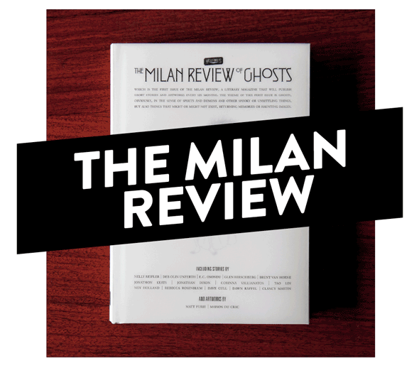
Tonight Radio Off is hosting the release of independent publishing house The Milan Review’s first project, “The Milan Review of Ghosts. The hardback literary review looks to be an genuinely well-curated, unusually interesting collection of short stories. And when’s the last time you read something genuine compelling about ghosts? Never, that’s when. And as icing-on-the-cake, the book is illustrated by Matt Furie (the monster mastermind), as well as Maison du Crac.

GHOST (n.) 1. The spirit of a dead person, especially one believed to appear in bodily likeness to living persons or to haunt former habitats. 2. The centre of spiritual life; the spirit; the soul of man. 3. A demon or spirit. 4. A returning or haunting memory or image. 5. Any faint shadowy semblance; an unsubstantial image; a phantom; a glimmering; as, not a ghost of a chance; the ghost of an idea. A suggestion of some quality.

With Tim Small as editor and Riccardo Trotta as art director, The Milan Review project itself looks to grow into something rather exceptional. Its unrestrained editorial focus will see it bring life to “an unspecified number of narrative books, art books, fanzines, and anything else we feel like publishing.” We certainly look forward to impending pleasant surprises.

Radio Off is curated by the brilliant Marco Klefisch, and The Milan Review of Ghosts will be subsequently presented in both London and New York.

Opening tonight at 19:00 at Via Pestalozzi 4, Milan. Free drinks, and live tunes courtesy of Stargate (alias Lorenzo Senni). See you there!

Tag Christof

Share: Facebook,  Twitter  
02/05/2011

The Editorial: A Mexican Hipster & Her Acapulco Bike

.

The Editorial: A Mexican Hipster & Her Acapulco Bike

Hipsters haven’t been a cultural minority for quite some time now. In fact, the obnoxiously iconoclast-at-all-cost hipster of yore has ironically been subsumed by his own culture, with even legions of teen girls now burning Lucky Strike and sucking down cans of Pabst Blue Ribbon at “alternative” parties. The famous Adbusters cover of a couple years ago proclaiming the hipster dead proved prophetic, afterall: the term has ceased to mean much of anything, its loose connotations now falling somewhere between 1) the irreverent, self-glorifying eternal teenager embodied in hilarious blog Hipster Runoff (and its countless imitators), 2) suburban kids in garish vintage clothes who have “rediscovered” The Smiths and 3) the design-loving, false-Luddite, artisanal beer-drinking foodie snob embodied in every Brooklynite. Perhaps the one unifying factor among the three is an undying reverence for the fixed-gear bicycle.

Now that the whole world is one gigantic small town in which we all must compete with billions of others, the fight for individuality, however, has taken on special importance. We must all be hipsters at heart, lest we be lost permanently in the crowd. Nevertheless, like so many cultural trends with roots in America and Europe, the hipster’s effect on the world at large has been unpredictable and at times has pitted western cool against the very cultures embracing it. Hipster spread predictably from West Coast USA to western Europe and Britain, and from there onto everywhere else. Now there are Chinese hipsters, African hipsters, Russian ones and Brazilian ones.

During Salone del Mobile, we had a chance run in with a promising young Mexican designer named Ana Gaby Gonzáles on the metro. We, being qualified type 3 hipsters (see above), approached her because of her particularly gorgeous sea-green fixed gear, which, fortunately for us, happened to have been designed by her. It turns out that the bike itself had a rather interesting story behind it, and since it was a clear sign of hipster’s world reach as well as an interesting design study, we invited Ana over for a conversation.

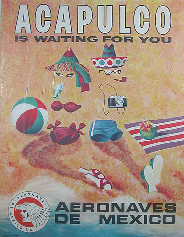
As part of an initiative from Mexico City-based espresso cycles for young Mexican designers to create several one-off bikes representing one of the country’s cities, Ana’s very 1950s colour scheme choice – together with detachable basket and portable umbrella – is an homage to Acapulco. The quintessential Mexican beach destination, which has declined precipitously in recent years, was the designer’s reach into the lost Mexico from her childhood. The problem is, one would never think immediately of Acapulco despite its colours: its essential form is fixed gear minimal and thus says “urban America” in the same way a Vespa painted in any colour says “Italy.”

Ana’s bike instead represents the new and strong cultural mixing that has erased borders in the internet age. Hipster has taken hold in Mexico, and as such, has itself become a part of Mexican culture. The fixed-gear community in the country is now large – check out Mexico Fixed – and well-established. And while the bike may be seen as yet another foreign colonisation of Mexican culture, for Ana it is instead a modernising of Mexico while keeping sight of its roots. And with the Acapulco bike’s well-intentioned mission, its importance ultimately lies in considering whether cultural preservation can be reconciled with progress in the first place.

Just like the dead hipster was overtaken by his own overdone individualism, entire cultures must make certain that they maintain a sense of individualism. Mexico, and Mexican designers especially, must therefore strive to mine their country’s energy and identity to truly preserve while making progress. With its incredible richness of imagery and rich tradition of transportation devices – from the humble improvised food cart to a deep love for vintage automobiles – there’s a lot of inspiration to be had… Ana and her peers are definitely moving in the right direction.

Ana’s bike (which is now permanently hanging around The Blogazine’s bureau) had previously been featured on Core 77 and in an exhibition from Our Cities Ourselves called Nuestras Ciudades Nuestro Futuro: “2030 Diez Ciudades Imaginando La Movilidad” – catch the video here.

Tag Christof 

Share: Facebook,  Twitter  
27/04/2011

The Typewriter Lives / Rand, Sottsass & Pintori

.

The Typewriter Lives / Rand, Sottsass & Pintori

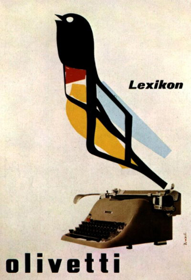
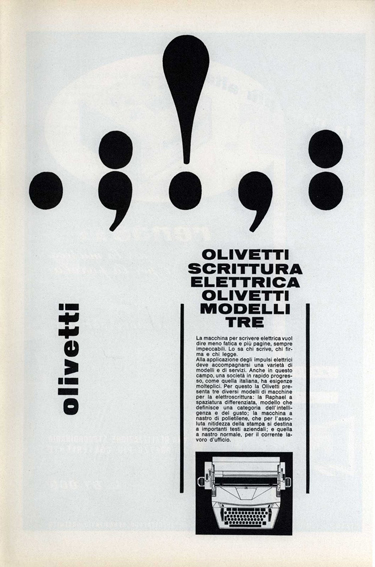
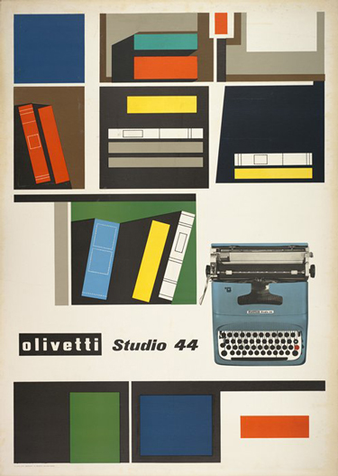
The typewriter is officially dead. Well, not really. It was widely reported to have died in 2009 when, ostensibly, the last company to produce them, Godrej & Boyce from Mumbai, discontinued production. But the world this week was quick to lament its symbolic and final passing, as Godrej sells its final stock. But as several respectable sources report, such as Canada’s National Post, several producers remain. Because, after all, prisoners and the Amish will always need something to write letters with.

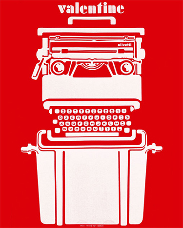
Today, we’re far from the days of the gorgeous Olivetti Valentine and rock-solid, anvil-heavy Smith Corona. It’s not rocket science to understand the lack of demand for the old workhorses over the past several years (or, y’know, decades). But the typewriter is is such a potent archetype that, even though it’s faded almost entirely from use, its complete abandonment is difficult to swallow.

We watched its form merge with that of the computer over the seventies and eighties. And today inside almost anything with a typing interface – mobile phones, computers, car navigation systems – the typewriter’s QWERTY archetype (or AZERTY for you crazy Frenchies) lives on. But as we’ve explored before, the loss of tactility in our new, predominately digital environments isn’t always easy to deal with. Not to mention the exponentially increasing complexity of the objects themselves. The typewriter’s death – real or exaggerated – signals a further uncomfortable detachment from the past.


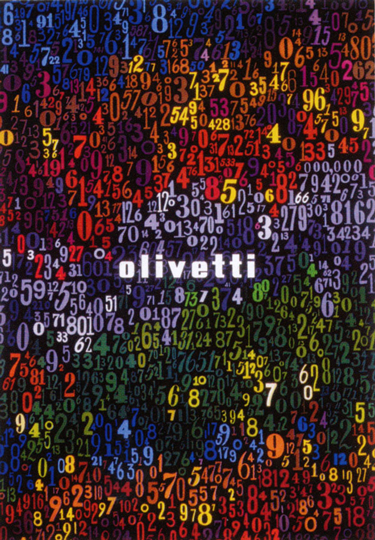
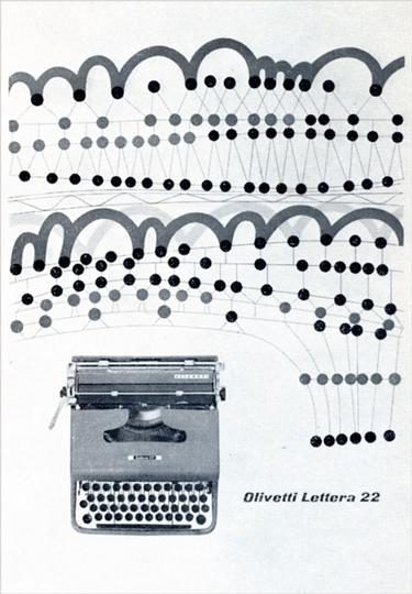
And although we’re most certainly not technophobic Luddites, the culture of the typewriter deserves its due. Its sheer brilliance was capped off by its 1960s and 1970s pinnacle as Ettore Sotsass, Mario Bellini and George Sowden turned them into functional high art. The typewriter was inextricably a part of the creative and visual cultures that made some corporations bastions of good design: think of Paul Rand, Giovanni Pintori and even Sotsass’ gorgeous and imaginative graphic works for the likes of Olivetti and IBM.

Typewriters were sources of great innovation in ergonomics and the relationships between object and user. They brought women into more dignified jobs and paved the way for equal workplaces the world over. The personal computer, in a design sense, can be thought of as an evolution of the typewriter…

Without the typewriter’s influence, it’s impossible to imagine the form the objects we use today might have taken on. Or if they’d even exist. And while not completely dead yet, it’s death is imminent, indeed. Should we fight for it, like Impossible did for Polaroid? Something tells me that wouldn’t amount to a typewriter revival…

Tag Christof – Images courtesy Olivetti, by George Rand, Ettore Sottsass and Giovanni Pintori

Share: Facebook,  Twitter  
18/04/2011

The Editorial: Barbapapa / Propaganda

.

The Editorial: Barbapapa / Propaganda

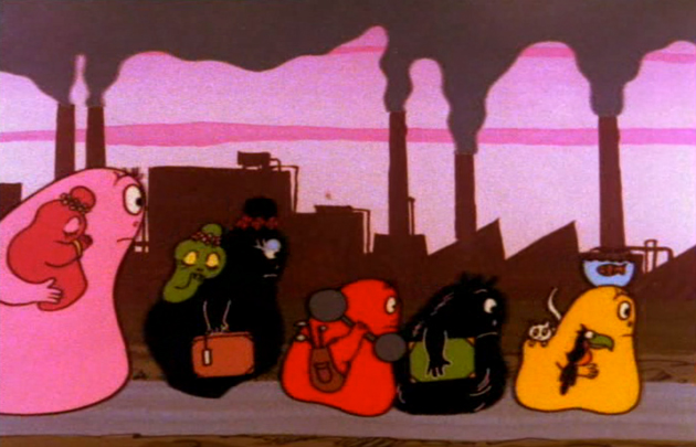
The drug fuelled 1970s was a time of discovery. Western cities dealt with swelling populations, skyrocketing crime and rampant pollution. Oil crises choked infrastructures and caused tension between nations. Recession after recession increased the gap between the richest and the poorest. Fashion rid itself of previous limitations and veered off on never before seen tangents; artistic conventions crumbled. And exactly like today – a decade of unprecedented complexity and extreme uncertainty – the 1970s was a time of discovery and reevaluation. It was and is once again a time in which we must take long, hard looks at ourselves and evaluate our systems, our values, ourselves. Barbapapa, the gorgeously kitcshy, cheaply animated 1970s cartoon did it for us forty years ago.


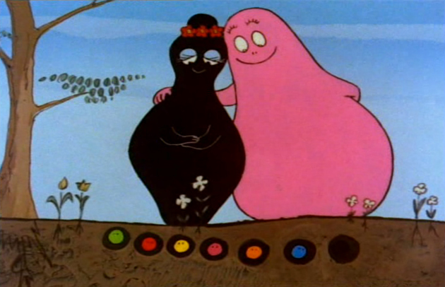
The amorphous pink blob, grown like a magical potato, is the manifestation of the modern human condition. He has supportive and nurturing friends, Claudine and François, but finds himself fundamentally alone, forced to seek meaning, as so many of us do, in a voyage around the world. Barbapapa is the commensurate self-aware individual, caught between his environment and himself: his awkward shape, size and colour set him apart, but his utility and benevolence endear him to those he is able to help. And although he uses literal and impossible solutions for immediate problems (such as transforming himself into a submarine, staircase or hot-air balloon), he serves as a magical metaphor for the wildly transformative power of imagination.


But forty years later, Barbapapa is as relevant as ever. The cartoon dealt openly with issues of depression, racism, displacement and inequality. And in a roundabout way with issues of homosexuality, gender identity, drug use and marital strife. The show dealt frequently with issues of pollution, environmentalism and animal rights. Barbapapa even tackled the dehumanisation, isolation and misery of anonymous midcentury public housing! Barbouille, the artist offspring, fights for creative freedom. And he and his family (while perhaps a bit unrealistically fond of one another) celebrate their differences, each helping the group along with their talents and sensibilities.

Generations of kids across the world have grown up listening to Barbapapa in a smattering of languages. And mostly none of them realised they were being schooled in tolerance and imagination. Perhaps Barbapapa is progressive propaganda. But the progressive, human values he represents are all too often overlooked in times of uncertainty. And with a future that looks more uncertain than ever, I think exactly what we all need is a little more gorgeously kitschy, cheaply animated 1970s good nature and humanity.

Tag Christof

Share: Facebook,  Twitter