15/07/2011

TANK/All New

.

TANK/All New

When we saw the amazing work from 2DM`s Bruna Kazinoti 
and Pandora Lennard - Tribe – we couldn`t help dedicating an article to the editorial last week. As an extension of the editorial, we must cite that the Tank team has changed a lot recently. New Art Director Micheal Donkin (coming from British Vogue) brings a breath of fresh air to the magazine. With a host of new talents, pleasant editorials like Croatia based talent Bruna and newly assigned Tank`s Fashion Director Pandora`s `Tribe`may be a more common future.


Since the magazine was first published in 1998, TANK has devoted itself to original and creative interpretations. For this deed, not only collaborating with considerable writers, artists, photographers, stylists and illustrators who all standout, but also with contributors who are independent thinkers which enrich TANK`s identity. The more TANK team discovers new approaches and such new names, the more they will capture the emerging talents.

Before the new art direction, TANK was a largely fashion oriented magazine that was a representation of a typically 90`s style and approach. It seems like Micheal Donkin felt the necessity to close the time gap, making it sophisticated though more reachable, which has turned out to be useful, new way magazine. Keeping the origins, new style in fashion magazine that has a considerable story behind.


Not only uniting the forces with new photographers has created timelessness, but also by the alternative art direction – just to mention the attention paid to fonts and the quality of the paper which is semi-matte – the magazine in general is helping the readers experience an evocative change.


We are curious about what is coming next in TANK who has given the signals that they are going to continue seeking out the most interesting names and subjects, always ELITISM FOR ALL.

Isil Gun 

Share: Facebook,  Twitter  
12/07/2011

Is it true? Do images represent our personality?

.

Is it true? Do images represent our personality?

It is always hard to talk about yourself because it entails laying your life bare. When people decide to do that they usually use reminiscences and images as tools to piece together fragments of their own experiences. But memory is irregular and repeatedly staggered. Even if it gives us the possibility to live again moments from the past, most of the times the chronological order gets lost and what comes out is a ‘map’ of ourselves, consisted of feelings that do not follow a linear path.

Citofonare Trombetta (“Ring Trombetta’s Doorbell”) – the 7th Wonder-Room opening, curated by Studio Blanco after a seasonal project break – echoed this thought.

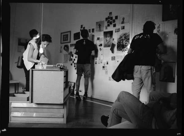
The show displayed the iconographic cues and materials (photos, Polaroids, negatives, prints), which cover Vicky Trombetta’s overall creative process, related to his life, work and passions. Several pictures of different dimensions, set up in an apparently random order, were hung on the walls of an intimate venue that allowed visitors to have a glimpse into the personal and deep research of Vicky’s daily life.
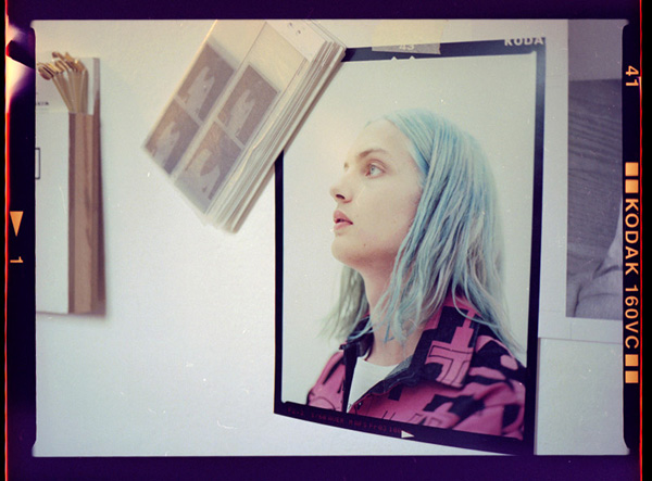
The delicately colored images, all analogue and printed without any digital processing, remind vintage prints full of memory and represent the artist’s journal made of places and individuals that have filled his private and social life in the last two decades.
Through traditional photographic techniques Vicky Trombetta framed the past in his works and created pics, which preserve memory and time. Spontaneous faces – relatives, friends and models – caught by the photographer in a poetic, instinctive and intimate dimension welcomed in the exhibition space, arranged as a private house with a comfortable sofa. Guests could sit down and have a drink, chatting and enjoying the show immersed in an atmosphere of sharing and conviviality that reflects the Wonder-Room spirit.

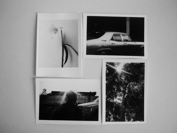
The artist’s need of sharing conveyed not only through the atmosphere but also thanks to the idea of giving a piece of his collection to visitors, who could choose one shot from some boxes containing fifteen mini limited-edition silver prints (6 x 7,5 cm), printed in nine copies by Giancarlo Vaiarelli, a master of b&w hand printing.

People – without knowing exactly what the images represented – opted for what reflected their mood and, at the same time, maybe unconsciously, they took away a small part of Vicky’s ‘map’.

Monica Lombardi – images Paolo Simi courtesy of Wonder Room

Share: Facebook,  Twitter  
11/07/2011

The Editorial: Trash Handcraft Treasure / Mexico

The Editorial: Trash Handcraft Treasure / Mexico

Mexican drugstores don’t sell rolls of film. Nice digital cameras, probably. But rolls of film, not so much. When you ask, shopkeepers seem always to give an expression that says “why on Earth would you still have any need for that?” It’s a surefire sign that the country is still pretty far from the cultural hegemony of hipster that we wondered about in May’s A Mexican Hipster & Her Acapulco Bike. Mexican culture marches on, as of yet diluted much less than most.

And like in India and China, two other nominally rich countries with exorbitant income disparities, handcraft in Mexico is alive and well. It’s an integral part of the country’s design patrimony – from musical instruments to pottery to hand-woven textiles. And there’s an honest unpretentiousness to all Mexican craft that makes even its cheapest examples something entirely different from the over-adorned, silky sparkly stuff in street markets around the world. Gorgeous hand-painted glassware, embroidered garments, hand-carved sculptures.

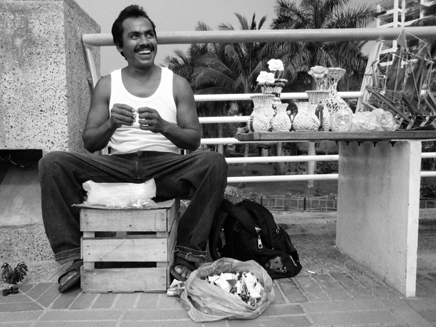
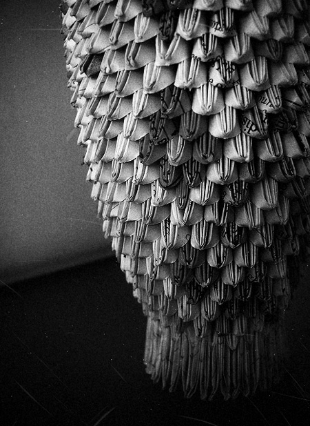
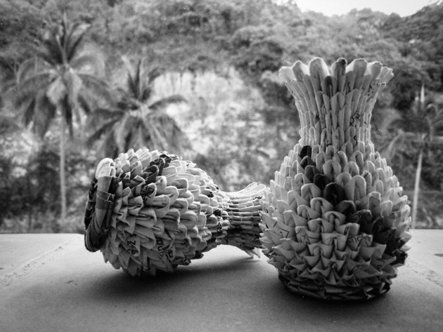
We came across a particularly upbeat artisan who makes elaborate decorative vases out of only scraps of meticulously cut-out paper from magazines. He spends his days creasing, placing, weaving at a table on a pedestrian sidewalk. Making pattern, form, shape and texture from former trash. And for his hours of hard work, he asks for almost nothing – one small piece that might take up to five hours is sold for no more than 3€.

He learned the technique from his father-in-law, but continues to develop it and play with new forms and ideas. Figurines. Perhaps water-tight paper weavings that could hold and keep flowers alive… Oh, possibility! His work has become more complex over time and he’s developed his own “style” (quite different from others who work with similar principles and material). And his trajectory seems uncannily like that of a classic designer-artisan like Lino Sabbatini: learn a material, experiment, then make it your own. Even if he works in as “poor” a material as recycled paper, good craft is good craft. And in a small way that this maker almost certainly doesn’t realise, his work is design.

Still, his son – who sat attentively by his side as we chatted – said he wants nothing to do with his father’s profession. He wants school. Knowledge. An improved life. His father wants it for him, too. And who can blame them? In a country relentlessly caught between rich and poor, upward mobility can be everything. Both of them have no doubt that there will be no paper folding in his future.

But we should hope that future generations don’t allow the tradition of Mexican handmade to fade away. If Mexico follows the pattern of other rich countries as its economic health continues to improve (and hopefully begins to be spread around more evenly), these one-man makers are likely to mostly disappear. But the country’s rich uniqueness is tied closely to these gorgeously lo-fi, refreshingly imperfect and unpretentious objects. They can be every bit as beautiful as a great number of good design pieces, but carry the extra validity of rich cultural context and skilled manual construction.

Their best hope for survival is probably a recognition by the rest of the world of their charm and distinctiveness, perhaps alongside a selling structure that would allow their makers a bit more to get by on. With a new generation of extraordinarily talented Mexican designers, artists and thinkers eager to steer a fresh course for their country’s cultural patrimony and place in the world, the question of handcraft’s should be a rather interesting one to tackle…

Tag Christof

Share: Facebook,  Twitter  
04/07/2011

The Editorial: Identità Virtuali

The Editorial: Identità Virtuali

We’ve talked here before about the changing typologies of objects thanks to revolutionary technologies that have made many separate objects obsolete (iFuture, iFatigue). We’ve talked about fine art and artisanal craft in the face of digital art’s low barriers to entry (Election Day / Every Day). We’ve even talked about quickening trend cycles and the impossible superficiality of pop culture in the internet age (Hugh Holland and the Lost Art of Living). But more importantly than any of these things, most of us haven’t truly stopped to consider that our very identities have been dramatically, irrevocably changed in the past few years. We are no longer singular “I,” but instead are plural “I.” We must exist temporally, and then we must also exist in the digital world to really exist.


In a fantastic exhibition which opened last month, Florence’s CCC Strozzina (part of the Palazzo Strozzi museum) explores this phenomenon in depth. Without coming across as anti-utopian, the exhibition attacks questions of identity and self in the age of perpetual connectedness.

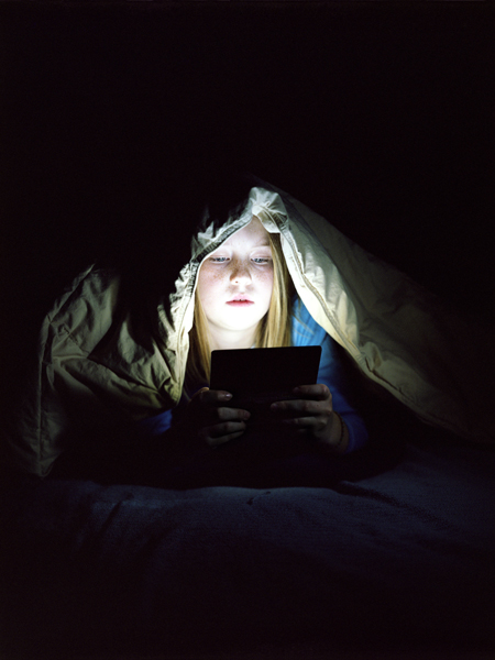
The exhibition begins with the striking works of Robbie Cooper and Evan Baden, who both explore users’ physical and mental connection to their virtual selves. Cooper’s video works record children playing video games from inside their television screens to brilliant effect: they are their virtual avatar, jumping and flinching and concentrating intensely on the task at hand. Baden’s photographs show users seemingly hypnotised by their His subjects’ fixed gazes seem to indicate an abandonment of their physical space for a complete mental transfer into their devices.

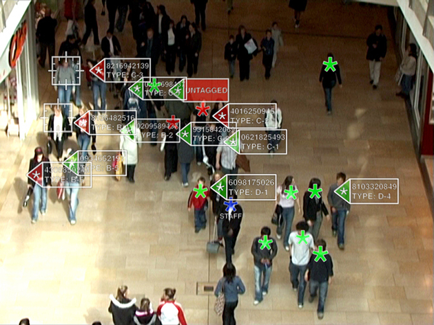
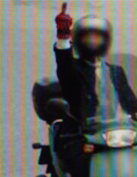
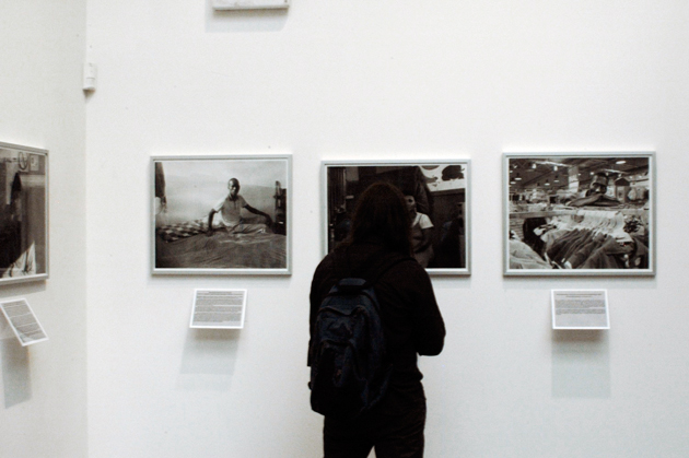
Michael Wolf’s work, which is a tongue-in-cheek mining of Google Maps Street View images around Paris asks this question brilliantly. When our spaces are completely inhabited by surveillance and recording, just what part does the individual have in it? His subjects are passers by who were (usually) unsuspecting subjects of Google’s surveying, thus creating an interesting look at the relationship between spaces, people and the digital world. Chris Oakley’s work takes this one step further, by showing a department store surveillance system which uses data from social networks to classify shoppers. And Christopher Baker’s cacophony of Skype video chats bewilderingly puts into perspective the enormity of the digital world.

But beyond the awkward disconnect between the digital and real, we also see the positive power of social networks for activism. Diana Djeddi‘s work on the infamous viral video of a woman murdered on the streets of Iran breaks down the phenomenon and reveals the power of strong symbols used over a network (even if in error). Nicholas Felton’s obsessive self-recording work, demonstrates the power of real insight onto your own life and habits and provides a glimpse into the growing desire for self-monitoring.


In any case, it seems clear: there is no escaping your virtual self. Even those staunch holdouts who refuse to join Facebook are being catalogued, analysed and measured up. There’s just no hiding. But instead of our digital and non-digital selves being diametrical opposites, they have instead become compliments. Chances are, in fact, that in time the two will only merge more completely.

The profound questions raised by this excellent exhibition are sweeping and will be debated by sociologists and anthropologists and economists (and everyone else) for the foreseeable future. But move wisely. As your two selves merge to become one “real” whole, remember that it’s already impossible to separate the two. Dress well, speak well. Share well, type well!

Tag Christof – Images CCC Strozzina 

Share: Facebook,  Twitter  
01/07/2011

Guest Interview n°30: Beatrice Fontana

.

Guest Interview n°30: Beatrice Fontana

Beatrice Fontana is a créatrice, in the strictest sense. She is considered a maven of taste and is a privileged consultant to the world’s premier luxury brands. In addition, she’s had a role in bringing high-luxury sensibility to very functional objects, and not long ago collaborated on a major project with Parker Pens. Hers is a life of invention and a constant search for inspiration.

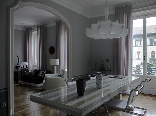
We visited her home earlier this year with 2DM photographer Lorenzo Nencioni, where she and her husband showed us their fantastically varied collections of objects, impeccable furniture, enormous music collection and the extraordinarily well-curated home in which it is all contained.
And what exactly does Beatrice Fontana studio do?
We are a consulting practice that studies trends in fashion and design, creating projects and products specially made for brands, our clients.

Your work for Parker pens is quite a departure from you work designing fashion accessories. Did you enjoy such a radical change?
When they called me I was seriously bowled over. But they told me they needed “style.” I accepted, driven by the fact that being charged as Artistic Director would mean that I would be given a new fountains of inspiration and ideas for any type of product.

You collect beautiful things. Tell us about that.
Yes. Mine is a search for style. To collect objects is both a fountain of inspiration and an indefatigable urge just to have them. And also, I like to live among things I love: some represent undying loves, some are a “flash in the pan,” and then, I give them away as gifts.
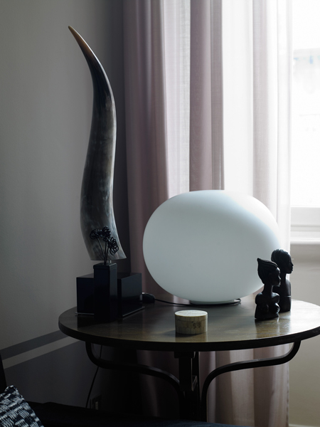
Your husband Corrado is also quite a collector. Has his love of hard rock influenced your creativity?
Certainly! That means that when we visit markets, we choose also the objects that are a little bit more “rock”… But in any case, in our living room we have racks of horns hanging over the room and the skull of a horned buffalo!

And together you and he have carefully curated your home here in Milan that Lorenzo Nencioni photographed recently. How has your personal space important for your creativity?
It’s fundamental! Some days when ideas don’t come to me, I work at home, and I lay out all my work material on our magnificent table by Piet Ein Heik. I pace back and forth on the creaky old parquet and I feel as if I’m in harmony…. It’s there that I find insiration.

Any particular pieces of furniture/decor that you treasure above others?
Memories from my childhood, like two armchairs from the 1970s that are in my living room which I had reupholstered in black calfskin. And a large crystal lamp that hangs over our bed that came from my parents’ room.

You studied at Istituto Marangoni in the 1980s when fashion was drastically different, and Milan was a radically different city. How have you seen fashion and luxury change over the years?
Milan has changed so much. Back then, everything was more simple… you proposed an idea, and it was considered solely based on its creative merit. I remember that I designed in complete liberty, following the inspiration of the moment. Then, the crises hit, minimalism became popular, people became much more cautious about their purchases, and every design is analysed from a marketing perspective. I think, though, that we “grew up” somehow, and that the distance from the frenetic 1980s have done us some good. Today, work is done in a more attentive and balanced manner, but there’s also a large-scale return to creativity as a catalyst for everything.
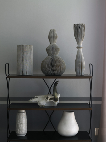
What was Milan like back then?
I remember it being more provincial and perhaps a bit more sorridente (smiley). In Milan we breathed an air of “anything is possible.”

How do you imagine Milan in 25 years?
A bit less liveable and more overcrowded. Unfortunately we are losing our soul bit by bit, even if it’s true that there is no city in Italy like Milan, in Italy we aren’t able to compete with other European metropolises in terms of stimuli, culture, minds…
I have architect and designer friends who come for Salone del Mobile every year and they go crazy for Milan. But sadly, Milan is only marvellous to live in during that one week in April.

What is true luxury, in your opinion?
Finding the answers to your own desires.

Interview and introduction Tag Christof – Italian translation Helga Tripi – Photos Lorenzo Nencioni / 2DM

Share: Facebook,  Twitter  
28/06/2011

Guest Interview n°29: Jack Skuller

Guest Interview n°29: Jack Skuller

Jack Skuller is on fire. He made waves last year with his toe-tapping, singalong single “Love Is a Drum” and has just followed it up with the every-bit-as-catchy “Secondhand Smoke.” His music is pop in original sense: engaging, approachable and instantly classic. The Ruckus hailed him as the “Anti Bieber,” and he certainly provides refreshing relief from the leagues of overproduced marketing machines that have ruled the international pop airwaves recently. He’s lightyears away, and is a stellar musician first and foremost.

Combined with his addictive rhythms, uncanny knack for songwriting and good looks, we’re convinced Jack’s going big places. 2DM photographer Roberta Ridolfi spent an afternoon with Jack – and they got on famously. With The Blogazine, Jack talked musical style, his favourite album of all time, and life in Jersey.

I hear a modern-day Ritchie Valens in your music… but you’ve been called a mini Jack White! So how would you define your style?
I am simply a rock and roll artist with a 50’s twist. There is a lot of blues incorporated into my writing and melodies and it mixes with modern rock and roll, which is what you are hearing.

And how do you feel about being called the “anti-Bieber”? (We’d feel pretty good about it!)
Well, I never know if it’s good or bad! (Haha) To be honest, I never really focused any of my aspirations on becoming the “anti-Bieber” nor the “next Bieber.” Our music is completely different from one another’s – we’re musically in separate galaxies!


And who do you consider your greatest musical influences?
There are so many that I can’t even name all of them! But some of my biggest influences are definitely Elvis Presley, Eddie Cochran, Little Walter, Black Rebel Motorcycle Club, and The Kills. A wide range of music I just covered, I know… Some may call me a hybrid!

Dream collaboration?.
A blues covers album with The Black Keys or Jack White.

How do you listen to music? Vinyls? iPod?
Great question! My family owns a lot of vinyl, but I usually use my iPod or my laptop.


What’s your favourite album of all time?
The Beatles’ Revolver

Let us in on your songwriting technique. Does inspiration flow when you sit down with your guitar, or do ideas strike more randomly?
It’s both. Sometimes I’ll think of a melody or a chord progression based on how I’m feeling and then the lyrics just write themselves. Other times, I’ll have an idea and just sit at my desk and go nuts on the paper. Most of my songs come from real experiences.

If you could choose to live in any era, when would it be?
Without a doubt, the 50’s – first generation of rock and roll!

Tell us a little about life in Jersey!
It’s splendid. I’m 10 minutes away from New York City, where most of my gigs are. I love school and my friends are so awesome and supportive.

How do you spend your time when you’re not rocking out?
I’m usually writing, rehearsing, running, playing basketball or baseball, or completing an assignment for school. But I don’t have to do that again for a while since I’m on summer break!!

Tag Christof – Very special thanks to Roberta Ridolfi / 2DM
 

Share: Facebook,  Twitter  
27/06/2011

The Editorial: Fashion Kids

.

The Editorial: Fashion Kids

Fashion is a canvas for wild experimentation. It is the single most tangible cultural lever by which we move forward in our relationship to the world. And in relation to ourselves and one another. Fashion is a harbinger of change, a powerful barometer of society’s mood, and a temporal definition of taste. Despite its seasonal direction changes, fashion opens the world progressively, and in a remarkably structured way. Compare the brilliant men’s collections we saw in Paris and Milan this season to the uniforms of the Mad Men era, or even Wall Street’s extroverted reign over the 1980s, and it becomes clear how drastically men’s role in society has evolved. Everyone’s role in society has evolved drastically. But, kids?

It goes without saying that fashion exists to break rules. We need fashion to fill that function. But as product design, architecture and other related worlds have progressed from styling-for-profit-driving to bastions of good ethics, fashion has stayed behind in several places it should be well ahead of the curve. Sweatshop labour abounds even today, fast fashion is raising serious issues of waste, and even the most prestigious labels can be less than forthcoming about their production practices. These are all, of course functions of the fierce competition brought on by globalisation.

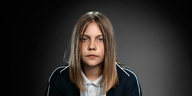
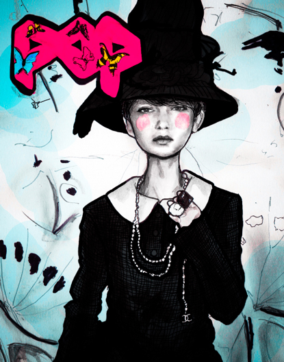
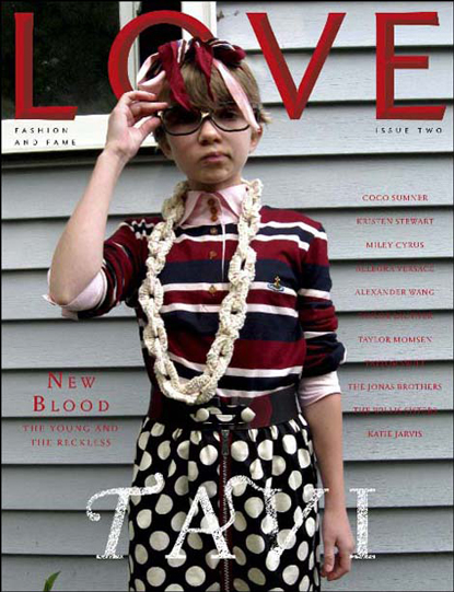
But in terms of fashion as a cultural force, the role of children has become a tenuous one. Not kids in sweatshops (although they are certainly a far more serious problem), but the junior fashionistas and talented young personalities who are capitalised upon by fashion for their recognizability and youth. The awkward and bespectacled mini-savant Tavi is, of course, the epitome. A few years after her she gained notoriety through her very well-written blog (she’s now 15 years old), she has become a full-fledged force unto herself (her “press” person once brusquely blew me off). And much to the chagrin of several of her (much) older colleagues, she has been snapped up by the industry as a sage and muse. But, did she ever have a childhood? She certainly didn’t have a long one. But her age creates buzz. She sells magazines. She’s good business.

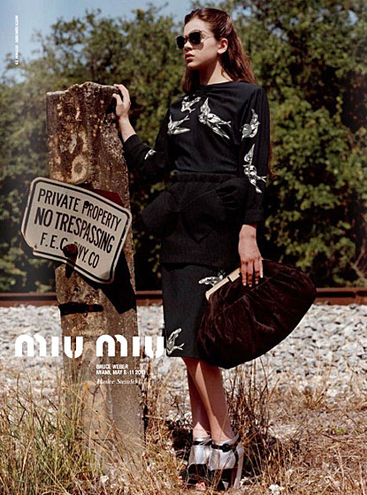
Prada has just made Hailee Steinfeld the new face of Miu Miu, and instantly at 14, she’s to become a full-fledged icon of her time. Now, exploited is certainly too harsh a word: these kids are anything but mistreated. They’re swathed in lavish outfits and marched around like the mini superstars they are. But the whole song and dance seems suspiciously like a highly calculated ploy in which marketers (and not designers) are grasping at anything out-of-the-ordinary for leverage in their brand-building wars. It’s like, “Flat, curvy, ethnic, strange, plain, ugly and extreme have all been done. So… um… how about kids?”

The problem is, using a kid as a marketing tool is slippery slope. Parents react strongly. And marketing tools, by nature, are designed to compel certain behaviours. Namely, consumption, adoration, reverence. What happens to the kids’ peers and their distorted worldview? Entirely separate from the wrongheaded Puritan diatribes about skinny models driving eating disorders and body image problems (that’s like saying advertising delicious food causes obesity, shitheads), throwing a kid into a mix changes the playing field. Tavi’s smart. Hailee’s a brilliant actress. Both are prodigies. But a prodigy in music or mathematics and a prodigy as marketing tool are drastically different. And precisely because fashion is a manifestation of our deep social and cultural conscious, maybe we should think a bit harder about what our new obsession means.

Maybe it’s just an uncomfortable inversion of the system. Maybe the beauty of youth is just too beautiful to ignore. Maybe we’re opening doors for new forms of expressions in fashion. But even in fashion, where most things should never be off-limits, there should be some room for the sacred. Maybe we should just let the kids be kids.

Tag Christof – Images courtesy Pop, Love and Miu Miu

Share: Facebook,  Twitter  
09/06/2011

Radio / Street Food

.

Radio / Street Food

Following their recent event for the The Milan Review of Ghosts, Marco Klefish‘s Radio is back with another, more delicious venture. This time they’re leaving the ghosts in the closet and taking to the streets for a glorious celebration of sometimes greasy, always delicious Street Food.

Tomorrow on Via Pestalozzi in collaboration with Tour de Fork they will be opening a public oven – yes! – reminiscent of ancient Mediterranean communal ovens, and will share their fare with guests. The celebration promises a mash up of chiefs, photographers, musicians, designers and editors all working together to reimagine culinary tradition and folklore. The result is sure to be an exceptional culinary feast, but thats not at all: If afro funk is your thing, Sila & The Afro Funk Experience will be playing a live show.

Opening tomorrow at Radio’s space at Via Pestalozzi 4, starting at 19:00. Bring a bib!

Daniel Franklin 

Share: Facebook,  Twitter  
07/06/2011

The Book Affair / Automatic Books

.

The Book Affair / Automatic Books

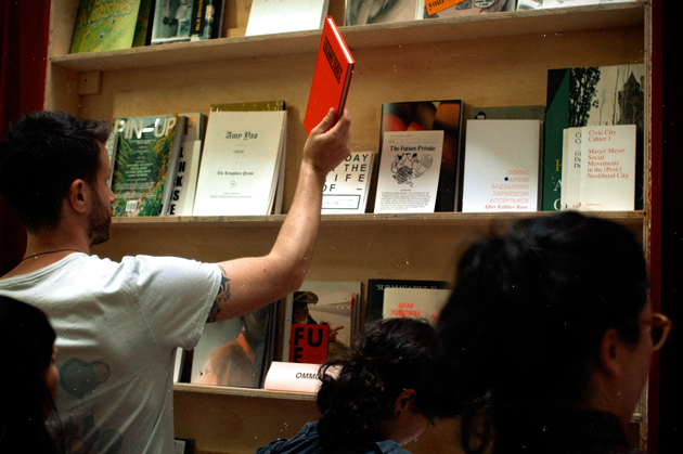
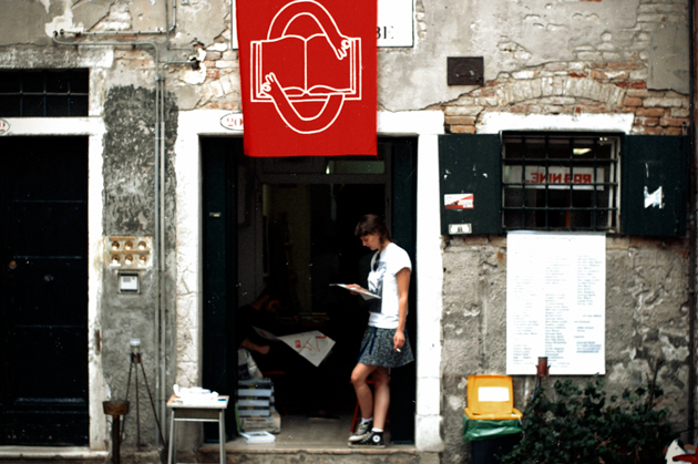
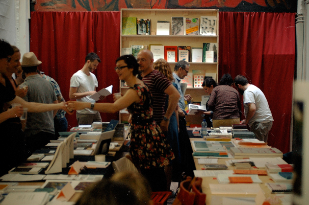
Last Thursday and Friday Metricubi played host to The Book Affair. Tucked into a cozy corner of Campo San Polo under ruby red Elena Xausa-designed banners, the event curated by Automatic Books brought together an excellent cross-section of independent publishers working across Europe today.


And although the polizia showed up at one point (down, rowdy book nerds!), the event was a smashing success. There were a series of readings by the various publishing houses, and the entire event was set up to encourage conversation. Much like picking fresh fruit from an orchard, talking to the people who make the books you’re about to read is a revelation not to be missed.

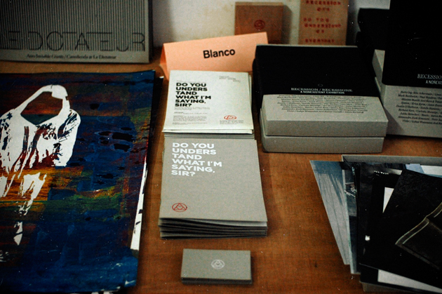
Highlights included the intriguing works by France’s Incertain Sens (including one of its entirely handwritten notebook volumes), a large selection of works from Britain’s Bookworks, the Recession boxed set by Studio Blanco, and some seriously deep literature pondering existence, banality, politics, everything… We were happy to see a printed version of San Rocco, having admired their website and the concept behind their zine for quite some time, and were exposed to a host of stellar works from foreign publishes we hadn’t known before. And we were happy to see works in the flesh by 0_100, Secret Furry Hole, Kaleidescope Press, The Milan Review, and Wonder Room alumni Studio Temp.

As top-down publishing increasingly gives way to electronic, hybrid and user-generated formats, the creativity these independent houses bring to books is a promising look towards the future. While run-of-the-mill, straightforward books might one day cease to be printed on paper, the book itself has exciting new life ahead of it: originality, distinction, rarity. Not only are these publishers not abandoning the printed, physical book, they are carrying it forward in its most fertile conceptual space – they are creating new, original paradigms and designs for end users who will continue to appreciate books as treasures.

The Book Affair’s first outing was a fantastic start, and we hope it flourishes with time. Until the next outing!

Tag Christof

Share: Facebook,  Twitter  
06/06/2011

The Editorial: This Is A Work Of Art. Why?

.

The Editorial: This Is A Work Of Art. Why?

“QUESTO È UN’OPERA D’ARTE.” “THIS IS A WORK OF ART.”

So says a blaring voiceover repeatedly as a small crowd gathers around two armchairs on wooden platforms designed by Gaetano Pesce. They appear to be straight out of Dr. Seuss, are highly derivative of his iconic 2010 “Senza Fine” line, and are occupied by two lounging nude models – a very busty blonde woman, and a muscular, long-haired man. Gaetano himself is there, mingling with the people who have gathered around mostly to catch a glimpse of the nudes, and perhaps to shake the hand of the celebrity designer who produced the pieces. But wait. “THIS IS A WORK OF ART,” the voice reassures us again. We’re not so sure…

As part of Italy’s pavilion at this year’s Biennale d’Arte di Venezia, Pesce’s contribution was among the included works of several hundred others in the canon of contemporary Italian art. The pavilion is supposed to be a celebration of Italian art at the country’s 150th anniversary of unity, but it is mostly just a confusing mess. Now, nobody should fault the noble attempt to include the entire scope of art of a massive and diverse country like Italy. But many works of dubious quality were included, and each being in the context of so many others ensures that the importance of all of them is lost.

Some are claiming that what I’m calling a mess is instead an appropriate representation of the difficulty of Italy itself. The Franco-Italian critic Philippe Daverio had this to say:

“They are all together, gorgeous and ugly, in a populist and transversal exhibition. A community where everyone is a happy, participating member of the family… It is an exhibition which helps us understand how one makes inroads in Italy, and for this, the pavilion is the most anthropologically appropriate that I’ve ever seen in my life.”

Perhaps. But Curation 101 dictates that a common thread – more elegantly a filo conduttore in Italian – is essential to any good exhibition. And when seen in the context of the American, Danish, Russian and several other strong pavilions this year, Italy’s misses the point entirely and is more likely representative of the lack of a clear idea for what Italian art should be. If this exhibition’s common thread is none other than “a bunch Italian of artists,” it says nothing.

Art itself has gone through quite a tumultuous period over the past several years. With infinitely easier access to images, art texts and art culture, it seems like everyone is calling everything art. The proliferation of e-art and the word “art” and vague ideas of flamboyancy as art appearing even in the most mainstream of pop culture, everyone is now “into art.” The problem is, pop culture is by definition superficial and transitory. Art cannot be – yes, pop art is art, but art is not pop.


The Italian pavilion – and the inclusion of a piece of design by Pesce, an easily recognisable name the curators believed might lend credibility to their show – is surefire proof that we are rapidly losing sight of the pivotal and important roles art plays. We frequently allow quantity to win out over quality and for art to be confused with several other things. In the case of Pesce and his work, we elevate a random piece of design to the exalted status of art. Why?

Design may sometimes do the same things as art, but its primary goal is practical. Design is none other than the improvement or changing or re-shaping if the environment with which we interact – aesthetics play a role, but only insofar as they affect experience. Design must change behaviour and enhance lives.

Art must change minds. Art must beg questions. Provoke. Challenge. It can be wholly impractical. It must provoke thought and discourse. Impractical, whimsical design is not art. It’s probably just bad design.

With that in mind, we have nothing against Pesce as a designer. His design work has been influential and imaginative. And his recent and very powerful installation for the Triennale “L’Italia in Croce” (“Italy Crucified”) was strong sociopolitical critique and a symbolic lament for a country he clearly loves – that was much closer to art. But with some odd-looking armchairs that are heavily related to pieces he’s already commercialised, he most certainly can’t accomplish both. Like the designer he is, while he mingled with the crowd, Pesce talked up the materials the chairs are made of – not the statement they make nor the significance of the piece itself. Despite what the voiceover said, they are not works of art.

Tag Christof

Share: Facebook,  Twitter