14/03/2012

The Editorial: Ode To Richard

The Editorial: Ode To Richard

And an ethically complex war that will undoubtedly impact our media-fueled futures rages on: just yesterday Richard O’Dwyer, the student accused of copyright infringement, has been ordered extradited from the UK to America. Yikes.

This year has already been a rager in the battle between traditional content producers and the quicksilver warriors of the internet. So far we’ve seen the sideshow spectacle Kim Dotcom’s fantastic downfall and enormous worldwide protests against the proposed Protect IP Act and Stop Online Piracy Act bills introduced by the United States’ legislature. And now, helpless Richard, who ran a two-bit site that linked to copyrighted content, is being hauled away from his home to face a wrath tied up in a sociopolitical and economic discourse much bigger than his actions.

Alas, television and movies (and their protected legal statuses) overwhelmingly originate in the USA, and the massive media conglomerates who produce them have a vested interest in making sure those programs and films can continue to generate steady profit. Fair enough. But the sudden push to toughen up criminal laws is reflective of a legal system that readily bends to the will of those with lots and lots of €£$¥. The conglomerates are scared. The porous, dynamic nature of the Internet has chipped away at their anachronistic models, and so they’ve been lobbying lawmakers around the clock to come to their defense. “Save us from that big bad Richard!” they cry, melodramatically.

But since power and money [almost] always flock together, helpless Richard loses. And while that may be a rather simplistic down-on-the-street 99% style argument, it’s nevertheless a scary proposition: like pirates rushing to shove dirty rags in the holes of their rickety ships while forcing someone to walk the shark tank plank because he helped steal a tarnished cubic zirconia, the conglomerates are ignoring their most pressing issues while they unscrupulously attempt to bend the rules to their favor. But since Hollywood and Silicon Valley stand on starkly different sides of the debate (Google wants open, Disney wants closed), there is a vast amount of clout (and money) on both sides of the issue. It will be fascinating to see how the story unfolds over the coming years. In any case, the implications are huge on both sides.

2DM itself is an agency whose signed talents produce a great deal of high-quality, original content. We shoot for the glossies, illustrate for the generation-defining independents and style for some serious brands. And despite inevitable minor skirmishes over rights and misappropriation, we generally feel that the world is a better place with our artists out there making it slightly prettier. So on the face of it, we agree with the old-style content creators – photographers, actors, musicians and designers alike cannot get by if people steal their hard work – but we see everyday the tremendous value that the open and dynamic nature of the internet has brought to the world. We might all make a bit less for our content, but in return we get far more and far better content than we once did.

At the heart of the problem lies more than a seriously unlucky student whose life will likely be ruined by the out-of-control complex that wishes to make an highly visible example of him: the open, transparent future we dream of has no place for the massive concrete walls of PIPA, SOPA and the lobbyists whose indirect actions are going to land that poor student in American prison.

Let’s all root for Richard. This is serious.


Tag Christof – Images courtesy of Walker Evans

Share: Facebook,  Twitter  
12/03/2012

Jay Reatard: Better Than Something

Jay Reatard: Better Than Something

Jay Reatard died just as he was beginning to outgrow the Memphis punk scene he’d spent most of his life putting on the map. Only 29 years old, he played in more bands and released more albums and 7” singles in fifteen years than most people do in 80. In interviews he often claimed to be constantly working against time, writing a song a day as if he knew he didn’t have many left. Then again, he also spent a lot of time talking about future plans, like buying a house, learning how to play the cello, and making more pop-oriented records. As much as anything else, the documentary film Better Than Something reveals that Jay Reatard did not plan to die.
Sometimes it’s hard to tell whether or not he wanted to. Since he could walk he’d been cutting himself and wrapping microphone cords around his head and screaming and unwillingly ejecting himself out of bands, schools, and relationships―the quintessential punk. The documentary for the most part sticks in Memphis as Jay takes us on a tour of the neighborhood he grew up in. “I wrote my whole first album in that house,” he says, pointing to a dilapidated shanty in a poverty-stricken part of town. Reatard is framed as a local hero who doesn’t seem to know what to do with his ballooning reputation. We get to see how his songwriting evolved from bratty speed-punk anthems like Lick on My Leather and Teenage Hate to more focused power-pop nuggets like It Ain’t Gonna Save Me and See/Saw. If you didn’t know anything about him, you’d think you’re watching a movie about a burgeoning talent, not a memorial service for a fallen icon.

And this is where the film really works: by opting to take a peek into Reatard’s life instead of framing the narrative around his untimely death. Likely it’s because directors Alex Hammond and Ian Markiewicz initially shot the footage for a documentary about the living Reatard. Regardless, the speculation on what could’ve been is for the most part wisely left on the cutting room floor.

From the beginning Reatard painted himself as an outsider, railing against Memphis’ rich musical history―Elvis and the blues in particular. His first album, released when he was 15, is called Fuck Elvis Here’s The Reatards; his last, Watch Me Fall. He redefined his town’s musical landscape. For many local musicians and fans considered the guy a prophet.

He was also somewhat of an asshole. As Better Than Something shows, he seemed to feed off of any and all negative attention. In one scene we see Jay humiliating his bandmate onstage by grabbing at his dick; in another he’s throwing equipment at the keyboardist. There are countless anecdotes about Jay crashing parties and starting fights with strangers, and we often see him annoyingly drunk, microphone in hand, antagonizing anyone who will care to listen. At times he seemed to be playing a caricature of every punk cutout from the past forty years―ripping off a pigeon’s head and stuffing it into a fan’s cleavage; punching his bandmates; smoking crack and breaking windows. It was all part of the show, which leads to the sneaking suspicion that Jay―in being the outspoken punk rock kid who didn’t take shit from anybody―was putting us on. His character is funny from a distance, but the gimmick loses its spark as it becomes clear that every band he founded was driven to destruction by his own hand. And it’s downright depressing when you realize that, in the end, even he couldn’t get out of his own way.

Lane Koivu

Share: Facebook,  Twitter  
09/03/2012

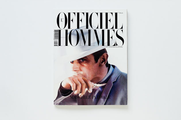
L’Officiel Hommes S/S 2012

L’Officiel Hommes S/S 2012

The spring issue of L’Officiel Hommes is on the newsstands almost worldwide. The quarterly men’s magazine with a fresh and dynamic approach to fashion has become, during the years, one of the most stylish points of reference among the international lifestyle publications.

Each edition of L’Officiel Hommes uses its own language to interpret and reflect cultural trends of different countries combining classic and unconventional looks. All the issues, with a common graphic taste and a special eye for high quality photography, are dedicated to a male readership interested in fashion, but at the same time they cover a wide range of topics – art, design, sport, music, architecture etc. –, which makes the magazine enjoyable for women as well.

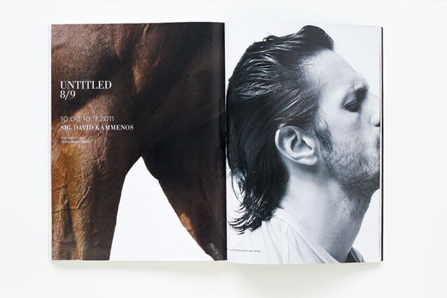
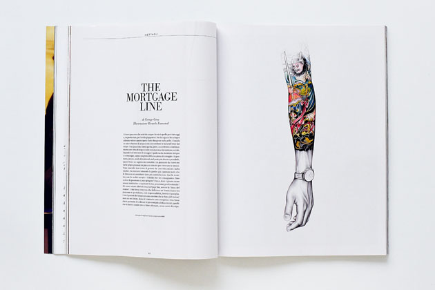
This season L’Officiel Hommes Italia hosts, among many notables, shoots by its brilliant creative director Pablo Arroyo and the drawings by the skilled illustrator Ricardo Fumanal, both proudly 2DM’s talents.


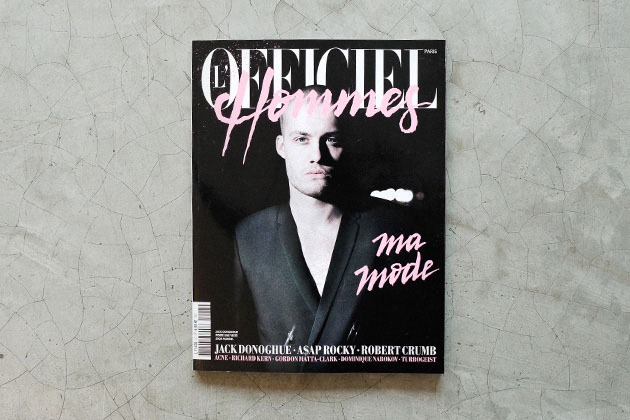
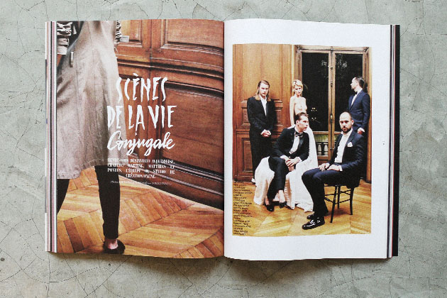
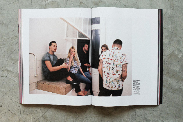
L’Officiel Hommes Paris, on the other hand, along with the interesting piece about the conceptual artist Gordon Matta Clark – renamed Anarchitec, famous for his ‘building cuts’–, features an editorial of impressive 20 pages dedicated to the team of the creative studio of Acne, shot by 2DM’s Bruna Kazinoti.

We look forward to the next issue and we’re warming up for the next satisfying collaboration.


Monica Lombardi

Share: Facebook,  Twitter  
08/03/2012

Rolling Stone Italia n.101

Rolling Stone Italia n.101

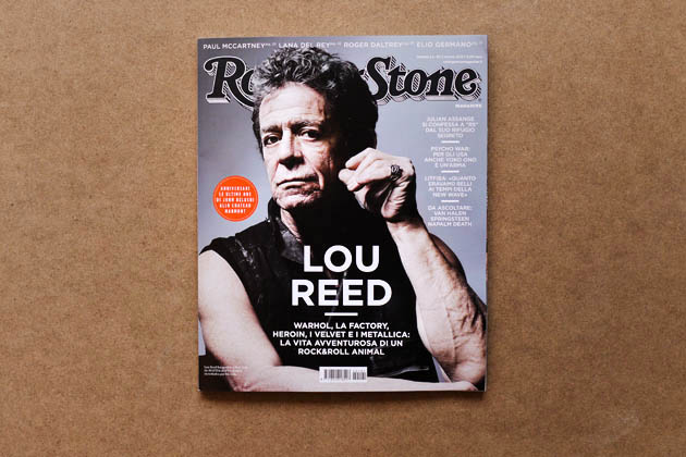
There’s no nicer way to start out new month than with a delightful shopping trip to the newsstand to collect all the best magazines, fresh off the presses. Today’s review is about one of our perennial favorites, Rolling Stone Italia, which this month is bursting at the seams with the artwork of 2DM‘s talents.

The March issue, n.101, sets the spotlight on a range of public figures, including Julian Assange, John Belushi, Roger Daltrey, Michael Margotta, Mark Stewart and Elio Germano, just to name a few. And the gloomy eyes of Lou Reed grace the cover, photographed for the magazine by Mattia Zoppellaro.

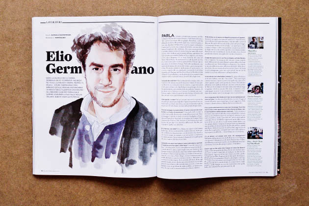
The first of the three 2DM talents represented on the pages of this issue is Karin Kellner for the interview of Elio Germano, who is interviewed by Raffaella Giancristofaro about his work, colleagues and thoughts about work and life.


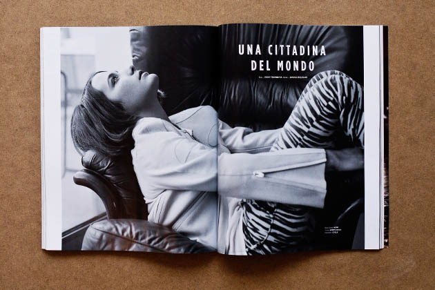
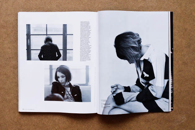
The B&W photoshoot “Una Cittadina Del Mondo” (A Citizen of the World), starring the actress Martina Codecasa was shot by 2DM’s own Vicky Trombetta, whose work here is an atmosphere charged with thoughts, dreams and memories.

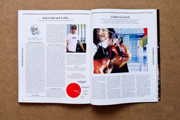
On page 111, you’ll find the signature styled collage by Diego Soprana, featuring the article “Contro il revival” by Angelo Flaccavento on how the “remake culture” is killing creativity and originality in the world, and according to the author it’s not just happening in fashion.

As always with a new issue of the ‘Stone, the suggestions, glimpses and profiles left us energized. We’ve got lots to google!

From the Bureau

Share: Facebook,  Twitter  
06/03/2012

Zak Kyes working with…

Zak Kyes working with…

Since becoming art director of Architectural Association at the age of twenty-four, Zak Kyes has done so many incredible works and won so many prizes that counting them might give you a headache. And if you think that having a major retrospective means being at least forty, you are wrong. As the doors of “Zak Kyes working with…” exhibition open, he is still in his twenties. The head spinning show is being hosted by Galerie Für Zeitgenössische Kunst in Leipzig as part of the annual “Inform Award” given to prominent designers that develop work within the context of applied and contemporary art. Zak, who was rewarded with the prize in 2010, has developed the exhibition together with curator Barbara Steiner and a long list of artists and designers. 

More interested in editorial, curatorial and publishing activities, Zak uses graphic design as a medium, a conveyor of content. The type of content Zak is interested in is arising from collaborations between disciplines and practitioners – artist, designers, architects, theoreticians. Citing Zak’s declaration: “The studio’s approach is defined by its active collaborations in ever-changing constellations. The studio is engaged in complex projects that integrate graphic design, publishing, research, strategy and architecture.”


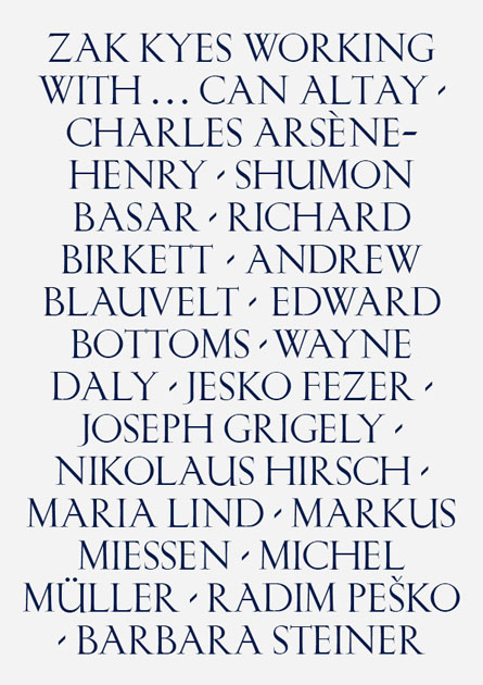
This approach should emerge clearly in the exhibition in course in Leipzig. Conceived as a participatory event, the exhibitions sees involved Can Altay, Charles Arsène-Henry, Shumon Basar, Richard Birkett, Andrew Blauvelt, Edward Bottoms, Wayne Daly, Jesko Fezer, Joseph Grigely, Nikolaus Hirsch, Maria Lind, Markus Miessen, Michel Müller, Radim Peško and Barbara Steiner in production of site specific work, as well as in a series of talks and lectures. The exhibition and the following catalogue (published by Sternberg Press) didn’t only show examples of incredible graphic design work from one of its most interesting practitioners, but also shed light on new kinds of collaborative and highly critical working methods that have become central for contemporary design practice.


Rujana Rebernjak

Share: Facebook,  Twitter  
05/03/2012

Werner Herzog at NYPL

Werner Herzog at NYPL

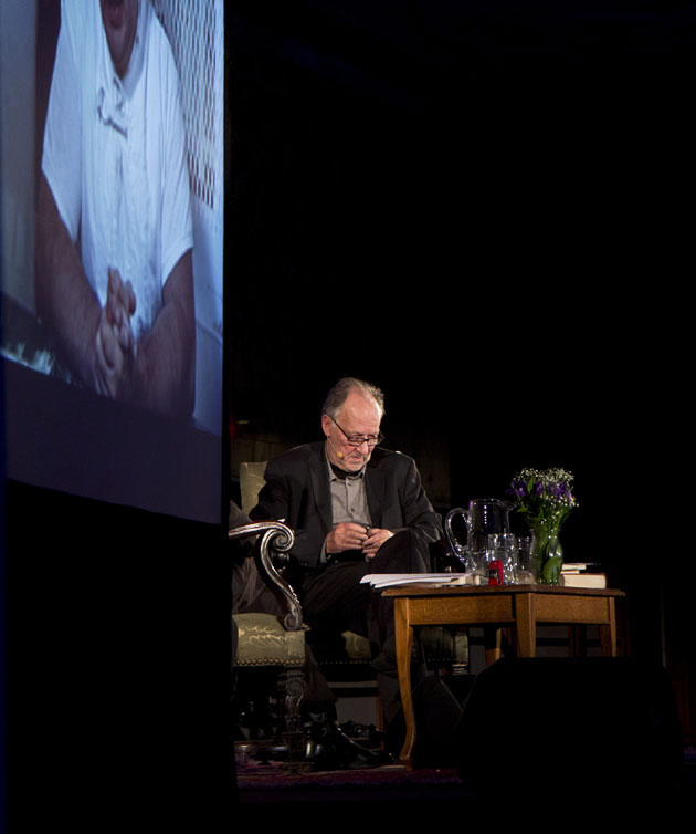
The last time Werner Herzog and Paul Holdengräber had a public discussion, the question was whether or not the 20th century was a mistake; this time around the jumping point was Herzog’s new film Into the Abyss, a documentary that examines America’s fascination with capital punishment from the perspective of a man who, in his words, “as a German, has no right” to condemn it. (Spoiler alert: he condemns it anyway.)

These two do not prefer to dance lightly.

Holdengräber and Werner have been friends for decades, and they treated one-another like two old comrades sitting next to the fire sipping brandy and trading war stories. The endlessly witty Live from NYPL director didn’t so much ask questions as poke at Herzog with a stick, which was good, because the filmmaker has a tendency to ignore questions anyway, preferring instead to go off on whatever happens to be on the top of his mind. There’s quite a bit up there—capital punishment laws, his childhood in Sachrang (“Snow is my element, mountains my landscape”), dragging a boat over a mountain in Fitzcarraldo (“I have a strong sense of feasibility”), his take on always playing the villain (“According to my wife, I’m a fluffy husband”), why he doesn’t go to museums (“They frighten me”)—and it’s highly entertaining to listen to him wander off on (seemingly) random tangents only to piece them together long after you’ve lost his trail. A man of contradiction (“I don’t like art. I am a soldier. That’s it. I am a soldier of cinema.”), he is a stoic realist but also heavily poetic. When asked whether or not someone can be forgiven for irrefutably heinous crimes, he casually replied, “Humans are capable of the most monstrous things, but they are not monstrous themselves.” I couldn’t help but think him pulling a gun on Klaus Kinski.

For all of his tenacity, it can also be a bit disconcerting to watch him work. (The audience did tense up when Herzog spun off-topic to talk about his admiration of Vladimir Putin, who recently repealed capital punishment in Russia.) Many things he talked about flew right over our heads (Mycenaean linear B script in five minutes, anyone?), but he’s less interested in making his audience understand what he’s talking about than he is with talking in front of an audience. At 69 he remains more curious than a giddy teenager about the inner-workings of the universe, and he sometimes appears dizzy with desire to share his knowledge with those lucky enough to get within earshot. “Give me Cormac McCarthy,” he demanded from Holdengräber at one point. “Beautiful stuff. He is the best living American writer.” He proceeded to read the final passage from McCarthy’s All the Pretty Horses before concluding the night with a scene of a Texas highway from Into the Abyss. How it all ties together is something I’m still trying to figure out, but it’s a fascinating thought nonetheless.

Lane Koivu – Images courtesy of Adam Kopysc

Share: Facebook,  Twitter  
02/03/2012

Tung Walsh / POP

Tung Walsh / POP

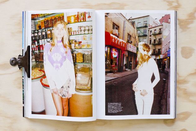
We were more than happy to see the newest spring/summer issue of POP magazine on the shelf of the bookstore, and indeed one copy of the fresh number landed in our office on a sunny spring morning.

The bi-annual POP’s number 26 is strongly present with its fashion editorials. Not a single editorial leaves you empty-handed, and the issue responds to various kinds of eyes for aesthetics with shoots from Emma Summerton, Tyrone Lebon, Hugo Tillman, Colin Dodgson, Danielle Levitt, Jamie Morgan, Viviane Sassen, Daniel Sannwald, Mel Bles, Mark Borthwick, Robi Rodriguez, Anthony Mayle, Max Farago and 2DM’s own Tung Walsh.

“POP Chinatown: New York” features Tung Walsh’s adventure with the model Maryna Linchuk from home to the Tom Sachs show “WORK” at Sperone Westwater gallery. The journey took them also around Chinatown’s streets and shops, mixing the Asian scenery with the gossamer clothing from Diesel Black Gold, Alexander Wang, Donna Karan, Marc Jacobs, The Row, Rag&Bone, Calvin Klein, G-star, Proenza Schouler, Michael Kors, Ralph Lauren and Altuzarra. The shoot is styled by Sara Moonves, hairstyling is by Tamara McNaughton, and the make-up by Ozzy Salvatierra.

Nora Stenman

Share: Facebook,  Twitter  
01/03/2012

The Change Of Luxury

The Change Of Luxury

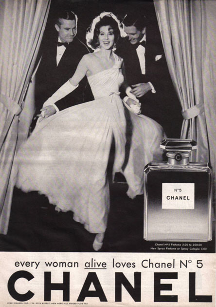
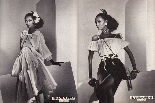
Gold, champagne and a recognized logotype on the inside of a handbag or craftsmanship, primary materials and history – luxury means different things to different people, and the view on luxury brands have changed over time as well. While big logotypes in shining metal on your bag, sunglasses or loafers mediated timeless style, success and the power of spending during the 90’s, the view on luxury have become subtler today. It is no longer only a high price that conveys status; time and knowledge are becoming as valuable, in particular among consumers, and brands can no longer depend on people’s wish to extend their self-image through an expensive logotype. “Gucci Gucci, Louis Louis, Fendi Fendi, Prada, the basic bitches wear that shit so I don’t even bother” might just be a line in a rap song, or it might give a hint of where the luxury market been heading. People are looking for something that makes them unique and stand out of the crowd and even though words such as inaccessible, limited and second to none are continuous leading stars, the necessity for it to be expensive isn’t as important anymore and customers might just turn to other markets to find what they’re looking for.

So how are traditional luxury brands supposed to react to the changes in the view of their segment? Some of them operate in their natural environments, presenting skillful craftsmen in their stores, creating something genuine and push for heritage, history and quality. Some of them have turned to social media to help tell their story and some of them make the two worlds blend perfectly. The digital world that a few years back was discussed as something that would kill luxury through making it accessible for everyone, is what today might save them. Brands are discussing strategies for how they can become within reach for more people while retaining a high quality, discussing how they can be accessible but exclusive. Some of them trust customers to choose them because they deliver what they always done; prestigeless quality that is available for a slightly higher price while others focus on overtop the expectations of the luxury consumer, at every level. What they have in common is that the majority of them mention their genuine history as the foundation of their branding strategies for the future.

Most of the brands embraced the power of Facebook, Twitter and every other social media channel matching their target. Market researches show that high income earners, as well as the “regular” shopper, go online to see new products or learn more about a brand whether they in the end shop online or in a store, another reason to why it has been crucial for the luxury market to go digital. This pressure to be present online has though in many cases instead led to low quality content and a chase of likes and followers, resulting in a watered down message where the digital image of the brand doesn’t match the high end image conveyed through printed ads. Experts says that the solution is to make brands live their luxe life virtually as well as in reality, something that today is fully possible with technology that helps create real, customized digital content. Quick-made and poorly presented backstage videos or presentations just for the sake of it are no longer going to do it if you’re aiming at the self-centered and selective quality consumer. So which is the right way to go, the smartest line of attack?

Undoubtedly there is more than one answer to that question and luxury marketing have probably never been more complex than it is at present, but in many ways it has also never been as challenging and interesting as it is today.

Lisa Olsson Hjerpe

Share: Facebook,  Twitter  
01/03/2012

Sometimes She Disappears: Cindy Sherman @ MoMA

Sometimes She Disappears: Cindy Sherman

Cindy Sherman has played many parts over the years, Hitchcock lady, horror victim, Madonna, Monroe, low-brow actress, ageing socialite, and sun-burnt Beverly Hills do-nothings among them. A lot of what she deals with identity and gender, but a lot of it is also deliberately abstract and multi-faceted, which is why it’s always been somewhat difficult to keep Sherman pigeonholed in one camp or another for too long. She simply refuses to be pinned to one thing or another. It’s also why she’s so popular.

What has never been revealed is the real Cindy Sherman, and you’re certainly not going to find her here. Her expansive, brilliant retrospective at MoMA should instead be viewed in part as an exercise in mass identity contortion. Though you can see that iconic face in nearly every shot, at 58 she remains an elusive figure as ever.


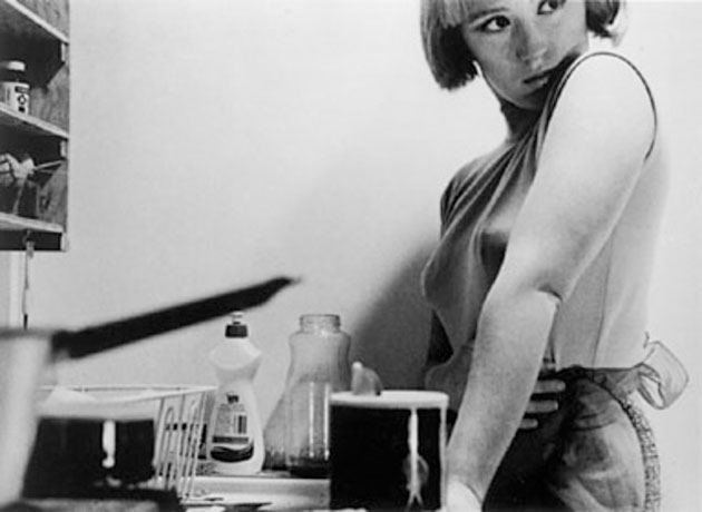
Sherman has long been in the business of deception and illusion, ever since she blew up with her Untitled Film Still, a brilliant 69-picture series from the late 70s that showcased many of the themes she would spend the next four decades exploring: gender roles, identity, voyeurism, exploitation, and consumerism. She executes in one frame what most filmmakers couldn’t dream up with three hours worth of tape. It’s impossible to tell exactly what you’re looking at. If born 100 years ago she probably would’ve been a rabbit-wielding magician in competition with Houdini, but in an era where media images are cropped and manipulated beyond recognition she is instead a modern trickster who utilizes photography as a way to showcase the unreliability of identity. Contrary to popular belief, the camera does lie―hers does, anyway―and often does so with an eye winking in the audience’s direction. The first thing you see off the escalator at MoMA are four 18 foot pictures of women dressed in what look like homemade Viking costumes, their facial features photoshopped just enough to make you cock your head. It’s funny, but not in a laugh-out-loud kind of way.

Artifice and irony have always bled through even her most serious portraits, though a large chunk of the opening afternoon crowd seemed to miss the inherent humor in her work. “That is disgusting!” remarked one young woman, notebook in hand, when she saw one of Sherman’s “LA women” staring at her, her tanned and sagging breasts all but dripping out onto the floor. Others could hardly stomach her late 80s work, one of the rare times Sherman stepped out of the frame and instead filled it with raw meat, cookies, vomit, and sunglasses to make some sort of comment on the AIDS epidemic (Untitled #175). A few people laughed when they saw Sherman playing Caravaggio playing Bacchus, wryly eyeing the camera with fresh grapes between her fingers.

How could you not?

Lane Koivu – Images courtesy of MoMA 

Share: Facebook,  Twitter  
27/02/2012

Deconstructing The Thing

Deconstructing The Thing

The Thing Quarterly is, in the words of the founders, a periodical in the form of an object. The object is typically functional and designed by celebrities and people otherwise notable in their line of work. Contributors in the past have included writer Jonathan Lethem, media artist Anne Walsh, and experimental geographer Trevor Paglen. They make things like military mugs, blank books with shoelaces sewn into them, and flags embedded with instructions on how to fold a flag.

It’s called art, and it’s brilliant.

It works like this: You pay them money ($65 an issue, or $200 a year), and at the dawn of each season you’ll receive a Dominos-shaped cardboard box with the contributors name stamped boldly in Helvetica. It’s clean and would look nice on top of a coffee table. It’s also minimal, as much as an offshoot of the absurd humor of Marcel Duchamp as it is with the craft aesthetic of something like Ready-Made, a crafty monthly rag that tells its readers how to build their own living spaces without having to go to Ikea. But where Ready-Made tells you how to build things, The Thing has celebrities build things, and you pay money to have their objects sent to you. The thing is, you don’t know what they’re going to put in the box until it arrives. One publication described what they do as part MacGuffin, and part… something else. The MacGuffin is the only part I can remember now that I’m thinking it over.

But it’s what’s inside that counts, right?


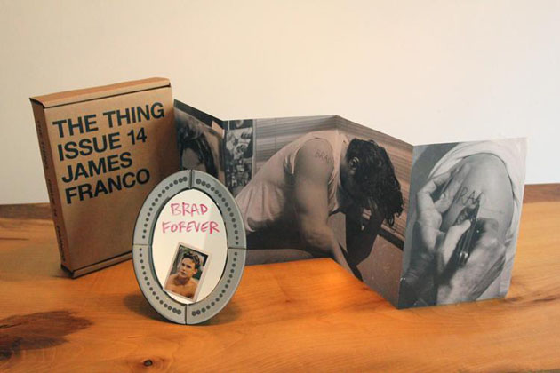
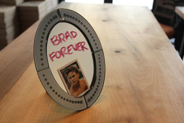
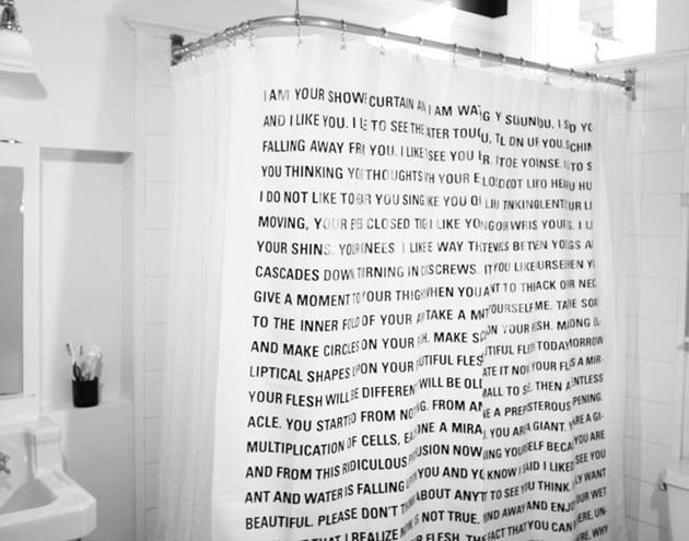
It depends on who’s putting what inside, and why. The most recent issue is an original Dave Eggers short story printed on a shower curtain. From the perspective of a shower curtain, too. If you’re a die-hard shower curtain fan, you can’t live without it. But James Franco’s tribute to Brad Renfro is downright ridiculous, arriving complete with lipstick, mirror, and a photo book of Franco getting “Brad” carved into his shoulder. If you want a piece of glass that has the words (written by Franco himself) “Brad Forever” smeared on glass in front of a neatly-tucked pocket photo of Renfro, Issue 14 is for you. It’s tacky, vain, and wildly pretentious even for a project where pretentious and indulgence are entry requirements.

But The Thing is heady like that. The people who produce it, visual artists Jonn Herschend and Will Rogan, promote the project as a surprise of sorts, something fun, like finding an object you weren’t looking for in the leftover bin at the local thrift store. Maybe a wolf t-shirt, maybe a set of hand-made wine glasses with a message inscribed on the bottom, maybe a Brad Renfro knife or something. Brad forever.

Wait, that knife exists and costs $650? These guys are full of surprises!

At least it seems like the contributors are having quite the time. Who wouldn’t want to, like Starlee Kine did in Issue 10 (sold out), write a short story about an onion on a cutting board designed for cutting onions? Or silk-screen a post-it-note on a functional shade says, “If this shade is down I’m begging your forgiveness on bended knee with tears streaming down my face,” like Miranda July did in the inaugural issue? This, too, is sold out, though I can’t imagine those words having the same kick the second time the shade is drawn.

But like Duchamp’s urinals, it’s the idea of The Thing is more important than what’s inside the box. And the objects sometimes are surprising, at least in the degree of incompetence they assume of their subscribers. But hey, it’s not like you’re forced to buy into this thing. I mean, if you’re the type of person who thinks it’s cool to spend $65 on a Dave Eggers shower curtain, I’m certainly not going to stop you.

Lane Koivu – Images courtesy of The Thing & Lenny Gonzalez

Share: Facebook,  Twitter