30/03/2012

It’s Now Or Never

It’s Now Or Never

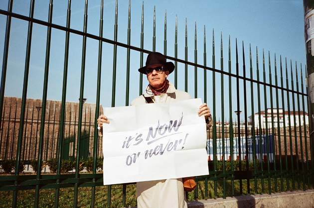
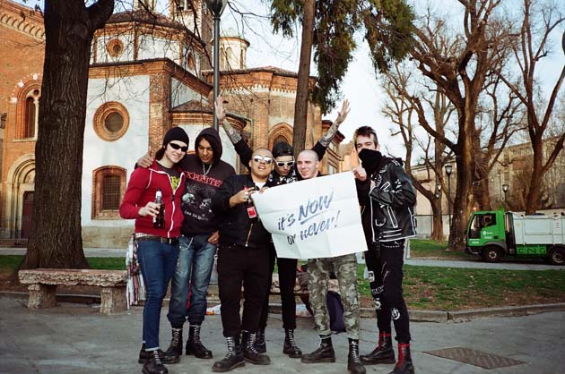
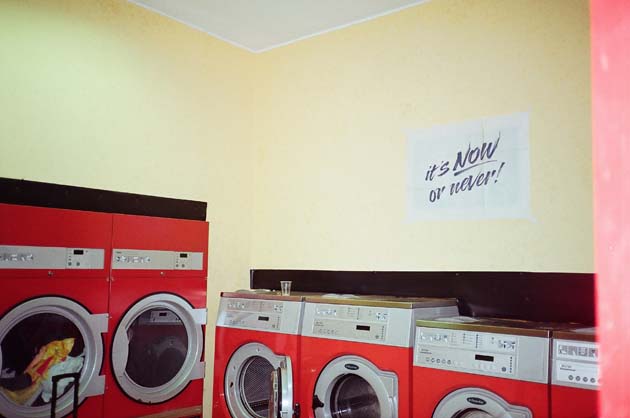
2DM celebrates the renewal of the Facebook page by launching a contest based on unleashing the creativity that may or may not be sleeping within everyone. The point of the contest is to create an image including the motto “It’s now or never”. The pre-buzz has already generated many photos including the motto poster, but we want to emphasize that to participate to the contest one doesn’t need to photograph the poster, but to compose any kind of image using any kind of tool, style, media and inspiration.

The idea behind the motto came one day after too many years of working nine to five in an atmosphere too grey and sleepy. “It’s Now Or Never” was printed into posters to spread the message to everyone to encourage them to adopt the carpe diem mentality, that we are now celebrating with this contest.

So whether you can release your creativity the best by using paints, pencils, magazine cut-outs or Lego bricks, we strongly recommend to find and join the Facebook group It’s Now Or Never to see the entries, participate yourself and to vote. You will have the whole summer to plan and produce your image. The winner will be the creator of the image that has collected the most ‘Like’s on the group’s Photo Gallery.

The prize will be a lovely trip for two with a B&B stay of two nights located in the continent the winner belongs to. We will be sharing more information on the group page.

Competition entry images from Gastón Suaya

Share: Facebook,  Twitter  
30/03/2012

Cloud Nothings

Cloud Nothings

Cloud Nothings kind of sound like all of the bands from my hometown that never quite made it.” I heard someone say it, but the thought was at the tip of many minds during the band’s recent show at the Glasslands Gallery in Brooklyn. And it’s true: Cloud Nothings sound familiar. The primary difference between them and those lost hometown bands is that these guys made it, and quickly, a messy fact that begs the obvious question: Why? How the hell did they manage to get out of Cleveland? And what’s all of this about, anyway?

I might be older and further along on the cynical side of the stands, but it’s hard to be fully committed to a band that pens songs aimed furiously at teenage hormones. Watching Cloud Nothings live reminded me of how stupid I used to be― and probably still am. Cap’n Jazz, Jawbreaker, Pinkerton―they all once posed similar questions for me in high school, one that struck at the heart of my then-spongy soul: Will we ever grow up? More importantly, can we ever go back? Most importantly: Will Susie ever see ditch that shitty quarterback boyfriend of hers and meet me behind the bleachers just once?

No, and yes (and―sigh―no again). Cloud Nothings aim to fill the hole created by so many bands loved by people who discover them when first forging their identity. Modest Mouse did it for me when I was learning how to quit the football team without my friends finding out. A friend of mine said it best: I would really like this band if I were 16. She’s in her mid-20s. I’m in my mid-20s. People like us don’t have many heroes younger than us, at least not on paper. It’s bad form for the cynic. And when Cloud Nothings say a line as loose as “Forget everything, no nostalgia, no sentiment, we’re over it now, and we were over it then,” I’m glad to know they’re not talking to me.

But I don’t have anything too wicked to say about this young band. If anything, I’m a tad envious of their rapid ascent―singer/songwriter Dylan Baldi is just 20 years old, dammit―but it’s clear that it doesn’t knock me off of my feet the way he might once have. I’m, as they say, out of their demographic. But is it their fault, or mine? The crowd at their sold-out show (in support of their Steve Albini-produced new album Attack on Memory) was made up entirely of people over 21 year-olds, and most of them seemed to be enjoying themselves. What’s wrong with emo? I found myself asking myself while Baldi screamed lyrics like “I need time, to start moving, I need time, to stay useless” at my face. A little vague, sure, but isn’t all rock music open to interpretation?

Cloud Nothings performed at Glasslands Gallery 03.29.12

Lane Koivu

Share: Facebook,  Twitter  
23/03/2012

It’s Nice That No. 8

It’s Nice That No. 8

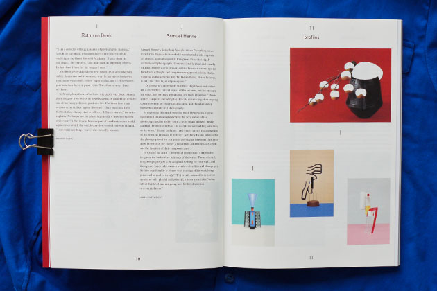
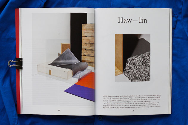
The latest print issue of It’s Nice That has hit the streets and in typical fashion has outdone itself: their newest is probably the best issue yet of what has become a bit of a generation’s defining affair – who among us doesn’t spend a few minutes a day on their brilliant blog? And that makes a new print issue – touchable! – all the more gratifying. We got a good look at lucky number 8 at its overflowing launch last night at KK Outlet in London’s Hoxton Square.


2DM’s Tung Walsh’s work was to be found not once, not twice, but thrice in the issue: he made portraits of both the legendary minimalist architect John Pawson and esteemed author and director of London’s Design Museum, Deyan Sudjic, as well as a lovely series called “Secret Exoticism” on The Barbican’s creepy/captivating conservatory, a menagerie of concrete and lush tropical plants tucked inside the sprawling brutalist complex almost unbeknownst to most Londoners.


Elsewhere in the issue you’ll find an interview with Paula Scher, a profile of Dutch architectural firm MVRDV, an interesting look at London’s smells, a profile of zany food masters Bompas and Parr, monumental photos by Cyril Porchet of church ceilings complete with fold-out poster (stick it on your ceiling for a monochrome Sistine Chapel effect), as well as many others. The cover – a compelling close up of a flower bud – was done by the brilliant Erwin Frotin. And as an added bonus, included is a lovely little booklet of “Metaphorical Measurements for a British Olympics” that puts the upcoming games into terms like “Stilton,” “Imperial Horsepower,” “Nottingham Pippin” and “irony” that any good Brit can understand: The women’s 100 metres hurdles is run over the length of four cricket pitches and completed in the time between the first and fourth chimes of Big Ben heralding the 6 o’clock news on BBC Radio 4. And suddenly it’s all clear.

Isn’t it nice that? Great work, guys!

Tag Christof – Special thanks to Alex Moshakis

Share: Facebook,  Twitter  
23/03/2012

Walking With Fire

Walking With Fire

It was Jack Fisk who once said, “Luckily, David Lynch is able to vent everything through his art… because otherwise somebody might be dead.” This thought weighed heavily on my mind as I waited my turn to shake hands with the man behind existential nightmares like Blue Velvet and Lost Highway. After all, David Lynch hasn’t made a full-length movie since 2006’s Inland Empire, and he seems to be spending a lot of time sponsoring nightclubs and jamming with Moby these days. I couldn’t help but wonder: has David Lynch been venting enough?

Anyone brave enough to sit through Crazy Clown Time, Lynch’s recent excursion into pop music territory, has every right to be worried. This is, after all, the man who made a hit soap opera about incest. Then again, Lynch rarely leaves home, preferring instead to stay in and paint, make nonsensical cartoons, and follow his mind to the depths of hell and back. This is his first solo New York exhibition since 1989. It’s hard to catch him, but I’ve done enough homework over the years to know that the flesh-and-blood Lynch is far removed from the horror he projects onto film. A proud Eagle Scout, he’s been wearing his own vanilla uniform since the late 70s: black shoes, khaki trousers and a white dress shirt buttoned to the neck, with a mop of brilliant white hair that looks like it got a little to close to the electrical outlet. His neighborly demeanor couldn’t be more at odds with the inner workings of his mind. This is a good thing. He is very polite. He smiles at people and shakes their hands and nods politely when they ask silly questions. At the same time, no one on this side knows the real David Lynch. Mel Brooks famously described him as “Jimmy Stewart from Mars”, and that’s about as close as we’re going to get.


David Lynch is in good shape, but his characters never are. They haunt his black canvases without form, only problems. Lots of problems. They’re “fucking broke,” as one goes, or dismembered, and usually on fire, their faces hanging out of the canvas like a grapefruit tumor swaying on a cow’s udder. Everything rots, no one is safe. One, “Fisherman’s Dream w/ Steam Iron”, features a fisherman’s hand bursting through a beached salmon, one of his fingers growing towards a mermaid lounging at the water’s edge. Somehow, the fisherman’s hand seems happy.

The paintings sit on the wall like boxes, wonderfully framed in thick gold frames and heavy glass. What’s inside makes Rene Magritte look like a journalist. David Foster Wallace gave the best definition of the man’s cinematic style―a style so singular it’s simply called “Lynchian”―when he said the term refers to “a particular kind of irony where the very macabre and the very mundane combine in such a way as to reveal the former’s perpetual containment within the latter.” Lynch is innately fixated with childhood dreams gone awry up against a paranoid, corrupt adult-dominated world (Blue Velvet, for starters). One painting, “No Santa Clause,” features a boy without a face watching Santa and his gang fly out of sight. It could be taken as a metaphor for how the acquisition knowledge ultimately crushes fantasy, or it could be about an evil Santa who eats the flesh off of little boys’ faces. It all depends on whether or not David Lynch believes in Santa.


David Foster Wallace also unfairly/hilariously described Lynch’s paintings as looking like “stuff you could imagine Francis Bacon doing in junior high.” The “Distorted Nudes” here are an obvious ode to Bacon’s triptychs of deformed freaks, but they’re more tip-of-the-hat than pale imitation, and even these have the unmistakable imprint of the man who built them. They are, to use the term, Lynchian.

Seeing someone in pictures is very different from seeing them in person, and it’s particularly weird when the two seamlessly match up. They do here. David Lynch looks like David Lynch, alright. “Please remember you are dealing with the human form,” we were warned back in 1968’s “The Alphabet.” I tried my best to keep that in mind when my turn to shake his hand finally came.

David Lynch at Jack Tilton Gallery, March 6th–April 14th, 2012

Lane Koivu – Images courtesy of David Lynch and Emily Paup

Share: Facebook,  Twitter  
21/03/2012

The Editorial: Pirate Space Race!

The Editorial: Pirate Space Race!

Just this month Russians voted (however dubiously) to put Putin back in their presidency. And like we saw last week, the USA is still keen on flexing its bully muscles to show the world who’s boss. Leaving aside economically-hobbled Europe and still-teething China for a moment, the world looks poised for yet another generation of long distance provocations between two bratty superpowers. The two remain stubbornly at odds despite Russian socialism’s ostensible demise. And despite its streets now crawling with the shiniest Italian fashion and German luxury rides, Moscow’s brutal crushing of both political and civil rights protests proves the place is pretty much as Soviet as ever. And as the clashes unfold in Russia, America–always nicely stocked with right-wing crazies with no shortage of terrifyingly ill-minded policy rhetoric to spew–continues to beat its hugely hypocritical chest about freedom and liberty and all of the blah blah that any casual observer of its recent wars in the Middle East know is mostly propagandistic tripe. The whole thing feels more than just a tad Cold War.

But wait! Remember the Space Race? It was far and away the coolest conflict-driven competition in the history of mankind! It was a crucible for endless, fantastical dreams for human possibility and a source of immense pride. Sputnik versus Explorer, Luna versus Apollo. Oh, the good old future!

Sadly, the next wave of antagonism between the world’s superpowers is not likely to include plans for cosmic settlements or Mars probes, but rather skirmishes over oil pipelines, food supplies and trade agreements, all driven by fractured ideologies. America, as it tends to do when short-sighted conservatives call the shots, has divested its grand space program to the “private sector” and Russia’s has withered in neglect as resources have gone into consolidating military power. In any case, it looks like dull old terrestrial life for us little earthlings.

But there still may be life in the space race, in some form or another: in a remarkable recent twist, infamous torrent website The Pirate Bay has declared that it plans to send its servers into orbit in the near future to avoid the sorts of legal battles that had temporarily closed the site down. So while America and Russia may not go at in the cosmos anymore, it seems that the next frontier of the brewing IP and copyright war might indeed be in space. If their plan seems a bit far fetched, consider that they’ve long thrived as renegades, dodging bullets from irate media conglomerates, artists and, of course, vengeful governments.

So, just as last week, as both a consumer and producer of content, we remain on the fence about the polar core issues of “stealing” and “openness,” but are valiantly watching the battles. The ethics of torrents could surely use a good old shakedown from an ethicist, but the argument seems to be bigger than the list of grievances against them from the likes of DreamWorks, Apple, Warner Brothers, the Linotype type foundry and various Swedish institutions. Clearly, the pirates are stepping on some powerful toes and will eventually have to result to drastic measures to save themselves from the wrath of their enemies. (Wired UK even reports that they tried to buy their own micro nation in the North Sea.) We can’t imagine any Western government would be keen to see a satellite devised to undermine a chunk of its commercial underpinnings make it off the ground.

Still, the overall picture is about more than just ripped off music and software. Unlike stilted speeches from policymakers about net neutrality, this kind of radical maneuvering really indicates a huge will to maintain an unpoliced realm within the web. The ideas of free space, equal access and uninhibited sharing embodied in the contemporary Occupy and predecessor Share The Streets movements (and many before them) is captured well in the spirit of The Pirate Bay’s defiant ethic, and the time seems right for such a radical move.

And while we remain doubtful that the project can really take off–pricey satellites for free content? really?–it’s a lot of fun to imagine how this epic saga might unfold. Will the pirates manage to pull off an orbiting content coup? Will they be ruthlessly shut down? One thing is clear: it’s much more exciting to imagine the former. So, in the spirit of rebellion and the joys of conflict-driven imagination, let’s imagine a benevolent pirate flag hurdling far above the skies sometime soon.


Tag Christof – Images courtesy of NASA

Share: Facebook,  Twitter  
20/03/2012

White Zinfandel

White Zinfandel

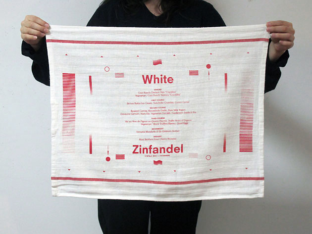
When speaking about White Zinfandel, the last thing that would come to your mind is that the name was the first random thing its founders came up with. Fortunately, the casually chosen name was a too special foreplay to be wasted on a sloppy project.

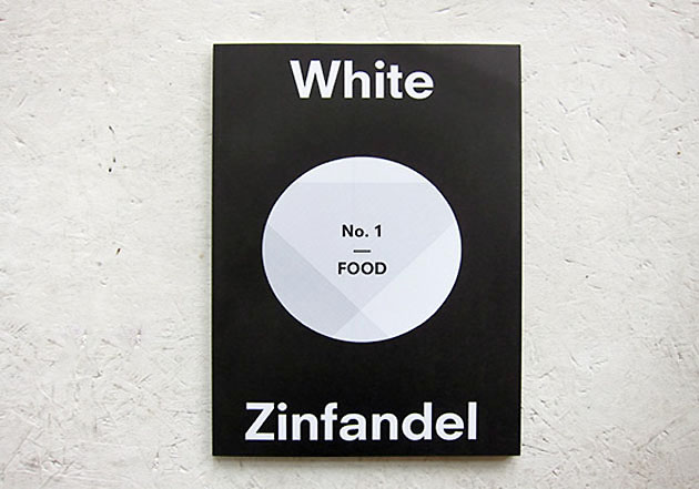
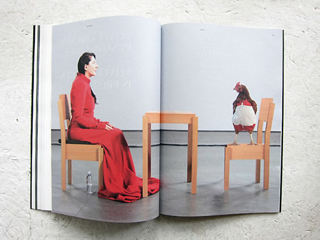
White Zinfandel is a New York based magazine founded by Jiminie Ho (the mind behind W/– project space) and Dominic and Chris Leong (of Leong Leong Architecture), after a series of fortunate coincidences, of which the first one was obviously the name itself. This self-styled magazine explores the visual manifestation of food and culture produced within the lives of creative individuals through a variety of media and means of expression. Each number is based on a culturally or historically relevant menu interpreted by various creatives.


To underline the boldness of their intentions, the editors dedicated the first number of White Zinf to Food, the SOHO restaurant from the 70s founded by Gordon Matta-Clark, Caroline Goodden and Tina Girouard.

The second number, issued past december, was called “TV Dinners”, paying a hommage to the simplest and most common American dining habit. As combining high and low profile content is one of White Zinf‘s stronger sides, the apparently simple subject evolves in a surprising product. Therefore some of the articles are “Searching for Rirkrit” by Pete Deevakul that feature the artist Rirkrit Tiravanija‘s portraits made out of food or abstract compositions made with steaks by Ruby Sky Stiler. Besides the witty articles and enviable artists’ collaborations, each issue of White Zinfandel is comprises an equally important dinner party, that celebrates the menu the magazine itself was based on.

After Gordon Matta-Clark’s “Food” and “TV-Dinners”, two themes that couldn’t be more different, we can’t but eagerly expect what will the threesome produce in their next issue. Just another reason why we can’t wait for summer to come!


Rujana Rebernjak

Share: Facebook,  Twitter  
19/03/2012

The Power of Habit

The Power of Habit

The Power of Habit, a fascinating new book by New York Times investigative journalist Charles Duhigg, takes a look at the nature of habits and their role in our daily lives. Habits are essentially our brains on auto-pilot, hard-wired neurological routes that grow deep and wide from repetition. There are good habits, like saving money and looking both ways before you cross the street, and bad ones, like procrastinating and binge-eating. Often our bad habits feel out of our hands, maybe even genetic, and so we accept them begrudgingly, like we put up with a nagging relative at a family reunion.

It turns out we don’t have to. Duhigg argues that habits “aren’t destiny―they can be ignored, changed, or replaced.” Sounds good, but how?

It’s simple: figure out the habit loop.

A habit has three major components: a cue, a routine, and a reward. These components form the habit loop. The cue is the trigger that tells your brain to prepare for auto-pilot. The routine can be physical, mental, or emotional; the reward is something that tells your brain whether or not the loop is worth remembering. Chocolate rewards tend to form habits; metal forks in light sockets don’t. If they do, you should make a habit of going to the psychiatrist.

There is a calculus, Duhigg claims, for mastering our subconscious urges, and the answer lies in finding the cues and rewards that influence our routines. I can’t get into too much detail here, but I strongly recommend you read his book―at least take a look at his recent NY Times excerpt called “How Companies Learn Your Secrets.”

That we can control and reshape our habits is not a new idea, but it remains a pertinent one, and Duhigg’s book offers a practical insight into how to deconstruct and wipe out some of our worst impulses, not least of all by putting on the responsibility on the individual: “Once you understand that habits can change, you have the freedom―and the responsibility―to remake them,” he says. “Once you understand that habits can be rebuilt, the power becomes easier to grasp, and the only option left is to get to work.”

Lane Koivu

Share: Facebook,  Twitter  
16/03/2012

Frank Selby: Some Things Never Change

Frank Selby: Some Things Never Change

This weekend, American artist Frank Selby (not to be confused photographer The Selby, Todd Selby) is opening his second exhibition at Paris’ Jeanrochdard gallery, ”Some Things Never Change”.

The works to be shown are in his usually meticulous style and are drawn from recent press photography. All reframe photographs from conflicts over the past two years as drawings to systematically demonstrate the distance between the photo – taken commonly as objective truth – and the actual event. Selby, through this work “raises the idea that our interpretation of these photographs – which are the cornerstone of our understanding of these historical facts – is changing and becomes more distorted over time.”

The exhibition harkens back to the fierce debates surrounding the effect of wartime photography during the Vietnam War and, more recently, Desert Storm. We remember through photos, and especially in press photography, there is a common assumption that the photographic image is a slice of objective truth. Public opinion surrounding conflicts are inevitably driven by these images, but Selby brilliantly draws our attention to the fact that even these ostensibly objective records can have an agenda: they’re telling one version of a story. Add to this a heavy peppering of symbolism throughout–hints of communism and the anonymity of the policeman’s helmet, for example–and the artist gives a beautifully illustrated sense of the photo’s potential inobjectivity as a record.

If you happen to find yourself in Paris over the weekend (or anytime before April 20th), the show really is a must-see. Opening tomorrow, March 17, from 5-9pm and running until the 20th of April at Jeanrochdard at 13 Rue des Arquebusiers.

Tag Christof

Share: Facebook,  Twitter  
16/03/2012

Guest Interview n° 38: Van Leeuwen Artisan Ice Cream

Guest Interview n° 38: Van Leeuwen Ice Cream

As much as New Yorkers love to bicker, at the end of the day we all more or less prescribe to the same dogma: do your thing, and do it well. This is especially true with Van Leeuwen, a wildly popular artisanal ice cream company run out of Brooklyn. Founded in 2008 by Ben Van Leeuwen, wife Laura O’Neill, and brother Pete Van Leeuwen, the company’s focus has from the start been about making exceptional ice cream using exceptional ingredients. It’s an old idea, and maybe not the most cost-effective for a food truck, but their commitment to craft has paid off well: what started as a couple of custard-yellow trucks peddling all-natural ice cream during the summer months has, in the course of four short years, ballooned into six year-round runners and three permanent store locations throughout New York.

Those trucks are hard to miss during the summer months, when lines can stretch down the block. No one seems to mind waiting for their scoop, in part because the brand has quickly become synonymous with quality, their butter-colored rollers quick to remind customers of the gas-guzzling trucks they used to chase down forgotten childhood streets on humid afternoons. Many consider Van Leeuwen’s to be the best in the city. And you know you’ve made it when Whole Foods has you in stock.

I recently spoke with Laura O’Neill about everything Van Leeuwen: the origins of the company, where they source their ingredients, and their ambitious plans for the oncoming ice cream season.
How did Van Leeuwen’s get started, and what was the initial motivation behind the company?
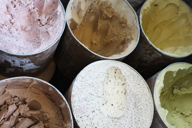
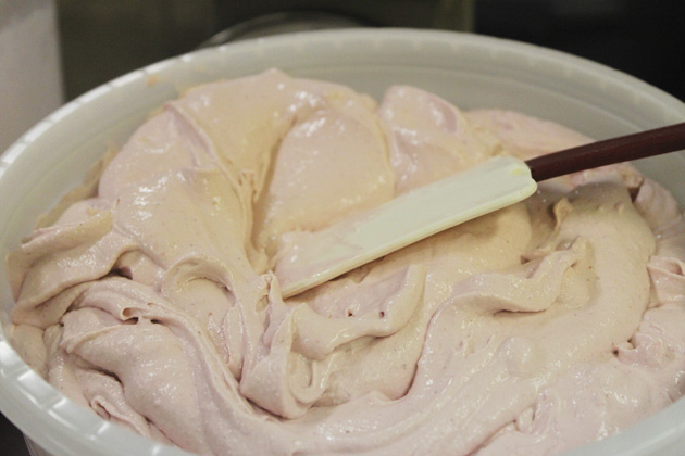
Ben, Pete and I started Van Leeuwen’s in the spring of 2008. We set out to make the best possible ice cream using traditional methods and the best artisanal ingredients from small producers locally and around the world. We saw a gap in the market for truly great, natural ice cream out of trucks in New York City. We also wanted to build really beautiful trucks that were clean and inviting. All of our ice creams are made using only fresh hormone and antibiotic free milk and cream, cane sugar and egg yolks. Our butterfat content is 22% and our ice creams are about 40% less sugar than most other premium ice creams. This allows the true flavor to come through without being masked with too much sugar.

In an age where people crave endless varieties, Van Leeuwen keeps their selection minimal and focused. What inspires the menu?
We want to do the classics as well as we possibly can. We spend a lot of time finding the best fruits, spices, nuts and chocolates on earth. Most of our flavors are a celebration of one single outstanding ingredient, such as Sicilian Pistachios from Bronte, Michel Cluizel Chocolate from France, and Ceylon Cinnamon from Sri Lanka, to name a few. 

How do you select your ingredients? 
We research a lot. We are looking for ingredients that match the standard of purity of the ice cream bases we are making. We get samples and try them out. Most of our ingredients come with a super interesting story as to what makes them so special.
How do you scout your locations?
Trial and error. Sometimes we think a location is going to be great and it just doesn’t work. Once we find a good spot, we establish it as a permanent spot, so customers can rely on us being there. In terms of stores, we started out in Greenpoint, Brooklyn because it’s our home neighborhood and we love it. Boerum Hill was kind of a fluke, but has worked out amazingly, and East Village was a no-brainer because it’s a super busy neighborhood full of food lovers!

What are some perks and drawbacks to having an ice cream truck?
Its great that we can move around and try out new locations. There is also a wonderful nostalgia attached to the classic American ice cream truck. But it really sucks when they break down!

Van Leeuwen’s has been a success from the get-go, and in addition to six trucks you now have three locations around the city. What is it about your ice cream that people identify with? 
People inherently appreciate real food and high quality ingredients. The fact that we use a lot less sugar and no stabilizers, means it doesn’t become cloyingly sweet by the end of the scoop and it’s a very clean mouth feel. They may not be able to pin point exactly what they love about our ice cream, but they feel good and happy after a scoop.

Lane Koivu – Images courtesy of Van Leeuwen and Martin Aldolfson
  

Share: Facebook,  Twitter  
15/03/2012

Luigi Ghirri – An adventure in thinking and looking

Luigi Ghirri – An adventure in thinking and looking

Thoughts, deeds, actions, visions, sounds, words, objects, ethic groups and echoes that come from everywhere in an evident and overwhelming fashion, transform and mark modernity. In our existence, this sense of alienation, this having continuously to relocate the common denominator, to unravel the billions of little physical and mental junctions and crossroads, a continuous re-finding ourselves only to get lost once again becomes the dominant feature of our era.

Luigi Ghirri, Lo sguardo inquieto, un’antologia di sentimenti (The restless daze, an anthology of feelings), 1988


What is photography? Luigi Ghirri – one of the most influencing photographers ever, and a milestone of contemporary history of the medium – answered to this question defining it as an adventure in thinking and looking. Ghirri’s adventure lasted 20 years, from 1970 to 1992, when he died prematurely, and left us an amazing collection of images, which reflects his personal and intimate dimension in a sort of anthropological research.

An important exhibition dedicated to this master of photography has just closed at Castello di Rivoli, and we couldn’t have avoid visiting the show – just in time before the finissage – to report our impressions and share them with our readers, giving inputs to all the photography lovers that unfortunately didn’t have the opportunity to live this experience. It’s no accident that in a time when sensationalism and ostentation seem to be inapt, places and people devoted to art re-discover the work of Luigi Ghirri, sunk into the oblivion for many years.


Ghirri’s approach to the act of taking pictures is comparable to an exercise of memory and soul. His pictures, depicting landscapes, working activities, diverse apparently meaningless objects or normal people – photographed from the back or afar, during their everyday life –, underline the photographer’s will of experimenting and probing all the possibilities and specificities of the medium. But the camera is much more than this for Luigi Ghirri, who used it to create his unique journal made of places and individuals interpreted without harking back to any previous model. The Artist’s project prints – the first contact prints, produced to visualize his work – shows that he rarely made changes in the framing in the darkroom, while his interventions were mainly related to chromatic control.

Through the research of the perfect colour intensity – unsaturated and delicate colours, a quality that allows to make the shots lighter – Ghirri was able to create his typical chromatic effect, which gives to the observers the feeling of going outside the images, beyond the appearance. Thanks to photography the artist introduced the possibility of representing the landscape as an anthropized environments dominated by an almost metaphysical silence that allow people to see the obvious from another point of view, measuring it slowly to reveal its details.


Monica Lombardi – Images from the archives of Luigi Ghirri

Share: Facebook,  Twitter