20/06/2012

MeMO – Museums and Men’s Fashion

MeMO – Museums and Men’s Fashion

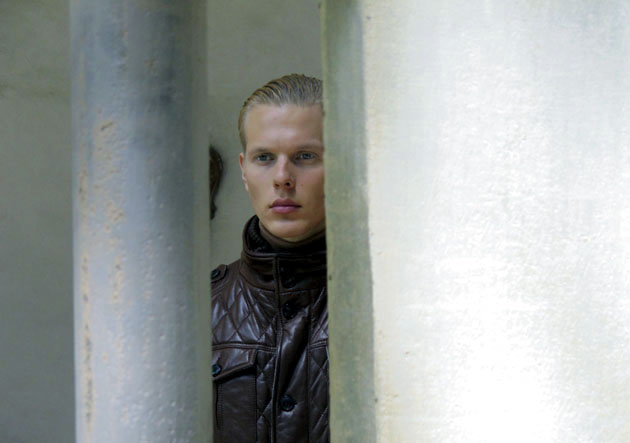
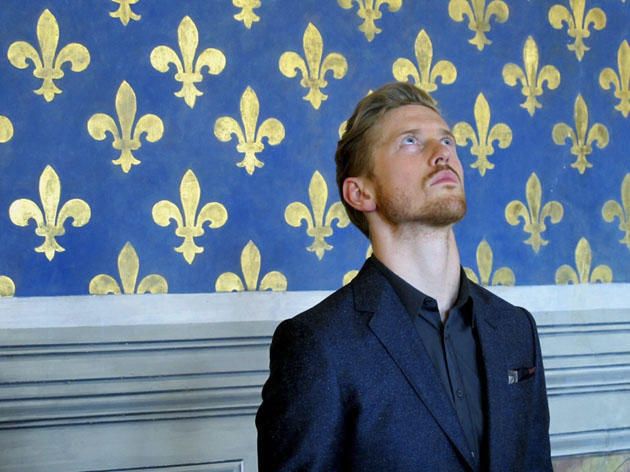
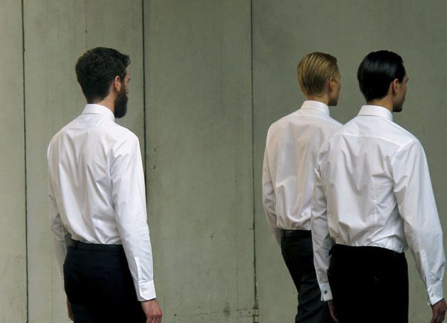
The discussion of what is art and what is fashion is a constantly on-going one. With an opening party and three following Notte Bianca‘s Mondadori presents MeMO – musei e moda uomo. The project aims at taking an inventive angle to the male fashion during Pitti Uomo 82 and is dedicated to merging art and fashion through twelve video collections placed in the five Civic Museums of Florence. “Fashion is art and art is fashionable”, says Angelo Sajeva (president and CEO of Mondadori Pubblicità).


The opening event was held at Palazzo Vecchio on Monday night, the day before the official opening of Pitti Immagine Uomo. From here onwards the five chosen spots will be open for the public to enjoy 19 – 21 of June, between 7PM and midnight each evening. The pieces are produced by video makers specialized in fashion, and will help the companies to create a story and an image outside of their normal habits.

“Art and fashion are generally the fruit of the same input: creativity!” continues Mr Sajeva.

The project adds to the art-fashion discussion and the invited opening crowd were able to take part in an astonishing event and in a great starting point for the upcoming week in Florence and Pitti.


The pieces can be seen at Fondazione Salvatore Romano, Capella Brancacci, Museo Stefano Bardini, Museo de Palazzo Vecchio (Sala d’Arme) and Museo di S. Maria Novella (Cappella degli Spagnoli).


Lisa Olsson Hjerpe 

Share: Facebook,  Twitter  
13/06/2012

The Editorial: Pretence. Plastic.

The Editorial: Pretence. Plastic.

It’s likely that we’ve all sat in a Louis Ghost chair. Every fighetto and fighetta in Milan has one or two ironically hanging around their “design” apartment. For me, the first time was a few years back at a beach house in Tuscany adorned with iridescent shells and pastel pictures of boats that seemed to exist only to forcibly remind everyone inside that “you’re on holiday, AT THE BEACH, goddamnit”. Two Louis Ghost chairs sat, noses upturned, at either end of a long table flanked by another six, less stately (but also clear plastic) Kartell chairs. “This place is POSH, goddamnit,” they said, hollowly.

For a piece of iconic “design” (an irksome classification, since everything man-made is designed, and is therefore design), the Louis Chair is incredibly derivative. It is an old, established form rendered in new material. It is invisible, yet its symbolic intentions are crystal clear. It was the perfect companion to the literal gaudiness of shells and pastel boats, as it is the perfect companion to a kitschy nail salon decorated with tropical plants and smelling of acetone, as it is the perfect companion to the generic posters and bad brochures of a second-rate travel agency. The Ghost chair is pretence in plastic. Nothing more.

And although the chair has lost must of the ooh-aah, genius gee-whiz novelty it once had, it has unequivocally become an instantly recognisable classic. An icon not only for Kartell and Starck, but for the 2000s and for contemporary Italian design. And it will be the first ugly thing your kids sell for 50¢ at a garage sale when you die.
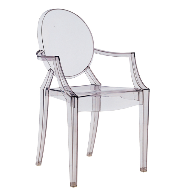
So, to honour this extraordinary object, artist Simon Martin this week opened an exhibition at Collective Gallery in Edinburgh focusing squarely on it. And while Scotland may not be the design powerhouse Italy is (was?), its artists are positively on fire. Plus, a hearty mix of whisky and bluntness might be just what the doctor ordered to knock some sense back into Italian design.

The exhibition is brilliantly critical. Although we’ve all probably given the Ghost at least some thought –certainly most designers have– but what an enigma it is! Deliberate, shamelessly appropriated, trapped in the present and yet thoroughly a relic of the past. Ugly. Stunningly gorgeous. Packed with history. Meaningless. In a short documentary, Martin juxtaposes the Ghost with plastic (ceramic?) lawn gnomes and their accompanying tree-trunk tables, African headrests, and a work by Donald Judd. Plastic wood. Wooden box. Box as symbol. Symbol as chair. And what it all does is call into question the very reasons for which we’d value such an object in the first place. It is the purest, clearest expression of our obsessive yet unthinking attachment to symbol. Perhaps ever. Why this objectively ugly chair has any value at all is pure sociological, anthropological, psychological magic.

While he may be a massive sellout (good businessman?), Philippe Starck is nothing if not an excellent designer. A designer who is extremely easy to hate for unleashing loads of ugly things on the world, but a very, very clever one, indeed. Maybe his snarky materialism–his oft-repeated mantra, after all, is “everything I make is absolutely unnecessary”–has actually been about coming to grips with the ills of materialism. Just maybe.

Tag Christof
Share: Facebook,  Twitter  
08/06/2012

The Obsolescence of Magazines

The Obsolescence of Magazines

Recently a young, but soon to be important, curator declared that he didn’t like magazines. He backed the statement explaining that an article in a magazine is not long enough to engage in a profound discourse nor relaxingly short. He prefers reading books when it comes to knowledge and 50-word blog posts when it comes to news and trends. 
If he was the one predicting trends involving printed ephemera, the statement would clearly be that magazines are long dead. At least the printed ones.


On the contrary, a recent article published on The Guardian’s website states differently. The article reports about a survey whose final results indubitably show that people still prefer reading printed magazines than their digital versions. Should we be surprised?

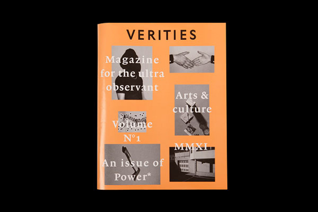
Even if the young curator won’t maybe ever waste his time reading one of them, some excellent magazines have been coming about lately. One of the newest on the list, currently presenting its second issue, is Verities – a magazine about art and culture. The bi-annual magazine has, since its foundation, stated it was a publication “of thought, observation and reflection giving equal focus to visual arts and literature”. The second issue of the magazine, entitled “The Muse Issue”, happily mixes literature, art, critique and theory in chapters titled “Observations”, “Inquiry” or “Studies”.

Verities isn’t the only one treating their readers with esteem and intelligence. The trend among independent publishers who started as ‘producing lovely magazines’ is gradually shifting towards ‘making culture’. Even though the trend part may still be included in the package, the shift in content is highly appreciated. Hopefully not only by magazine geeks.

Rujana Rebernjak

Share: Facebook,  Twitter  
06/06/2012

Awakening Of The Rainbow Dragon

Awakening Of The Rainbow Dragon

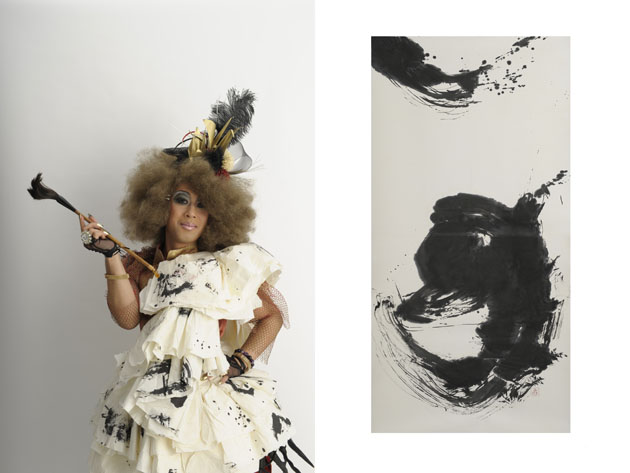
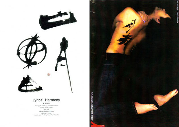
MAAYA SHO started calligraphy at the age of 6, and has ever since been developing his distinctive approach towards ancient script, originally carved on strange materials such as tortoise shells or a piece of bull scapula as a method of fortune telling more than three thousand and a couple of hundred years ago in China. The unique and beautiful shapes of the script embody the very origin of its meaning, later evolved into Kanji [Chinese character], which inspires us to imagine the ancient people’s way of living and their interpretations of the world.

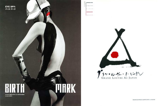
His works are in Thai Royal Family Collection and his handwriting can also been found as one of the official logos of the Louvre Museum and as collaborations for example with fashion maisons and restaurant designing. His unique style ‘Queen of the art of calligraphy’ was fully demonstrated in his outstanding exhibition and performance in Tokyo last April, in which he showed his latest work Ten-Ryu Ji-Ryu I (Heaven Dragon Earth Dragon I).

The Dragon is revered and considered as the eminent spirit in Oriental culture. In his exhibition, two Dragons – Ji-Ryu is considered as a symbol of anxiety or frustration in the modern society while Ten-Ryu is a symbol of purifying and extrication – inspired us to meditate on ‘liberation of the mind’ in our age, especially after the 3.11 earthquake, which was a critical turning point in his creative life.

“After the earthquake, I couldn’t take up my ink brush for a certain while. An intense feeling was deeply engraved in my mind: ‘Tomorrow is promised to no man, it’s as uncertain as the wind.’ It was then when I decided to change my name from MAAYA to MAAYA SHO. ‘SHO’ is the term placed after your name as your signature in calligraphy. Including it as my name itself meant that I was then determined to live with calligraphy forever.”

Since then, one of his intriguing approaches came to fruition in the form of the opening of his workshop on each new moon and full moon.

“Through my workshop, I would love people to know the power that words and Kanji have, also to feel the joy of the art of calligraphy. The workshop takes place twice a month, on the day of the new moon – a powerful day to make your wishes come true – and on the day of full moon when the creative energy grows highly. In my workshop, I help people to choose one word, which could be their favourite, part of their name or my suggestion based on Kyusei Kigaku (an ancient method of Chinese fortune telling). You write the word in ancient script, which is very graphic, and the word could be seen as your lucky symbol. The process will help you meditate on people’s communication, caring mind and the purposes of life at each stage. The most potent way is to do it with positive affirmation messages. Always, in present tense.”

Every form of life starts from the present. For MAAYA SHO himself, the one word that embodies his feelings now in the Year of Dragon 2012 is ‘明’ which literally means ‘light’. In ancient script, it describes the moonlight coming through the open window.

“You know, I love happy endings.” he smiled.

Ai Mitsuda – Images courtesy of MAAYA SHO

Share: Facebook,  Twitter  
06/06/2012

The Editorial: (Your Words Here)

The Editorial: (Your Words Here)

It’s always seemed quaint to me that Oxford and Webster still go through the trouble to formally ‘admit’ new words into the English language every year. Web words, buzzwords, passing neologisms, schoolyard slang… and all of a sudden, “ginormous” makes it! It’s a real word! And at long last, you can officially use “retweet” in a game of Scrabble. But it all seems like a tireless quest to contain something that generally can’t be contained, like in the Academie Française’s futile attempt a decade or so ago to replace the word “email” in the French language with the anodyne “courriel.” Language grows as it goes, bitches.

Now, for posterity’s sake it’s probably a good thing that someone bothers to put these buzzwords du jour down on a printed page, lest we forget them forever within a few years time. I’m just old enough to remember a few volumes worth of Encyclopaedia Britannica hanging around dustily on a living room shelf… remember when they were the one-stop-shop for science and animals and history and faraway Iplaces? But just a few short spins around the sun and those stolid, proud-looking books are aaaaaaaaancient. Like, prehistoric. Like, dead and gone. Like, completely and utterly useless.

But thankfully for us, there’s the Internet. Our swirling, at-the-edge-of-chaos, superconnected source for everything good and evil. The conduit for our culture and the most supremely dynamic platform ever devised for the sharing of human knowledge. And just like language itself, it invents and subverts and redefines itself like a force of nature. So, it seems like old misters Oxford and Webster best just leave the wordsmithing to the great collective brain. Open-source Urbandictionary and Wikipedia and their more specialised online cousins, afterall, are the source of all that we know nowadays. (And I mean that only half jokingly.)

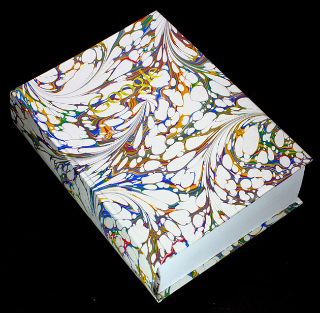
So in an infinite stroke of genius, Felix Heyes and Ben West, two students at Kingston University, took to Google to create their very own version of the dictionary. (Hey, why not? We’re all authors of our culture, now.) For every word in the existing dictionary, the two used an algorithm to take the most prominent finding in an image search to make for a visual record of, well, us. And without throwing around the old ‘picture is worth a thousand words’ adage too much, this exercise in culture mining is far, far more indicative of the state of human language and society than any dictionary that almost arbitrarily lets “gaydar” and “grrrrrl” onto its pages. Several thousand images of porn, gore, and plastic celebrities later, it’s a look into an all-seeing mirror. And just like the day after an all night rager, you might not much like what you see staring back at you… but it’s real!

And since my Webster-backed computer spell check has just claimed that “rager” isn’t a word, my work here is clearly done.

Tag Christof – Images courtesy of Ben West

Share: Facebook,  Twitter  
04/06/2012

Warming Up For Contemporary Art Summer 2012

Warming Up For Contemporary Art Summer 2012

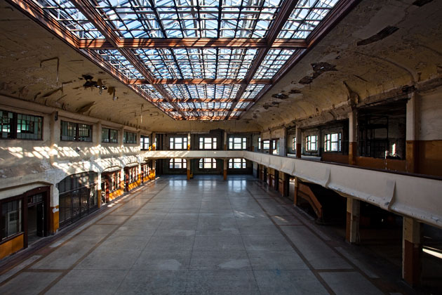
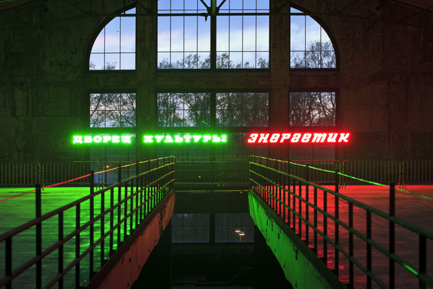
The exciting summer season of art opened its doors on the 2nd June, with Manifesta 9: the only traveling European biennale dedicated to contemporary art that – after Rotterdam, Luxembourg, Ljubljana, Frankfurt, Donostia-San Sebastián, Trentino-Alto Adige and the Region of Murcia – chose this year to takes place in the restored Waterschei Mine complex, located in the industry-leading city of Genk, Belgium.

Curated by the Mexican art critic, curator and historian Cuauthémoc Medina with associate curators Katerina Gregos and Dawn Ades, the concept of the 9th edition of Manifesta is based on the dialogue between art, history, geographical and social issues, focusing on the rise and the decline of industrial capitalism during the modern age. A former coal-mining site, which lies deep in the green fields, becomes the charming venue of a critical reflection that analyses and retraces the role of memory and cultural heritage in modern and post-modern societies.

Through the interpretations and critiques made by numerous past and contemporary artists around the object/metaphor ‘Coal’ – from the genius of Marcel Duchamp to Marcel Broodhaers’ ironic approach, from Bernd and Hilla Becher’s photographic testimony to the ‘energetic’ neon sculpture by Claire Fontaine and the video installation by the young Italian artist Rossella Biscotti – Manifesta 9 plumbs the depths of the modernity both by recording and transforming the outlook of social development between new and historical, local and global.

Manifesta 9, which will run until the 30th September, is just the first event on an art lover’s calendar. Our tour goes from Belgium to Germany, more precise: to Kassel, where another world’s leading art show will open next week. From the 9th June until the 16th September, it’s the turn of dOCUMENTA 13 – this year under the direction of the global citizen and art connoisseur Carolyn Christov-Bakargiev – that traditionally comes back every five years to last for exactly 100 days. The event, which usually attracts thousands of people (in 2007 visitors were 750.000) in spite of the small size and the isolated location of the host city, will present a survey of new artistic trends. Thanks to the works by more than 150 artists, and to a variety of collateral events spread around the city, dOCUMENTA affirms itself as one the hottest destinations of the international contemporary art summer.

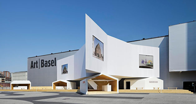
The countdown has started even for the icing on the cake of this season: Art Basel, the kermesse where the top representatives of art and design gather together from all over the world to show off their masterpieces in Switzerland. Art Basel hosts over 300 leading galleries and more than 2500 artists – from old masters to emerging talents. It will open on the 14th June and it will run until the 17th, being a byword for art excellence accompanied, as each year, by smaller fairs (among which Volta, Liste and Scope and great shows.

2012 holds the turn of Jeff Koons at Fondation Bayeler, Gerrit Rietveld at Vitra Design Museum, Tatlin at Tinguely and the artist nominated for Turner prize 2011 Hilary Lloyd at Kunstmuseum (just to mention a few).

Enjoy the art season!

Monica Lombardi

Share: Facebook,  Twitter  
31/05/2012

Charles and Ray Eames – The Films

Charles and Ray Eames – The Films

The legacy of Charles and Ray Eames is still one of the most relevant cultural heritages we have carried out from the sixties. The famous couple, known respectively as the architect and the artist, started their long work-life relationship back in the college years. 
Hundreds of successful projects that have crowned their collaboration, originated from a studio in Los Angeles that has grown up to be America’s most creative site during the Mad Men years. 
Charles and Ray’s career has recently been poured into a documentary. The film was appropriately titled “Eames: the Architect and the Painter”.

The film in itself, apparently a feature created for mass audiences, doesn’t reveal much to a design geek. Historically speaking though, it gives an insight into their studio and working method, narrated through a series of anecdotes told by their young collaborators. The movie actually reveals quite vividly the complex visual world the creative couple has brought to life during their career. 
One of the most interesting projects Charles and Ray worked on, surprisingly as it may sound, is not their appraised furniture.

The actual treasure revealed by the documentary is the way they made their short films. Guided by Ray’s sensitivity that transformed everything in paintings, the filmography produced by the Eames’ studio had the exact same goal of every other project: to communicate ideas. The extensive list of films is conserved today by “Eames Office”, an association dedicated to communicating, preserving and extending the legacy and work of Charles and Ray. Comprising more than 100 films made between 1950 and 1982, it showcases videos like Powers of Ten, Tops, House, supreme examples of their wit and curiosity towards the world.

Rujana Rebernjak

Share: Facebook,  Twitter  
30/05/2012

Electrik-Shrine In An Insomnolent City

Electrik-Shrine In An Insomnolent City

Slowly climbing down the narrow stairs, we visited Electrik-Jinja (literally means ‘Electric Shinto Shrine’) located in the center of Roppongi, the massive nightlife mecca and the melting pot in Tokyo.

Happy birthday Kenji, the owner of the place. The celebrations were well underway, the underground skeleton box was jam-packed with his friends, bare wall to wall. Amongst them, the distinguished jazz bassist Christopher Thomas from St.Louis. The place itself was newborn last April.

Why “Electrik-Jinja”?

“For me, the two terms are actually synonymous. In ancient times, spirits were everywhere, and certain places were designated for the interface of this world and the sacred. Even monuments were not always necessary, it’s all about the vibration of energy. Energy is electric, something invisible, but does exist. You don’t see it, but you feel it. And we humans are also electric, right? I love to see people’s vibes generating spontaneous Jinja here.”

Suddenly, we felt an amorphous mass of billowing vibes, which lulled us into the illusion of wriggling luminous red sea slugs in the blackness. Hung Electro-Voice 15 inches were blowing Miles Davis’ The Man With The Horn.

“Something raw, greasy, chaotic… Once Mishima said (in an essay For Young Samurai by Yukio Mishima, 1969) that ‘culture is yourself’ and ‘be more proud to be savage’, it took me long time to understand his words. Now, I believe in those things deeply rooted in one’s raw emotions based on real life, you know, something far beyond right or wrong.”

Kenji continued, “Every time when my friends come from overseas asking me where they could discover Japanese culture, I always say, go to Harajuku area, you will find those girls in odd fashion called Gothic & Lolita walking around Meiji Shrine.”

A profound embracement to let something vulgar move around in the holy ground. It was already around 7 AM when we climbed up the stairs, fresh air after the rain welcomed us with a sight of a little shrine, coincidentally named ‘Morning Sun’, just then a Shinto priest in white was entering through the concrete Torii (gateway), while three young drunk boys were playing next to it.

Ai Mitsuda

Share: Facebook,  Twitter  
30/05/2012

Acqua for Life

.

Acqua for Life

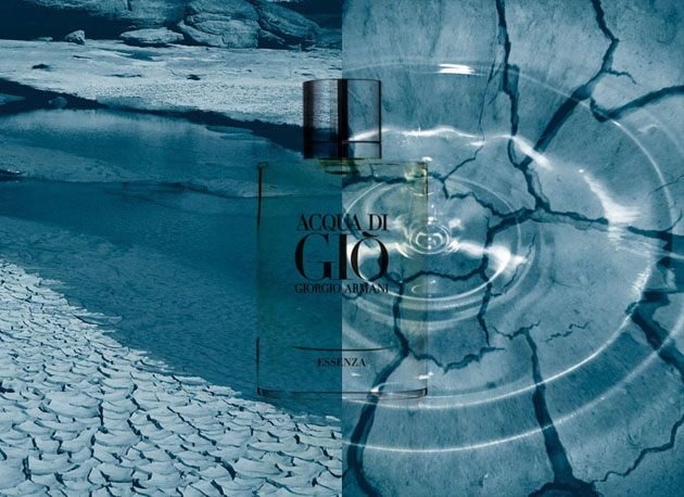
Acqua for Life is an initiative by Giorgio Armani in partnership with Green Cross International, aiming to collect clean water to Ghana and Bolivia, the two countries included in the project. This is the second year that Armani is taking actions in this specific cause and with two days left before the ‘expiration date’, the Acqua for Life Facebook page got almost 362 500 likes, which in itself means over 18 million litres of clean drinking water. The minimum quantity of water that will be donated is 40 million litres, the final result of the 2011 Water Race. Through 100 litres of donated water for each bottle of Acqua di Giò or Acqua di Gioia and 50 litres for each like on Facebook, they hope to take the Water Race even further and go above last year’s numbers.

Organisations performing charitable actions which not necessary are linked to the expectations of society could be called corporate philanthropy and should be separated from Corporate Social Responsibility, even though the line between them often is seen as fine, and even more so – hard to define. Whether we are talking about one action or the other, it gives a boost to the social image of a company and adds to what many of today’s highly sensible and conscious customers are looking for. We have seen fashion companies using their power to raise awareness before, and thanks to social media and a generally interested and involved ‘audience’ it is an industry that really can make an impact. Campaigns such as these do not only do what they are set to. Hopefully they create circles on the water, increasing the attentiveness for other issues regarding society, environment and development.

At the moment, Italy is the leading country, leaving both Denmark and USA behind, together with all the other countries taking part in the project. Even though it’s not the single contest but the gathered efforts that will make a difference, today, Milan is a winner, leading the Acqua for Life Water race 2012 to its goal.

Lisa Olsson Hjerpe – Image courtesy of Acqua for Life – Armani

Share: Facebook,  Twitter  
17/05/2012

May Reading List – Jürg Lehni & Alex Rich

May Reading List – Jürg Lehni & Alex Rich

Introducing a reading list may be quite a demanding task, as lately it seems to be quite difficult to actually find books that are readable in the conventional sense. “Looking at and understanding the meaning of written or printed matter by interpreting the characters or symbols of which it is composed” isn’t the primary activity to throw ourself in when opening the books listed below. The experience they offer is mostly of a contemplative kind.

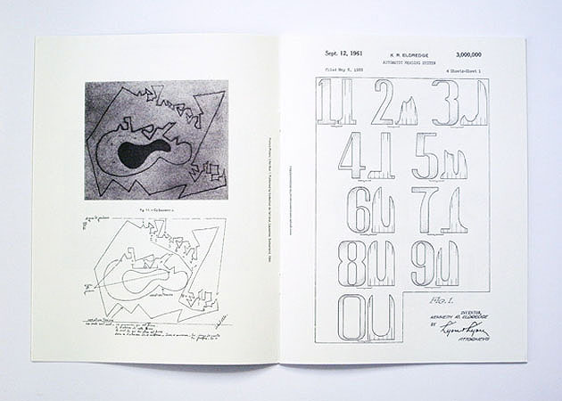
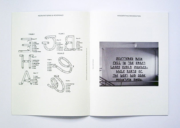
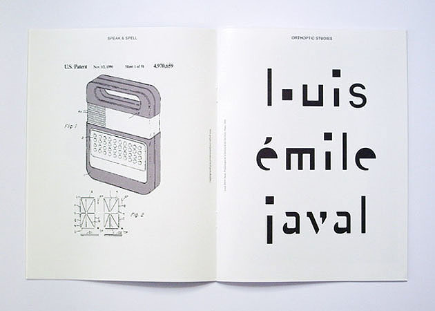
The following four books are part of the archive documenting Jürg Lehni’s and Alex Rich’s collaborative work that started in 2008 with a series of emails. The emails revolved around the issues of communication and technology, the gap between the user and the technologies of communication. The archive itself is named “A Recent History on Writing & Drawing” and it was exhibited at ICA in London involving a series of performances. All of the books have been published by Nieves.

Things to Say

“Things to Say” is a book documenting the drawings made by Victor and Hector. The mechanical brothers are actually relatively simple spray-can output devices driven by two motors. The devices are a collage of other tools, giving them the characteristics of being malleable for interaction and interpretation. 
“Things to Say” brings together the drawings that appear like simple in-line illustrations, thus hiding their origins and confirming the authors’ ideas.

Research Notes

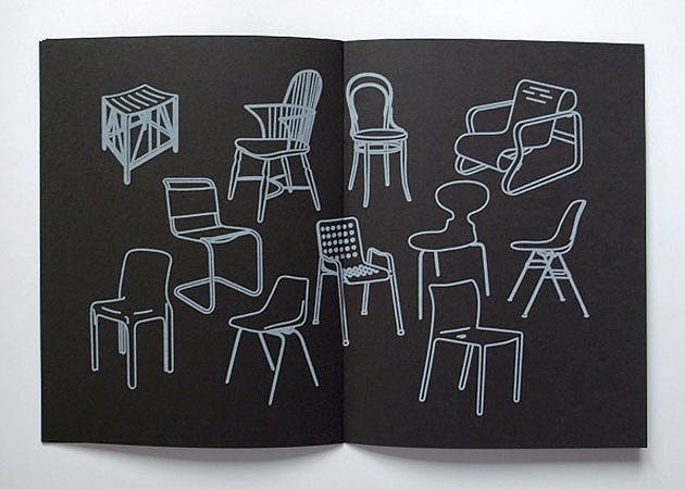
“Research Notes” is a book born with the idea of celebrating “how we find ourselves doodling while on the phone, testing pens in stationery shops, with our belief in folklore, with the need to misuse technology or thinking whose idea it was to fly aeroplanes in formation to write messages across our skies”. The book is an ode to the human necessity of documenting our thoughts and ideas.

News

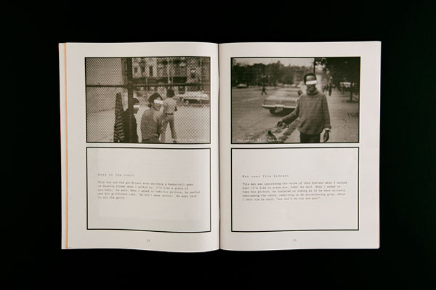
“News” is a simple title that unveils the content of this clever book. The artwork presented in the book is a series of anonymous phrases taken from the newspaper headlines reproduced with a Speed-i-Jet, a mobile hand printer. While you start doubting the utility of the object itself, the beauty of the book might actually give its existence an actual meaning.

Empty Words

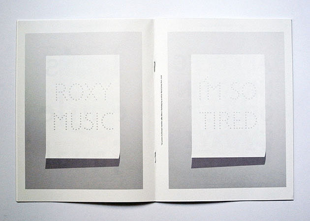
“Empty Words” is another word-play (and also a tech-play) with a series of phrases cut out with another mechanical device. The actual device has been brought to almost industrial perfection making it suitable for mass production of dotted posters and texts, drilled at a controlled speed. According to the authors, it should be almost as solid as a Linotype.

Rujana Rebernjak – Images courtesy of Nieves 

Share: Facebook,  Twitter