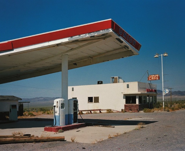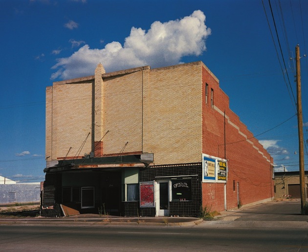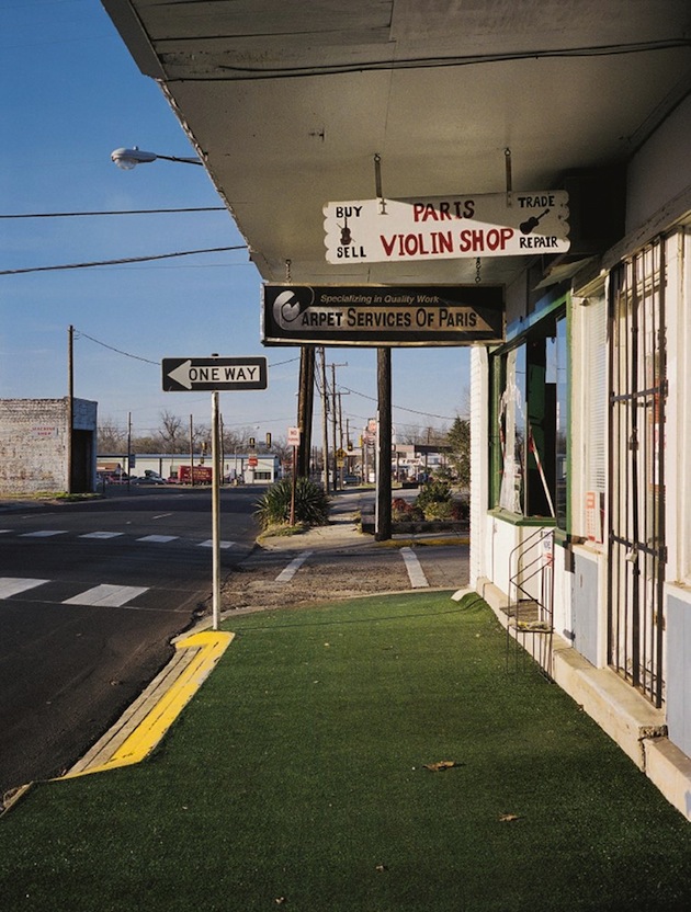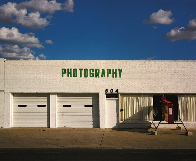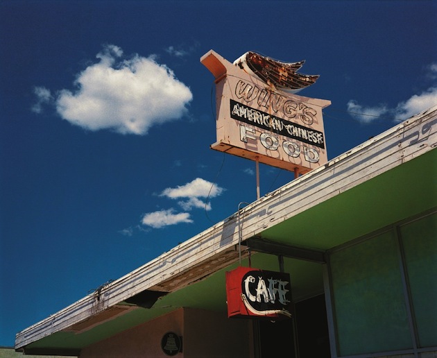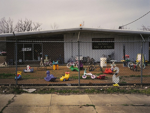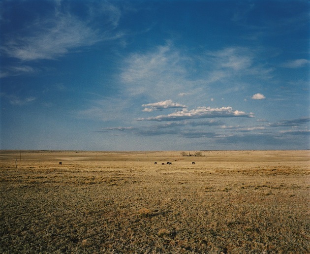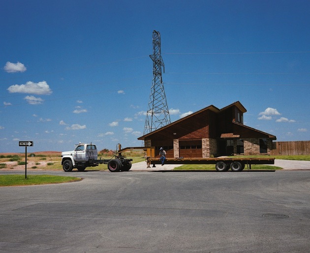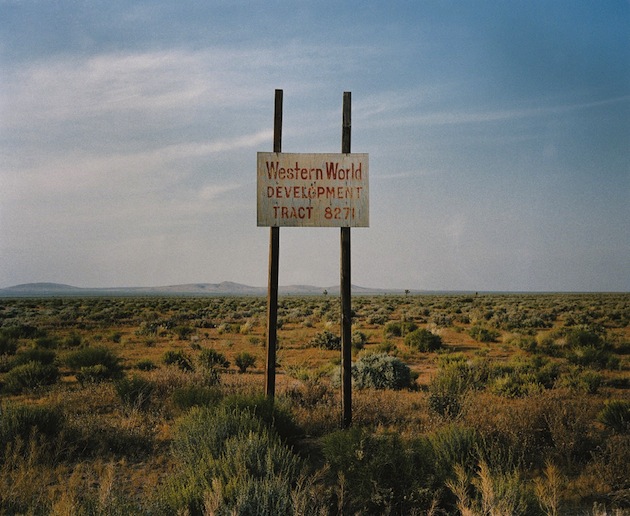
In 1983, on the look for the perfect location for his iconic movie “Paris, Texas”, Wim Wenders captured the life of the city that gave the film its name. Capturing the slow, unnerved, and somewhat disconnected life that bursts through Wenders’s movie, these images portray empty gas stations, courtyards, street signs and shops. Twenty years after they were first exhibited – at Centre Pompidou in Paris, these photographs are collected in a new re-edition of the book (the first edition was published in 2000), simply titled “Written in the West, Revisited”.
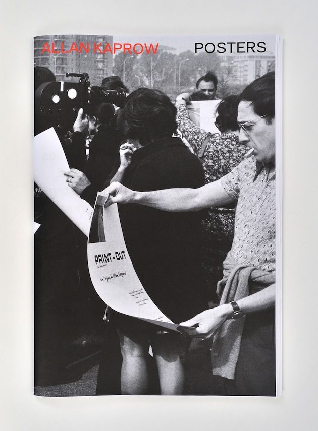
The Blogazine – Images courtesy of Schirmer/MoselAllan Kaprow (1927–2006) is considered to be the founding father of the Happening, of Environments and Activities: terms that he continued to redefine throughout his career. With a wide selection of images, this publication, designed by Coline Sunier and Charles Mazé, documents Kaprow’s posters, a lesser-known side of his work, produced between 1953 for his first show at the Hansa Gallery, New York and 1996 at Kunsthalle Palazzo, Liestal. Most of these posters were designed by Allan Kaprow and are characterized by their aesthetic quality, the earliest ones in particular a combination of hand-lettered text and drawings and the later ones of photographs and typographic text in a minimalist style. More than merely advertising Happenings or Activities, these posters act as scores/tools for the participants to the Happenings and as everyday objects that blur the boundaries between art and life.
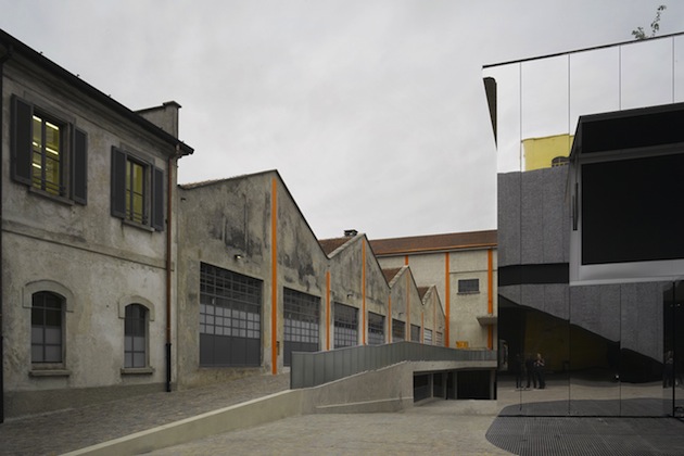
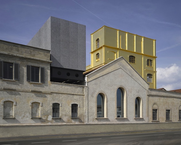
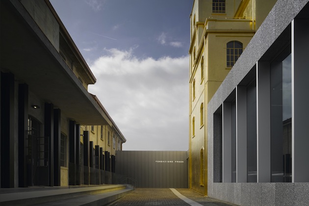
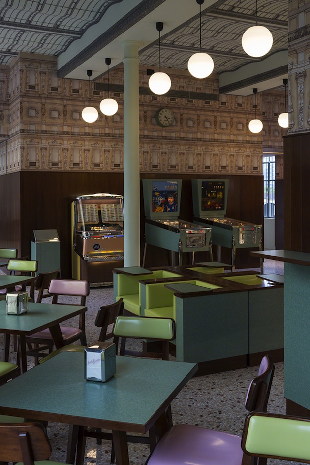
The BlogazineThe new Milan venue of Fondazione Prada, conceived by architecture firm OMA—led by Rem Koolhaas — expands the repertoire of spatial typologies in which art can be exhibited and shared with the public. Articulated by an architectural configuration which combines preexisting buildings with three new structures, it is the result of the transformation of a former distillery dating back to the 1910’s. Located in Largo Isarco, in the South of Milan, the compound has a gross surface area of 19,000 m2/205,000 ft2, of which 11,000 m2/118,000 ft2 is dedicated as exhibition space. The entrance building will welcome visitors to two new facilities, developed through special collaborations: a kids’ area designed by a group of students from the École nationale supérieure d’architecture de Versailles, and a bar where director Wes Anderson has recreated the typical mood of old Milan cafés.
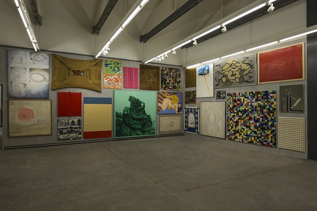
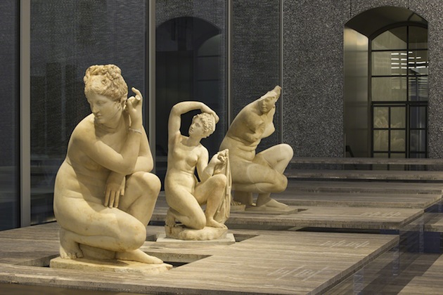
On the occasion of the opening of its new Milan venue, Fondazione Prada presented a wide range of activities. Robert Gober and Thomas Demand realized site-specific installations in dialogue with the industrial architecture and the new spaces in the compound. Roman Polanski explored the cinematographic inspirations behind his artistic vision, which will translate into a new documentary and a series of film screenings. Selections of artworks from the Prada Collection are presented in a series of thematic exhibitions. ‘Serial Classic’ — an exhibition curated by Salvatore Settis in collaboration with Anna Anguissola — completes the program. The project, whose display system has been conceived by OMA, focuses on classical sculpture and explores the ambivalent relationship between originality and imitation in Roman culture and its insistence on the circulation of multiples as an homage to Greek art.
At the same time, the Venetian headquarters of Fondazione Prada, which has launched 4 exhibitions in the venue until today, concurrently with a preservation and repair programme of the palazzo which is developing in several phases, presents the exhibition ‘Portable Classic’. The show explores the origins and functions of miniature reproductions of classical sculptures from the Renaissance to Neoclassicism, showcasing more than 90 artworks.
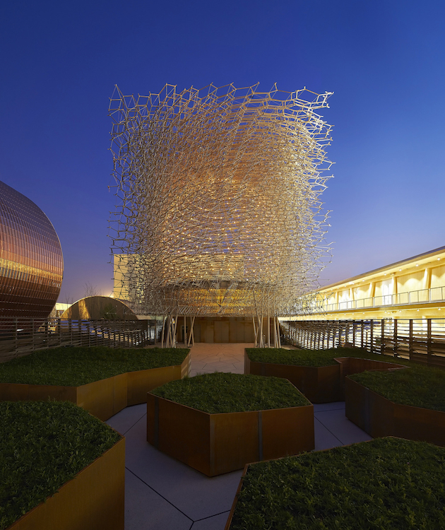
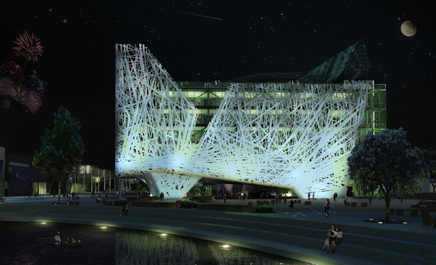
The Blogazine – Images courtesy of Fondazione PradaAfter years of speculation, criticisms and debates, the 2015 EXPO in Milan is scheduled to opened its gates tomorrow. The world exhibition, which hosts 140 countries and is expected to welcome over 20 million visitors during the six months of its duration, is revolving around the evocative theme “Feeding the Planet Energy for Life”. Expo 2015 is conceived as a platform for the “exchange of ideas and shared solutions on the theme of food”, but also as a platform for geopolitical discussion, analysis and, of course, competition. While food is supposed to be at the centre of debates, the monumental architectural designs of certain pavilions are bound to overshadow the spirit of conviviality and exchange among participating countries. For a final count of successes and failures of Italy’s first Expo since 1992, we will have to wait the end of October 2015.
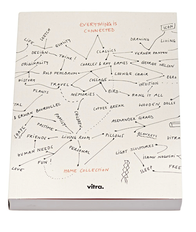
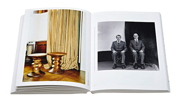
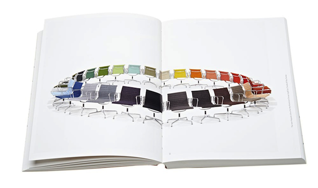
The Blogazine“Eventually everything connects – people, ideas, objects… the quality of the connections is the key to quality per se.” Charles Eames’ quote opens this purely visual book in which the designer is a key link between the images and the story being told. Vitra’s “Everything is Connected” thoughtfully compiles photographs conveying the essence of connectivity. The Swiss interior design company’s book echoes the game when, as a child, we learned to be visual detectives by looking for hidden objects in puzzling images. Here, the hidden object can be a color, a shape, or a motif. Patterns travel effortlessly through the twentieth century like a time machine, yet instead of limiting itself to a linear approach, Everything is Connected shows the evolution of a piece of furniture such as the iconic Eames Lounge Chair through situational sequences. Ads, snapshots, portraits, and sketches demonstrate the prevalence of such objects with elegance, subtle wit, and sometimes blatant humor. This book, published by Gestalten, was conceived as a window into the world of Vitra, allowing viewers to catch a glimpse of the infinity of connections between the featured objects.
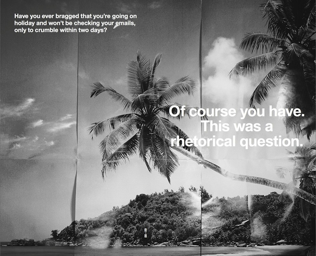
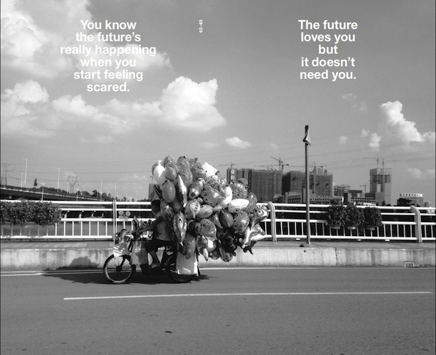
The BlogazineFifty years after Marshall McLuhan’s ground breaking book on the influence of technology on culture The Medium is the Massage, Shumon Basar, Douglas Coupland and Hans Ulrich Obrist extend the analysis to today, touring the world that’s redefined by the Internet, decoding and explaining what they call the ‘extreme present’. The Age of Earthquakes, published by Penguin Books is a quick-fire paperback, harnessing the images, language and perceptions of our unfurling digital lives. The authors invent a glossary of new words to describe how we are truly feeling today; and ‘mindsource’ images and illustrations from over 30 contemporary artists. Wayne Daly’s striking graphic design imports the surreal, juxtaposed, mashed mannerisms of screen to page. It’s like a culturally prescient, all-knowing email to the reader: possibly the best email they will ever read. Welcome to The Age of Earthquakes, a paper portrait of Now, where the Internet hasn’t just changed the structure of our brains these past few years, it’s also changing the structure of the planet. This is a new history of the world that fits perfectly in your back pocket.
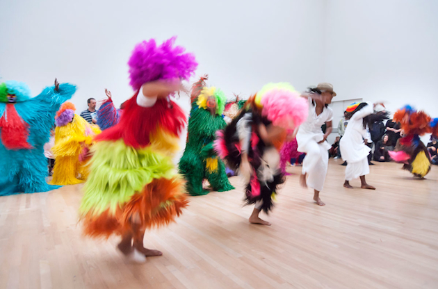
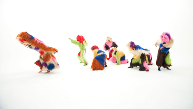
The BlogazineIn the upcoming months, Nick Cave, the brilliant artists and dancer, will stage his sculptural Soundsuits in a new exhibition at Cranbrook Art Museum. Titled “Here Hear” the exhibition will collect approximately thirty Soundsuits, his wearable performance suits designed for sound, mobility, and dance which were influenced by a vibrant palette of African art, armor, found objects, fashion, and textile design, yet find their root in social critique. Cave first created a suit in the aftermath of the Rodney King beating in 1991, envisioning an emotional shield that protected one’s race or gender while still expressing individuality. As Cave’s artwork began to resonate with vast audiences, the artist saw the Soundsuits as powerful agents to capture the public imagination on a monumental scale. Cave’s artistic practice now advocates the vital importance of collective dreaming, which he actualizes through large-scale performances.
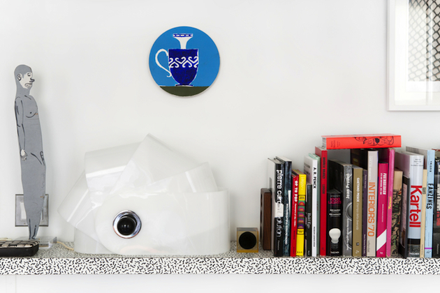
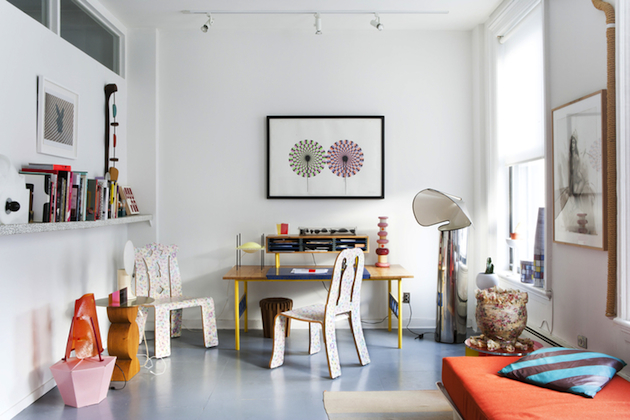
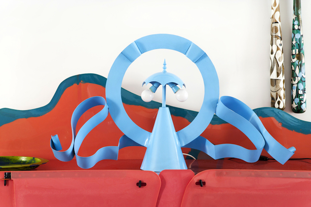
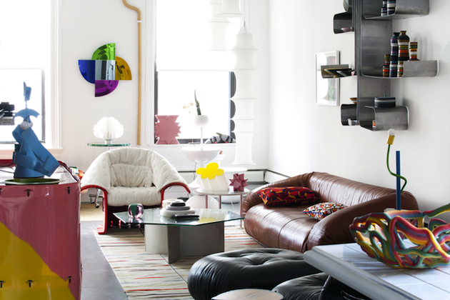
The BlogazineOne of the most brilliant and creative moments of design history – the radical experiments of the 1960s and 1970s in Italy, as well as elsewhere in Europe and the US – have been the subject of much revisiting, adoration and contemplation lately. Yet, for some, the love for work developed by collectives such as Memphis or Alchimia, isn’t just a passing, trendy, craze. Jim Walrod, the brilliant interior designer and a knowing, practical design historian of sorts, has been collecting lighting designs from Gaetano Pesce, Ettore Sottsass or Alessandro Mendini for the past 20 years. Now, his extensive collection of lamps is exhibited at Patrick Parrish Gallery in New York under the title “Rad Lights”, running through April 19th 2015.
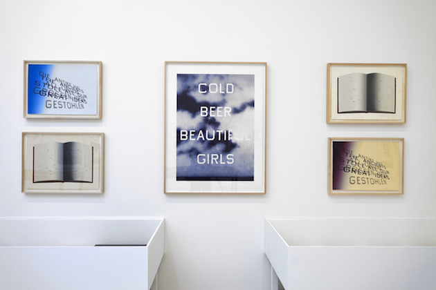
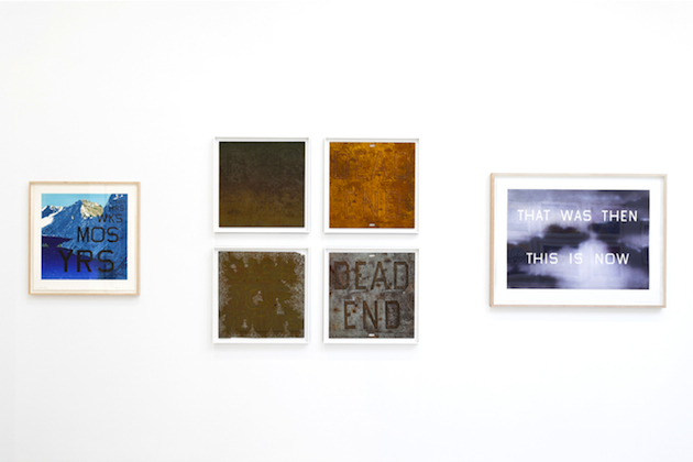
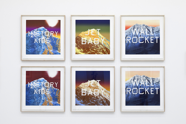
The Blogazine“Prints and Photographs” and “Books & Co.” are two exhibitions organized by Gagosian Paris that survey the world of Ed Ruscha: his prints of the past forty years, together with rarely seen photographs produced since 1959, as well as his legendary artist’s books, together with those of more than 70 contemporary artists from all over the world, providing an in-depth examination of the unrestricted gestures that fuel his assiduous art. Ranging freely and dexterously across traditional, unconventional, or sometimes even comestible materials, Ruscha’s prints are a fluid forum for the spirited investigation of what a limited-edition artwork can be. His absorption and re-thinking of the requirements of each graphic procedure and format result in step-by-step transformations, a process that echoes the eternal return of the subjects that make up his broader oeuvre. His artist’s books, on the other hand, were inspired by the unassuming books that he found in street stalls during a trip to Europe. In 1962 Ruscha published his first artist book, Twentysix Gasoline Stations under his own imprint, National Excelsior Press. A slim, cheaply produced volume, then priced at $3.50, Twentysix Gasoline Stations is exactly what its title suggests: twenty-six photographs of gas stations with captions indicating their brand and location, just like works of art. Ruscha followed this up with a succession of similarly self-evident and deadpan books, including Some Los Angeles Apartments (1965), Nine Swimming Pools and a Broken Glass (1968), and Real Estate Opportunities (1970), all of which combined the literalness of early California pop art with a photographic aesthetic informed by minimalist sequence and seriality, shot through with a wry sense of humor.
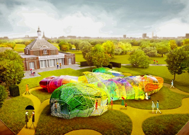
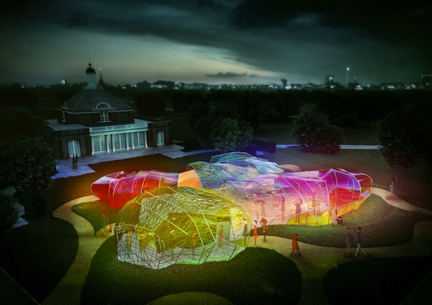
The BlogazineOne of the most iconic landmarks in London during Summer is a temporary, fleeting piece of architecture: the Serpentine Galleries Pavilion has been delighting its visitors for the past fifteen years with constructions designed by some of the world’s most notable architects. Yet, for the past couple of years, the museum has decided to invite practitioners that do not easily fall within the ‘starchitect’ category. Therefore, this year’s commission was assigned to Spanish architects SelgasCano and this will be, according to the Serpentine’s rules, their first ever construction built in the UK. As the designs of the pavilion are unveiled, we know we can look forward to spending the warm months within an amorphous, double-skinned, polygonal structure consisting of panels of a translucent, multi-coloured fabric membrane woven through and wrapped in webbing. Visitors will be able to enter and exit the Pavilion at a number of different points, passing through a ‘secret corridor’ between the outer and inner layer of the structure and into the Pavilion’s brilliant, stained glass-effect interior. It looks like a very bright and appealing summer, indeed, even under cloudy London weather.
The Blogazine