19/11/2012

La Photo à Paris

La Photo à Paris

From 1996, each year, mid-November, for four days, Paris turns into the world centre of historical and contemporary photography, gathering together the most important international galleries that work with this artistic language, expert and lovers, hosting them in the outstanding building of the Grand Palais. That’s Paris Photo, the heart of photography, where everybody can feel the thrill of making a journey through the history of this medium, moving from past to present and enjoying its masters and emerging talents.
 A load of visitors, many red stickers (synonym for good sales, and consequently good spirit); the atmosphere is sparkling. Maybe the only sore point – at least for our nationalist side – is the almost total default of Italian galleries (not being here it’s a bit like being on the bench of “photography games”.)
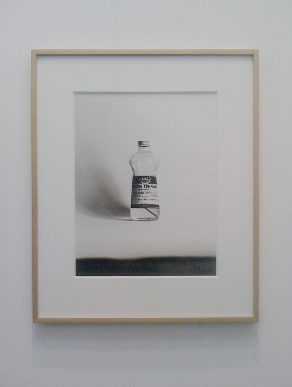
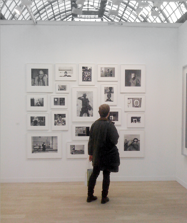
Our tour starts at Lumier de Roses that shows anonymous pictures from 19th and 20th century, whose value is not influenced by the name of the photographers, but is entirely due to their evocative power. Anonymous photography is also presented at the exhibition Private Collection, arranged thanks to the Archive of Modern Conflict, which counts 4 million different images created by both famous artists such as Boris Mikhailov and first-class unknowns.
 At Fraenkel‘s stand, a self portrait picture gallery by the renowned artist Lee Friedlander catches our attention, and it is another picture gallery, some stands after, at Weinstein Gallery to intrigue us: it is the work by internationally celebrated Alec Soth, who plumbs and interprets women’s intricacy.
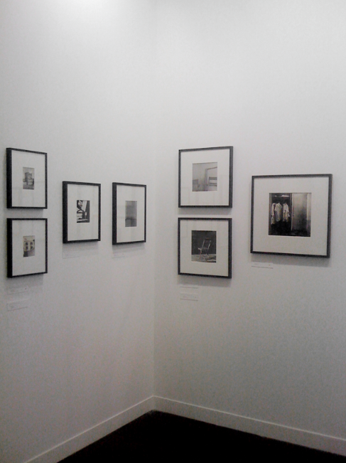
We meet again Boris Mikhailov at Guido Costa Projects, while Paradise Row presents Adam Broomberg & Olivier Chamarin’s images from the new series “To photograph the details of a dark horse in low light”. Poker of aces at David Zwirner and Gagosian‘s respectively with names of the like of Philip-Lorca di Corcia, Gordon Matta-Clark and Thomas Ruff, Gregory Crewdson, William Eggleston, Douglas Gordon, Andreas Gursky and Hiroshi Sugimoto, just to mention a few.

A voice out of the choir for Westlicht, which exhibits the works of the Viennese Actionism – Günter Brus, Otto Muehl, Hermann Nitsch, Rudolf Schwarzkogler (who committed suicide in 1969) – characterized by a stark, sadomasochistic aesthetic.


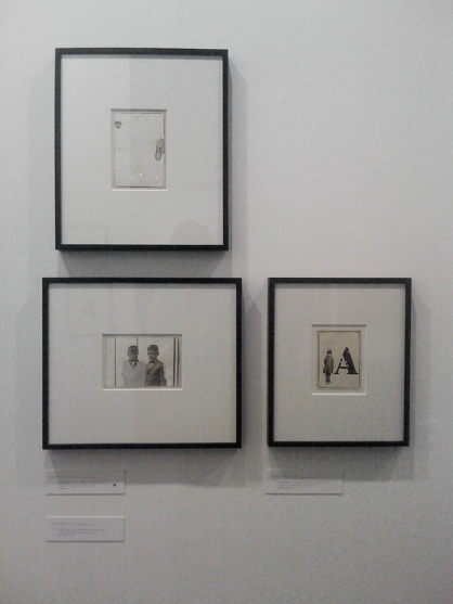
We close our review mentioning one more space: Pace/MacGill Gallery with its four André Kertész’s small and intimate pictures that go under our favorite theme among the three main ones of the fair: “Small is beautiful”, “Le réel enchanté” (Enchanted Reality) and “La photographie française et francophone de 1955 à nos jours” (French and francophone photography from 1955 to the present day). 
For the new Paris Photo event that will be held at the Paramount Pictures Studios in Los Angeles – at the end of April 2013 – we just hope to see more young talents like Dwarfs standing on the shoulders of giants.
Monica Lombardi

Share: Facebook,  Twitter  
14/11/2012

The Editorial: The Ballad is Back

The Editorial: The Ballad is Back

Before Flickr, before the unnavigable mess that is Tumblr, we saw fine art photos primarily in three ways: in galleries, in magazines, and in monographs. Dusty old volumes on messily stacked shelves in art school libraries, lone hardbound bricks proudly displayed on coffee tables. You knew someone with a Mapplethorpe or Ruscha book had style, just like you knew someone with Robert Frank or Ed Weston had taste. Dentists’ offices and old people always had an Ansel Adams lying about, and every shutterbug ever had some bound collection of the same iconic Cartier-Bresson snaps. They were precious commodities, not lest because they normally cost a small fortune, but because they were published in relatively limited quantities and were objects their owners pored over.


And while legions of small publishers, as well as the most culturally savvy big players like Phaidon and Taschen have succeeded in keeping the genre very much alive in the Instagram age, the newer crop of monographs simply cannot escape their time. They are all inevitably web-influenced, sleek, hyper literate collections that lack the clarity, the humble naïveté of their forbears. And while not to disparage the web’s amplification and democratisation of fine photography (we may have never known Vivian Maier without it!), there is something else in those pre-web books that hasn’t been recaptured in recent years.

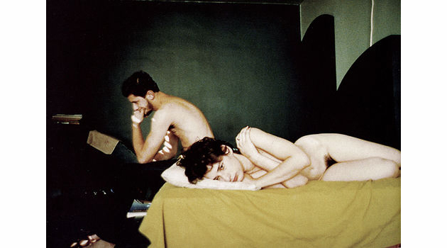
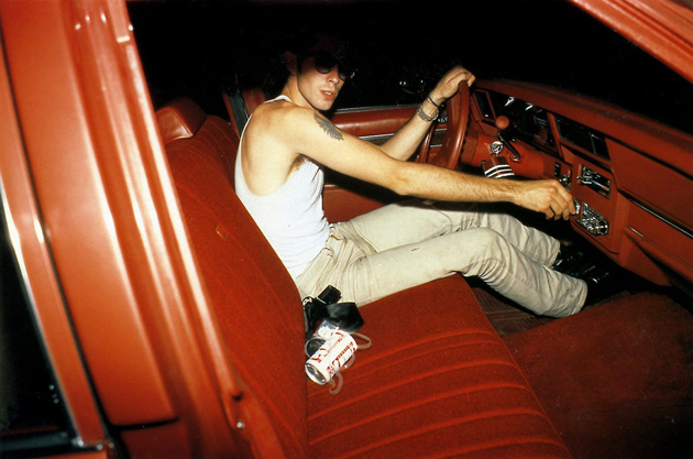
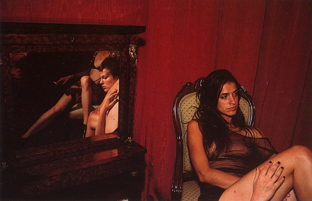
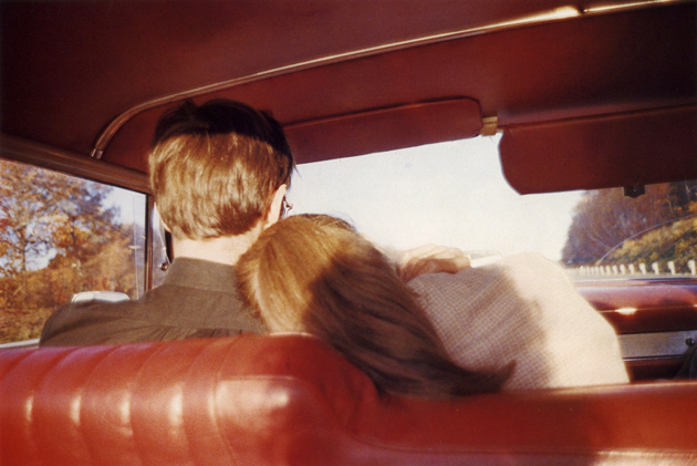
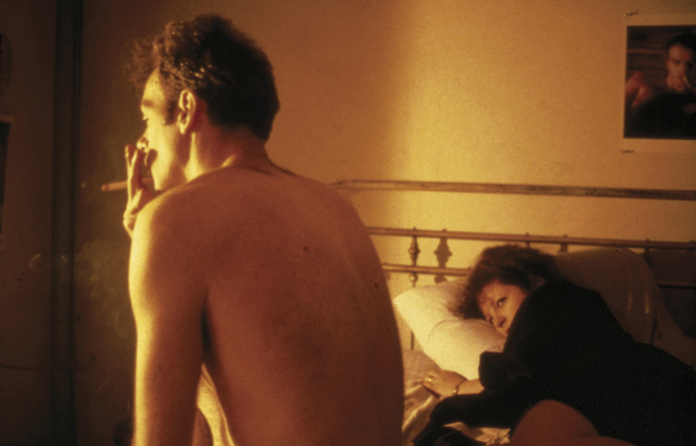
So in a nod to those heady days of yore, it’s with great happiness that we learned of Aperture Foundation’s re-release of Nan Goldin’s Ballad of Sexual Dependency, a fantastic collection of photos if there ever was one. In the short year or so, since I’ve been taking photographs seriously, no other collection has been more useful for inspiration. But my relationship to Ballad – and certainly that of many photographers – is much more complicated than that.


Once upon a time, as a misfit teenager in rural America, I indulged in strange transgressions. Not drugs or … , but rather in a collection of cultural artefacts: I bought and hid designer clothes and art books in my bedroom as if they were contraband. The photo books were the most important: Garry Winogrand, Minor White, Jakob Holdt, Diane Arbus… and, most importantly, Nan Goldin. Her work, most saliently in Ballad was a revelation: its images were the first time I saw the camera’s potential to dig uncomfortably under the skin. Past social mores, through put-on artifice down to a soft, compromised, imperfect humanity. It wasn’t the deer-in-the-headlights I’m doing this because I know it’s provocative discomfort of Diane Arbus, but a far more honest, far less pretentious “other-ness.” I identified with these photos. And feel better about being human when I see them.

As a footnote, 2DM’s Skye Parrott was once Goldin’s protégée – check out her work for a more youthful, yet still very Goldin-esque eye.


Tag Christof

Share: Facebook,  Twitter  
13/11/2012

Seller / Publisher / Artist with Franco Vaccari

Seller / Publisher / Artist with Franco Vaccari

One of our favourite exhibition spaces in Venice, A Plus A gallery, and one of our favourite publishing houses, Automatic Books, have joined their forces in organizing a series of conferences about artists’ books. The cycle of encounters, titled “The seller, the publisher and the artist”, inaugurated a few weeks ago with a conference by Cornelia Lauf, one of the founders Three Star Books publishing house, while this weekend we have had the chance to assist to a talk by Franco Vaccari.


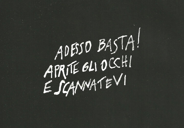
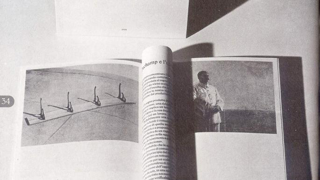
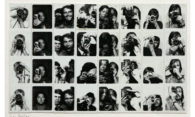
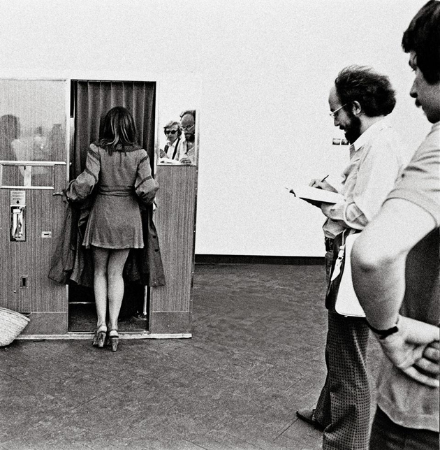
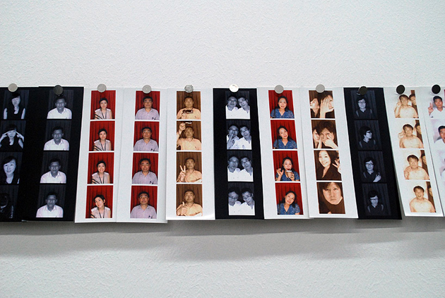
Franco Vaccari, born in Modena in 1936, is an Italian conceptual artist mostly known by his Photomatic “Esposizioni in tempo reale” installation at Venice Biennale in 1972. Mostly working with photography, Mr. Vaccari has made numerous artists’ books during his life and has kindly introduced them to us this saturday. After his studies in physics, Mr. Vaccari has entered the world of art in the mid-sixties, a period when pop art was starting to explode internationally. Hence, the first book he made was called “Pop esie”, collecting a series of casual short poems composed from journal clippings. He gradually started working with photography, building his opus through the idea of breaking down any mental preconceptions he might have. From there on Vaccari has continued constructing situations that put the viewer in an active position, involving their actions, reactions and reflections through the installations he created. That is how Photomatic “Esposizioni in tempo reale” came about, putting a photographic machine inside the show where every visitor could take a personal snapshot. The shots were collected in a book, titled, again, “Esposizione in tempo reale”, becoming an absolute rarity nowadays.


Mr. Vaccari, a kind gentleman and still a passionate artist, was extremely moved by the fact that his talk was attended by a full room of young creatives interested in artists’ books, saying that he can usually count the attendants on the fingers of one hand. Well, we must admit, so were we. Hopefully, this event is another demonstration that both books as well as art will never go out of style.


Rujana Rebernjak

Share: Facebook,  Twitter  
06/11/2012

Penguin – The Beauty Of The Book

Penguin – The Beauty Of The Book

A few days ago a big news has come up in book publishing. Two major publishers, Penguin and Random House, are merging to form one of the biggest contemporary publishing houses. Besides the economical and market outcomes (they might control one fifth of the UK book market), the operation might have an implication even on design.

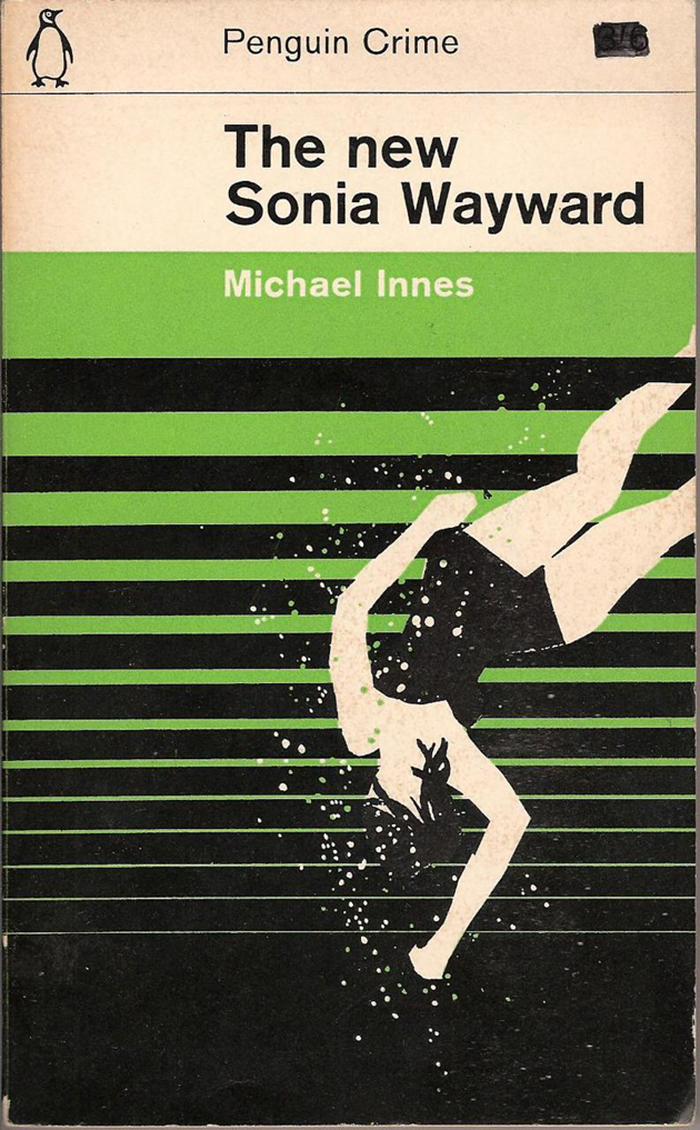
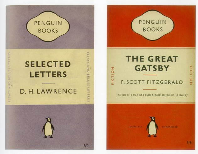
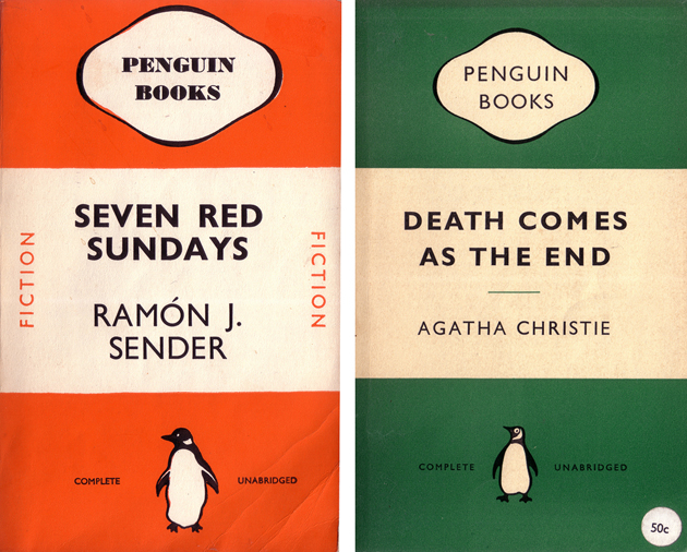
Penguin Books has made its name in timid history of design for its subversive book covers. Guided by the illuminated impresario Allen Lane, the founder of Penguin, the first book covers designed for Agatha Christie’s novels have immediately become a classic. Following the idea that “Good design is no more expensive than bad”, Mr. Lane has created not only a publishing empire, but even a design one.


While it all began with Mr. Lane, the person who gave unity to Penguin’s visual expression was Jan Tschichold, a Swiss designer born in Germany. Tschichold is widely known for his revolutionary manifesto-book “The New Typography” published in 1927, which anticipated Swiss modern design by nearly two decades with its idea of ‘universal’ typography, rigid grid structure and almost no decorative elements. After the second World War, Mr. Tschichold retreated himself in the UK, where he turned back to his origins as traditional typographer and set the iconic corporate image for Penguin. As well as the impeccable composition guidelines.
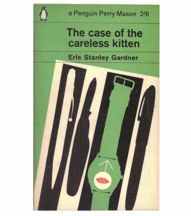
Besides Tschichold, a long series of world class designers has offered their services and wit in designing one of the most beautiful and intriguing book covers ever. Among them you can find Alan Fletcher, Colin Forbes, Derek Birdsall and Germano Facetti, all notorious design figures. As the last accords between Penguin and Random House are being signed, we all hope the new publishing house might treasure their and our design history.

Rujana Rebernjak

Share: Facebook,  Twitter  
30/10/2012

30 Designed Reasons to Vote Obama

30 Designed Reasons to Vote Obama

As the USA presidential elections get closer and closer, we can all witness an almost frightening hustle and bustle going on around us. Every minute of each day, hundreds of web posts, articles, statistical analysis and other types of information are being poured in our heads with the one and only intention – to gain some precious votes. It is reasonable to believe that this information overload is surely confusing and that we might appreciate it much more if it was handed out in a different way.


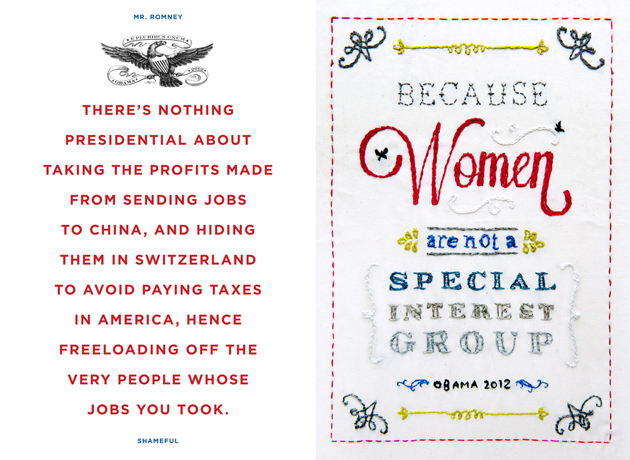
This is where designers step in, reunited under the initiative called 30 reasons – an email and internet poster campaign due to last 30 days (with more or less 10 days left to go). The campaign isn’t an un-biased source of information, but gives an intimate interpretation of why we all hope the Americans might re-elect Mr. Obama. It is well known that, by the very nature of the profession they serve, graphic designers are left-wing oriented. A socio-democratic political orientation stands at the very foundation of their work, coherently based on Modernist ideals of democracy and equal distribution of means and resources.

30 posters shown on the initiative’s website don’t try to make a rational political evaluation of pros and cons for voting a candidate, but let us peak inside an intimate designer’s world. More importantly it also shows how this profession, often seen as extremely frivolous, might actually serve quite urgent causes in our society. Hence, the works promote Obama’s attention for women and gay rights, social service and health care, education and social equality. While we aren’t going to judge graphic quality of these works, we completely agree with the founders of the project who believe that “designers have the duty to stand up, speak out and help promote social justice”.


Rujana Rebernjak – Images courtesy of 30 Reasons and respective authors

Share: Facebook,  Twitter  
26/10/2012

Time & Space

Time & Space

The ex-colony has colonised the coloniser! Well, not exactly. But the long and sordid history of the UK and Australia has certainly created a fascinating symbiosis between the two cultures, and a strong cultural osmosis from both sides. On Tuesday, Bargehouse opened a 15-artist exhibition, Time & Space, to showcase a cross-section of Australian artists, each of whom has completed a residency in London and many who continue to practice in the UK. The exhibition spans most conceivable medias and mixes artists of different generations to very good effect.


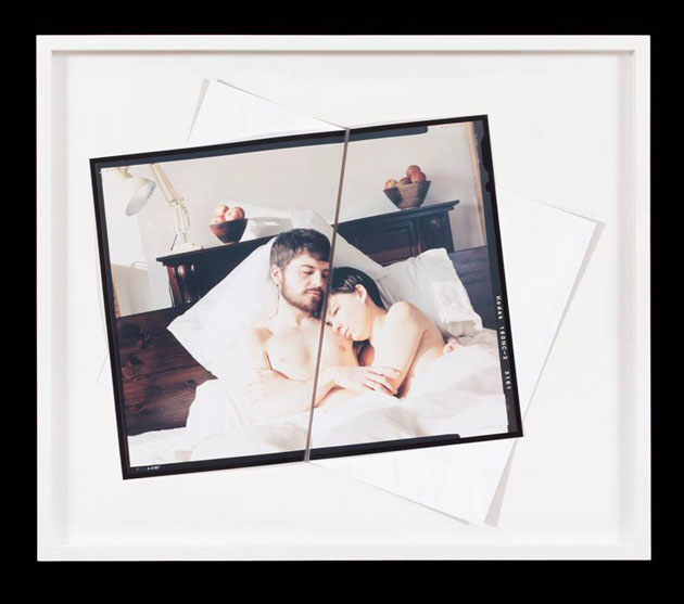
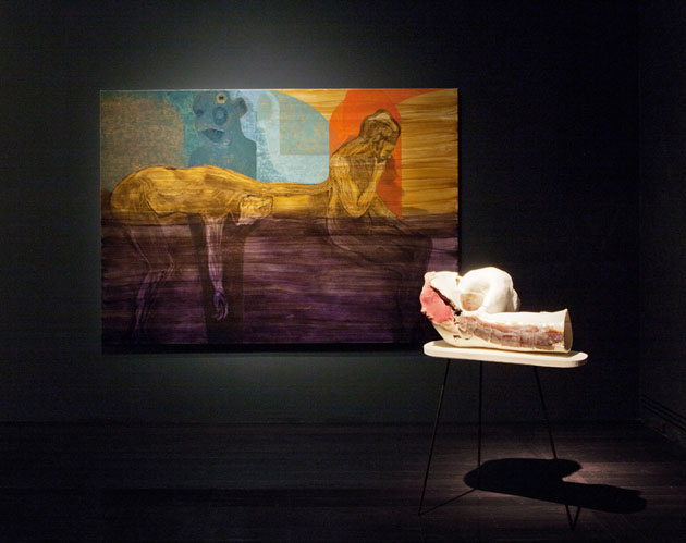
Included in the exhibition are Paul Knight’s intimate, erotic large-scale photographs, a participative painting by Tom Polo and ceramic sculptures by Michelle Ussher, a site-specific tribute to Bargehouse’s former use as factory by Lyndall Phelps and works by Daniel Crooks, Nicole Ellis, Patrick Hartigan, Jacki Middleton, Vanilla Netto and others. The overall effect is compelling, and one gets a sense of a very definite cultural signature that is at once uniquely Australian but clearly informed by British and European sensibilities.


The exhibition is currently running in the Bargehouse space on the South Bank, and is open until this November 11.

Tag Christof

Share: Facebook,  Twitter  
03/10/2012

The Editorial: Shit We Say

The Editorial: Shit We Say

The Shit Girls Say meme was a mini revelation: an a-ha treasure trove of hilarity. Zing! American girls, look at how hilarious and absurd you are! Except that, as clever things on the internet tend to do, it grew to become just a theme on which countless variations (hyperbole: it’s just more than 700, apparently) would be made. Before long it had become “Shit (insert-group-here)-ers/-ites/-[etc.] Say” and everyone had been parodied–girls, guys, gangsters, gringos, gays, geriatrics, gorillas, giraffes, Greeks, Germans, Georgians – and if you know someone who kinda fit into any of the boxes, you were on the floor in stitches.

It was almost as if we were holding up mirrors to our friends’ faces. Except, what we were (and remain) oblivious to is that mirrors were being held up to our own imperfect faces. To illustrate, the star of the “Shit…” video parodying the citizenry of my very culturally unique home state in the USA has become a local folk hero of sorts, and has gone on to be featured in television commercials and print adverts. Her portrayal of the accent, linguistic quirks and localisms was spot on and we loved her for it. But few realised that it was in fact themselves, ourselves!our accent, our quirks – who made any “Shit…” video hilarious. I don’t talk like that! I don’t sound that moronic!
So, great. We’re all both predictable and ridiculous. But since we hear an awful lot about social media’s fragmentation of society, it seems counterintuitive that such a hyperindividualistic (I probably just made that word up) society could be painted in 700 or so odd brush strokes. The videos merely seize upon some broad particularities of broad groups, yet that so many of them ring so true is more than a small reason for us to take a long hard look at ourselves.

A growing number of sociologists who contend that since social networks encourage grouping with like-minded individuals, we are inadvertently sequestering ourselves into neater and more well-defined (and perhaps confining) boxes than ever. You are a teen girl and are therefore predictably ____. Zing! You are a twentysomething who lives in Brooklyn and are therefore predictably ____. Zing! Some even blame recent bursts of extremism, from Al Qaeda to the Tea Party on this dynamic: like minded people with bad ideas in a post-geographic community of critical mass. But shouldn’t it be easier in this day and age to transcend the most basic assumptions about who we are and avoid being reduced to hapless, unthinking stereotypes?

Now, go watch the video that best parodies you. Will you laugh?

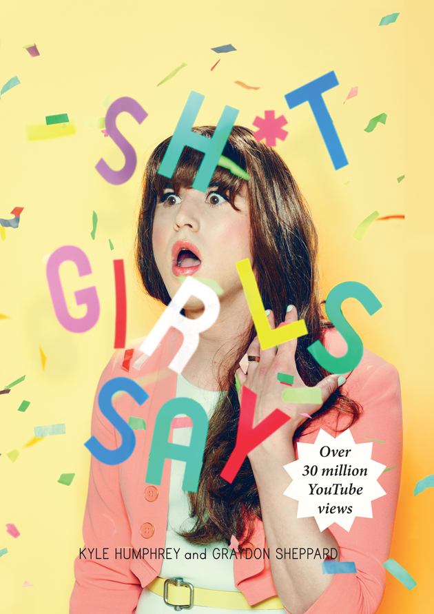
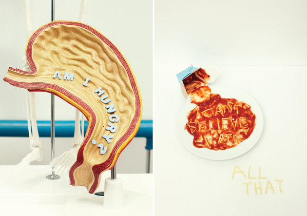
With some seriously well-styled images, Kyle Humphrey and Graydon Sheppard have turned the online phenom into a nifty little book that launched last week in London. Pick up a copy at KK Outlet in Hoxton Square.

Tag Christof – Images courtesy KK Outlet

Share: Facebook,  Twitter  
28/09/2012

TIM MAIA WAS THE MAN!

TIM MAIA WAS THE MAN!

Going on with its independent and focused research activities, Radio – the concept designed and curated by the talented Marco Klefisch – comes back with another exciting project: the international party to celebrate the soul-rocker Tim Maia’s 70th birthday (28th Sept. 1942 – 15th March 1998). The event, which will be launched simultaneously in New York, San Francisco, Los Angeles, Portland, Washington DC, Chicago, London, Gothenburg, Melbourne, Lisbon and Milan, will also mark the release of Maia’s new record Nobody can live forever. The album is a collection of the most famous songs by the globally legendary Brazilian man, who became the king of the black-Brazilian music during the 70’s thanks to his talent to perform different genres in an unmistakable way. From soul to funk, from romantic sounds to psychedelic and pop music, Maia was able to invent a unique style that mixed together great positive energy along with his dark and self-destructive attitude – drug and alcohol abuse represents a revealing aspect of his dissolute, but still fascinating life.

Tim Maia’s birthday party, thanks to the collaboration of the music label Luaka Bop, is opening this evening at Radio space at via Pestalozzi 4, from 7 to 11pm, with the DJ Set by the calligrapher/designer and eclectic creative figure Luca Barcellona, Brazilian music lover and vinyl collector, and Tombun, the monthly point-of-reference-event by Mauro Simionato and Gigi ”Giandisco” De Rosa. Let’s Soul and Funk tonight!

Monica Lombardi

Share: Facebook,  Twitter  
07/09/2012

Eating Stone Age Style

Eating Stone Age Style

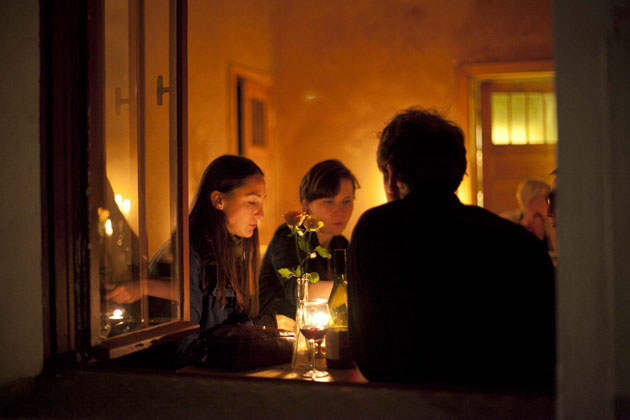
It is said to be the first Paleolithic restaurant on the Eurasian continent, if not the entire world: Berlin based restaurant Sauvage.

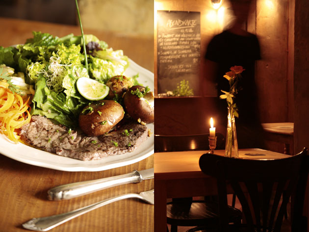
This former brothel in the Kreuzköllner area, offers an all-organic diet of wild legumes, nuts and seeds, sustainably raised fish, grass-fed pasture-raised meat and above all, no processed grains, dairies or sugars. Or more simply put: everything the ancient pre-agricultural hunter-gatherer ancestors ate 200,000 years before us. Yes, it is an all-prehistoric Stone Age cuisine that is bestowed here.

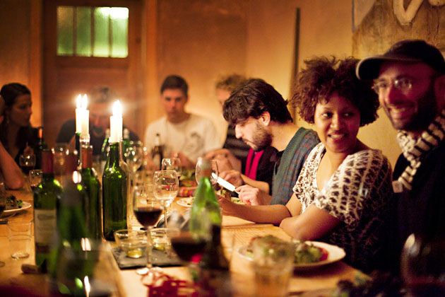
The founders of the restaurant, Boris and Rodrigo had become fond adherents of this dietary lifestyle and felt like spreading the word through opening their own eatery. And so they have. The cave man theme is consistently worked through the interior, as the cozy place –it can only seat up to 40 people- is dimly lit by candle lights and environed by sturdy stonewalls.

But restaurant Sauvage is not just about mimicking how prehistoric men ate. In fact, it combines ancestral cooking methods and evolutionary science with contemporary cuisine and is as such a modern off-shoot to the paleo diet. According to the owners’ philosophy, it is about feeding the body the way nature primordially intended it.

Our prehistoric ancestors were quite ahead of their time when it came to maintaining a vigorous diet. The health results are said to be quite impressive: energy levels are prognosticated to be higher and steadier throughout the day, skin, hair and teeth will look better and even one’s sex drive is anticipated to increase substantially. And not in the least, the taste is delicieux. It surely explains why the restaurant is fully booked just about every night.

The nutritional concept isn’t entirely new though. Neanderthal eating was already promoted and adapted in several books and academic journals around the mid-1970s. In spite of it though, it remained a marginal phenomenon. With the excessive load on quite colossal crises human kind is currently facing, there is irrefutably a growing re-appreciation for the past. In fact, one could go even so far as stating that through the use of old artifacts or in this instance, by restoring an old cooking method, the discomfort with the present and future is channelized.

If anything, its manifestations have become increasingly diverse. Whether it is the accrued interest in traditional handcrafts, the perpetual love for all things “vintage” or the fascination with prehistoric foods, there is a latent longing to go back to our human roots. In the case of Sauvage however, the appreciation for the ‘old’ and our homo sapien roots, go back just a tiny bit further in time.

Claire van den Berg

Share: Facebook,  Twitter  
30/08/2012

Architecture Biennale 2012 – Giardini

Architecture Biennale 2012 – Giardini

This year’s Architecture Biennale has officially opened its gates to the visitors yesterday, while the real news of the day in the architecture world was who the Golden Lion would be awarded to. Trying not to be influenced by the jury’s choice, we have visited all the pavilions in the Giardini choosing our personal favourites.

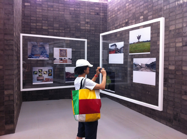
Before visiting the various countries, we headed for the second part of Chipperfield‘s curatorial show which surprised us even in this section. One of our favourite entries was Olafur Eliasson‘s Little Sun lamp, which was displayed both in an installation as well as a video, showing the artist’s wit through an ingenious but simple object. Seen that we can’t stress enough about their work, we have to mention the beautiful installation showing Airports by Peter Fischli and David Weiss. Photography was one of the most frequently used medium in this show, with artists like Armin Linke or Candida Höfer showing their artworks in relation to other architect’s work. One of the most beautiful entries in this year’s Biennale was Gabriele Basilico‘s interpretation of the national pavilions around Giardini, both for its incredible photography as well as the way the photographs were displayed around the room.


As far as the national pavilions are concerned, the ones that shouldn’t be missed are the British pavilion, together with its German neighbours who involved the designer Konstantin Grcic for creating the set-up for the show.

When the national participation award was handed to the Japanese pavilion, we must admit we were quite surprised. Guided by Toyo Ito as curator, the pavilion proposed a series of solutions for the area destroyed last year by the tsunami. While among the “Common Ground” exhibitors, the Golden Lion went to Urban Think Tank and Justin McGuirk, one of our favourite installations mentioned in the previous article.

Even though it was wednesday, on its first day of public opening, the Biannale venues were full of curious visitors. Maybe we are now ready to say that the Architecure Biennale, with its 13th edition can compete intellectually with its older Art sister. Common Ground is on show until the 25th of November.

Rujana Rebernjak

Share: Facebook,  Twitter