
If you had ever seen a Wes Anderson movie, the most obvious feature you remember it by is surely its soft, retro visual feel and particularly melancholic poetics. From the universally loved “The Royal Tenenbaums” to the animated “Fantastic Mr. Fox”, each Anderson’s movie is designed to the last detail. Annie Atkins, the graphic designer who worked on Anderson’s last feature, “The Grand Budapest Hotel”, states that the director “is completely involved in every aspect of his filmmaking”, so much so that he even “wrote all the articles of the newspaper featured in the film, even though, on screen, you only get a chance to read the headlines”.


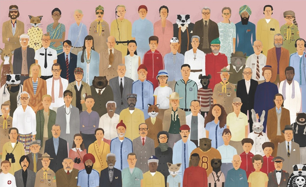
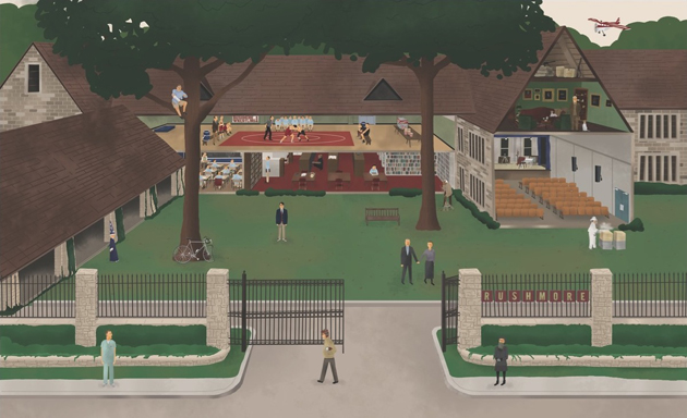
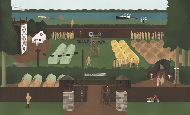
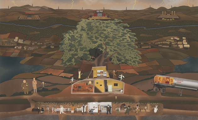
While Anderson’s overtly controlled and ultimately ‘constructed’ filmmaking doesn’t appeal to everyone, his particular aesthetics has evolved into a complex and recognizable language, characterized by an elaborated visual artistry, inimitable tone, and idiosyncratic characterizations. Even though some elements of his visual code have already been analysed and classified by his loyal admirers, a book released last Summer, “The Wes Anderson Collection” is the first in-depth overview of his work. Bringing together interviews, previously unpublished photos, drawings and original illustrations, it reveals – step by step – the process that guides the creation of each of Anderson’s movies. Meticulous and particularly rich, “The Wes Anderson Collection” perfectly captures the spirit of his films: melancholic and playful, wise and childish—and thoroughly original. “The Wes Anderson Collection” was written by Matt Zoller Seitz and published by Abrams Books.


