30/10/2015

Kyrja Puts Iceland on the Fashion Map

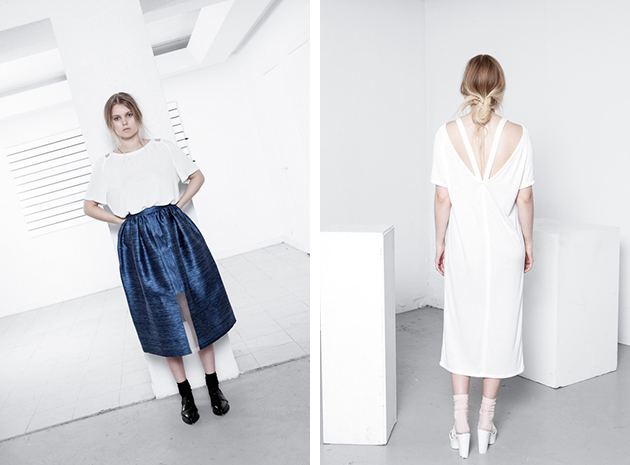
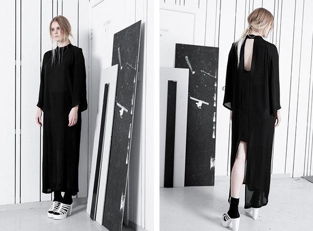
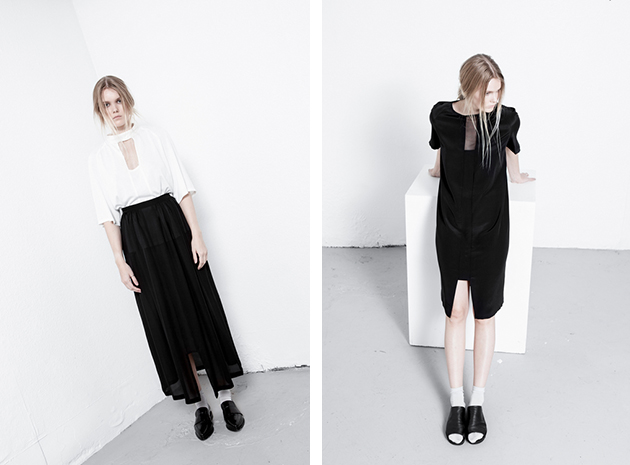
We are really passionated about celebrating new, talented designers and we believe it to be especially interesting with young talents that help put their countries – that traditionally wouldn’t be considered fashion-forward – on the fashion map. The designer behind the upcoming brand Kyrja is Iceland-native Sif Baldursdóttir. She graduated from Istituto Marangoni in Milan in 2010 and founded her own label two years later. Her debut collection was launched for A/W 2013, which led to Kyrja’s first award, with the prestigious “Looking forward to in 2014…” prize at the Reykjavík Grapevine Design Awards.

The brand has captured the raw and clean design aesthetic that often is referred to as Scandi-chic and combined that style expression with natural and exclusive fabrics such as silk, mohair and bamboo. The result is high quality design that feels urban and contemporary, minimalistic without being boring. The focus is placed on details such as great cuts, interesting see-through details and, last but not least, Baldursdóttir’s amazing sense for materials. The whole feeling of the brand is based on an effortless, yet chic look that can be spotted on the streets of any big city in Scandinavia. It’s the typical look for a genuine cool girl that succeeds with looking cool without even trying. Baldursdóttir has found her own expression among many Scandinavian design references with a style that will put both her and Iceland on the fashion map.

Hanna Cronsjö 
Share: Facebook,  Twitter  
29/10/2015

Daily Tips: 2015 Stirling Prize Celebrates Education

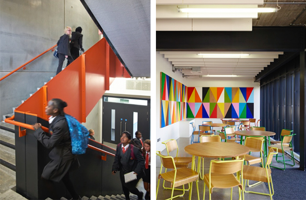
“The new building has made me more excited and motivated to come in each day. It’s just such a lovely environment to work in.” – one of the students of Burntwood School told the Guardian. With this simple phrase, it is easy to understand why it was Burntwood School to receive the Stirling Prize for 2015. Designed by Allford Hall Monaghan Morris (AHMM), the project added six new buildings to the existing school campus in Wandsworth, designed in 19532, creating a coherent space of teaching blocks and sports and arts facilities, interspersed with public squares and lawns. The project was awarded not only for its formal architectural qualities, but more importantly, since it serves as a bold reminder for the power of design in education.

The Blogazine 
Share: Facebook,  Twitter  
29/10/2015

The Art of (Shoe)Making: André Perugia

The best stories are often told by small details. When thinking about a look, shoes are often something complementary, something that goes along and completes other – more important, more visible – choices. But looking at the past, the diversity of the history of fashion can only be caught by individuating the net of relationships between great personalities, some exalted, some forgotten, that have given shape to fashion as a multifaceted experience we consider it today: a balanced ensemble of clothes, accessories, fantasies, myths and desires.

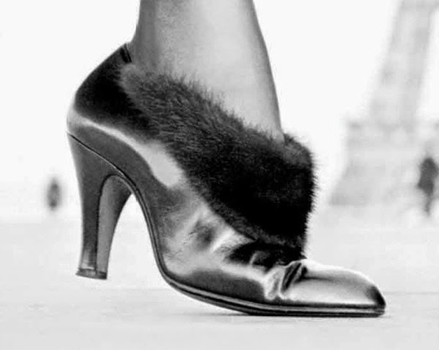
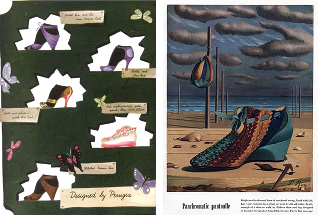
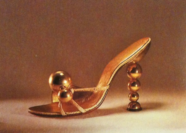
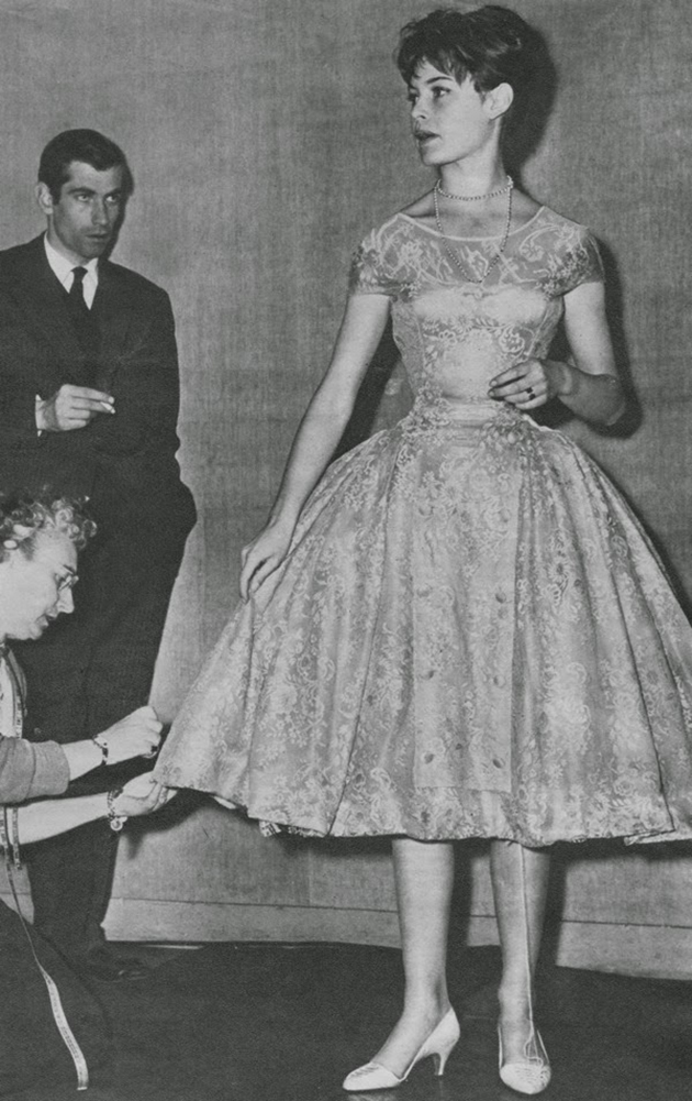
Andre Perugia is surely one of these personalities. Perugia is remembered as one of the first acclaimed shoe designer and maker whose name has been synonymous with style and inventiveness for an extremely long period of time. His career spanned from the 1920s to the 1960s, He was quite revolutionary, not only in the designs themselves, but also in the way he approached shoe design. After learning the technical skills from his father, he set up his own boutiques, the first in Nice, his hometown, and then in Paris. His abilities as a maker developed working in an aircraft factory during First World War. The precision needed in that sector opened up his mind to the possibility of applying ‘science’ to shoemaking; this made him halfway between a maker, an engineer and, of course, a master createur. He collaborated with the designers who ‘made’ history of fashion, from Paul Poiret to Elsa Schiaparelli and Christian Dior; he was also a collector of art, and many of his designs are hommages to his favourite artists, from Braque to Picasso. His last collaboration was with Charles Jourdan – he acted as consultant to the company between 1960 and 1966 – to whom Perugia left his personal archive after his death in 1977.

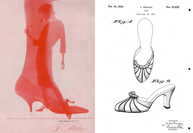
Most interestingly, he was a pioneer in giving value to his design by patenting his models. This denotes the growing consciousness of makers in their own capabilities and, above all, their inventiveness and creativity. As a common raise of consciousness, many designers from the 1920s onwards started to care about copies and looked for ways to protect their work. Madeline Vionnet, maybe the most remembered case, used to make videos of her apparently simple designs, in order to safeguard not only her products, but also, and more importantly, her creative process. Thinking about material property, it is interesting to see how these designers started to reclaim the authenticity of their products, as symbols of craft, quality, value and identity. Perugia’s designs were extremely precise and considered the aesthetics and the use as well, confirming that to shape a shoe is to shape a walk, and of course the confidence of the person who wears them. Infamous is his quote: “A pair of shoes must be perfect as an equation and adjusted down to the last millimetre, like a piece of engine”. It is difficult to point out one feature that can characterise Perugia’s works. Each piece shows a different skill, and his keenness to put ahead a concept. Some of his ‘inventions’ – this is maybe the best way to call them – are incredible in their consideration of both ‘wearability’ and look; for instance, the Desappearing Pump or ‘Vanishing Vamp’ made for Givenchy in 1955 was a visual adjustment to make the foot more elegant, playing on what was visible while walking.

Shoes designed by André Perugia are kept in museum collections all over the world –in the Bata museum in Toronto, in the Met in New York, in the V&A museum in London, in the Kyoto Costume Institute, among others – and jealously possessed by private collectors, but his story has never been publicly told. It is interesting to know that the exhibition ‘Shoes: Pleasure and Pain’ at the Victoria & Albert Museum in London showcases many pieces designed by Perugia, alongside typical, historical and contemporary iconic pieces. His name pops up in the exhibition, catalysing the attention of who looks for a fil rouge in the historical development of shoes in the 20th Century.

Marta Franceschini – Images courtesy of the Historialist 
Share: Facebook,  Twitter  
28/10/2015

ABC: Letters, Words and Images by Apartmento

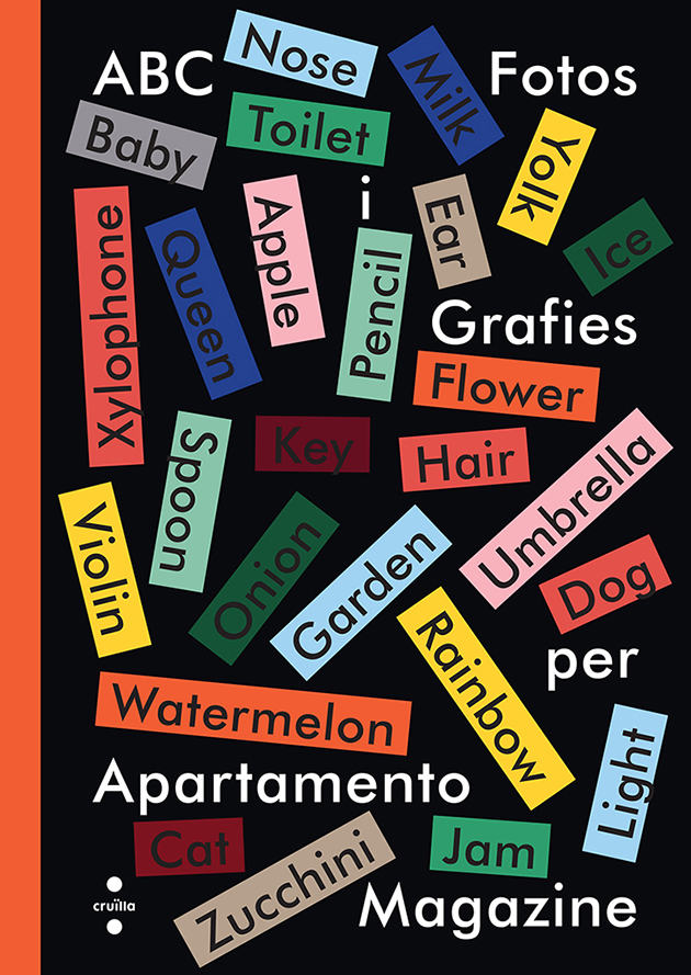
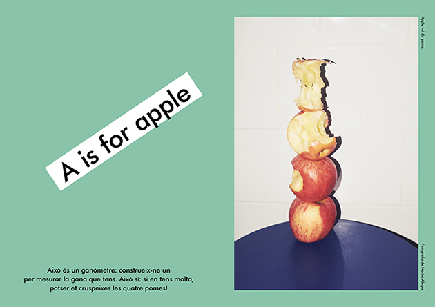
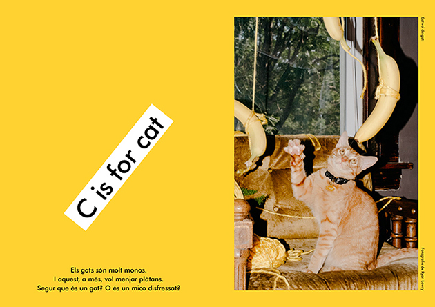
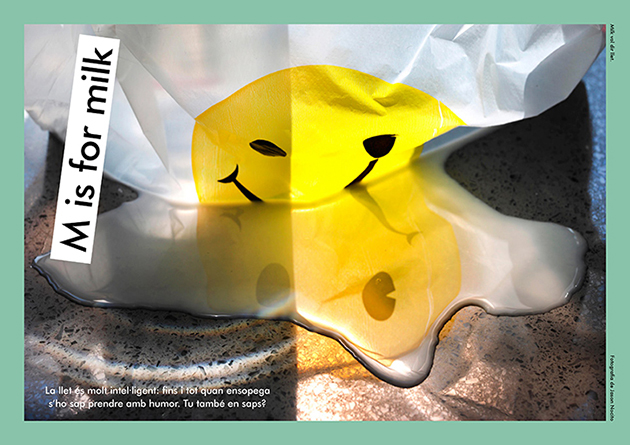
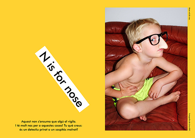
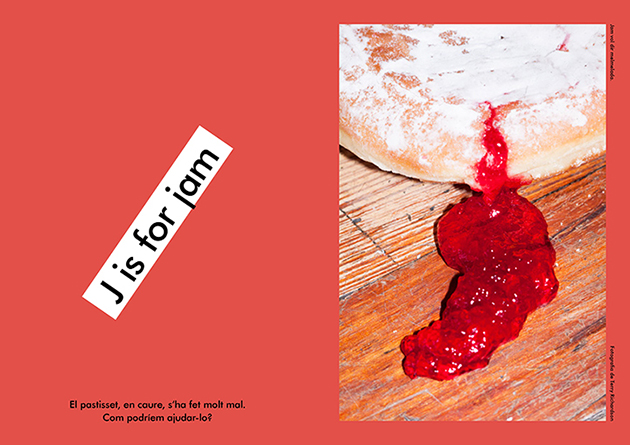
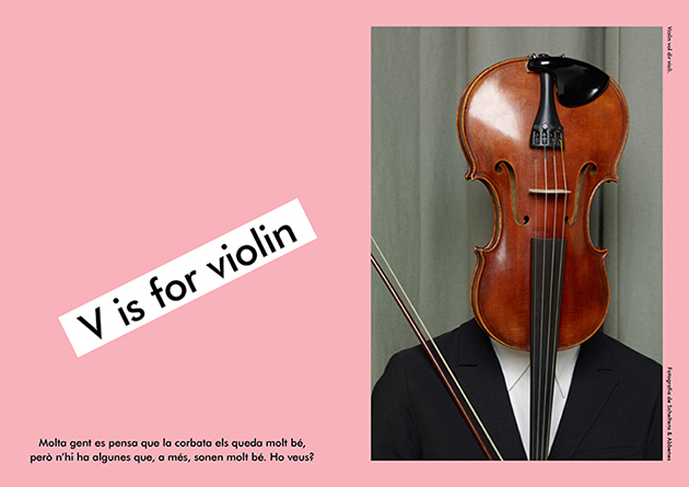
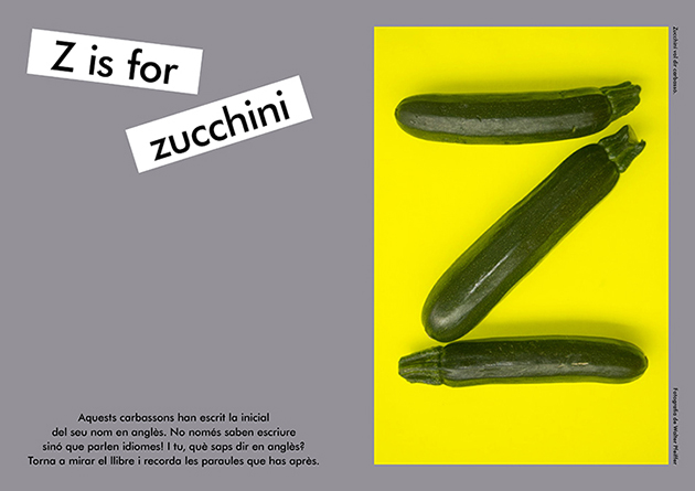
How can letters be transformed into words, words into ideas, concepts and thoughts? The latest publishing endeavour coming from Apartamento magazine transforms letters and words into images in a uniquely delightful children’s photo book. Gathered from the magazine’s rich roster of incredible photographic collaborations, the book brings together photographs from Juergen Teller, Wolfgang Tillmans or even Terry Richardson, as literal, yet curious, illustrations of its alphabet. From zucchini to milk, from cats to noses, the photographs are representative of the subtle visual language Apartamento became known for over the years. Apartamento’s co-founder Nacho Alegre explains, “We tried to find pictures that could, through some narrative, involve the kids in a story. The accompanying words ask questions about the images, like what’s behind them and what they make you dream of.”

The Blogazine – Images courtesy of Apartamento Magazine 
Share: Facebook,  Twitter  
27/10/2015

Daily Tips: Assemble’s Granby Workshop

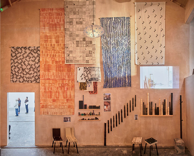
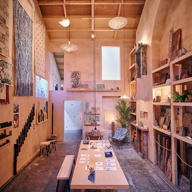
Can socially-oriented design still exist and what is its role in society today? A possible reply – albeit, weirdly balanced between art, architecture and design – comes from the British collective Assemble. Nominated for this year’s Turner Prize, for their architecture work with the community-led rebuilding of a Liverpool neighborhood following years of dereliction, Assemble have opened “Granby Workshop” – a social enterprise making handmade products connected to the refurbishment of the area. From clay handles to printed fabrics, the project has been set up by Assemble as part of their ongoing work, with proceeds raised going towards further redevelopment of the area.

The Blogazine 
Share: Facebook,  Twitter  
27/10/2015

Between Digital and Material: Ai Weiwei in London

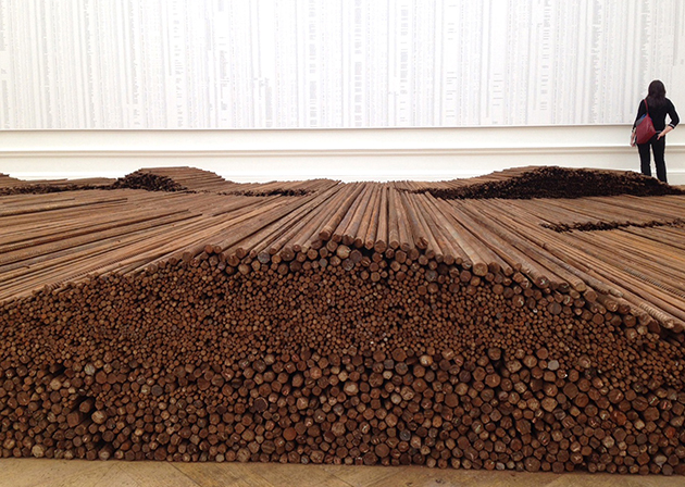
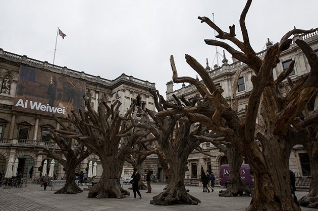
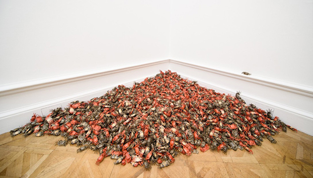
Taking into account the sheer size of installations filling the monumental rooms of the Royal Academy in London, it is quite difficult to comprehend how much of Ai Weiwei’s work actually relies on the immateriality of the digital world. And yet, this exhibition cannot but point to the Chinese artist’s dependence on the ‘online’ world – be it as a tool that allows him to maintain a relationship with the outside world in the moment of his reclusion, be it as the central subject of his monumental explorations. The first survey of Ai Weiwei’s work in the UK, the show maintains a dynamic balance between the physicality of the installation and the immaterial, yet closely interwoven, digital world.

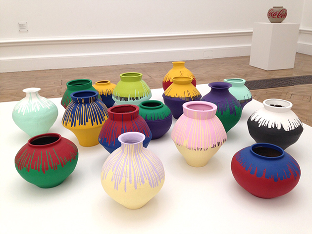
Working in a variety of different contexts, Ai Weiwei, in fact, transforms materials to convey his ideas, whether in wood, porcelain, marble or jade, testing the skills of the craftsmen working to his brief in the process. Sculptures such as Surveillance Camera, 2010 and Video Camera, 2010, both masterpieces in craftsmanship, monumentalise the technology used to monitor, simultaneously rendering it useless and absurd. For this exhibition, Ai Weiwei has created new work, including site specific sculptural installation of monumental Tree displayed in the Annenberg Courtyard, consisting of eight individual trees, each measuring around seven metres tall. The installation was funded through a Kickstarter crowdfunding campaign, where £123,577 was raised; the largest amount ever raised for a European art project on Kickstarter.

Citing Duchamp as ‘the most, if not the only, influential figure’ in his art practice, Ai continues to engage with creative tensions between complex art histories, conceiving works with multiple readings in the process – and often building tension between political powers in China. In fact, the opening of the exhibition marked Weiwei’s first trip outside the country in four years. Ai Weiwei’s show will remain on view until 13 December 2015 at Royal Academy in London.

The Blogazine – Images courtesy of the Royal Academy 
Share: Facebook,  Twitter  
26/10/2015

The World of Charles and Ray Eames

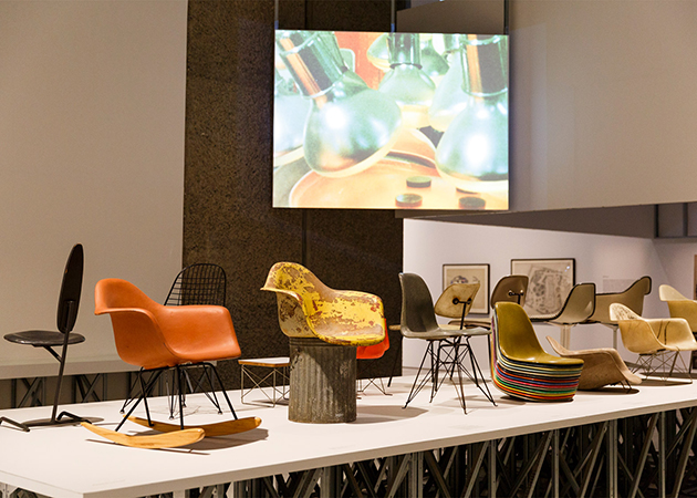
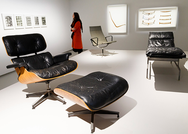
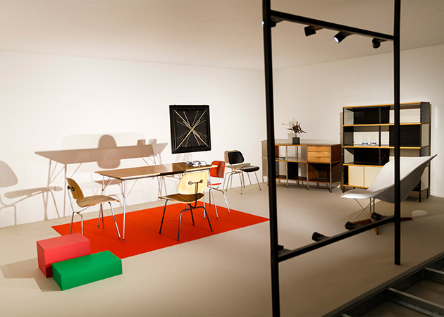
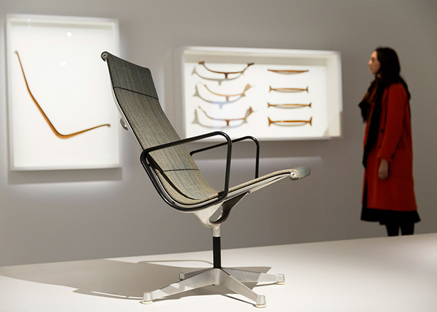
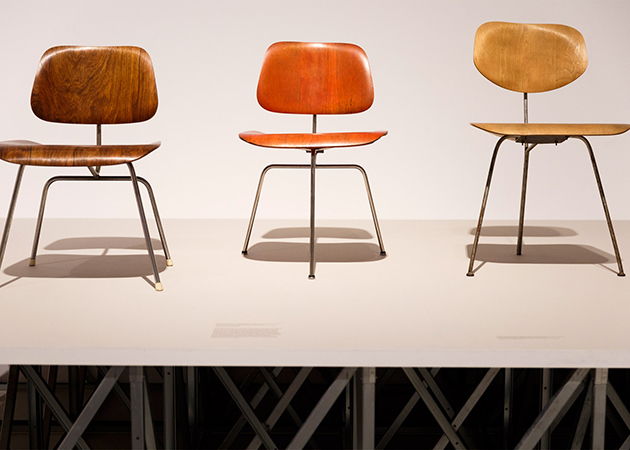
“For Charles and Ray Eames, design was not simply a professional skill, it was a life skill—more than that, it was an essential attribute of life itself.” Design as a way of life, a state of mind, a personal philosophy – from the opening words of Eames Demetrios, the director of the Eames Office to Martino Gamper, one of the most important contemporary designers – it seems that design, for both designers and the general public alike, can hardly be separated from life. It is through this lens that visitors to the recently opened exhibition “The World of Charles and Ray Eames”, are introduced to the legacy of, possibly, the most famous design couple. In fact, had it not been for their personal relationship, the exhibition points out, perhaps their world of timeless, essential, fundamental, designs would never had existed.

Held at the Barbican, itself the landmark of positive, utopian, modernist design thinking, the exhibition opens – perhaps a bit too uncritically – with Charles and Ray’s early experimentation with plywood – the material that is central to their careers. From wartime plywood leg splints – a modular, inexpensive, ergonomic, mass-produced object – to post-War focus on domesticity, with plywood chairs, tables, children’s toys and furniture, the exhibition traces the history of design from technological innovation to the comfort of the home – apparently, the ultimate design destination. Yet, while Charles and Ray started their career by designing products, the exhibition surveys the evolution of their work towards creating installations and exhibition designs that pre-date the multimedia environments of today. In fact, the story of the Eames Office is that of the trajectory of visual and material culture in the post-war period of the last century as Charles and Ray Eames moved fluidly between the mass-production of objects for everyday use and the transmission of ideas through exhibition, film or installation, in anticipation of the global ‘information age’.

From their modular house, “Case Study House #8”, to their sweet love letters, the exhibition focuses on showing how Charles and Ray moved seamlessly through formats, types of production, events, or even geographies, time and contexts – from their intimate life to the public sphere – by using the tools of design as a media for approaching life. Bringing together over 380 works, the exhibition presents the world of Charles and Ray Eames through objects and projects produced during their lifetime, offering an opportunity to re-examine their work and legacy, and the legacy of post-war modernism. It also features a wealth of documentation and contextual material from the professional archive of the Eames Office as well as artefacts from their personal collections, that highlight their relationship with the leading artistic figures of the 20th century – their immediate circle included Buckminster Fuller, Alexander Girard, Sister Corita Kent, George Nelson, Isamu Noguchi, Eero Saarinen, Saul Steinberg and Billy Wilder – and show the importance of these relationships to the Eameses’ life, philosophy and working processes. In fact, even their friendships cannot but reveal how the imperative of design in their everyday life. “The World of Charles and Ray Eames” runs until 14 February 2016 at the Barbican in London.

The Blogazine – Images courtesy of the Barbican 
Share: Facebook,  Twitter  
23/10/2015

Designing Modern Women: Krasimira Stoyneva

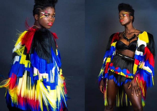
Even though Krasimira Stoyneva is a recently established label, the designer behind it is already prominent and features a signature style. Before founding her own brand in 2014, Stoyneva graduated with a First Class Honours degree from the University of East London and attracted further global attention by wining the High Commend Award by Diversity Now 2014 and the Vogue & Muse Young Vision Award 2014. Her debut collection Future Queens became an international success and it helped to set the tone for her design aesthetic.

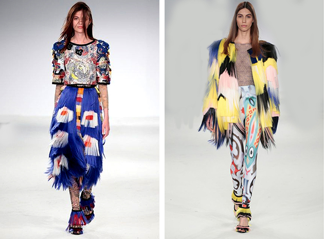
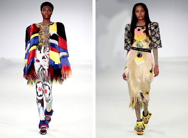
One of her many strengths as a designes is the fact that she pushes boundaries and discovers new, bold ways to create pieces. She reinvents new materials in an innovative and curious way, resulting in pieces that are both fresh and cool. The use of synthetic hair has, for example, become one of her trademarks, combined with bold prints and contemporary cuts. The movement plays a central role in her design and the point she tries to send accross is how such garments look when worn by women on the move. Her pieces aren’t for the shy, instead they are made for women who like to stand out among the crowd, women who aren’t afraid to stand up for themselves. The feeling they create is contemporary and liberating.

For the Spring/Summer 2016 season she held on to the original design philosophy, embracing it in a slightly more delicate and feminine way. Silk and its natural movement combined with the texture of hair and delicate embroidering embodies that theme and results in a collection that continues to feel confident, contemporary and most of all, uniquely ’Stoyneva’.

Hanna Cronsjö 
Share: Facebook,  Twitter  
22/10/2015

Designers on Screen

Movies are a very direct and immediate means to tell stories. In a society like ours, where the speed is one of the main features of everyday experience, movies are also used as means to document practices, fix moments and draw the attention of the public to particular issues. Many are the movies dedicated to fashion designers, whose cult seems to have reached its peak now, thanks to the aura of accessibility given by social media. Exploiting the communicative power of fashion, designers, in order to be effective on the market, put so much effort in producing images and build mythologies around their products, that they have ended up belonging to popular culture; and this not through the objects they produce, but through their personality.
When designers decide – or accept – to go on camera, they are putting forward their image, their name, themselves. Authenticity is surely one of the core issues that comes up while watching these kinds of movies; as Worth’s official photographies were designed in every detail – he choses to depict himself as a createur, appropriating of the symbols traditionally belonging to artists, rather than a clothes-maker – so designers today use the means they have to convey their message, and everything has to be camera-ready. Another issue indirectly brought up by these kind of movies is power or, better, powers: what is the story? who decides how to tell it? what is real and what is made up? what kind of public does the film address?
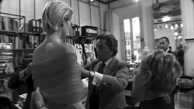
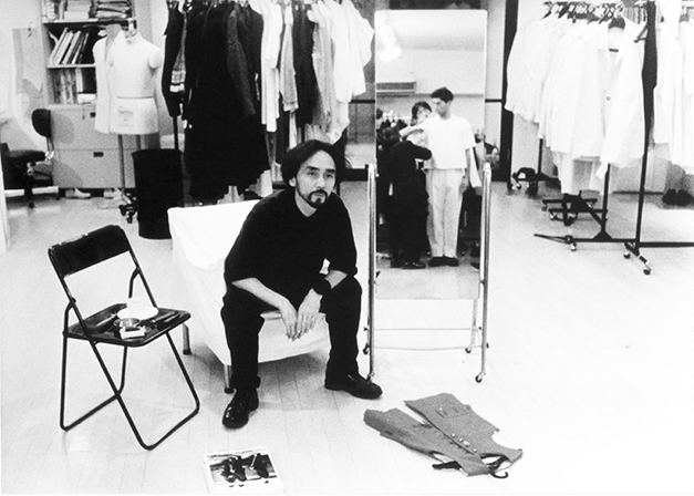
Movies as Giorgio Armani’s Made in Milan directed by Martin Scorsese, and Yohji Yamamoto’s Notebook on Cities and Clothes by Wim Wenders are not just documentaries, but carry the mark of the strong and recognisable hand of famous directors: in these two films the centres of power clearly emerging right from the beginning are two. That of a designer who wants to put himself under the limelight, and that of a well known director with a precise and personal project. Alternatively, Valentino’s ‘The Last Emperor’ is more ‘naive’ in its representation; it seems a straightforward documentation of the conclusion of a process, the last effort of the designer before his retirement. After an event as grand as his exhibition at Ara Pacis in Rome, it is not surprising that he choses a closing line so peremptory as ‘après moi, le deluge’: the end of an era, whose very last minutes are frozen in the film as they were lived, in their greatness and in their reality.
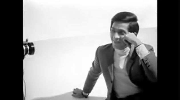
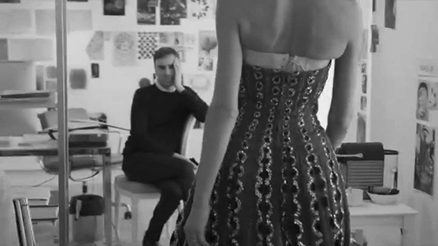
The most recent movie that has appeared is Dior and I, which documents quite the opposite of what Valentino did. It reports the very first experience of Raf Simons as designer of Maison Dior. It goes back and forth betweens Simons’ work on his first house couture collection and the thoughts of Christian Dior as written in his autobiography ‘Dior et Moi’. The film is complex above all in what it does not say: it was made after a tumultuous period for the French fashion house, that was in search of a voice that could bring the maison forward, re-establishing a link with its roots. Interestingly, the film doesn’t mention the Galliano scandal.
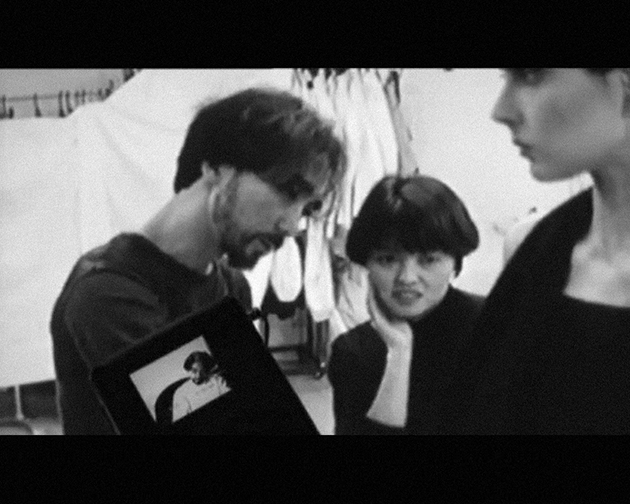
Even though they seem to enter a process in medias res and freeze a practice that is quite cyclical and repeats itself, with some natural variations, every six months, these films engage with milestones, rather than with the everyday; notwithstanding this, the repetitive patterns are the one on which directors and designers rely to convey authenticity, also in its historicised symbols: the toile, the patterns, the whole atelier as narrative topos. The matter does not end up here, though. These poles of power are just the most accessible and immediate – the designer, the director, the ‘moment’ captured by the camera. And authenticity is not something that can be measured by simply sticking with definitions – movie, reportage, documentary. Since the stories are based in real life, there are many other actors, both on and off the screen, and many implications that contribute to the narrative; there is no key to the ‘right’ reading of these films. It is up to the public to chose how to engage with them. What is sure is that they can be considered as a material to critically engage with design, and complicate the reading of relationships, society and culture.

Marta Franceschini 
Share: Facebook,  Twitter  
21/10/2015

Alec Soth: Gathered Leaves at Science Museum

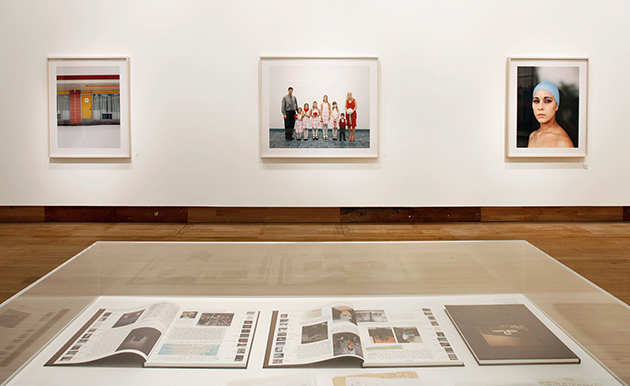
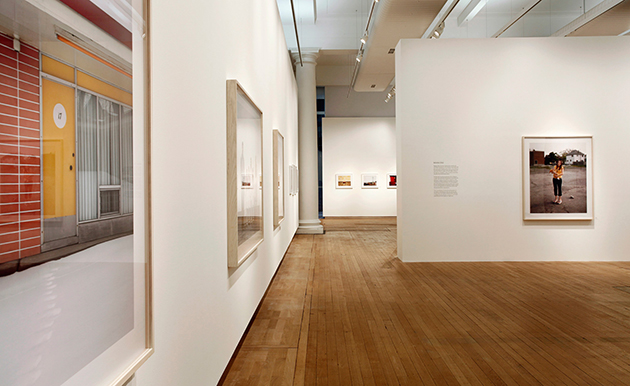
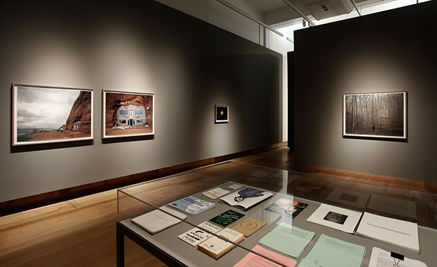
“One of the joys of being a photographer is the ability to present my work both in the pages of a book and on the walls of a gallery,” said Alec Soth in the occasion of his first major UK exhibition. “Gather Leaves: Photographs by Alec Soth” opened at London’s Science Museum to rooms filled with Soth’s signature projects Sleeping by the Mississippi, Songbook, Niagara and Broken Manual, which explore American everyday life. Alec Soth’s work is characterised by a lyrical approach to documentary photography and a restless experimentation across the many forms that photography can take: from exhibitions and books, to zines and digital media. Soth, who lives and works in Minnesota, also shares the great American fascination with the open road in his projects, bringing a fresh perspective to ideas explored in the twentieth century by artists and writers such as Robert Frank, Stephen Shore and Jack Kerouac.

In Songbook, one of four exhibited projects, Soth elucidates modern American life in stunning and timeless black and white. The project emerged from a series of road trips he embarked on with his friend, the writer Brad Zellar. Posing as local newspaper reporters, over the course of two years they crossed seven states and attended hundreds of meetings, dances, festivals, and communal gatherings. The resulting stories were published by Soth’s own imprint, Little Brown Mushroom, as an ad hoc series of ‘dispatches’ from the different states visited. In the series, Soth isolates his photographs from their original news context, and in doing so, evokes a human desire for interaction in an era increasingly defined by virtual social networks. Funny, fragmentary and sad, Songbook is a lyrical meditation on the tension between American individualism and the urge to be united.

Kate Bush, Head of Photography at the Science Museum, perfectly described Alec Soth: “His work belongs within the canon of great American photography of the past century. He’s an acute observer of contemporary life, always alert to the poetic possibilities of individual triumph and tragedy. He’s an artist who captures a profound sense of what it is to be human, in all its surprising dimensions.”

The Blogazine – Images courtesy of Science Museum 
Share: Facebook,  Twitter