12/08/2015

Sink or Swim: A Wardrobe Addition

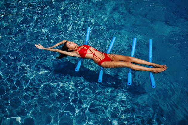
Even though most of the Summer has already passed, there are still a couple of weeks of sun left. For those of you who still have to head for your yearly sunny holidays, it is necessary to evaluate what are the best beachy looks. For this season, the top trends for swimwear have been influenced by a bohemian 1970s flair like a one-piece in a halterneck style, which create a silhouette that makes it easier to cross-over a beach day to night look, as another trend developed to utilize these often underused garments to their full potential. Another big trend are, of course, the sporty influences that seem to go hand in hand with the fitness trend, still alive and raging.
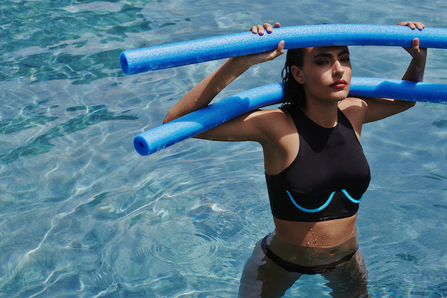
Overall, the Summer of 2015 has proven that swimwear can be looked at as an underestimated piece of clothing. In an era when the body, crop top and underwear as outerwear trends have been made almost basic in women’s wardrobe, to include swimwear as part of that and take it beyond the beach and waves, seems a natural progression.
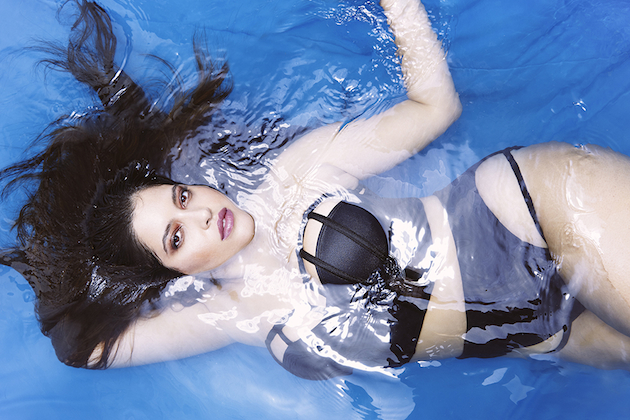
As an example of this approach to swimwear design, the design label Chromat could not but be discussed. Chromat is a collection of swimwear, lingerie and clothing of an architectural type, with designer Becca McCharen calling her creations “structural experiments for the human body.” Visually she has become famous for fashioning cages for the body that stand away from the arches of the hips and shoulders almost as a framework of the human form. She has gained the attention and designed for celebrities such as Beyoncé and Madonna, accentuating in both form and prestige the significance of her garments, while adding to the debate of the future of fashion and the expansion of the basic wardrobe. For McCharen our bodies can be viewed as a latent collection of data; design and technology are therefore naturally linked. Chromat’s latest collection is a perfect example of the brand’s signature style of graphic silhouettes fused with sporty architectural influences. With straps of fabric and pops of color, the collection highlights the human body in whatever shape or form.

Victoria Edman 
Share: Facebook,  Twitter  
11/08/2015

Daily Tips: Art and Design take over Somerset

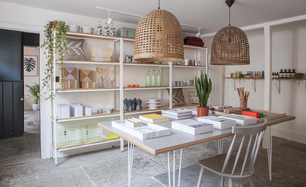
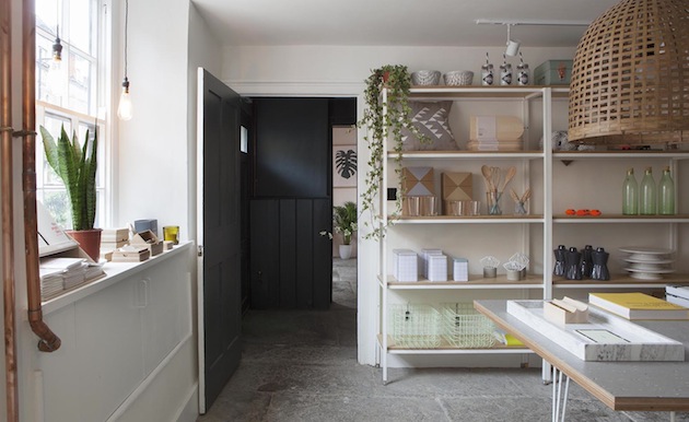
The UK is certainly not known for great weather. Nevertheless, if you should find yourself in Somerset this Summer, a new design delight awaits. Caro,a lifestyle shop offering objects for life and home sourced from around the globe, has recently opened an outpost in Bruton, Somerset. A growing hub for art and design, Bruton can already count the international gallery Hauser&Worth as one of its attractions. Like international art dealers, Caro’s founders have also fallen in love with Somerset and “wanted to make a new home that shared the objects and moments we all covet in life”. Therefore, if you’re on the look for that perfect design piece, or just look for a nice weekend outing, head to Bruton for a design delight.

The Blogazine 
Share: Facebook,  Twitter  
10/08/2015

Collage: A Graphic Tale at Villa Noailles

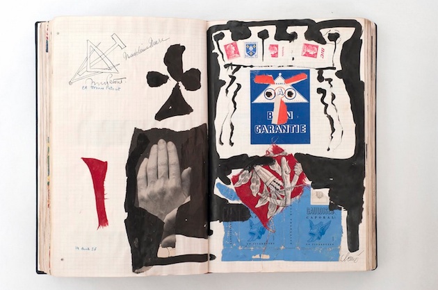
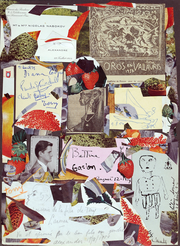
For more than a century, Villa Noailles in the south of France has served as the centre of artistic fervor, first as the residence of Charles and Marie-Laure de Noailles, art patrons who dedicated their life to the promotion of modern art, and now, for the last 20 years, as the site of two internationally renowned festivals focused on contemporary design, photography and fashion. For this year’s “Design Parade” a special focus was given to Marie-Laure de Noailles with the exhibition “Collage” that brings together her personal scrapbooks along with collages by Étienne de Beaumont, Georges Hugnet, Antoni Clavé, and Max Ernst.

Twenty-four scrapbooks, filled over almost fifty years by Marie-Laure de Noailles with images, photographs, letters, drawings, postcards, reveal the existence of an intellectual, artistic, elite and sociable multiplicity. Carefully dated, the pages illustrate the activities of each day, week, month. The initial albums, started in 1928, consist above all of photographs and a few articles, carefully positioned and glued; the layout is simple and spacious. Very quickly, the scrapbooks took on a specific form. Patrons of surrealists and friends of Max Ernst, whose works they collected especially the collection of collages from his work The Hundred Headless Woman, the Noailles seemed particularly interested by this form of art. Probably influenced by this same spirit, Marie-Laure de Noailles started to arrange her albums differently. Thus, in a skilfully organised disorder, are arranged several staves by Auric and Rorem, a note from Jacques Lacan, a drawing by Balthus, a photograph by Man Ray, a concert programme, and articles cut-out from local newspapers on a meeting of boules players or the impending arrival of extraterrestrials.

The couple did not hesitate in hanging alongside each other and against any rules of the time, works which in principle had nothing in common — a Goya alongside a Dalí. Indeed, within the scrapbooks, these overloaded pages, where images, texts, paintings, articles, drawings, and advertisements overlap, follow this same iconoclastic process. Similarly, it is an elaboration which allows us to catch a glimpse of this taste for the eclectic, the vitality of their perspective, and the formal intelligence of these extraordinary patrons. Hence, it is a journal and a unique testimony. Perhaps, also an art work — a “work in progress” over a period of fifty years.

The Blogazine 
Share: Facebook,  Twitter  
07/08/2015

‏Julia Seemann – From Vivienne Westwood to Making it on Her Own

‏The Swiss fashion designer Julia Seemann is only 24 years old but has already come a long way on her fashion journey. After graduating from the Institute of Fashion Design at the Academy Of Art and Design in Basel in 2014 and working for Vivienne Westwood and Meadham Kirchhoff in London, she has now founded her own label. Based in Zurich‪,‬ Seemann’s brand has now expanded internationally and received attention outside the Swiss boders.

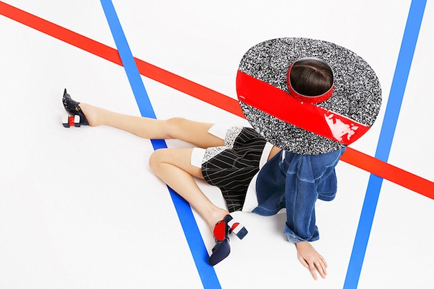
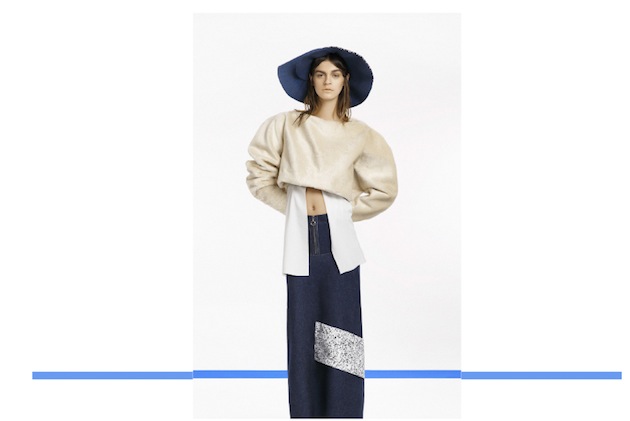
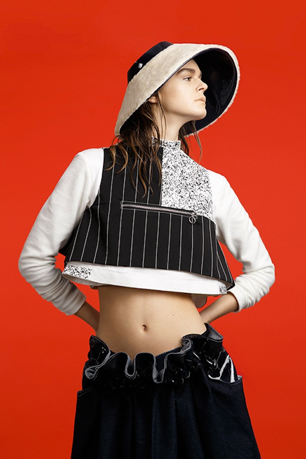
‏Her aesthetic vision is built around the thought of combining reduced geometric forms with plain or rough fabrics and materials that create a feminine and elegant look but with an edgy twist. In other words, Seemann’s style can best be described as cool, with its sculptural pieces, eye-catching, confident and personal – cool clothes for the cool girl. It feels like a breath fresh air and her architectural approach is bringing something new to the table. With her latest collection ”Another Composition” she is continuing to push her limits by translating the traditional and regular working wear and giving it a modern update by adding strong, primary colours. The result is a collection that mixes references and styles, but still succeeds in feeling coherent. She is true to her vision, and we can’t wait to see how she will translate it in her next collection.

Hanna Cronsjö – Images courtesy of Julia Seemann 
Share: Facebook,  Twitter  
06/08/2015

Daily Tips: Saint Laurent at the Bowes Museum

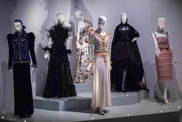
“Fashion fades, style is eternal” – just like his famous quote about style, the work of Yves Saint Laurent is eternal, as well, judging by the sheer amount of exhibitions devoted each year to the grand master of fashion. This time, his magnificent work takes centre stage at the iconic Bowes Museum in the UK, in an exhibition titled Yves Saint Laurent: Style is Eternal. Developed in collaboration with the Fondation Pierre Bergé – Yves Saint Laurent, it is the first exhibition in the UK to present a comprehensive display of the French fashion designer’s work and life. The YSL show highlights the defining elements of his vision, and the significant influence it has had on fashion and the way we understand womenswear. The exhibition highlights the diverse influences of Yves Saint Laurent and explores a number of themes, from art, lace and transparency, and Masculine – Feminine as well as featuring the different eras and styles of his creative career. Yves Saint Laurent: Style is Eternal will remain on show until 25 October 2015.

The Blogazine 
Share: Facebook,  Twitter  
05/08/2015

Ryan Roche – It’s All in the Knits

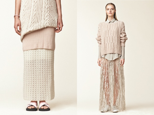
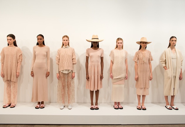
Sustainable fashions are gaining momentum and awareness is being made across borders and seasons. Still, there are challenges within the field – an observation that womenswear designer Ryan Roche has faced and dealt with. Ryan Roche is mostly known for knitwear and other stunning basics that add something to the closet, primarily in blush and nude color palette.

Following high school, Roche started studying tailoring and couture sewing for two years before she majored in fashion design at San Francisco’s Academy of Art. In 2004 Ryan Roche created her children’s brand Mor Mor Rita that quickly caught the eye of the industry. She focused on creating a responsibly manufactured collection, and was soon asked to create adult versions of her children’s looks by clients such as Milla Jovovich, finally presenting her first womenswear collection in 2011. Today – with collections sold worldwide – she can pride herself in being 2014 CFDA/Vogue Fashion Fund runner up, receiving a nomination for the 2015 CFDA Swarovski Womenswear and being named “the new queen of knitwear”.

By combining sustainable clothing that speaks about the ethics of making and high quality production, Roche paints herself as an intriguing character within the fashion world. Her signature “blush” shade is, for example, attained by using avocado skins and pits, while her cashmere knits are crafted in a small women’s cooperative in Nepal, with other pieces of the collection produced in New York. Ryan Roche’s self-named label isn’t interested in changing beliefs to fit a traditional fashion market – instead, she goes her own way and takes fashion on her own terms – one knit at a time, it seems.

Victoria Edman 
Share: Facebook,  Twitter  
04/08/2015

Daily Tips: Project Ocean

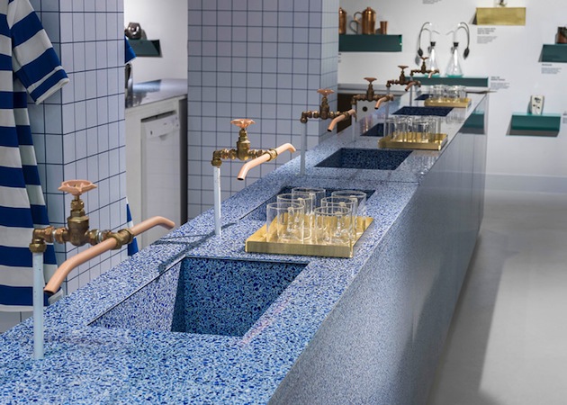
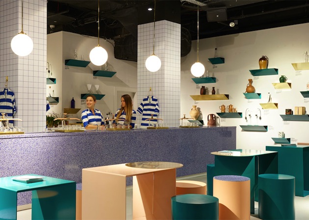
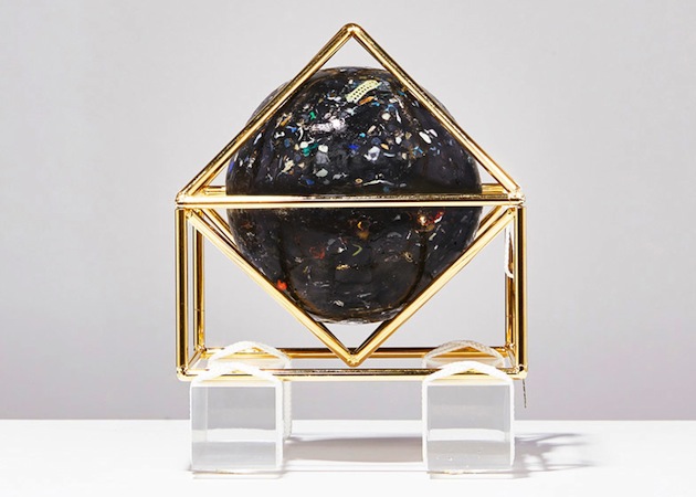
How can big brands help the environment? Since the 1990s the cultural establishment has, on one hand, worked on condemning the big brands, while, on the other, it has uncritically worked in their service. Luckily, things have changed, and colossal brands are now – albeit rarely – working on raising the level of awareness with respect to environmental responsibility. One of such initiatives is Selfridges’ “Project Ocean”, which recently featured a design exhibition and a water bar. Curated by Jane Withers in the Ultralounge at Selfridges London, the exhibition brings together works by designers and artists, including Studio Swine, Andrew Friend, Nick Wood and Alice Dunseath, which shed light on the problem of plastic in the sea. At The Water Bar, Arabeschi di Latte reconsiders the everyday ritual of water drinking, inviting us to imagine life without the plastic water bottle. Together these experiences and exhibits aim to show how, through reconsidering how we use and abuse plastic, we can all be part of the sea change.

The Blogazine 
Share: Facebook,  Twitter  
03/08/2015

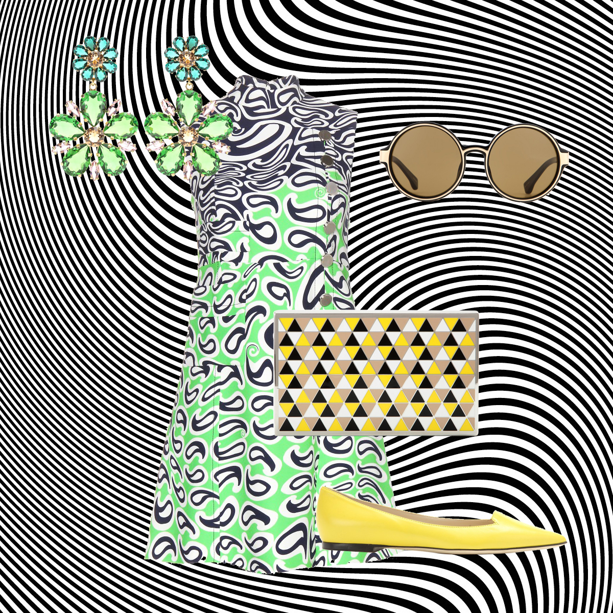
Style Suggestions: Psychedelic

Dust off the Jimmy Hendrix albums and take out the mini skirts because the 60′s are back. If you still have some vintage pieces or looking to buy something new psychedelic prints are a fun element to boost your wardrobe.

Dress: Miu Miu, Shoes: Jimmy Choo, Clutch: Victoria Beckham, Sunglasses: Dries Van Noten, Earrings: Dolce&Gabbana

Styling by Vanessa Cocchiaro 

Share: Facebook,  Twitter  
03/08/2015

Everything is Architecture: Bau Magazine at the ICA

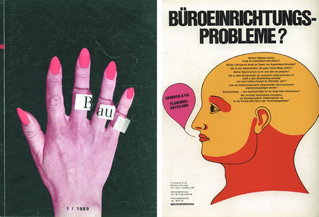
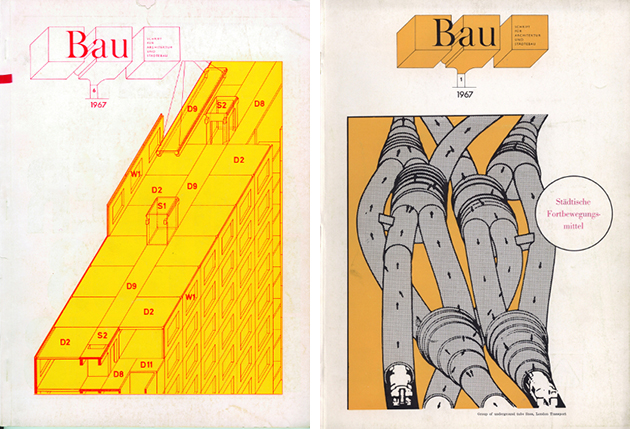
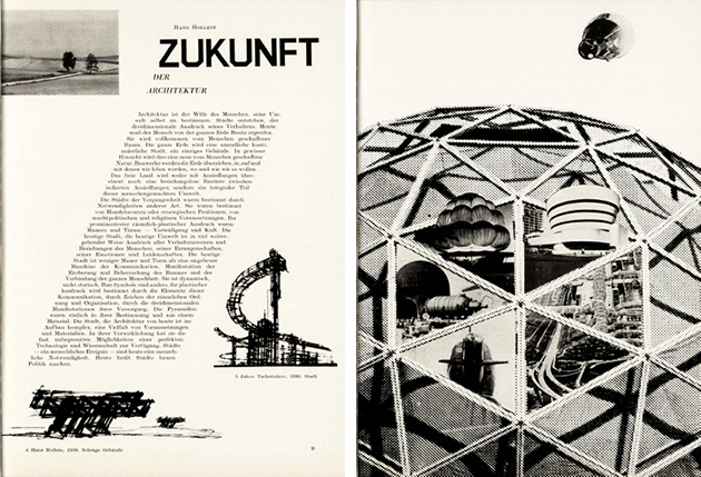
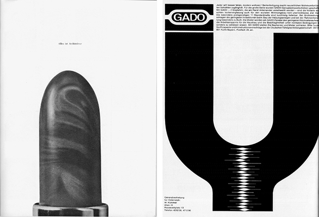
In 1968, Hans Hollein, the influential architect and winner of 1985 Pritzker Prize for architecture, declared that “everything is architecture.” His words were published on the pages of Bau Magazine, a short-lived architectural publication published by the Central Association of Austrian Architects, which has since remained a hallmark of radical approaches to architecture and its criticism. Thus, when Hollein compared architecture to lipstick, a portrait of Che Guevara or an astronaut suit, he was expressing a wider concern for reframing architectural practice and discourse outside of the narrow limits imposed by Modernist formalism.

Hollein was a member of group of influential architects and artists, among whom Walter Pichler, Günther Feuerstein, Sokratis Dimitriou, and Oswald Oberhuber, who took over Bau Magazine between 1960 and 1970. During this time, Bau became a platform for new, experimental ideas in architecture that embraced political, artistic and social concerns, engaging with them both through philosophical texts as well as its vibrant, iconic imagery. The critical, fundamental influence of Bau Magazine is now explored in an exhibition staged at the ICA in London.

Running through 27 September 2015, the exhibition, compact in size yet dense in content, juxtaposes issues of Bau Magazine with contemporary publications emerging at the time in the UK, Italy or Japan. Compared to other experimental publications of the time, Bau demarcated itself through its size which was closer to that of a glossy fashion magazine as well as its creative use of advertising – elements that were carefully used to show that architecture, indeed, is everything.

The Blogazine – Image courtesy of the ICA 
Share: Facebook,  Twitter