09/06/2015

Yoko Ono at the MoMA

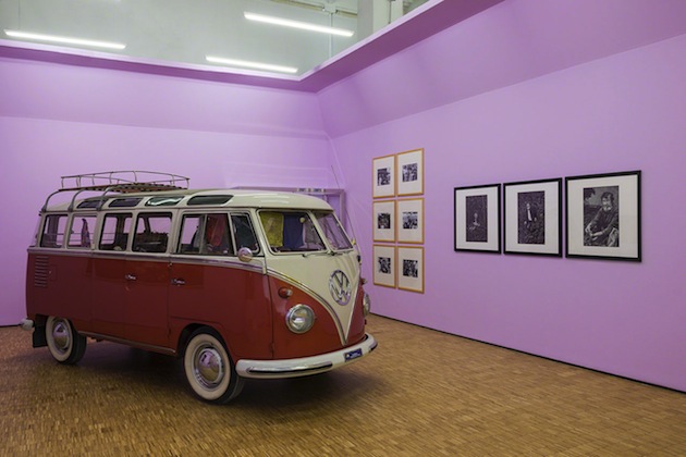
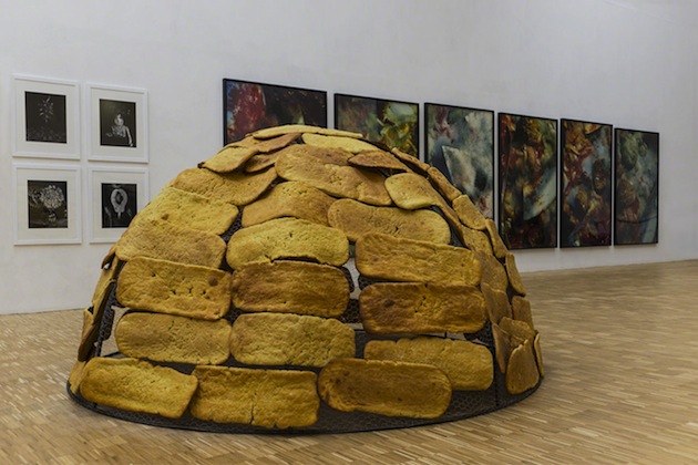
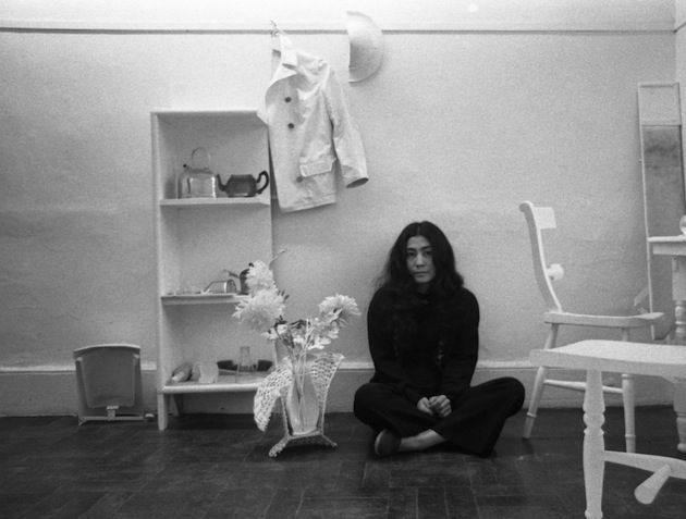
In late 1971, Yoko Ono announced an exhibition at the Museum of Modern Art — a one-woman show titled Museum Of Modern (F)art. When visitors arrived at the museum, however, there was little evidence of her work. Outside the entrance, a man wore a sandwich board stating that Ono had released a multitude of flies and that the public was invited to follow their flight within the museum and across the city. Now, over 40 years later, Yoko Ono: One Woman Show, 1960–1971 surveys the decisive decade that led up to that unauthorized exhibition at MoMA, bringing together approximately 125 of her early objects, works on paper, installations, performances, audio recordings, and films, alongside rarely seen archival materials.
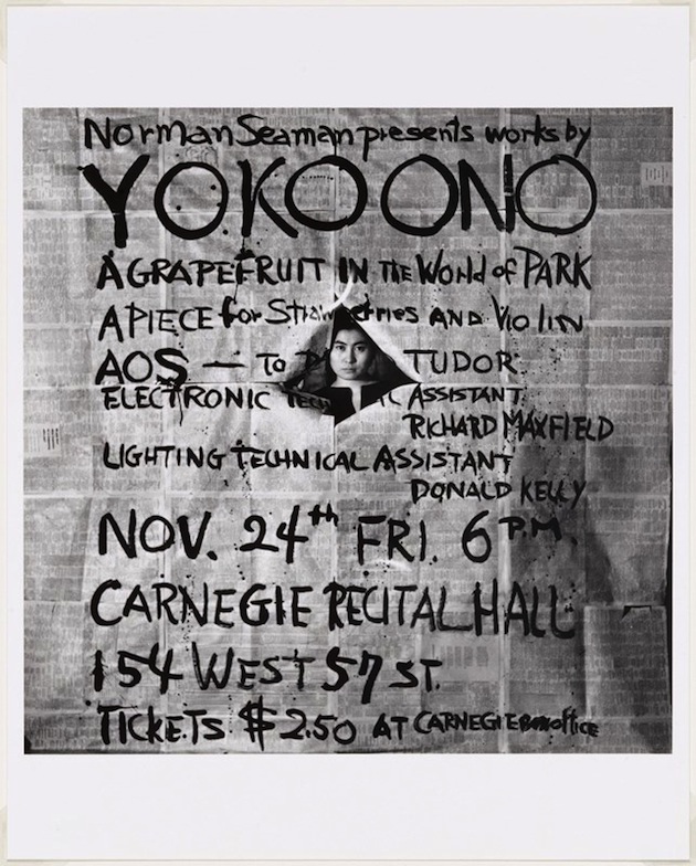
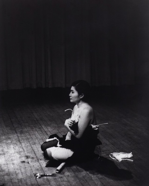
The exhibitions is organized chronologically, with thematic currents, providing multiple ways for visitors to navigate the exhibition. It brings together works that invite interaction, including Painting to Be Stepped On (1960/61), and Ono’s groundbreaking performance Bag Piece (1964), together with her earliest works, which were often based on instructions that Ono communicated to viewers in verbal or written form. At times poetic, humorous, unsettling, and idealistic, Ono’s text-based works anticipated the objects that she presented throughout the decade, including Grapefruit (1964), her influential book of instructions; Apple (1966), a solitary piece of fruit placed on a Plexiglas pedestal; and Half-A-Room (1967), an installation of bisected domestic objects. The exhibition also explores Ono’s seminal performances and films, including Cut Piece (1964) and Film No. 4 (1966/67). At the end of the decade, Ono’s collaborations with John Lennon, including Bed-In (1969) and the WAR IS OVER! if you want it (1969–) campaign, boldly communicated her commitment to promoting world peace.
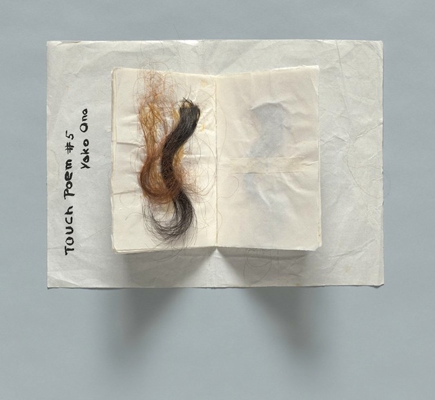
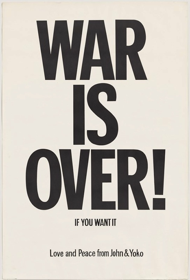
“Yoko Ono: One Woman Show, 1960–1971″ is curated by Christophe Cherix and Klaus Biesenback and will run until 7 September 2015.

The Blogazine – Images courtesy of the MoMA 
Share: Facebook,  Twitter  
08/06/2015

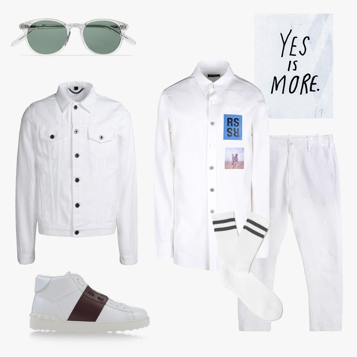
Style Suggestions: White on White

Menswear can get tedious, so take a chance and try something new. The all-white look has moved from the runway to the street: its your chance to have some fun.

Jacket: Burberry Prorsum, Trousers: Ann Demeulemeester, Shirt: Raf Simons, Shoes: Valentino, Sunglasses: Our Legacy, Socks: Beams Plus

Styling by Vanessa Cocchiaro 

Share: Facebook,  Twitter  
08/06/2015

Matali Crasset: We Trust in Wood

Any discussion about design inevitably starts from the final product: the material qualities of a chair, a table, a lamp, a book, a poster, are thoroughly scrutinized in search of traces that, by revealing how such an object was made, might also tell a story about why it was made – transcending the apparently simple and direct purpose of the object itself and giving shape to a wider story about our world. Nevertheless, some projects are able to reveal this wider purpose by their very design – calling to our attention not so much the subtle curves and minute details, but the process that brought them to light.

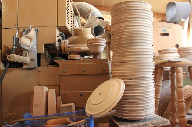
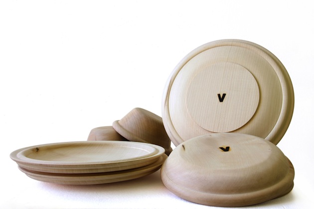
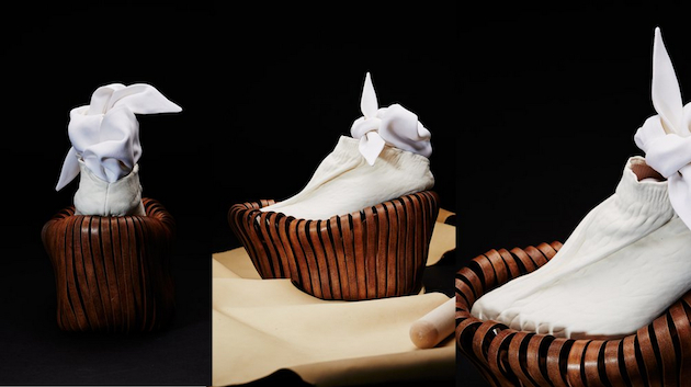
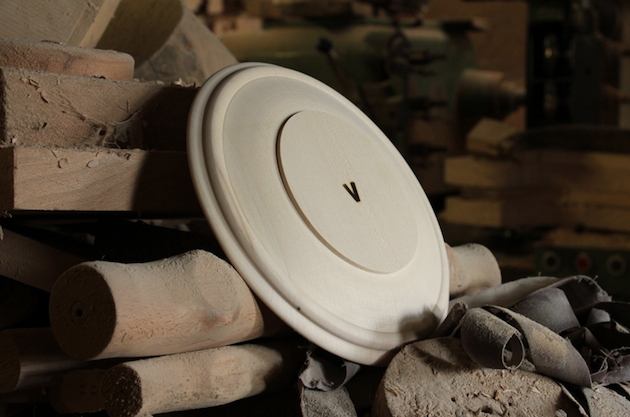
Matali Crasset’s latest endeavour is one such project – designed not so much as a series of objects to be looked at (or, perhaps, even used), but as a media to read into relationships that design can build, systems that it can create in the context of a ‘wider world’. Crasset, whose designs often hint at community engagement and social responsibility, proposes a project that is valuable only as a means of accessing and participating in the network of relationships it builds. “We Trust in Wood” is an exploration of design as a medium of engaging with a community, in this case, local artisans from the Meuse region in the north-east of France. Developed in collaboration with Vent des Forêts, a local organisation of six villages that builds relationships with designers and artists to help develop the identity of the area, “We Trust in Wood” is a series of simple wooden plates and bowls in three different sizes crafted by a local artisan. The design of the objects themselves – if subjected to a quasi-archeological analysis – reveals precisely the intention to focus on the economy of their production.

An archetypical form, the plate is characterised by wide, thick borders and simple curves – almost forgoing any formal distinction or virtuosity, submitting their aesthetic dimension to the needs of the handicraft production. As Crasset put it, “You don’t fight wood. Even when you do something simple like turning it, you have to understand it because the material is irregular. You gain control by understanding how the block is structured. It’s a lot about feeling.”, and the final product – with its subtle irregularities and unique details – reveals precisely the grace of touch of the artisan who made it. “We Trust in Wood”, thus, serves as a textbook example of what design can do – how its three-dimensional form engages with realities that are well beyond its direct materiality. For the designer, “We Trust in Wood” is about shaping a network, from the design, to production, distribution and use. For the artisan, it is about crafting his identity, together with that of his territory. And for the users, it is all about getting a little bit closer to understanding what design could be.

Rujana Rebernjak  
Share: Facebook,  Twitter  
05/06/2015

Graduate Shows 2015: Royal College of Art

Spring means graduation, and this week the MA graduates of the Royal College of Art showcased their collections and vision to the world. It was an unconventional runway, market both by the presentation and stylistic choices. Instead of the usual linear runway the models walked dynamically, choreographed to display the different collections, with an attitude that brought about a laid-back atmosphere while elevating the designs within their context.

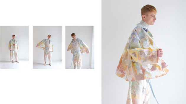
Deconstruction, minimalistic, geometry and knitwear. These are some of the keywords that came to mind when viewing the fashion show of the Royal College of Art. There was also a glimpse of futurism within the show, constructed in a way that it simply felt as a continuation the 1990s minimalistic trend with just addition of unexpected elements, such as volume. The color palette was in general muted and very somber with shades of white, grey, black and beige. However, there were a few pops of color used to make interesting silhouettes stand out, in indigo and bright red, or a skintight blue jumpsuit with accompanying skin tight restricted red long dress, definitely served as food for thought. That ‘plastic is fantastic’ also seemed to be embraced by RCA graduates, with coats and other stand-alone pieces making a mark. Constructed menswear pieces in plastic were presented as an interesting update of urbanity and a new take on the PVC trend from the early 2000s. Jackets and coats had been painted with an abstract pattern on top of the plastic surface making the heads turn twice.

The RCA fashion show displayed an interesting take on the future of fashion favoring deconstruction, geometry and knitwear but also putting forward ideas on how to evolve trends such a minimalistic tendencies, sport influences as well as incorporating technology such as 3D printing and digital projection. The graduates are a bridge into tomorrow’s trend cycle and Wednesday’s fashion show of Royal College of Art marked an exciting new beginning for this raw fashion talent.

Victoria Edman 
Share: Facebook,  Twitter  
05/06/2015

Designers’ Autobiographies: Life in Practice, Design in Words

In design practice, stories are told through objects. Design is a practice that allows us to tell stories by making things, constructing a discourse around a project which is both the most material and volatile way of narrating ideas. In many cases, the story told by objects goes hand in hand with the life story of the person who created the objects themselves. For a designer, it is quite impossible to separate work from life – they are intertwined and influence each other, and designers end up considering every action or aspect of their lives as part of a project, making the ‘I am what I do’ quote incredibly true.

Since the rise of couture at the end of XIX Century, the culture of fashion has exalted the personality of the designer presenting him or her as a createur: a sort of oracle catching social and cultural zeitgeist, able to translate it in shapes, lines, fabrics, often celebrated as a member of the jet set. The identity of the designer was since then strengthened, and now it is barely possible to separate the public persona (which is also the professional one) and the actual person. The construction of the ‘myth’ of designer was enriched by the publication of autobiographies written – or approved – by designers themselves. Design has to do with choices, and autobiographies stand as examples of the selectiveness of designers. For instance, Christian Dior, in his ‘Christian Dior et Moi’, talks about two people with the same name, the person and the couturier, declaring in the preface that only the second will be protagonist of the story; but, concentrating on the life in the atelier and avoiding his private life, he inevitably gave us elements to understand his personality and his commitment to his work.

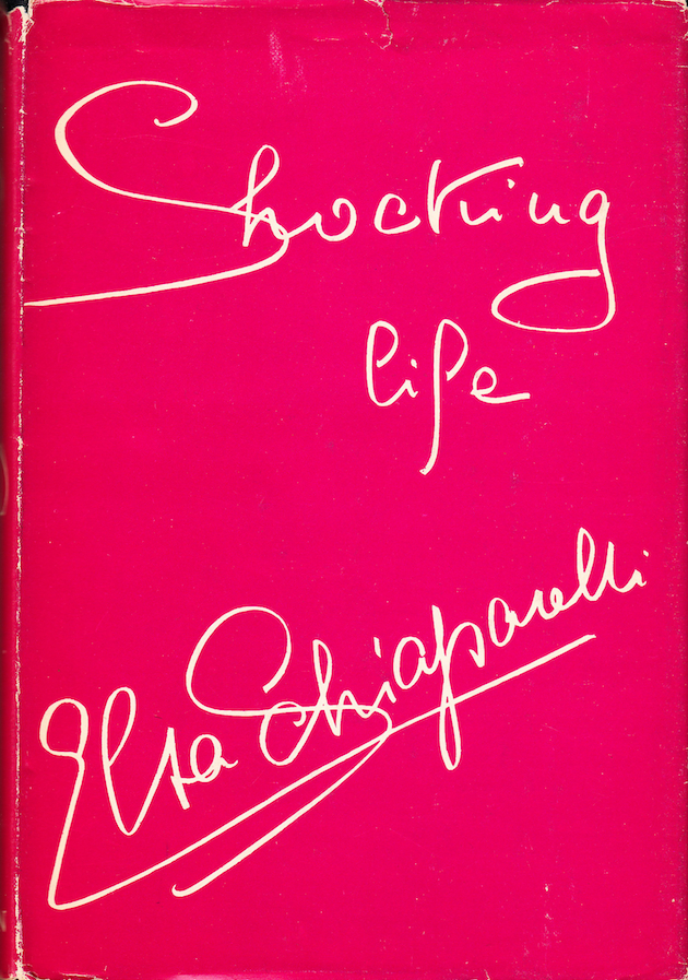
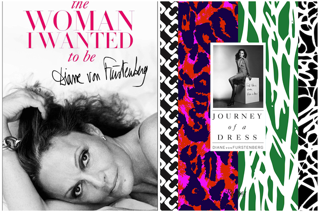
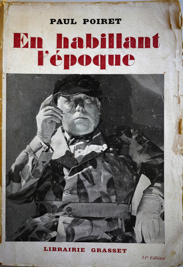
The most interesting issue with autobiographies is the way in which designers deal with their identity. If Christian Dior doubles himself separating his two identities, Elsa Schiaparelli mixes her two personalities changing the tone and the protagonist – sometimes Elsa, sometimes Schiap, in her ‘Shocking Life’. Diane Von Furstenberg, in her ‘The woman I wanted to be’, switches easily from personal to professional life, without apparent continuity, but highlighting in this way the fluency between the two; Paul Poiret, in his ‘En habillant l’époque’ (dressing the century), presents himself as an artist, and guides the audience through his vision of the world, as seen from his privileged point of view. Rhetoric is of course one of the tools widely used in these narrations – but even looking inside the techniques and linguistic expedients is interesting, if we are to understand the designer and, consequently, the person.

As everything else in the life of a designer, autobiographies are themselves a project; thus they are designed in order to give shape to the idea of life designers wanted to achieve – and, in most cases, actually achieved. Words are chosen carefully, and just what has to be shown is written, but they give the chance to insiders and amateurs to read between the lines, and get information not only about a personality, but about a whole historical period, told by someone who was shaping it from the inside. If seams and cuts are not a common language and cannot ‘speak’ clearly about the wit behind them, autobiographies are a strong statement of the intentions and desires of designers, and can be used to analyse a person, a fashion and a whole epoch; but, above all, they tell useful and beautiful stories that would otherwise be submerged and hidden in the pleats of history.

Marta Franceschini 
Share: Facebook,  Twitter  
04/06/2015

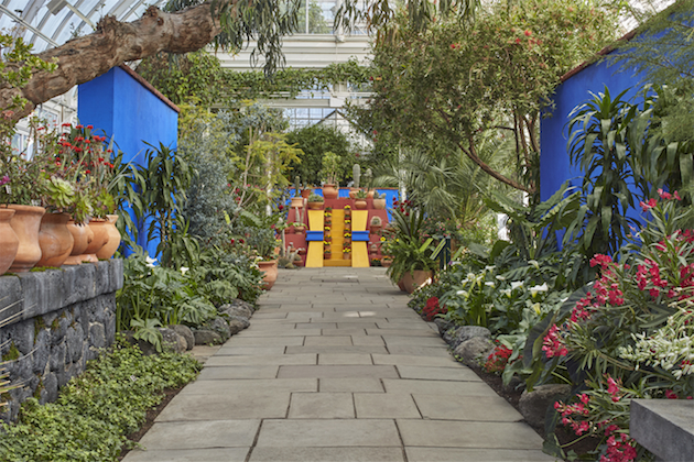
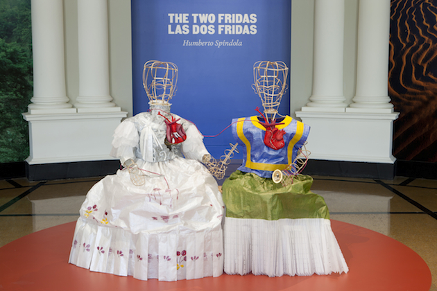
Frida Kahlo: Art, Garden, Life

The Mexican painter Frida Kahlo was adored by the fashionable crowd simply for being herself and, therefore, unconventional. Her vibrant look of irregular stacked heels, long skirts and an iconic uni-brow was often elevated through her relationship with the nature. Kahlo would pick flowers from her own garden and wear them in her hair. The combination of all these elements amounted to a fashionable yet relaxed style of the painter, which made her a fashion icon. Looking at Frida Kahlo, we can understand the power of fashion to portray our surroundings as much as our personality. And taking a walk through Frida Kahlo’s garden – recently staged in New York – is almost like taking a peek inside her eclectic closet.

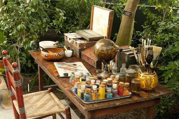
The exhibit “Frida Kahlo: Art, Garden, Life” at the Botanical Garden in New York is made up of two sections. The first one is a re-creation of Kahlo and Diego Rivera’s garden at Casa Azul; an installation made possible from photographs, paintings, and firsthand accounts. What to expect in the garden as you pass through it, is the Mexican flora to a T. Hidden within the garden is also a model of Kahlo’s painting studio, perfected to the very last oil paint and brush to illustrate the uncanny resemblance. A few steps away in the museum are 14 botanical-themed works by Kahlo, as well as several photographs of the artist herself.

Kahlo’s botanical guidance within fashion can still be found today, for instance in Gucci’s 2015 fall collection. On the runway you could see petite gold bees balanced on the straps of lacy tops, dresses sprinkled with flowers, hummingbirds swishing across sweaters and everything colored within Kahlo’s aesthetic, showcasing the artist’s establishment as a fashion icon and adding to the debate on art and fashion. Frida Kahlo: Art, Garden, Life is on display now to the 1st of November at the New York Botanical Garden.

Victoria Edman 
Share: Facebook,  Twitter  
02/06/2015

Food Between Function and Form

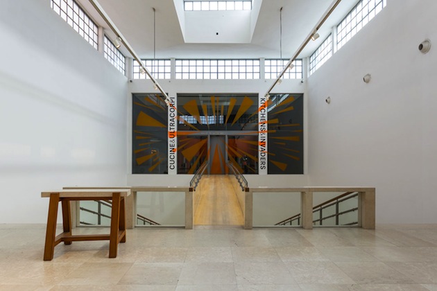
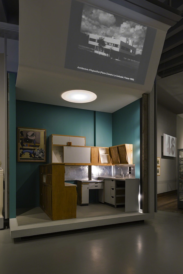
The relationship between design and food is long and elaborate one. The process of cooking itself has often been compared to designing, with a mix of ingredients and different processes serving as an apt metaphor for binging to life material objects of our everyday. The central place that both food and objects have in the everyday – the ‘normal’, ordinary evolution of time – sets them apart as perhaps the most adequate media for tracing the evolution of the perception of the everyday itself through history. The metamorphosis of modernity through the lens of cooking is the main proposal of the latest, eighth, instalment of Triennale Design Museum, curated by Silvana Annicchiarico together with Germano Celant, titled “Kitchens and Invaders”.

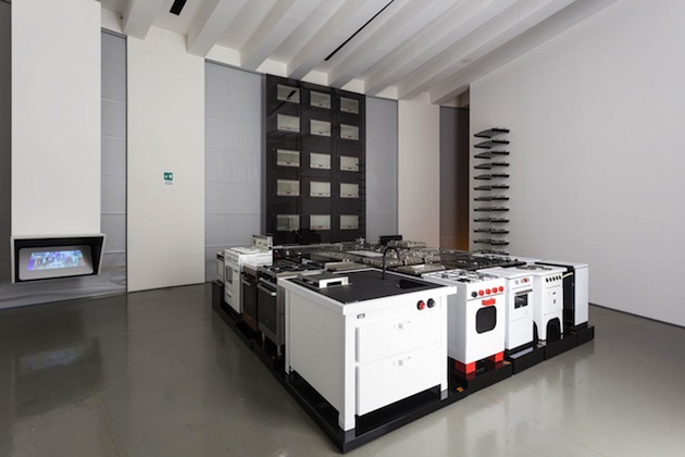
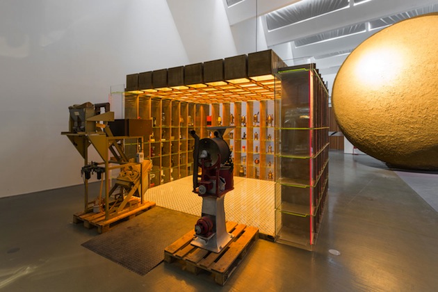
Seeking inspiration for its title in Jack Finney’s science fiction novel “The Body Snatchers” published in 1955, the exhibition does not comply to the everyday normality of cooking. Instead, it seeks to turn the ordinary upside-down, revealing the imaginary, the speculative and the fictional in apparently simple, unassuming acts of preparing food. The hidden layers of extraordinary in the everyday are revealed by focussing precisely on the relationship between food and design – between the precision of tools, machines and utensils, which collide with human bodies, actions and thoughts. The evolution of the machine, presented through Celant’s often ironic vision, propels the ordinary world of cooking into a strange constellation of mechanical tools that appear detached from how we usually perceive it. The kitchen, in Triennale’s vision, becomes a paradigm for the evolution of society.

And yet, the precise shape this evolution takes in everyday life remains somewhat hidden. Have we really come to rely on such extensive mechanisation as “Kitchens and Invaders” would want us to believe? Is this “universe of body snatchers – from refrigerators to microwave ovens, coffee makers to toasters, waste disposal units and ductless hoods to kettles and blenders, deep fryers and ice-cream makers” the reality we live today? Perhaps a more nuanced vision is presented in the adjacent exhibition “Art and Food” which explores the intricate relationship between food and creative disciplines. Developed as the only Expo2015 pavilion in the center of Milan, it sets a historical view on the interaction between aesthetics and the act of dining, tracing how these rituals have changed through time – and, more importantly, how we changed with them.

Rujana Rebernjak – Images courtesy of Triennale di Milano 
Share: Facebook,  Twitter  
01/06/2015

Style Suggestions: Pastels

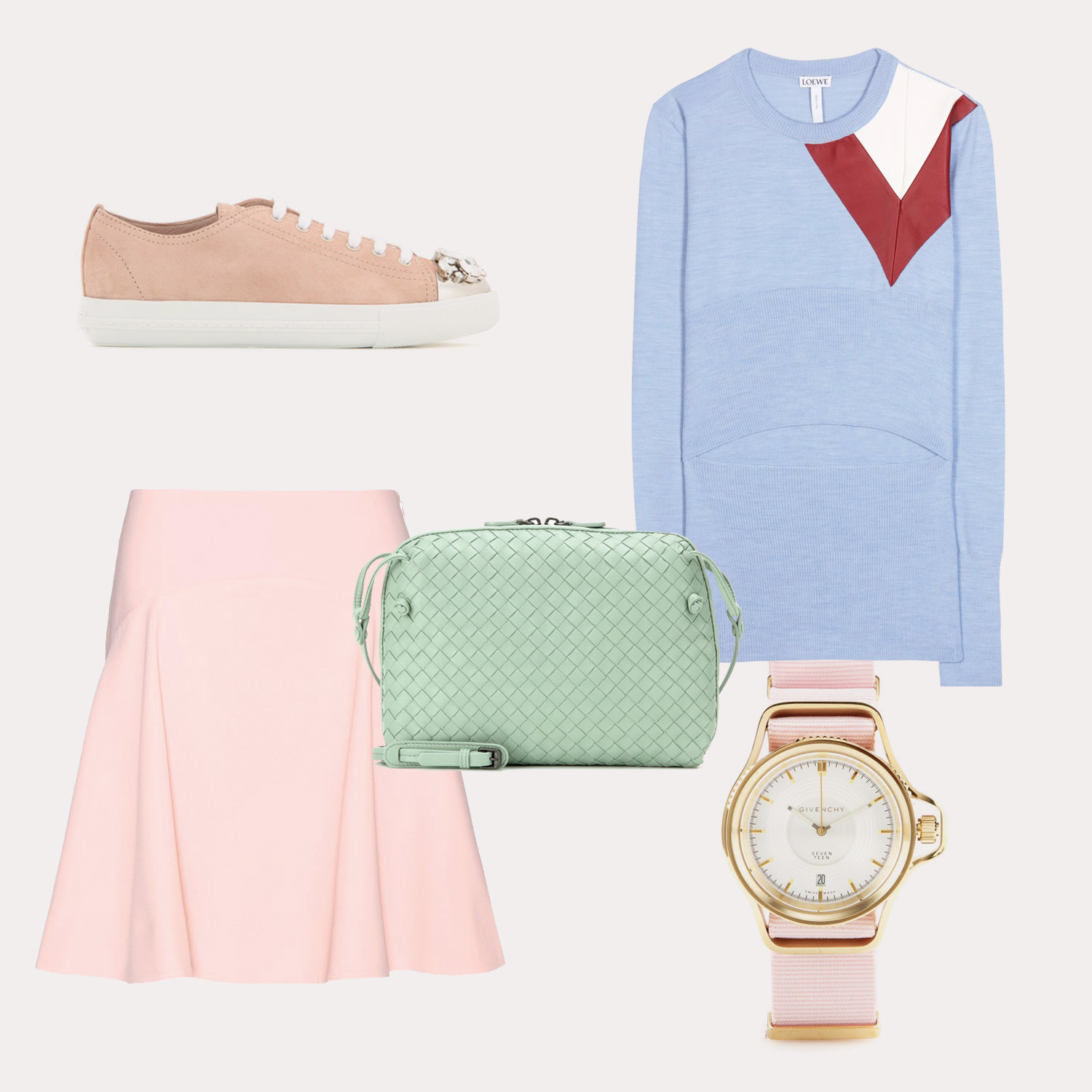
Candy colours are a perfect addition to your Summer wardrobe and there are so many options to choose from. Here are our some of our favourite pieces to get you started.

Sweater: Loewe, Skirt: Kenzo, Bag: Bottega Veneta, Shoes: Miu Miu, Watch: Givenchy

Styling by Vanessa Cocchiaro 

Share: Facebook,  Twitter  
01/06/2015

Marketing Territory: A New Design Perspective

What does design stand for today? Even if we keep on saying that every age deserves its chair – which means that, despite contemporary oversupply, industrial renovation still makes sense and still needs to be encouraged as a source of evolution and self expression– we are also aware that design needs to challenge its core identity and progressively shift toward new boundaries of meaning and usefulness.

“Design for the other 90%”, “sustainable design”, “service design”: these are all possible design extensions that have recently been identified as new, effective frontiers for contemporary problem-solving. Nevertheless, other perspectives seem to recur quite often, and one, in particular, curiously stands in the middle between economic development and entertainment. That’s the case of marketing territory, a marketing subcategory that has recently looked at design as a privileged method to promote and enhance an area’s cultural and economical potential. Sounds like an effort already undertaken by the wine industry? Yes, when it has been singing the praises of terroir as the most authentic dimension behind a bottle’s goodness and value.

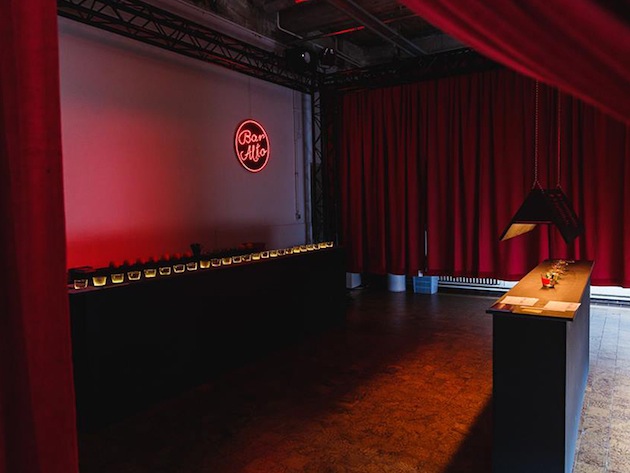
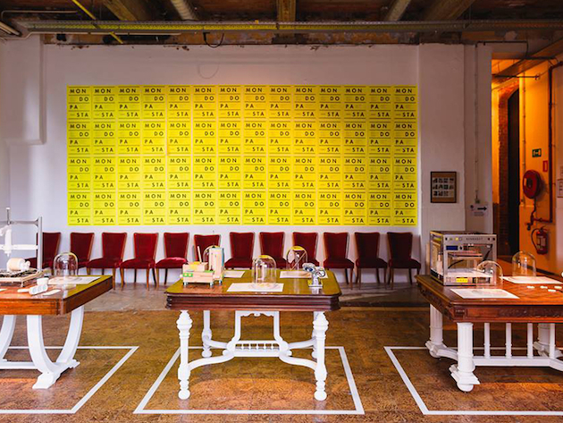
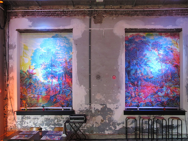
Three casually chosen case studies show what is at stake. Elected cultural capital of Europe in 2015, the Belgian city of Moins decided to invest into an unusual promotion of its partnership with other European towns, including Milan. “Ailleurs en Folie Milan”, curated by Arabeschi di Latte’s founder Francesca Sarti and involving many original voices of the youngest generation of Milanese designers, explores atemporal clichés of Italy’s economic capital – the Negroni cocktail, the dance hall, a trattoria and a bar, just to quote a few examples -, reinforcing their imagery through irony and a new aesthetics.

In a few days, the architecture collective Rihabitat will launch a workshop to be held in Irpinia, one of the most underdeveloped areas of Southern Italy. The goal of their “Rural Design” initiative is to promote design as a means to rediscover local artisans’ expertise and to refresh it through the visions and needs of young designers. In September, the siege of Europe’s most ancient University location, the city of Bologna, will inaugurate the first edition of its design week. In conjunction with Cersaie, international tradeshow for ceramic tile and bathroom furnishings, the fair off will be conceived as a means to present the city’s design vocation – its significant manufacturing industry, for example, but also the heritage of the most prominent Bolognese designer and entrepreneur, Dino Gavina – and to engage local creative industry into a reinforced, performing networking system.

Giulia Zappa 
Share: Facebook,  Twitter