18/06/2015

Agnes Martin at Tate Modern

Has the moment finally arrived for women artists of the past century to take over the spotlight from men? Tate Modern this year seems devoted to reaffirm the role of women in art, first with a compelling exhibition on Sonia Delaunay, and now with a massive retrospective devoted to the doyen of conceptual art, Agnes Martin. Martin, known for her geometric, meticulous paintings, is put in context by exhibition curators as “one of the pre-eminent painters of the twentieth century”, thus her work is explored in relation to artists like Ellsworth Kelly, Robert Indiana and Lenore Tawney.

With a willingness to discover the origins, permutations and inspiration of the subtle poetics that characterized so much of Martin’s work, the exhibition reveals Martin’s lesser-known early paintings and experimental works from this period including The Garden from 1958. It charts her experiments in different media and formats with found objects and geometric shapes, before she began making her inimitable pencilled grids on large, square canvases which would become her hallmark. Even though the desire is to paint a comprehensive, elaborate narrative on Martin’s work, the show also brings together seminal examples of here signature works from the 1960s such as Friendship 1963, a gold leaf covered canvas incised with Martin’s emblematic fine grid.
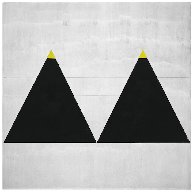
From her birth in in 1912 in Macklin, Saskatchewan, Canada, to her position on the New York art scene, to her final move to New Mexico by 1940 ( following a nubbier of other artists and writers such as DH Lawrence, Edward Hopper and Mark Rothko who had all been drawn to visit the area), the exhibition challenges how we understand Martin’s work. While often associated with Minimalists and an influential figure to those artists, Martin’s restrained style underpinned a deep conviction in the emotive and expressive power of art influenced by Asian belief systems including Taoism and Zen Buddhism as well as the natural surroundings of New Mexico. But even for those who don’t feel like delving too deep into meanders of philosophy and art theory, seeing Agnes Martin’s work will be a pleasure to the eye and, more importantly, the mind. The exhibition remains on show until 11 October 2015 at Tate Modern in London.

The Blogazine – Images courtesy of Tate Modern 
Share: Facebook,  Twitter  
17/06/2015

Graduate Shows 2015: Royal Academy of Fine Arts Antwerp

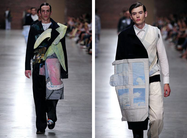
At the Royal Academy of Fine Arts in Antwerp there have been several success stories over the years, not the least the “Antwerp six”. So, each year the expectations are high to view what the graduates of the school have produced. During the Fashion Show of 2015 many awards were given to the Master students that have now completed their studies and will continue out in the fashion world. For the students as well as the teachers, the experience at the Royal Academy of Fine Arts has been evolutionary and taught the students to harbor and express their creativity without losing touch with the production aspect, according to the words expressed by Walter van Beirendonck, who is in charge of the fashion department of the Academy.

Color and patterns were transcendent to the silhouettes without dominating the looks in their entirety. However, the fun twist to the story was how many pieces seemed almost anachronistic, out of time. There were 1960s references and a sophisticated adaptation of the 1980s fitness revolution. Nevertheless, the pieces had a nuance of suave effortlessness that was fresh to the eye.

The collections’ key element could be written – however cliché it might sound – in one word; “Love”. The collection “The Dear Elso Letter” from designer Laure Severac was inspired by love, especially the nostalgia for knitting with her grandmother. The inspiration explains the collection’s ethereal feel and the combination of abstract with structured pieces to illustrate the abstract feeling of love, yet lived with a specific moment in mind. Designer Miriam Laubscher presented pieces with a layered color-blocking effect, bringing to mind Yves Saint Laurent’s Mondrian dress but in a totally new spin, still establishing it as a work of art. Designer Joeri Van Campenhout elevated his looks with delicate appliques of feathers and small trims, resulting in a demure approach that caused a dramatic effect. The graduates seemed to be in sync with contemporary approaches that use small means to create a larger effect and push fashion forward with an interesting concept for future endeavors.

Victoria Edman 
Share: Facebook,  Twitter  
17/06/2015

Through the Lens of Fresh Faced and Wild Eyed Talents

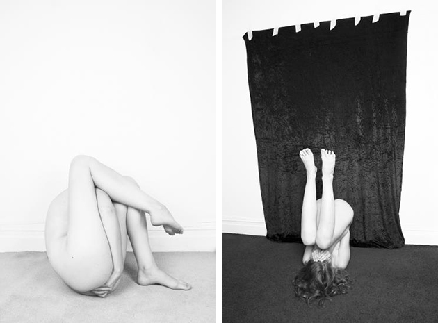
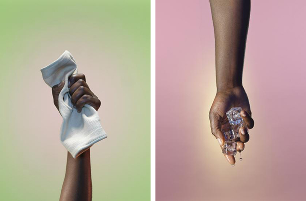
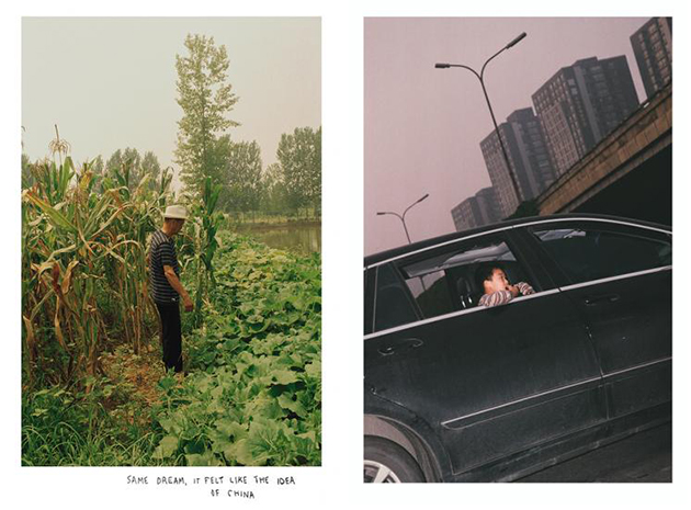
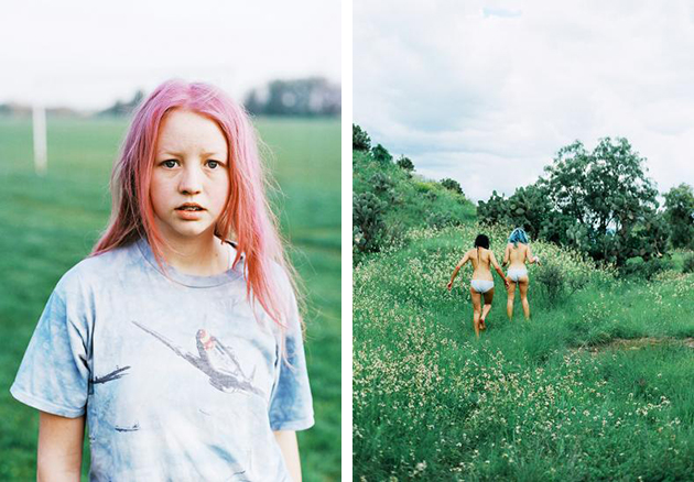
Established in 2008, the annual exhibition and competition FreshFaced+WildEyed gives emerging talent the opportunity to exhibit their work at The Photographers’ Gallery. Showcasing the quality and breadth of graduate work from visual arts courses across the UK, the exhibition and relating programmes celebrate the innovative practices from a range of photographic fields. Selected by a panel of photographic experts from different backgrounds, artist/photographers have the opportunity to work closely with the exhibitions team to develop their presentation within the exhibition at The Photographers’ Gallery (16 June – 5 July 2015) as well as participate in talks and events. This year’s panel of judges are Kate Cooper, Autoitalia, Damien Poulain, Oodee Books, AK Dolven, artist and photographer and Brett Rogers, Director The Photographers’ Gallery.

Images top to bottom: Jocelyn Allen, Dominic Hawgood, Signe Emma & Theodoulos Polyviou, Coco Capitan, Jonathan Simpson, Francesca Allen, Sian Davey, Craig Gibson

The Blogazine – Images courtesy of The Photographers’ Gallery 
Share: Facebook,  Twitter  
16/06/2015

Reassessing Modernism? The Brutalist Playground

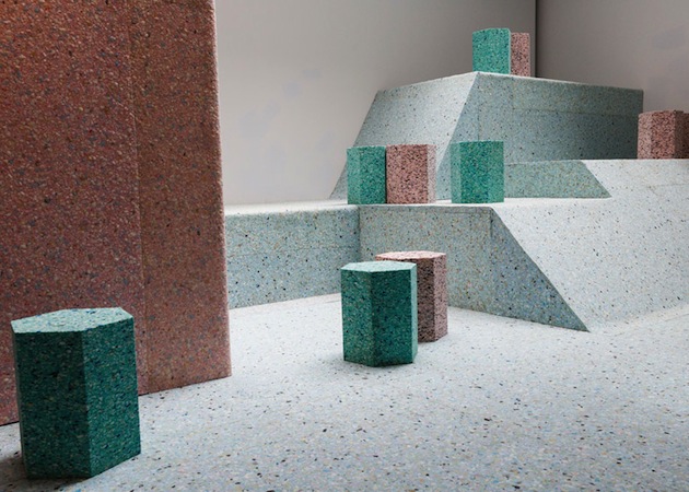
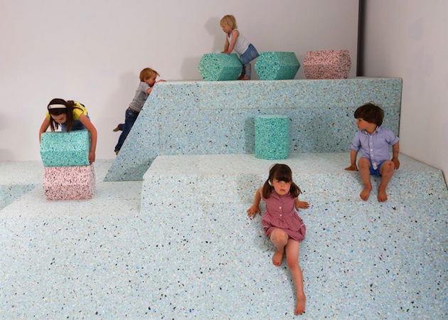
The Brutalist Playground is an exhibition that is part sculpture, part architectural installation, which invites people of all ages to come and play, the Brutalist way. Occupying the entire Architecture Gallery at RIBA in London, the immersive landscape is a new commission by Turner Prize nominated design and architecture collective Assemble and artist Simon Terrill. It explores the abstract concrete playgrounds that were designed as part of post-war housing estates in the mid-twentieth century, but which no longer exist. They became playgrounds unsuitable for play. The exhibition draws on features from a number of London estates including Churchill Gardens, the Brunel Estate and the Brownfield Estate. The playgrounds were often made from concrete, cast into sculptural forms, which presented a distinct move away from previous playground design. They were envisaged as a key aspect of the estate layout and design and as such reflect the preoccupations and social theories of society at that time.

“The challenge of reconstructing elements of now forgotten Brutalist play structures within the RIBA gallery is an exciting opportunity for us to explore contemporary issues surrounding play, by looking at the often surreal objects from the past. Working closely with the RIBA collections and the artist Simon Terrill, the interpretation of these spaces has allowed us to ask questions around materiality and the nature of risk in play, while also giving greater visibility to the incredible original images of the playgrounds that can be found in the collections.” said the collective.

Assemble and Simon Terrill have drawn inspiration from photographs and visual material in the RIBA’s collections, documenting the playgrounds when they were newly built and in use. The exhibition installation will recreate visual elements from the playgrounds in reconstituted foam, creating an interactive, contemporary space where the viewer becomes participant and in this way completes the work. Archive images of the original playgrounds will be projected on the walls. The playground will remain on show until August 16 2015 at RIBA in London.
Rujana Rebernjak 
Share: Facebook,  Twitter  
15/06/2015

Style Suggestions: Preppy Cool

Preppy style is something that will never go out of date and it is not a complicated look to accomplish. Mix classic and modern by putting together a traditional cardigan with a denim shirt so you can look cool and feel comfortable.

Cardigan: Maison Margiela, Shirt: Acne Studios, Trousers: A.P.C., Shoes: Roy Roger’s, Sunglasses: Ray Ban, Backpack: Dolce&Gabbana

Styling by Vanessa Cocchiaro 

Share: Facebook,  Twitter  
12/06/2015

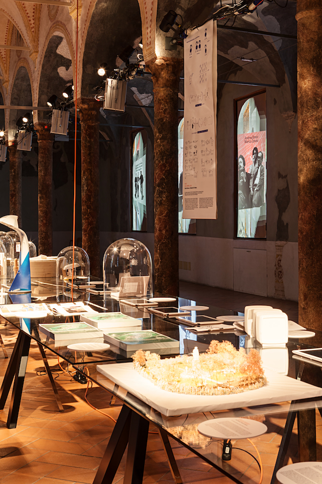
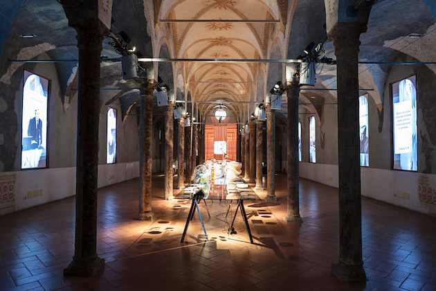
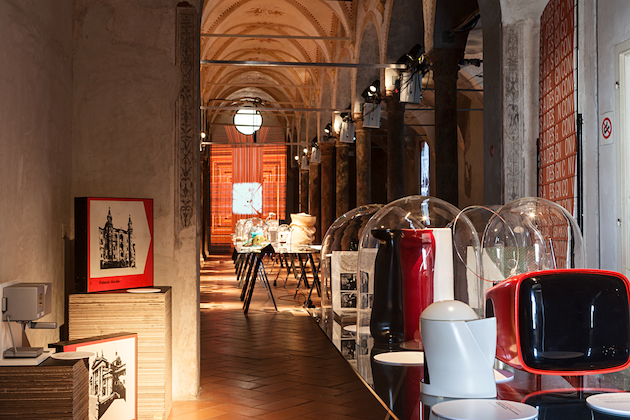
When Dante Inspires Design Knowledge: ISIA Design Convivio

In Italian, a “convivio” is an out-dated synonym for banquet, a cheerful meeting around a table reuniting the joys of food and conversation into a unique framework. This archetype, deeply rooted in the Italian culture and beyond, vaunts a noble literary reference: before dedicating the rest of his life to “La Divina Commedia”, Dante Alighieri spent his first years of exile from Florence writing “Convivio”, an essay dedicated to the representation of the whole spectrum of human wisdom. According to the Sommo Poeta (lit. “Highest Poet”, which is how Italians use to call their most illustrious writer), knowledge can be conceived as a banquet, where every dish is a philosophical topic that table-mates need to appreciate and “digest” one after the other.

Back to our time, where food debates have become ubiquitous and represent the new obsession both in terms of function (a resource to be distributed) and form (of culinary research, of self expression), the first Italian design university to be founded in Italy in 1975, ISIA, has decided to go back to Dante’s work to presented in Milan the showcase of its students’ projects exploring new perspectives on food and social responsibility.

The metaphor of knowledge as a table laden with ideas and proposals animates ISIA’s quest for learning: how can design nourish the planet, serving every man’s right to be fed? Is design a means of knowledge for all? How can a project involve our senses? Can design inspire new virtues? In the time of Expo, design seems curiously willing to go back to the same great questions that marked the shift from the Middle Ages to Renaissance, expressing the need for a new humanism which, once again, gets human and user centred.

Giulia Zappa 
Share: Facebook,  Twitter  
12/06/2015

The New Gucci Girl

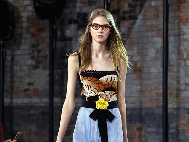
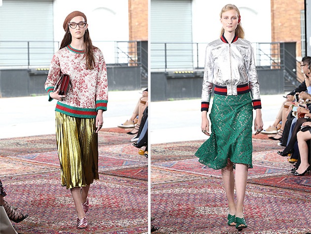
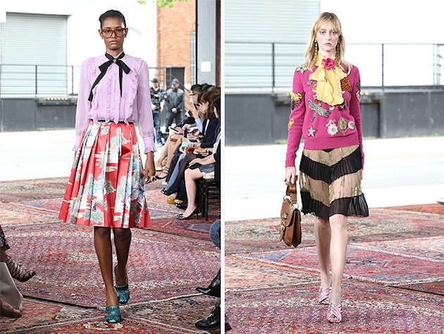
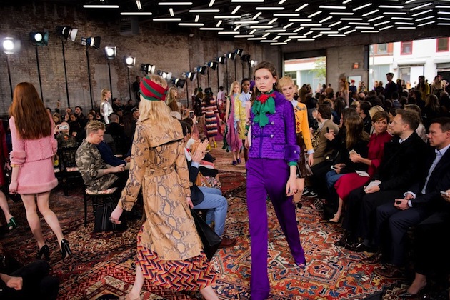
The Gucci girl imagined by the brand for their recently revealed resort collection for 2016, turned out to be completely different than the one conceived during the epoch of Frida Giannini. Alessandro Michele is continuing to do his very best to redefine what Gucci is. The looks sent down the runway in New York were not attempting to appear young, they actually were young, while at the same time appearing to be out of time – like those looks borrowed from a grandmother’s wardrobe that you always cherish and wear. Could this be a controversial turn for Gucci? Is re-inventing the brand almost from scratch a wise thing to do in fashion industry? Like in music, it is usually met with either delight or scorn. Reinventing one’s identity nevertheless often happens both in fashion and music, but the new is often a mixed with ideas drawn from the old archives. That is the case with Gucci’s resort collection; a collection with clear references to the ’70s make Michele’s inspiration quite apparent and approachable. This turn on Gucci runway might not, however, come as a big surprise, due to the fact that the decade that gave us flares and hippies has influenced most collections for both this Summer and Autumn.

Gucci’s collection has a clear vision, feels well thought-out and complete, but the most striking is it feels so wearable – an impression that further develops the idea of Gucci’s newfound youth and maybe also a possible attempt to add a new target group to its list of customers. The truth is, in fact, that this is the first Gucci collection in a while that speaks to the younger, Instagraming generation, a generation that aims to add value to what they wear on their own terms. Is this a model for luxury brands to expand their audience? Will offering wearable pieces that can easily be adapted to anyone’s style have an impact on how brands’ structure change? The ‘personal’ turn in fashion is already in its course, with an ever more growing list of collaborations, interpretations and variations added to each brand. The final question that is left to as is: how might this approach hollow our the basic logic of the market of luxury items, when the value that has always been defined by the final product is suddenly due to the customers to create.

Hanna Cronsjö 
Share: Facebook,  Twitter  
11/06/2015

Dawn of the Idols: Age, Cultural Heroes and Fashion Ads

When we admire someone, for his or her qualities, wit or actions, we tend to idealise the person in a way that makes him or her eternal. Idols stay young in our minds, and with them what they stand for remains vivid and valid in our thought. But what happens when idols age? And, above all, how should we react when their image, old but still influential and respected, is used in contexts different from their own, and separated from their voice?

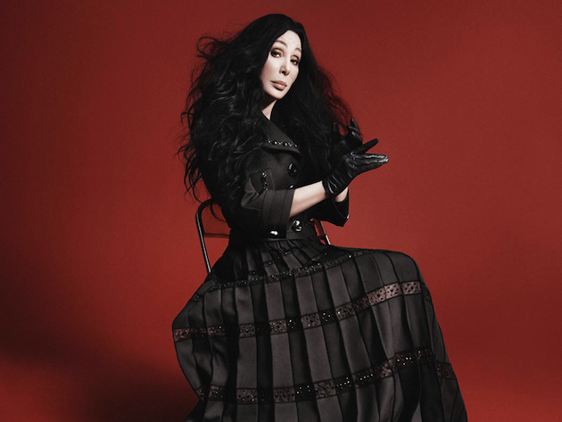
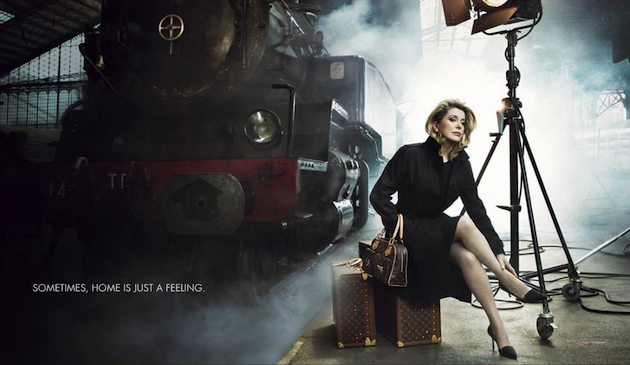
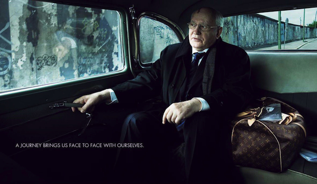
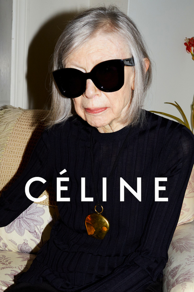
Fashion’s appropriation of cultural personalities – read idols – has become quite common. Lately, fashion houses have been appropriating the current image of ‘idols’, portraying them as they are now in campaigns and ads. The latest is Marc Jacobs, who cast Cher as his new testimonial (the previous one was an intense Jessica Lange). Before him, Saint Laurent’s creative director Hedi Slimane shot musician Joni Mitchell, French brand Céline cast writer Joan Didion, and Louis Vuitton hired photographer Annie Leibovitz to shoot an iconic series of campaigns named ‘journeys’, alluding to the journeys of life, with the likes of Catherine Deneuve, Sean Connery and Keith Richards, among other incredible personalities, like the fist American woman in space Sally Reid, Apollo 11’s Buzz Aldrin and Apollo 13’s Jim Lovell, and the last Soviet leader Mikhail S. Gorbachev. The ads have caused disarray. Some people strongly criticised them, underlining the capacity of fashion to take everything down to some ‘silly’ dresses or ‘overpriced’ sunglasses. The issue displayed the insolence of fashion in using the elderly image of cultural personalities and twist their ideal value to the mundane, earthly act of selling.

What’s the real preoccupation of these – quite naïf, I dare say – critics? Is it the portray of these ‘serious’ personalities – as opposed to the frivolity of the fashion world – that scandalises? Or is it unacceptable that these ads try to commercialise the message these people carry with them? In both cases, one point is missing. Fashion is a multifaceted discipline dealing with many – if not all – aspects of reality. It is surely an industry that produces and sells objects, but it also creates a narrative around these products, and analyses society and people’s instincts, needs and desires. To obtusely criticise these choices means to be stuck at obsolete stereotypes; that is to say, fashion has to remain in its own field, using its language of underweight, super-young models with kilometric legs and vague gaze without disturbing champions of other, more ‘thoughtful’, fields – be them writers, musicians or politicians.

Fashion is not just about the newest thing, although it is inevitably projected to the future, even when it deals with the past. Age can be used to bring on a message, which is everlasting, and the newness is in the way this message is presented to an ever-changing – and ever-growing – audience. The ‘pure’ image of these personalities stands for what they did and who they are now, and carries all the meanings people are able to read through the wrinkles of their faces. There’s nothing ‘old’ in these ads; it is a way to take a distance from stereotypes that want fashion as a silly, superficial part of reality, as something that ‘important’ people do not care about (quite often, they do: never heard about the importance of a signature style?). What’s really dated is thinking about fashion as mere commercial industry: a rather obtuse vision, which negates the power to convey messages and, above all, change through images, something that fashion skilfully manages to do.

Marta Franceschini 
Share: Facebook,  Twitter  
10/06/2015

Graduate Shows 2015: BA Central Saint Martins

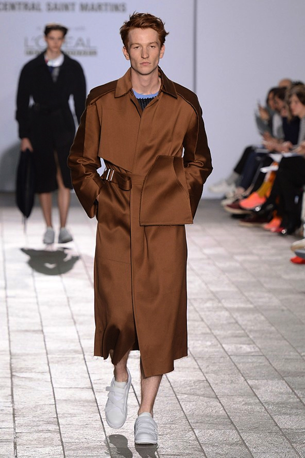
39 designers presented their collections last week at the Central Saint Martins BA graduate show. The collections on display showcased the versatility and creativity to enclose the future of fashion. Silhouettes were voluminous, including full skirts with a 1950s vibe, oversized coats and jackets. Inspiration was gathered from the juxtaposition of eras such as the 1930s and 1960s as well as a post-apocalyptic society. The color palette showed all the colors of the rainbow (sometimes all together at once), with a slight edge for earthy tones and pops of red.

Womenswear designer Susan Yan Nan Fang made her collection stand out from the crowd by completing her futuristic looks with enormous mobile-like headbands. However, she was not alone in completing the ensemble with a headpiece to elevate the look. Designer Rebecca Jeffs adorned her models’ heads in shredded fabric, adding a bit of whimsy to a minimalistic creation, requiring a second look from the attentive audience. Knitwear expert Gabriele Skucas infused a sense of playfulness alongside an impeccable technical ability, in a collection which turned childhood toys such as teddy bears and hobby horses into wearable art. Designer Louis Pileggi’s bright check-board patterns and stripes in addition to flowy ribbon-like effect on hemlines and cuffs, brought to mind the fashionable nature of Harlequin jester, for an further addition of quirkiness that illustrated the fun-loving nature of fashion and a desire for self-expression.

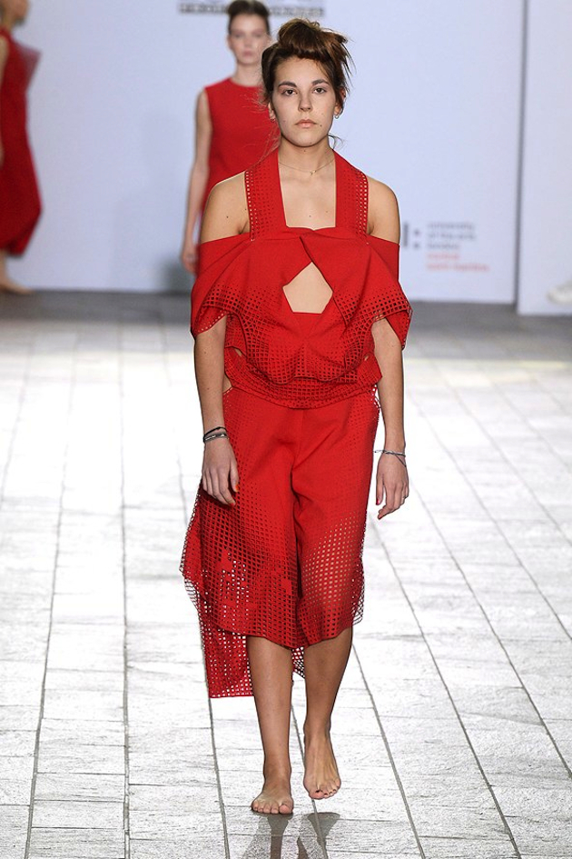
Womenswear designer Laura Newton took a more naturalistic route and incorporated wood into her looks. Sticks of wood had been constructed and worn as breast-plates or to emphasize various parts of a minimalistic aspect, showcasing the old saying “less is more”. The desirable title “Designer of the Year” was however given to womenswear designer Jim Chen Hstang Hu, who presented a fiery collection all in red, giving the phrase “Lady in Red” a new tone. The collection comprised of clean cut garments showcasing complex craftsmanship with surprises such as structural 3D details and laser-cut textures.

Victoria Edman 
Share: Facebook,  Twitter  
10/06/2015

Masters of Art Through the Lens of Gianfranco Gorgoni

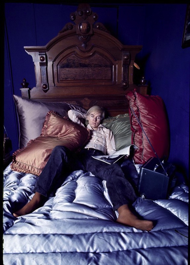
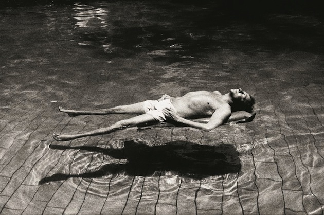
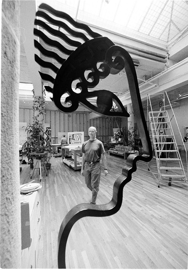
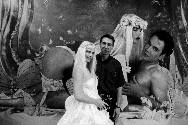
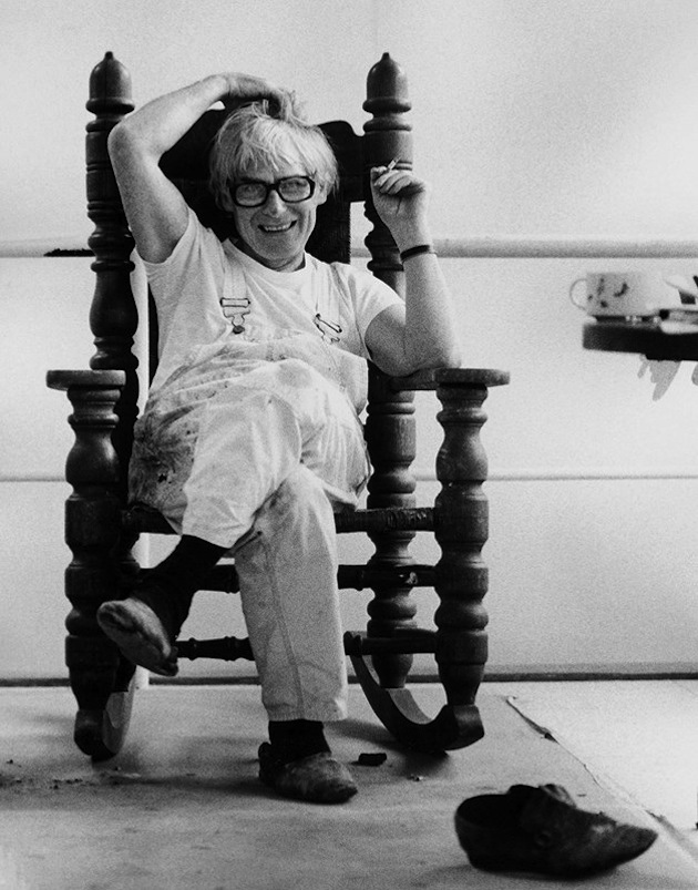
During the late 1960s, Gianfranco Gorgoni was commissioned by the Italian weekly L’Espresso to create a photo story on the vibrant New York City art scene. Through his close contact with legendary art dealer Leo Castelli, Gorgoni was introduced to all the key artists of the day including Andy Warhol, Robert Rauschenberg, Jasper Johns, Roy Lichtenstein and Jean­‐Michel Basquiat. Gorgoni created a series of candid and telling portraits of artists who would become leading figures in the art world for decades to come. He captured his sitters in a variety of manners, both in posed and spontaneous settings. The intensity with which the artists showed his sitters resonated through the art world and captured the attention of world-leading publications, resulting in a highly successful career as an international photojournalist. An exhibition of Gianfranco Gorgoni’s work closes today at Contini gallery in London.
The Blogazine – Images courtesy of ContiniArtUK 
Share: Facebook,  Twitter