There is nothing simple than a fancy A-line dress for your perfect Summer look. Pair these three pieces with classy accessories for those lazy days along the coast.
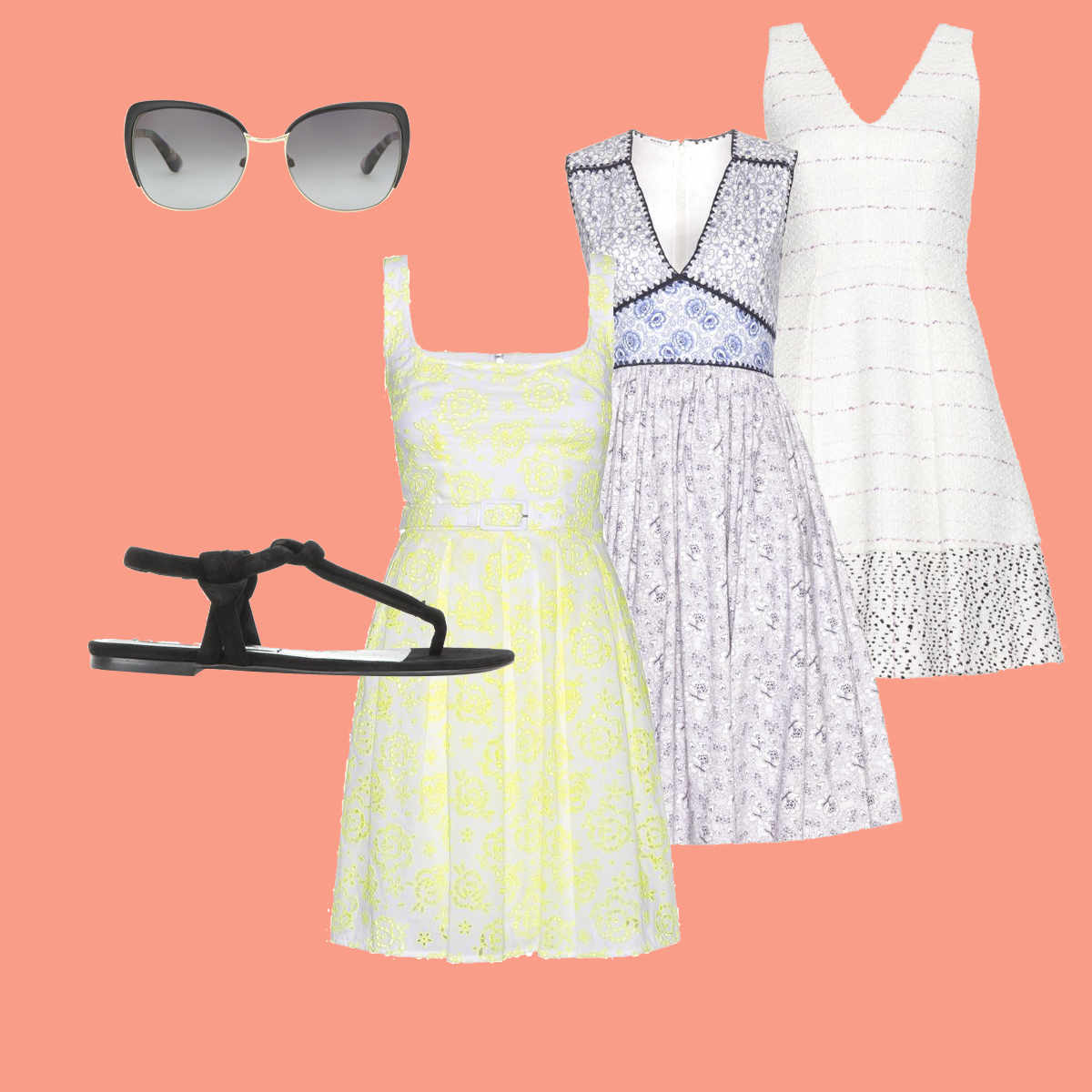
Styling by Vanessa Cocchiaro
There is nothing simple than a fancy A-line dress for your perfect Summer look. Pair these three pieces with classy accessories for those lazy days along the coast.

Styling by Vanessa Cocchiaro
Paris is always a good idea: this past fashion week established just why this saying is so often used. Elements of color, detail and stylistic inspiration materialized styles that were thought provoking and definitely “good ideas” for the year to come.
Colors – Black, White, Beige and Mustard: Besides segments of blue making their way into Parisian collections, the colors for the season seemed to go back to basic with a surprising hint of mustard, as seen at Strateas Carlucci, among a few. Black and white dominated both Haider Ackermann and Maison Margiela runways, but was accented with other basic colors such as beige and grey.
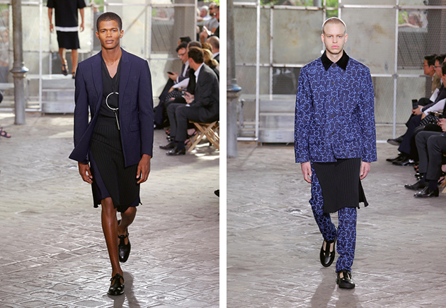
Detail – A Feminine Touch: On several runways, we could spot details previously ascribed to female styles. There were, for example, the neck scarves casually tied around the models’ necks, with abstract patterns, as seen at Yohji Yamamoto, or a more somber and classical stripe, as seen at Officine Générale. Givenchy re-introduced the male skirt in different varieties – with pleats, in denim or with a Jesus print. Men in skirts are just another step in the layering process. Belted waist was also a popular accent, as showcased by Issey Miyake.
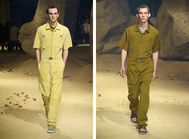
Silhouette – All in One: The jumpsuit has, for several seasons, been spotted at the runways, where it is now introduced as the prime menswear piece for spring 2016. At fashion houses such as Kenzo and Acne Studios, the jumpsuit was dressed with a utility touch in vibrant colors, whether in bold prints or sophisticated block-coloured looks.
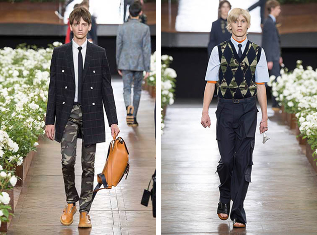
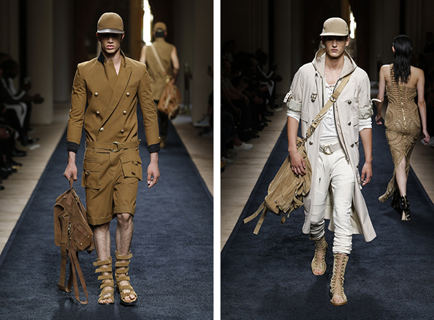
Inspiration – Military Influences: The marching band may not have been playing on runways in Paris, but there was a definite influence of military on several collections. Military references graced specific silhouettes, such as jackets seen at 3.1. Philip Lim, and overall looks as seen at Balmain. The camouflage print was also used for an added twist to otherwise classical pieces, such as Dior Homme sweater vests, pants and ties, which were adorned in camouflage, while Valentino used the print as an outer shell on shirts and jackets.
Victoria Edman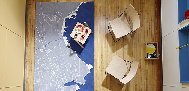
Apartment no. 50 at the Unité d’Habitation in Marseille has been recently invested of a renewed form of interest and veneration. The reason of this re-emerging passion has, of course, something to do with its great place in the history of architecture. Nevertheless, it is also connected with the capacity to reinvent its allure, updating its capacity to relate with the contemporary through new cultural politics.
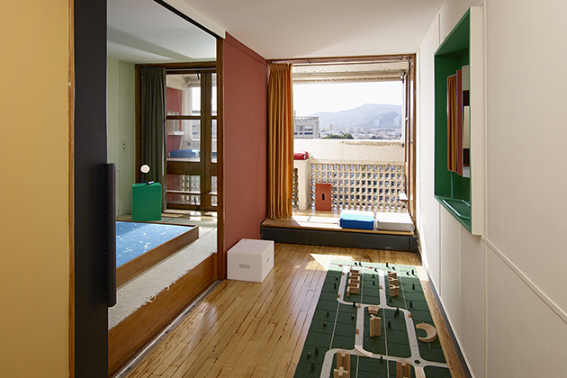
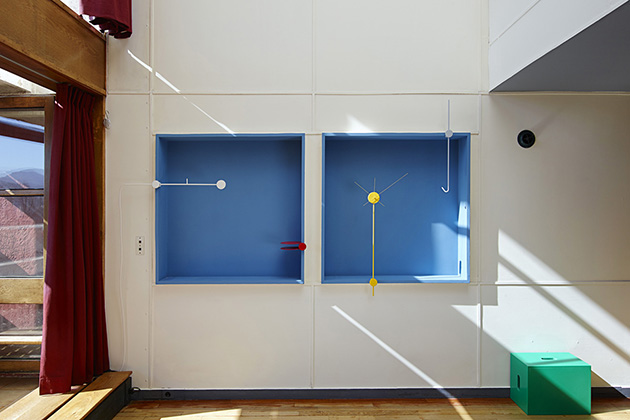
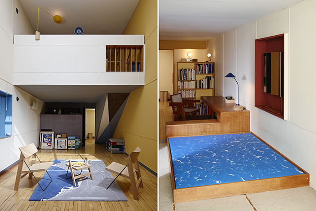
Jean-Marc Drut, Apartment 50’s owner for the last couple of years ago, felt that this place was too important to be experienced only through images in books. Thus, he decided to periodically open his home to the public in order to allow people to experience the space, the proportions and the light that Le Corbusier conceived for his great architectural vision. Among other apartments of the Unité d’Habitation, Apartment no. 50 has not been upset during the years and thus preserves all the elements that made these flats unique: the entrance at the upper floor – originally being the Unité’s duplex – from the mezzanine, the stairs lead to a wider lower space.
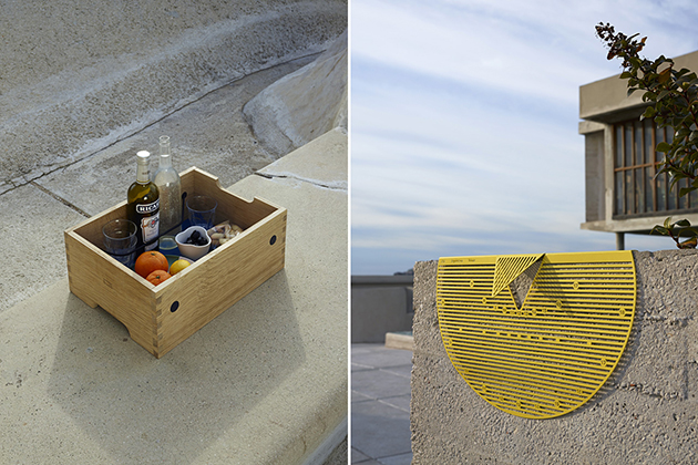
Drut’s involvement, nevertheless, is not limited to being an enlightened host. Since 2009, he has invited several international designers – Jasper Morrison, Ronan & Erwan Bouroullec, Konstantin Grcic, Pierre Charpin – to furnish the space through their sensitivity and with their products. This year, on the contrary, this chance has been offered to ECAL’s students, who participated in a workshop in September 2014 and then developed a series of products conceived exclusively for this place.
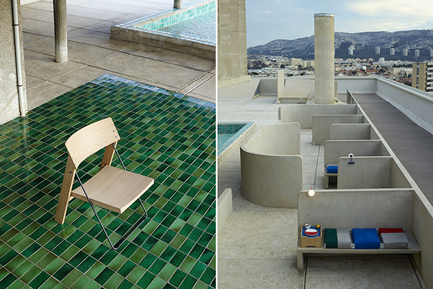
It may sound unexpected, but the result achieved by ECAL is even more stimulating than that of the previous years. All these objects, in fact, are both bespoke and anonymous: we didn’t have the time to see them through fairs, exhibitions or catalogues. Magazines didn’t celebrate their beauty through contests and reviews. Thus, they do not transform the Unité d’Habitation into a sophisticated showcase, but keep on enlivening Le Corbusier’s project respecting its genius loci: a “machine à habiter” dedicated to common people and everyday life.
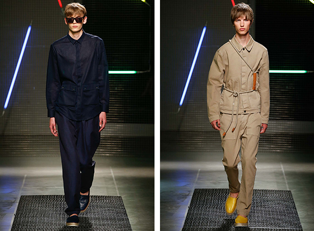
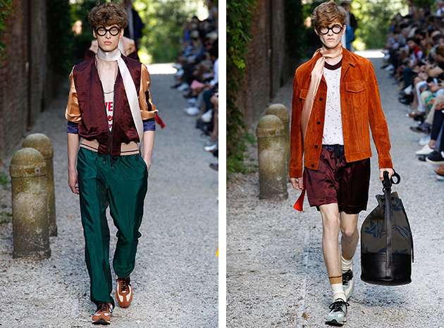
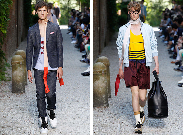
As one of the worlds finest fashion capitals, with a long list of international and influential fashion brands based in the city, Milan has struggled to find room for its upcoming talents. Instead, cities such as London and New York have been more obvious choices for young designers aiming at a breakthrough, and the fashion debate has been dominated by possible solutions to what could be considered as Italian fashion’s biggest challenge. However, Italian upcoming talents have recently started to receive more attention and support. These efforts led to a great improvement when it comes to supporting and celebrating upcoming talents, so here are two of these promising menswear names.
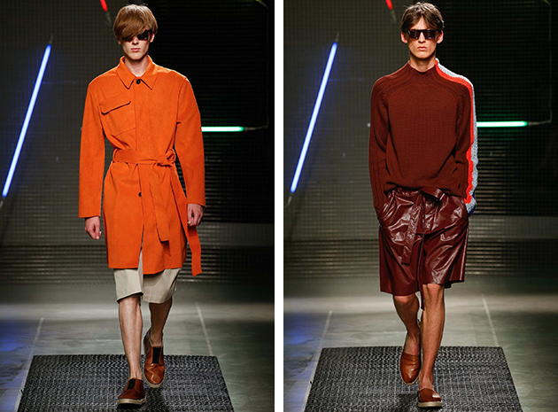
MSGM is a contemporary and modern brand that had its real breakthrough last season when they became the brand on everyone’s lips following their first Milanese show. They became a popular label within the blogosphere as much as on the streets – two important arenas to win when aiming to appeal to the younger crowd, which seems to be one of MSGM’s many goals.
Andrea Pompilio is the master graduate from Istituto Marangoni and winner of the 2011 edition of Who’s on Next, the contest for emerging designers sponsored by Vogue. He is influenced by his two style icons and grandfathers, one a true gentleman with tailored suits, the other a military – two strong sources of inspiration that feel present in most of Pompilio’s work.
When summarising the efforts of the emerging talents in Milan (and the rest of Italy, of course), it is clear that the situation has improved radically in just a couple of years thanks to projects such as the previously mentioned Who’s on Next and the support of Giorgio Armani, to name a few. Even though the situation is better today and the future of Italian fashion seems brighter than before, there are still things that could be improved to optimise the chances for the promising talents to develop into established names. It is no doubt that these two will, and already have, meet great success with their work. They represents three different takes on menswear, and the fact that they are all showing in Milan is a sign for how versatile both menswear and Milan fashion week have grown to become.
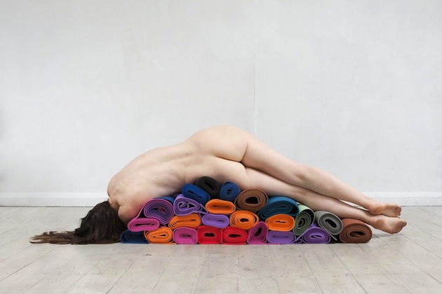
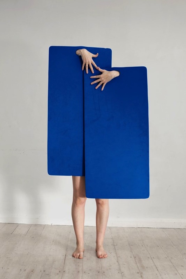
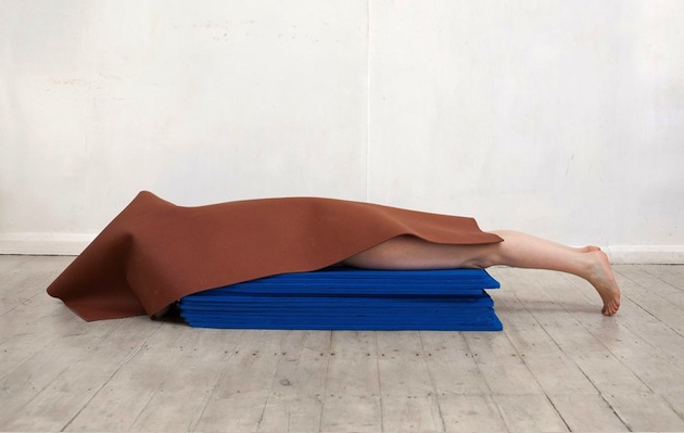
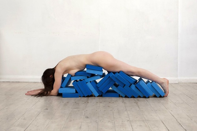
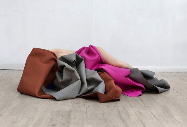
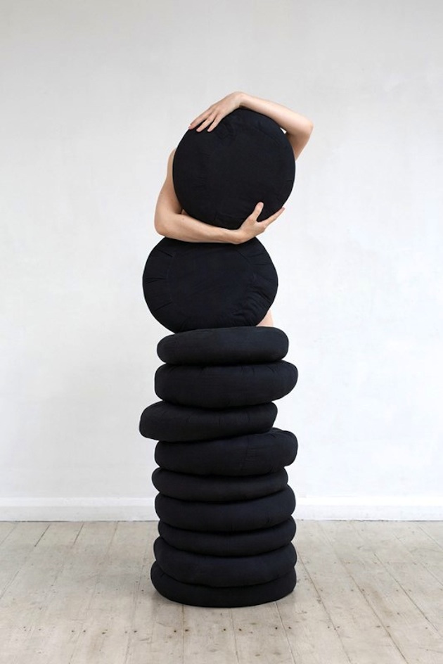
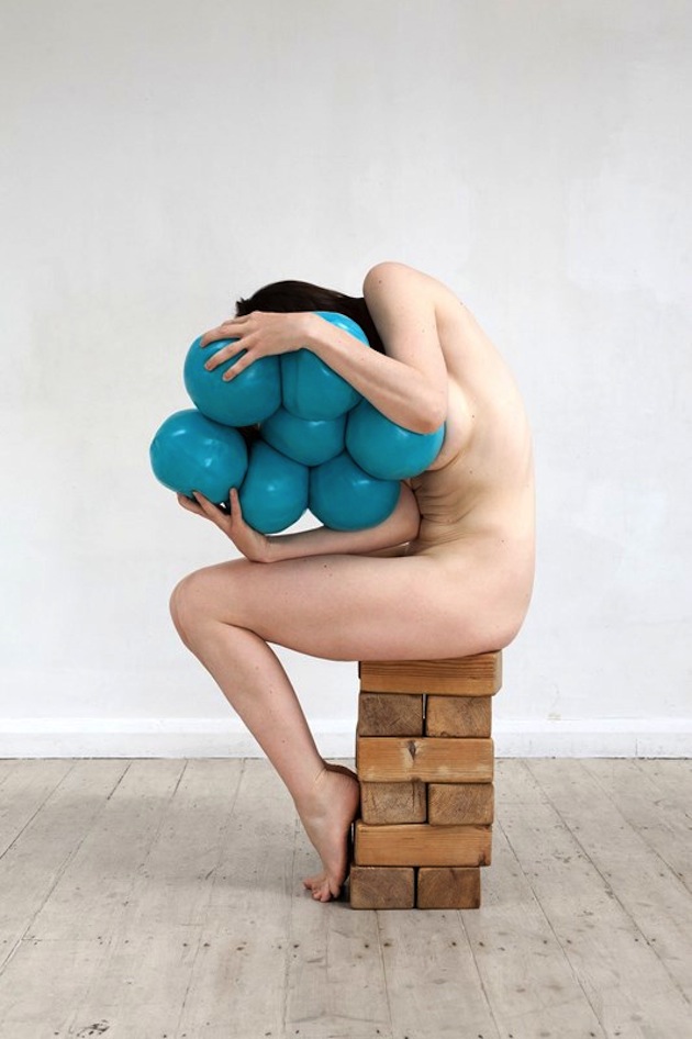
From Andy Warhol’s little known Torsos and Sex Parts series to Robert Mapplethorpe’s explicit work, using the medium of photography to explore the limits and nature of the human body shapes an ongoing and fast evolving subject of research. And yet, the photographer Polly Penrose brings a new and unmediated touch to this body of work, with her soft exploration of female identity. Part of an ongoing series titled “A Body of Work”, “I Was Never Good at Yoga”, shown here, was shot in a yoga studio over a limited period of time as an examination of how the human body can be at once material, raw and unbearably present, while at the same time result almost transient, immaterial and in perpetual transformation.
Images courtesy of Polly PenroseWhen the doors of world fashion capitals open up to menswear every year, colors, shapes and styles to must be admired and documented. What is shown there will dominate fashion trends on streets for seasons to come and, therefore, deserves proper attention.
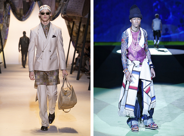
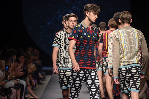
Colors: Grey, Blue and Metallic – Surprisingly, black was on the back burner for once and instead left room for grey. Seen in different shades it was the partner in crime for many suits. The addition of metallic flashes was also an element spotted on the runways of Les Hommes and Emporio Armani. It was an unexpected hue that brought back a pre-millennial feel. However, it didn’t change the dominance of blue that reigned many runways, including Missoni and Corneliani, where an assortment of blue tones projected an aquatic look.
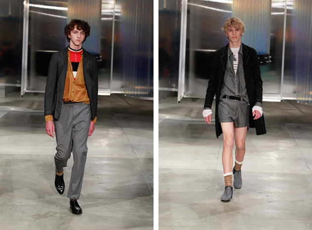
Shape: Layered – A shirt and jeans may be the right look to get you by, however for the stylish man of 2016, the challenge is to master the art of layering. Whether it is with a double breasted three piece suit in a unison color scheme, as seen at Giorgio Armani, or in a more laid back style with parkas and ponchos of all kinds ,as presented at Dsquared2, layering was the key to assembling an innovative look. Versace also showcased their spin, with a reinvention of a traditional look.
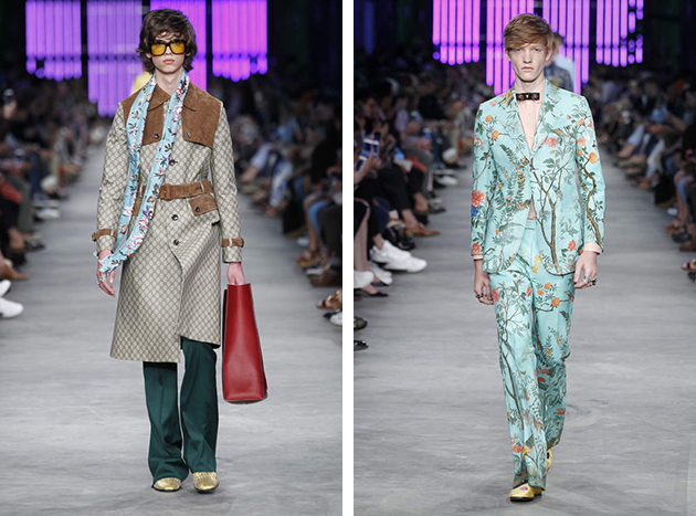
Stylistic influences: A Man and Woman in Time – Even though fashion is a forward looking creative practice, it is hard to not take note of elements from the past and place them within a new timeframe. Many designers during Milan Fashion Week took aspects from the 1970s and combined them with, for example, influences from the 1990s, to blend together a new look for 2016. This trend went hand in hand with the androgynous appeal, reflected on the runways of both Gucci and Andrea Pompilio. Both houses used florals as an addition to their menswear lines and played with traditional gender boundaries, while adding to an ongoing debate on limits between sexes. Andrea Pompilio used sporty influences to bring the focus back together without losing a touch of humor that kept things interesting.
AUTHORFashion week is coming to and end and if you have been following the latest trends and wondering where to get them here are some of our favorites to give you some ideas.
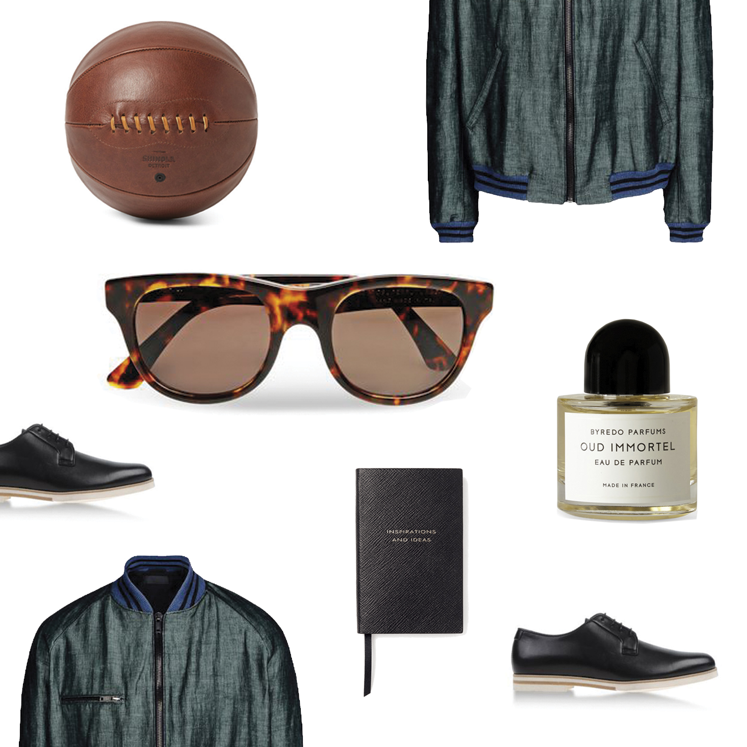
Styling by Vanessa Cocchiaro
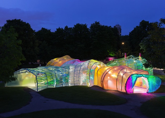
A colourful structure carefully nested among green lawns and trees of Kensington Gardens – the latest Serpentine Pavilion takes on a breezy, playful note as a way of reminding its public of the limited, temporary nature of its purpose. Opening this week and now at its 15th edition, the Serpentine Pavilion has become the Summer cultural hotspot in London as a site of a rich series of “Park Night” talks, lectures and readings. Created by Selgas Cano, a little known Spanish architecture practice based outside Madrid, the pavilion consists of a double-layered plastic skin in a variety of colours, wrapped around a series of metal arches.
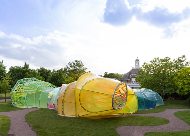
José Selgas and Lucía Cano describe the project: “When the Serpentine invited us to design the Pavilion, we began to think about what the structure needed to provide and what materials should be used in a Royal Park in London. These questions, mixed with our own architectural interests and the knowledge that the design needs to connect with nature and feel part of the landscape, provided us with a concept based on pure visitor experience. We sought a way to allow the public to experience architecture through simple elements: structure, light, transparency, shadows, lightness, form, sensitivity, change, surprise, colour and materials. The spatial qualities of the pavilion only unfold when accessing the structure and being immersed within it.”
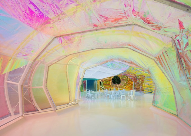
After Smiljan Radic, Sou Fujimoto, Zaha Hadid or Peter Zumthor – all architects who haven’t built in the UK prior to their pavilion commission – apparent disregard for seriousness and theoretical conceptualization distinguishes this work, serves as an antidote to London’s dire weather, as well as a reminder that architecture can be an engaging and boundary-pushing platform for a discussion in arts.
The Blogazine – Images courtesy of Iwan Baan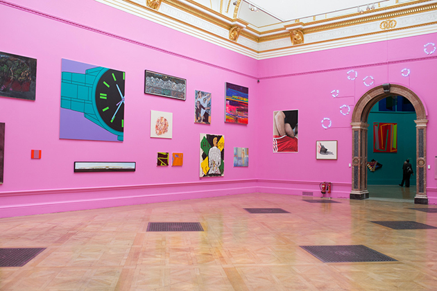
Held for the past 247 years, the Summer Exhibition at the Royal Academy is a direct heritage of 18th century fair-like approach to displaying art. Its premises are simple and clear: artists submit their work through an open call, which is then evaluated by a panel of judges and displayed in the institution’s imposing galleries. While this exhibition model has defined how art was disseminated and approached in the past – and is enacted in different biennials, which amass artistic production in out-dated national pavilions – its relevance for contemporary art must be questioned today.
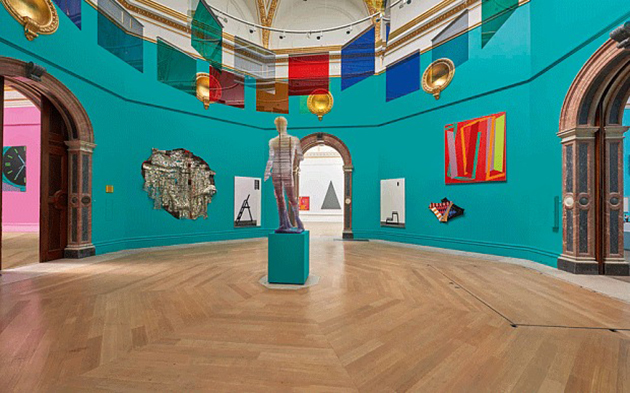
This is the prerogative with which one approaches this edition of the Summer Exhibition, which opened on the 8th of June at Burlington House. This year, the show was coordinated by Michael Craig-Martin, whose “distinctive creative vision” guided the display of works in “room after room bursting with variety, colour and remarkable new work by leading and emerging artists” selected from a pool of 12,000 entries. The final number of displayed work amounts to around 1100 individual artworks loosely arranged in groups based on different media and disciplines. The sheer extent of the show allows for its definition as the ‘most democratic art exhibition’, which conditions both its modus operandi as well as positions its ultimate goal.
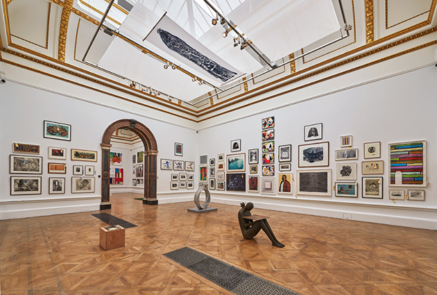
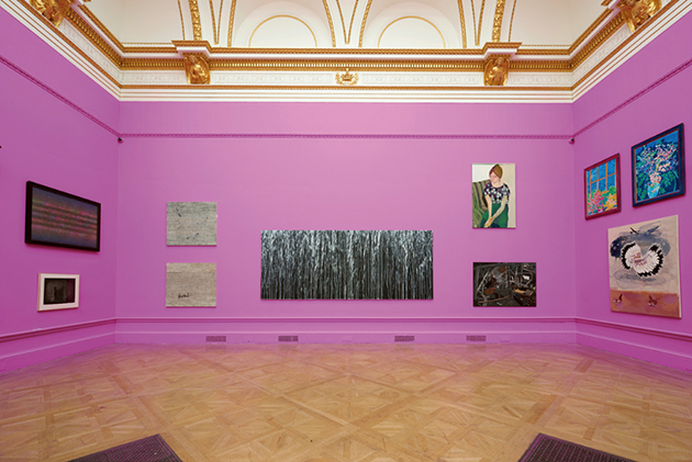
Each gallery was hung by a member of the selection committee – Norman Ackroyd, Olwyn Bowey, Gus Cummins, Jock McFadyen, David Remfry, Mick Rooney, Alison Wilding and Bill Woodrow – who arranged works according to a common thread, ranging from themes like ‘radical landscape’ to rooms dedicated specifically to sculpture. Craig-Martin’s choice to use bold colours, enhances the visual impact and guides the visitor through often crowded displays.
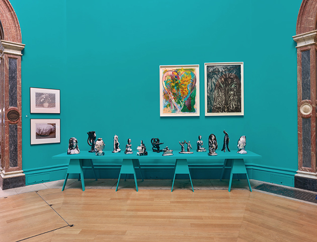
But is the Summer Exhibition really democratic, and why should that even be relevant today? In a time of elusiveness, continuous redefinitions of the term and tumultuous national and foreign policies, the very use of the word democracy is charged with political meaning – theoretically positioning this exhibition in a context that it does not seem to live up to. While the richness and diversity of work – ranging from established artists like Anish Kapoor to Ron Arad, blended with young artists and a number of Royal Academicians – allows for a plurality of meanings, discussions and concerns, the fair-like background of the exhibition conditions its ultimate goal – selling work. Thus, can an open call really constitute the premise for ‘democracy’ in art? It most likely can’t.
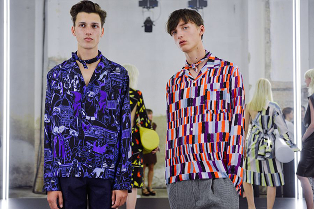
The international fashion scene is currently dominated by menswear: the current menswear shows and this week’s Pitti Immagine Uomo 88 – an international trade event that showcases men’s fashions and contemporary lifestyle trends – have taken the fashion spotlight. The question on everyone’s lips these days is what the future of menswear will look like.
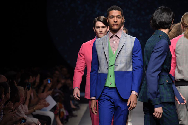
Several projects focusing on menswear were presented during the ongoing Pitti Uomo event in Florence. One of these is ”Open”, which aims to challenge our ideas about gender, and offers an interpretation of a new generation of collections that move beyond borders of what is masculine or feminine. The project will be presented in a conceptual setting designed by the Storage Associati, a renowned Milan design studio that works on cross-pollination between different art forms.
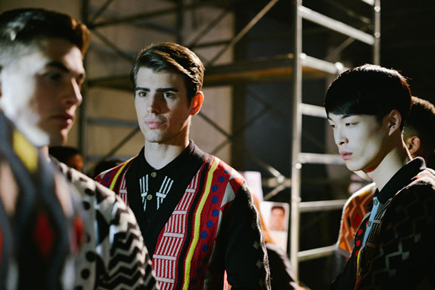
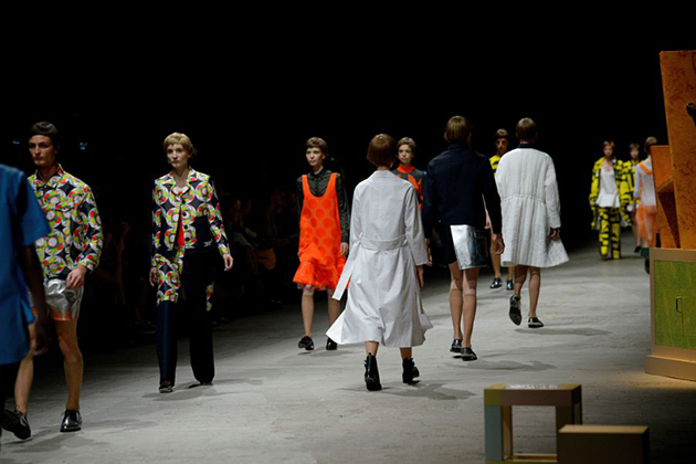
Another innovative section displayed during the event is ”My factory”, a result of a union between technology, music, art and design that aims to create a platform promoting creative workshops within the fields of urban style and sportswear. The future society and the urban lifestyle have inspired everything, from the concept of the event to its set design. Similar ideas were also seen on the catwalk, and have influenced, for example, Christopher Kane’s menswear collection for Summer 2016 that was shown in London this week. Kane has developed the brand’s menswear line, from almost being a toned down match to its womenswear collections, into a collection that both feels more relevant and looks to the future. Kane has successfully included pieces that both feel gender-natural and that take on the urban- and sportswear aesthetics. If this is what menswear will look like in the future, we can’t but love it.
