13/04/2015

Salone del Mobile 2015: Critique of the New

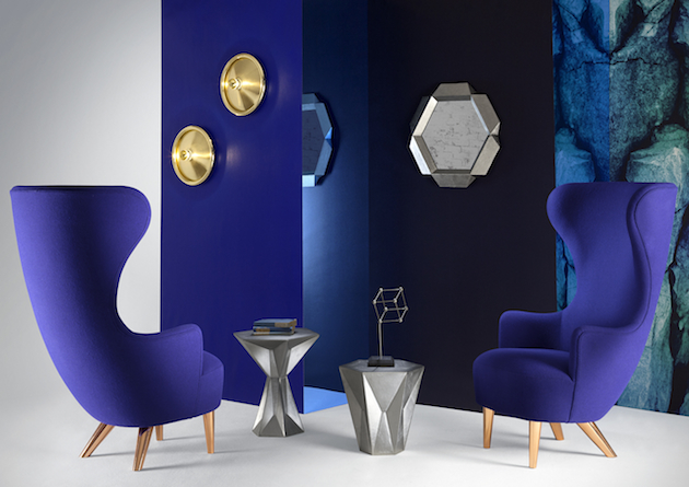
When the first Salone del Mobile opened in Milan in 1961 – as the Italian version of a similar fair held in Cologne, Germany in the 1960 – its participants, mainly small artisans working in the wood industry, who eagerly gathered following an organic ‘word of mouth’, would hardly have imagined that in 50-years time, their desire to build an honest platform for development and debate would transform in such radical and not entirely positive ways. Half a century later, in fact, Salone del Mobile has turned out to be one of the most openly critiqued events of the design world, a symbol of design practice’s implicit incoherence and inadmissible, yet too often exercised, superficiality. This year in particular, the critique of the Salone has been more vociferous than in the past, with both theoreticians and practitioners questioning the purpose and dynamic of the platform.
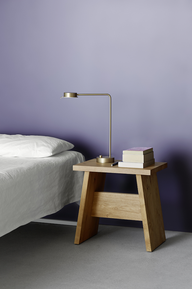
It is important to note that today, the fair itself – the actual Salone del Mobile – has only become a backdrop for a myriad of events taking place around the city, effectively colonizing its streets, shops and windows with anything even slightly related to design. While a global attention to Salone and its ‘unofficial’ counterparts has allowed many young, independent designers to present their work in such a rich, international context, it has also given rise to an abundance of meaningless, possibly unworthy showcases that don’t contribute to any constructive debate on the state of design practice today. Even more so, though, the fact that the fair has become an annual event (until 1991 it was held every two years) forces design companies to hectically assemble products that, were it not for the Salone, would probably never see the light of day.
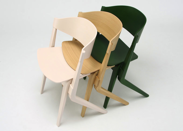
In her recent article for Frieze magazine, design critic Alice Rawsthorn argues that: “by dominating the media’s portrayal of design so relentlessly, the Salone has unintentionally reinforced the popular stereotype of design as a superficial, stylistic tool steeped in consumerism,” adding that “many of the new design challenges are explored in the fringe exhibitions and debates held during the Salone. But a furniture fair is not the most empathic or effective forum for them, raising the possibility of their migrating elsewhere.” Hella Jongerius, the famous Dutch designer, and Louise Schouwenberg, a design theoretician, have recently presented a manifesto titled “Beyond the New”. In it, they advocate for “an idealistic agenda in design, as we deplore the obsession with the New for the sake of the New, and regretfully see how the discipline lacks an intimate interweaving of the values that once inspired designers, as well as the producers of their ideas”, and shape an idealistic agenda for design that will be “a liberation from the schizophrenic subdivision of our field and the stifling rut in which users, designers, and producers have been caught for far too long.” By saying “It’s time to rid ourselves of the obsession with the new,” Jongerius and Schouwenberg inevitably point to events like Salone, and the timely publication of the manifesto, cannot but refer to its compulsive dynamic.
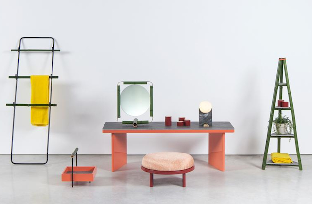
Yet, would it not be an exaggeration to blame Salone del Mobile for everything that is bad in design production today? Or is the Italian fair the only cause of design’s obsession with the new? Can Salone del Mobile renew itself with a claim for a more thoughtful, heterogeneous depiction of design practice? Despite the power of industry and the media, its future cannot but rely on designers themselves. As Jongerius and Schouwenberg suggest, it is designers that must take the matter into their own hands: “Designers are pivotal to industrial design. Any shift in mentality should thus begin with them.”

Rujana Rebernjak 
Share: Facebook,  Twitter  
10/04/2015

Salone del Mobile: an Excuse for Agenda Setting

When an important tradeshow slowly transforms itself into a chaotic media circus, the rules that make it work change drastically. Rarely, in an overcrowded scenario of supposed novelties, final users have the chance to check personally what truly deserves a medal for quality and innovation, but are rather guided by the image and the agenda that devilish communication professionals have set for them. “Dura lex, sed lex”, we may say, especially since the digital domain has started to reward indefinite events and to rebound their echoes through social media buzz. This is particularly true for the imminent Salone del Mobile of Milan, the leading international design event that every years gets in town more than 200.000 disoriented professionals, over stimulated by the offer and often incapable to recognize the boundaries of what was, and has now become, a matter of design. Of course, the marketing rules that are engaged in Milan design week are not different to those that govern other worldwide design events. Nevertheless, remaining Milan the biggest tradeshow, it maintains the most hyperbolic and dazed dimension.

But what are the tips that nowadays determine the success of a product or an event at the Salone? Those who had the chance, or the misfortune, to work as journalists, content editors, and PRs for the Salone del Mobile, generally know them quite well:

Anticipate competitors: Salone del Mobile is all about timing. Be the first to unveil your new products – no matter if the prototype you shot does not even work – and you’ll make them memorable for your public before it gets tired and confused by hundred previews.

A good image is better than a good product: nothing is worth as much as a good shooting, because the first filter that any media professional applies is that of an eye-candy visual impact. No matter if the written description that gets along, or the product itself, are not equally enchanting.

Involve edgy bloggers: making a reputed, trendy blogger speak about you is definitively the way to impose your agenda setting to the design community.

Story is better than technique: if a product does not have a concept or a story, please fabricate one. Just a very few people –and definitively not the right ones – get involved by the description of any technical innovation, even if relevant and astonishing.

Build exclusivity: a new design district, a new format or a new “design something” needs to be communicated as an initiation for a privileged few.

Finally, should we ask ourselves if this all makes sense? Of course we should, but we actually don’t, because if this is all simply about participating in a circus, nobody wants to be the first to leave the party.

Giulia Zappa 
Share: Facebook,  Twitter  
10/04/2015

Alexander McQueen: The King of Dreams

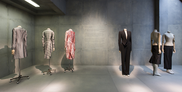
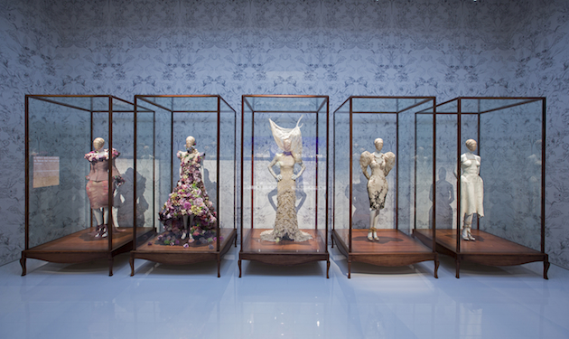
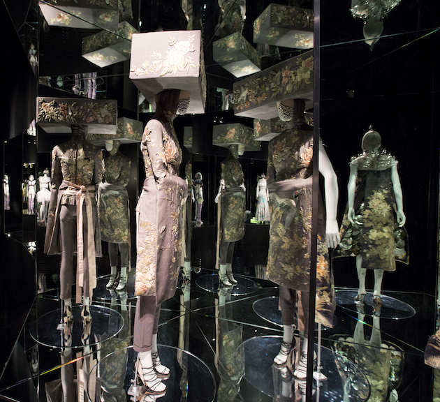
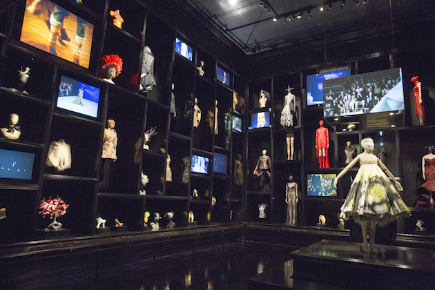
Five years after his death, the life’s work of Alexander McQueen lives on. The exhibition Alexander McQueen: Savage Beauty is now shown at Victoria & Albert Museum in London, after being one of the most successful exhibitions ever staged at Metropolitan Museum of Art in New York. Everything cannot but predict a similar success in Lee’s hometown.

Savage Beauty is a portrayal of McQueen and offers a glimpse of the creative utopian universe that he created. If you didn’t realize it while he was still alive, it becomes clear now, that McQueen was and still is a designer out of the ordinary and one of the world’s most influential creative minds. The exhibition has succeeded in recreating the shapes, techniques and McQueen’s ability to relate his creations to a historic period – qualities that contributed to making him unique. In the giant halls of the V&A museum, you are able to experience the different influences that guided McQueen in his work, with themes such as Cabinet of Curiosities and Gothic Mind. The final part of the exhibition showcases McQueen’s last collection, Plato’s Atlantis from S/S 2010. It was influenced by nature studies and inspired by Charles Darwin, but instead of focusing on the evolution, Lee was more interested in the ”devolution”, a dystopian prediction of our future.

McQueen brought his dreams (and sometimes nightmares) to life, whatever they might have been, they had one thing in common: the final creations were incredible and so was the craftsmanship behind them. The work of McQueen proves everyone who defines fashion as trivial, to be wrong. Instead of seeing it as something shallow, he used fashion as an instrument, a tool for creating and expressing feelings, thoughts and fantasies. McQueen was a phenomenal talent, not just because he had a great technical knowledge and an innovative approach to fashion, but because he used those qualities to create his own universe in which he was able to question or celebrate our society and future. Most designers might have those ambitions, but few of them are able to fulfill them without losing focus on everything else going on in the fashion industry. McQueen shut that out, and focused on making his dreams – and nightmares – real. The darkness was an often returning element of McQueen’s collections, and it was also those demons who took one of the fashion world’s last real designers away. Like other creative and talented people who died too soon, too young, McQueen has reached icon-status after his death. Some people might say that this is a typical reaction to how we look at the designer of today- as a creative genius put on a pedestal. The designer has a significant role in today’s fashion industry, but that does not mean it isn’t deserved. Alexander McQueen was a special and unique designer in many ways, who left a huge void after him, of which we are even more aware after seeing Savage Beauty.

Alexander McQueen: Savage Beauty runs through August 2nd 2015 at the V&A in London.

Hanna Cronsjö – Images courtesy of V&A MuseumR 
Share: Facebook,  Twitter  
09/04/2015

Daily Tips: The Age of Earthquakes

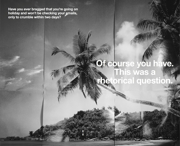
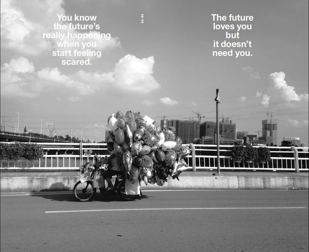
Fifty years after Marshall McLuhan’s ground breaking book on the influence of technology on culture The Medium is the Massage, Shumon Basar, Douglas Coupland and Hans Ulrich Obrist extend the analysis to today, touring the world that’s redefined by the Internet, decoding and explaining what they call the ‘extreme present’. The Age of Earthquakes, published by Penguin Books is a quick-fire paperback, harnessing the images, language and perceptions of our unfurling digital lives. The authors invent a glossary of new words to describe how we are truly feeling today; and ‘mindsource’ images and illustrations from over 30 contemporary artists. Wayne Daly’s striking graphic design imports the surreal, juxtaposed, mashed mannerisms of screen to page. It’s like a culturally prescient, all-knowing email to the reader: possibly the best email they will ever read. Welcome to The Age of Earthquakes, a paper portrait of Now, where the Internet hasn’t just changed the structure of our brains these past few years, it’s also changing the structure of the planet. This is a new history of the world that fits perfectly in your back pocket.

The Blogazine 
Share: Facebook,  Twitter  
08/04/2015

The Talented: Creatures of the Wind

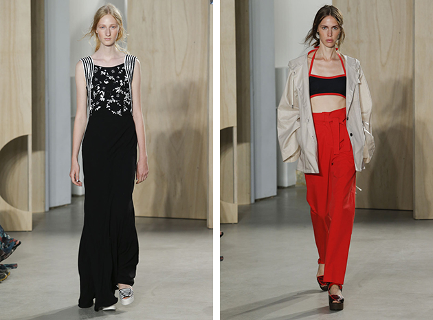
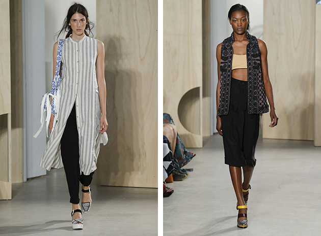
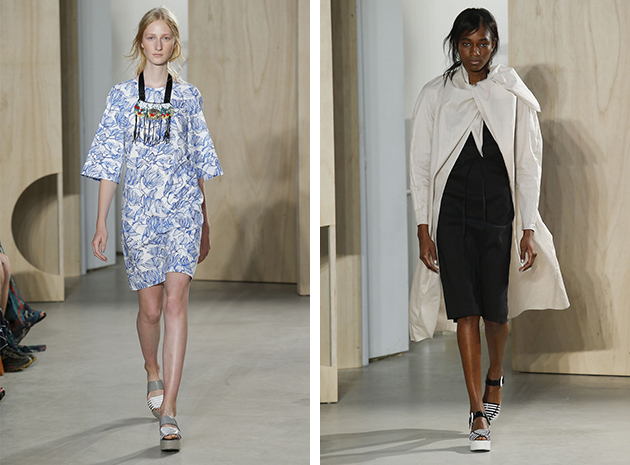
When viewing Creatures of the Wind Spring 2015 collection you can feel a sort of a united ambiguity, that often takes shape when the focus is more organic than goal oriented. A vibe of authenticity runs through the collection, that is rare today in many other collection where authenticity is forced or passes completely unaddressed. Even though the color palate differs from light blue to fire red, it comes across as a natural progression, showing a spontaneous and natural flair a few fashion houses possess.

The design duo behind the brand Creatures of the Wind are Shane Gabier and Christopher Peters, both graduates of the School of The Art Institute of Chicago. Following graduation, Gabier departed to Antwerp to work at Dirk Schonberger as a menswear designer. Peters, on the other hand, worked as a studio assistant to artist and designer Nick Cave, until, in 2008, the duo launched from Chicago what is today a blossoming fashion brand. The brand was given instant recognition with their first collection featured on the cover of WWD magazine. The following years, the collections were driven by both concept and narration, drawing inspiration from everything – from subcultures to mythology. Dedicated to thorough research and cultural references, Creatures of the Wind frequently collaborates with artists and designers, including Tabitha Simmons, Pamela Love and Erickson Beamon.

Well-known for their hands on approach, Creatures of the Wind keeps control of sustainability, a central concern for emerging brands today. While most of their products are primarily produced in New York City, the brand has also initiated production in northern Japan, while their shoes are made in Italy and the fabrics come from some of Europe’s finest mills. Brocades, jacquards and handmade laces create an amazing sartorial experience especially when paired with vintage English wool and Japanese cotton. Creatures of the Wind create complex and appealing fashion stories in each of their collections with varying shapes presented in a vast color schemes. They are speaking to a younger audience, but with the voice of someone older and wiser – a true characteristics of a timeless brand.

Victoria Edman 
Share: Facebook,  Twitter  
08/04/2015

Through the Lens of Barbara Rossi

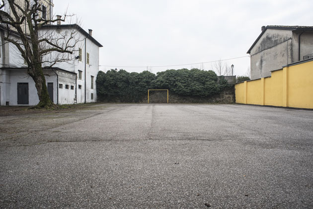
“The Inventory of Via Emilia” is a project by Italian photographer Barbara Rossi. In her words, “via Emilia is the great roman artery built in 187 a.C. to connect Rimini and Milan that crosses Emilia Romagna, a region in North Italy. The inventory is an attempt to catalog signs and changes left by man in that section of Italian landscape. Most of the time these changes don’t improve our lifestyle, but are just traces, contradictory traces of our intervention in the landscape. In the complexity of these particular Italian territories we can recognize and classify specimens, dividing reality into taxonomies. This process allows us to mitigate the conflict between rules and chaos and to understand the transformation of the landscape. Traveling along Via Emilia, I left out city centers in favor of suburban areas, the ones apparently devoid of a common logic where people seem to claim a right to creative expression that modifies the landscape. SS9 describes a fragmented landscape, the result of a trip back-and-forth (between Rimini and Milano) undertaken not only with the aim to describe the landscape’s “life cycle”, but also to trigger questions, reflections and future projects.”

Images and text by Barbara Rossi 
Share: Facebook,  Twitter  
07/04/2015

Daily Tips: Nick Cave’s Upcoming Here Hear

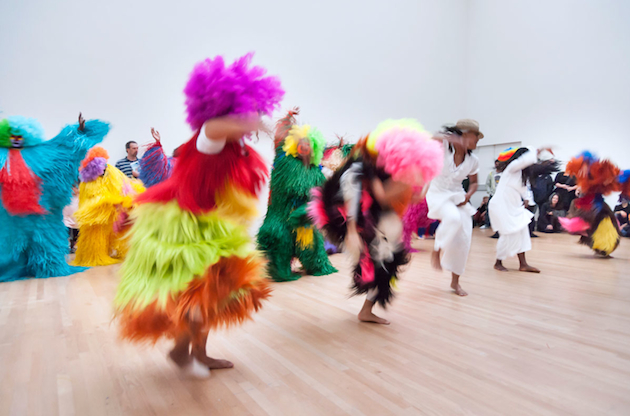
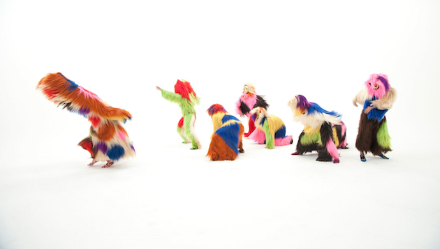
In the upcoming months, Nick Cave, the brilliant artists and dancer, will stage his sculptural Soundsuits in a new exhibition at Cranbrook Art Museum. Titled “Here Hear” the exhibition will collect approximately thirty Soundsuits, his wearable performance suits designed for sound, mobility, and dance which were influenced by a vibrant palette of African art, armor, found objects, fashion, and textile design, yet find their root in social critique. Cave first created a suit in the aftermath of the Rodney King beating in 1991, envisioning an emotional shield that protected one’s race or gender while still expressing individuality. As Cave’s artwork began to resonate with vast audiences, the artist saw the Soundsuits as powerful agents to capture the public imagination on a monumental scale. Cave’s artistic practice now advocates the vital importance of collective dreaming, which he actualizes through large-scale performances.

The Blogazine 
Share: Facebook,  Twitter  
07/04/2015

Shapes of Modernity: Architecture in Latin America

What was modernity and how can we understand it today? Can modernity even be firmly located in the past? If we consider architecture and design, the disciplines’ modernity inevitably encompasses a wide range of practices, many of which responded to similar theoretical frameworks – rejection of the past and utopian visions of the future, self-consciousness, progressive belief in human power to shape their environment through rational experimentation, knowledge and technology – yet took on entirely different forms. Modernity escapes narrow definitions and limited geographic and temporal frames; in fact, the elusive nature of modernity allows for varied iterations and shapes, which are not represented by how it has been theoretically approached. Turning to the discourse on architecture and design, modernity – broadly paralleled to International Style – seems to conform to a monolithic view of the period, inevitably West-centric and not at all international.

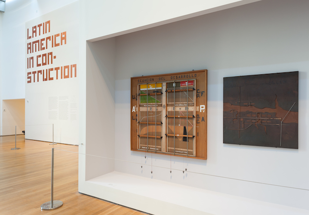
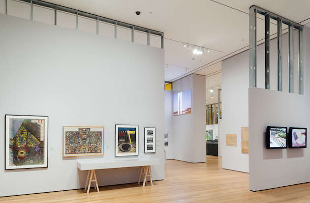
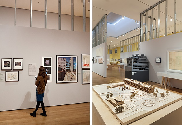
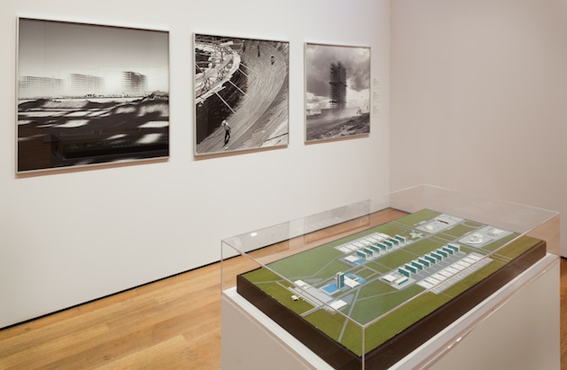
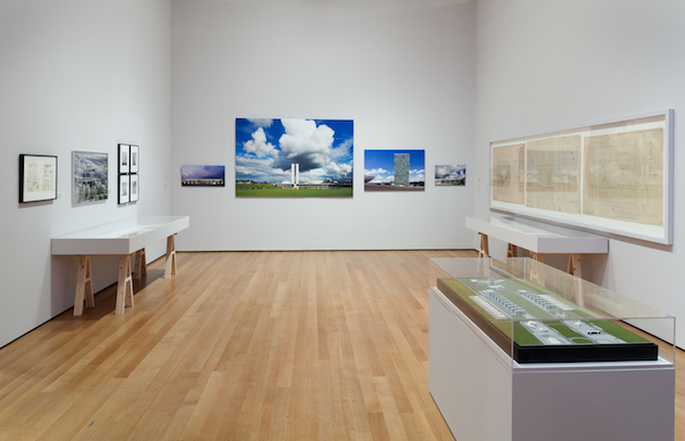
With the attempt of broadening the understanding of modernity in architecture today and defying such a limited view of the discipline’s past, the Museum of Modern Art in New York takes an in-depth view at architecture of South America with a new exhibition: “Latin America in Construction: Architecture 1955-1980”. Opening 50 years after MoMA’s last survey of the continent’s architectural practice – Latin American Architecture since 1945, held in 1955 – the exhibition curated by Barry Bergdoll, Patricio del Real, Jorge Francisco Liernur and Carlos Eduardo Comas, takes on a quarter of the century of architectural history, tracing its most significant developments, ideas and protagonists. Far from a view of Latin America’s architecture as a playground for European architects or a showcase of its already well-known stars (such as Oscar Niemeyer or Lina Bo Bardi), the show is structured around five central themes: “Urban Laboratories”, “Cities in Transition”, “Housing”, “Export” and “Utopia”. Each of these sections shapes a unique architectural discourse, specific to the continent, while also highlighting its connection to wider modern developments and modes of thinking.

Latin America in Construction, an incredibly revealing and thorough exhibition, brings together more than 500 original works that have largely never been exhibited: from architectural drawings and models, vintage photographs, and films from the period collected from architecture and film archives, universities, and architecture offices throughout the region. “I was stunned by how Latin America had been systematically not part of my own historical education in architecture—despite the fact that I have three degrees in art and architectural history,” says Barry Bergdoll, the lead curator of the show. “Most history books on modern architecture in the English language assign a subordinate role to Latin America, and I was intrigued if it might be possible to see whether, in the postwar period, the region had been a full actor in a transatlantic development along with North America and Europe. Not simply as a place where the pupils of Le Corbusier went to build, but a place of origins of ideas.” In fact, this exhibition comes as a signal of a wider effort to read modernity as a period and space of thought defined by pluralism of ideas that deserve to be understood, than by canonic interpretations of theory and styles.

“Latin America in Construction: Architecture 1955-1980” runs until July 19th 2015 at the MoMA in New York.

Rujana Rebernjak – Images by Thomas Griesel, courtesy of the MoMA 
Share: Facebook,  Twitter  
06/04/2015

Style Suggestions: Surf Escape

It’s that time of year when you need to re-energize and feel the sun on your skin and flex those lazy surf muscles. So, pack your bag with the bare essentials and escape to the coast for the weekend.

Hoodie: Acne Studios, Shorts: Saturdays Surf NYC, Sneakers: AMI, Hat: Béton Ciré, Sunglasses: A.P.C.

Styling by Vanessa Cocchiaro 

Share: Facebook,  Twitter  
06/04/2015

Thornhammar – A New Take on Scandinavian Minimalism

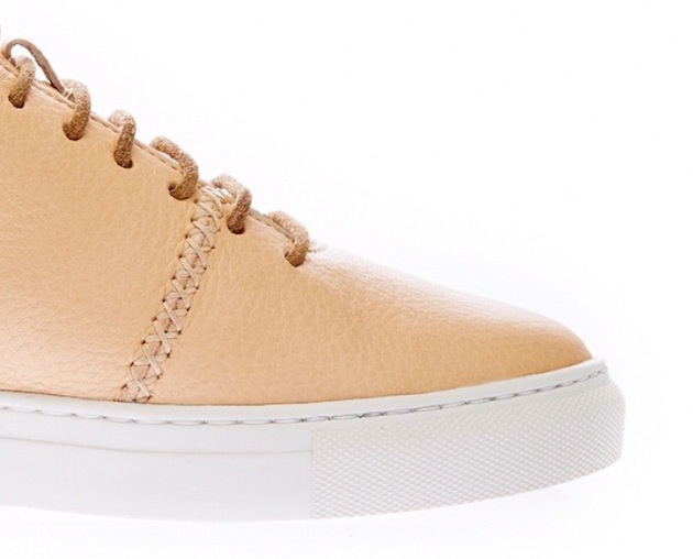
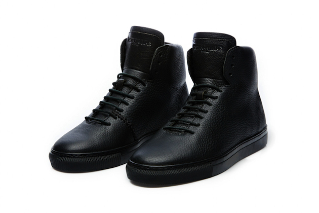
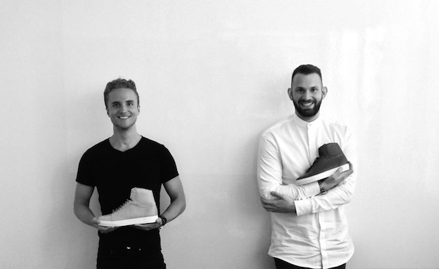
The slightly cryptic and vigorously appealing name Thornhammar, reveals the luxury organic sneaker brand, founded by the two friends, Jesse Davison and Hannes Steen Thörnhammar, with a distinctly a “Swenglish” feel to it. Jesse is American, Hannes is Swedish and their brand is the result of a combination between their different design approaches as well as their personal interests. Jesse has a background at Hermès and a freelancing career in material-sourcing for a well established brand. Hannes, on the other hand, is more interested in PR and marketing, which took him to companies such as Design House Stockholm and Stinton Advertising in New York, before founding Thornhammar.

The two friends and founders first met when studying at Parsons School of Design in New York, several years ago. Thornhammar, the brand, was born from a reaction to the market of bad quality shoes, and from an ambition to create something they – and their friends – would love to wear. The result are sneakers that are made of organic leather produced in a small Swedish city. Even though the shoes are put together in Thailand, which might easily be criticized for its inherent contradiction to what appears to be a dedication to local production, Jesse and Hannes are part of the production process from start to finish.

The two founders describe the brand as “Swedish maximalist”, which is an updated version of the classic Scandinavian minimalism, with the name of the brand itself, chosen with the purpose of sounding Swedish, recalling its design background, yet aiming to make it more international. Their aim is not to create another sneaker, but to take subcultural streetwear, where sneakers used to belong to, to another level by adding luxurious, global, local and organic aspects. The products are, thus, not the only interesting aspect of the brand; they are the result of a design process in which questions about national style, subcultural attributes and organic values as luxury high fashion, are drawn to light. In that sense the sneakers are far more than other luxury shoes, they are capturing the time we are living in and the many different sources of inspiration that are typical of the postmodern society. They are also redefining old truths, by awakening questions like, what Swedish or Scandinavian style can really be defined as, or if it can even exist as such? “Swedish maximalism” sounds like a welcoming term: a term which could perhaps include a combination of Swedish and American design perspectives, or even something completely different.

Hanna Cronsjö 
Share: Facebook,  Twitter