13/03/2015

Changing the Face of French Fashion

Paris Fashion Week – the city of haute couture, where fashion is taken incredibly seriously – has, for a long time detained the status of the capital of fashion. Nevertheless, despite its impressive fashion past, Paris was recently met with some tough competition from other fashion metropoles. In fact, the geography of fashion has changed, and it would be inaccurate to speak of only one, key fashion capital today. However, Paris is still one of the most influential cities in the industry, which is more obvious than ever during every fashion week. But if we put the established brands aside, what is the temperature for upcoming designers in Paris? Here is a brief list of names which have set themselves to be the next fashion wonders.
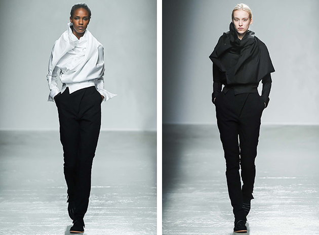
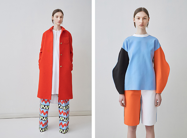
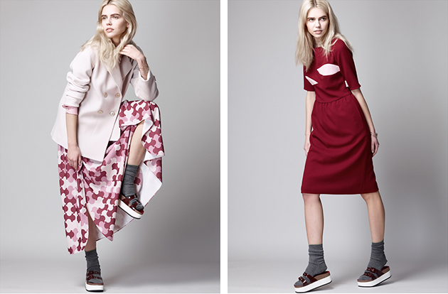
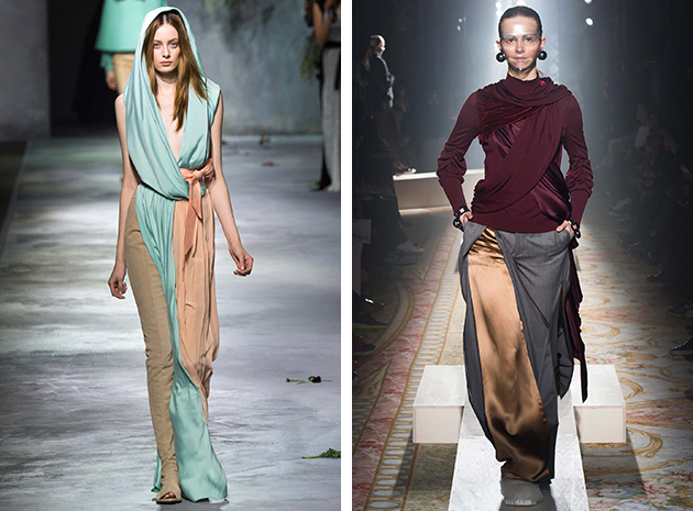
Aganovich is the new avant-garde fashion brand, whose two designers, Nana Aganovich and Brooke Taylor, have built their design philosophy around a mix of influences which take form in an abstract and conceptual way. This design approach is seen in their latest Fall 2015 collection, where mixes of patterns and volumes form key features of each look. Aganovich might not be easily approached by everyone, but that is also one of the most interesting things about the brand: they have stayed true to their vision and fulfilled it without trying to make it mainstream, establishing an initiative and approach that is refreshing in times when many brands are trying their best to be liked by everyone.
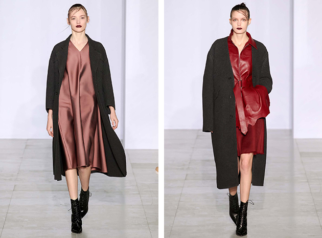
Yang Li is known for his “grunge romantic” aesthetic and has in just a couple of years made a name for himself due to his particular approach which combines of rough and soft attributes. For the next Fall, Li has taken inspiration from the look, definition and feeling of the word ‘tension’. The whole collection embodied the theme, from the metallic color scheme to the fabrics which were crumpled like a plastic bag. The balance and tension between the perfect and imperfect was always present in the pieces – a message that feels very current in a world of Instagram filters and airbrushing: sometimes the imperfections are what makes everything more interesting, a saying that Li successfully expressed.
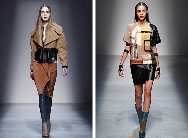
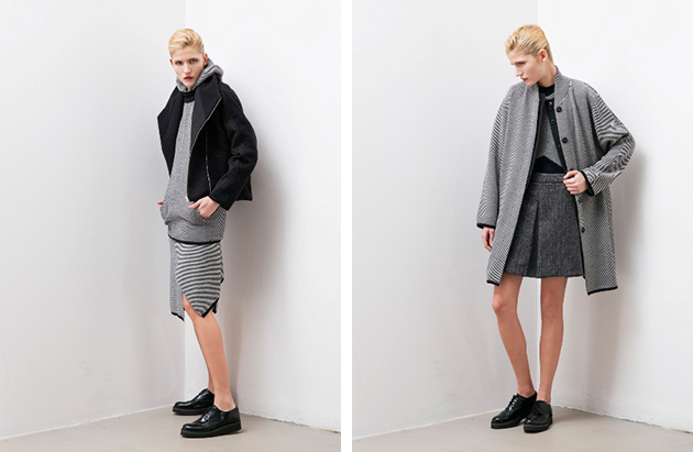
Masha Ma is a young emerging Chinese designer with one foot in Shanghai and one in Paris. The Central Saint Martins graduate and Alexander McQueen intern, is known for her feminine and yet futuristic approach to fashion, and for this Fall strong women were her main focus. With that said, it was not the look of one woman sent down the runway, instead a lot of various looks and styles were showed. From 70s inspired pieces to more clean silhouettes with items in black and white, the collection embodied many different types of women, with one thing in common – they dresses for themselves.

Hanna Cronsjö 
Share: Facebook,  Twitter  
12/03/2015

Paris Fashion Week: Shapes

As the fashion world’s most exciting season comes to an end, we bring about the final account of Paris fashion week, moving on from accessories and colours, to the, perhaps, most defining of all ingredients: the cuts. From classic draping or wide palazzo pants, the next Fall/Winter 2015 season looks is shaping up to be a very elegant affair.

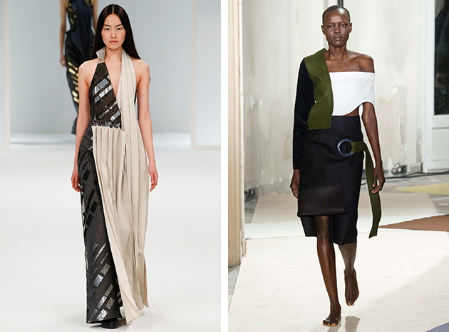
Two-in-one: One of the most recurring trends was creating a sort of a patchwork effect, making looks seem almost ambiguous and exciting. On one side, this trend was translated in half a dress in one color or fabric and the other half in a different one. Witnessed at Chalayan, Céline and John Galliano, the approach could be seen mostly on flowy dresses, creating a rather romantic bohemian composition. On the other side of the trend, structural tops in several different colors, shapes and patterns combined in a single piece, were seen at Jacquemus and Stella McCartney, where the technique was used to expand the garment’s repertoire.

Draping: Draping is one of the most traditional, classic and tested styles, with different typologies and techniques of draping used at Undercover, Rick Owens and, naturally, Vionnet. The laid back style of draping used made for a rich visual effect, recalling a mystical time of yesteryears without relinquishing a modern artistic elegance.

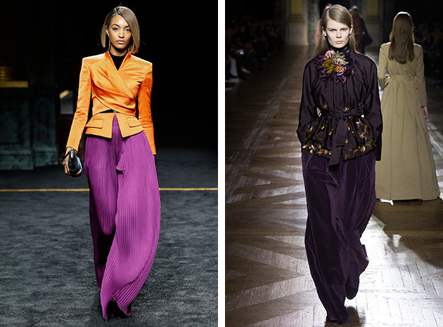
Palazzo pants: The cigarette pant was a mere memory on Parisian runways, as several shows put on, the relaxed over-dimensioned pant. Designed in silk with pleats, black leather, velvet – and the list could go on forever – leisure clothes were taken on a more elegant and urban route. At Balmain, the palazzo pants were given a pop art soul, while a more tailored look could be seen on the runways of Emanuel Ungaro and Maiyet. Finally, some designers simply focussed on the right fabric – velvet – as in the case of Dries van Noten.

Victoria Edman 
Share: Facebook,  Twitter  
11/03/2015

Paris Fashion Week: Accessories

Moving on from Milan to Paris, accessories are able to highlight just any look. Aside from the continued profiling of fur details adorning several garments, there were a few other recurring accessories seen at the Parisian runways.

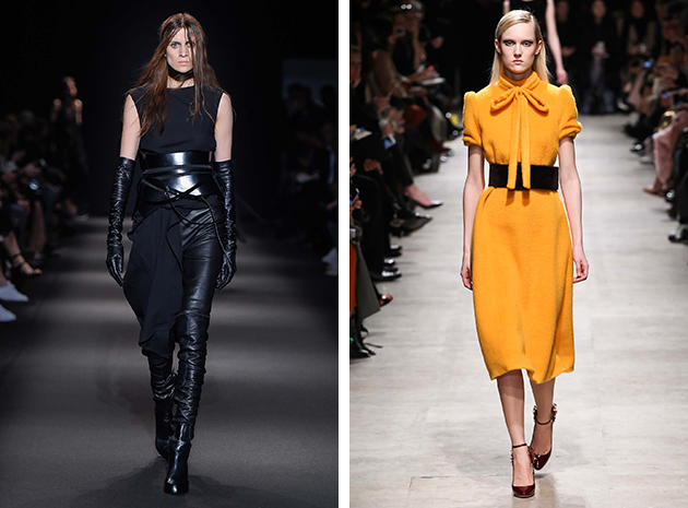
Wide belts: This season features a comeback of both the traditional wide belt borrowed from the 1980s, as well as the obi-belt, seen strutting down the runways of Ann Demeulemeester, Rochas and Haider Ackermann as well as many others. Showcased mainly in black leather, the wide belt functioned as an unexpected twist to ordinary looks. It was worn smartly way to contrast both color and material without making things too complicated.

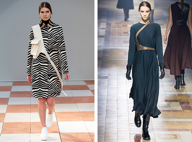
Harness: Leather structures, reminiscent of different form of harnesses, was another way of adding an interesting element without completely violating the style of the look. It made for a futuristic, yet oddly vintage feel. Strapped over the chest in an asymmetrical swirl as seen at Lanvin, or over the whole body, recalling a cross body bag, as seen at Céline or just presented as a leather detail around the upper chest as showcased at Balmain. The harness effect created the illusion of layering without actually adding another layer, bringing the piece to a more postmodern fashionable time.

Victoria Edman 
Share: Facebook,  Twitter  
11/03/2015

In the Books: Strange Plants II

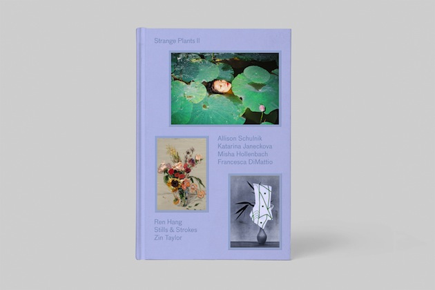
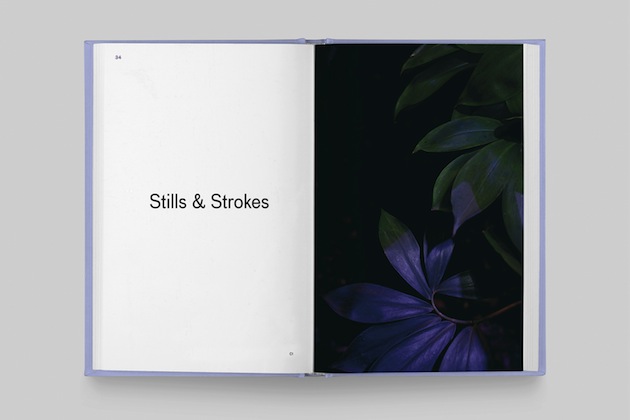
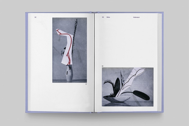
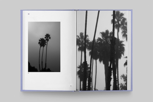
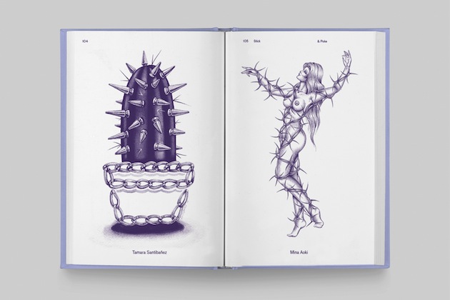
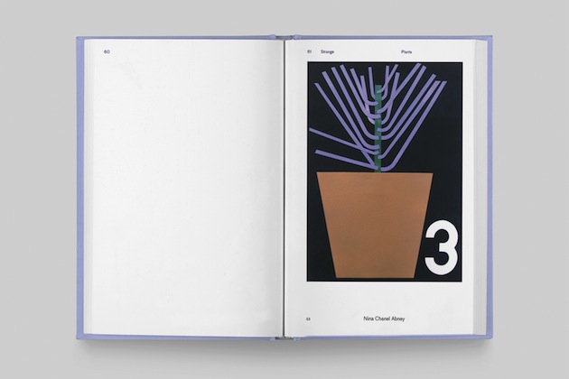
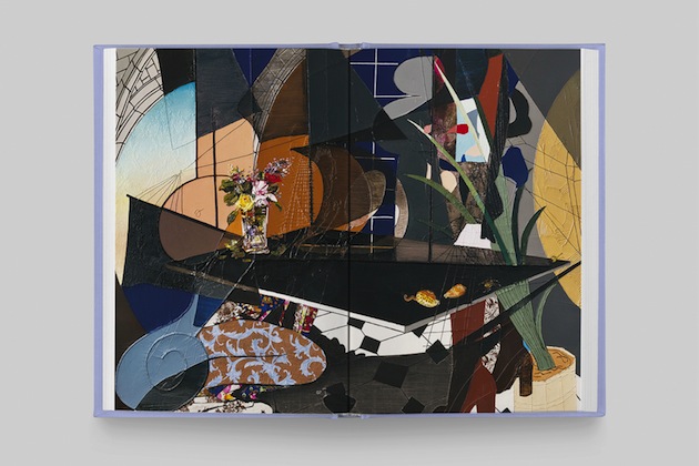
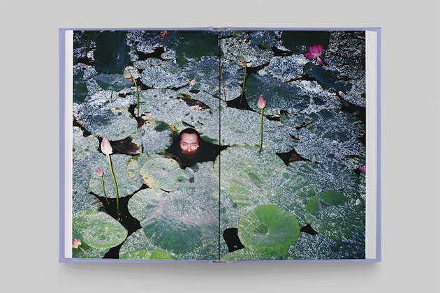
Strange Plants II is the second book in a series that celebrates plants in contemporary art published by LA-based publishing house Zioxla. The book features the work of 30 artists, and explores what these artists think about plants and how they portray them in their work. It includes viscous paintings of drooping flower arrangements; intuitive photographs of lily pads and lithe bodies; mixed-media collages that juxtapose the tranquility of Japanese Ikebana with the chaotic energy of vandalism; and much more.

For the book, editor Zio Baritaux brought together several artists who take a unique approach to incorporating plants into their work: Allison Schulnik, Misha Hollenbach, Francesca DiMattio, Zin Taylor, Katarina Janeckova, Stills & Strokes and Ren Hang. Schulnik, for example, used her own garden as a character in one of her short films; Stills & Strokes projected colors and geometric shapes onto the leaves of plants in botanical gardens; and DiMattio filled the sculptures in her exhibition with dramatic and unruly flowers. Each artist’s work is accompanied by an insightful article or interview that delves deeper into the relationships between plants and people. Taylor talks about a wild jade plant he clipped at the Eames house in Santa Monica and smuggled back to Brussels, thus transporting the spirit of Charles and Ray
 to his own home. Hollenbach discusses observing a deciduous tree in his backyard as a way to teach his young daughter about the cycle of life. Janeckova, a Slovakian ex-pat who now lives in South Texas, explains how plants keep her company in her new homeland.

“The aim of Strange Plants II is to continue the compelling conversations about how we perceive and interpret both the bizarre and beautiful sides of art and nature,” editor Zio Baritaux says. “Since the release of the first book, a community of like-minded, inquisitive and creative people has grown up around these conversations, and I hope this community will expand with the publication of this book.”

Images courtesy of Zioxla 
Share: Facebook,  Twitter  
10/03/2015

Paris Fashion Week: Colours

For over a century, the fashion from Paris has dictated upcoming trends around the world, including what colours to invest in. During the shows for the upcoming cold season – Fall/Winter 2015 – black was still the dominating colour. However, there were a few other contenders to keep in mind.

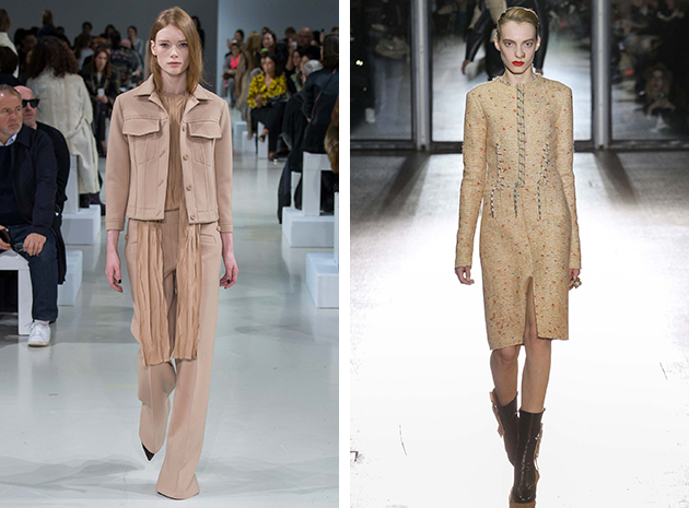
Earth: Sand-tones like beige and taupe were seen at many Parisian runways, including Nina Ricci and Acne Studios. In a tailored and nuanced way the different fashion houses used earth tones on mixed materials creating a grounded effect which paradoxically lifted the looks to something more eye-catching than just another beige coat.

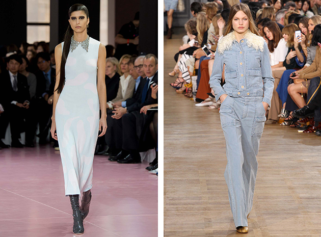
Wind: Fresh as a summer breeze, light blue notes infiltrated numerous shows, sometimes bordering on white – as seen at Loewe – or in light denim – as seen at Chloé. The custom seemed to be a head-to-toe light blue look, with darker accent colors. A black belt, as seen at Barbara Bui, or dark grey boots á la Dior, are just a few sources of inspiration.

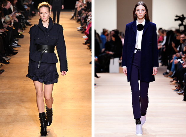
Water: Since the water in the fall suddenly becomes dark and enchanting, so were some of the color schemes on Parisian runways, proposing the same deep blue scale. Navy was dominating and could be spotted at Carven, Lanvin or Isabel Marant. It could be seen in apt combinations which brought together different shades of dark blue with black or white, showing why it is considered a classic, yet of its time.

Victoria Edman 
Share: Facebook,  Twitter  
09/03/2015

Style Suggestions: Season’s Must Haves

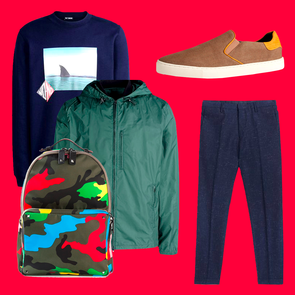
For this season, menswear should not leave out a selection of key pieces. Here are some of our (colourful) suggestions to get you started.

Jacket: Acne, Sweater: Raf Simons, Pants: Paul Smith, Shoes: Burberry, Backpack: Valentino

Styling by Vanessa Cocchiaro 

Share: Facebook,  Twitter  
09/03/2015

Three Young Fashion Talents from Milanese Runways

As Milan fashion week turned its spotlights off, and all eyes are on Paris, we still want to relish the brilliant “Made in Italy” style. Though it is not usually known as a hub for new talents – Italy like its designers traditional and old – this year, a couple of exciting young designers could be found on Milan’s runways. Here are three names everybody should write down for the years to come.

Arthur Arbesser: Before founding his own brand in 2012, the Milan based designer Arthur Arbesser has studied at Central Saint Martins and worked for other fashion brands in Milan. Arbesser’s design aesthetic is based on an eclectic mix of cultures and approaches to fashion. Arbesser, who grew up in Vienna, often mixes influences from Austrian culture with references and ideas coming from the world of art, most probably learned during his studies in London. For the A/W 2015 collection these approaches and references are expressed through an elaborate selection of intriguing patterns, which, combined with strong silhouettes which, clearly show his great knowledge of the design craft.

Paolo Errico: Paolo Errico is mostly interested in design from an innovative and sculptural point of view, as he is able to create garments through shaping techniques which focus on volume and balance. He aims to evoke emotions by combining high quality, functional and creative pieces. Errico’s design goals are reflected in the pieces – all created with the modern woman in mind – which succeed in keeping the balance between contemporary urban style and the practicality of everyday life.

Marianna Cimini‪: ‏The Milan based designer Marianna Cimini, sees her designs as a balance between modernity and femininity, fusing together pieces that are both contemporary and elegant. She unites sharp silhuettes with sportswear, looking for inspiration at familiar places – that range from the Mediterranean and her childhood growing up on the Amalfi Coast – when creating the patterns and colours and exploring her own, unique, design philosophy.

Hanna Cronsjö 
Share: Facebook,  Twitter  
05/03/2015

Dress Like a Man

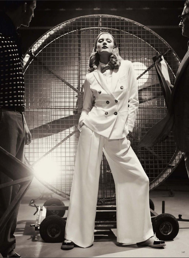
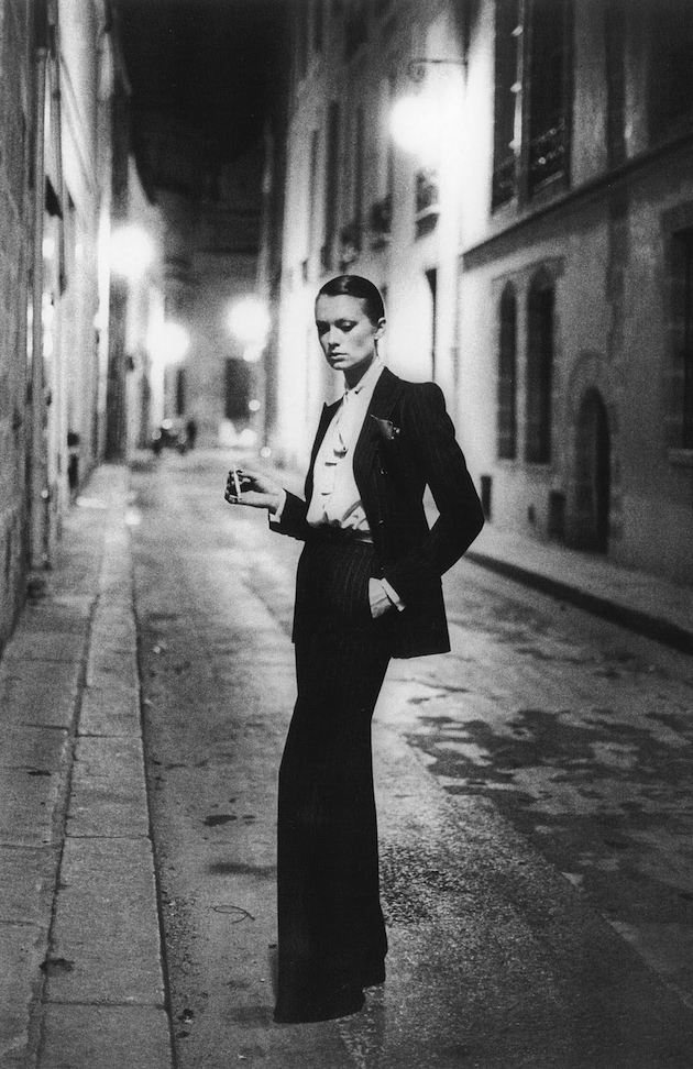
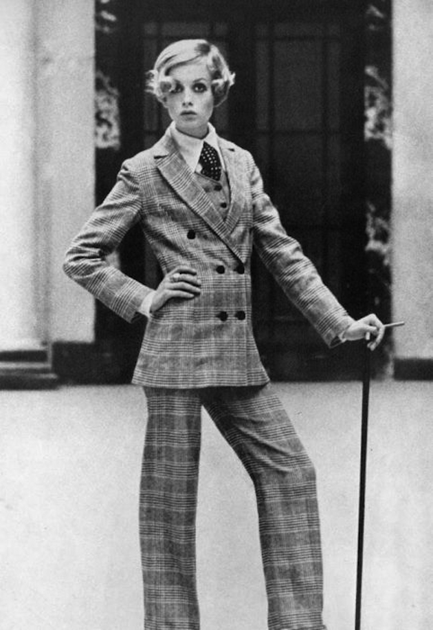
Dressing like a gentleman is not considered a new ‘thing’ anymore, with mannish trends becoming very popular season after season. But, like everything, its beginning can be traced back to a precise moment in time, the 1930s, when women used to wear suits composed by skirts and jackets. The pioneer of the mannish look was Marlene Dietrich, known for her slack suits. The actress didn’t just wear them during many of her movies, she also chose slacks for her public appearances.

A fundamental step forward happened during 1960s, when Yves Saint Laurent created what we still call the androgynous look, by making models wear a tuxedo. Fashion photography followed the path and made the look even more mannish by adding some interesting details such as slick hair and typical boyish poses. Helmut Newton brought the influence to life by photographing androgynous styles for most important magazines of the time. In some of the last shows for next season, Prada and Gucci above all, designers seemed happy to play between genders by mixing typical girlie details with more masculine silhouettes.

Francesca Crippa 
Share: Facebook,  Twitter  
05/03/2015

Tales of Two Cities (and Styles): YSL and Halston at FIT

In 1973, the Château de Versailles hosted one of the events rightly remembered as one of the milestones of recent history of fashion. Known as the ‘Battle of Versailles’, it was a fashion show which saw opposed five well-established French fashion houses and five new recruits who were dictating style directions on the other side of the Atlantic. The French maisons were Pierre Cardin, Emanuel Ungaro, Christian Dior, Hubert de Givenchy and Yves Saint Laurent, opposed by Oscar de la Renta, Stephen Burrows, Bill Blass, Anne Klein and Halston. The show took the shape of a competition, whose main merit was to underline, once for all, the distinctive ideas at the basis of design in Paris and in the US, respectively.

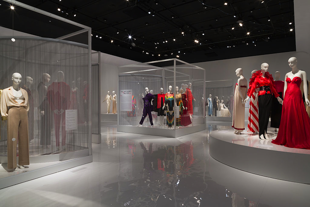
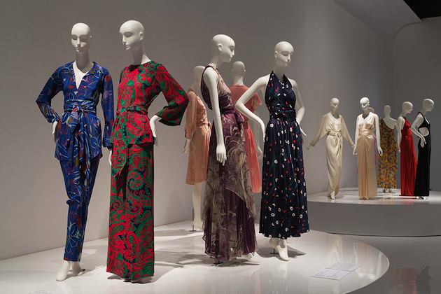
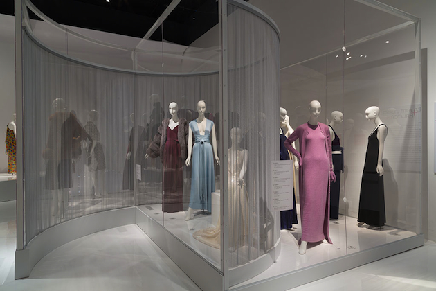
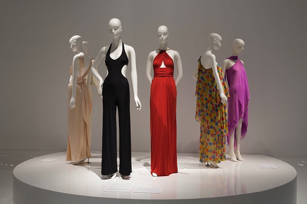
The exhibition now on stage at FIT seems to be a reprise of one of the five direct confrontations which took place during 1973, the one which saw Halston and Yves Saint Laurent directly opposed one to the other. Curated by Patricia Mears and Emma McClendon, Yves Saint Laurent + Halston: Fashioning the 70s runs through the iconic creations of both designers, focusing on differences and similarities in vision, path and outputs and trying to extend the discourse around the 70s, a period for so long set aside and which is coming again to the fore in the latest collections seen on the runways.

The exhibition holds about 80 ensembles and 20 accessories, all of them selected from the FIT’s archive, and is thematically subdivided into three areas: menswear, exoticism and historicism. The isolation of these three themes is useful to analyse the different approaches to common inspirations and shared imaginaries, which led to the delineation of two precise aesthetics. While the clothes shown can be confused or wrongly-attributed at a first glance, a thorough observation of them in comparison highlights the diverse sensibilities for forms, constructions and above all details, which carry the mark of the environment in which the two designers lived and worked. This juxtaposition of messages colonises the set – and the atmosphere – of the exhibition, which becomes in this way a territory somehow hybrid: between the stroboscopic lights of Studio 54 and the gipsy-esque attitude of bohemian Rive Gauche.

It is an occasion to reflect not only upon the work of the two designers, who still dominate the idea of the 70s we have nowadays, but also on the territorial characterisation of fashion itself; Halston’s tan ultrasuede shirt dress and YSL’s Safari Jacket are blatant examples of two dissimilar ways to read and interpret history and sources in general: the first epitomises a predilection for clean lines and basic, extremely easy design, while the second is synonymous with a more solid relationship with inspirations, which always win over commerciality. Two strong and overt directions, which can still be found in the collections showing in the two fashion strongholds: Paris with its eccentric chic and rampant and pragmatic New York. Nevertheless, the title of the exhibition, with that little plus between the two big names, proposes an addition more than an opposition; maybe suggesting that, while discussing the fashion of today, we should stop thinking about the place itself and restart from the basis – in other words, from design itself.

Marta Franceschini – Images courtesy of FIT 
Share: Facebook,  Twitter  
04/03/2015

Scholten & Baijings: Reproducing the Shape of Thought

In the past decades, many attempts have been made to systematically organize and describe design practice. Questions about purpose, context, media, tools or use are often brought up with the hope of answering what design is and fitting its multifaceted realities into precisely defined categories. Yet, it is unlikely that design is ever going to adapt to any of those laborious categorisations, for it is in its very nature to remain elusive and continue to transform. In fact, design practice is at its best precisely when it refuses to be moulded, shaped and contained. Nevertheless, should we be determined to penetrate the complexity of design’s geography today, we’d have to look at how designers design. Design process – a medium in itself – offers a glimpse at how thoughts, ideas and concerns are transformed into material shapes, how they become the landscape of ‘things’ that define the world today.

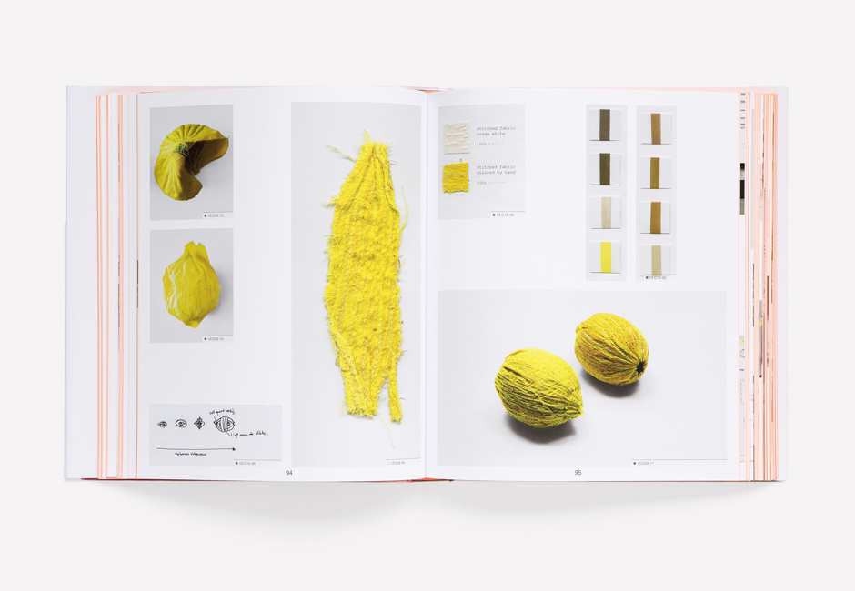
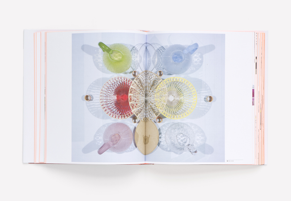
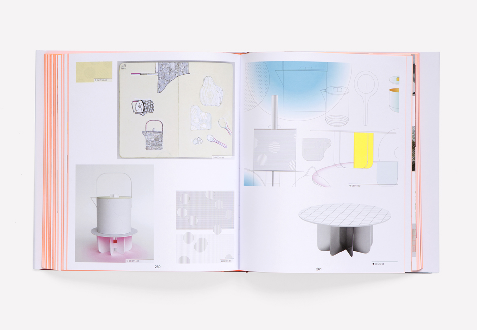
Design process is at the centre of a new book, published by Phaidon, that attempts to categorize the work of Stefan Scholten and Carole Baijings, the Dutch design duo founded in 2000. In fifteen years of practice Scholten & Baijings have given shape to a particular kind of design, concerned with the visual language and transformation of conceptual vocabularies into three-dimensional patterns. Though reluctant to engage with social or political concerns inherent in any designed product, their work is valuable as it transforms design process into tangible, material forms. One of their most famous projects, a series of porcelain tablewares for Japanese manufacturer 1616/Arita Japan, is a systematic transformation of design thought into a collection of objects. Questions of colour, materials and form and their relationship to tradition, purpose and manufacture were translated into three different series of porcelain services – minimal, colourful and extraordinary – each becoming a synthesis of a specific approach to design.

Thus, it is no wonder, that “Reproducing Scholten & Baijings” attempts to bring this material discussion on design process into a two-dimensional space. Created in collaboration with Maharam, one of Scholten & Baijings’ most interesting clients, the volume gives shape to a reconstruction of design process, seen as the most authentic and unmediated way of engaging with and understanding their work. By flipping the pages – a collection of drawings, sketches, colour swatches, samples, models and photographs – a clear and straightforward visual pattern of thought emerges as a story, not so much about objects in themselves, as about how and why they need to exist. As Michael Maharam says, “Apart from the quality, thoughtfulness and utility of their output, Carole and Stefan have succeeded in creating a highly legible and cohesive embodiment of their vision.” Scholten & Baijings‘ work is significant because its material reality displays the shape of thought.

Rujana Rebernjak – Images courtesy of Scholten&Baijings and Phaidon 
Share: Facebook,  Twitter