11/02/2015

Joan Didion Seen Through the Lens of Julian Wasser

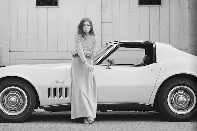
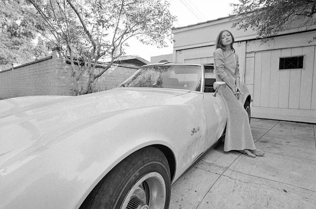
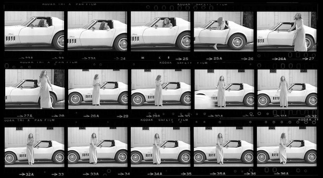
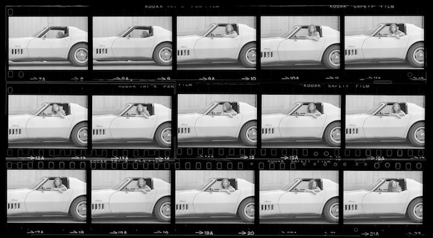
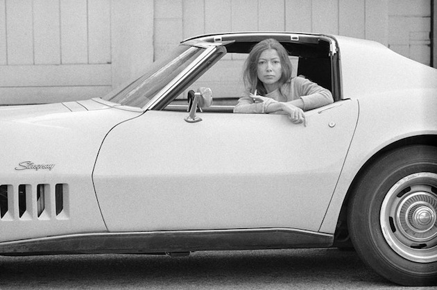
When Julian Wasser first shot Joan Didion in her home in Hollywood in 1968, little did he know that his nonchalant images of the literary hero would inspire a fashion campaign almost 5 decades later. Posing with ease and carelessness, Ms. Didion, shot for Time Magazine after the release of her book “Slouching Towards Bethlehem”, unknowingly anticipated her current status as fashion icon and model for the French brand Céline. After causing much internet upheaval – the campaign was shot by notorious Mr. Teller and shows Ms. Didion hidden behind a pair of oversized black sunglasses – the great writer is now the main subject of a show at Danziger Gallery in New York. As part of their ‘project’ series, the gallery showcases selected images of Ms. Didion shot by Julian Wasser, posing with her Corvette Stingray car, or while smoking or with her daughter Quintana Roo on her lap. Recalling the afternoons spent at the writer’s house – the photographer would shoot her five times over the next couple of years – Mr. Wasser said: “It was a nice, cozy house. And she was a very easy person to talk to. No Hollywood affectations.” And it is exactly that atmosphere that still appears in Ms. Didion’s portraits, even those ‘staged-not-staged’ images set forward by Juergen Teller.

Images by Julian Wasser – Courtesy of Danziger Gallery 
Share: Facebook,  Twitter  
10/02/2015

Daily Tips: California Surfing and Climbing in the 50s

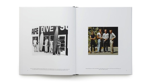
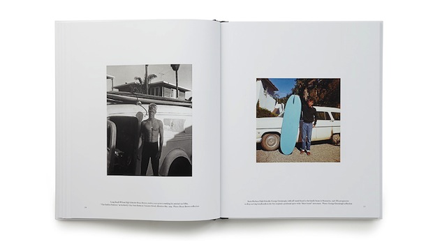
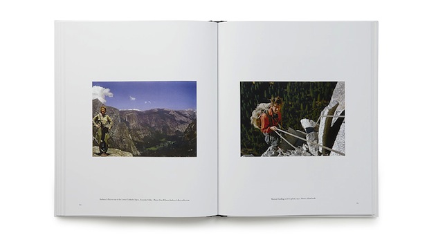
Too accustomed to fairly recent images of Californian surfers and skateboarders, it might come as a delightful surprise to see that adventurous subcultures have always shaped the landscape of the “Golden State”. A book released by Tom Adler, a publisher rooted in West Coast culture, titled “California Surfing and Climbing in the Fifties” uses text, paraphernalia, colour and black and white imagery gathered from a variety of photographers and private collections, in order to reconstruct the everyday life of the pioneers of surfing and climbing in 50s California. Reduced in size, yet rich in content, the book captures the spirit of a small group of individuals who have, ever since, shaped both activities, from the first ascent of Yosemite’s Half Dome northwest face to the first waves ever successfully ridden at Waimea Bay.

The Blogazine 
Share: Facebook,  Twitter  
10/02/2015

From Abstraction to Life: Adventures of the Black Square

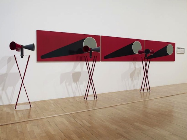
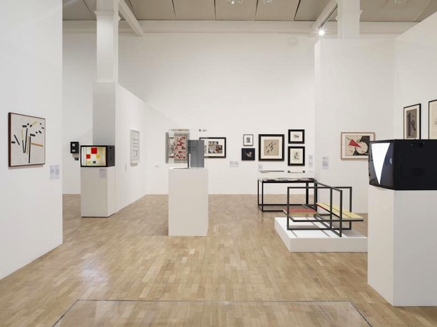
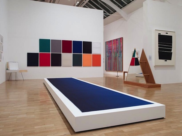
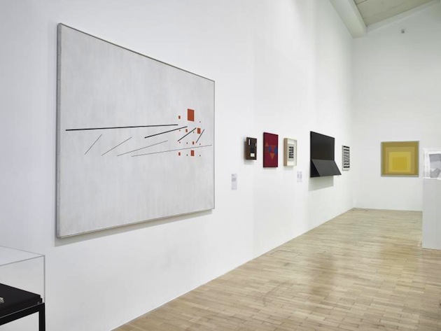
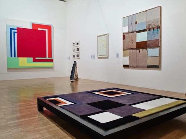
In 1915, Kazimir Malevich first showed one of his suprematist paintings, titled “Black and White. Suprematist Composition” at the exhibition “The Last Futurist Exhibition of Paintings: 0.10” in St Petersburg. Malevich’s painting of a black square on white background established a radical rupture with the past by setting forth the notion that “the visual phenomena of the objective world are, in themselves, meaningless; the significant thing is feeling, as such, quite apart from the environment in which it is called forth”. “Adventures of the Black Square: Abstract Art and Society 1915 – 2015”, an exhibition currently on show at the Whitechapel Gallery in London, reads that specific moment as a crucial event that would forever change both art and life.

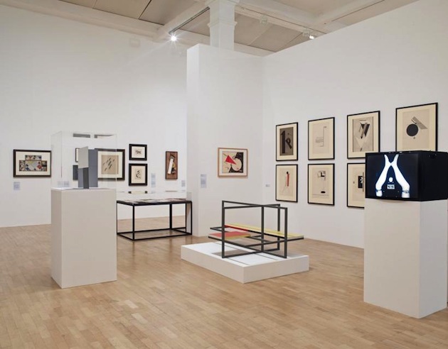
Understood as an act of subversion of established hierarchies, a rebellion against rigid social norms and a proposal for change, Malevich’s ‘black square’ is the starting point of a reflection on points of intersection between society, politics and abstract art through a period of 100 years, from 1915 until today. Divided into four different thematic sections – Communication, Architectonics, Utopia, the Everyday – the exhibition aims at showing how abstract art permeates different spheres of ‘reality’, precisely as it questions, or abolishes, the established relationship between ‘realness’ and representation. The ground floor of the exhibition, thus, departs with works that shape each of the exhibition’s themes, such as Lyubov Popova’s Painterly Architectonic, Gustav Klutsis’ loudspeaker stands, or Sophie Taeuber-Arp’s wall hangings. These seminal works are, though, only a small part of the curators’ narrative on the intersection between art and society. The show, in fact, presents a rich structure as it showcases design, painting, photography, film and video, sculpture, performance, textiles and participatory work. Therefore, Max Bill’s painting sits near a wall upon which images of Bauhaus’ students having lunch on the school’s terrace are projected, while Anni Albers’ “Hanging” builds a dialogue with Italian magazines of the first half of the 20th century.

Yet, as the exhibition progresses, the radical impulses of the beginning of the century are slowly substituted by a diluted vision of abstraction in art. Concentrated on gestures, social action and the political, the second half of the exhibition sets a different understanding of abstraction. Works such as Amalia Pica’s “Memorial for Intersection #2” or Sarah Moriss’ “Beijing” focus on the act of social and political subversion itself. But as art evolves and engages with society through its media and formats, it seems to have built a distance, a critical reflection and a fundamental division of art and life, perhaps bringing it far from what the initial ‘black square’ intended to achieve.

“Adventures of the Black Square: Abstract Art and Society, 1915-2015″, curated by Iwona Blazwick and Magnus af Petersens will run until April 6th 2015 at the Whitechapel Gallery in London.

Rujana Rebernjak – Images courtesy of the Whitechapel Gallery 
Share: Facebook,  Twitter  
09/02/2015

Style Suggestions: Wool

Don’t lock yourself away during the cold months. Keep toasty warm and look great with these woolen essentials.

Coat: Isabel Marant, Sweater: Stella McCartney, Scarf: Acne, Beanie: Eugenia Kim, Gloves: Missoni, Necklace: Lanvin,

Styling by Vanessa Cocchiaro 

Share: Facebook,  Twitter  
09/02/2015

Konstantin Grcic: The Future Landscape for Design

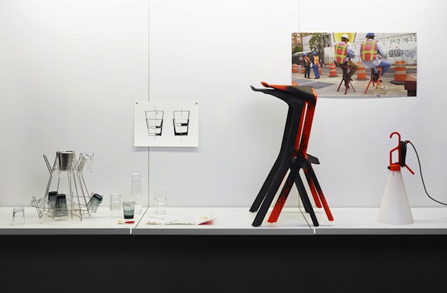
Konstantin Grcic is one of the most influential designers of our time. Serious and functional, unwieldy and occasionally disconcerting, his works combine an industrial aesthetic with experimental, artistic elements. Many of Grcic’s creations, such as Chair_One (2004) or the Mayday lamp (1999), are widely acclaimed as design classics. Opened this Sunday at Z33, “Konstantin Grcic – Panorama”, developed in collaboration with the Vitra Design Museum, is the largest solo exhibition on Grcic and his work to date.

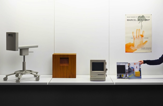
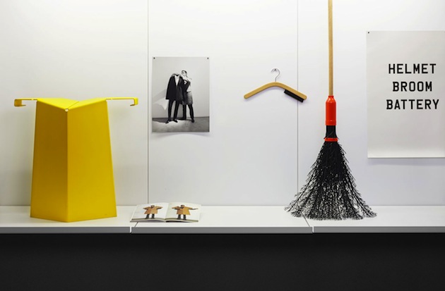
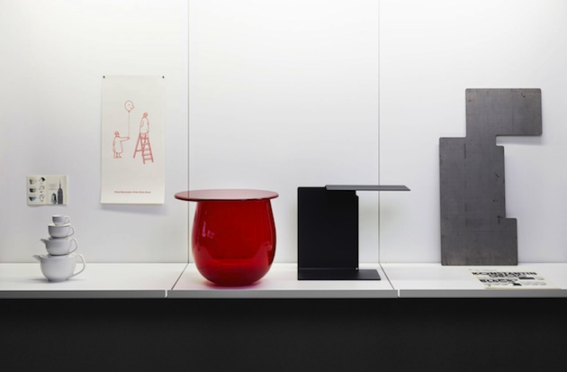
Specifically for this exhibition, Grcic has developed several largescale installations rendering his personal visions for life in the future: a home interior, a design studio and an urban environment. These spaces stage fictional scenarios confronting the viewer with the designer’s inspirations, challenges and questions, as well as placing Grcic’s works in a greater social context. The highlight of these presentations is a 30-metre long panorama that depicts an architectural landscape of the future. A fourth area of the exhibition takes a focused look at Grcic’s daily work. This section presents many of his finished objects, but also prototypes, drawings and background information along with artefacts that have inspired Grcic – from an old teapot and an early Apple computer to works by Marcel Duchamp, Gerrit Rietveld and Enzo Mari. In the shift of perspectives between larger and smaller scales, the exhibition demonstrates how design is more than mere problem solving for Grcic, but a highly complex process that integrates coincidences, ruptures, chance discoveries and a profound engagement with the visual culture of our time.

With “Panorama”, Grcic enters new territory. Never before has he so fundamentally reflected on his own work and so thoroughly disclosed his own understanding of design in general. The exhibition is based on an extensive analysis of current technological shifts, innovations and upheavals in contemporary design. It was developed over three years of close collaboration between Grcic, Vitra Design Museum and Z33. The result is a striking presentation of narrative and visual intensity, situated on the cusp between present and future, reality and fiction.

Rujana Rebernjak – Images courtesy of Vitra Design Museum 
Share: Facebook,  Twitter  
06/02/2015

Is Haute Couture being lost?

Haute Couture has been the heart of the fashion world since C.F. Worth made his designs known to the world. From then on, the artistry of Haute Couture have evolved, yet it is still today regarded as the highest form of fashion. It is all about tailoring to perfection and creating the magical substance that fuels the abstract dream that fashion may sometimes be. Just last week couturiers showcased their creations for the fashion world to see.

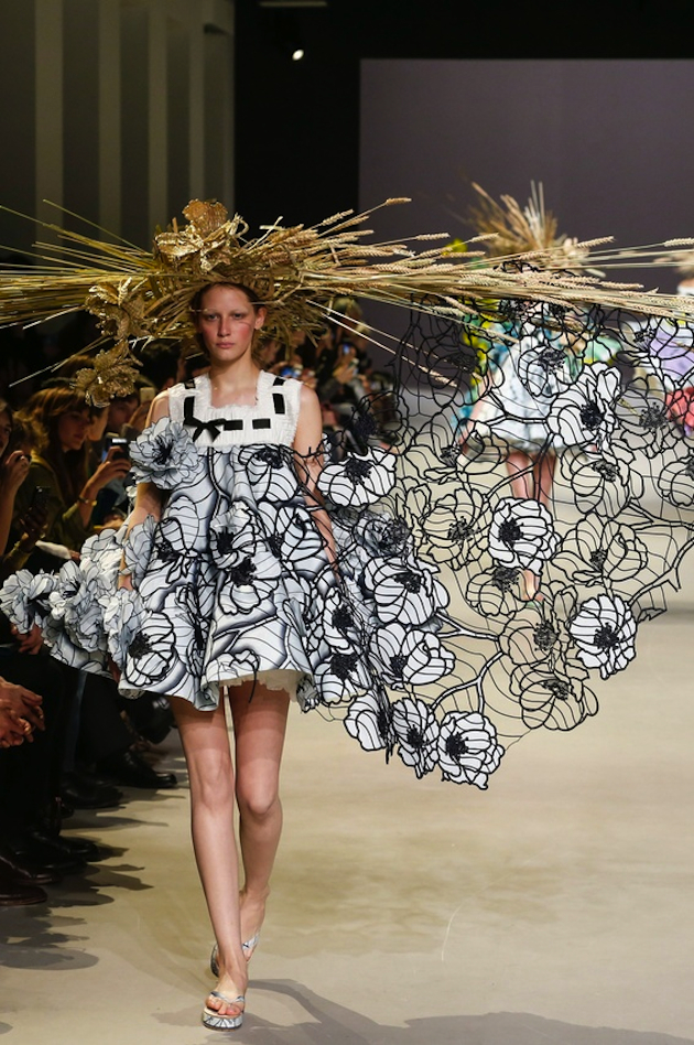
Viktor & Rolf: The fashion duo presented pieces that seemed to come from a surreal floral dream. The flower embellished dresses in voluminous A-line shapes induced the effect as if they were drawn on, emphasizing the feeling of surrealism. Adding different oversized straw hats and daydreaming of spring was given a more visual shape.

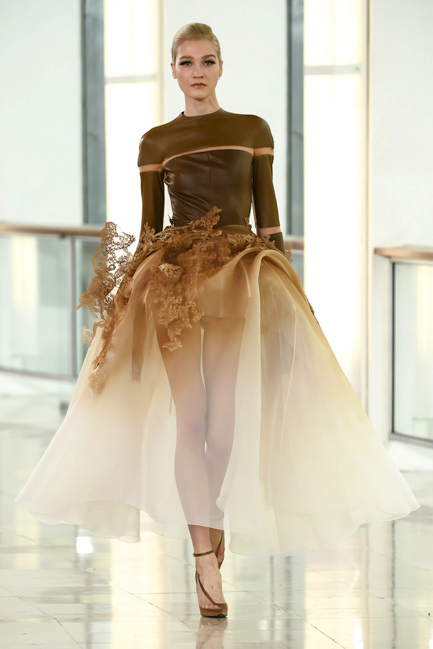
Stéphane Rolland: Transparency might make difficult colors not only beautiful but also thought provoking: a lesson learned at Stéphane Rolland. The first looks were reminiscent of an alien ballet dancer echoing the runway. A long sleeve leather top referencing a futuristic look was balanced with the softness of a see-through full ballet skirt adorned with, what from a far looked like, coral or branches.

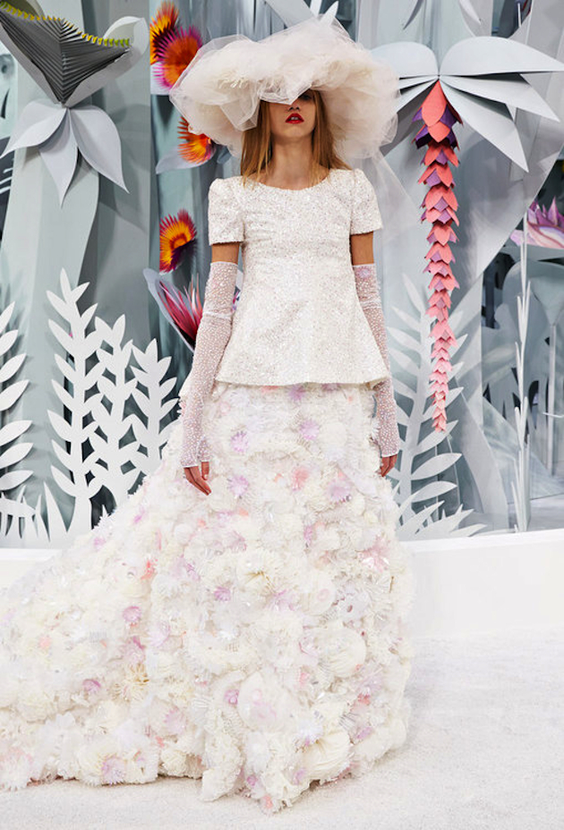
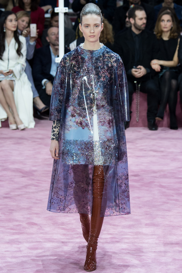
Dior & Chanel: Karl Lagerfeld and Raf Simons stayed true to the essence of their design house’s aesthetic. Chanel showcased different takes on the Chanel suit but it was their final piece that truly stopped the show. A long flowy, yet stiff, white layered dress paired with an over the top hat made the model stand out as a chic cupcake. Dior paired 1950s glamour with the 1960s mood. Simons showed a surprising look, that paired a black spattered raincoat with purple latex stockings. Playing with both colors and adding unexpected elements of sex appeal to an otherwise modest look.

Haute Couture is to be admired for its impeccable craftsmanship and pushing the limits of fashion. It’s the essence that keeps things fresh. The past couple of seasons it seemed to have rendered into a bit of a slump, something that is partially now changing tune. Couture is engrained in fashion and isn’t going anywhere. It is likely that focus on minimalism and prêt à porter will generate more creative ways, finding outlet in the Haute Couture of tomorrow.

Victoria Edman 
Share: Facebook,  Twitter  
05/02/2015

Lamija Suljevic: Bosnian Craft Meets Modern Technology

Lamija Suljevic is an upcoming Swedish designer with roots in Sarajevo. The mix of the two cultures has inspired her design in different ways as she tries to unite the two cultures with the ambition of creating something unexpected and new. By Suljevic’s talented hands, traditional costumes from Sarajevo and modern fabrics which she relates to Sweden, merge, resulting in the strongest collection showed during Stockholm fashion week.

Suljevic’s A/W 2015 collection, as well as her previous work, carries a depth that not all designers menage to express. Her unique pieces, from laser cut out dresses to traditionally decorated but modern slitted pants, are all highly executed and decorated by hand. The time and effort put into the collection shows in every single piece sent down the runway. Suljevic really knows her craft and you can’t help but feel a vibe of haute couture even though we are far from Paris, both geographically and ideologically.

This collection is great in so many levels – the craft, the pieces and the personal inspiration behind the collection – it embraces the mix of cultural references and shows how she successfully united them. Her work is a proof of how fashion can unite and bring people and cultures together resulting in something more interesting and innovative than it otherwise would have become. The combination of the personal sources of inspiration and the dark and in the same time beautiful pieces, all created with amazing craft, makes this collection a story about life’s deepest and greatest moments. The sparkly and black pieces seem to be a reflection of the fine line between them both, and how fast it all can change. In other words, it is a collection about life.

Hanna Cronsjö 
Share: Facebook,  Twitter  
05/02/2015

The Stage and the Actors: Fashion Mix at Palais de la Porte Dorée

Italo Calvino, in his book The Invisible Cities, states that the delight one can have from a town lays not in its wonders, but in the answers it can give to the questions the person asks to the city itself. In many cases, these answers are so unforeseen and, still, glaring that they immediately get to the core, shaping thoughts, feelings and, of course, practices. Among all the mythical places of fashion, Paris surely holds a privileged position, and this has been true since the very beginning of the modern concept of fashion itself. The stories of fashion with Paris as its main scenery are many; perhaps, any fashion story has something to say about the city. Still, if we read them carefully, it becomes clear that most of the time, Paris is not only the setting, but an actual character, actively interacting with other actors on the scene. Fashion Mix, the exhibition now on view at Palais de la Porte Dorée in Paris, showcases the many stories of the fascination – love stories, we would dare to say – that foreign designers have had and continue to have with Paris, confirming its legendary role as the main stage of the global history of fashion.
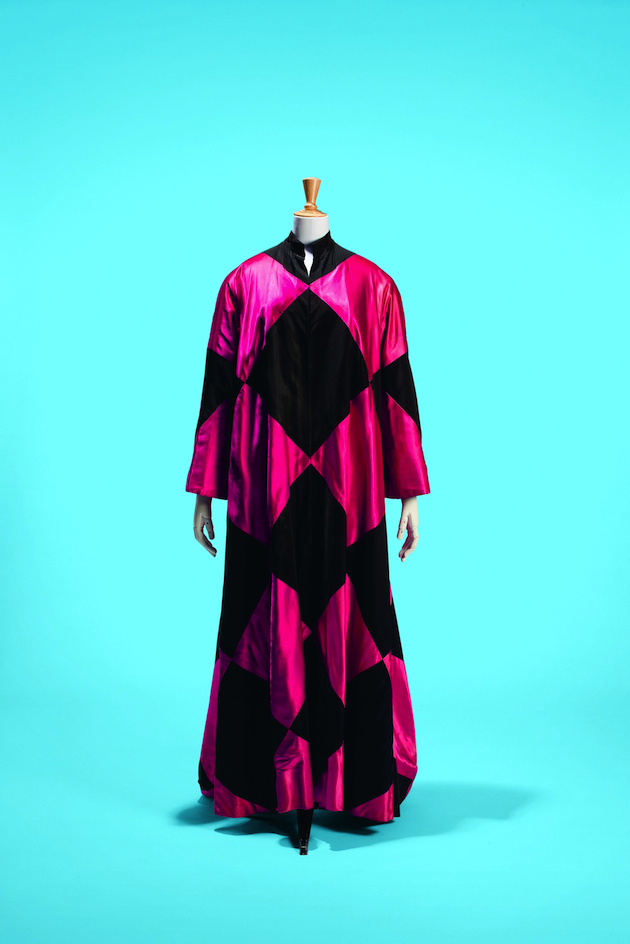
A mutual relationship, that between international designers and the city, established a style so diverse and declinable, but always ascribable to the ‘Parisian Flair’ – the so-called Allure Parisienne. The exhibition wants to be a journey between all the ramblings that have brought designers from all over the world from being foreigners to become part – and sometimes symbols – of the city and its established imaginary. The exhibition, curated by Olivier Saillard, stages nearly a hundred objects, between clothes and accessories, most of them coming from an almost entirely renovated archive of the Palais Galliera, drawing an imaginary line between Charles Frederick Worth to Martin Margiela, Cristobal Balenciaga to Riccardo Tisci, passing through Schiaparelli, Galliano, Miyake, Yamamoto and many others. It also counts many unseen materials, such as registration documents, official files, naturalisation applications, coming from both private and public archives, gathered by the Musée de l’histoire de l’immigration.
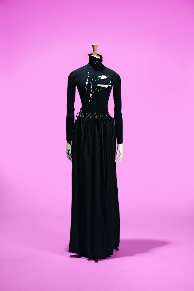
Fashion Mix stands as a manifesto of the enormous value of cross-pollination and influences within design practice, which becomes complex, and thus more interesting, when peppered with the clash of habits and cultures. Paris comes out from the exhibition as the active host of these movements, convoluted and simple, and the real enhancer of their effects: in the late 1880s, the city saw the dawning of the Couture by hand of an Englishman, as if the city had somehow called for it. The city still is home to the most established and awaited of the fashion weeks, calling up designers from all over the world to show their own collections, but above all to design for its historical fashion houses. Clothes, with their object nature, have the power to hold together as many references and memories as the person who designed them has been able to instil. Here, clothes are the material witnesses of the inevitable influence of Paris upon creative minds with the most different backgrounds, education, tastes, tempers. A prove that the city has given incredible responses to all of their questions.

Marta Franceschini 
Share: Facebook,  Twitter  
04/02/2015

Reframing History: Bouroullec for Artek

A myriad of de-contextualised references, historical re-appropriations and insufferable, outright arrogant replicas characterize the sphere of product design today, blatantly pointing to the practice’s complex relation with its history. In fact, historical contextualisation and awareness is one design’s greatest challenges today. Can contemporary design – especially furniture and interior design – propose an authentic vision for the future of the practice? Or is everything we see just a re-interpretation of modernist canons, re-packaged and re-vamped for a contemporary audience, oblivious to the discipline’s past? Can these questions even be addressed through practice, rather than through theoretical discourse?

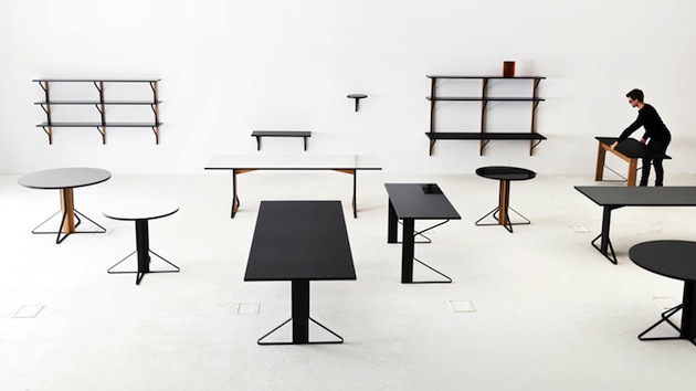
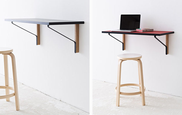
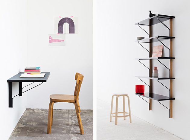
Rather than plainly ignoring or subverting design history, Ronan and Erwan Bouroullec’s new project for Artek, the Finnish company founded by Alvar Aalto that has shaped design history, claims to acknowledge historical influence and Aalto’s insurmountable legacy. Kaari Collection comprises a series of products that emerge as a direct result of the company’s history: “Both wood and steel banding are traditional materials and a fundamental part of the Artek heritage – however, they have never before been combined in this way,” Ronan and Erwan state. A well-coordinated series of everyday objects – a table, a shelving system and working desks – supposedly follows Artek’s tradition of bent metal and laminated wood, re-proposing it for contemporary aesthetic sensibility and, above all, commercial viability.

The Bouroullec’s deliberate use of historical references does not, in any way, reform contemporary design’s position towards history. On the contrary, seen within a broader context of Artek’s recent evolution – the company was acquired by Vitra in 2013 – it says more about design’s commercial strategy rather than constructively contributing to its debated relationship with the past. In this specific case, design history is used as a means of validating projects that, in an over-saturated market, might not have any success or even reason to exist. Moreover, it poses a critical question about sustainability: if, as the Bouroullecs say, the table as typology of object has only undergone minor alterations over the past 100 years, is there really anything left to add? Perhaps a more thorough reading of design history might be the right antidote to such superficial appropriations, and just what contemporary design practice desperately needs.

Rujana Rebernjak 
Share: Facebook,  Twitter  
03/02/2015

Daily Tips: PJ Harvey at Somerset House

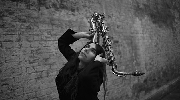
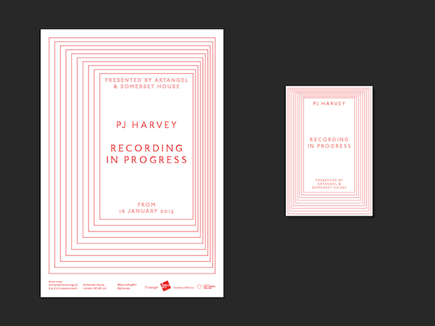
Recording in Progress is a project conceived by PJ Harvey, in collaboration with Artangel and Somerset House, for the Inland Revenue’s former staff gymnasium and rifle range in the recently opened New Wing at Somerset House. Harvey has chosen to record her ninth album inside an architectural installation designed by Somerset House-based Something & Son. The structure, a recording studio in the form of an enclosed box, has one-way glazing, displaying PJ Harvey, her band, producers and engineers as a mutating, multi-dimensional sound sculpture. Visitors experience exactly what is happening at a particular moment in the studio, as Harvey and musicians, together with her longstanding producers Flood and John Parish, go through the creative process of recording an album of songs.

The Blogazine 
Share: Facebook,  Twitter