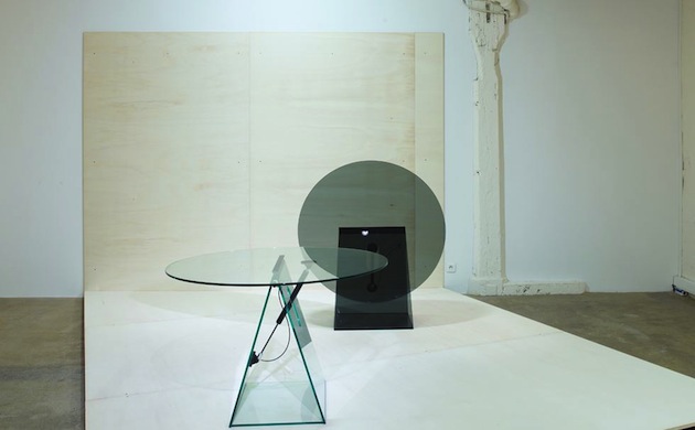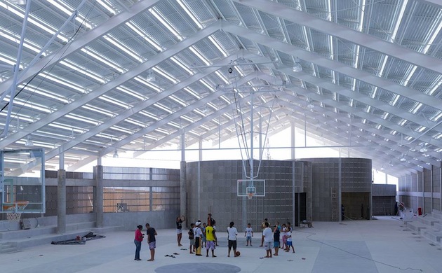
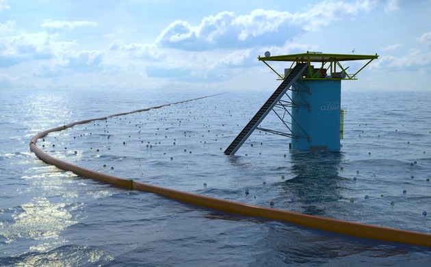
For the eighth year in a row, the Design Museum in London has revealed 76 projects for its “Designs of the Year” award. From architecture to digital design, the projects included range from socially responsible, environmental systems like “The Ocean Cleanup” or “Air-Purifying Billboard” to monumental buildings such as Frank Ghery’s Foundation Louis Vuitton or Herzog & de Meuron’s gymnasium in Brazil. Divided into 6 disciplinary categories – architecture, digital, fashion, graphics, transport and product – the shortlisted projects were chosen by the Design Museum’s team among 200 nominations put forward by industry experts. Commenting on the breadth of the award and its accompanying exhibition, the curator Gemma Curtin explains: “We want to show the whole spectrum. For every huge designer they started off as a smaller, new person on the block with a great idea or a new technique or vision. I think when we whittled down these selections to what we have in the exhibition, it was to give an inspiring and innovative showcase of design.”
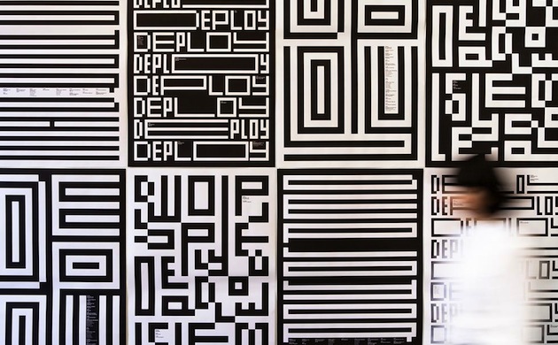
Perhaps as any other award, Designs of the Year is known for its controversial choices which, in the past, divided both critics and professionals. Most notably, last year’s overall winner, Zaha Hadid’s Heydar Aliyev Center in Baku, Azerbaijan, was widely criticized for its reluctance to engage with the context within which it was commissioned, designed, built and is now used. Awarding the top prize to Hadid meant that Designs of the Year had somewhat departed from its previous dedication to ‘design for the greater good’. As Patrick Burgoyne wrote in his review of the last year’s awards, “Briefing for the nominees was always somewhat, er, brief with an admirable degree of trust bestowed on nominators to come up with appropriate suggestions. […] Whether by accident or (sorry) design, it has carved out a position for itself with successive winners rooted in social causes or design for the public good. […] The emphasis was on the aspirational: design as we may like it to be rather than as it is for the majority of practitioners.”
Read through this lens, it is easy to understand why Designs of the Year often brings together such diametrically oposed projects. To emphasise this eclectic approach, Curtin has decided to arrange this year’s selection around loose themes in order to reflect the way these projects would be perceived in everyday life – where each element of the artificial landscape shapes relations and connections to other objects that surround it. “I think there are actually great similarities between some projects in their intent, if not in what they are trying to do. Obviously a magazine that comes out twice a year is very different to a piece of architecture that may have taken ten years from idea to finished building. But, I think that some of the processes, some of the intentions, some of the desires, unify these projects”, Curtin says. In fact, this curatorial choice is a step forward in reflecting how design is experienced today. Nevertheless, it poses a question as to how such a juxtaposition might contribute to the understanding of meaning, context and significance of each of the selected projects. In fact, can we even speak of a design of the year today?
