12/11/2014

Hubert de Givenchy: Everything Starts with the Fabric

Following the notes of Richard Roger’s “Isn’t it Romantic”, Audrey Hepburn interpreting Sabrina Fairchild attended the Larrabee party in a particularly memorable ball gown. At the time considered “tres magnifique”, and today highly iconic, the dress was designed by Hubert de Givenchy.
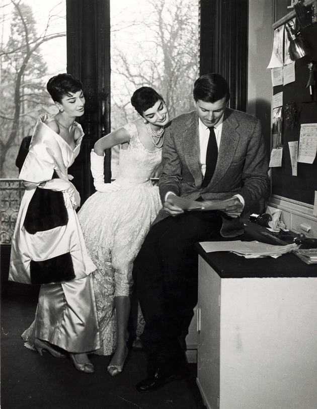
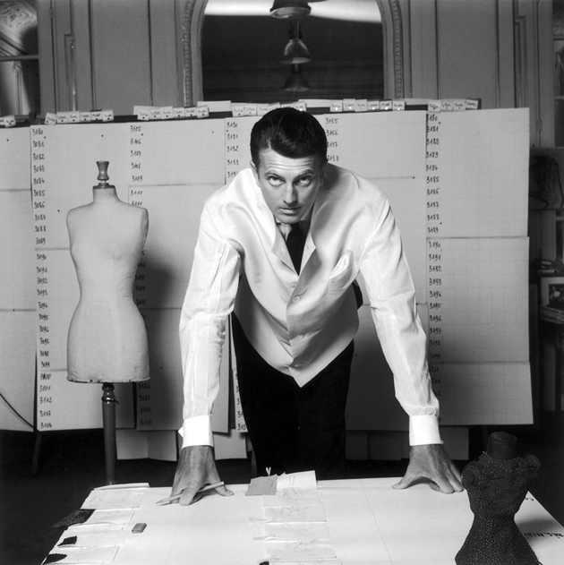
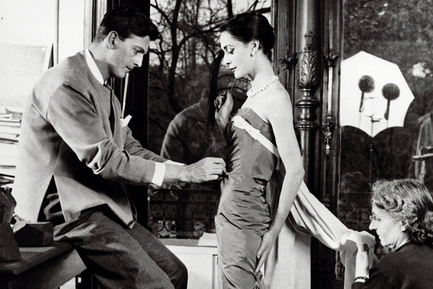
Mr. Givenchy was born in 1927 to an aristocratic family in the French city of Beauvais, and it was his maternal grandmother who instilled an initial passion for fabrics. He left for Paris at the age of 17, starting his career as an apprentice for the vibrant Jacques Faith and later the legendary Elsa Schiaparelli. In 1952, Givenchy opened his own couture house and presented his debut collection, which included the iconic “Bettina blouse” named after model Bettina Graziani. Givenchy would soon attract prestigious clients and introduce couture fashion to the Hollywood world. In fact, it was the unexpected encounter with a Hollywood diva – Audrey Hepburn, of course – that characterized the designer’s career as she became his lifelong muse, creative partner and most eager supporter. Together, they created Sabrina Fairchild’s style, influencing decades of fashion history and bringing their respective worlds to an iconic status. When Givenchy launched his first perfume, L’interdit, in 1957, it was Audrey Hepburn who fronted the campaign making headlines. 1957 was also the year Givenchy introduced the “sack silhouette”, an innovative cut free of form and waistline. Givenchy also encouraged women to show more leg through higher hemlines, becoming a forerunner of 1960s fashion.
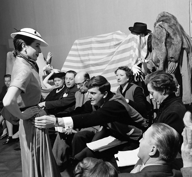
After being one of the first designers to sell his fashion house to a big corporation in 1988, Givenchy retired in 1995 abandoning, almost entirely, the fashion limelight. His work is now being honored at the Thyssen-Bornemisza Museum in Madrid in an exhibition curated by designer himself. Hubert de Givenchy’s retrospective features 95 of his pieces celebrating the designer’s remarkable career.
Victoria Edman 
Share: Facebook,  Twitter  
12/11/2014

Viviane Sassen at The Photographers’ Gallery

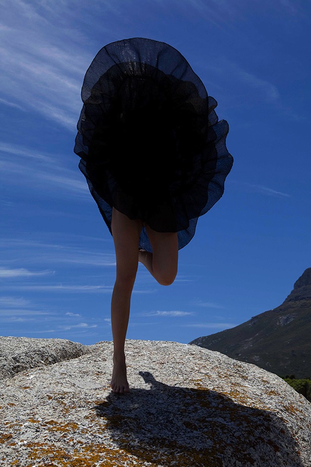
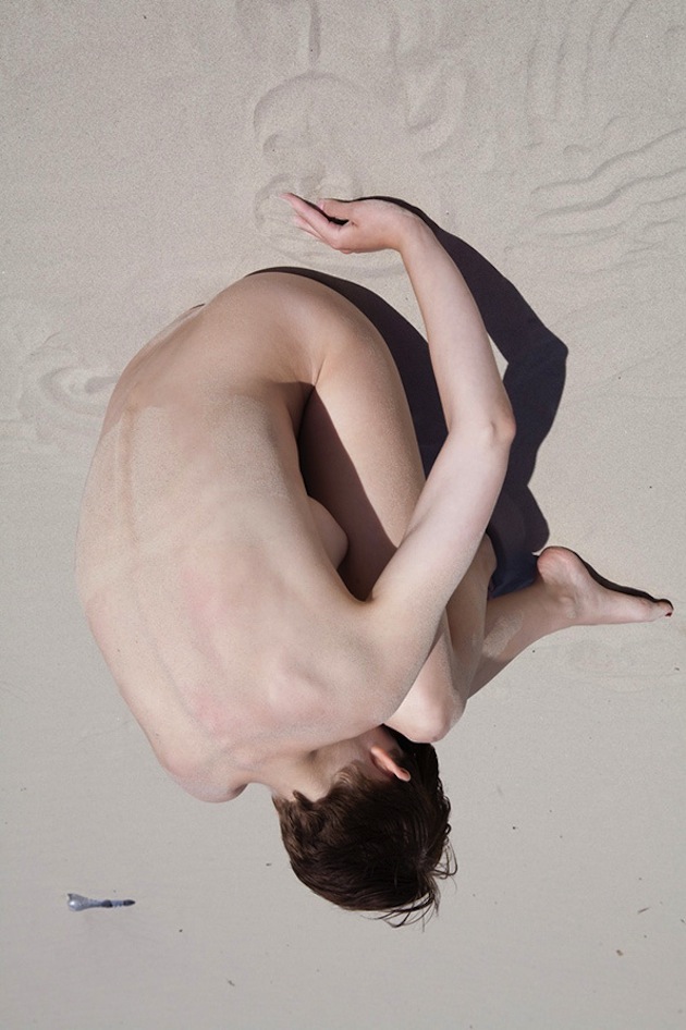
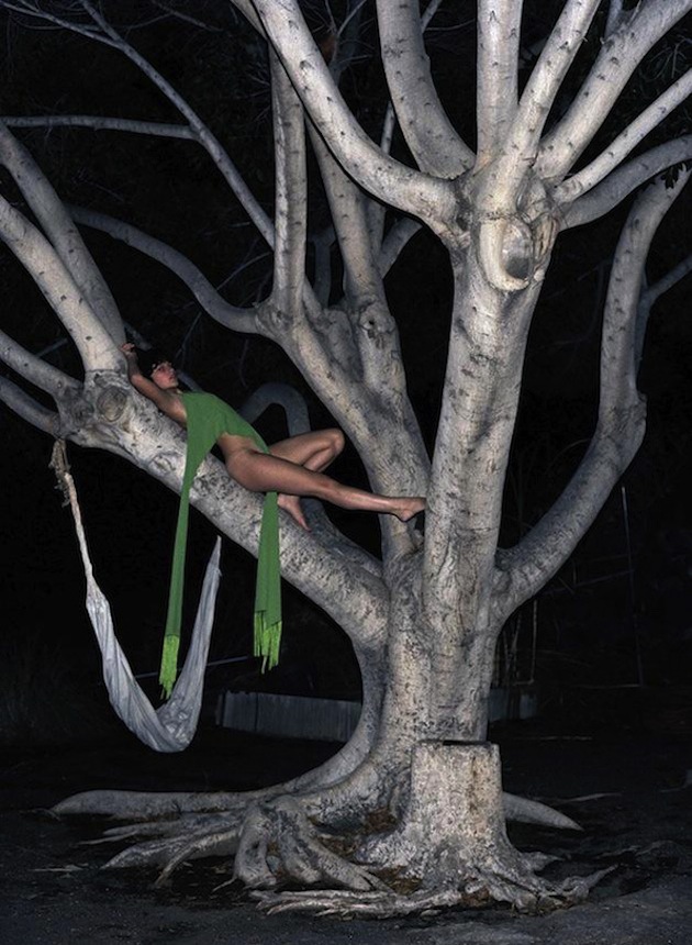
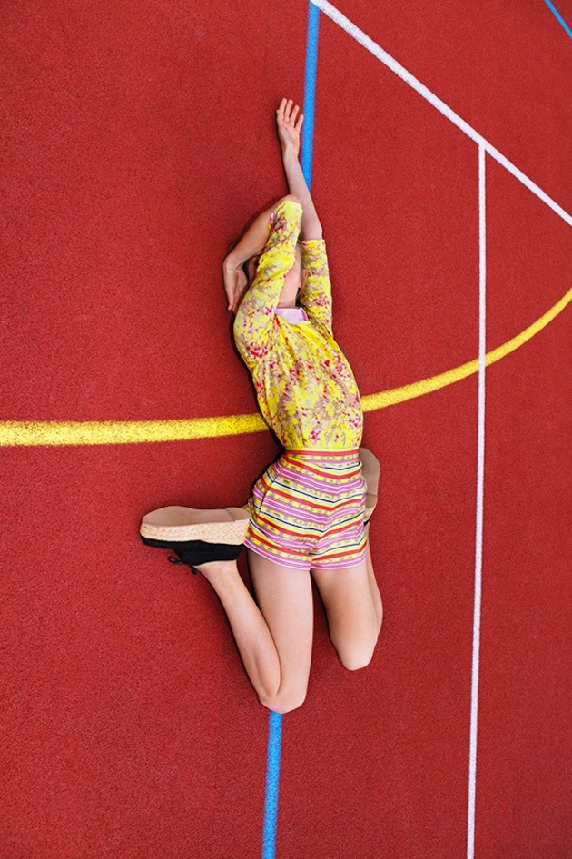
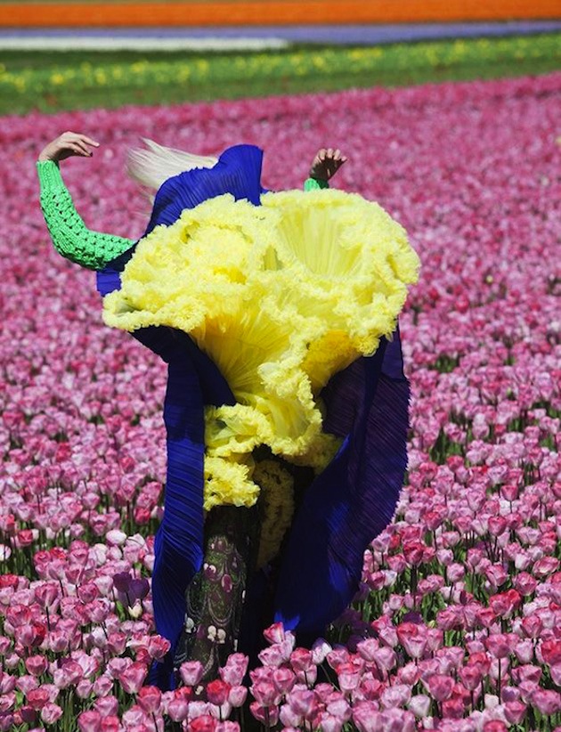
Analemma: Fashion Photography 1992 – 2012 at The Photographer’s Gallery is the first London presentation of works by Dutch-born photographer Viviane Sassen (b. 1972), one of the most exciting and creative figures working across contemporary art and photography today. Her highly distinctive style reflects an innovative and dynamic approach to the medium, producing images that foreground an expressive use of colour and tone, unusual viewpoints and a sculptural concern with form and shape that often lends a surreal quality to her compositions. This exhibition focuses on her fashion work and features around 350 images that subvert the limits and conventions of this genre. Sassen has conceived an immersive installation for The Photographers’ Gallery, presenting her images as a series of dynamic looped projections which sweep over and across the Gallery walls and floor. Mirrors and specially defined projection areas dissect the photographed bodies and disturb the viewers’ sense of gravity and viewing expectations.

Rujana Rebernjak 
Share: Facebook,  Twitter  
11/11/2014

Clothes with History: the Military Jacket

Throughout fashion history, certain garments were able to acquire specific meaning and represent ideas, concepts, struggles and relationships much more broader than the item itself. One such garment is certainly the military jacket – from an institutional item to a symbol of subcultures protesting against the Vietnam War, up to today’s use in the music context – the military jacket can tell stories about the history of our society through a simple piece of rough fabric.

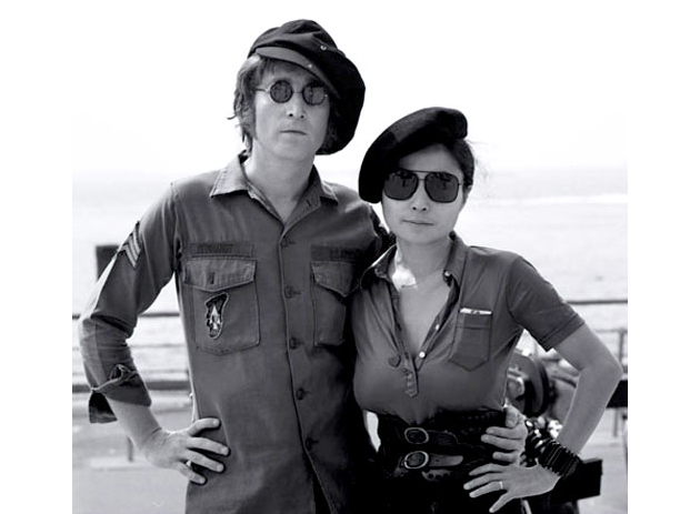
From John Lennon’s uniform of choice to Robert De Niro’s rough character in “Taxi Driver”, the military jacket was offered to the fashion world through the worlds of cinema and music. It was Yves Saint Laurent in 1968 who first introduced it in high fashion, with his “Sagarienne style” borrowed from British officers in India. From grand couturier’s atelier to young fashionistas on the grassy catwalks of Glastonbury or Coachella, the leap is quite long, and yet the military jacket still serves as a statement piece of an easy and subtly rebellious look.

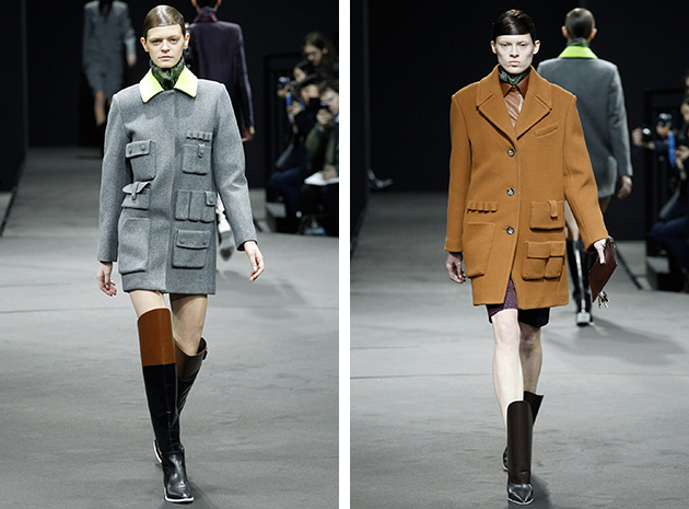
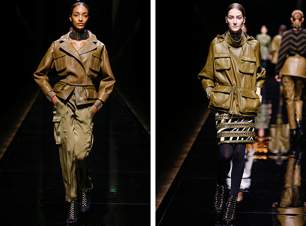
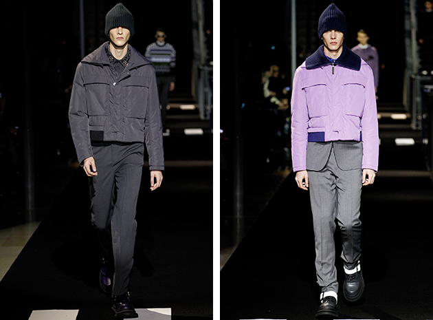
In fact, last season’s runways proposed a contemporary interpretation of the timeless military jacket, with Alexander Wang, for example, designing a crossover jacket-dress piece. Olivier Rousteing from Balmain proposed a more realistic, everyday look with utility pockets and though green leather as the basis of his collection. For men, on the other hand, Kenzo proposed a different palette with a feminine lily nuance. As we slowly put on heavier jackets and coats, we cannot but look towards Spring 2015 and its take on this iconic piece of clothing.

Francesca Crippa 
Share: Facebook,  Twitter  
10/11/2014

Style Suggestions: Rug Up

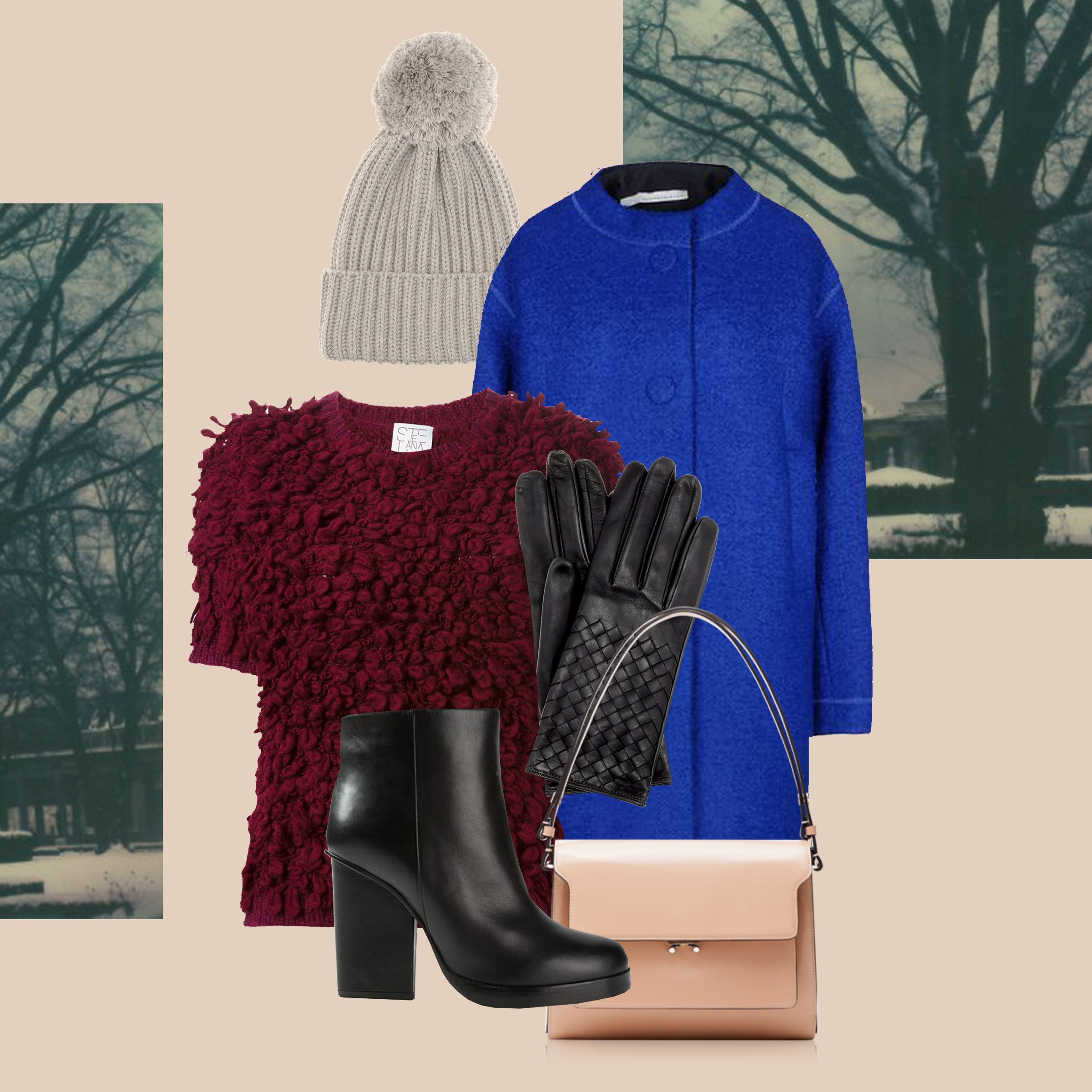
As temperatures get lower by the day, the only fashionable solution is to add layers of fabulous clothes in burgundy or electric blue paired with classic accessories in black and white.

Coat: Aquilano Rimondi, Top: Stella Jean, Gloves: Bottega Veneta , Beanie: Stella McCartney, Booties: Jil Sander, Bag: Marni

Styling by Vanessa Cocchiaro 

Share: Facebook,  Twitter  
10/11/2014

Richard Tuttle: I Don’t Know or The Weave of Textile Language

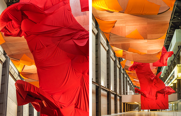
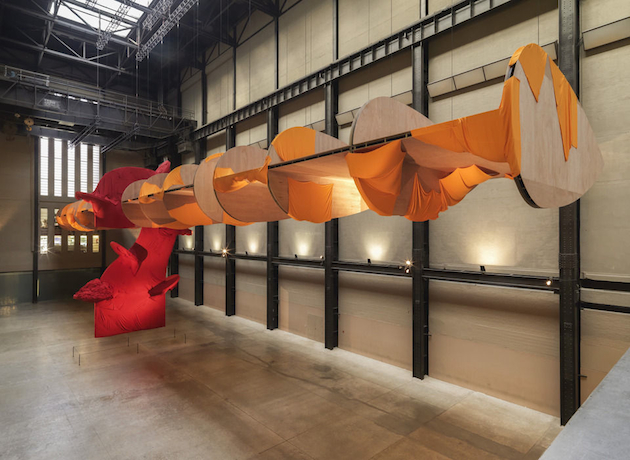
Richard Tuttle (born in 1941 in New Jersey) came to prominence in the 1960s, combining sculpture, painting, poetry and drawing. He has become revered for his delicate and playful approach, often using such humble, everyday materials as cloth, paper, rope and plywood. Two major art institutions in London – the Whitechapel Gallery and Tate Modern – are currently showing a comprehensive survey of Tuttle’s work through a retrospective exhibition, a specially commissioned project and a new publication, titled “I Don’t Know, Or The Weave of Textile Language”.

Taking textiles – the material that is most commonly associated with craft and fashion, yet lies hidden behind many of the world’s most acclaimed works of art – as the starting point of the project, the exhibition investigates the importance of this material throughout history, across Tuttle’s remarkable body of work and into the latest developments in his practice. The Whitechapel Gallery presents a major exhibition surveying Richard Tuttle’s career from the 1960s to today: showcasing works selected in close dialogue with the artist the exhibition centres on his use of fibre, thread and textile, all positioned in a formal relationship with each other and in direct response to the architectural framework Whitechapel Gallery’s historic exhibition spaces.

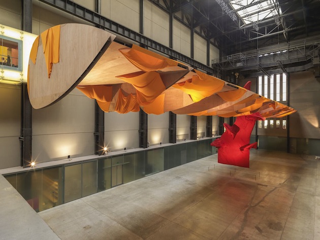
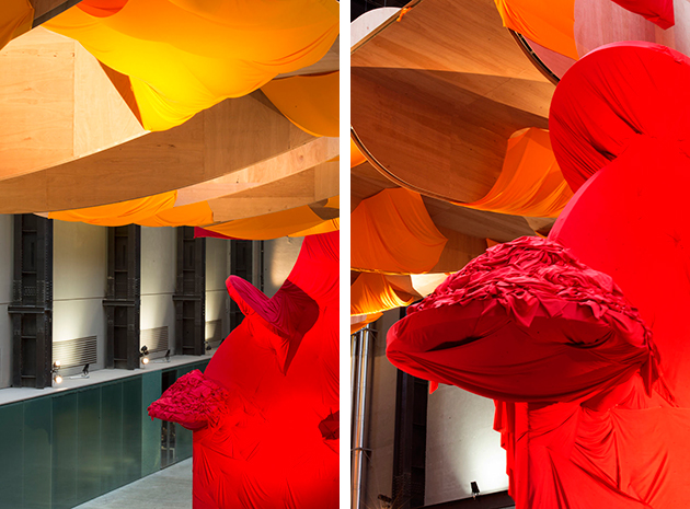
Alongside this exhibition, Tate Modern presents a newly commissioned sculpture in its iconic Turbine Hall. Principally constructed of fabric, it is be the largest work ever created by the artist, measuring over twelve metres in height. It will bring together a group of specially-made fabrics, each of which combines natural and man-made fibres to create different textures in bright colours. These will be suspended from the ceiling as a sculptural form, contrasting with the solid industrial architecture of the Turbine Hall, to create a huge volume of joyous colour and fluidity.

Rujana Rebernjak – Images courtesy of Andrew Dunkley 
Share: Facebook,  Twitter  
07/11/2014

Istanbul Design Biennial: Reconfiguring the Future

Has the future changed? Zoë Ryan, appointed curator of the second edition of Istanbul Biennial (1st November – 14 December 2014), has chosen a paradoxical statement – “The Future is not what it used to be” – as a starting point to rethink the performative relationship between design and the contemporary contexts where it is conceived and experienced. The 75 international projects on show, selected through a two stage call for ideas and exposed in the very heart of the Turkish metropolis at the Galata Greek Primary School hub, share a common approach that emerges despite the heterogeneous nature of their purposes (and which correspond to the Biennal’s different sections: “Personal”, “Norms and Standards”, “Resources”, “Civic Relations”, and “Broadcast”. According to Ryan, in fact, all the works “are intended to have outcomes – not only as texts – but open systems, whether actions, services, provocations, objects or buildings”.

In a country dominated by conflicting drives between tradition and modernity such as contemporary Turkey, this attitude is not afraid to side with the most progressive design analysis (and its political drifts, we presume), exposing its audience to new unexpected claims. And, in the end, neither is afraid to rehabilitate the value of Manifestoes, whose goal, always according to Ryan, is “to declare ideas and […] to frame pertinent questions”: in a time of liquid phenomenologies, the Manifesto stops to be programmatic and turns into a fertile setting for interaction, inclusion and development.

The interlocutory mission of Istanbul Biennial is the last of a promising series of design Biennials that, after the previous Ljubljana’s Biennial of Design and Kortijk’s Biennale Interieur, have highlighted this autumn’s calendar with an overdose of stimuli and open questions for design critique. Their success is not a matter of exhibitors’ selection, but on the contrary is more connected to the effectiveness of their format, which has surpassed standard design fairs and the accomplished expectations they have been generating in the latest years. Furniture showcases, together with the ways we’ve been used to enjoy them such as previews, fair off and other social happenings, may not have changed that much in the decades. That’s why the ability to give curators a more dilated time to understand new needs and emerging issues, to impose daring questions, to aggregate different projects, may prove to be the right way to boost a spent genre.

Giulia Zappa 
Share: Facebook,  Twitter  
07/11/2014

The Talented: Graham Fan

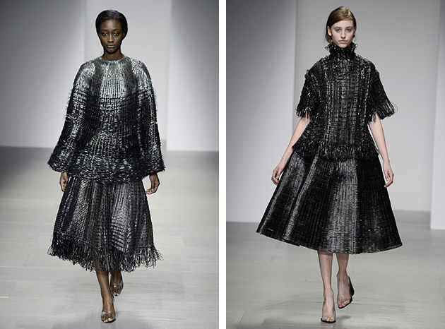
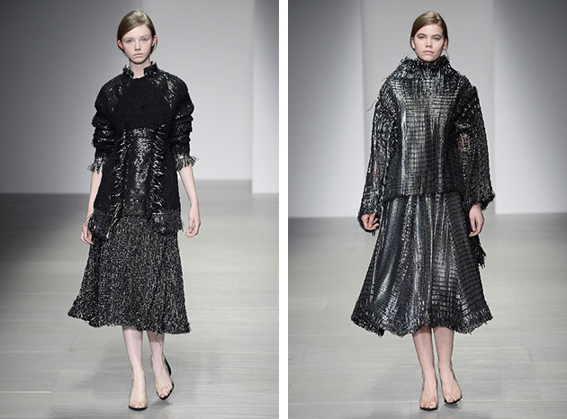
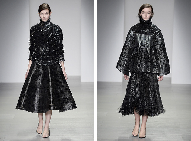
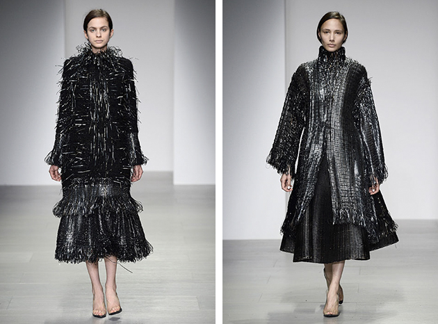
Graham Fan, a young designer with roots in both Canada and Hong Kong moved to London at the age of 19 to attend Central Saint Martins College of Art and Design; a decision that, as with many other fashion designers attending the school, became the start of his promising design career. Graduating earlier this year, during his time at the college Fan interned both with Marc Jacobs and Donna Karan. The time he spent in their design studio effected the way he sees the content of a modern wardrobe, defined by him as a balance between being sophisticated, sensual and edgy.
For his Fall/Winter collection, shown as part of Central Saint Martins MA 2014, the young designer was inspired by old weaving techniques. He explored the possibilities of the old technique using it with unconventional materials. Thus, the collection is a combination of traditional craft and innovative material choses, as he mixes mohair, metallic plastic cords, leather and cords. The silhouette fuses together influences from the 1950s as well as more modern twists expressed through boxy shapes, which in combination with the black and metallic woven materials makes the resulting pieces quit unique.

Despite his young age, Graham Fan has built his own design language which combines different influences, materials and styles into products that feel interesting and special. His AW 2014 collection gave us an insight in his design world, and now we can not wait until we get to see more of his sophistication, sensuality and design edge; in other words, Graham Fan’s work is something to look forward to.

Hanna Cronsjö 
Share: Facebook,  Twitter  
06/11/2014

Saul Steinberg: Architecture by Line

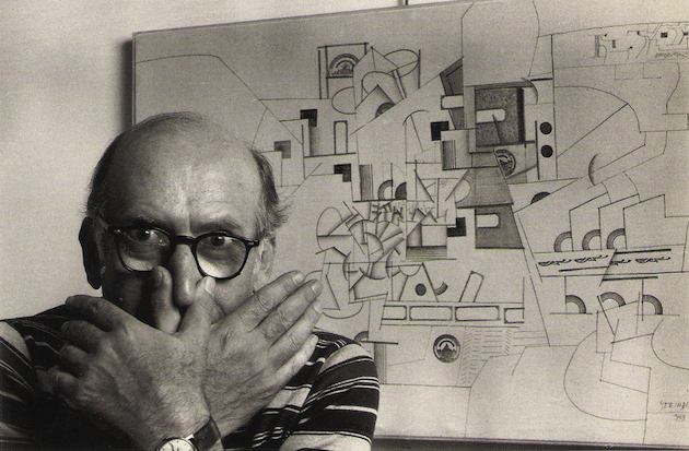
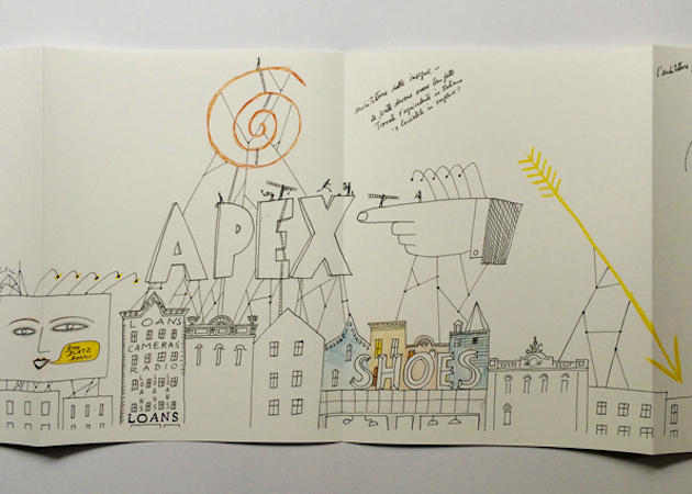
Drawing is the perfect medium to shape and express ideas and viewpoints on architecture without using words. Lines come together to make forms, which in turn become coherent images that enable the viewer to grasp even the most complex intentions and meanings. The American artist Saul Steinberg (1914-1999), well known for his long collaboration with The New Yorker, considered himself to be a ‘writer who draws’. A ‘speechless writer’ perhaps, but one who had a great deal to say about the buildings and cityscapes that came under the scrutiny of his critical eye. In this sense, he was a forerunner of postmodernism, and although he did not write essays many theorists of architecture see him as an important critic of design and construction.

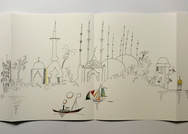
Architecture by Line exhibition at Archizoom exhibition space in Lausanne weaves links between Steinberg’s two-dimensional oeuvre and architecture. In 1954, Steinberg’s four long drawings were produced for the Children’s Labyrinth, a spiraling, trefoil wall structure at 10th Triennial of Milan. The Line, which begins and ends with a hand drawing, is Steinberg’s manifesto about the conceptual possibilities of the line and the artist who gives them life. The Line occupied one of the structure’s three leaves, while the other two hosted Types of Architecture, Shores of the Mediterranean, and Cities of Italy. Types of Architecture is a satirical survey of world architecture (Steinberg was trained as an architect in Milan), from America’s log cabins to Bauhaus exaggerations to fragile skyscrapers. Shores of the Mediterranean presents a sailor’s-eye-view of the Mediterranean coastline, filled with the ruins and renascences of successive civilizations. The Italy Steinberg knew as a student in the 1930s resonates in Cities of Italy, as the inked line, drawn with the artist’s usual spare elegance, imagines an urban sprawl of campaniles, factories, piazzas, apartment houses, curlicued domes, and a water tank that seems to have escaped from a carnival. The four drawings were collected and published together for the first time by Nieves in the form of an artist’s book with four individual leporellos.

The exhibition also includes works by a selection of international artists – Ingo Giezendanner, Nathalie du Pasquier, Nigel Peake, Medelon Vriesendorp and Wesley Willis - who do not necessarily share any filiation with him but who, by their use of drawing, question the way people see and inhabit the places that architects design. The exhibition shows how visual impressions captured by artists may anticipate architectural thought, and even short circuit it. In doing so it poses a vital question: is art the vehicle by which architecture is set free?

Rujana Rebernjak 
Share: Facebook,  Twitter  
05/11/2014

Beauty is Power in the Life of Helena Rubinstein

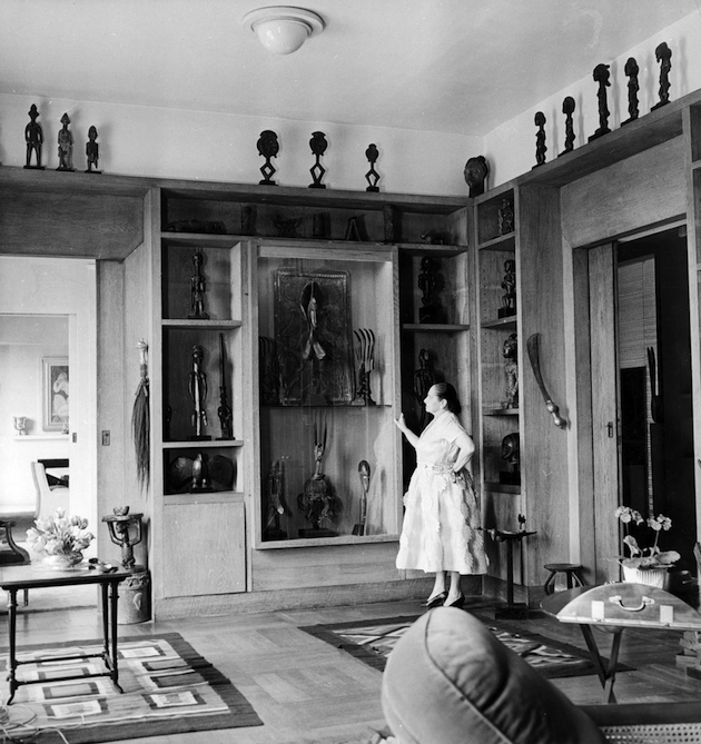
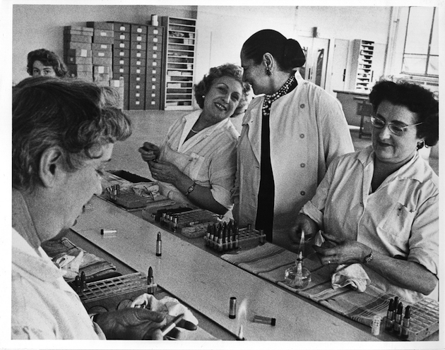
A “Madame” of perseverance and style, who not only broke the boundaries between commerce, beauty and art, but also became a symbol for modern women during the 1920s: building the concept of beauty salon as a place of education, personal growth and modernist culture, Helena Rubenstein empowered the aspiring modern women to define themselves through her own choices. She was a feminist heroine and a model of independence, rejecting the consolidated ideas about cosmetics and revolutionizing the industry.

Born in 1872 in Kraków, she departed for Australia at the age of 24, changing her name from Chaja into more poetic Helena Juliet. As her skin quickly caught the eye of Australian locals, in 1903 she started selling her miracle face cream “Valaze” at her debut salon in Melbourne. Following the modest beginnings, her global empire quickly grew to be present in over 30 cities including London and Paris. At the outbreak of World War I she relocated to New York City, a place where Rubinstein would become a true icon. She put specific beauty products, such as the waterproof mascara, on the map and was one of the early promoters of sunscreen. As unbiased as her approach to cosmetics, the eclectic taste showcased in the decor of her salons and homes served to expand the discourse around her peculiar idea of beauty. The Rubinstein salon was a unique place where women could go not only for beauty but to contemplate design, color, and art.

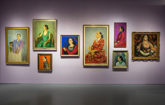
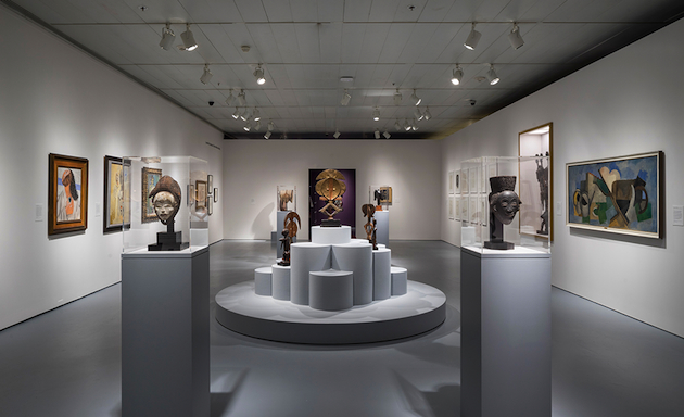
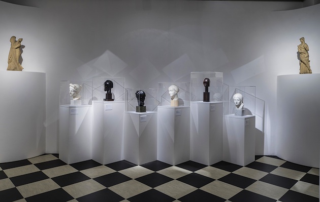
Helena Rubinstein: Beauty Is Power is an exhibition showcasing how Rubinstein’s approach changed the established conservative palate and created a modern twist to the world of beauty, making it accessible to all who desired it. The exhibition features over 200 art pieces from Rubinstein’s collection including works by Picasso, Andy Warhol and Frida Kahlo, jewelry and clothing designed by Elsa Schiaparelli and Paul Poiret as well as vintage advertisements and cosmetics products related to her iconic beauty brand.

Helena Rubinstein: Beauty Is Power will run until March 22nd 2015 at the Jewish Museum in New York.

Victoria Edman 
Share: Facebook,  Twitter  
05/11/2014

My Belgrade by Boris Kralj

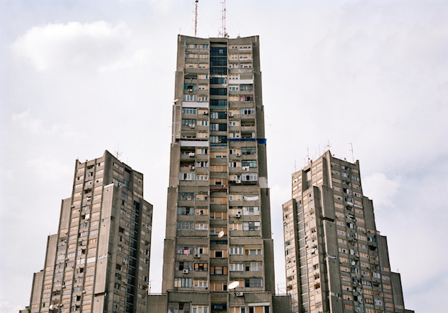
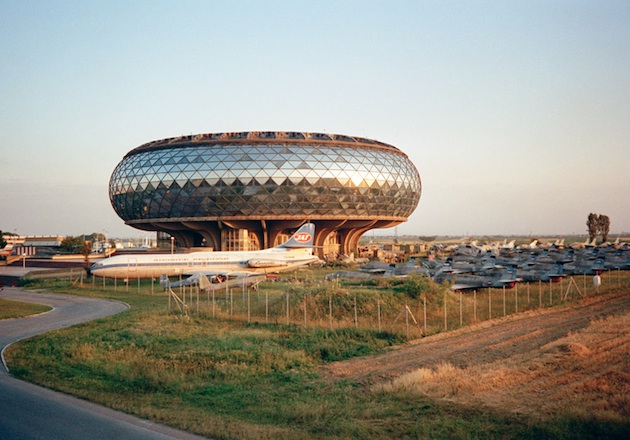
In everyday life, nostalgia is often associated with a warm feeling of subtle longing for the past, typically “for a period or place with happy personal associations”. Yet, in certain contexts, nostalgia can play a more significant role, related to issues of politics, collective memory, cultural and national identity. After the Yugoslav Wars, the citizens of former Yugoslavian countries developed a specific form of nostalgia for their socialist past. Defined Yugo-nostalgia, it has since grown into a real cultural phenomenonin an attempt to justify and cope with the region’s difficult past.

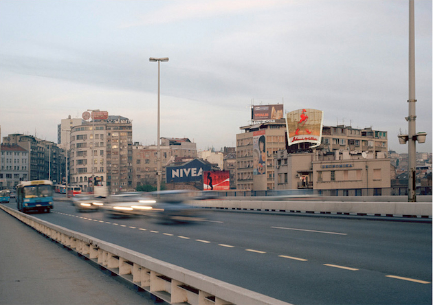
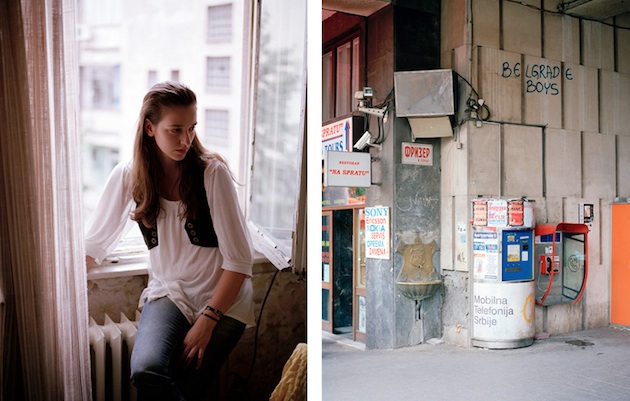
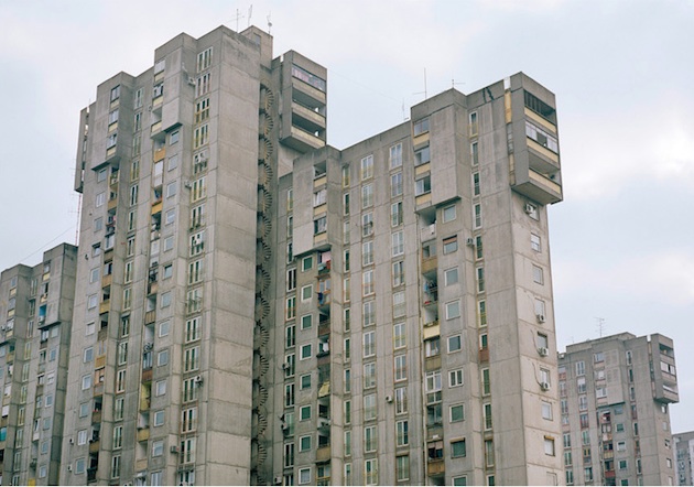
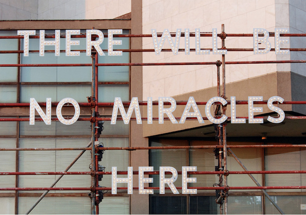
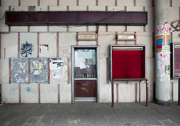
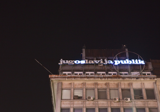
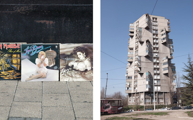
While Boris Kralj, a Berlin-based photographer and son of Yugoslav immigrants to Germany, has not experienced the life within the Yugoslav regime directly, his nostalgic photographic exploration of the former country’s capital, Belgrade, can be seen as a quest for personal identity. My Belgrade, takes the shape of a book that collects images of the city that form a very specific place in the collective Yugoslav memory, even: the neon signs and dull loking cinemas, the overwhelming brutalist buildings and empty roads, the grey skies and occasional pops of red. These are all iconic elements that appear in Kralj’s photographs, telling a story – that is both personal and collective – of nations that tried to forget their common past and are now reclaiming it with a vengeance.

Rujana Rebernjak – Images courtesy of Boris Kralj 
Share: Facebook,  Twitter