20/11/2014

Modern Wunderkammer: Noritaka Tatehana at SHOWStudio

What is a wunderkammer? Historically, it is the place of accumulation: a space for people to keep interesting, loved, strange objects with no clear use or meaning. Fashion world’s fascination with the theme of wunderkammer has always been tangible, as a way to keep trace of objects as well as references, instants, obsessions. SHOWstudio’s SHOWcabinet, the gallery located in Belgravia’s iconic Pantechnicon Building on Motcomb Street, has what it takes to be a modern wunderkammer: a physical place where art and fashion meet on a ever changing basis,where all its shifts are documented – and implemented with related contents – on its online platform.
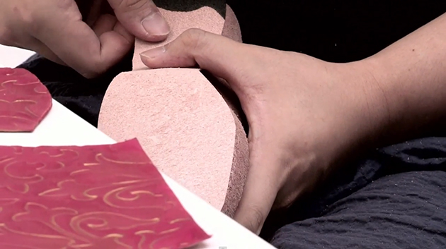
The first artist to show here was Daphne Guinnes, and this month the place hosts the works of the designer she is most tied to, Noritaka Tatehana. Defining him is not easy, but maybe the best title we could use is ‘master of heels’ – even if ‘heels’ in the western idea are, for him, a completely transfigured element. His practice, standing between craftsmanship and art, allows him to create pieces inspired by Japanese tradition, inflating his works with modernity, thanks to the use of avant-garde techniques derived precisely form the mastery of traditional crafts.
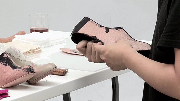
For Tatehana, appearance is everything: drawing inspiration from Japanese courtesans – the Oiran – every piece is a complex ensemble of precious materials, unexpected forms and incredible details. Looking at his works is a new way to experience Japanese art and to get a glimpse into traditions and culture, without necessarily understanding them: enjoying his works is, first of all, agreeing to pure aesthetic contemplation. Together with Tatehana’s works, SHOWCabinet showcases the photorealist portraits of artist Taisuke Mohri, whose poetic merges motifs both from the East and West; illusion, mirrors, cracked surfaces which blur the line between reality and imagination.
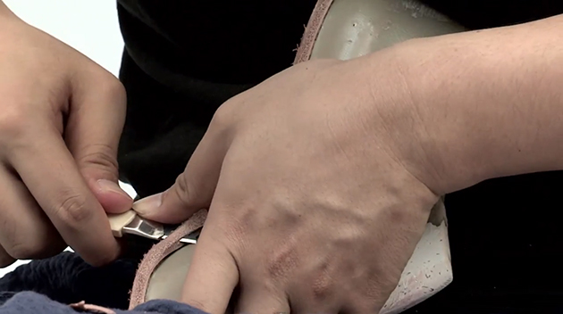
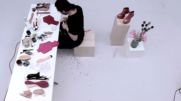
Even the very moment of creation is documented in this modern wunderkammer. Prior to the exhibition, Tatehana created a pair of shoes right in front of the camera. As Nick Knight stated: ‘We actually want to show the process of creating art, so we show people how the artist works and we allow people into that moment.’ Thanks to technology and video, and to collaboration with hybrid personalities like Tatehana, whose work cannot be assimilated to just one discipline, SHOWstudio has given new life to the Wunderkammer, proposing a new democratisation of not only art, but of the creative process itself.

Marta Franceschini 
Share: Facebook,  Twitter  
19/11/2014

Pierre Cardin: The Future is Now

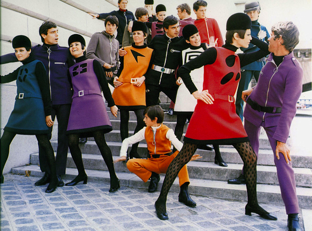
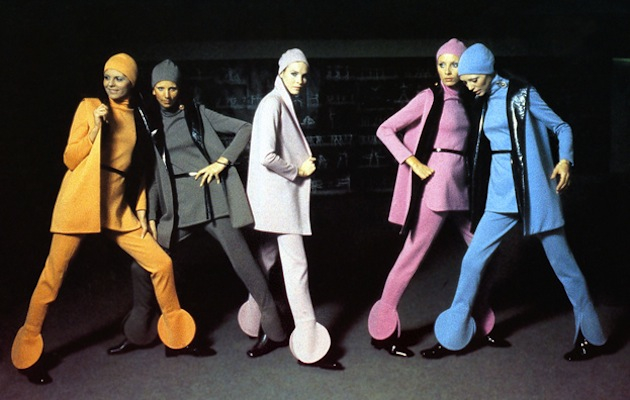
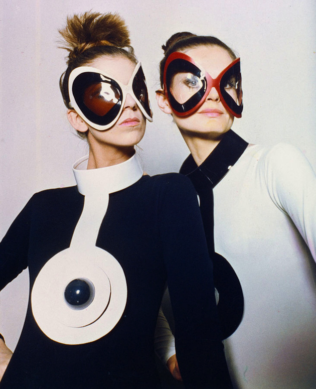
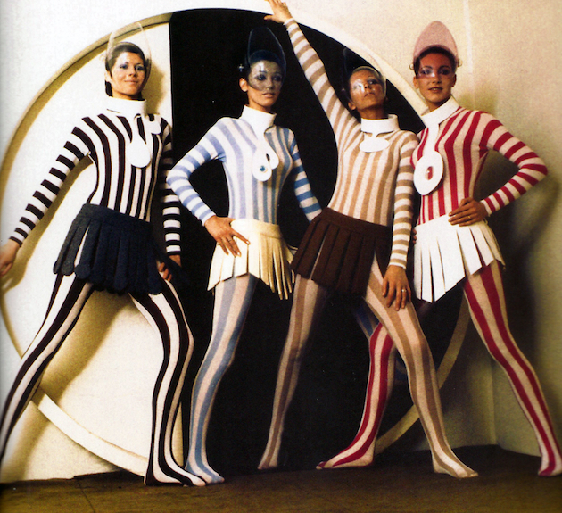
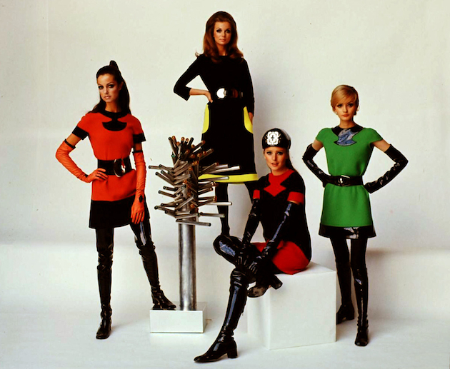
Last week one of the great creators of 1960s fashion spirit – Pierre Cardin – opened the doors of his Past-Present-Future museum in the posh Marais neighborhood of Paris, showing the last 50 years of his avant-garde career, known for an out-of-the-ordinary futuristic touch, geometric shapes and outer-space millinery.

Pierre Cardin moved to Paris in 1945, where he started working at the Paquin fashion house founded by famous designer Jeanne Paquin. He would move to the fashion house of Elsa Schiaparelli within months. The subsequent year Cardin began to work for Christian Dior’s newly opened maison. As soon as 1950 Pierre Cardin established his own house and in 1953 he presented his first womenswear collection. The following year he introduced the “bubble dress”, which sparked an instant success. Looking for inspiration outside of Paris’ narrow fashion scene, Cardin started to draw from Eastern influences, becoming the first couturier to launch his products on the Japanese high fashion market in 1959. Since then, Pierre Cardin fashion house has become an empire, producing products as disparate as house furniture and bottle water.

The exhibition of the Past-Present-Future museum collects around 200 pieces tracing Cardin’s career through haute-couture designs, accessories and jewelry. The visual representation is stripped-down, yet at the same time overwhelming: decorated with nothing more than a date-label the contextual placement within fashion history or the designer’s own creative past is meant to be constructed by the viewer. A couple images of the designer himself adorn the walls, but Cardin hopes his designs will speak for themselves. The outfits include coats with square pleats, skirts threaded with hoops and even a black lace dress perfectly fitting for the red carpet of today. Looking at this vast collection on cannot but wonder how does Pierre Cardin’s prophetic mind really work.

Victoria Edman 
Share: Facebook,  Twitter  
19/11/2014

Ettore Moni: Case Sospese

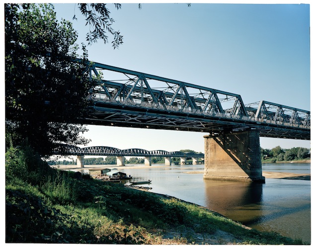
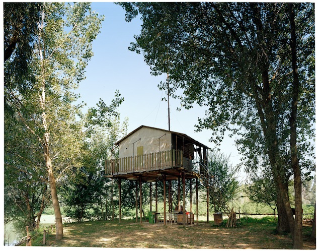
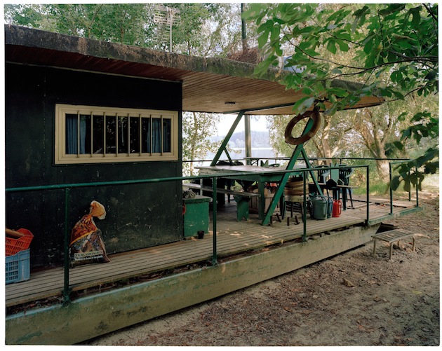
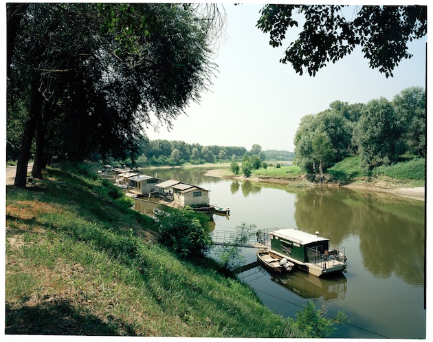
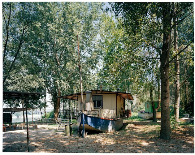
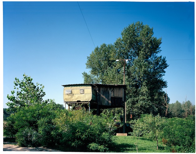
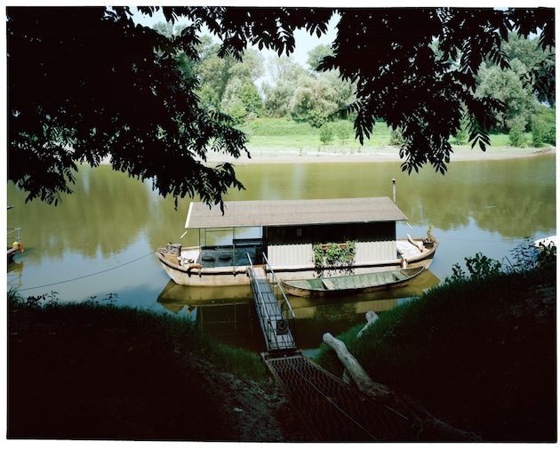
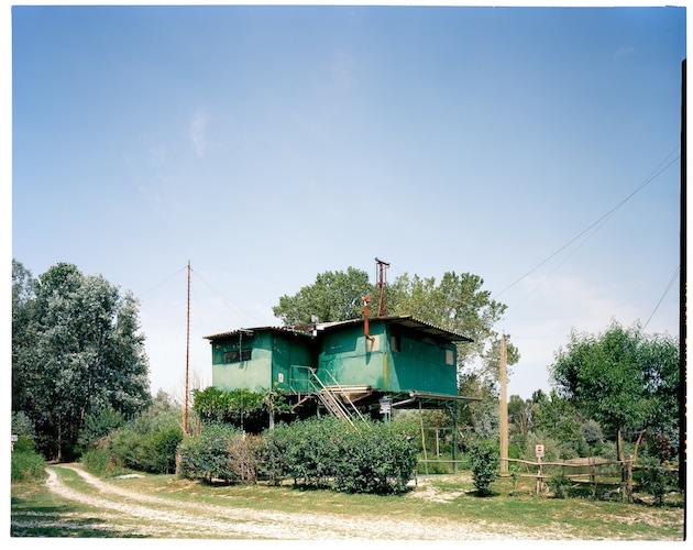
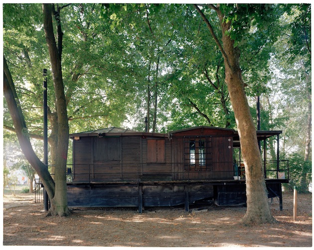
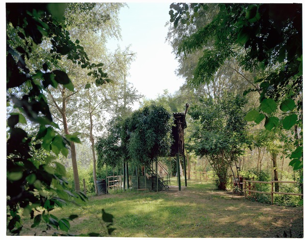
“Case Sospese” is an architectural and anthropological exploration of the banks of river Po, undertaken by Parma-based photographer Ettore Moni. Attentive to landscape, but focused on housing, the project captures stilts, boats, barges, mobile homes and hanging houses that seem to come from a different world. These constructions are in-between nature that is perpetually on the move and the willingness of man to put down roots. Ettore Moni captures the essence of this suspended landscape, through images taken with a large format camera and left untouched. Moni portrays natural and urban landscapes in search of signs left by man; signs of human intervention that shift the perception of space that surrounds us.

Rujana Rebernjak – Images courtesy of Ettore Moni 
Share: Facebook,  Twitter  
18/11/2014

Winter in White

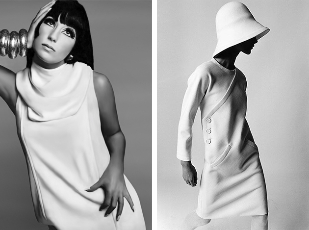
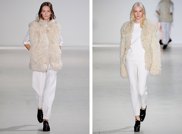
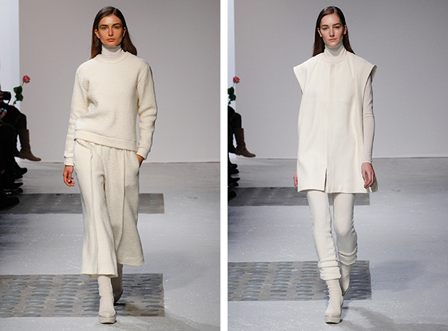
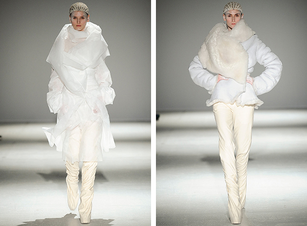
Wearing white clothing after Labor Day, the first Monday of September, has been a controversial subject for many years. Why? Because, back in the day, a part of fashion world used to have rules it had to deal with, a kind of a bon-ton scheme, where white was considered only related to summer and leisure time. And, for that reason only, one should have stopped wearing it in Autumn. Fortunately things have changed, therefore nowadays, along with matching blue and black or red and pink, white during fall and winter season has been legitimized, too. Last fashion shows have proven it for good: many designers have chosen the candid nuance for their warm and fuzzy winter catwalks.

We saw a comfy yet sophisticated approach at Barbara Bui’s show, where embroidery capes, along with turtleneck sweaters and sartorial trousers made the collection perfect for winter season. Ennio Capasa at Costume National offered a different point of view, with black shoes interrupting the white harmony and a fur vest adding an unexpected twist to the brand’s minimal look composed of a slouchy pair of pants and a blouse. Gareth Pugh, on the other hand, proposes a typically exaggerated show, with fairies from other planets hovering on the runway, all wrapped up in odd covers and dresses – some more bi-dimensional others extremely soft.

Whatever you’d rather chose as your favourite winter piece, white is for sure a trend you should not forget, both in the city and on the slopes.

Francesca Crippa 
Share: Facebook,  Twitter  
18/11/2014

Architects as Artists at the V&A Museum in London

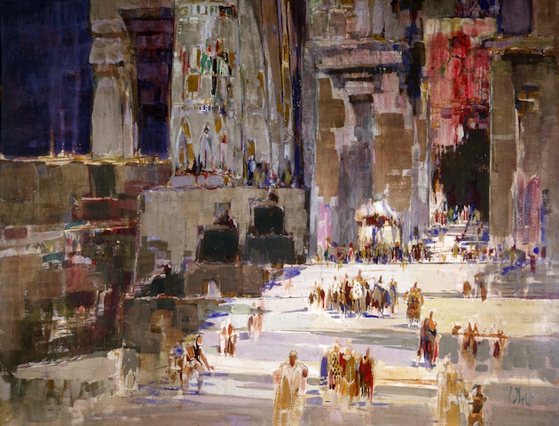
From the Renaissance to the current day, architects have made drawings for study and pleasure, to represent their projects, document their travels and supplement their income. Architects as Artists, a new exhibition at the V&A Museum in London, examines the relationship between architecture and art. From work by Raphael to a project by contemporary Brazilian architect Isay Weinfeld, the exhibition presents examples of the many ways in which architects use and create art.

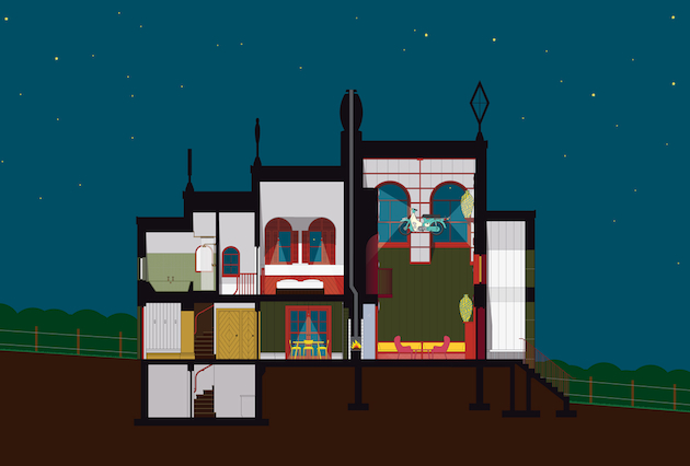
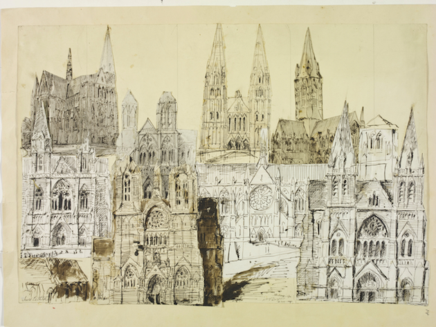
Drawing on the collections of the V&A and RIBA, this display of about 50 works includes a pair of striking digital renderings for ‘A House for Essex’, a project between FAT Architecture and the artist Grayson Perry. These images sit alongside designs for an artist’s house by E.W. Godwin, a drawing by Raphael of the Pantheon in Rome, a lithograph by Cyril Power depicting the staircase of Russell Square tube station, a watercolour sketch by Hugh Casson, a drawing by Italian Futurist Virgilio Marchi and a volume of architecture fantasies by the Russian architect Iakov Chernikhov. Recent works including Tom Noonan’s depiction of the re-forestation of the Thames Estuary and drawings by William Burges, Augustus Pugin, Alfred Waterhouse and William Walcot are also featured in the show.

Architects as Artists considers how the ability to represent a building in two dimensions and communicate space has been fundamental to architects’ work since the Renaissance, when architecture first developed as an independent profession. It looks at the importance of experiencing historic architecture and how architects make drawings of buildings and landscapes to record their travel and improve their designs. The display also explores how architects create drawings for different audiences and how pictorial conventions are often adopted when communicating with a wider audience, showing how these ‘artistic’ images often bridge gaps in knowledge, ideas and perceptions.

Architects as Artists will run until March 15th 2015 at the V&A Museum in London.

Images from top to bottom: Image courtesy Ordinary Architecture Ltd; Victoria and Albert Museum, London; RIBA Library Drawings and Archives Collection; Victoria and Albert Museum, London.

Rujana Rebernjak 
Share: Facebook,  Twitter  
17/11/2014

Style Suggestions: Modernist

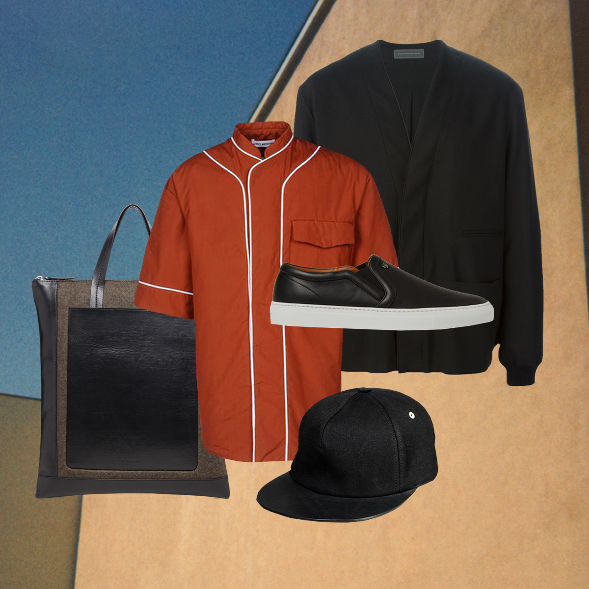
Clean cuts, sleek lines, pure colours and sophisticated detailing for a conceptual modern look. Refine your Winter wardrobe with these modernist interpretations of classic everyday pieces.

Jacket: Christophe Lemaire, Shirt: Umit Benan, Bag: Marni, Shoes: Givenchy, Baseball Cap: Rick Owens,

Styling by Vanessa Cocchiaro 

Share: Facebook,  Twitter  
17/11/2014

Paris Photo 2014 Returns to the Grand Palais

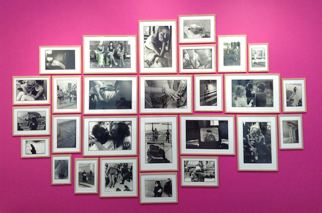
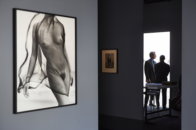
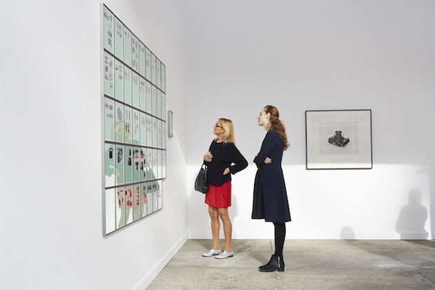
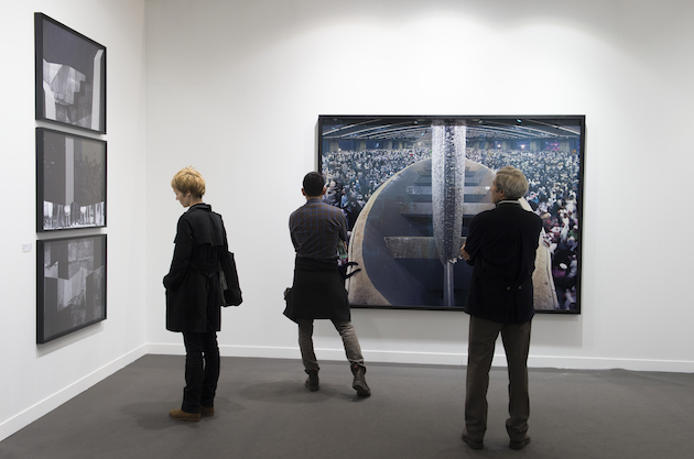
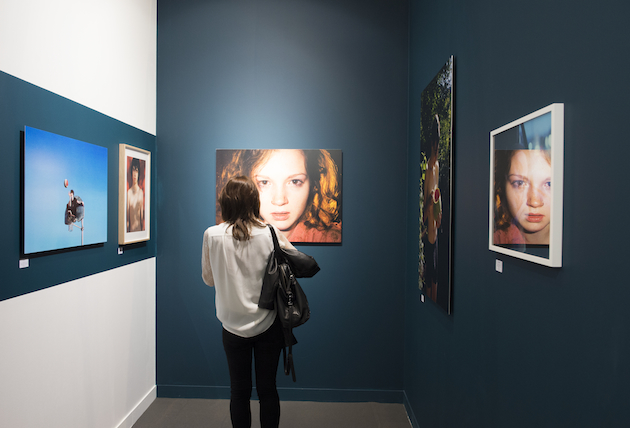
After the latest successful edition of FIAC closed its gates back in October, the huge glass exhibition pavilion of the Grand Palais returned to the centre of contemporary art for a weekend dedicated to photography with Paris Photo. As in the previous years, the well-regarded fair (now in its 18th edition) brought new trends and historical landmarks of photography world to the French capital. 143 galleries and 26 international publishers coming from 35 countries, took part in a rich program of exhibitions spanning different approaches, schools of thought and media: from reportage to still life, from fashion to manipulated photography, from fictional and dreamlike narratives to reality.

Among the big artists and young talents we counted the names of famous Düsseldorf school members Thomas Struth and Candida Höfer, as well as William Eggleston, Diane Arbus, Henri Cartier-Bresson, David LaChapelle, Bettina Rheims, Ed Templeton with his striking street photo-installation, Vic Muniz, James Casabere, Cristina De Mittel, Marwane Pallas, Massimo Vitali or Ren Hang, just to mention a few. International galleries and publishers of the like of David Zwirner, Gagosian, Galerie Dominique Fiat, Pace/MacGill, RoseGallery, Carlier|Gebauer, Thaddaeus Ropac, Zilberman, Hatje Cantz, La Librairie du Jeu de Paume returned to Paris Photo or were here to present themselves for the first time in an ever evolving and growing international showcase. Italian players were present, too, even if in little less imposing numbers, since the photography market is still feeble in the country: Guido Costa displayed a selection of small black and white vintage prints of Nan Goldin, a brand new series by Paul Thorel, Carlo Valsecchi’s “Factory Series” and Boris Mikhalov’s small dyptich from his iconic “Brown Series”; Photo & contemporary focused on international research and the promotion of Italian artists abroad, and Paci contemporary showed the irony and audacity of Leslie Krims in a bold solo show.

Paris Photo 2014 completed its full schedule with an exhibition arranged by the LINK NAME featuring a selection of recent acquisitions, and with painted photography from India and Southern Asia of the Alkazi Collection of Photography. For those who are interested in artists’ books, “Hidden Islam” By Nicolo Degiorgis won in the Aperture Foundation Photobook Awards, while “Imaginary Club” by Oliver Sieber is the winner of the Photobook Of The Year and Christopher Williams with “The Production Line of Happiness” won in the new category titled Photography Catalogue of the Year.
See you next year, Paris Photo!

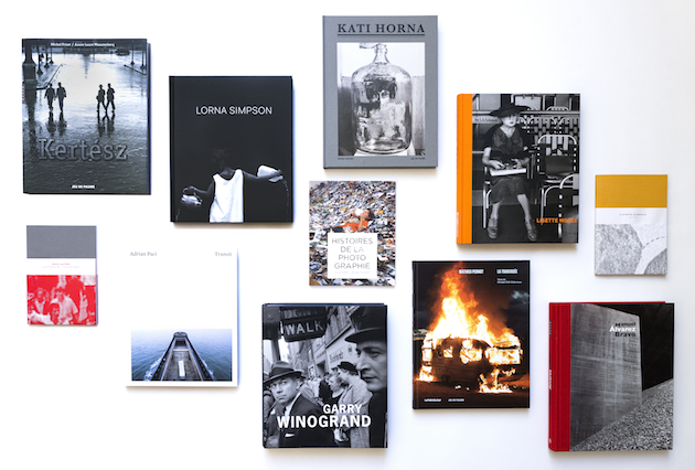
Images from top to bottom: Ed Templeton, photo-installation of 28 photographs, curated by Emeric Glayse for Galerie Dominique Fiat, Paris / Courtesy Roberts&Tilton, Los Angeles / Copyright Ed Templeton; View of the Grand Palais, courtesy of Jérémie Bouillon for Paris Photo; Recent publications of La Librairie du Jeu De Paume; View of the Grand Palais, courtesy of Marc Domage for Paris Photo.

Monica Lombardi 
Share: Facebook,  Twitter  
14/11/2014

The Talented: Sadie Williams

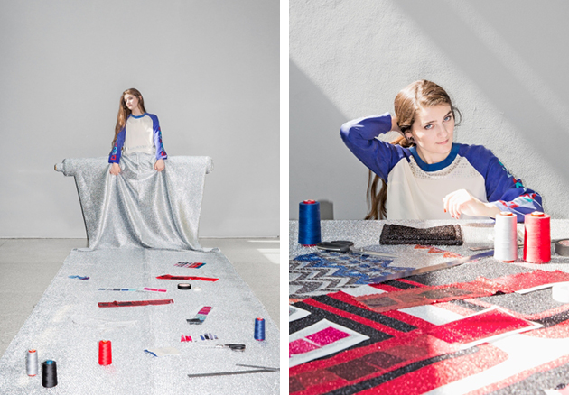
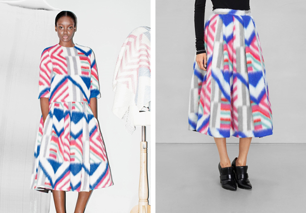
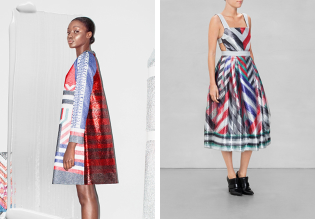
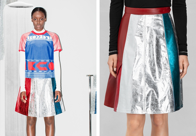
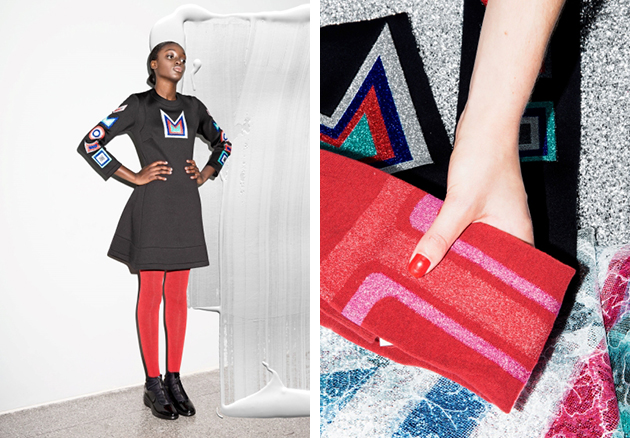
Ever since Sadie Williams sent eight eye-catching gowns down the runway of her Central Saint Martins MA graduating show in 2013, her unique design aesthetic was launched to the foreground of innovative fashion sphere. Now she is lighting up our dark Winter wardrobes with her new collaboration with the Swedish brand & Other Stories, which follows her characteristic design. The collection includes both scuba dresses and silk shirts, fusing her luxurious and unmistakably personal prints, bold colours and metallic influences with sporty yet classic silhouettes. The collection is an exercise in balancing commercial needs with innovative design by offering both Williams’ striking design as well as more natural and toned-town pieces suitable for a wider distribution.

Being creative lays within Sadie Williams’s DNA: her brother Joe Williams is a talented animator and filmmaker and her aunt, Venetia Scott, is a fashion editor and photographer. After following a traditional design education in one of the most influential fashion schools, only a year after her graduation Williams has already been absorbed within the mainstream fashion world. The question that we must ask is will her work, praised for an unconventional, multicultural approach – drawing from different culture, styles, and historical periods – be flattened by the needs of commercial success, or is she mature enough to keep her voice independent.

AUTHOR 
Share: Facebook,  Twitter  
13/11/2014


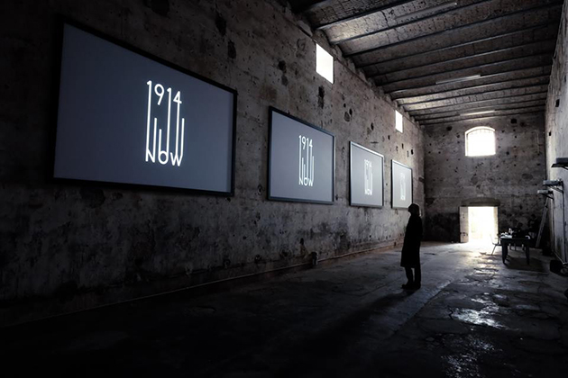
1914 Now: Four Perspectives On Fashion Curating

The 14th edition of Venice Architecture Biennale, curated by Rem Koolhas, focuses on “architecture, and not architects”. It aims at pointing out the process that any country has undertaken to erase the characters of national architecture and to conform to a universal language between 1914 and 2014. Koolhas’ exhibition serves as a way to retrace the history of modern times while underlining the features each country has kept and protected. The project stresses the narrative and the power of architecture to tell its own story by reflecting upon its forms, features, its fundamentals. History of fashion and history of architecture have much in common: they talk about objects that have become material memories, things that have a function in people’s life, and thus become more than mere ‘things’. Telling their own story, these object testify the shifts in the use, bear the signs of the past and bring these ‘wounds’ as fundamental elements in reconsidering history.

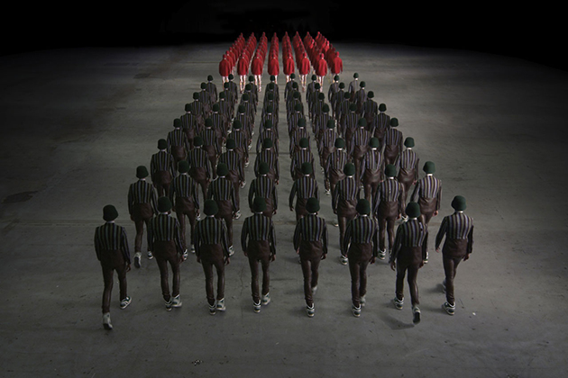
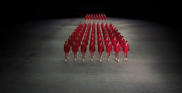
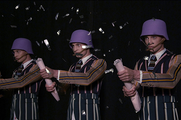
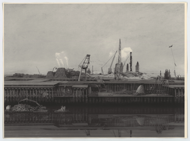
The exhibition “1914 Now. Four Perspectives on Fashion Curation”, inaugurated at Spazio Punch in Venice on November 6th, reflects on history from the perspective of a curator. Alison Moloney form London College of Fashion has gathered four curators, different both in terms of their interests and research fields, asking them to think about dress in relation to the decisive year, 1914. Taking the curatorial practice out of its natural context, the curators have collaborated with filmmakers to explore their practice within the frame of the video. Amy de la Haye and Katerina Athanasopoulou started from a tea gown to examine the dawn of modernity. Judith Clark and James Norton used ‘il manifesto tecnico futurista’ by Giacomo Balla to read the ‘set’ in which life took place; Kaat Debo and Marie Schuller the tensions between ornament and modernity and how the need of the new affects progress; Walter Van Beirendonck collaborated with Bart Hess to reinterpret the typical war helmet from a new, nearly ironical perspective.

Video is a ‘creative’ instrument, in the sense that it allows to create a new output holding together elements and aesthetics that often come from the past. These four videos, though different in style and direction, are all examples of storytelling; and of different ways one can approach curating, seen as a ‘creative’ action. Moloney’s curatorial operation in bringing together all these different personalities and making them collaborate, with their differences in poetics and practices, shows the need to turn fashion history into an instrument not only for re-reading modernity, but to actually move toward the future really understanding its reasons rooted in the past.

Marta Franceschini 
Share: Facebook,  Twitter  
13/11/2014

Bellinzona: An Architectural Jewel

Not far from Milan, right after crossing the Italian border and entering Switzerland, you can find Bellinzona, a city situated in the Canton Ticino. Nested between lakes and mountains, this small city is worth visiting for its three main architectural projects which have transformed its public face and brought a new approach to revitalization of historical architecture and the fusion of buildings with the natural environment.

Castelgrande
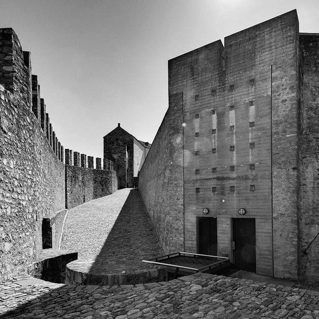
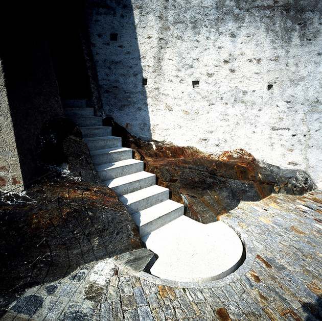
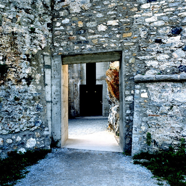
Built on a hill, the oldest of three castles in Bellinzona, Castelgrande was mentioned in 590 by Gregor von Tours as “Castrum”. Between 1486 and 1489 the Sforza family from Milan extended the castle in order to repel the Swiss advancing from the north. Castelgrande has been restored between 1982 and 1992 and can nowadays be reached by an elevator from the city’s Piazza del Sole. Aurelio Galfetti, the architect in charge of the most recent restoration, combined modern architecture with a sense of Medieval pride, in order to create an “Acropolis of Light”. Aurelio Galfetti is one of the leading architects of Ticino’s local scene, and his transformation of the ruined remains of the Castelgrande in Bellinzona into a contemporary museum and culture centre provides us with a provisional resume for decades of architectural work. While Galfetti proposed a series of typological corrections to Bellinzona’s diffused townscape, he was also concerned in sharpening the public awareness of the genius loci and the town’s history, as well as with its future, of which the rebuilding of Castelgrande was a central point. Galfetti’s effort produced one of the most significant conversion projects since Carlo Scarpa’s legendary work on Castelvecchio in Verona. Galfetti had neither restored nor conserved Bellinzona’s ‘Acropolis’. At the most – as Neapolitan architect Francesco Venezia would say – he joined together pieces that form spaces in which light, objects and landscape carry a silent communication. He was concerned in the first place with transforming an extraordinarily damaged historical situation into an analogue reality that would be able to speak for itself again.
Piazza del Sole
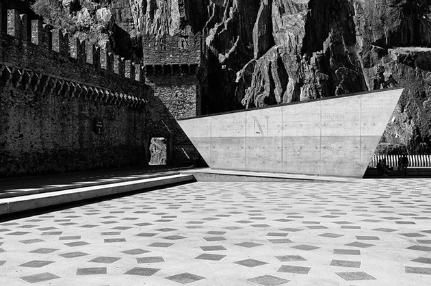
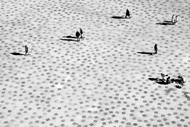
The Square of the Sun, also known as Piazza Porta Ticinese, was built only in the XVIII century. The buildings that have marked the square were progressively removed starting from the 50s: the so-called island placed in the middle of the square was demolished first, then the houses close to the rock, and finally those constructions that concealed the city’s medieval walls. Today, Piazza del Sole can be viewed in its restored design carried out by architect Livio Vacchini. The linearity of the design, simplicity of access shafts and ventilation of the car park under the square, the dialogue instilled between the new architectural composition, the rock and walls recall, in a way, the city’s old spaces and size.

Lido di Bellinzona
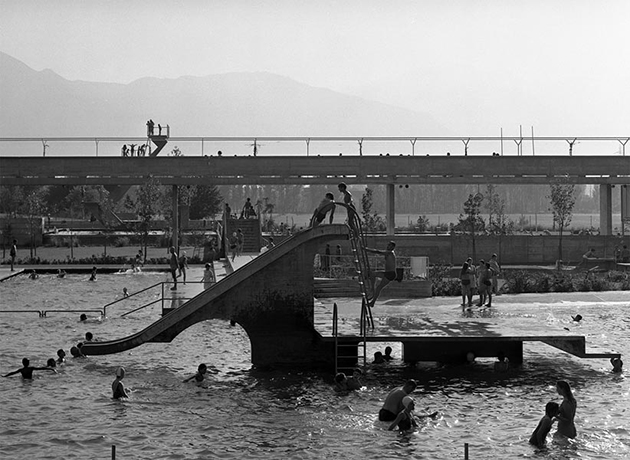
It is Aurelio Galfetti, again, who transcends the proposed program creating a simple but ambitious infrastructure for the pools of Bellinzona. Thus, Galfetti uses all the factors involving the commission in order to design a piece of architecture prepared to take on future programs that complement each other. The route of access is embodied in a concrete structure, which organizes the built landscape and territory, through a pedestrian walkway raised 6 feet above the level of the river, connecting visually the empty valley of Ticino, the Castelgrande hill, the city, the mountains and the sky. All functional aspects of the pool have been resolved by subordinating them to a spatial vision, meant to merge the city with the river through a pedestrian walkway, a structure that provides the open expansion of a city character, a projected landscape, ready to accommodate new activities and functions.

Giulio Ghirardi 
Share: Facebook,  Twitter