It’s comforting to know that these days, design is not necessarily relegated to the private domain of single consumers, ubiquitous designers and corporations, but it can be usefully employed to shape our experience of the world to the benefit of the public sector. Institutions, in fact, are primary players when it comes to ordering commissions or promoting a contest in the design field. In a few cases, however, their role is really irreplaceable, especially when they remain the only legitimate player who can use design as a means to inclusively represent a community in an accurate, engaging, and hopefully progressive way: beyond the status quo and through unpredicted and future-oriented solutions.

Norwegian institutions have recently proved capable of fulfilling these duties with courage and originality. Two months ago, in fact, Norway’s Central Bank announced the winners of a competition for the realization of new banknotes for the Scandinavian country. The graphics elaborated by architecture and design studio Snøhetta has been spotted by all magazines and design blogs worldwide: their geometrical patterns, inspired by the sense of boundary between land and sea and expressed through a pixelated, abstract texture, represent a clean change from the past. They archive, in fact, the celebratory language usually chosen by nations to represent themselves – the rhetoric of “a nation of saints, poets and sailors”, the worlds that Mussolini engraved in the Square Coliseum he built in the EUR district – by choosing to omit illustration and depiction.

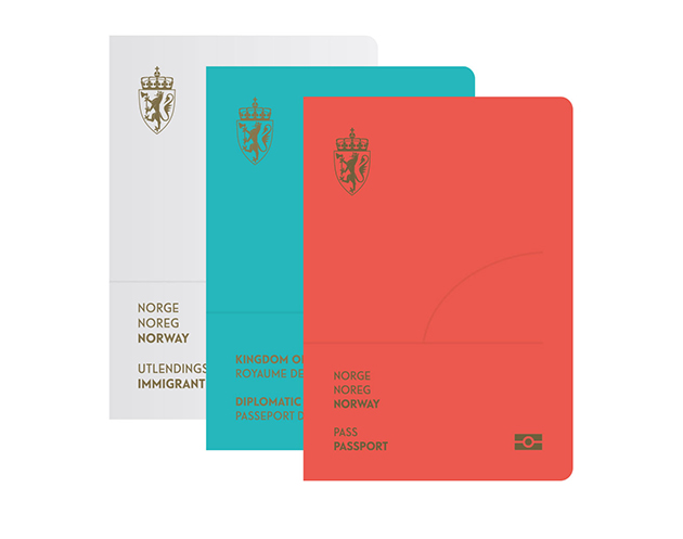
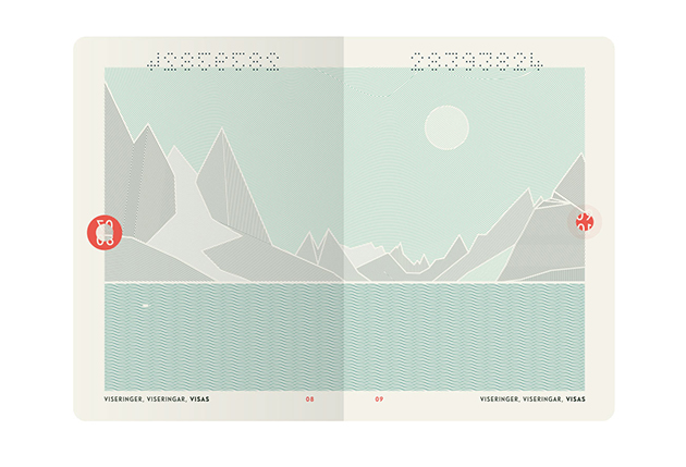
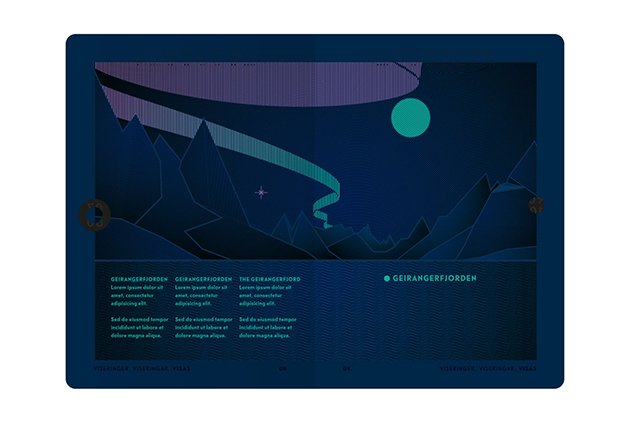
Just a few days ago, then, Norway’s National Police Directorate has selected the best proposal of the contest it had launched in February to renovate the image of Norwegian passports and ID cards. The first price was won by Neue Studio from Oslo, which has chosen abstract signs to represent what, according to their words, is a key element all Norwegian people are engaged with in the same way: the bond with nature and with national landscapes. However, their project didn’t hesitate to go for a true coup de théâtre: under UV light, the landscapes within the pages turn into a positive representation of themselves, and thanks to photosensitive ink, they are transformed into a night-time view that evokes the magical charm of a nativity scene background. Thus, an unexpected narrative dimension is included: the passage between day and night, the true genius loci of all Nordic countries.
Giulia Zappa
