15/10/2014

Under Construction – New Positions in American Photography

In her collection of essays “On Photography” first published 1977, Susan Sontag wrote: “Needing to have reality confirmed and experience enhanced by photographs is an aesthetic consumerism to which everyone is now addicted. Industrial societies turn their citizens into image-junkies; it is the most irresistible form of mental pollution.” Nearly forty years later, the over-consumption of images has now turned into oblivion; we are oblivious to the effects of images, they do not reach our consciousness and are, ever more, turning our reality into a bleak, fading experience. The value and significance of photography is often the subject discussed by contemporary photographers who, through their work, question the very principles of the medium.

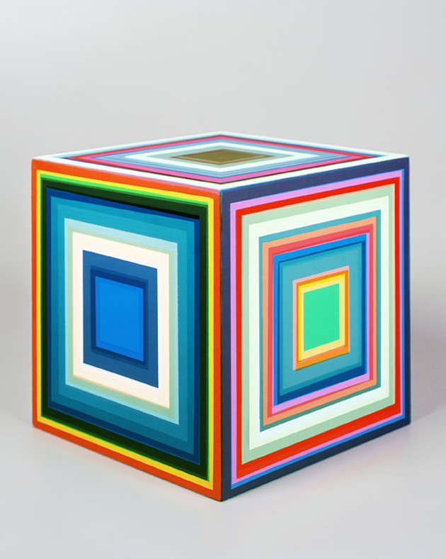
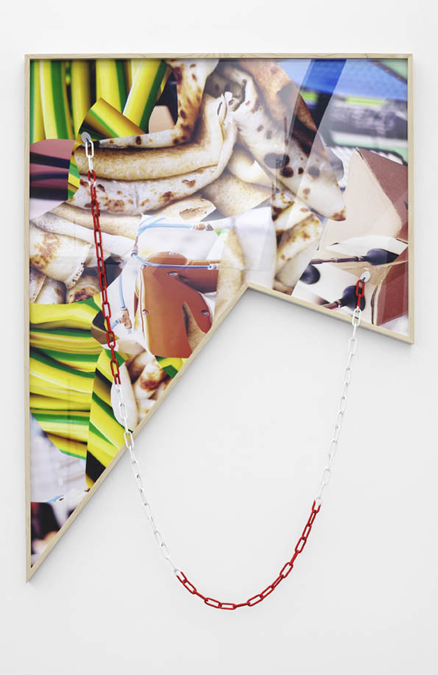
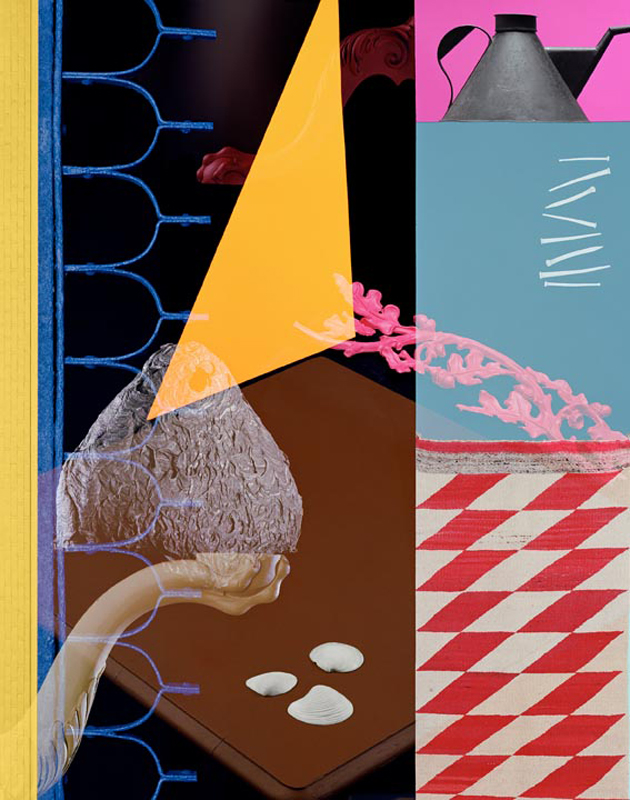
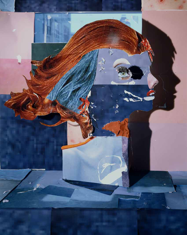
A new exhibition at the Foam Museum in Amsterdam gives space to this line of enquiry by proposing the work of nine US and Canadian photographers – Sara VanDerBeek, Lucas Blalock, Joshua Citarella, Jessica Eaton, Daniel Gordon, Owen Kydd, Matt Lipps, Matthew Porter, Kate Steciw – whose project pose questions like: in this new world, how can photography or a photograph be defined and what is its value and significance? How are photographic images created? How does photography relate to reality? What is the function of images in a society in which digitisation has so fundamentally altered the way we communicate (socially, politically and commercially)? “Under Construction – New Positions in American Photography” will run until December 10th 2014 at Foam in Amsterdam.

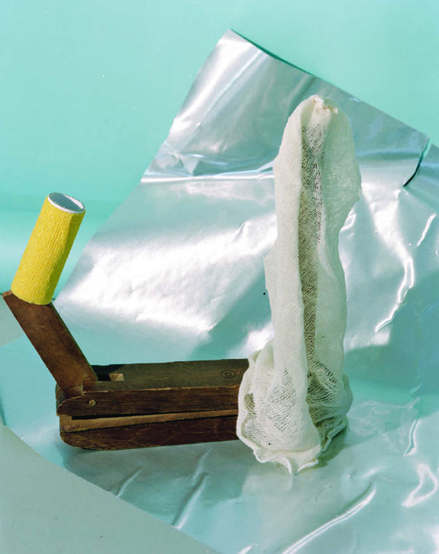
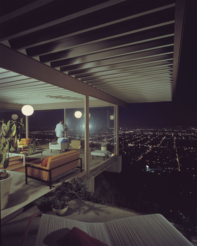
Image credits, top to bottom: This is Tomorrow, 2013 © Matthew Porter / Courtesy M+B gallery, Los Angeles; Silhouette, 2010 © Daniel Gordon; Heads, 2010 © Matt Lipps / Courtesy Jessica Silverman Gallery, San Francisco; Ancient Solstice, 2014 © Sara VanDerBeek / Courtesy of the Artist, Metro Pictures NY and The Approach London; Standing Offer, 2011 © Lucas Blalock / Courtesy Ramiken Crucible, New York; cfaal 379, 2013 © Jessica Eaton / Courtesy M+B gallery, Los Angeles; Composition 008, 2014 © Kate Steciw / Courtesy Neumeister Bar-AmBerlin and the artist.

Rujana Rebernjak 
Share: Facebook,  Twitter  
15/10/2014

Knitwear is the New Black

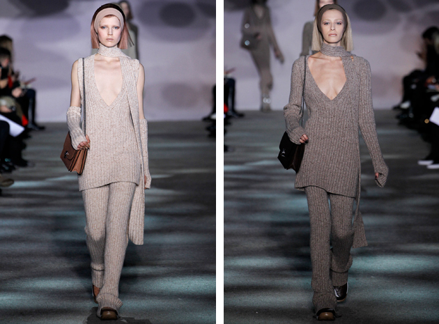
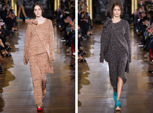
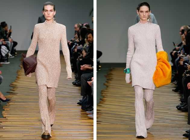
Wool is the winter fabric par excellence, yet what we saw this season is a literal knitting invasion. Not only in the form of classic sweaters, the fabric also came in the exciting form of pants and bags. The most innovative look was the one presented by both Stella McCartney and Céline. Extra large shapes for the first, long flared pants –with partially covered shoes – long sleeves and tight silhouettes, for the second. The color palette is pretty similar as well, with the choice of beige, light shades of brown and grey, serving as a statement with the aim to promote ease and warmth in winter-wear.

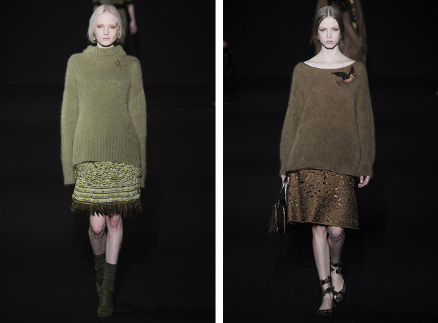
Marc Jacobs followed the same path by underlining a Sixties mood made of sober knitted suits. The tendency of using in the wool in a different, more sophisticated manner comes even from classy brands: Alberta Ferretti and her refined sweater are a sweet proof of the new approach to knitwear.

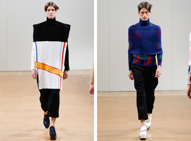
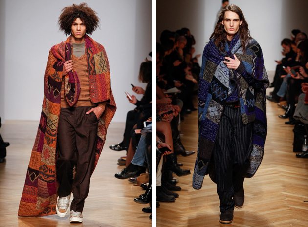
On the menswear side, we saw an attempt to involve a wider use of the material in collection such as J.W. Anderson – the sort-of-poncho with a turtleneck that is so feminine yet equally suitable for men – and the maxi, blanket-like cover-ups from Missoni. It seems this year fashion has finally decided to let us cover ourselves up and enjoy the comfort of being warm, without giving up on style.

Francesca Crippa 
Share: Facebook,  Twitter  
14/10/2014

Style Suggestion: Bright Colors for Fall

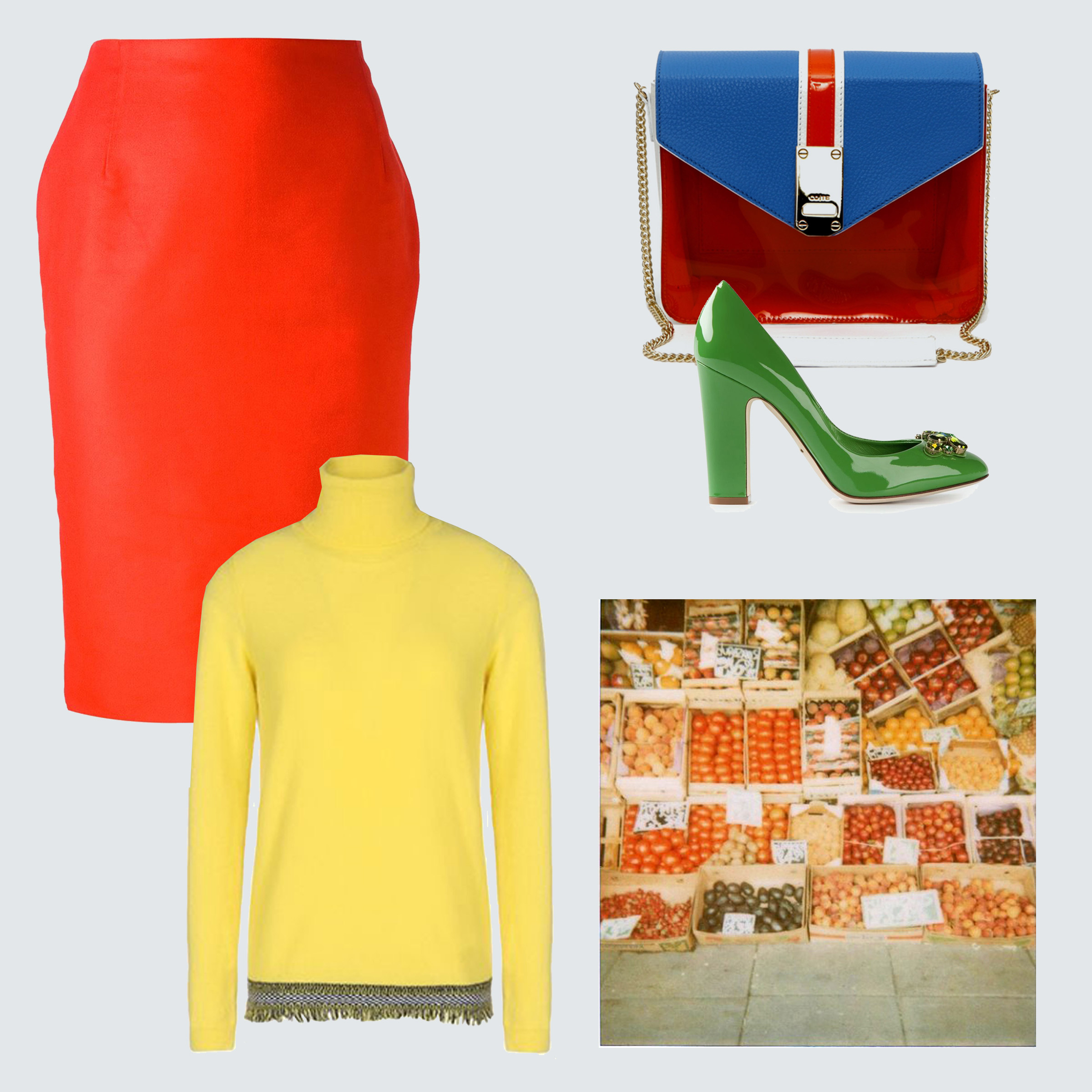
If the upcoming fall days become as grey as you can bare, add a splash of vivid colors – from bright yellow to hot red or acid green – to liven up your wardrobe.

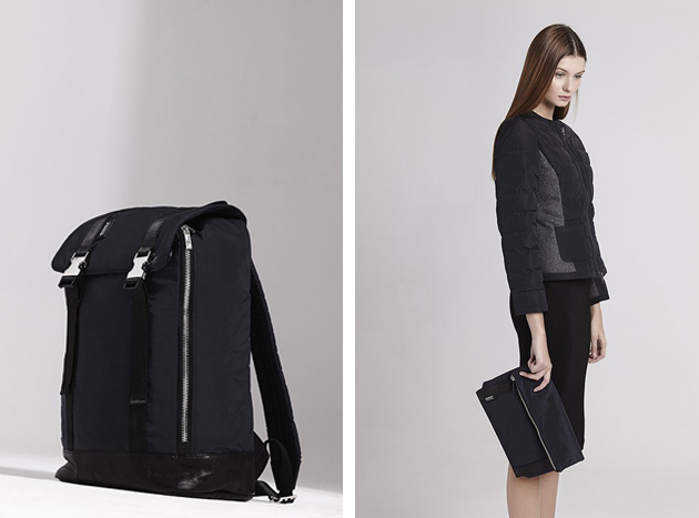
Top: Mauro Grifoni, Skirt: Arthur Arbesser, Shoes: Dolce&Gabbana, Purse: co|te

Styling by Vanessa Cocchiaro 

Share: Facebook,  Twitter  
14/10/2014

Glitch | Interference Between Art And Cinema

On the occasion of the 10th edition of “The Day Of Contemporary Art” – the annual appointment introduced by the Association of Italian Museums of Contemporary Art to allow a larger audience to visit art venues for free –, PAC opened its latest show with the evocative title “Glitch. Interference between art and cinema”. It was Saturday evening and the area surrounding the art space was teeming with families and groups of people of different generations (mostly men), decorously queuing to see a joint exhibition, which bodes to examine the actual overlapping among disparate languages and expressive mediums, putting in contact contemporary art and cinema. The crowd in and outside the museum is striking and cheerful – certainly the free entrance, the eye-catching design of the event and the summer spirit help to attract visitors –, but the situation doesn’t really allow to enjoy the exhibited works, especially the videos, so we opt for returning to the venue the day after.

As expected, Sunday morning is calm as it is clearly autumn and the number of people seeing the show is much more reasonable. Following a structure based on three levels – cinematographic, installative and performative – the exhibition presents three projection rooms arranged with red curtains, black walls and aligned chairs, while long corridors in front of the garden and first floor are devoted to installations, prints, sculptures, pictures and books developed by numerous participating artists (mostly Italian or living in Italy) invited by the curator Davide Giannella. The list of more or less well-known names is extremely long; sixty-two artists were asked to share their peculiar research, which redefines the increasingly undefined boundaries between different expressive languages, united by a common passing of established classifications.

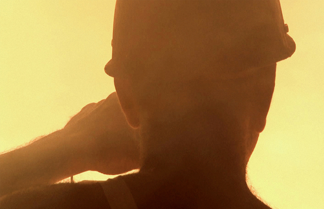
Among these artists we want to point out: Yuri Ancarani (b. 1972, Ravenna), who presents his trilogy devoted to extreme jobs including “Il capo” (2010), “Piattaforma luna” (2011) and “Da Vinci” (2012); Meris Angioletti (b. 1977, Bergamo) and her multidisciplinary approach; Rosa Barba (b. 1972, Sicily, lives and works in Berlin) with her moving sculptures made of light; Rossella Biscotti (b. 1978, Molfetta, Bari), who displays a video, an installation and a set of pictures based on the figure of “Donnie Brasco”, and Adrian Paci (b. 1969, Scuturi, Albania, lives and works in Milan) with his “Electric blue” (2010), a video we already talked about a year ago in occasion of his show, also held at PAC.

It’s hard to mention all the artists that are worth being mentioned, even because it would take a full day to see nearly half of the videos that are projected at alternate days, thus the experience has to be repeated at least twice (there is a season ticket that gives the opportunity to visit the show several times until its end). Even though the set-up is clear and captivating, maybe decreasing the number of artists would have made the exhibition more fulfilling (“and to think that usually we complain about the lack of content…”). “Glitch” will run until 6th January 2015 at PAC in Milan and it definitely deserves a visit.

Monica Lombardi 
Share: Facebook,  Twitter  
13/10/2014

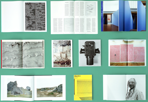
Sixteen Years of Roma Publications

What is the relationship between publishing and art? A publication is usually considered the final point of an artistic process: a document of what has been done, a sort of a portable archive and a reminder of a long period of research and inquiry, rather than being the subject of a research process itself. Nevertheless, artistic activity tied to the form of a book has been developing for more than half a century, with a resilient and ever-expanding niche of artists and publishing houses exploring the printed medium. Roma Publications, founded by graphic designer Roger Willems and artist Mark Manders in 1998, has been a part of this world for the past sixteen years and a new exhibition, which opened this Saturday at Fondazione Giuliani, narrates its complex and intriguing oeuvre.

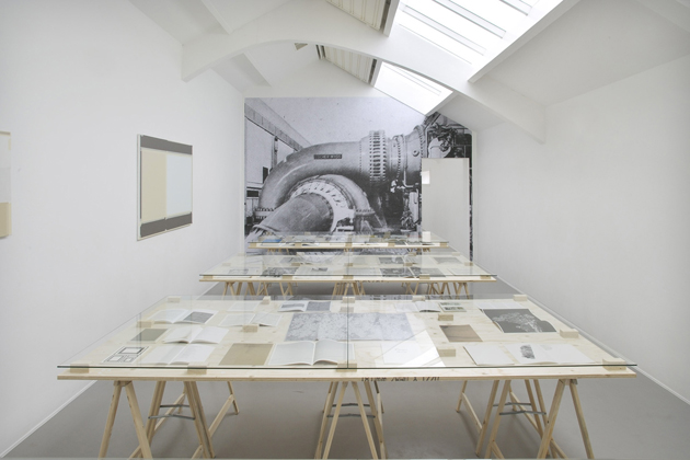
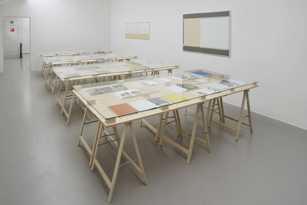
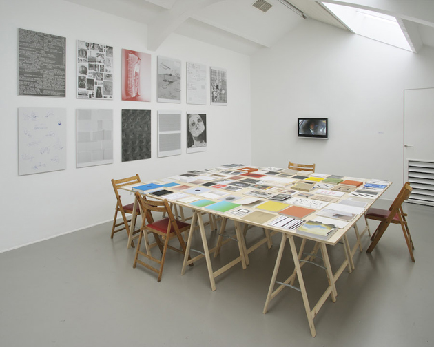
“Roma Publications 1998-2014”, curated by Lorenzo Benedetti and Roger Willems, aims to present the form of the book as an extended media that can involve the exhibition space, evolving from a communication tool to an authentic form of artistic practice. Presenting more than 230 books and editions from the publishing house’s rich catalogue, the exhibition showcases artists who have contributed to the fading of the distinction between paper and space, image and material, original and reproduction (the print run of Roma Publications’ issues varies between 2 and 150.000 copies). Books, newspapers, posters and other printed matter are combined with artworks and installations relating to the publisher’s identity inside an exhibition dimension. The informal way of bringing art and publications together in a carefully composed exhibition gives clear insight into the working process of Roma Publications, which is based on a collaborative relationship to the artists.

“Roma Publications 1998-2014” runs until December 13th 2014 at Fondazione Giuliani in Rome.

Rujana Rebernjak 
Share: Facebook,  Twitter  
10/10/2014

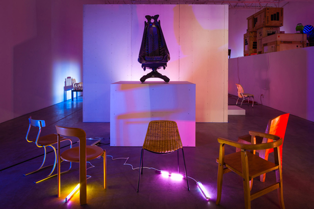
Fin de Siècle at the Swiss Institute

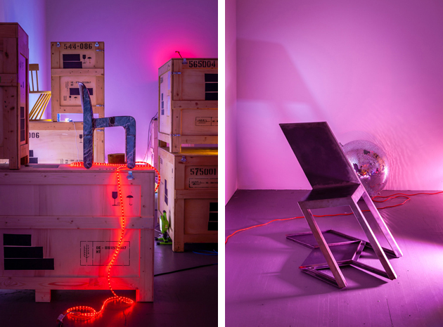
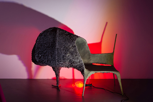
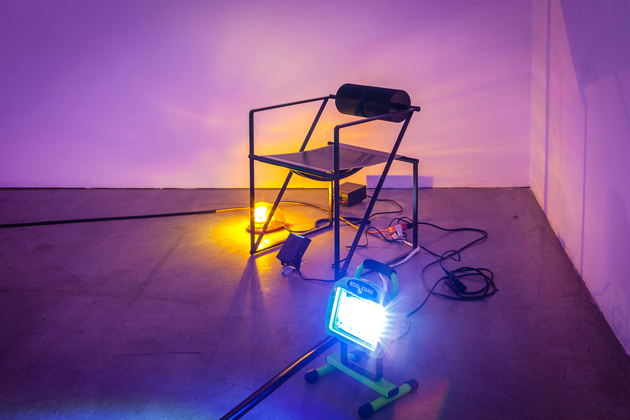
Throughout history, creating chairs has always provided the occasion for furthering formal and structural experimentation, critical discourse and play in design practice. Both one of most frivolous as well as technically demanding design tasks, designing a chair appears to be a compulsory exercise and a necessary step in any designer’s career. Due to its simplicity and straightforwardness of use, as well as its established visual code and centuries old history, looking at a chair design can often seem like reading Raymond Queneau’s “Exercises in Style”, where the content (in this case, the function) remains unvaried yet the meaning subtly changes with each formal perpetration.

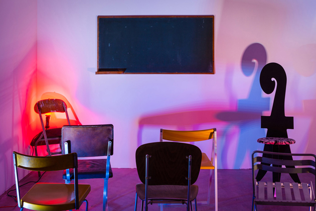
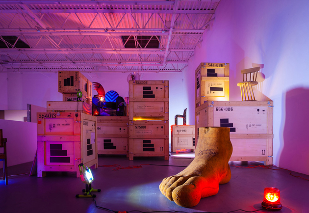
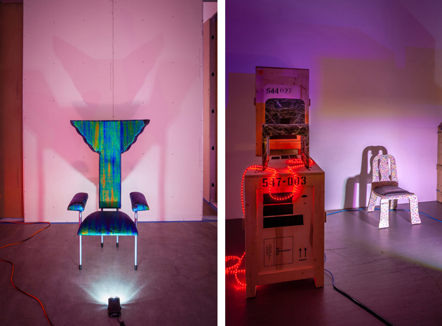
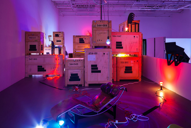
Fin de Siècle, a recently inaugurated exhibition on show at the Swiss Institute in New York, approaches chair design with a similar spirit. Drawing from Eugene Ionesco’s 1952 absurdist play “The Chairs”, the exhibition is designed to communicate the objects’ inherent narrative. “In ‘The Chairs’, an elderly couple recounts the demise of civilization to a stage full of empty chairs. Absent of any sitters, the audience is left to imagine the invisible figures that the increasingly incoherent Old Man and Old Woman address. In Fin de Siècle, the chairs themselves speak asynchronously, cast as characters and imbued with life. Directed into small vignettes of imagined conversations and actions that transcend periods and design movements, their dialogue echoes the modernist promise fading away.”

From mass produced objects to experiments in utopian design, Fin de Siècle includes projects by some of the greatest minds in the history of design – Le Corbusier, Alessandro Mendini, Marcel Breuer, Charlotte Perriand, Gaetano Pesce or Andrea Branzi, leaving their designs to narrate the story of design practice, its intricate dynamics, peculiarities and contradictions. Fin de Siècle, curated by Andreas Angelidakis, is the inaugural edition of the Swiss Institute’s Annual Design Series, and will remain on show until the 23rd of November 2014.

Rujana Rebernjak 
Share: Facebook,  Twitter  
10/10/2014

Ecoalf: a New Take on Fashion Innovation

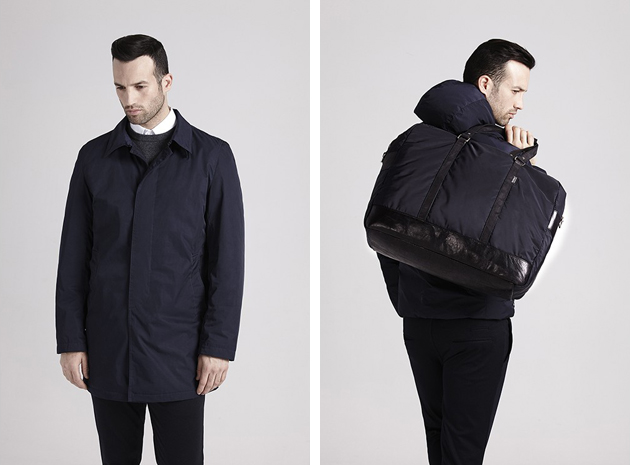
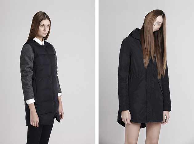
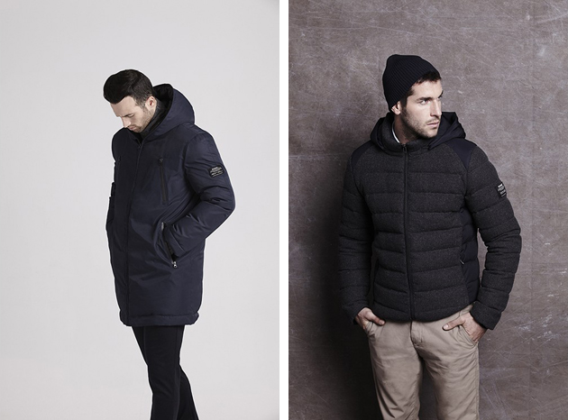
What could you possible make of discarded fishing nets and plastic bottles? In the context of fashion, that is a curious and unexpected, yet equally reasonable question, an answer to which has been given by the Spanish brand, Ecoalf. Ecoalf transforms everyday plastic objects into clothes. Using pet bottles and recycled material in the process of making garments is not a new phenomenon, but Ecoalf proposes a new take on the process, with a concept that is both more technologically innovative and formally appealing than other similar projects.

The brand, founded in 2009 by Javier Goyeneche, is grounded on the idea of recycling as one of the solutions to the overconsumption of natural resources; a concept that has grown with its development without leaving physical marks of the recycled process on the clothes themselves. By using innovative recycling methods and materials, such as discarded fishing nets, used ground coffee, used plastic bottles and worn out tires, the brand produces a complete line of clothes for both women, men and kids that is essential, smart and well-designed. The process of making clothes from ground coffee consists of several different stages: the used coffee is picked up from several diners; then, the compound, which is still humid, is then taken to the recycling plant; there the coffee dries out and any oil it may contain is extracted; subsequently it is ground to the size of nano-powder; the powder is then mixed with recycled polyester polymers in order to create a yarn, which then can be used to make clothes.

While the process might seem long and complicated, Ecoalf’s design aesthetic expresses a completely different feel: it is sporty, wearable and casual, with a focus on outdoor pieces, accessories and shoes. They have developed several collaborations, such as an exclusive collection (made of recycled nylon plastic bottles) for Galaries Lafayette department stores and a partnership with Gwyneth Paltrow’s website Goop. For everyone who has doubted about the power and use of recycled fashion Ecoalf is proving them wrong by showing that it is possible to make well designed pieces out of unconventional materials: who said that discarded fishing nets or used coffee ground had to be ugly?

Hanna Cronsjö 
Share: Facebook,  Twitter  
09/10/2014

Never Modern: 6a Teach Good Architecture

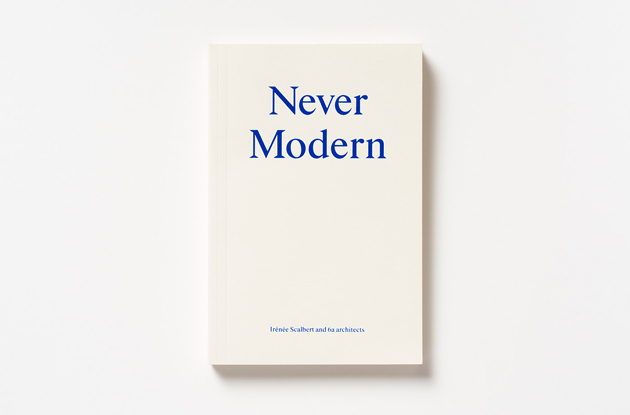
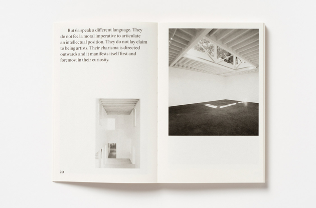
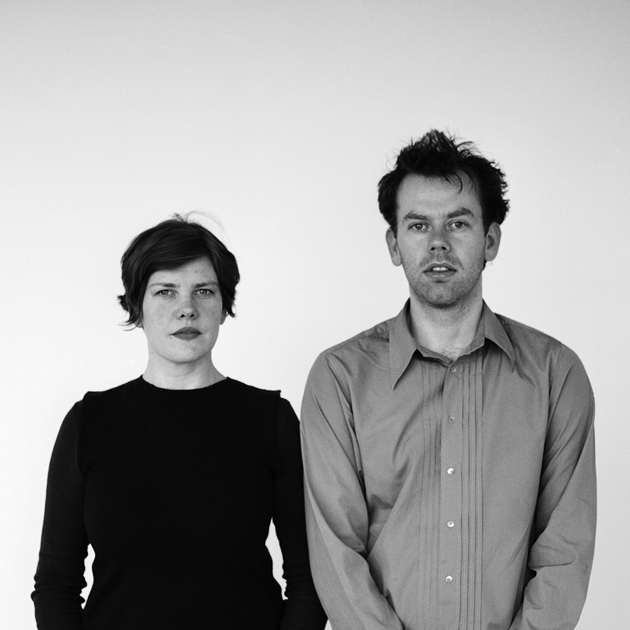
In, “Never Modern”, an exceptional book on the London based studio 6a architects, critic Irénée Scalbert looks at the role of narrative, history, appropriation and craft in the work of Tom Emerson and Stephanie Macdonald. The book is based on a dialogue with the two partners of the office, yet it’s not a book written in the first person by the designers, it is not an interview or a dialogue between a critic and a group of architects. Rather, “Never Modern” is a strange book, hard to classify. The tone is different from a classic essay. It is very well written, with a style, or better, with a rhythm that changes and transforms continuously.

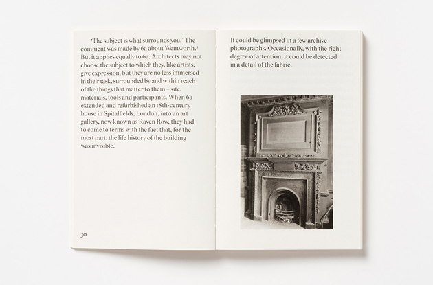
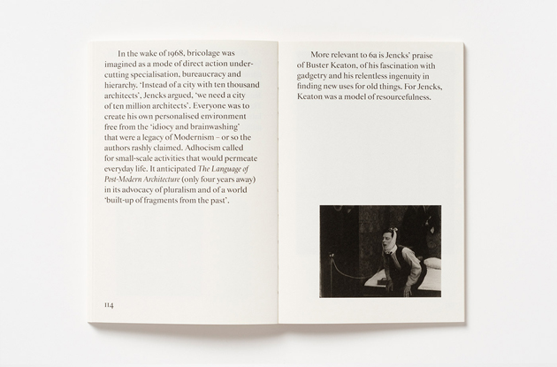
Maybe it’s a story, or a collection of poetic fragments of spaces, objects, atmospheres and built artifacts, which follows, in a sense, the approach that the architect duo applies to their work. Structured around notions of situation, intervention, making, comedy, bricolage, chance and anthropology, the text is mirrored in a visual essay of archive photographs, artworks, film stills and recent projects by the studio. For 6a, the project is the result of a slow narrative, seemingly trivial, the kind of process that can be considered as fragments of existence that are manipulated and re-presented in a modern way, despite its title apparently stating the contrary.

The story of a building is its future form, the gesture is replaced with listening, making architecture as the only solution to finding a poetic form. Irénée Scalbert defines it as a DIY attitude more than conceptual, theoretical operation. The fragments constitute the entire script of what can and should be regarded as the structure of an idea of architecture that communicates not so much with the past, but mainly with the layers deposited on the space and time. Emerson and MacDonald do not deny the past, do not try to be modern at all costs, but they need to understand an environment, before rewriting the space according to a narrative form. Their work fits with the poetics of architects such as Tony Fretton, Caruso St John and Sergison Bates who, in the work of Alison and Peter Smithson, find their point of reference.

The book traces an architectural approach avoiding style, signature, theory and even concept in favor of metis, an ancient form of intelligence combining “flair, wisdom, forethought, subtlety of mind, deception, resourcefulness, vigilance, opportunism, varied skills, and experience.” 6a architects escape from easy reprogramming of the buildings, trying to understand and read the hidden stories, not trying to prolong the life of these buildings through a simple makeover, or by repurposing it into a coffee shop or an exhibition space. The architecture should not accept its physical decline, it must turn over the crisis of a system, or the production of housing, in a new starting point; the architecture should go back to be a living space. The notion of space is in fact much more important than the architecture that contains it, and this is not an easy subject to teach, in a world where schools often repackage a style instead of giving the tools of imagining the future.

Giulio Ghirardi 
Share: Facebook,  Twitter  
08/10/2014

Women in Clothes: Why We Wear What We Wear

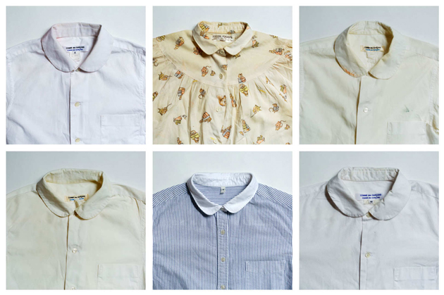
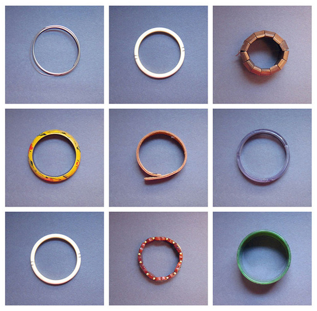
While it is commonly said that eyes are the window to a person’s soul, clothes can be considered a gateway to their psyche. The way we dress might allude to choices that were made when we put our clothes on, that can vary from mostly practical concerns all the way down to issues concerning representation, identity or political expression. Why did we choose black and not white, a dress and not pants, can give thought and convey broader ideas about ourselves. When we think about ‘why we wear what we wear’, the answers are often more than one and can be as unique as our personas.

Aware of deeper questions tied to the way we dress, Sheila Heti, Heidi Julavits and Leanne Shapton started discussing their meaning. How important could clothes really be? Quite quickly it appeared clear this wasn’t just a “brunch topic”; it was the topic of a broader discussion that many women could relate to, and, as such, should be put to print in the form of a book. Settling on the idea of the relationship between women and clothes, the editors reached out to the wider public, since the main objective of the book was to look at ordinary women’s way of dressing. After asking questions to everyone they knew, as well as handing out surveys on the street, the information started to pile up and the peculiar story of “women in clothes” grew. Through interviews, surveys, diagrams and even drawings, coming from both the editors and additional 639 contributors around the world, “Women in Clothes” tries to decipher the essence of women’s clothing choices.

The saying that ‘you can’t judge a book by its cover’, as the story within is always much deeper, sums up perfectly the tone of the volume and is something “Women in Clothes” brings forth in spite of touching upon a matter considered trivial by many – clothes. Stories such as the novelist Kiran Desai’s account about her aunt, who stopped wearing saris post 9/11 worried that she might look to suspicious and get shot, reveal a truth that goes beyond sheer appearance; these stories speak about women who were given a voice, even if only through something as simple as clothes.

Victoria Edman 
Share: Facebook,  Twitter  
08/10/2014

Constructing Worlds at the Barbican

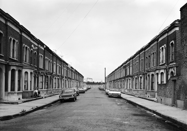
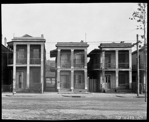
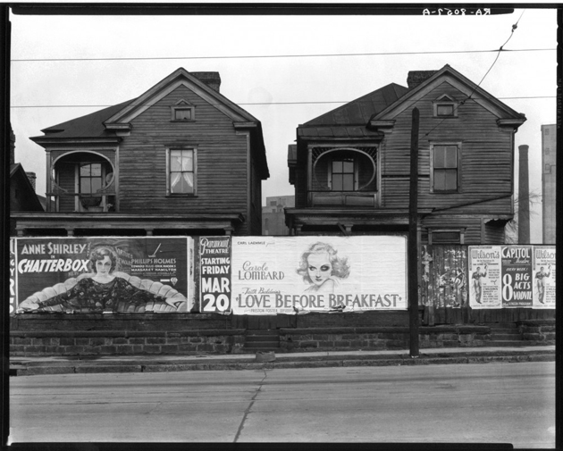
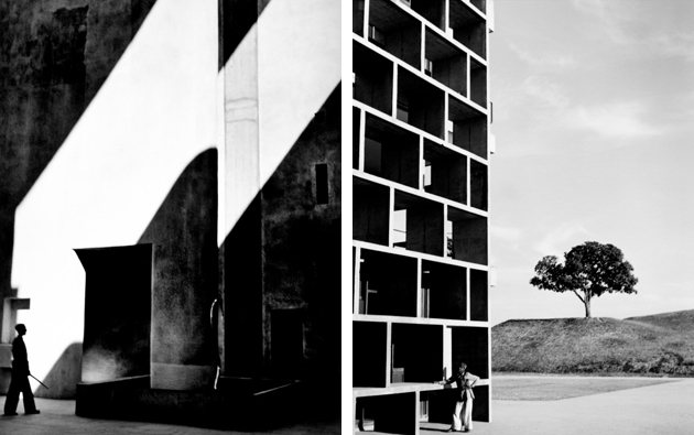
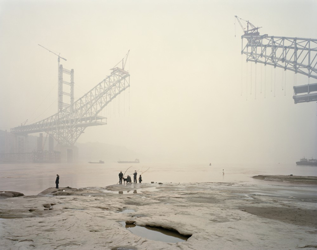
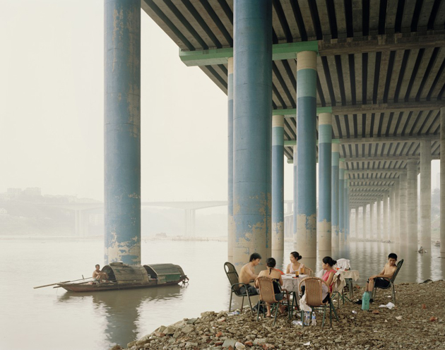
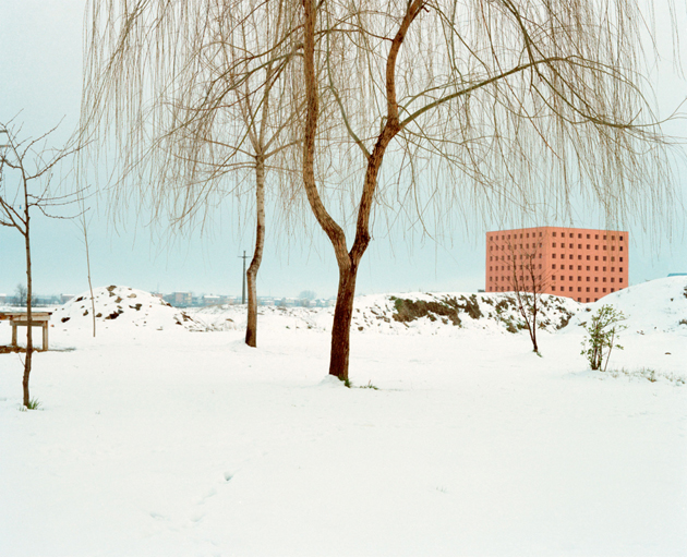
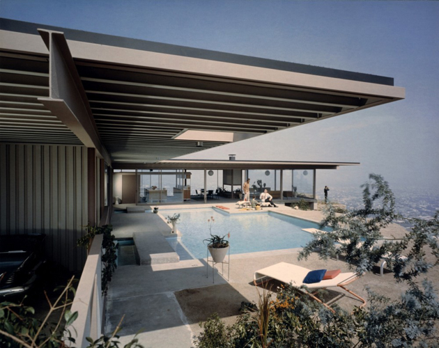
Since the very first photograph, architecture has proved to be an enduring subject matter for photographers. “Constructing Worlds: Photography and Architecture in the Modern Age”, a new exhibition recently opened at the Barbican looks beyond the medium’s ability to simply document the built world and explores the power of photography to reveal wider truths about society. The exhibition brings together over 250 works – some rarely seen and many shown in the UK for the first time – by 18 leading photographers from the 1930s to now, who have changed the way we view architecture and think about the world in which we live.

Constructing Worlds takes the visitor on a global journey of 20th and 21st century architecture, with highlights such as Berenice Abbott’s ground-breaking photographs charting the birth of the skyscraper in New York; Lucien Hervé’s subtle evocations of modernity as found in Chandigarh by Le Corbusier; the luxury lifestyle of Julius Shulman’s images of California’s residences; the moving nature of Daniel Libeskind’s Jewish Museum as seen by London based photographer Hélène Binet; the recent dramatic growth of Chinese urbanisation recorded by Nadav Kander and the devastating effects of war in Afghanistan as expressed in the poignant images of Simon Norfolk.

Rujana Rebernjak – Images courtesy of the Barbican 
Share: Facebook,  Twitter