23/09/2014

Ilmari Tapiovaara: the Lost History of Finnish Design

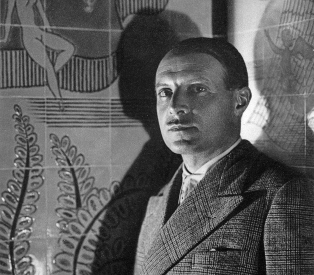
As any other attempt to classify and preserve material history, the history of design is a “way of filtering the past.” As Tibor Kalman, J. Abbott Miller and Karrie Jacobs wrote, it is “a way of selecting what’s important to remember, shaping it and classifying it. It’s also a way of selecting what’s important to forget.” Nevertheless, not always is our choice of forgetting a rightful one and, every so often, what we choose to omit unjustly passes into oblivion. This is the case of Ilmari Tapiovaara, one of the foremost protagonists of Finnish Modernism – or Functionalism, a movement strongly linked to social reform and the role of architecture and design in shaping a better environment for the working class – who sought to change the course of history with his thoughtful, eloquent and acute approach to design.
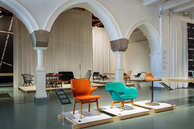
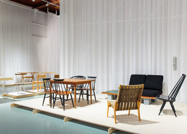
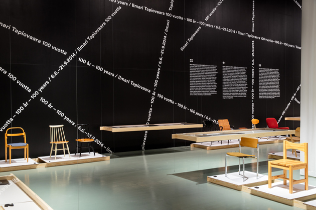
Ilmari Tapiovaara (1914-1999) has studied design at Central School of Industrial Art in Helsinki at its department of Furniture Drawing. While design studies gave form to his aesthetic references, it was the period spent abroad, working in the UK and in France, as apprentice with Le Corbusier, as well as on the eastern front during the war years, that shaped Tapiovaara’s ideological credo and a totalitarian approach to design process. In fact, in the following years, Tapiovaara’s most significant projects would come to light not while working as an in house designer for Finland’s biggest producer of furniture, Asko-Avonius, but rather, while working as both the artistic and business director of Keravan Puuteollisuus Ltd., a small carpentry firm operating near Helsinki.
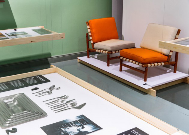
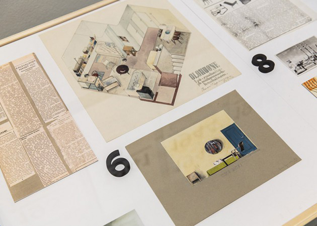
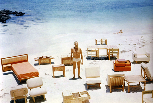
At Keravan Puuteollisuus, Tapiovaara was in charge of the whole chain of production – from design through production, marketing, packaging, graphic material, shipment, and finally, to export markets abroad. This holistic approach to design brought about some of his most iconic products: the Domus chair (from 1946-47), the Nana chair (1957), the Aslak chair (1958), or the Lukki chair (1956). Firmly grounded in the possibilities offered by Finland’s natural resources, Tapiovaara’s designs were mostly made of solid wood, plywood and metal. His designs were simple, clean, modular, resistant and affordable, and as such were extensively used in public spaces – auditoriums, student halls, dining halls, hospitals – fulfilling his ideal of creating objects that “can be produced in quantity, at low price and in high quality” as “everyone should be entitled to good, functional and moderately priced furniture.”
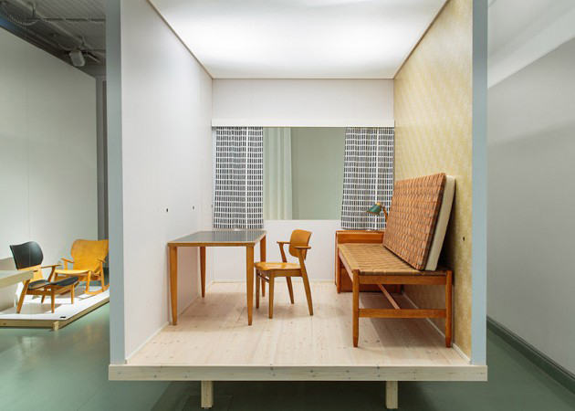
Despite its fundamental humane character, an attitude of social responsibility and formal innovation, the work of Ilmari Tapiovaara has until recently been largely overlooked. Partly because it was overshadowed by his contemporaries, namely Aalvar Alto, Charles Eames, Eero Saarinen, Hans Wegner or Tapio Wirkkala; partly because it was, perhaps, to rigorous, utilitarian and tied to everyday public life (in fact, many of his designs have never entered the private sphere) to be considered a rightful product of ‘design’. Fortunately, the history of design is young enough to change its course and rewrite those bits and pieces that have been lost. As is the case of Ilmari Tapiovaara, whose life and work was celebrated in an exhibition at Design Museum in Helsinki, that closed its doors on the 21st of September, leaving open a path to discovery of one of the richest bits of design history.
Rujana Rebernjak – Images courtesy of Design Museum Helsinki 
Share: Facebook,  Twitter  
23/09/2014

Milano Moda Donna: Three Trends for the Next Season

As the Milano Fashion Week turns off its spotlights after five full days of exhausting runways, we are finally able to present the main trends that will rule next year’s summer season. As many observers have noted, the most evident inspiration of Italian designers has been the past. In a moment of turmoil and insecurity, many brands have expressed a melancholic longing for a better time, a precise moment in the past when the Bel Paese reached its peak moment of glory.
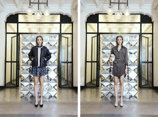
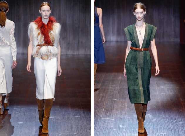
From Gucci to Costume National, the rock’n’roll, hippie vibe reminiscent of the 70s style, conquered most of the shows. Gucci’s Frida Giannini proposed a collection in tune with “American Hustle” vibe, continuing along the line of produced for the movie itself, with circus jackets, total denim, scarves and sleek dresses as key elements of the collection. Ennio Capasa at Costume National, on the other hand, followed the path started last June with the brand’s menswear collection by paying a tribute to rock stars and their unique, unforgettable style: with suede as the fabric of choice and a powerful purple as the most prominent nuance.

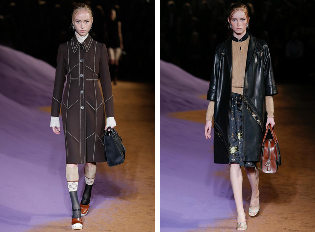
A different historical reading was the one proposed by Prada, with a slow and sad, yet unbearably chic, woman taking over the catwalk. Prada’s S/S 2015 collection was, reportedly, the result of three years of research, where Miuccia explored antique fabrics, especially silk brocade, while the silhouettes were borrowed from the 60s and 70s, resulting in a dreamy and touching aesthetics, reminiscent of our granny’s ethereal wardrobe.

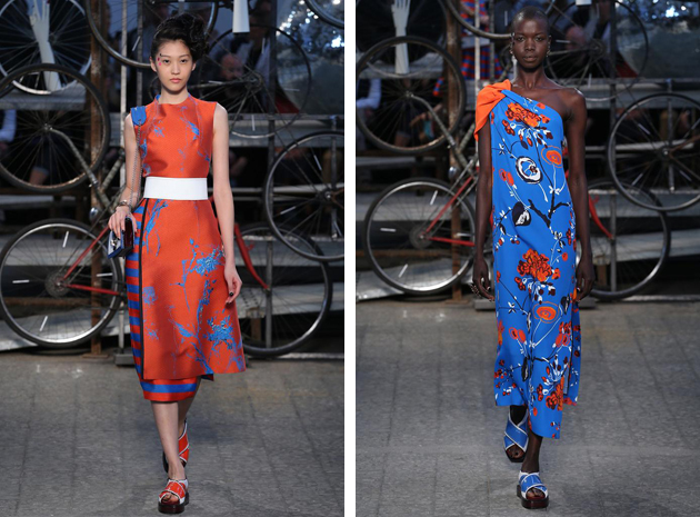
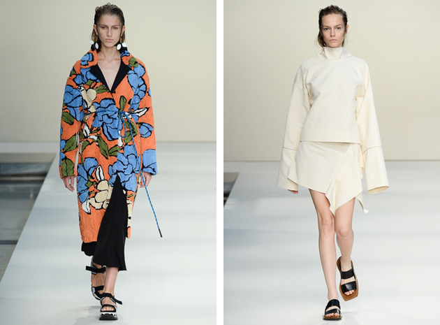
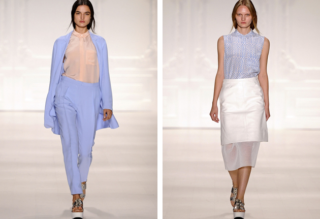
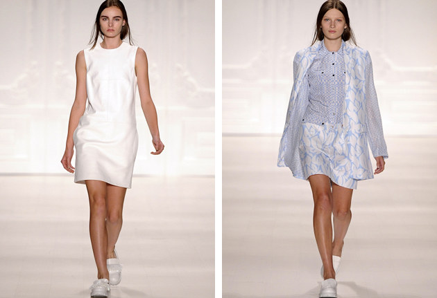
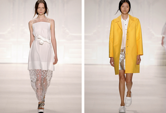
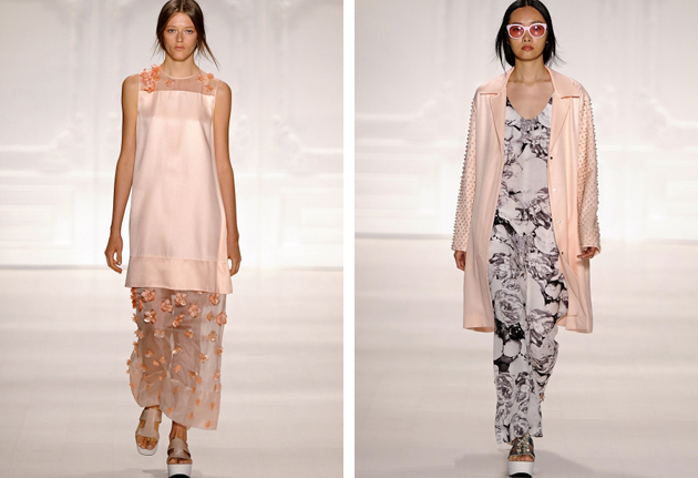
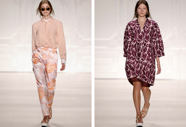
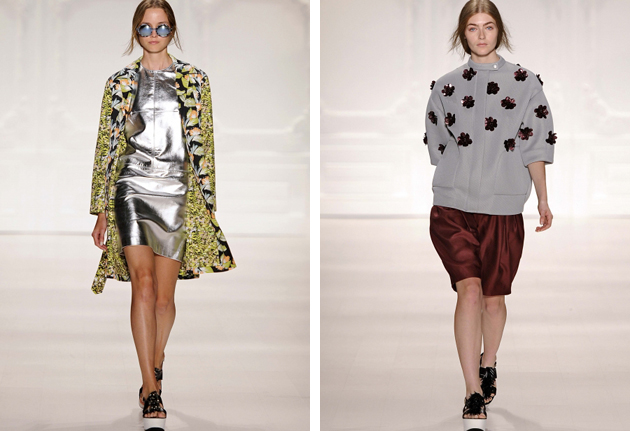
Speaking of colours, next season will be characterized by chromatic contrasts, as seen at Antonio Marras – whose collection was a love letter to artist Carol Rama – as well as by desaturated colour codes, as seen at Marni, who played with extreme purity, both in terms of shapes and colour palette, in the occasion of its 20th anniversary.
Francesca Crippa 
Share: Facebook,  Twitter  
22/09/2014

Style Suggestions: Shades of Blue

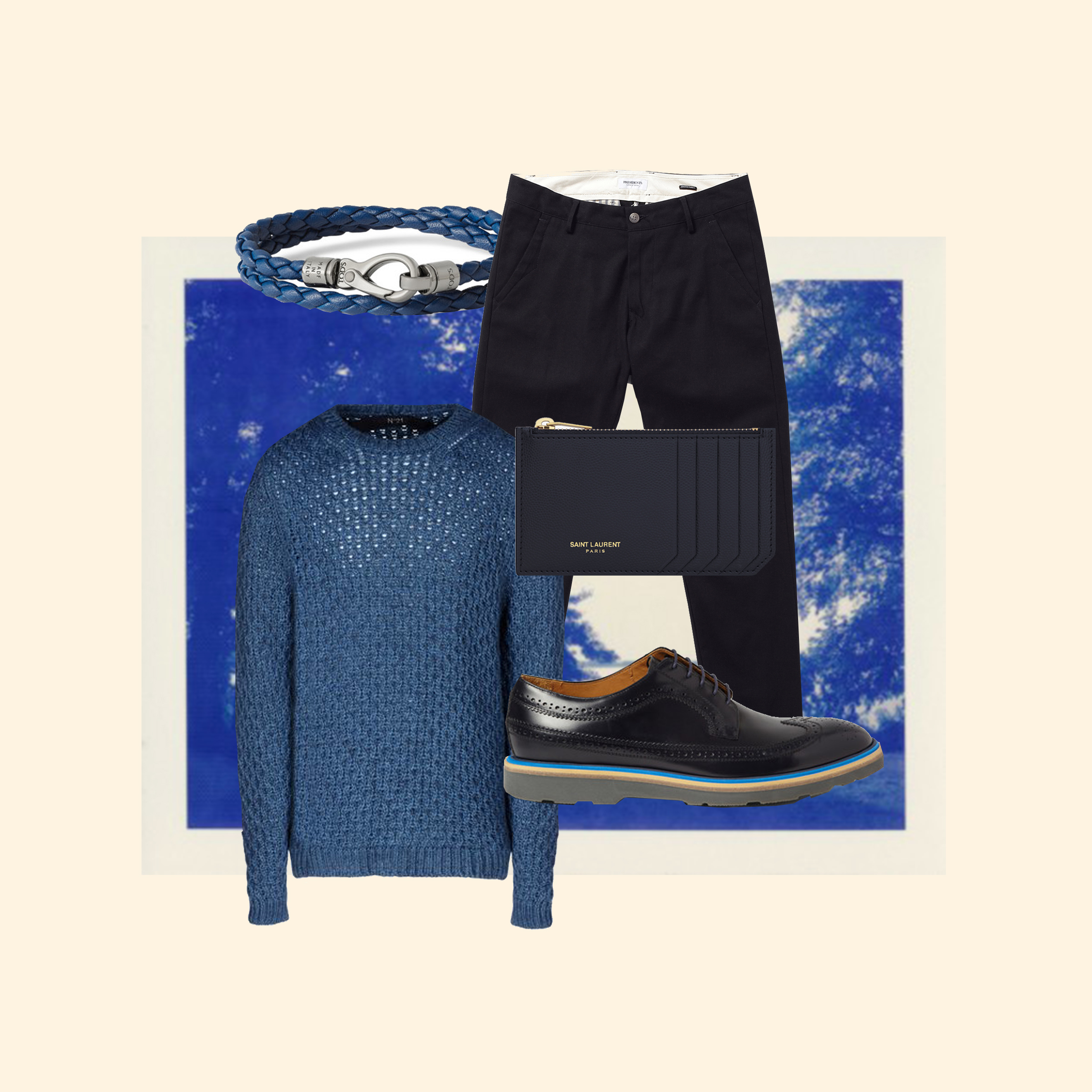
Blue will continue be a timeless colour and as a prominent menswear trend this season it is one that is easy to work with. Of course, that doesn’t mean throwing on a pair of jeans and calling it a day as a little imagination and versatility will go a long way.

Sweater: N°21, Chinos: President’s, Shoes: Paul Smith, Bracelet: Tod’s, Card Case: Saint Laurent

Styling by Vanessa Cocchiaro 

Share: Facebook,  Twitter  
22/09/2014

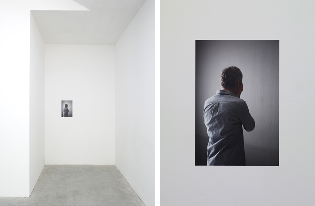
Ryan Gander | Retinal Accounts

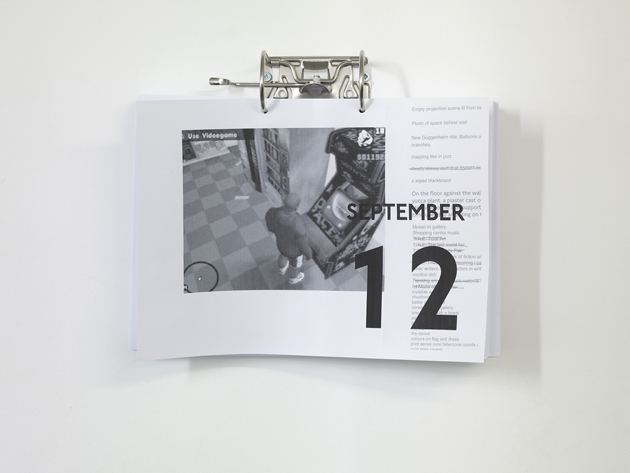
This is not the first time that we mention Ryan Gander (b. 1976, Chester, UK), and gb Agency is one of our favourite galleries worldwide, so we cannot avoid devoting some words to “Retinal Accounts”, the latest project coming from the fruitful bond between the two ‘art establishments’.
The work of the English artist, one of the most brilliant protagonists of contemporary conceptual art (and not only), creates more or less veiled juxtapositions, relations and connections between seemingly unrelated entities. His works – conceived with different kind of media, ranging through installation, sculpture, performance, writing, film and graphic design – refer to everyday objects of our society and reveal part of his personal experience. Gander’s poetics is immediate as well puzzling, with an uncommon narrative power. Ye, more than a storyteller who gives answers, the artist could be seen as a catalyst who triggers enquiries. The viewers are included into the setup and invited to wonder about what they are watching. Gander leads people to linger on diverse cognitive dissonances and to plump all the possible combinations, even the most bizarre and distant from our set of beliefs.

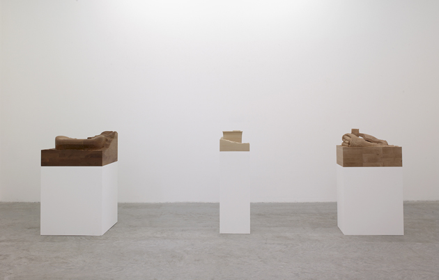
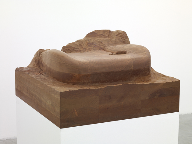
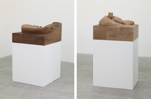
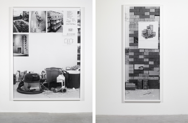
“The way things collide” (series started in 2012) unites elements far from each other and from the world we are accustomed to seeing, objects difficult to imagine together, resulting in unexpected artifacts such as a bath towel or a condom made of wood. It seems forcing, but this approach coveys irony and hides food for thought. Through evocative titles and unrestrained works, Gander introduces different levels of comprehension to his practice, involving various levels of reading as well as the audience’s unrestrained curiosity, significant for its capability of developing a narrative, to whatever end it may lead.

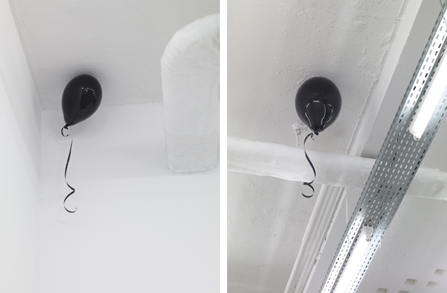
In “Two hundred and sixty nine degrees below every kind of zero” (2014), and “Two hundred and sixty eight degrees below every kind of zero” (2014) the artist places two balloons made of fiberglass floating on the ceiling. The title refers to the boiling point of helium, while the piece refers to the word/world invented by Gander: “Culturefield”, the name of a parallel universe towards which the balloons seem to be directed. Gander’s work can incite other people’s creativity by showing them how to easily move from our usual reality to everything else that still has to be invented. Interacting with his spectators, the artist helps them to divest from their superstructures, and enjoys the pleasure of activating their minds.

For all those who think Paris is so much more than a fashion stage, the exhibition will run until 11th of October.

Monica Lombardi 
Share: Facebook,  Twitter  
19/09/2014

Richard Ginori: Florentine Correspondences

At the edges of the most well-established northern districts of Italian design, but still not excluded from their boundaries neither for artistic vocation, nor for industriousness, Florence keeps on representing a niche environment in the world of creation: not fertile enough to make outstanding innovation develop, but still able to keep safe the most excellent bricks of its decorative DNA.

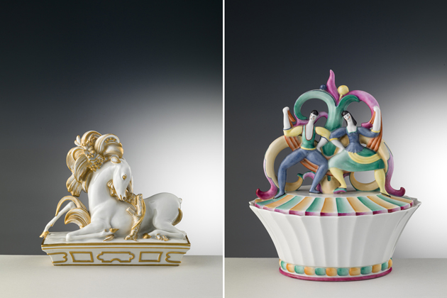
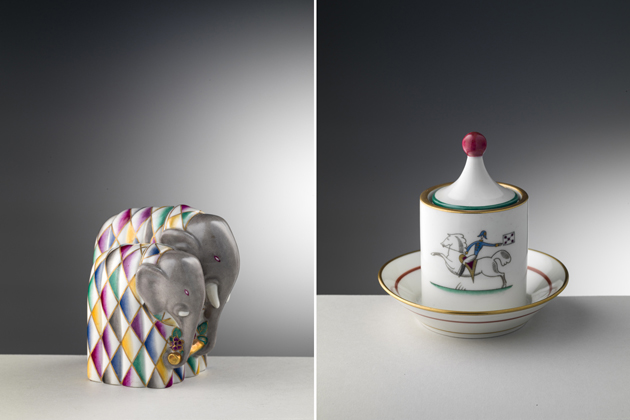
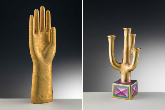
That’s the case of the magnificent heritage of Richard Ginori, Florence’s historical porcelains manufacture founded in 1735 by marquis Carlo Ginori and still active nowadays with what, in figures, remains the biggest national production of china tableware. In the course of its three centuries of history, Richard Ginori has absorbed and reinterpreted the most relevant movements of European decorative arts, vaunting outstanding art directors and dream commissions for museums and private collections. In May 2013, after a few years of financial deep waters, it has been acquired by Gucci Group, which is now committed to defend Ginori’s brand, strengthen its commercial appeal, and to get the city closer to this important chapter of its material culture.

Co-financed by the Gucci Group itself and hosted at Museo Marino Marini in the very heart of Florence’s old town centre, the “Richard Ginori and Gio Ponti: an inedited correspondence” exhibition is a proud attempt to enlighten this patrimony. Curators Livia Frescobaldi Malenchini, Oliva Rucellai and Alberto Salvadori have made a conscious choice: to present a restricted selection of Gio Ponti’s creations and to match the 50 pieces on show with the epistles that Ponti addressed from 1923 to 1933 to Ginori’s production departments representatives. Illustrated and annotated as a sketch book, each letter is not only an ironic attempt to describe the art director’s insights, but also a concrete example of what industrial design really is: an inclusive team work that reaches the highest peaks only through an obsessive attention to detail along the whole supply chain.

Not far away from Museo Marino Marini, a visit to the historical Richard Ginori’s showroom in via Rondinelli, recently reopened after the financial handover, bring us apart from the creative intensity of Ponti’s research. The stylistic choice of the new interiors, a shabby chic revisitation of neoclassic taste, can be seen as an indicator of what the new management has in mind: to leave apart the most iconic and imaginative pieces, including the mix&match experiments developed by the latest art director Paola Navone, and to encourage the stable business of traditional high-end tableware.

Giulia Zappa 
Share: Facebook,  Twitter  
19/09/2014

The Talented: Noon by Noor

Founded in Bahrain in 2008, Noon by Noor has come a long way since it took its first steps as a young and independent fashion brand, and its latest collection, shown at New York fashion week, is taking the world by storm. The founding designers behind Noon by Noor are the two cousins and childhood friends Shaikha Noor Al Khalifa and Shaikha Haya Al Khalifa. They studied fashion design in the US together and returned to their home country, Bahrain, after graduation with the goal set on designing luxurious, feminine clothes with great attention to detail. It has now been five years since they founded their brand, and they were already awarded with “The Breakout Talents of 2013” by Elle and loved by celebrities such as Solange Knowles, Olivia Palermo, Blake Lively and Coco Rocha.

Noon by Noor is often described as the next big thing in the sphere of young contemporary fashion designers. Their design aesthetic can be described as chic, modern, clean and playful, where the inspiration is drawn from both Eastern and Western influences. For Spring 2015 they added a sporty dimension to their pieces, creating a collection which was based on the idea of new beginnings, renewal, and youth. Botanical prints, fresh colours, metallics, mesh and embellishments were among the most prominent motifs seen on the catwalk, and we are especially loving the white bomber jacket with airy mesh paneling. The fact that Noon by Noor was the only brand from the Gulf region showing in New York, makes us both impressed and worried. While nowadays it is possible for brands from all over the world to succeed on the global fashion scene, which Noon by Noor are a proof of, we are just hoping that successes like these will make way for other brands coming from ‘unconventional’ fashion backgrounds to succeed on the global fashion scene.

Hanna Cronsjö 
Share: Facebook,  Twitter  
18/09/2014

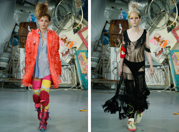
Meadham Kirchhoff’s Fashion Revolution

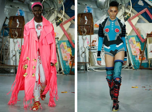
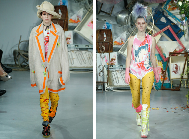
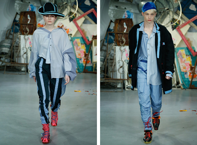
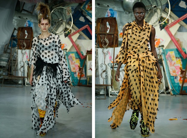
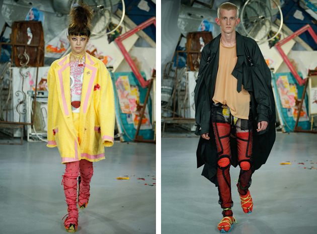
Can fashion still be rebellious, subversive, revolutionary and independent? Can it still contribute to a broader political discourse on society and our time? The latest Meadham Kirchhoff collection for Spring/Summer 2015, presented during London Fashion Week, aimed at proving that fashion design can still construct a narrative that goes beyond traditional issues of style, tailoring and beauty, touching issues of gender equality and representation, fight against misogyny, commercialisation and discrimination.

Meadham Kirchhoff was founded in 2006, by designers Edward Meadham and Benjamin Kirchhoff who studied womenswear and menswear respectively at London’s Central Saint Martins. Initially launched as womenswear brand, Meadham Kirchhoff has developed its first menswear collection in 2013, mixing in their latest show the two productions with the deliberate aim of subverting the traditional division of the two fields. Everything in their last presentation was carefully planned with the aim of delivering a precise political message: from the choice of location (the basement of a classic Soho record store), to their choice of models (an open casting call brought together a mix of ‘local kids’), from the set-up of the show (made of what appeared to be kitschy garbage) to the rebellious fanzine that was handed out to each participant.

The collection itself, made of cheap fabrics, over-exaggerated accessories (those bloody tampons were possibly a little bit unnecessary) and opulent cuts, called to action by referencing the most iconic anti-establishment scenes of the past decades – punk heroines, queer club kids, grunge and ‘angry feminists’. A commercially difficult yet unbearably of-the-moment collection, Meadham Kirchhoff’s latest creative endeavour instructed its public to “reject everything” precisely by embracing what is, ever so often, rejected.

Rujana Rebernjak 
Share: Facebook,  Twitter  
17/09/2014

Munthe – Expected Glamour with Unexpected Twists

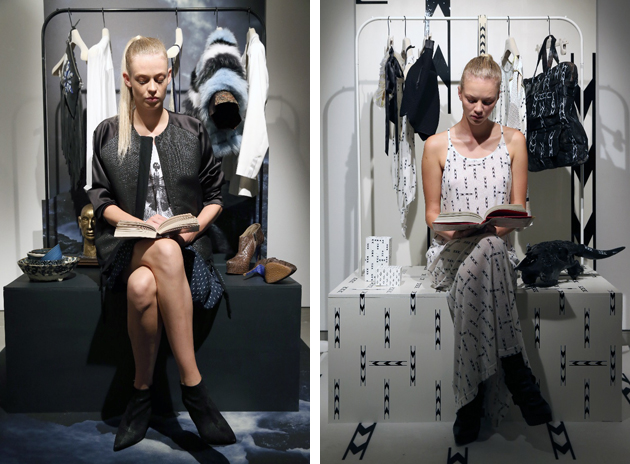
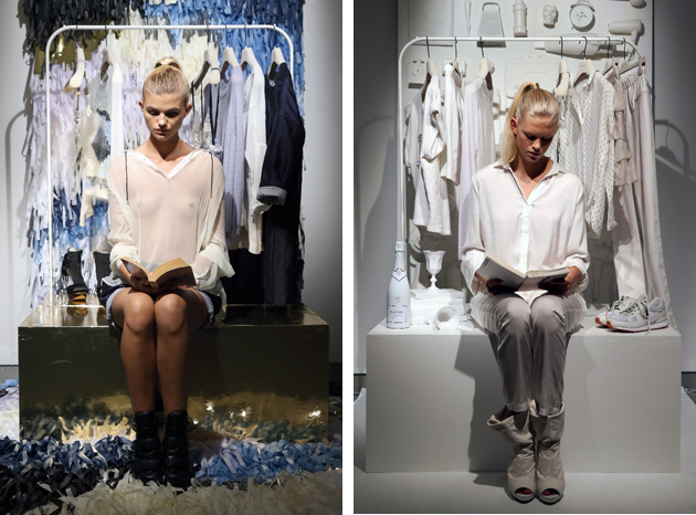
It’s Wednesday morning and the summer air is breezing through the fashionable crowd enjoying the Munthe brunch before entering the show. To everyone’s surprise the runway has been replaced by an installation. In a small room there were seven girls sitting and reading while showcasing the newest collection from Munthe. Behind them was the remainder of the collection. Having adapted to the importance of street style Naja Munthe showed her authenticity, but also made it clear that fashion doesn’t exist just for the “glamazon”. It is even more important for the plain Jane, where it’s all about creating an image of who or what you want to be.

The art of perception is something Munthe brand has taken to heart. Established in 1994, the brand quickly rose to fashion stardom within Denmark and soon enough became a household name. Naja Munthe studied design at the design school Kolding and is known for gaining inspiration from her travels, the Scandinavian seasons as well as art and literature, creating an eclectic nature for her fashion house to grow in. Through the years, the fashion brand has been awarded in several categories and countries, including Italy (Trade Leaders Club, Corporate image) and France (Veuve Clicquot, Business Award of the Year).

In 2010 Naja Munthe created an interior collection named Casa de Luxe by Naja Munthe adding to the brands wondrous world. After 20 years in the spotlight the brand has become synonymous with a laid back glamourous design with a raw edge, as well as being a reliant pillar of Danish fashion scene. Following her own voice, the clear DNA of Munthe is always present and offers the expected, undeniably bohemian rocker vibe. Normally a death sentence in fashion, sticking to a precise set of references has in this case been turned on its head, generating surprise twists and exploring different sides of one style. For SS15 season, we could see the expected laid-back elegance, but by adding pieces such as a striped fur bolero Naja built on that essential elegance making it something more, making it unmistakeably Munthe.

Victoria Edman 
Share: Facebook,  Twitter  
17/09/2014

Through the Lens of Carissa Gallo

Images courtesy of Carissa Gallo 
Share: Facebook,  Twitter  
16/09/2014

London Design Festival 2014

Have you ever considered design to be overwhelming? Touching realities, objects, disciplines and crafts as different as glassmaking, automobile industry, packaging or motion graphics, design gives shape to nearly any sphere of human activity. It can be simple and straightforward or conceptual and inquisitive; it forms such a complex and articulated ecosystem of activities and artefacts that it is sometimes unbearably difficult to grasp. And yet, when all those spheres of activity collide, the result is often an exuberance of intelligence, wit and insight or, on the contrary, of uselessness, waste and superficiality.

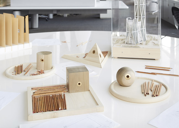
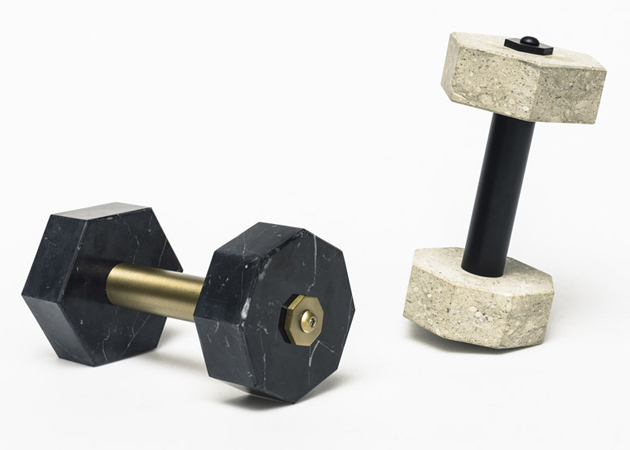
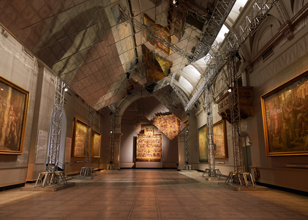
As any other grand design fair, this year’s London Design Festival presents a healthy mix of both. It is insightful and innovative, as well as somewhat repetitive and futile. As such, it is, in fact, an accurate representation of the many faces that form the design sphere. Founded in 2003, London Design Festival has opened its 12th edition with a program of around 300 projects scattered between various design districts, small independent spaces and established design institutions. Lacking a well-defined core such as Milan’s ‘fiera’, the Festival shifts its focus between talks, exhibitions, presentations, events and specially commissioned projects, such as two Landmark Projects – one at the V&A developed by Barber and Osgerby and one in Trafalgar Square by Morrison, Patternity, Raw Edges and Studioilse –, a series of installations at the V&A Museum, Global Design Forum panel, six design districts – Brompton, Chelsea, Clerkenwell, Islington, Queens Park, Shoreditch, rather than designjunction, 100% Design, Focus/14 or Tent London creative hubs.

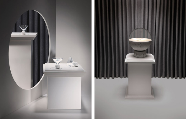
Lasting a little more than a week – the festival opened on the 13th of September and lasts until the 21st – London Design Festival explores design’s diversity and apparently endless limits. It shows its relationship with the past and monumentality with Barber and Osgerby’s installation in V&A’s Raphael Gallery; it shows design’s reflection on design itself with Formafantasma’s “From Then On” project for Established & Sons; it demonstrates its relationship with subtle gestures and peculiarities of everyday life with Fabrica’s “Extra-Ordinary Gallery” at the Ace Hotel in Shoreditch; it explores its storytelling abilities through “Crafting Narrative” exhibition at Crafts Council; and, most of all, it explores its inevitable, fundamental relationship with the industry with projects that range from new furniture designs for Vitra to a conceptual mini market set-up by Hay, eloquently showing the dense, seamless and perpetuate transformation of contemporary design practice.

Rujana Rebernjak 
Share: Facebook,  Twitter