29/08/2014

The Radical World of Ettore Sottsass

Of many great Italian designers of the past century, Ettore Sottsass is the most difficult one to grasp. Initially trained as an architect, throughout his life Sottsass has produced work that spanned many disciplines, media and types of production. From critical design developed with radical group Memphis to industrial design projects – among which stands out the timeless Olivetti portable typewriter ValentineSottsass has marked the discipline’s course and his work is still reflected in projects developed by contemporary young professionals.

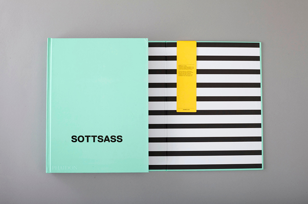
Nevertheless, until recently, a comprehensive reading of Sottsass’ life and work appeared to lack. Bits and pieces of his work and thought were scattered around in different volumes, such as Barbara Radice’s “Memphis. Research, Experiences, Results, Failures and Successes of New Design”, which offers a critical reflection on the Memphis period, rather than Sottsass’ autobiography “Scritto di notte”, revealing his youth years and an unconventionally free approach to life. For this reason, Phaidon’s monograph on Ettore Sottsass was a highly anticipated and much needed work.

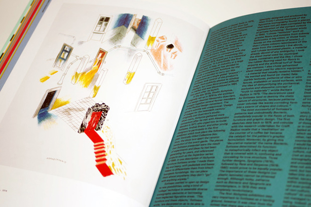
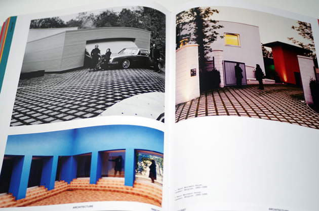
Edited by Philippe Thomé, this monumental volume aims at revealing the complexity and eclecticism of the designer’s work by dividing the book both chronologically and thematically. Therefore, each subsection of the book – whose complex and at times too bold graphic design reflects perhaps the density of its subject – is divided into different chapters based on the type of production – ceramics/glass, furniture, sculpture/painting, architecture, jewellery, etc. – offering a comprehensive and clear vision of the evolution of Sottsass’ thought. Thomé, a Swiss scholar who wrote his doctoral theses on Sottsass, complemented the meticulous research work with essays by Francesca Picchi, Emily King, Andrea Branzi or Deyan Sudjic, as well as with precious and utterly exciting inserts of Sottsass’ characteristic sketches. With more than 500 pages and 800 illustrations, the book’s sheer volume stands as a reminder of the depth of Sottsass’ achievement.
Rujana Rebernjak 
Share: Facebook,  Twitter  
28/08/2014

Style Suggestions: Graphic

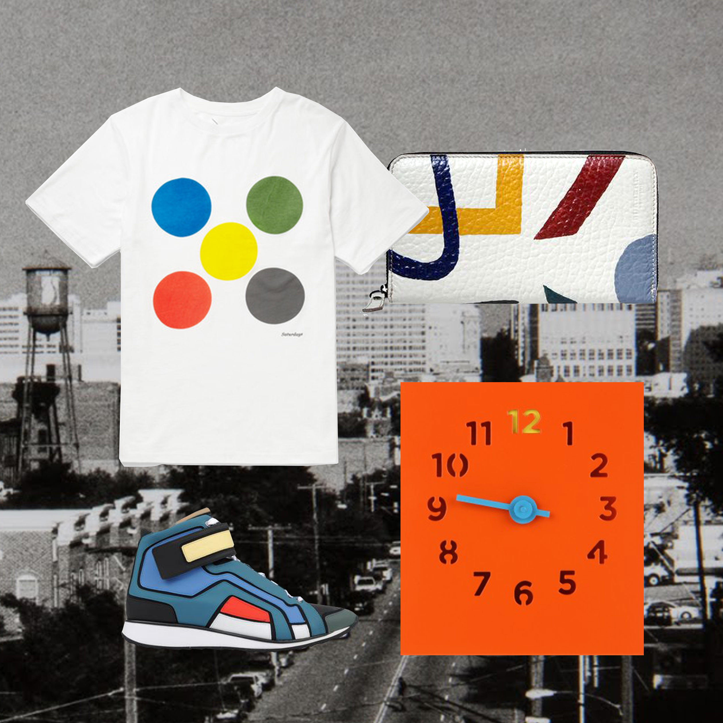
Have some fun this season with graphic colours and prints. From clothing to accessories this trend is a must have if you want to add an extra kick to your wardrobe.

Clock: Block, T-Shirt: Saturdays NYC, Kicks: Pierre Hardy, Wallet: Burberry Prorsum

Styling by Vanessa Cocchiaro 

Share: Facebook,  Twitter  
27/08/2014

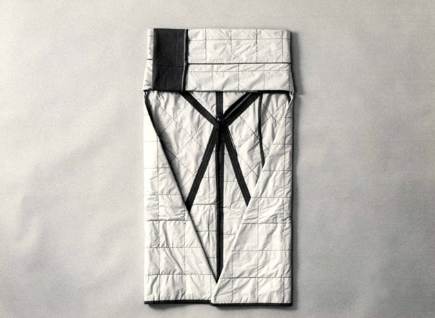
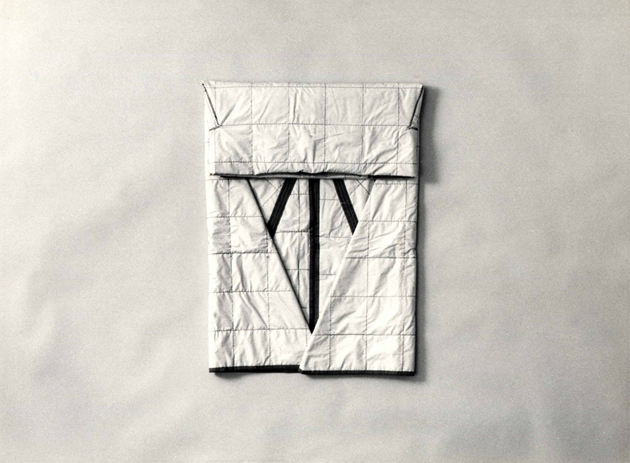
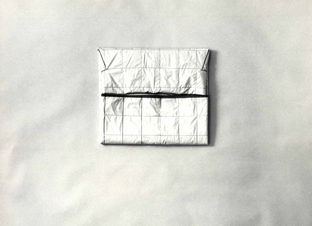
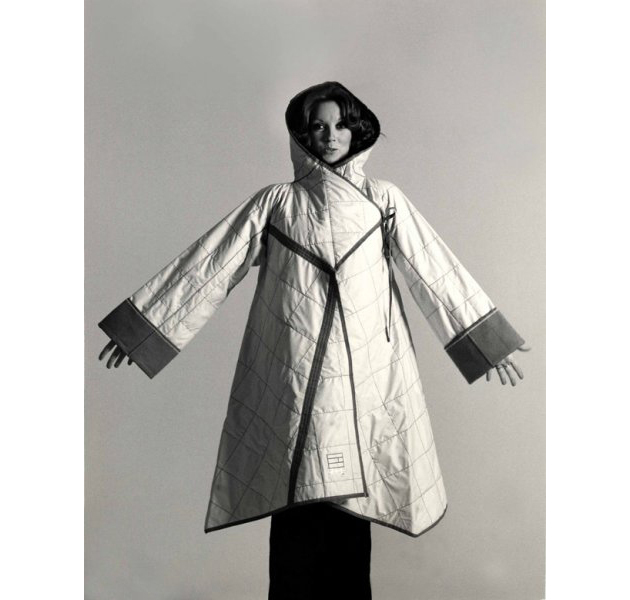
Nanni Strada: Shaping the Practice of Fashion Design

“My intention, then and now, is to untie the dress from its tailoring origins and from its subjection to the body and to fashion and its rules. I deal with the creation of dresses with a methodological approach typical of industrial design practice.”

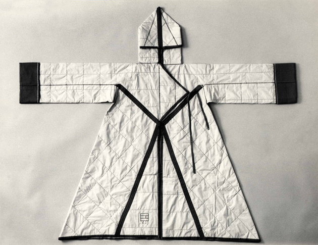
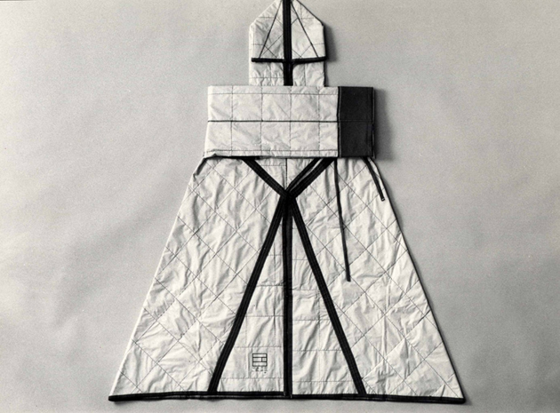
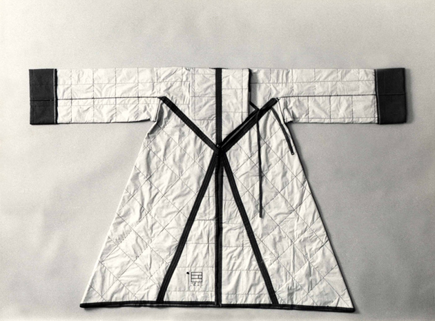
These sentences reveal the philosophy to which Italian fashion designer Nanni Strada devoted her practice, as well as all her life. Nanni Strada, born in Milan “during war years” (as stated in her biography), has dedicated her life to rewriting the rules of fashion, establishing fashion as a practice spiritually linked more with industrial design than with art. Playing with her own native language, in 1971 she designs the so-called ‘habitable dress’ (abito abitabile): with no lining, no size, adjustable fastenings and no reinforcements, just kept together by so-called ‘welding stitches’, until then used solely in knitwear. The application of this technique to the creation of fabric itself brought Strada to further experimentations, perpetually seeking purism in architectural forms of clothes.

In 1974, she presents Il Manto e la Pelle (The Mantle and the Skin) – a documentary illustrating geometric, two-dimensional, compressible clothes assembled with futuristic stitching and tight tubular garments without seams – the seamless suit, a project developed in collaboration with Calza Bloch. This sartorial innovation opened new frontiers and broke the rules of pattern-making, opening new possibilities altogether in the fields of knitwear and underwear. The project, presented at the Milan Triennale, will eventually, in 1979, win the prestigious design award Compasso D’Oro. 1974 is also the year Mappamodello was published. It was a catalogue featuring designs conceived for the competition Arab-Islamic National Dress, which then formed the designer’s collection produced and distributed by Oriente e Cina, a shop in the centre of Milan. This publication combines structured, geometric clothing – Strada’s trademark – garments with an eastern origin, as well as pieces of workwear, all in one singular pattern.

The interest in different cultures and places has always influenced her design practice, and travels have served as a moment of discovery and enrichment, translated into clothes that, once again, pushed the boundaries. The Torchons, another invention dated 1986, were dresses made in pure linen, to be kept furled to maintain the pleats in place, designed precisely for traveling: smart but still elegant, these were clothes that re-affirmed that fashion does not mean slavery to obsolete diktats, but has to be lived as a support to a life lived to the fullest. In 1988, Strada unites draped Indian linen and traditional Scottish tartan in her project The elegance of the hybrid. Not contamination, but hybridization. It served as a way to gather elements from different cultures and make them work together, to create a language that carries messages from different philosophies and traditions.

Capable of capturing the zeitgeist of the time – similar are the results of Issey Miyake, whose experimentation led him to succeed in ‘sculpting’ the fabric, with his famous pleats – Nanni Strada’s informal and timeless designs are still to be admired as examples of endless research and deep reflection upon the necessities of an ever-evolving reality.

Marta Franceschini 
Share: Facebook,  Twitter  
26/08/2014

Testing Chairs

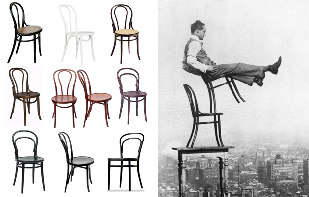
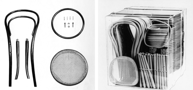
Designing a chair represents a staple for every aspiring designer. A chair, in fact, stands at the crossroad of multiple demands: its ergonomics is more than essential in evaluating the pleasure of its usage, and yet its iconic value needs to overcome its functional features and establish a special narrative dimension that, almost like an aura, surrounds every legendary seat in the design world. As in all complex tasks, this giant effort is not confined to prototyping, but includes testing as a tough but intriguing part of the job. It’s no coincidence that design history starts with a daring testing procedure: when presenting n°14 chair at the World Exposition in Paris, Michael Thonet launched his “chaise bistrot” from the top of the Eiffel tower. His goal was to demonstrate how resistant, besides being formally innovative, his bended wood creation was, and thus the result has legitimated the risk. Further to this spectacular demonstration, “the most elegant chair of all times”, according to Le Corbusier, won the Gold Medal and was finally put in mass production.

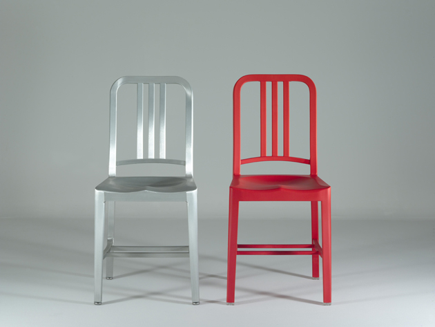
Another milestone among design chairs, Navy Chair by Emeco, shares another spectacular test practice. Commissioned by the American Navy in 1944 and basically confined to U.S. military submarines and ships till the ‘70s, this aluminium chair has always been celebrated for its resistance. Guaranteed for 150 years, it was previously tested resorting to the considerable weight of a bunch of muscular men who were meant to jump on a board laid on its legs. Nowadays the process has gone mechanical and includes numerous testing phases, which submit each piece to drop, impact, back and legs strength stresses.

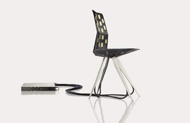
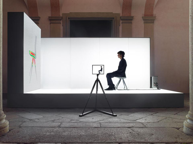
However, advancements in technology change not only the way testing process is led, but also the target involved. For their R18 Ultra Chair, designers Clemens Weisshaar and Reed Kram created a public testing environment during 2012 Salone del Mobile in Milan. For this first crowd-sourced test in design history, visitors were invited to sit on the chair prototype and allow the sensors placed inside the seat to capture their movements and transform them into relevant data, used to optimize the final product.

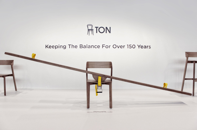
Beyond technology and its digital progress, however, testing can be transformed into an award-winning issue. At the latest DMY in Berlin, the Czech company that has taken the reins of the manufacturing factories where Thonet chairs were first produced, Ton, won the Exhibitor Award for a special installation that animated its booth. On show, a slide on a chair – a clear reference to the way bent wood chairs were first tested- becomes not only a symbol of long-lasting handmade techniques, but also stands as a metaphor of the humble yet playful effort every innovation needs to support.

Giulia Zappa 
Share: Facebook,  Twitter  
25/08/2014

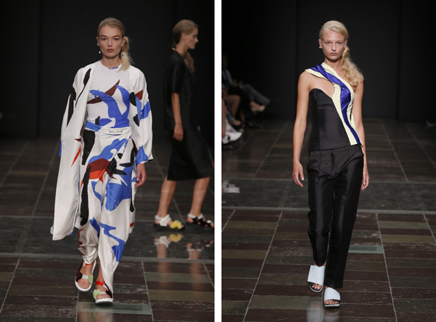
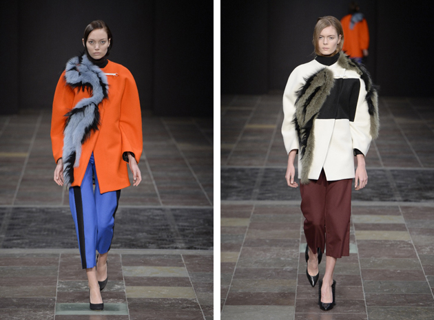
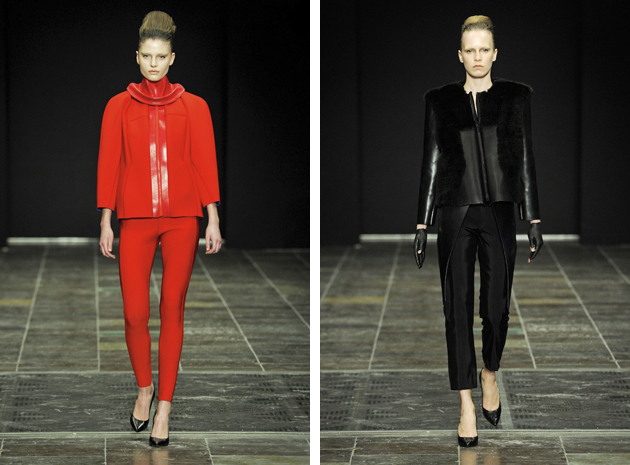
Freya Dalsjø – On the Edge

For up-and-coming designer Freya Dalsjø, things have been moving like a clockwork. After graduating from the Antwerp Royal Academy of Fine Arts she launched – in June 2012 – her own brand Freya Dalsjø, and was given the honor of opening Copenhagen Fashion Week. Since then, Freya Dalsjø has been described as a fashion innovator always bringing a bold statement to the runway. Numerous collaborations with designers in Denmark have been made, including Kopenhagen Fur and Nørgaard på Strøget. Her design and innovative skill has given her recognition both nationally and internationally; most recently the young designer was nominated for the Dansk Design Talent Award.

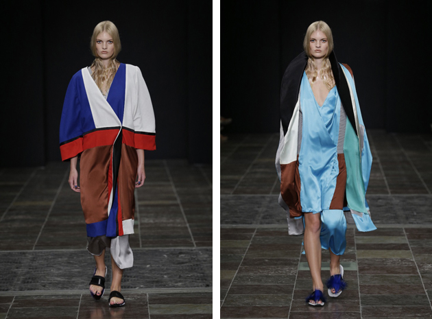
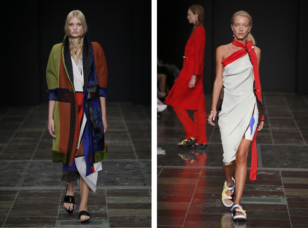
Over the years, Freya Dalsjø has shown diversity in her work. In her AW13 collection the feel was quite dark and futuristic. Women were presented as very confident and seductive – almost untouchable – with neoprene, leather and fur as well as exaggerated shoulders as the main component, creating a very postmodern look. For SS14 it was as if the women had been lifted into a more serene state. The reference to the 1990s was there in silky slip dresses, as well as that to Eastern culture, with layered effects, draping, boxy shapes and superb use of color. For AW14, an architectural touch was introduced as a compliment to the layering, with the use of color-blocking remaining untouched in order to create unique prints and mix of materials to add dimension to the garment. It built a modern take on the 1960s, with several minimalistic pieces creating both staples and stand outs for the Scandinavian winter. When witnessing Freya Dalsjø SS15 collection there was a clear range of know-how and talent being demonstrated. Draping, structured pieces and many more elements caught the eye: laid back colorful elegance at its best, making you long for spring.

Freya Dalsjø isn’t simply a designer caught in the moment, her design has an eclectic element that invokes a thought process in the viewer and brings forth the notion that a woman who wears Freya Dalsjø doesn’t just use clothes as a mere reflection of herself but as a way of framing herself: the surroundings and feelings of a woman are capsulated into the act of dressing.

Victoria Edman 
Share: Facebook,  Twitter  
22/08/2014

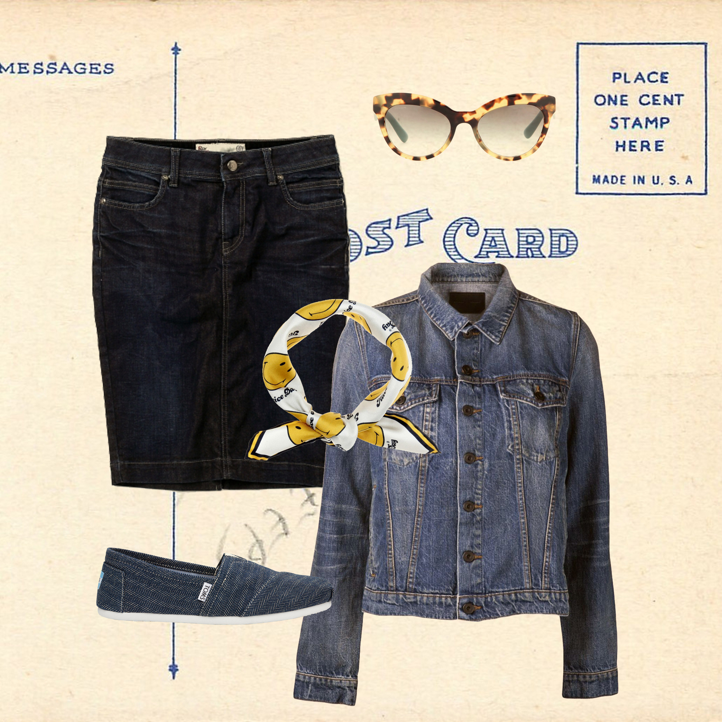
Style Suggestions: Denim

Spice up your skinny jeans this season with a fresh approach to all things denim. From culottes, skirts, shirts and jackets make your denim selection a little more interesting.

Denim Jacket: Proenza Schouler, Skirt: Roy Roger’s, Shoes: Toms, Scarf: Anya Hindmarch, Sunglasses: Prada

Styling by Vanessa Cocchiaro 

Share: Facebook,  Twitter  
21/08/2014

Bouchra Jarrar: Modern Day Wear for Everyday Life

After nearly twenty years of working more or less anonymously in the ateliers of prominent fashion brands, fashion designer Bouchra Jarrar left the anonymous work behind her and founded her own brand in 2010. In 1994 after graduating from Duperré, her ambition to learn more about “diminutive details, to acquire a precise and meticulous savoir-faire” led her to Jean-Paul Gaultier jewelry licensee. Two years later she arrived at Balenciaga, where she worked as the studio director until 2006. In 2008 her passion for the ateliers of the couture houses and her wish to improve her knowledge of the know-how of couture and various tailoring techniques, brought her to Christian Lacroix where she became the couture head of design. In early 2010 her own high-end ready-to-wear house, which also offers custom-made creations to couture clients, became reality and Bouchra Jarrar Paris was founded.

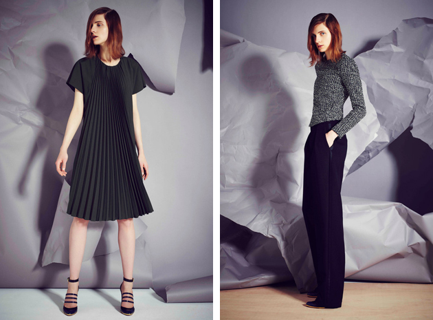
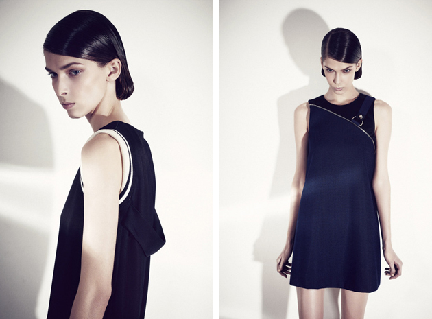
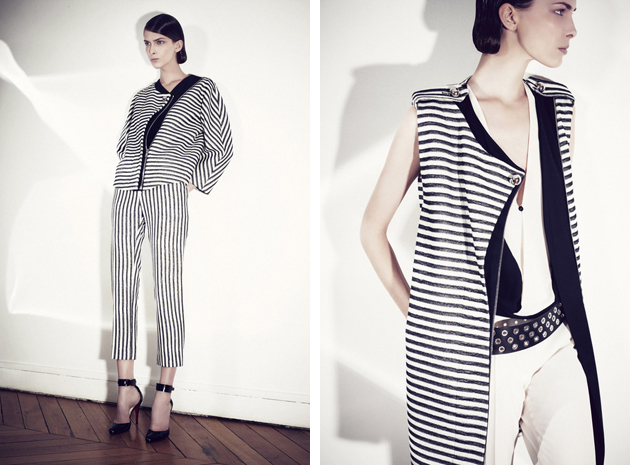
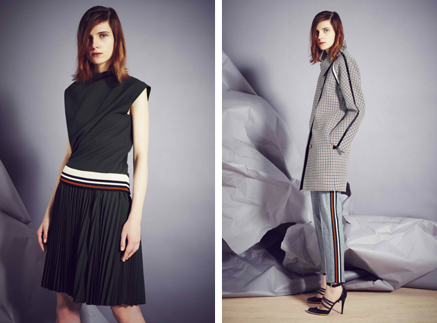
The brand stands for a modern and elegant design philosophy, and Jarrar has declared it her mission to create an everyday wardrobe that will allow women to “reveal the elegance that we all possess, even if we don’t always know how to express it”. Twenty years in the industry, spent working with huge names such as Nicolas Ghesquière, have sharpened her technique and she has learned the mastery of fabrics and cuts – skills that today serve as a key in order to stay true to her concept of designing an elegant everyday wardrobe. This season is no exception: with a neutral color palette dominated by grey, black and white, Jarrar she uses the details to make the collection more unique. The result is a simple and clean collection with contrasting colors, patterns, interesting constructions and innovative cuts which makes it perfectly suited for our everyday life.

Her great experience of the industry in combination with her never ending desire to develop and learn more about the craft, has made her brand a success story in just a few years. She was awarded the Chevalier dans L’Ordre des Arts et des Lettres medal in recognition of her contribution to the French arts. We couldn’t but be happy that Bouchra Jarrar took the final steps into the spotlight, which seems to be exactly the place where she belongs.

Hanna Cronsjö 
Share: Facebook,  Twitter  
20/08/2014

Larry Clark: Tulsa and Teenage Lust

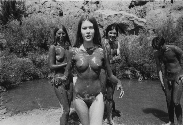
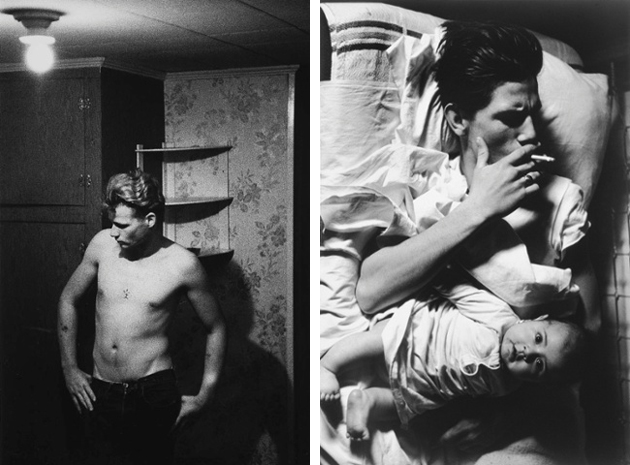
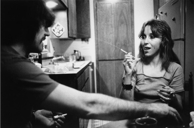
In 1971 Larry Clark wrote on the pages of Camera magazine: “I was born in Tulsa, Oklahoma in January 1943. When I was 16 I started shooting valo. Valo was a nasel inhaler you could buy at the drugstore for a dollar with a tremendous amount of amphetamine in it. We would work up a shot and shoot it. I shot with my friends everyday through high school. When I was eighteen I left Tulsa and went to art school and studied photography. In 1963 I went back to Tulsa and shot valo and took pictures for a few months. Then I went to New York City to become a magazine photographer but I was drafted so I did two years in the army.”

“All my friends back in Tulsa were into burglary and armed robbery and did time in the penitentiary. Also my younger sister was now shooting. I went back two or three times and in 1968 I spent the summer with my friends and did pictures and 16mm film and tape recordings. I didn’t do many pictures because there was so much dope around. We had more than you could shoot. We lived in an apartment with some girls who were prostitutes and then had some tricks who were doctors so we had everything from liquid amphetamine to morphine pharmaceutical. The police were hot on everybody and busted the door down a few times. I was arrested for weed in one bust and the police took my camera and film and recorder and tape. I got the recorder and camera back a year later abut they still have some film and tape.”

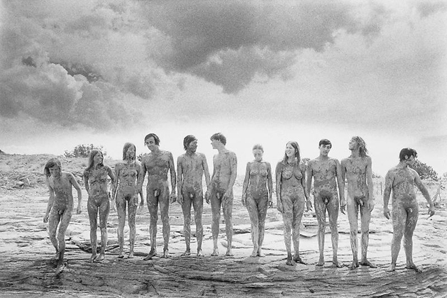
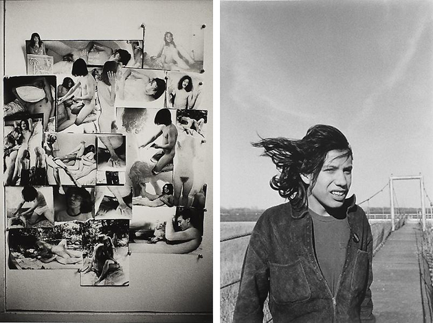
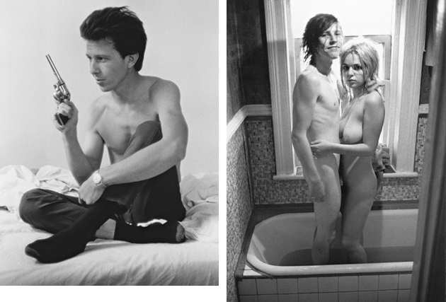
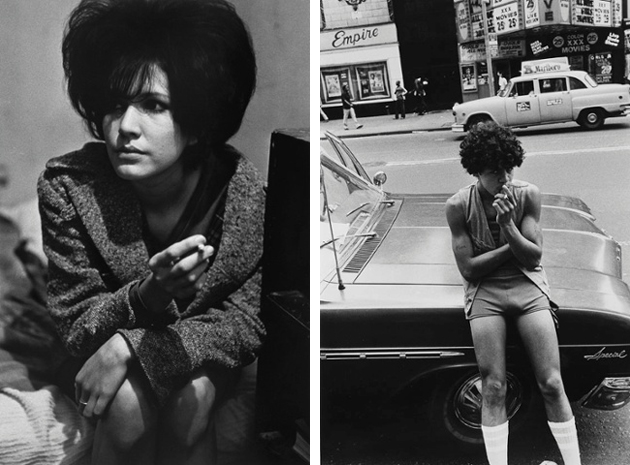
As direct and unmediated as his words, Larry Clark’s early projects Tulsa and Teenage Lust depict violence, sex and drug use with rawness, unpolished truth and subjectivity. These two series, on which Clark worked between 1963 and 1983, and which established his reputation, are currently on show at Foam Museum in Amsterdam. Larry Clark – Tulsa/Teenage Lust will run through September 12th 2014.

Images courtesy of the artist and Luhring Augustine Gallery 
Share: Facebook,  Twitter  
19/08/2014

Cité Radieuse with Daniel Buren on Top

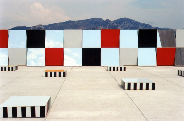
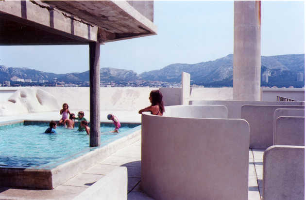
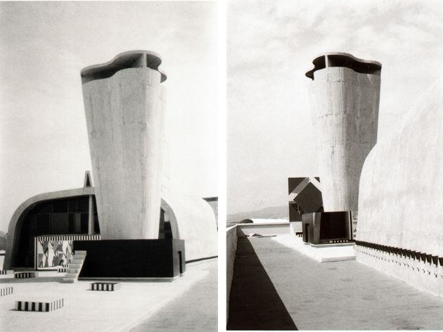
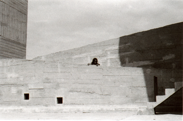
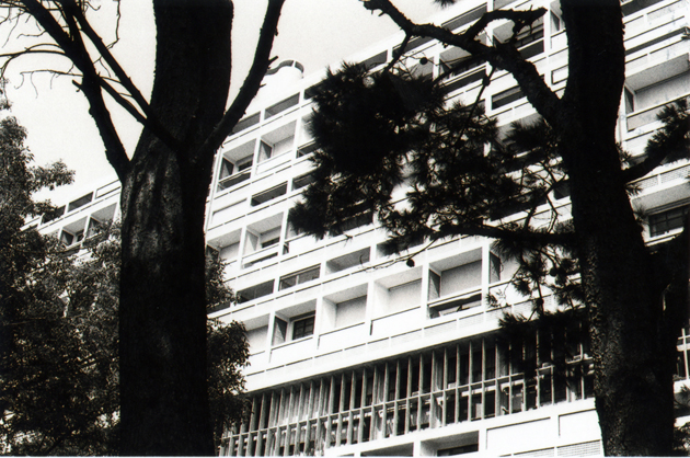
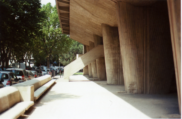
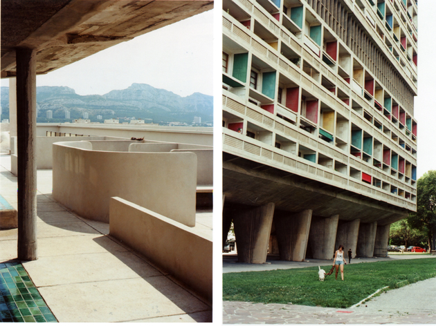
Four years ago, the French designer Ora-Ïto worked on the terrace of the Cité Radieuse in Marseille, the first Unité d’Habitation and one of the best examples of brutalist architecture, completed by Le Corbusier in 1952, with the aim of converting what was once a gymnasium into an art space. The roof of the giant ‘urban steamer’ was subjected to a lengthy restoration that brought it back to the original plan and converted into a contemporary art center of 600 m². A year after its opening, the project titled “Défini, Fini, Infini” by French artist Daniel Buren took over the open-air museum with seven works of monumental art, subverting the prospects through reflection and visual fractures generated by contrasting colors and mirroring surfaces. The French artist spent five months working on the project specifically for the space of Cité Radieuse, proposing an in situ work that plays with Le Corbusier’s architecture. Playing with a work of Le Corbusier was a big gamble, but it seems that Daniel Buren has succeeded.

The intervention – with a strong aesthetic outcome – uses different sculptural blocks of pure, well defined color and angled mirrored panels that alternate along one edge of the roof, reflecting slices of heaven and beton brut. On the small outdoor theatre, on the long side wall and on the bottom of the vent stack, a combination of mirrors and color panels rebuild the space, deconstructing it ad infinitum, and defining a new vision of this iconic architecture of the Modern Movement. This game in space, the reflections of lights and parts of the landscape are building a contemporary unit, a graphic proposal where the body is the center of this three-dimensional game.
Works created by Daniel Buren are composed of mirrors and frames with bright colors on Dibond panels (aluminum composite panels). These extremely smooth surfaces also play with rough surfaces of the raw concrete or cement. The contrast is striking and spot-on, and this combination of different ‘skins’ invites the hand to caress both the work of Buren, as well as Le Corbusier’s rough concrete. Buren neglects the humors of painting in favor of the synthesis of perceptual phenomenon, by using visual tools that modulate space and guide the visitor beyond the limits of recognizable. The light, which reflects on the mirrors, acts as a third eye, allowing you to see what’s in front and behind, leading the viewer in a kaleidoscopic revelation of events. This can also be seen at night when the light passes through the large window, covered with translucent multicolor sheets, doubling the chromatic effects on the surfaces of the surrounding elements.
In the old gym, Buren plays with colors and mirrors: the floor is a carpet of mirrors, the interior facade becomes a window. The visitor feels like facing a television test pattern. At night, the play of light on the vent stack and the cuboid concrete of the kiosk lifts complement the work of Buren and give the whole terrace a truly dreamlike feeling. Daniel Buren therefore proposed the work with the idea of a real contemporary architectural project, a journey where landmarks in space are diverted to infinity, where the sheets of his works bring into contrast those of Le Corbusier’s and the landscape of Cité Radieuse’s rooftop ended in a new visual definition.

Giulio Ghirardi 
Share: Facebook,  Twitter  
18/08/2014

El Greco And Modern Painting At Prado

This week we abandon our aptitude for contemporary to jump back to the Renaissance and have a look at the work of one of the all-time great masters of painting: El Greco, born Dominikos Theotokopoulos (1541 – 1614) in Crete, but working and living in Toledo, Spain. We decided to spend some words on this remarkable Greek artist not just because Prado Museum devoted an important retrospective to the masterpieces of Spanish Renaissance: El Greco And Modern Painting, including some extraordinary pieces executed by him in different periods of his life, but mainly because he was undoubtedly a forerunner, a key figure of art history, too forward for being fully understood by his peers.

With experience gained by traveling throughout Italy and Spain, El Greco developed a unique style, not ascribable to any conventional school, which encompasses elements of Post-Byzantine art, along with ingredients of Mannerism and Italian Renaissance spiced with an uncommon flair for modernism. He was an outsider of his time who got his place in the pantheon of artists with a capitol “A” only in the 20th century. The Spanish museum offers the occasion to admire the refined work of the artist who is considered to be the precursor of both Expressionism and Cubism. The elongated and sinuous silhouettes that remind us of ghosts, the weird palette of unreal colours and the virtuosity of technique combined with the strong expressivity, characterized the conceptual art of El Greco, far from the mere naturalism and focused on human spirit and mind.

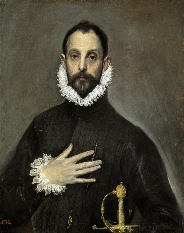
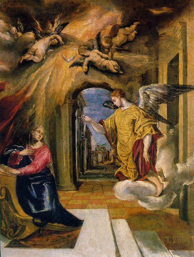
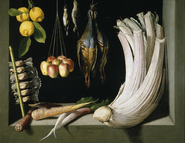
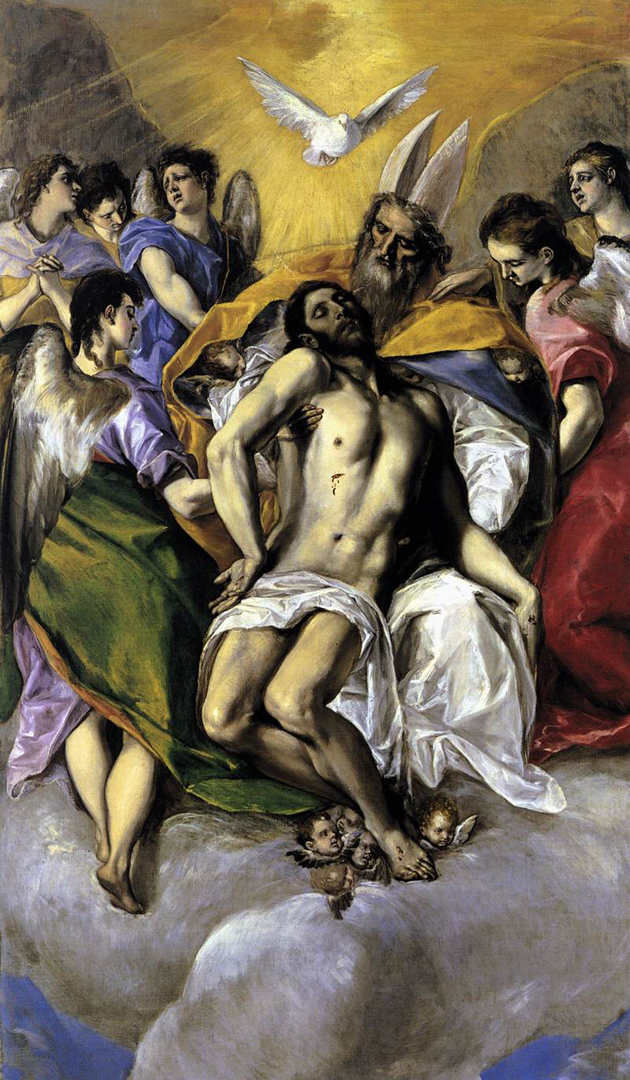
Among the works by El Greco on view at Prado we count The Annunciation, The Flight to Egypt, The Trinity, The Nobleman with his Hand on his Chest, accompanied by other works of the outstanding permanent collection such as The Still Life with Game, Vegetables and Fruit of Sánchez Cotán. Even if you are a rabid fan of contemporary art, you cannot avoid being enchanted by the expression of a genius. The exhibition will be on show until October 5th.

Monica Lombardi 
Share: Facebook,  Twitter