08/07/2014

Design Parade 9 at Villa Noailles, Hyères

During the last century, Villa Noailles in Hyères, France, was an evolving experiment in International Style as well as the home of many Mondrians and Brancusis, Giacomettis and Lipchitzs, Dalis and Rays. Designed in 1923 by Rob Mallet-Stevens for Charles and Marie-Laure de Noailles, prominent ‘art collectors and modernism enthusiasts’, the villa went through many changes, following the eccentric taste of its proud owners. Nevertheless, after Marie-Laure’s death, it was sold to the town of Hyères and nearly abandoned for almost 30 years, before it finally became a temporary home for contemporary international talents, like Viktor & Rolf, Raf Simons, Dries van Noten, Walter Pfeiffer and Scheltens Abbenes.
In 1996, after nearly 30 years of slow decay, Villa Noailles was put on disposal of the Association of the International Festival of Fashion Arts. Honouring the villa’s heritage, the Association used the space to nurture new talents in fashion, art and design, eventually setting up a rich cultural program it now hosts. Besides the initial fashion competition, Villa Noailles is known for its annual photography and design festivals, the latter of which took place last week. Design Parade showcases a selection of 10 product designers, offering assistance to young professionals in realizing their projects and developing their careers by a residency program and research scholarship, creating lasting bonds with the laureates.
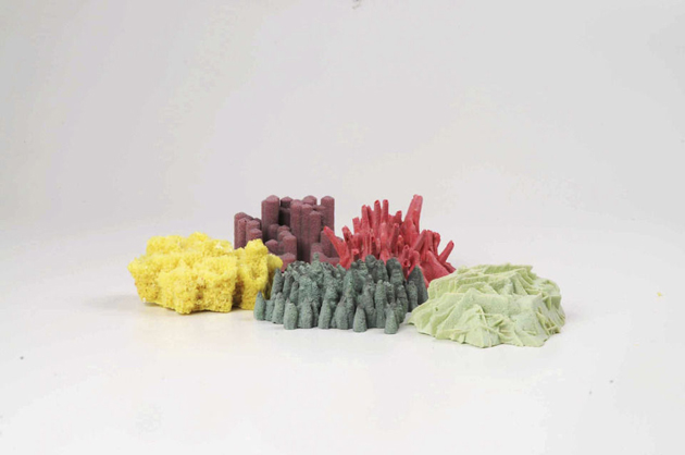
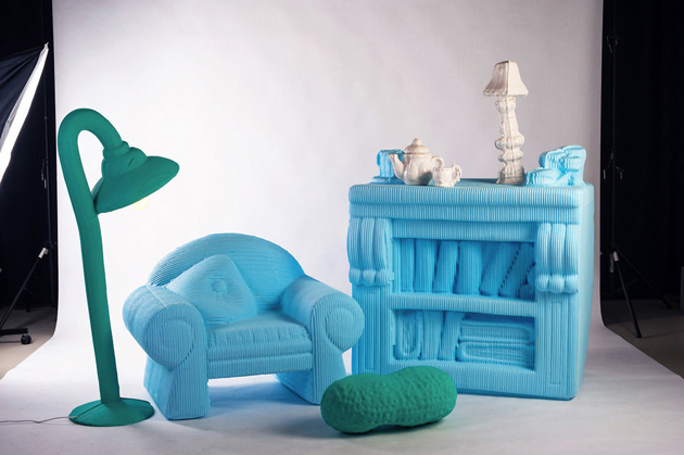
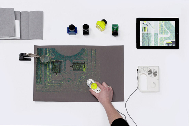
The 9th Design Parade appeared to have broken with the festival’s past. Usually showcasing carefully crafted and formally refined objects, this edition offered nuanced reflections and conceptual research rather than well-defined products. Starting from the winner of this year’s edition, Laura Couto Rosado, the selection favoured a sort of a new wave of ‘critical design’, displaying projects on the “extreme perfection of this technological revolution” with a series of blown-up doll house furniture produced with a 3D printer by Silva Lovatsova, “manifestation of technology in design” with a new printer concept by Axel Morales, rather than “the process of design conception” with a series of imaginary furniture by Malak Mebkhout.
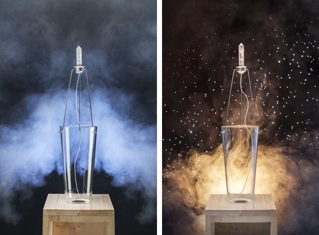
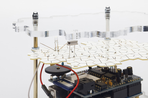
Laura Couto Rosado’s winning project developed a technical enquiry into properties of quartz crystals. Often used for high-tech components, the crystal’s piezoelectric properties were exploited by connecting a frequency generator to an amplifier and a transformer, turning quartz into a 21st century musical instrument. For the author, the project is “magical, not because it is technically advanced, but because it reveals the poetry inherent in existing technology.” Conceptually elegant and formally intriguing, this project seems to signal a new era for design where technological evolution should possibly become ever more concerned with issues of historical continuity, meaning and humaneness inherent in any object, material or production process.
Rujana Rebernjak 
Share: Facebook,  Twitter  
08/07/2014

Letting Things Slip

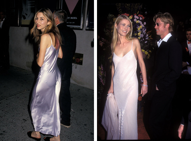
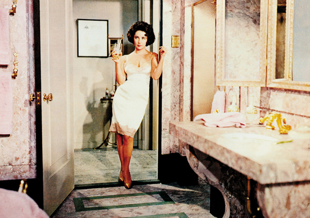
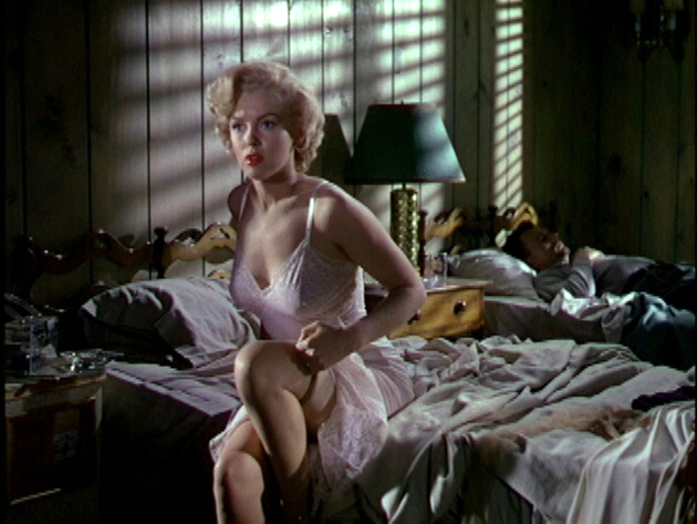
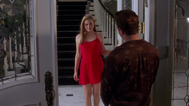
The decade we thought we never would have missed – the feared 1990s – is back with a vengeance. By now, everybody must have noted the relentless shopping-era trends – from grunge to wearing underwear as outerwear – are very much in style. While underwear as outerwear mostly evokes the vision of Madonna and her cone corsets, a much more demure garment was re-introduced in the 1990s, gaining instant success: the slip dress.
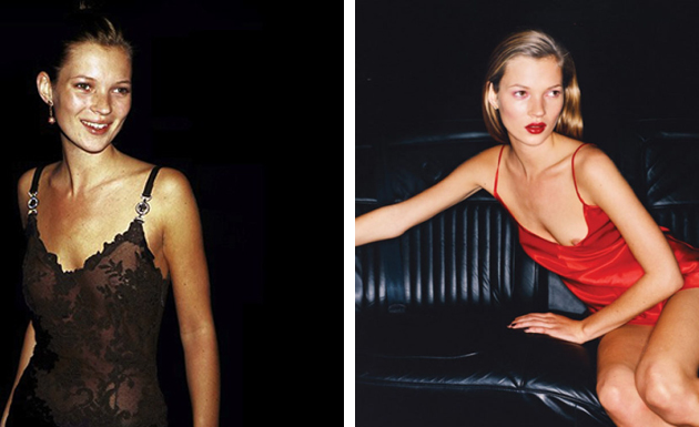
A slip dress is a thigh or floor-length gown, first introduced in the 1930s and meant to be worn underneath sheer dresses, preventing them from revealing too much. The slip dress is traditionally cut on the bias, while its key element are the signature spaghetti straps. In the late 1960s, the slip found new popularity especially thanks to Emilio Pucci’s kaleidoscopic designs, which gave the slip a slightly bigger role in women’s wardrobe, though not a leading one. It would take other 30 years for the slip dress to gain fashion momentum, with one of the first John Galliano’s designs for Dior being a lace trimmed, dark blue, slip dress famously worn by Princess Diana in 1996. While the slip dress became a ‘buzz garment’, other designers followed Galliano’s suit, with Calvin Klein and Narciso Rodriguez introducing their own designs. With fashion icons – like Kate Moss – seen wearing the slip dress, it finally became the timeless piece we know and appreciate today.
For 2015 Resort collections, designers like Marc Jacobs, Nina Ricci and Ralph Lauren all presented their take on the slip dress covering it in sequins, creating it from chiffon or sensual black lace – all rigorously kept at thigh-length. The contemporary version of the slip dress is particularly revealing, with a constant play of minimalism and decadence demanding from its wearer not to fear being in the spotlight. At the same time, lightweight fabrics and effortless flair make the dress comfortable and almost casual. In the digital era, making the slip dress work out and about is by layering a contrasting piece. A chunky cardigan worn with a lace trim slip dress creates a stylish and nuanced ‘rolled-out-of-bed’ look, making it more 2014 than 1990.

Victoria Edman 
Share: Facebook,  Twitter  
07/07/2014

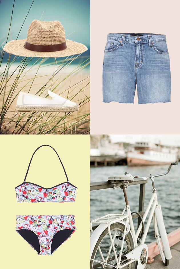
Style Suggestions: Weekend at the Seaside

Summer’s finally here, and by now you might be begging for a vacation. The only way to save yourself from the city and the heat are short but sweet weekend trips. Escape to the seaside for a couple of days and all you’ll need is your swimsuit and and some sunscreen.

Hat: Hat Attack, Swimsuit: Erdem, Shorts: J Brand, Shoes: Stella McCartney

Styling by Vanessa Cocchiaro 

Share: Facebook,  Twitter  
07/07/2014

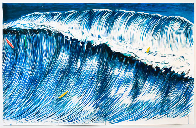
Raymond Pettibon Still Rocks

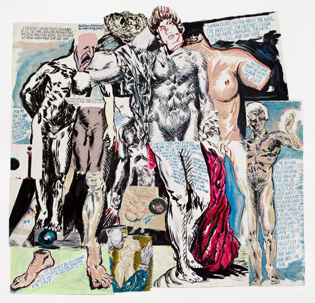
Raymond Pettibon (born Raymond Ginn in Tucson, Arizona, 1957) is recognized as one of most significant and peculiar US figurative artists, despite his outsider nature, maintained since the 80s, when he first emerged on the international art scene.

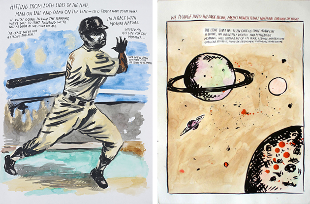
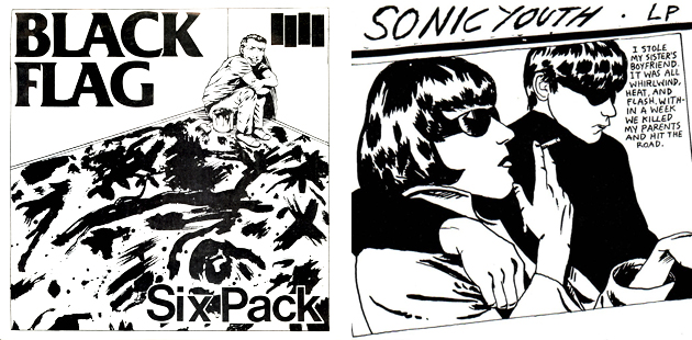
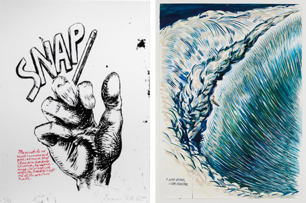
The “petit bon” (good little one) – as Raymond was called by his father – adopted this nickname as surname during the late 70s when he started playing with his brother Greg Ginn, the founder of the famous punk band Black Flag. At that time, Pettibon started creating ironic and irreverent drawings: ink and gouache on paper that mixed fiction literature and comic-like sketches, creating strong, often ambiguous, associations. The artist’s works, which initially appeared on T-shirts, stickers, skateboards, flyers, cover records and such – among which, the most notable was the distinctive four-bars logo designed for the Black Flag and, later on, the cover of Sonic Youth’s 1990 album “Goo” –, at the beginning spread mainly within underground culture, helping to define the punk aesthetics.

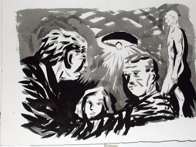
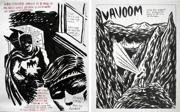
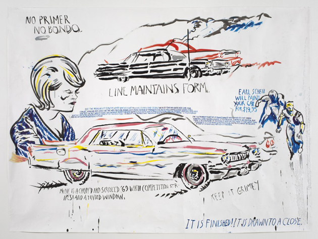
But besides curious drawings and scrawled aphorisms, Pettibon’s copious production includes paintings, collages, books, animation made from his drawings, live action films from his own scripts and fanzines, all works that deal with reading things from the world at large and collecting subject matter from media, television, books and music. The artist’s interests, that span from baseball to literature and surfing, inevitably meet the US popular everyday life and crime news section characters such as Gumby, Vavoom, Batman and Robin, Charles Manson, Patty Hearst, but also US presidents like Nixon or Reagan, almost always accompanied by his own or someone else’s puzzling words.

The long and unconventional career of Raymond Pettibon has never experienced setbacks and, after his umpteenth affirmation at Art Basel and the surfers retrospective at Venus Over Manhattan, the artist is now presenting his new works at the prestigious Contemporary Fine Arts in Berlin: another good occasion to look closely at the artistic research of a great, always up-to-date author.
The exhibition runs until 31st July 2014.

Monica Lombardi 
Share: Facebook,  Twitter  
04/07/2014

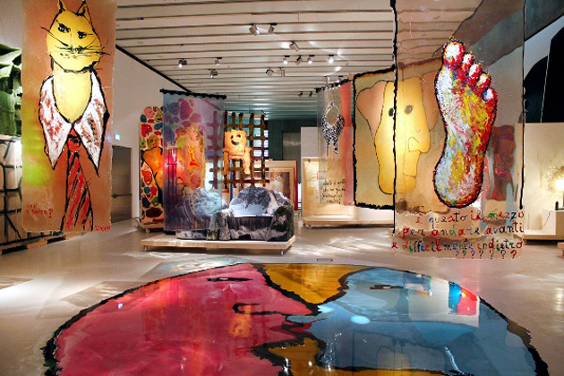
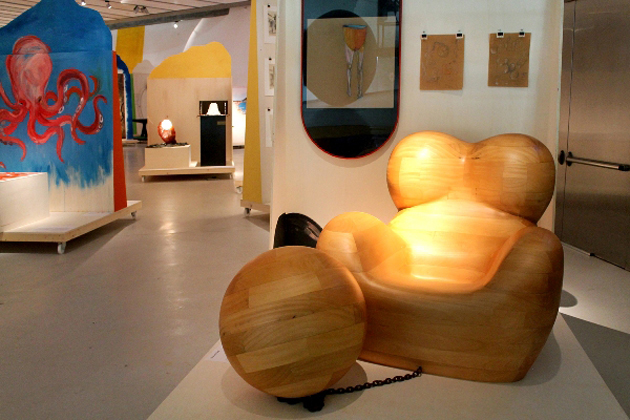
Gaetano Pesce, a Kaleidoscope of Diversity

It’s such a surprise when a city that has never called itself a design capital has suddenly something to say about it. The reason for this unexpected vitality is offered by two exhibitions that Maxxi dedicates to Italian designers gone abroad. After “Design Destinations”, the showcase exploring the creative outcomes of young Italian designers migrated to Eindhoven, the Roman museum focuses on the previous experience of radical design to celebrate one of the undisputed maestros of that fortunate, unconventional season: Gaetano Pesce.

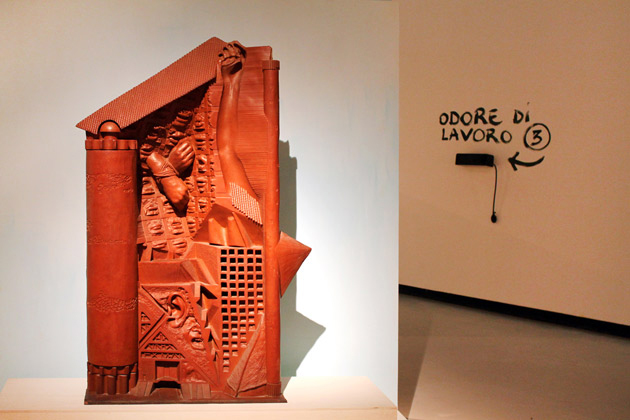
The exhibition, emblematically called “Il Tempo della Diversità” [“The Time of Diversity”], offers the opportunity to dive into an inventory of projects, sketches and products documenting Pesce’s huge yet transversal production. Born in La Spezia and based in New York since the 80s, Pesce has always preached the deconstruction of boundaries between architecture, art and design, expressing through his artworks the breaking up of vertical and monolithic knowledge.

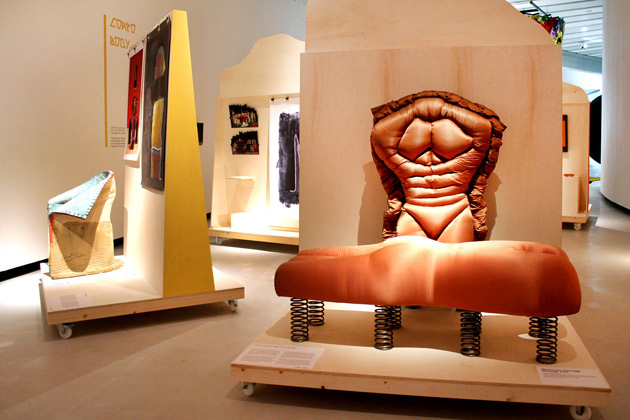
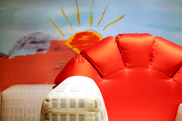
However, it’s when it comes to political dimension of his works that the exhibition unveils unexpected connections and intensity. Each piece of art, in fact, explores in its own way the concept of difference, starting from the critique of rationalism in architecture (“Pugno all’architettura”), to the reconsideration of home partitions (“Manifesto per una casa elastica”), to the celebration of female equality as the most urgent political issue (the historical “UP 5&6” series, but also the re-contextualization of Malala Yousafzai’s speech at the UN in Maxxi’s courtyard).

Pesce’s quest for originality represents, first of all, a celebration of the psychical diversity that imprints us all, and finds in figurative language a spontaneous and immediate means of speaking to a wider public. And when it comes to design, originality cannot but rediscuss the idea of series, offering a cue to reconsider the heritage of recent trends in international design, with a particular reference to Dutch design – and here is an intriguing connection with “Design Destinations” – which recently reintroduced the seed of craftsmanship into contemporary design.

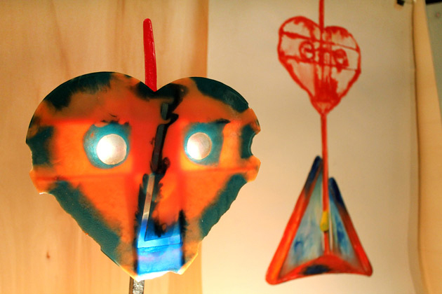
Organized around seven thematic sections – Not Standard, Person, Place, Flaw, Landscape, Body and Politics – the exhibition distinguishes itself for an innovative set-up. All the projects, in fact, are distributed on 40 mobile panels that can ideally be moved from one section to the other, calling into question the cataloguing made by curators Gianni Mercurio and Domitilla Dardi. Pesce himself invites the visitors to accomplish a small subversive gesture: “You are kindly asked to liven up with your physical presence Gaetano Pesce’s elastic objects, to impress your impulse, to watch them while they auto-determine”. Which is nothing but another tribute to diversity and its means of expression.

Giulia Zappa – Images courtesy of Cecilia Fiorenza 
Share: Facebook,  Twitter  
04/07/2014

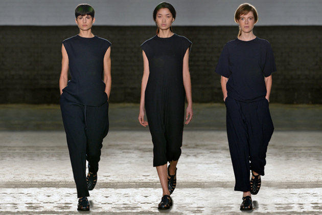
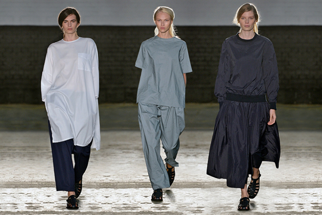
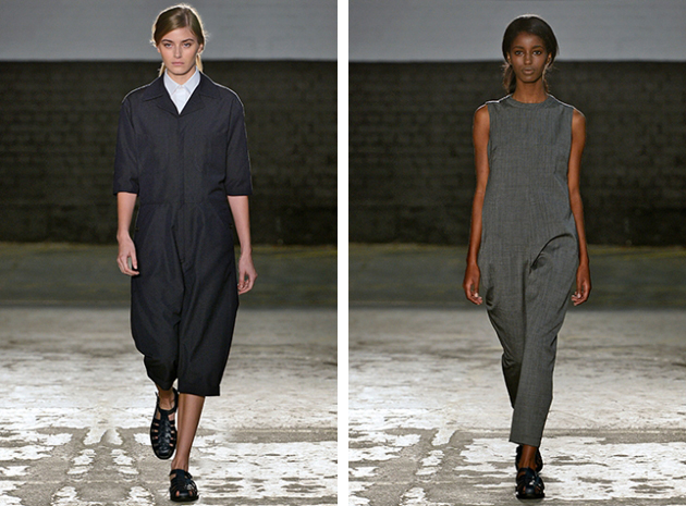
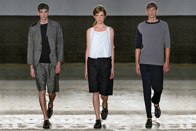
The Talented: 1205 and its Wearable Unisex

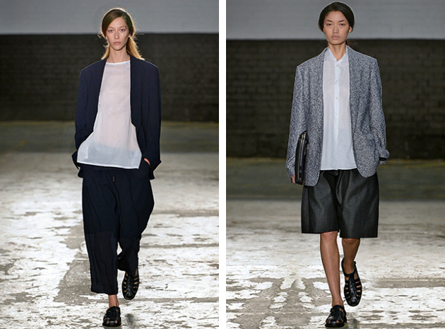
Minimalistic, wearable yet unbearably fascinating: this difficult combination of fashion adjectives was infused into 1205′s collections, by the brands founder and main designer Paula Gerbase. After graduating from Central Saint Martins, Gerbase worked with both menswear and women’s couture before founding 1205 in 2010. Her ‘mixed’ design background has influenced the elegant, clean and androgynous looks which have become the signature of the brand. Paula Gerbase describes 1205’s design aesthetic as defined by “quality of cut, fabric and proportion, emphasising traditional craftsmanship by seeking the essential”.

These design values are showing in every detail of her classy runways – from models’ simple hairstyles to this season’s color palette which include pieces in black, white and different shades of grey. The collection also contains sporadic splashes of color with items in burgundy and dark blue. The cuts, the fabrics and the proportions are as well as the colors, are always uncompromisingly simple but with a stylish, decisively bold twist. These are the details that make the brand stand out, answering the question to why 1205 feels far more interesting than many similar brands. Gerbase’s search for inspiration in the formal precision of geometry as well as the vital elegance of nature gives her work an unexpectedly fresh flair, turning even the simplest details into an occasion for innovation and thoughtful research. 1205 shows an exciting mix, resulteing in an elegant and clean aesthetic which feels both modern, classic and unique in the same time.

It is, thus, quite easy to grasp 1205′s enormous growth since its beginning four years ago. The brand is now being retiled in department stores all over the world, and we have a feeling we will se a lot more from Paula Gerbase and her label in the future. Keep the number combination 1205 in mind!

Hanna Cronsjö 
Share: Facebook,  Twitter  
03/07/2014

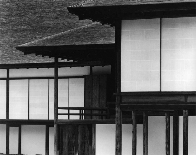
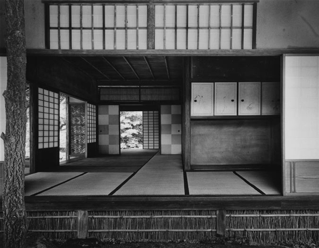
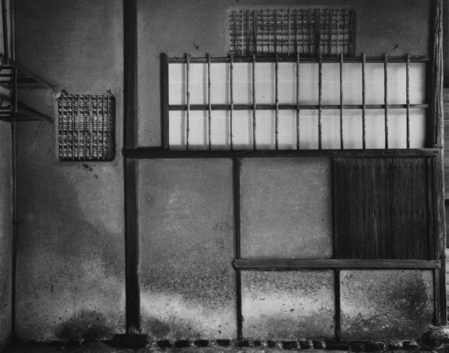
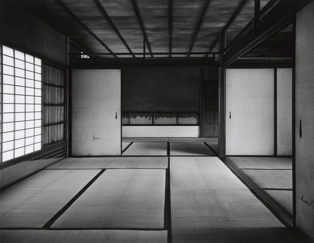
The Architecture of Katsura Palace

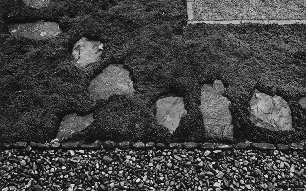
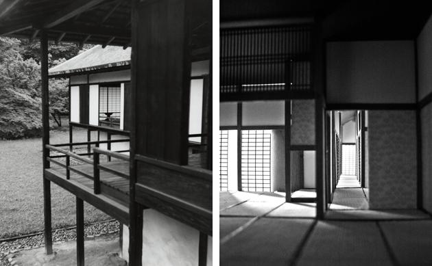
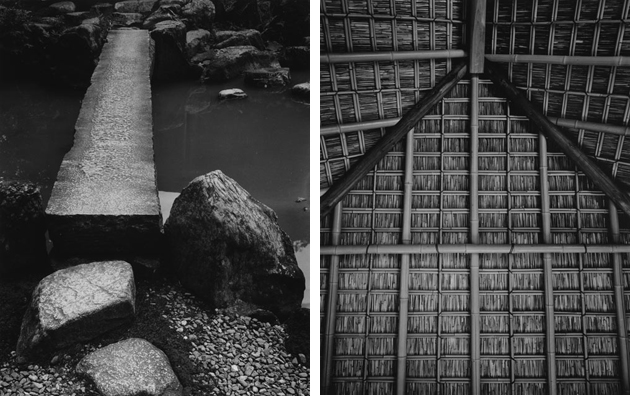
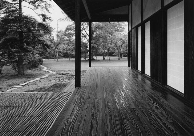
Set in wooded surroundings within the ancient perimeter of the imperial capital, Kyoto, the rikyu, or separated residence, of the Katsura Palace is the finest product of a secular and unofficial tradition. It was built in the 17th century by Kobori Enshu, tea ceremony master and architect, who sought to express his ideals of rustic simplicity and picturesque nature on a larger scale than had been attempted before. Katsura is not attributable to a single architectural style, nor to a unique project or to a single author, with its extremely heterogeneous mixture of compositional elements, but at the time perfectly integrated one with one another.

The villa of Katsura has been the focus of many different theories of interpretation on the part of the most powerful representatives of modern architecture. They, as architects, have focused their investigation of Katsura as architectural work; the analysis of Katsura is the analysis of the “space”, since it is the space to establish the extent of the architecture. The modernist architect Bruno Taut made a critical and utopian analysis, which he expresses through the language of architecture, with the search for “unity, simplicity and transparency”. So Taut read Katsura, as a place in which every element is in perfect harmony with the others, but at the same time perfectly independent, “as in a good society” thus giving the villa a symbolic political connotation. Katsura was seen as an “ultimate meaning of world through architectural form”, a “totality” in which they identified significance of higher order and conceived to unify man with nature. The carefully balanced environment considered the fragility of a human and caged its experience within proportions a man could relate to. The next western architect to comment on Japanese architecture, Walter Gropius, reiterates Taut’s earliest interpretations calling the simplicity, modularity, and indoor-outdoor relationship, “many of our modern requirements”.

Kenzo Tange was among the first in his “Tradition and creation in Japanese architecture”, in 1960, to speak of “symbiosis” of elements and stylistic tastes in villa of Katsura, analysing the evolution of architectural styles and showing how these in Katsura combine in a harmonious way. But although still admiring the villa to a degree, Tange expressed criticism of the tradition of Katsura. Tange claimed Katsura draws Japanese architecture away from reality and into a passive and contemplative space, rather than a progressive one engaged with progress and technique. But contemplation is not passive. If Katsura has hidden tensions, then is not a purely passive sanctuary, it is very much in a state of progress and a state of living, and one finds an acknowledgment of the vitality of Katsura in its unfinished character and its openness to expansion, not simply a machine for living in but an ever-changing living space as yet unclosed.

Tange tries to trace the characteristics of Japanese architecture in the villa that he will define Jomon and Yayoi, respectively “energetic, violent and popular” force and a “serene, refined and aristocratic” force. These two forces, popular and aristocratic, in Katsura collide, creating a strong spatial tension. Arata Isozaki did the latest, updated, interpretation of the villa; it contains a summary of the various interpretations so far attempted and thus provides a vision that leaves open the question of interpretation of the architectural space of Katsura talking about “ambiguity of space”. The purity of the materials used, the precious dark Hinoki wood, the rigour of design principles, the simplicity of structural elements – columns, architraves and balustrades – make it the ultimate expression of classical Japanese style.

Giulio Ghirardi 
Share: Facebook,  Twitter  
03/07/2014

Some notes on: Antwerp Royal Academy Fashion Show

It is no secret that the power of design education lies in its lack of restraints. While the ultimate goal of any university degree is to best prepare us for ‘real’ life, it might just be that avoiding the limits of everyday reality, offers the best preparation a design student could get. When we speak about any design practice – graphics, product, or fashion – forgoing the limits of commercial production – marketing rules, costs, distribution, and so on – is at the core of research and innovation.

This line of thought appeared to be at the basis of Antwerp Royal Academy of Fine Arts Fashion course, whose 2014 final show presented a series of projects inspired by child-like freedom and mind wandering. Differently from its British counterparts – Royal College of Art and Central Saint Martins – Antwerp school’s runway didn’t strike us for its impeccable sartorial quality or conceptual research. Rather, its students were capable of capturing the unique spirit of the moment, transforming it into a vision for the future.

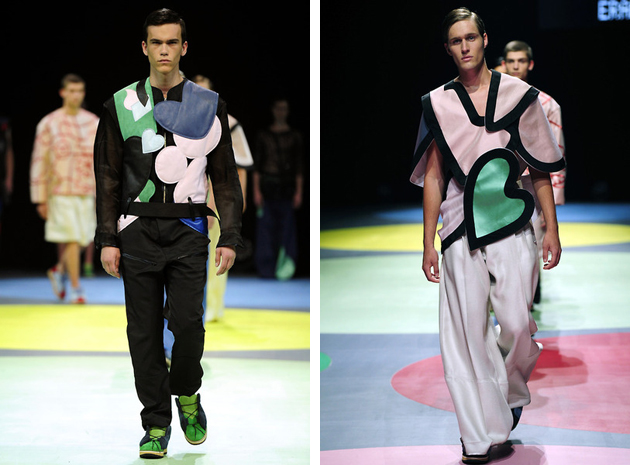
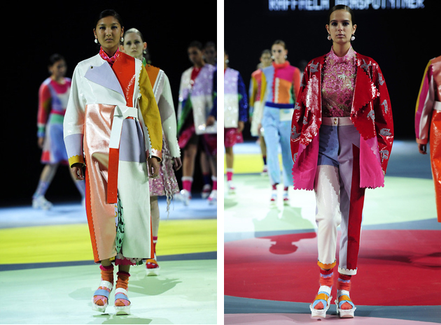
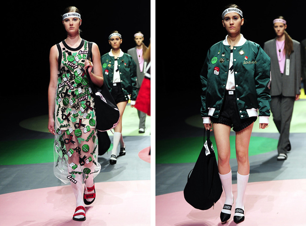
Among its ten 2014 graduates, the one that immediately stood out – bringing home three different awards – was Raffaela Graspointer. Titled “Holi Blush Bubble Crush”, this explicitly meaningless title captured the essence of her collection made of apparently random and unexpected combinations of materials, colours and shapes – fused together in a series of eclectic kaleidoscopic looks. On the other hand, Hyein Seo or Eran Shanny’s collections were perfectly summed up in their respective titles. Seo’s “Bad Education” featured bold graphic garments and punk aesthetics, toned down by simpler cuts and essential lines, while Shanny’s “Wild Hearts” designated a menswear collection full of hart-like cuts, shapes and décors.

On the other side of the ‘let your mind wander’ spectrum, were the collections of Clara Jungman Malmquist and Madeleine Coisne, who concentrated on tactile and textile research rather than playing with conceptual puns. Therefore, their collection featured bold patterns and colourful, yet refined juxtapositions, fused with brainy silhouettes, showing, as usual, that Antwerp is still the hot spot of creative freedom and exceptional fashion education.

Rujana Rebernjak 
Share: Facebook,  Twitter  
02/07/2014

Style Suggestions: Summer Dresses

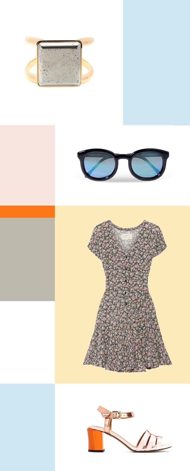
For the best throw-on-and-go piece in your wardrobe, summer dresses are the ultimate must-have. Whether you are in the city or at the beach, the summer dress will always keep you feeling comfortable and looking great.

Ring: Chloé, Sunglasses: Mykita, Dress: Current/Elliott, Shoes: Fendi

Styling by Vanessa Cocchiaro 

Share: Facebook,  Twitter  
02/07/2014

Through the Lens of Jessica Backhaus

Jessica Backhaus was born in Cuxhaven, Germany, in 1970 and grew up in an artistic family. At the age of sixteen, she moved to Paris, where she later studied photography and visual communications, and where she met Gisèle Freund in 1992, who became her mentor. In 1995 her passion for photography drew her to New York, where she assisted photographers, pursued her own projects and lived until 2009.

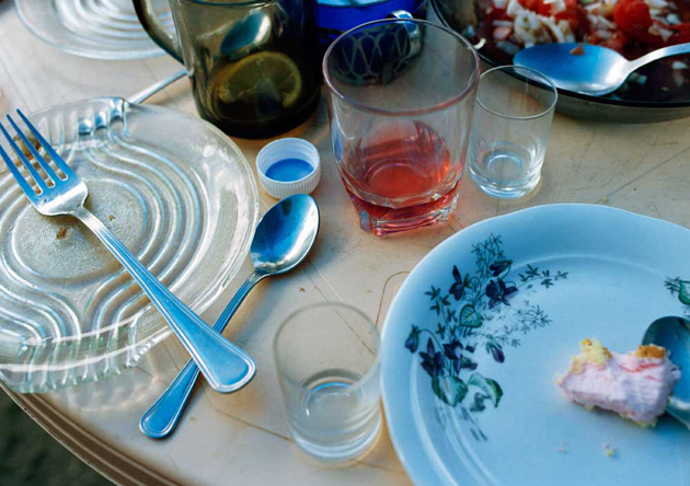
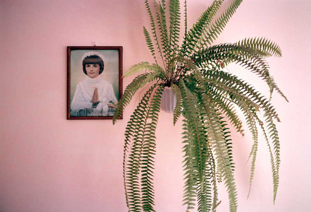
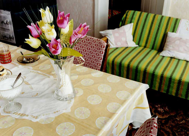
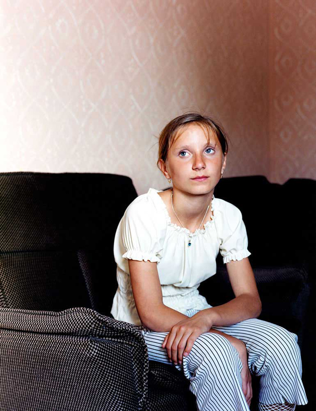
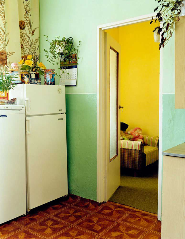
Regarded as one of the most distinguished voices in contemporary photography in Germany today, Jessica Backhaus has shown her work in numerous solo and group exhibitions, published different books and is featured in numerous prominent art collections. Presented here is a series of images from her project “Jesus and the Cherries”, published in 2005, documenting everyday life in the Polish province of Pomosrskie, where the artists has spent a total of three and a half years portraying the residents of Netno town.

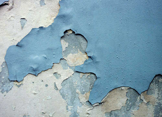
She shows people in their apartments, at work, and in the untouched Polish landscape. With a sure eye and an unusual colour language, she points out important but easily overlooked details: plastic flowers and crocheted pillowcases, images of saints and lace doilies, and cherries preserved in mason jars. The pictures are neither intrusive nor tactless; she encounters people with dignity and full of admiration for the way of life of Poland’s rural population. The intimate character of the photos suggests a special relationship to the subject: we feel the warmth, cordiality, and authenticity with which Backhaus was received in Poland. Jessica Backhaus thus tells a tale of traditional ways of life that may already belong to the past.

Images courtesy of Jessica Backhaus 
Share: Facebook,  Twitter