11/06/2014

There Is Something About Thomas Tait

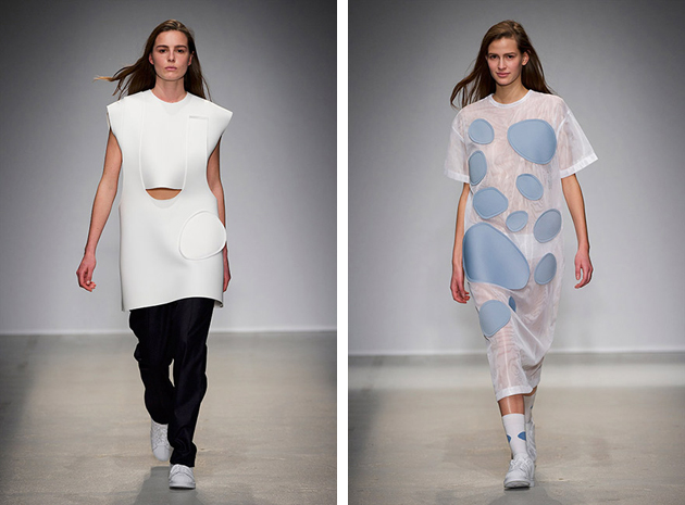
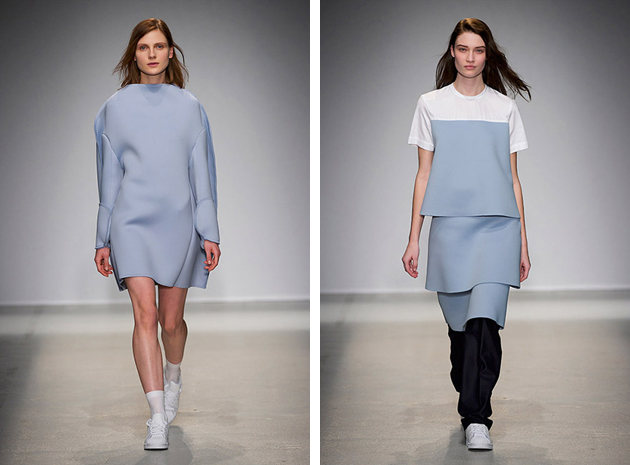
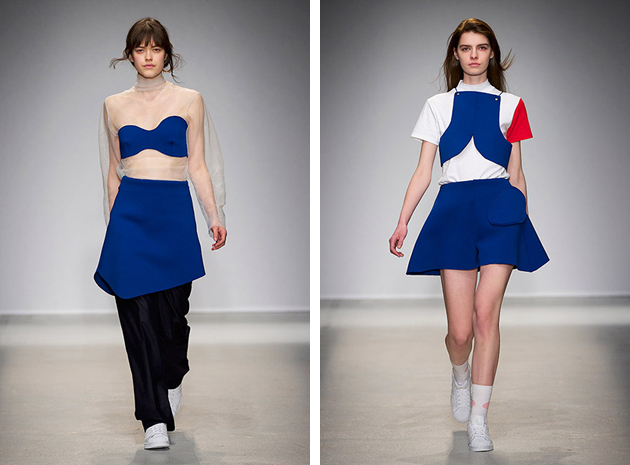
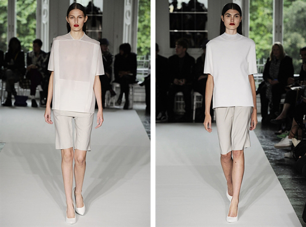
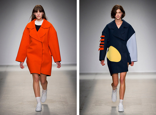
Last week Thomas Tait was announced winner of the inaugural LVMH prize sealing his position as fashion world’s newest darling. Being selected as winner among 12 creative finalists by a prestigious jury that included designers Karl Lagerfeld, Raf Simons, Nicolas Ghesquière and Marc Jacobs, must mean there is clearly something about the clever Mr. Tait. But what?
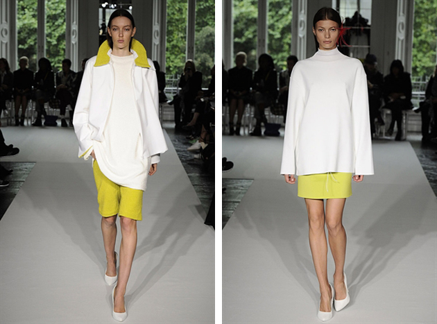
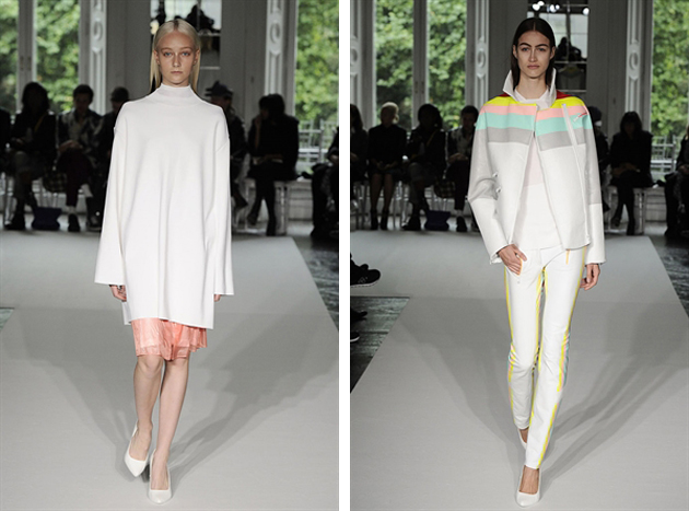
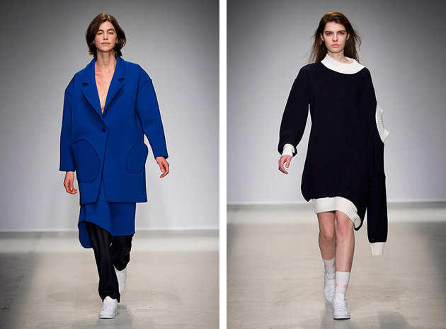
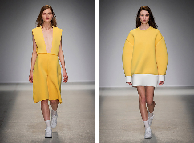
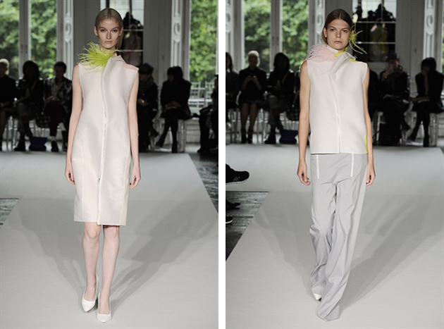
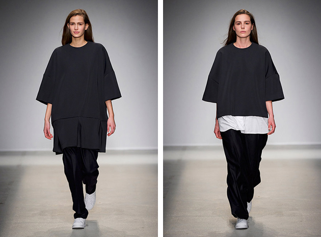
The native Canadian has previously attained a technical diploma from Collage La Salle in Montreal. He began his career in 2010 after graduating as the youngest graduate ever from London’s Central Saint Martins, an indisputable hub of fashion talents. Tait’s graduation collection was shown in London during AW 2010 runway shows and introduced his particular focus on geometric shapes and basic colors. While he often restrains to black and white, Tait’s designs are made playful and frisky by slightly oversized shapes and exaggerated lines. The play with geometry of the garments became Tait’s signature trait, seen on his later collections where the color scheme remained unchanged, but different materials and processes were applied to create movement and structure – such as pleats mixed with smooth counterparts on skirt designs.
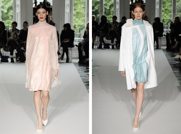
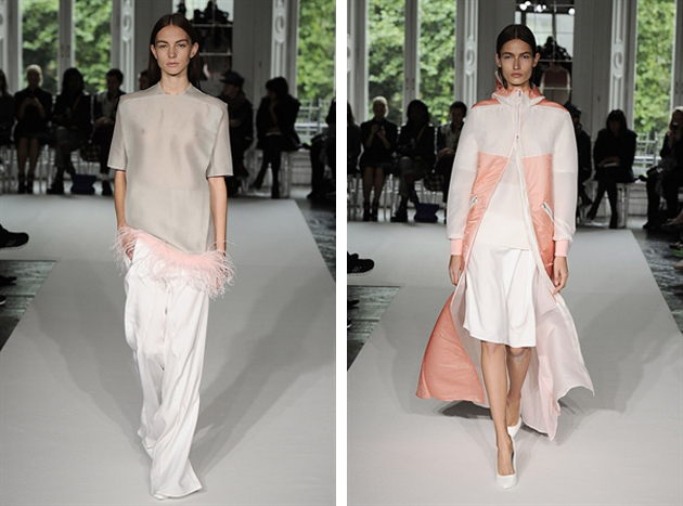
In his first spring collection the designer added more colors, with pastels and a mix of materials used to create a layered yet relaxed sportswear look – with sports as the operative word for all of Tait’s collections. With each season, bolder colors and more exaggerated shapes were used in direct reference to the neon trend and the idea of merging future with the present. However, just as we managed to wrap our mind around Tait’s designs, the new SS 2014 collection showcased an unpredictable and entirely new train of thought. The features he previously treated separately – namely, colors and shapes – were fused together under his distinctive aesthetics, perpetually reinventing pieces that have become staples in his work.
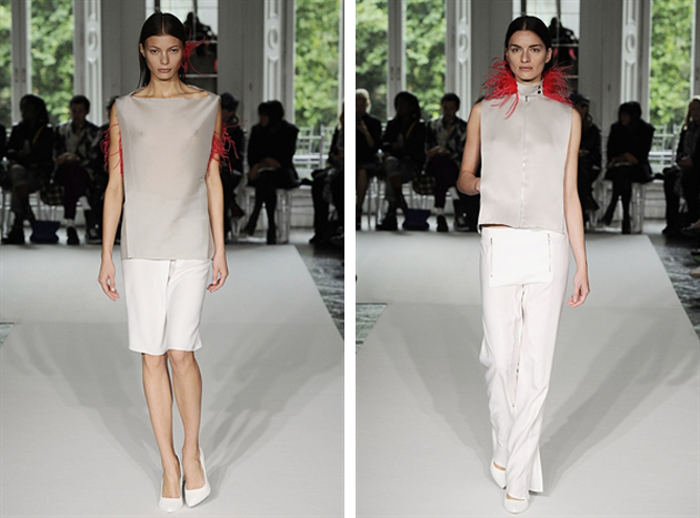
Thomas Tait has a certain je ne sais quoi, as the French put it, that charges his apparently simple designs with a bold personality – a personality able to tell a story in many different languages and styles. The constant ability to rework what has already been done, might just be the characteristics that made him stand out among the 12 finalists. Turning something expected into an unexpected treat is a very special kind of gift – almost as if you were spinning straw into gold.
Victoria Edman 
Share: Facebook,  Twitter  
11/06/2014

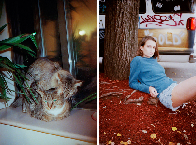
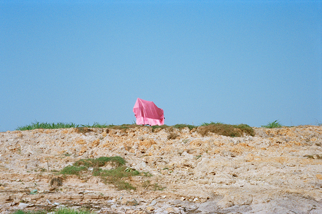
Through the Lens of Charles Lu

Images courtesy of Charles Lu 
Share: Facebook,  Twitter  
10/06/2014

Did You Say Monochromatic?

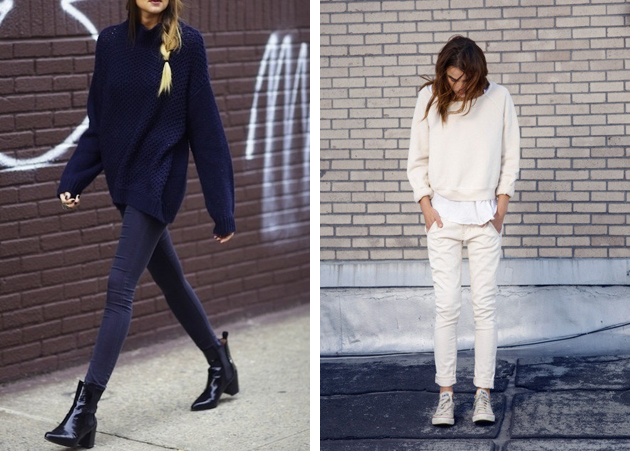
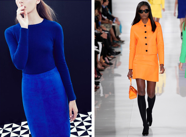
The definition of monochromatic in fashion simply means featuring a lighter and darker version of the same color. Or even choosing all the pieces of the exactly same shade. Although we recently saw a big come back of color blocking, the difference between the two trends is substantial. The first one requires creating a bright and effective combination between two different tinctures, which is not as easy as it may seem. In the second case, instead, your goal is just choosing the right hues of the same color and combining them together. It monochromatic trick might be simple and elementary when the colors are neutral, a little bit more difficult if you aim for bolder tones.

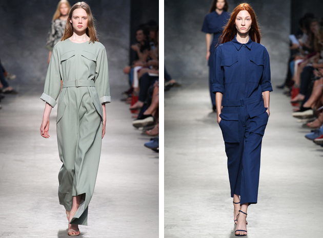
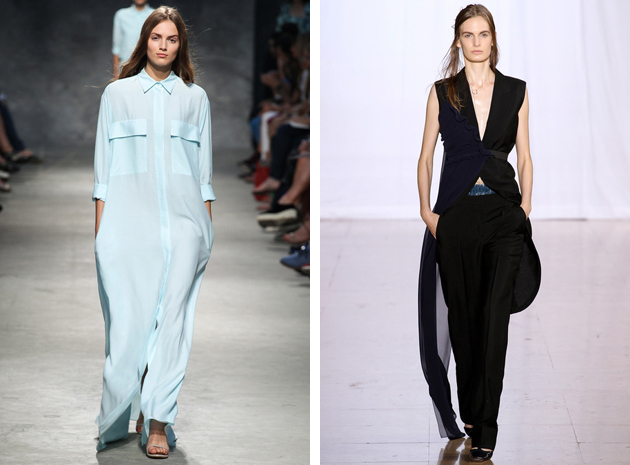
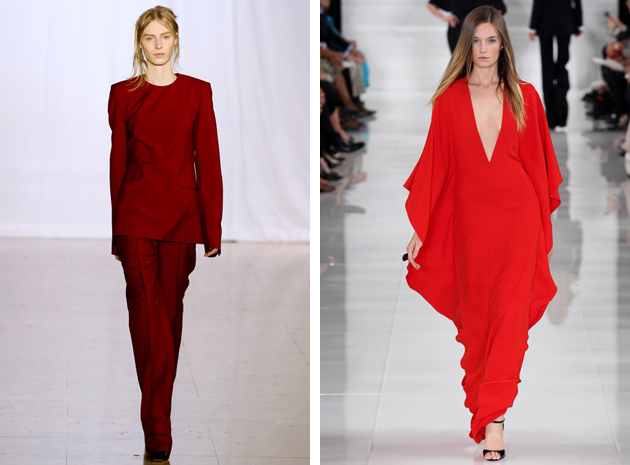
For the ultimate inspiration, one should have a look at the last fashion shows,for Spring-Summer 2014, where, in fact, many designers have chosen a monochromatic approach. In New York we saw a sequence of bright colors at Ralph Lauren’s show, from freesia yellow to venetian red; in Paris we took a long calm breath at Felipe Oliveira Baptista who created relaxing shades of green and blue, giving space both to jumpsuits, long dress and extra large coats.

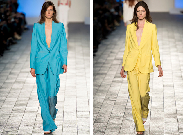
Paul Smith continued on his colorful path, the one started with Autumn-Winter 2013-14 collection, where he showed his mastery in powerful color blocking. This time around he made it simple by combining the exactly same shade of a single color on his masculine and comfy suits. Maison Martin Margiela has always supported the trend and for SS 2014 gave us a few looks composed of trousers and long sleeved shirts, for a minimal yet chic result, especially in burgundy.

Francesca Crippa 
Share: Facebook,  Twitter  
10/06/2014

Fundamentals: 2014 Venice Architecture Biennale

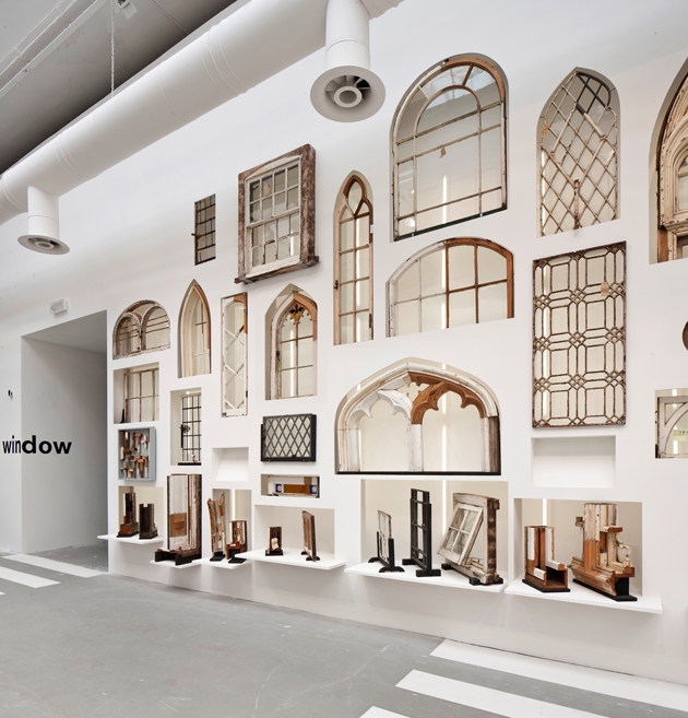
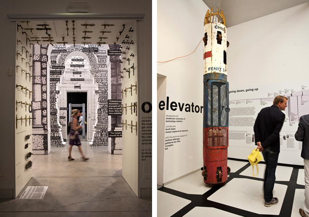
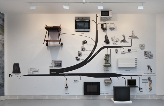
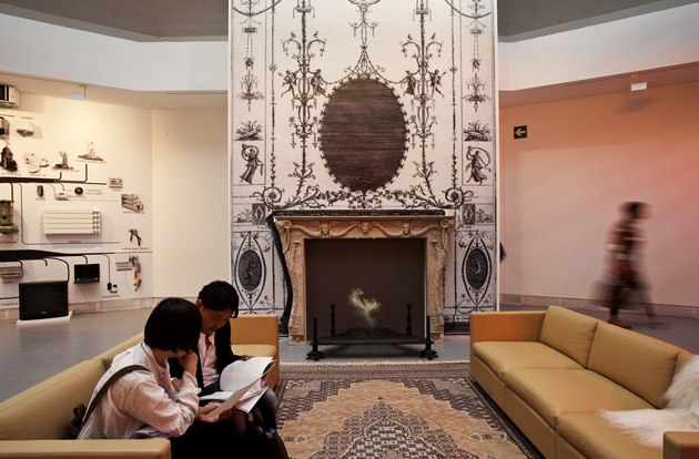
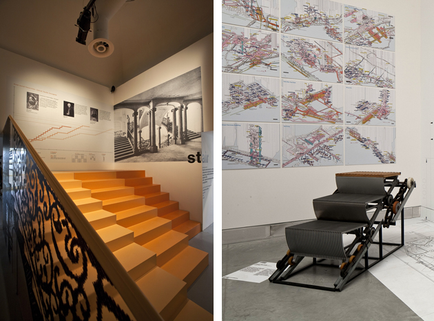
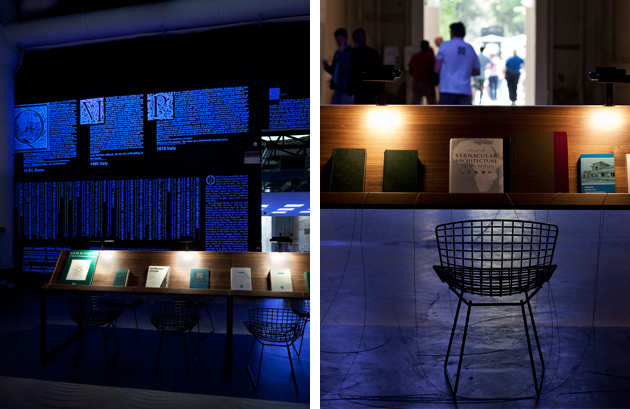
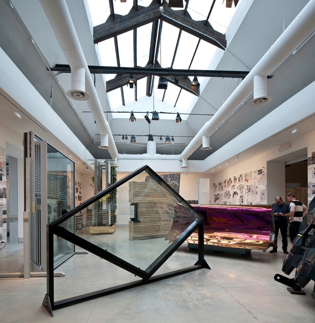
For the visitors of this year’s Venice Architecture Biennale, the exhibition was a though nut to crack. Not because it was particularly challenging or deep, rather because the usual radical-chic architecture crowd roaming the Arsenale and Giardini during the opening days couldn’t easily decide if they loved it or hated it. Titled “Fundamentals”, the exhibition, under the guidance of Rem Koolhaas, was divided into three separate projects: “Monditalia” set at the Corderie dell’Arsenale, “Elements of Architecture” staged at the central pavilion in Giardini and “Absorbing Modernity 1914-2014”, the unique theme elaborate by all the national pavilions.

“Monditalia” was conceived as an overview of Italian in a moment of crucial political change. Thus, the exhibition presents an eclectic mix of architectural projects, films, critical reflections and historical moments that deliver a chaotic understanding of the country’s past and present contradictions, problematics, curiosities and characteristics. For the first time, Koolhaas has also brought together the Biennale’s different sections, merging together architecture with dance, music, theatre, film and art.

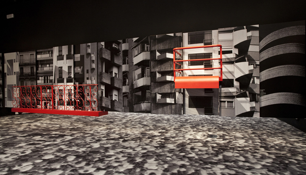
“Elements of Architecture”, on the other hand, looks under a microscope at the fundamentals of buildings, used by any architect, anywhere, anytime: the floor, the wall, the ceiling, the roof, the door, the window, the façade, the balcony, the corridor, the fireplace, the toilet, the stair, the escalator, the elevator, the ramp. While many have lamented that this section appeared more like an introductory course to architecture rather than a ‘state of the art’ exhibition, the projects presented were often lined with political, social and cultural implications inherent in any built environment that are all too often forgotten by architects. Spaces like sad hospital corridors and waiting rooms, stairs and elevators, socialist-style ape’s nest balconies, were shown to reveal what the discipline happily overlooks.

For “Absorbing Modernity 1914-2014”, 65 countries – in the Giardini, at the Arsenale and scattered around the city – were asked to examine key moments in a century of modernization, revealing how diverse material cultures and political environments transformed a generic modernity into a specific one. Set as one of the most ambitious Architecture Biennale ever, Koolhaas’ “Fundamentals” may not have entirely reached its initial goal, but it would be a mistake reading it as a crowd pleaser that misses addressing issues that concern the social, the political or the marginal in our everyday experience of architecture.

Rujana Rebernjak 
Share: Facebook,  Twitter  
09/06/2014

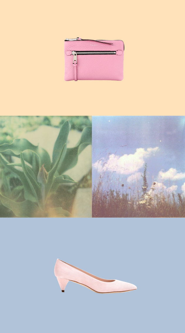
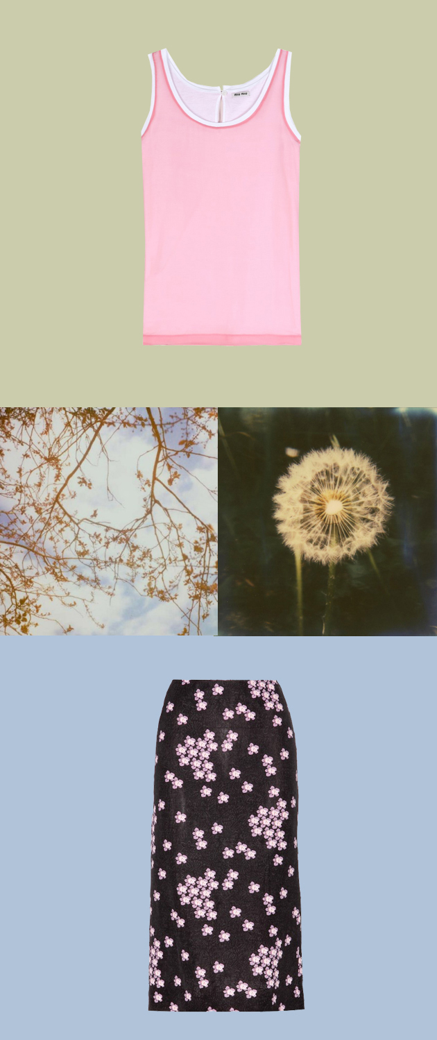
Style Suggestions: Pretty in Pink

There is more than one way to feel flushed this summer, think of the frosty feel of a gentle pink blush.

Clutch: Marc Jacobs, Top and shoes: Miu Miu, Skirt: Marni

Styling by Vanessa Cocchiaro 

Share: Facebook,  Twitter  
09/06/2014

I’m Isa Genzken The Only Female Fool

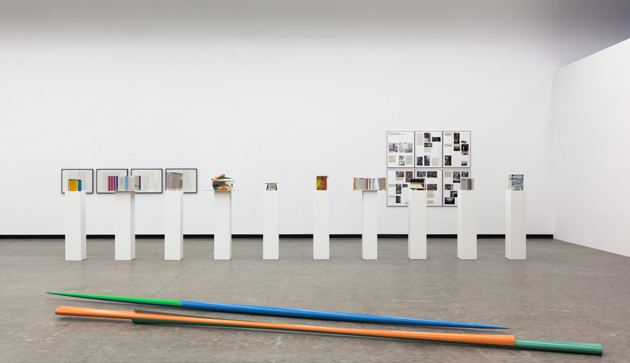
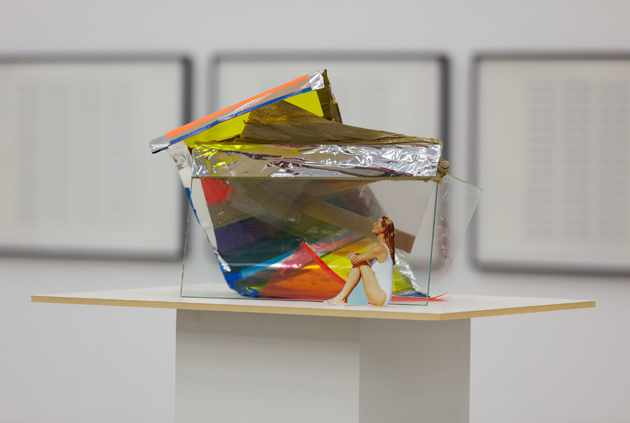
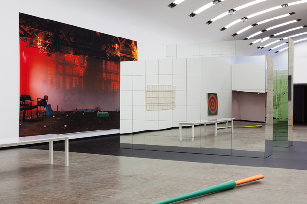
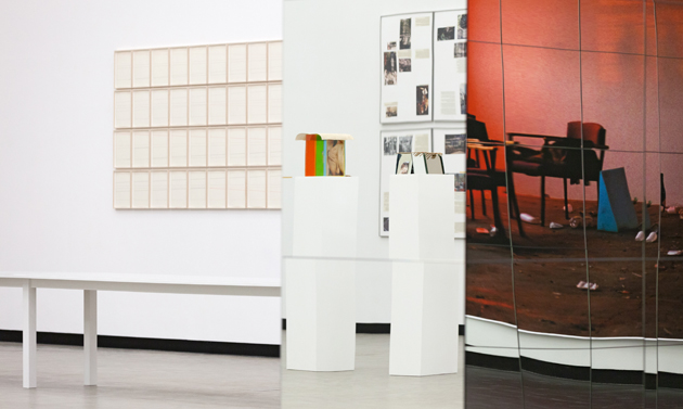
Kunsthalle Wien offers, once again, the occasion to talk about one of the reference points of contemporary experimentation in art. The exhibition “I’m Isa Genzken The Only Female Fool” brings to our attention the varied work of Isa Genzken (b. 1948, Germany): an artist able to turn everything into sculptural material, as stated in the video “This is Isa Genzken?”, produced for her March 2014 retrospective at MoMA Museum of Modern Art in New York, which retraces the entire career of an artist, who was always able to reinvent herself.

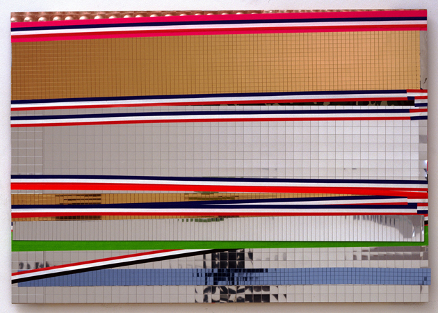
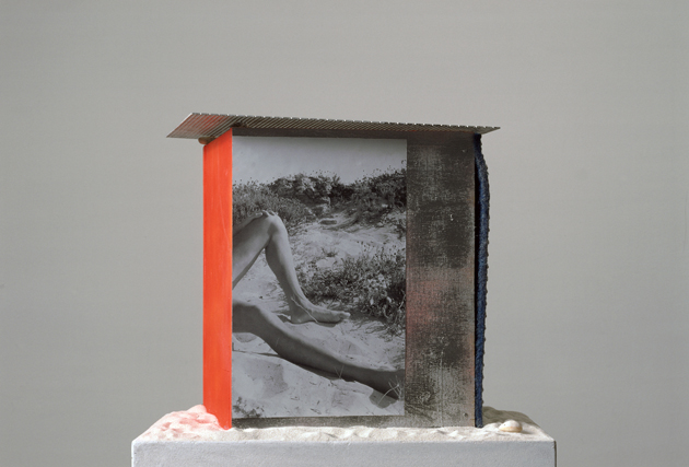
Genzken creates concrete sculptures that express unconscious feelings through essential objects, showing an outstanding sense for volumes and the ability to put together different objects in free new ways that perfectly fit to each other. The show in Vienna displays the distinctive characteristics of Genzken’s research, focusing on the theme of the mirror, the column, the examination of architecture, design, space as a social sphere, along with her collaboration with other great artists. No less than Dan Graham, Gordon Matta-Clark, Jasper Johns, Gerhard Richter (her ex-husband), Wolfgang Tillmans, and Lawrence Weiner are singled out to reveal their mutual esteem.

The artist, who represented Germany at the 52nd Venice Art Biennale with a multipart installation, which occupied the entire pavilion, wrapping the building with orange plastic net, uses a range of media that includes three-dimensional sculptures, pictures, movies, drawings, canvases and freestanding assemblages, all unusual and absolutely original. Someone said about her work: “she strikes the nerves”, but we want to add “in a well-proportioned way”. Playing with words, materials and meanings, she jumps from chaos to order and vice versa, combining ready-mades with real experiences.

The Exhibition at Kunsthalle Wien will run until 7th September and will be accompanied by a publication with texts by Joshua Decter and Tom McDonough.

Monica Lombardi 
Share: Facebook,  Twitter  
06/06/2014

The Talented: Jacquemus

Origins and background story: Simon Porte, the young French designer behind Jacquemus, came under the fashion spotlight following a slightly unorthodox path. Quitting fashion school after only two months, her worked as an assistant in a creative director’s office until 2010, the year when he founded his own brand. A strong proponent of spontaneity, freedom and informality, he started to draw his own line out of his apartments, often sketching ideas while riding the Métro. Yet since debuting his first collection in the spring of 2013, the clothes have stood out and some of the coolest chicks of the Parisian fashion scene have been spotted wearing his creations, while Dover Street Market and Opening Ceremony, the world’s most sought-after stores, started carrying his collections.

Trademark: One of the key features of Jacquemus’ approach to designing is spontaneity. Simone Porte states: “I don’t like to intellectualise fashion. It’s something very instinctive. Like a child deciding to do something just because they want to. Those circles are like a child drawing something but very badly.” In fact, his clothes are characterized by oversized lines, bold texture and geometric motifs, among which oversized tops and graphic-inspired wear stands out across a couple of collections. Other than his clothes, Jacquemus is also recognized by his way of shaking-up the Parisian fashion week scene with his unorthodox runway style: for his AW 2014 show, he asked all the guests to wear customized hospital scrubs, each having a circular disc stitched onto the torso, while last fall’s presentation was staged at a public swimming pool, where plastic foot-bags were dispensed so that editors wouldn’t sully their shoes.

Collections: Jacquemus’ AW 2014 collection started off with white neoprene looks, where one could recognize Porte’s experimental flair. The first piece, an oversized shirt-dress with a rounded back was followed up by overalls worked over a cropped vest and black pants, with oversized details in the form of rounded shoulders and geometric bottoms. Known for his love of the colour blue, the designer proffered three shades of the hue. There were also several pieces in canary yellow and vivid orange – as well as red and striped accents, which contributed to the collection’s screwy theme.

Chiara Tiso 
Share: Facebook,  Twitter  
06/06/2014

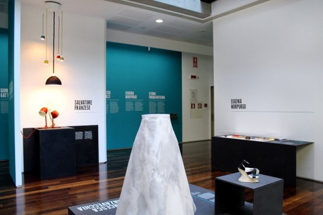
Design Destinations, Italians going Dutch at MAXXI

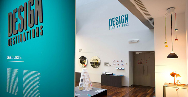
“Design Destinations” is the title of the exhibition dedicated to the new frontiers of contemporary design research by the Roman museum of XXI century arts – MAXXI. The insight developed by curator Domitilla Dardi is curious and fertile: to give voice to a new generation of young Italian designers that studied at Design Academy Eindhoven and then remained to live and work in Holland. Their means of expression: an inedited collection commissioned by MAXXI together with the City of Eindhoven, institutional partner in the project.

The whole show outdoes the value of single pieces and subtends, instead, a few crucial questions on the future of this discipline: how a “made in Holland” education influences the outcome of every personal research? How is Italian design changed by the new phenomenon of cultural migrations? And, above all, does the idea of a “national design” still make sense?

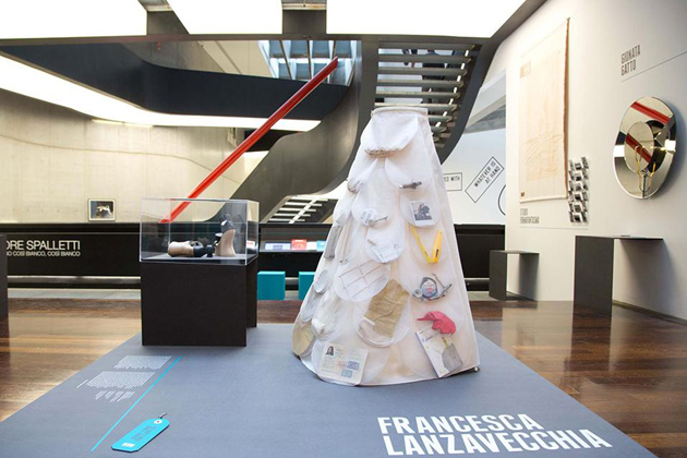
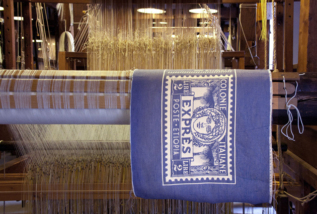
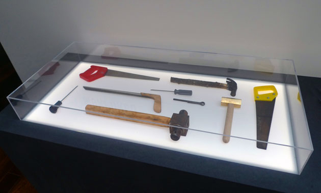
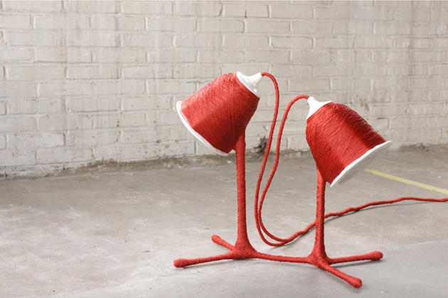
The exhibition does not offer any definitive answers. It’s up to single works to express, each in its own way, an idea of cross-contamination among different cultures. With “Perspectives”, Gionata Gatto gets inspired by Jan Van Eyck’s “Arnolfini Portrait” to design an enlightened mirror that multiplies refractions and points of view. Studio Formafantasma transforms the Bel Paese into a new barycentre between Ethiopia and Holland, updating the cartography of migrations into a new collection of blankets, “Asmara”. On the other hand, “Re-tools” by Eugenia Morpurgo explores the potential of ‘maker’ culture to transform production into a grassroots and transnational opportunity.

Heterogeneous at first sight, the works nevertheless share a common multiple which bypasses single peculiarities that characterize every designer: the predominance of a concept with a biographical or geopolitical background, which remains the very essence of the Dutch approach to project development. Beyond method, however, these “design destinations” seem above all a matter of liberty, which is the freedom to go through a globalized geographical dimension, but also to overstep the role of companies as commissioners and privileged speakers – that’s to say, the very essence of Italian design since the post-war period. That’s what this young generation seems to have unconsciously learnt: not to put aside the great resources of the Italian productive background, but simply to enlarge our host of opportunities, going beyond the problem-solving method proposed by companies and practising design through new forms and content.

Giulia Zappa 
Share: Facebook,  Twitter  
04/06/2014

Festival Fashion that Never Goes Out of Style

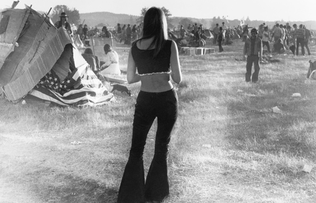
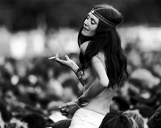
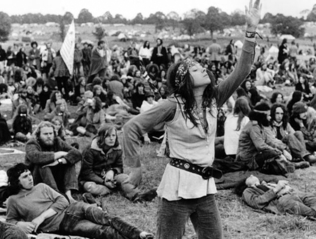
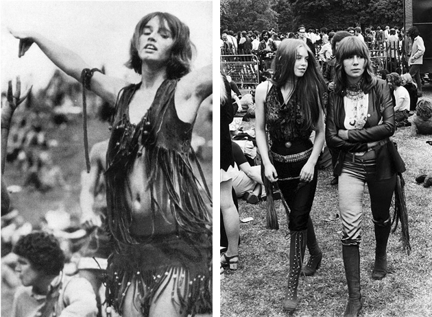
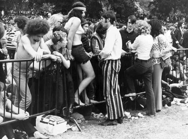
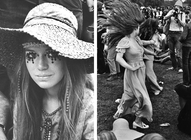
Since the first Woodstock Music & Art Fair was held back in 1969, festival fashion has become a natural segment of the fashion world. There are a few staples in your wardrobe that can be festival essentials and have, through the years, become products of a collective festival fashion history. Let’s take a walk down the memory lane and pick some of the original festival’s key pieces that return season after season.
Layered accessories and boho style: A massive trend seen at many festival scenes is the notion that ‘more is more’ especially when wearing several of your favorite accessories together, almost as if making an ironic statement on Marie Antoinette’s decadence. This trend started long before the concept of boho-chic became popular in the beginning of the 2000s. At Woodstock, in 1969, both women and men could be seen sporting this look as a sign of a bohemian laid back glamour. The bohemian hippie was all about being grounded and natural, free and peaceful, showing it by wearing natural materials and having a tendency to lose their shoes.

Leather Jacket from 100 Club Punk Special: Gaining a lot of momentum during the 70s, the punk culture, naturally, arose form a festival as well. However, don’t expect to find the serene, au naturel, bohemian Woodstock style, since studded leather jackets and heavy makeup came into use to proclaim their subcultural dominance. A leather jacket is still in play today, having become a natural accessory which both adds edge and flair to your down-time look.

Denim cut offs and oversized shirts from Lollapalooza: In the 90s, grunge was the look that became wildly popular in connection to many youth groups. Musical groups such as Nirvana put the look on the map and at the famous Lollapalooza festival you could spot a lot of distressed denim and oversized plaid shirts. The sporty laid back look of the grunge period is still very much in style, currently more as a stylish break-point to create a twist to a classic easy-going festival look.

With time, styles generated from genres seem to have blended together, be it through new types of festival music (eclectic musical vibe was created and celebrated), rather than by simply transcending the boarders of fashion. Today, we are all free to blend genres, periods and style in creating our unique festival persona.

Victoria Edman 
Share: Facebook,  Twitter  
04/06/2014

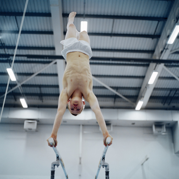
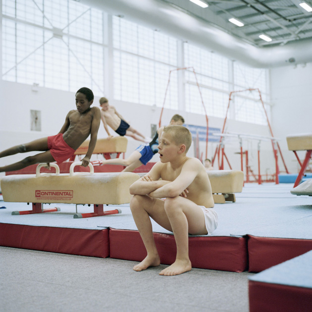
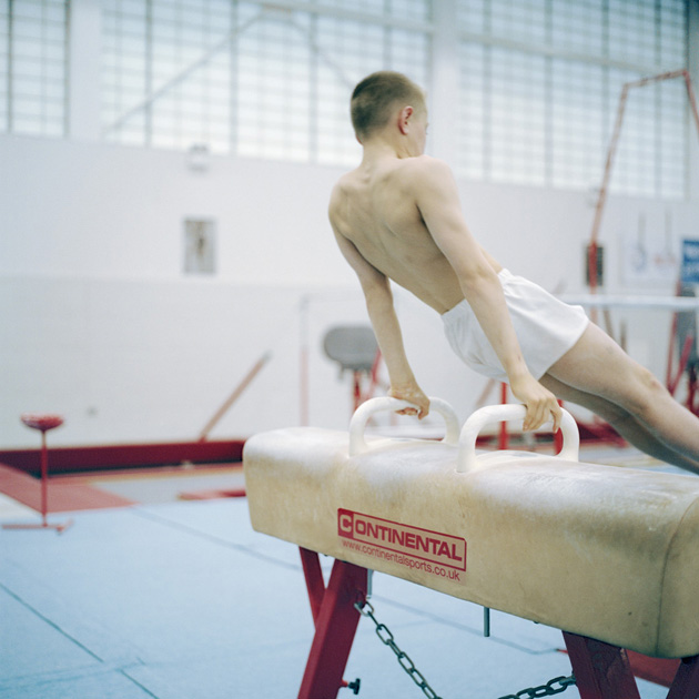
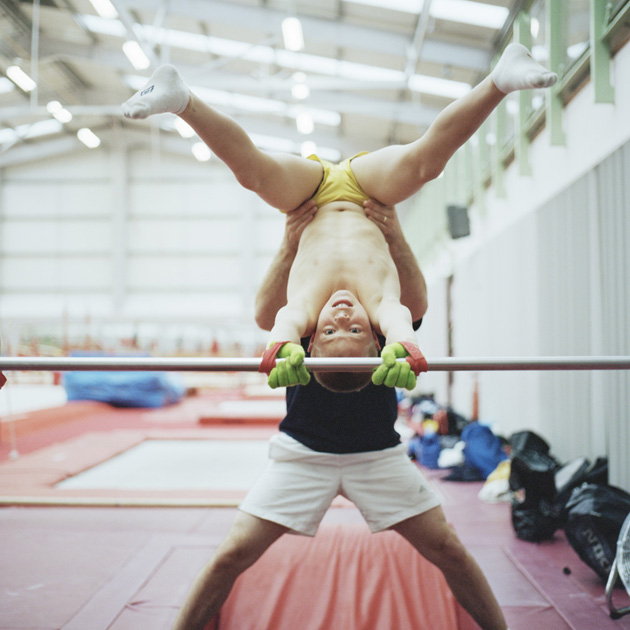
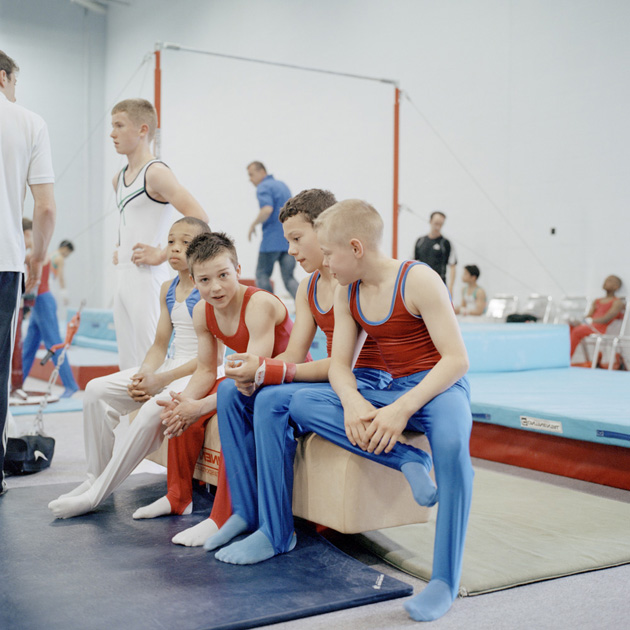
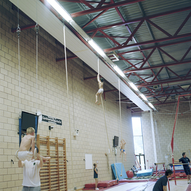
Through the Lens of Jo Metson Scott

How, when and why did you decide to work as a photographer?
I always liked photography, I remember asking for a roll of black and white film for my 11th birthday and then making my poor younger brother dress up and pose in a field for me. But I never really considered it as a career. I went to University to study Graphic Design, but I wasn’t enjoying it that much. I did one module in photography and just loved the class and the tutors so switched to photography and I guess from then on just followed what everyone else was doing.

How you would describe your work and what early influences you think you had?
I find it really hard to describe my work. That’s one of the reasons I take photographs, so that I don’t have to describe in words what I’m seeing. Early influences..? Dan Eldon, Steffi Jung – a great friend and photographer I studied with, a book about Derek Jarman’s garden, Hannah Starkey and Tom Hunter.

How do you approach your work – how and why do you choose your subjects?
I think my approach is based on creating a personal bond with the person I photograph. I like spending time with people, talking to people, being in their homes, I spend a long time not even taking photos (in fact sometimes I even forget that’s what I’m there for). When I have a slight bond with a person, and if that person is interested in having their photo taken by me, I think that is when I ‘choose’ a subject. And generally if someone is open to talking to me then I’m drawn to take their photograph.

What do you aim to communicate through your work?
It changes with every project so it’s difficult to put it down to a single aim. I usually concentrate on the personal experiences of individuals to humanise a wider and more intangible, political or social subject.

What kind of projects you would be interested in working on next?
If it means meeting new groups of people or traveling to somewhere new I’m interested in working on it! I’m working on a number of different personal projects at the moment. One is about the English/Scottish border. I’ve been doing a series of road trips with a writer looking at the culture of the people living in the area. The Scottish referendum is in September and we wanted to look at people on the English side of the border (who don’t get to vote) looking at how the possible independence in Scotland would affect their life.

Interview by Agota Lukyte 
Share: Facebook,  Twitter