30/06/2014

Bye Bye Art Basel #45

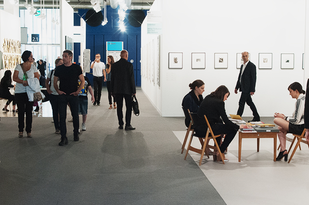
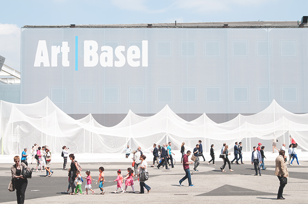
The 45th edition of Art Basel, the most renowned contemporary art fair worldwide, able to attract a sensational number of visitors, ended a few days ago and it’s time to review this latest intense experience, before it’s too late. This year 92.000 collectors, art players and lovers reached the Swiss city to visit 285 galleries coming from 34 countries and presenting 4.000 artists. Professionals reported a great success in terms of buying and selling. Many big galleries such as David Zwirner, Marian Goodman, Michael Werner, Skarstedt seem to have closed very good deals and the presence of international museums – Moca, Whitney, Pompidou, Louvre, even Maxxi from Rome –, made us think it truly was a success.
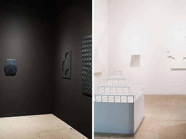
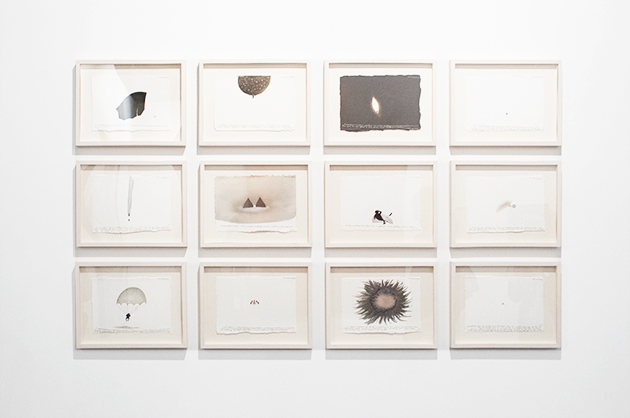
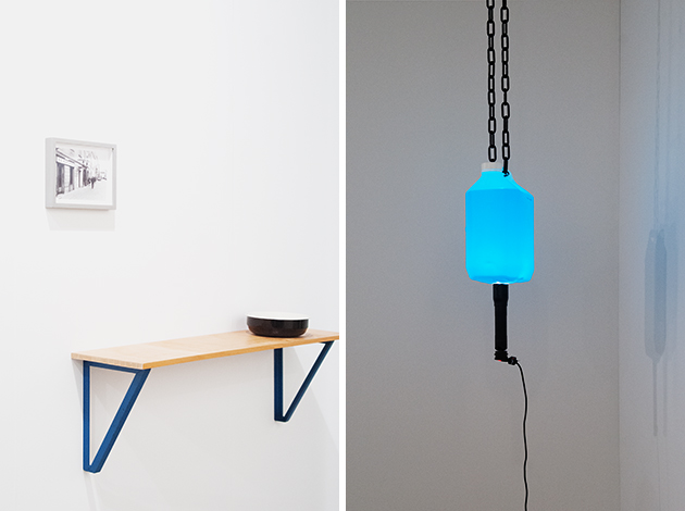
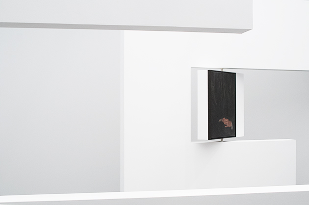
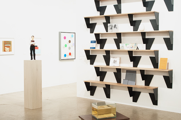
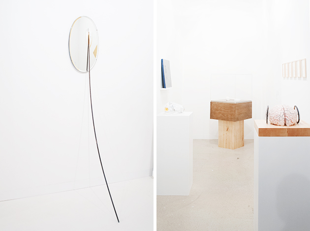
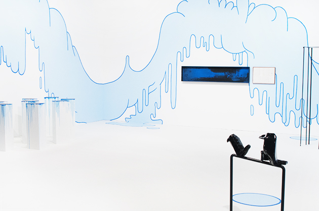
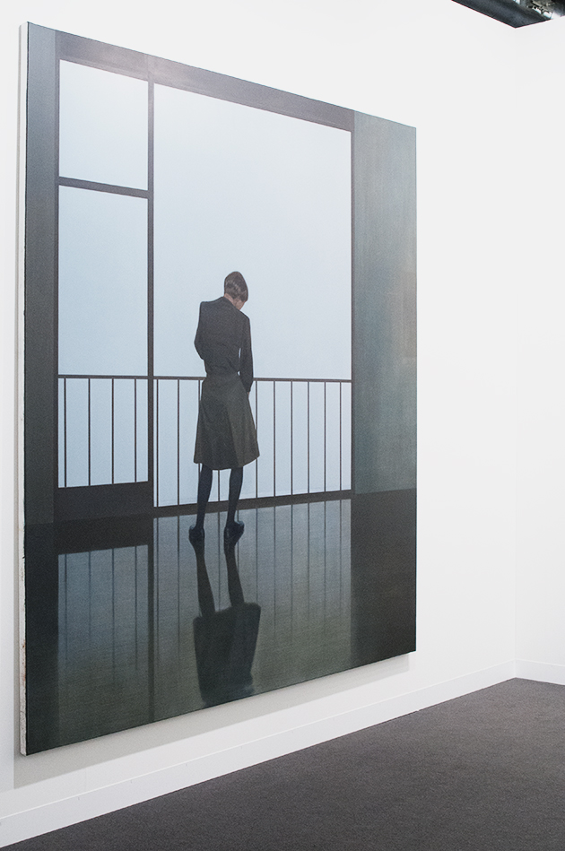
Starting from hall 2.0, proceeding randomly, we saw the essential shapes made of mirror and bronze created by Alicia Kwade both at mennour and Wallner; at Lambert we stopped to check the space devoted to Jenny Holzer, while Marconi showed a fascinating and mysterious middle-large canvas of Markus Schinwald (we will meet him again later, visiting Unlimited). There are sketches by Raymond Pettibon and pictures in pictures by Will Benedict in more than one gallery; Massimo De Carlo offers a sober, b/w symmetrical selection of works by Paola Pivi, Piotr Uklanski, Nate Lowman, Massimo Bartolini, Enrico Castellani and Alighiero Boetti; Eigen+Art displays a large-scale painting by Tim Eitel, while Kaufmann Repetto surprises with a total stand concept that unites different artist under the light blue liquid clouds by Lilly Van Der Stokker. gb agency merits a special attention thanks to contributions of artists of the like of Ryan Gander, Roman Ondák, Pratchaya Phinthong, Jiri Kovanda and Hassan Sharif. The ground floor was occupied by the usual giants, renown names such as White cube, Tucci Russo, Raffaella Cortese, Lisson, the “loud” Gagosian and so on, showing off their muscles.
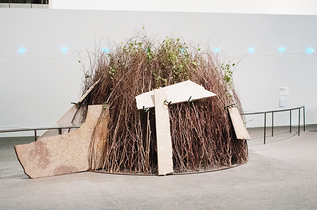
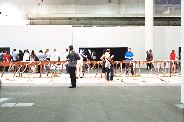
But what really makes the difference is Art Unlimited in hall 1. Allowing the exhibitors to put on display monumental works, exceeding the size of a normal stand, this important section of the fair, presents, among the others: the amazing Matrice di Linfa (Matrix of Sap) (2008) by Giuseppe Penone, a 46m imposing and significant work based on the morphology of a tree, elaborated through resin, terracotta and leather to show the life sap of nature; Arte Povera and its strong sensory effect is featured also through the igloo of brushwood, steel, stones made by Mario Merz. We considered absolutely cool the presence of Christian Marclay with his Shake Rattle and Roll (Fluxmix), an installation of 16 videos playing simultaneously on monitors arranged in circle and displaying the artist’s hands manipulating Fluxus objects. The result is a kind of a visual concert, producing an absurd, hypnotic symphony. Ryan Gander exhibits a film production entitled Imagineering (2013), a short movie recalling in all a perfect governmental positive advertisement, and Bruce Nauman, one of the pioneers of Post-minimal and conceptual art, presents the Raw Material with Continuous Shift – MMMM, 1991, a single video shoot looped in two monitors, one upside-down, depicting a turning head with shifts in color.
There were so many things to enjoy in Basel, but unfortunately times goes by so fast when you’re having fun… see you next year!

Monica Lombardi – Images courtesy of Agota Lukyte 
Share: Facebook,  Twitter  
27/06/2014

Marie Rime: the Obvious and the Unkown

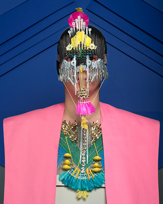
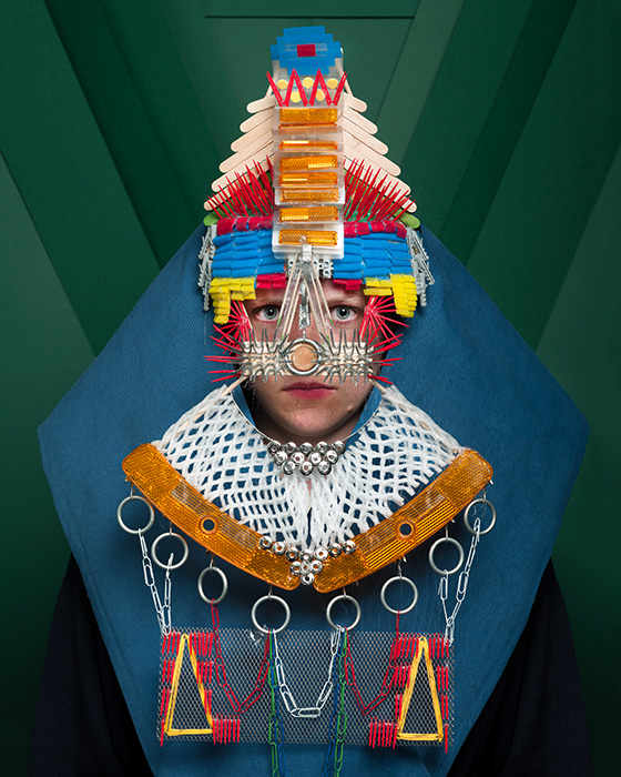
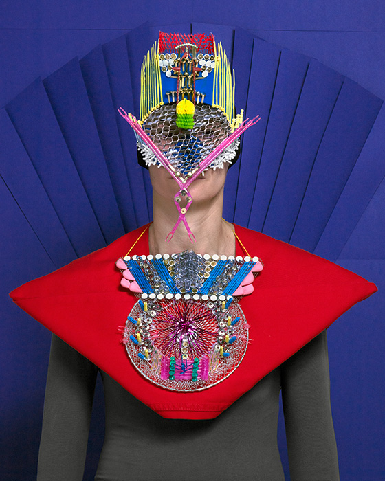
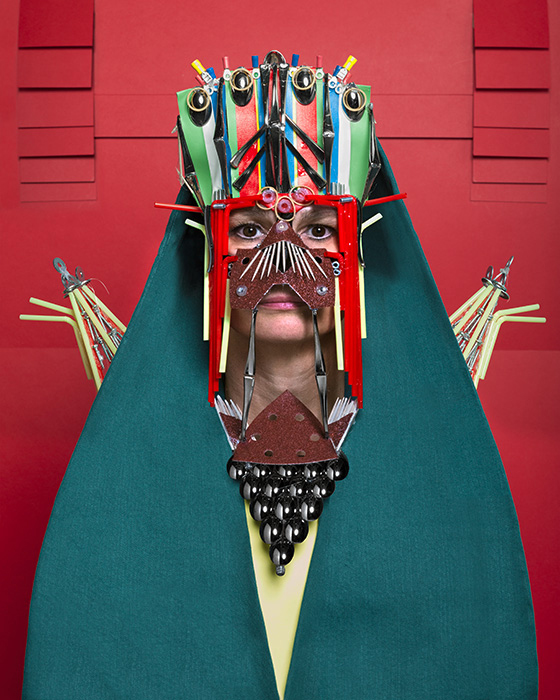
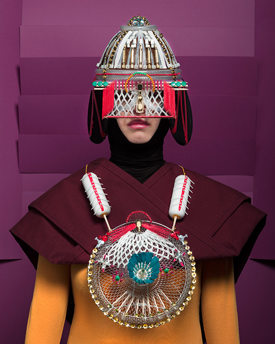
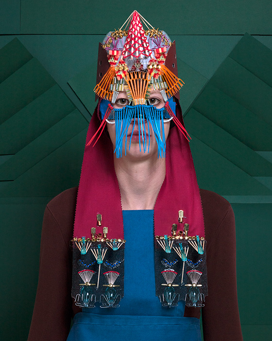
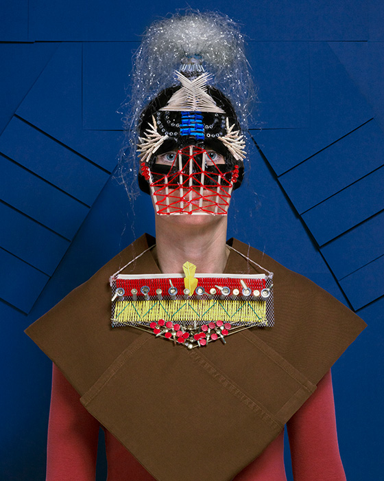
Marie Rime is a young Swiss photographer (class of 1989), studying at the Ecole Cantonale d’Art de Lausanne (ECAL). This year, her work was shown at Hyères Photography Festival, where she won the Public Prize for her two projects: Armures and Pharma, characterized by high-colored geometries and strict compositions.

Armures is a series about women dressed in costumes fashioned from everyday objects. These portraits are the starting point of a reflexion about the relationship between power, war and ornament. These women lose their identity and become a support for their clothing. In Pharma, Rime questions an industry which is very much talked about in Switzerland: the pharmaceutical industry. Here, she zoomes in pharmaceutics packagings, that she chooses to photograph against a colored background, for a result which recalls minimalist painting, questioning the notion of a too-obvious beauty.

Her work has been exhibited in 2013 as part of the ECAL photography show at Galerie Azzedine Alaïa, Paris and Galleria Carla Sozzani, Milano as well as in the context of the prize Vfg Nachwuchsfördepreis at Galerie Oslo 8, Basel, Switzerland.

Rujana Rebernjak – Images courtesy of Marie Rime 
Share: Facebook,  Twitter  
26/06/2014

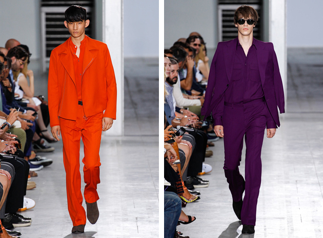
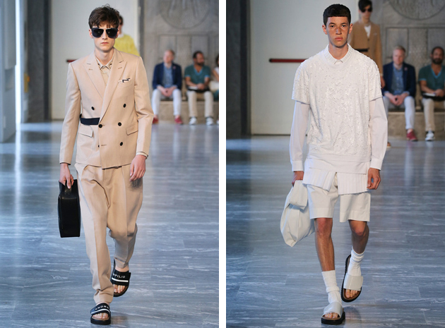
Milano Moda Uomo: Technical Details and Monochrome Looks

If London is considered the rich soil of fashion originality, Milan is surely the one of tradition and craftsmanship. For the next Spring-Summer 2015 season, the breeze seems to bring a more relaxed and comfy approach, not excluding elegance, although giving it a brand new and extremely contemporary twist. Two trends we saw on the catwalks seem to particularly meaningful: technical detailing – often combined with contrasting preppy looks – and monochromatic suits.

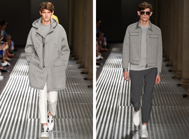
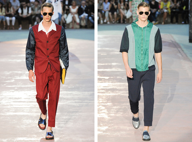
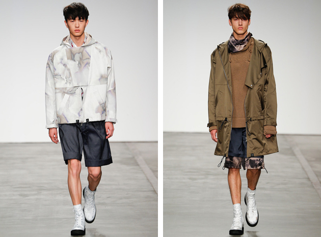
Let’s start from the first trend. The adjective “technical” in fashion usually refers to a certain kind of garment – even the most traditional one – made precious and unique by adding sporty details in very technical fabrics. One of the best examples of this trend is Neil Barrett. Clean and pure silhouettes, restricted color palette and digital prints, distinguish themselves thanks to modern materials used on Seventies-style shapes: like the slim jackets or even the elastic bands on sartorial pants. Antonio Marras followed a similar path when he decided to focus on Gigi Riva – an Italian 60s football player – and presented a burgundy tuxedo with waterproof sleeves or simple shirts embellished by hoods. No less technical were the choices of Ports 1961 and Iceberg, where the first played with the contrast between bourgeois looks and flashy clothing, while the second did the opposite.

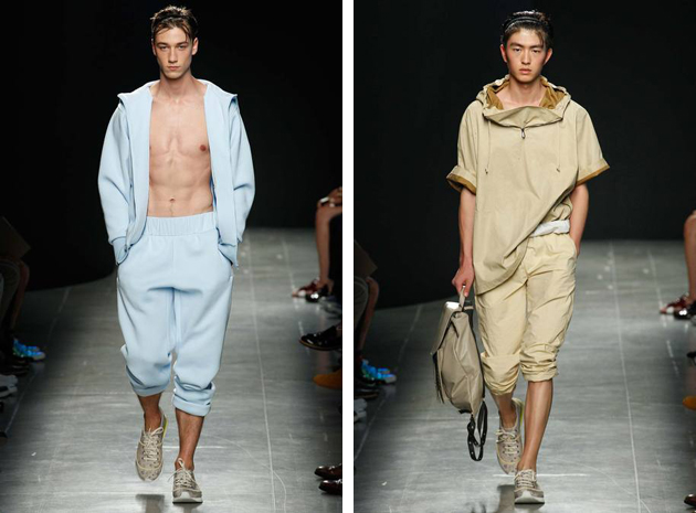
We already told you about monochromatic looks. This trend is slightly different, since it does not involve womenswear. From Costume National, where Ennio Capasa took inspiration from legendary rock stars and developed a very Seventies oriented collection characterized by vitaminic shades – the total purple look was a step forward –, to Bottega Veneta, probably the most casual collection of the season, where plenty of male models strode down the catwalk wearing ton sur ton looks. Many brands with completely different philosophies, aesthetic appeal or even generational references – like Versace and Andrea Pompilio – were seen embracing the same choices. It kind of makes you wonder, doesn’t it?

Francesca Crippa 
Share: Facebook,  Twitter  
25/06/2014

Craig Green: Yin and Yang of Contemporary Fashion

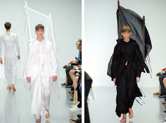
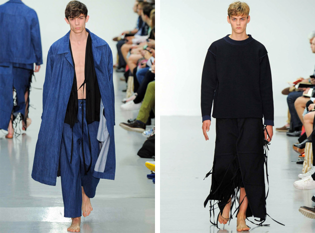
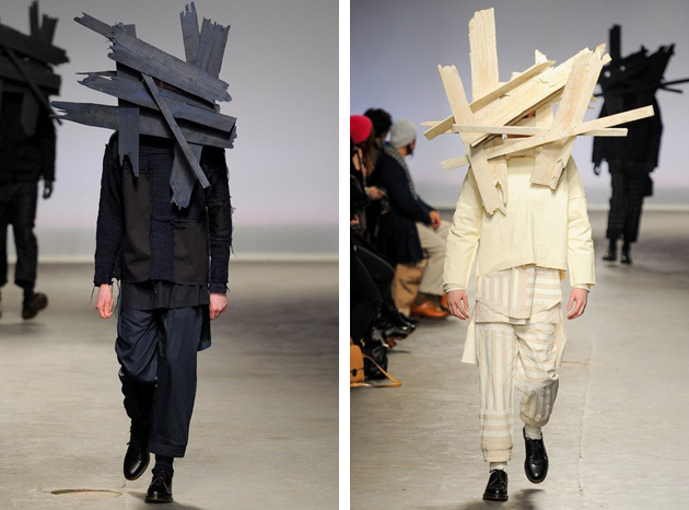
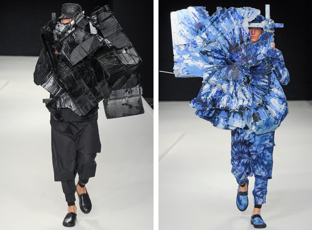
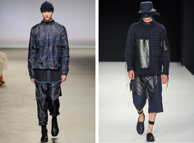
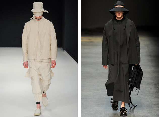
Craig Green’s latest collection for SS15 managed to move most of the fashionable crowd with a silent message of beauty: soft colors and yards of fabric, the ease of several of the runway looks was only partly contrasted with giant wooden sculptures on the back. The London native, who studied for a BA and MA in Fashion at Central Saint Martins, stood out with his own particular aesthetics. Nevertheless, this is not the first time that Green’s name comes up among fashion crowds. After graduating, Green won the L’oreal Professional Creative Award, which allowed him to launch his own line, characterized by research for innovation and risk. His first collection was presented during Men’s fashion week for autumn/winter of 2013 as part of Topman and Fashion East’s MAN initiative at London Collections.

His designs featured carved masks and shirts with glossy waxed cotton in combination with easy shapes highlighted by adornments, turning the clothes into metaphoric objects and taking them beyond the stage of wearability. For his first few collections, Green played around with the notion of shadows and reflections which resulted in contrasting materials of the same color palette, experimenting at the same time with combinations of light and dark tones. These experiments created an in-between feeling for his designs making them harder to figure out and therefore keeping designs interesting. Even though every collection pushes further the notions of wearability and design, the results nevertheless appear serene and nothing is ever forced. Even though giant wooden sculptures and exploding prints – as seen at Green’s SS14 collection – might seem forced it is always done with a transcending ease.

When viewing Green’s collections, Japanese fashion references are particularly clear, both when it comes to shape – seeing implicit salutes to the samurai and traditional robes – but also for an aesthetic reminiscing of Rei Kawakubo and Yohji Yamamoto. However it is always done with a Victor & Rolf flair, making it a true Craig Green original.

Craig Green’s work can be viewed as a juxtaposition of workwear and conceptual art, mimicking a quest for exploration – of cultures of East and West, of fabric and prints and of the fine line between fashion and art – resulting in delicate yin yang balance, that gives Craig Green’s designs a bold emotional state.

Victoria Edman 
Share: Facebook,  Twitter  
24/06/2014

The Law of Fashion and the Culture of Copying

Where is the fine line between inspiration and copying? That is the question everyone is asking themselves with the latest copyright lawsuit fresh in mind. The footwear company New Balance is filing a lawsuit against fashion icon Karl Lagerfeld, claiming he ripped off their trademark trainer logo when he designed a sneaker for his own brand.

Lagerfeld bridged the streetwear trend for trainers when he in January showed Chanel’s couture collection in Paris, and sent every model down the catwalk wearing sneakers. This statement contributed to the trend from which New Balance have benefitted. However the sneaker for Lagerfeld’s own brand made New Balance react. The company claims that the use of the letter K on a pair of trainers from Lagerfeld’s collection is too similar to New Balance’s distinctive N, and is causing confusion for costumers.

Karl Lagerfeld has very likely taken inspiration from New Balance and made some changes in the design to fit his own esthetic. This is a common method in fashion, and designers are often finding inspiration from each other. In this seasons streatwear trend, it is especially obvious that many designers have been influenced by the streets as well as by other brands. Givenchy made for example a double-buckle version of the Birkenstock sandal and the pool sliders which were featured on the spring/summer 2014 catwalks of Christopher Kane to Prada, are probably inspired by the originally plastic leisure footwear from Adidas and Nike. Maybe that is a consequence of seeking new influences from the same sources.

Many bloggers have already written about the similarity between Lagerfeld’s and New Balance’s trainers, doubting it is a coincidence that they look so much alike. The accusation of copying can hurt a designer’s image which is depending on inovation and originality. However, other than the juridical judgment, there is no right and wrong when it comes to how and where designers find their inspiration. The truth is, regardless we like it or not, that fashion partly depends on improving and updating already existing products. Although the line between improving and copying someone’s design completely, might be drawn when costumers confuse a pair of trainers for $360 with the originals for $112.

Hanna Cronsjö 
Share: Facebook,  Twitter  
24/06/2014

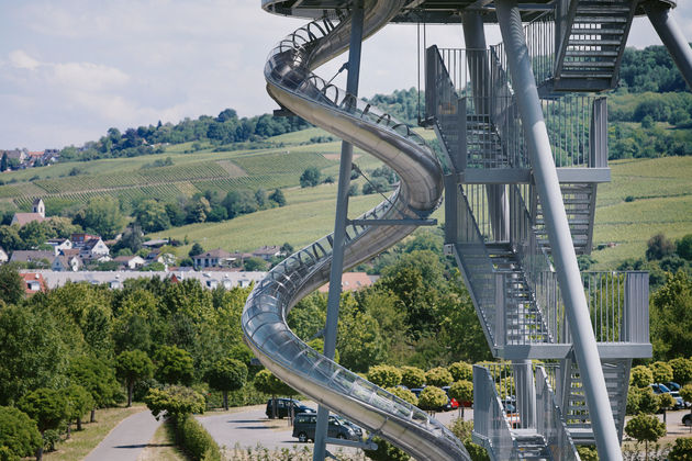
Vitra Campus Grows: Slide Tower by Carsten Höller

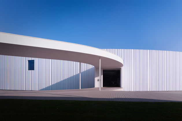
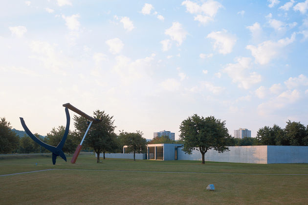
When Vitra Campus first opened to the public back in 1984, showing the sculpture Balancing Tools by Claes Oldenburg and Coosje van Bruggen, it was immediately clear that this was going to be no ordinary factory and retail space. Since then, some of the most significant and prestigious contemporary designers and architects have left their mark at Weil am Rhein: from Frank Gehry’s 1989 museum to the most recent factory building designed by SANAA, completed in 2012. While last year we saw Renzo Piano’s utopian “Diogene” cabin being installed among trees of the Campus, this year the visionary Mr. Fehlbaum decided to commission a new work to Belgian artists Carsten Höller.

Scientist by education, Carsten Höller holds a doctorate in agriculture and his works are often structured as a chemical and meticulous analysis of human emotions and reactions. His most famous and theatrical work – a series of corkscrew slides started back in 1998 during Berlin Biennale – calls on the interaction between work and public in a playful and disorienting manner. Vitra Sliding Tower builds on this ongoing series, with the most famous edition being the one realized for Tate Modern’s Turbine Hall in 2006, consisting of three diagonal columns that meet at the top, with a revolving clock mounted at their point of intersection measuring six metres in diameter, and a 38-metre-long corkscrew tube slide.

“A slide is a sculptural work with a pragmatic aspect, a sculpture that you can travel inside. However, it would be a mistake to think that you have to use the slide to make sense of it. Slides deliver people quickly, safely and elegantly to their destinations, they’re inexpensive to construct and energy-efficient. They’re also a device for experiencing an emotional state that is a unique condition somewhere between delight and madness,” says Höller. The loss of control and the induction of a particular state of mind related to freedom from constraint, reduces the distance between work and viewer and reflects on the peculiar relationship between public and work of art. On the other hand, Vitra Sliding Tower is another addition enhancing the power of Vitra empire and their unreachable, visionary role as guardians of modern design.

Rujana Rebernjak 
Share: Facebook,  Twitter  
23/06/2014

Style Suggestions: Accessories for Men

As men’s fashion week is well on its way choosing the right accessories is not always an easy task. Here are some of our suggestions for a classic man.

Scarf: The Elder Statesman, Shoes: Grenson, Bag: Roy Roger’s

Styling by Vanessa Cocchiaro 

Share: Facebook,  Twitter  
23/06/2014

Gerhard Richter PICTURES/SERIES

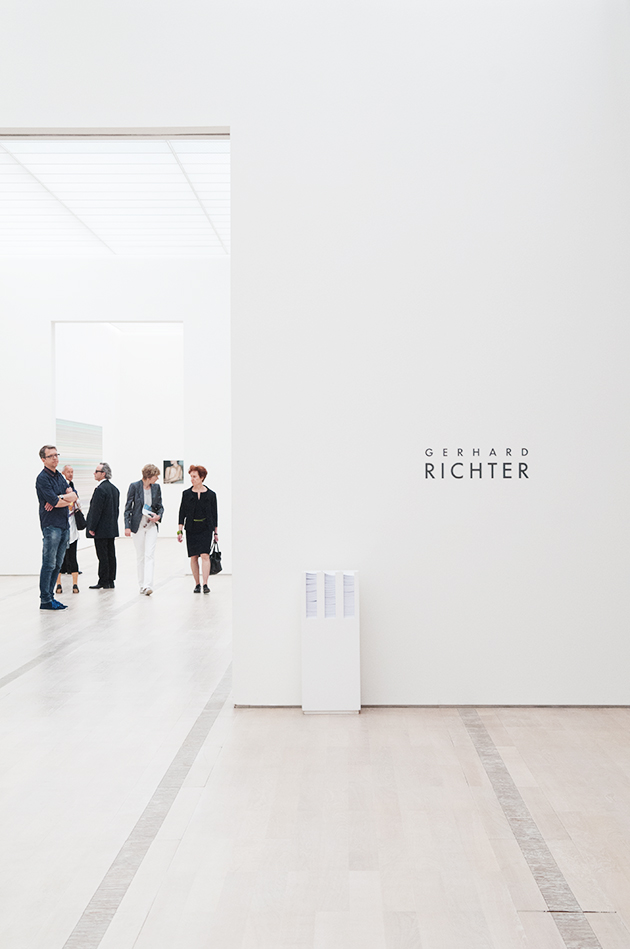
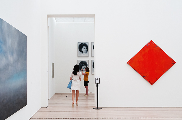
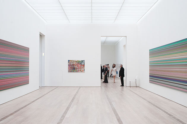
As every year, during Art Basel, the Swiss city turns itself into a hub of contemporary art, attracting collectors, art players and lovers from all over the world; but the secret of this success is not just due to the international fair, though it is undoubtedly one of the well-known and most visited. What makes it “a place to go” is also the list of outstanding art institutions offering high-level program of talks and exhibitions accompanying the event, which become memorable experiences. Soon after reaching Basel, our first stop is Fondation Beyeler, the perfect building designed by Renzo Piano that, as usually, pays tribute to a giant of art: this is the turn of Gerhard Richter (b. 1932, Dresden, Germany), one of the most important artists of our time. Following on from Panorama – the huge retrospective, which celebrated the artist’s 80th birthday at Tate Modern in London, the Neue Nationalgalerie in Berlin and Centre Pompidou in Paris in 2011-12 –, the Foundation hosts an exhibition entitled Pictures/Series, curated by Hans Ulrich Obrist, that puts together, for the first time, Richter’s works conceived as series and cycles.

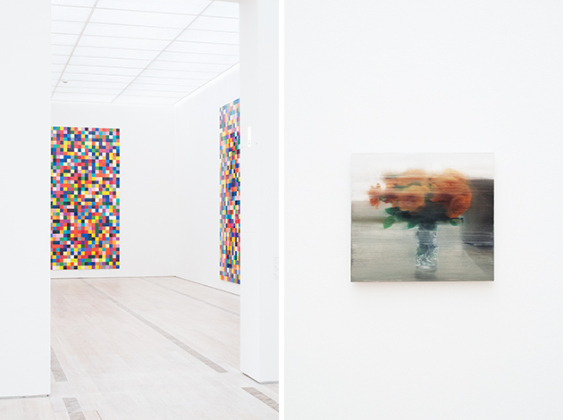
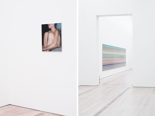
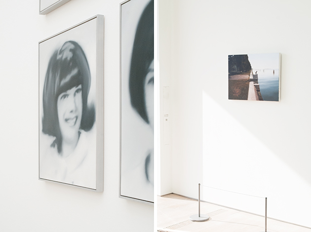
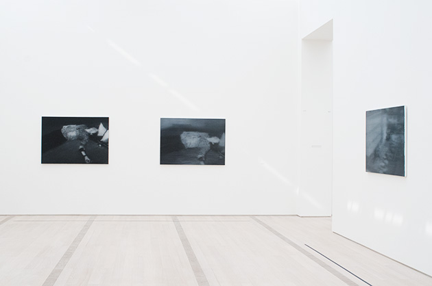
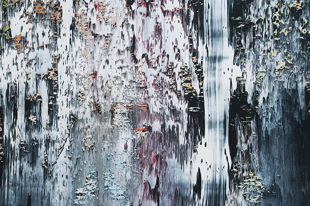
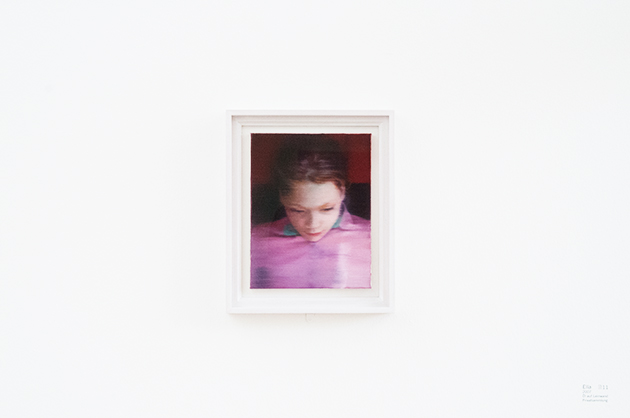
Floodlit by the natural light coming from the ceiling and the huge walls/windows, the show presented a stimulating selection that encompasses the artist’s career over the last sixty years, displaying figurative works, including portraits, land and seascapes, abstract paintings, Greys and Color charts, photographs and digital prints. After the wall-size color chart entitled 1024 Colors (1973) that greets the visitors in the foyer along with two graceful small flowers paintings, the exhibition path goes on with the eight-part S. and Child (1995), which recalls the Virgin and Child theme through the representation of real portraits, but depicted with different stylistic approach and levels of abstraction. From the monumental and controlled pictures of Strip (2013) to the as much large-scale canvases of Cage (2006) – layered surfaces, scratched and erased while listening to the American composer, John Cage –, passing through the Abstract Painting, Rhombus (1998) and the Gray (1975) monochromes, there is space for individual works such as the poetic and emotional Seascape (1975) and Iceberg in Mist (1982) – Greenland landscapes shrouded in mist and mystery –, the delicate and iconic Ella (2007), Small Bather and Reader (both 1994), Betty (1988) and Torso (1997).

The Annunciation after Titian (1973) and the cycle October 18, 1977 (1988) merit a special attention. The former offers the rare opportunity to see all together the five paintings inspired by the old master, catching Richter’s personal process of abstraction and continuous variation; while the latter, consisting of 15 blurred and dark paintings that reproduce press images of the members of the German terrorist group Red Army Faction (RAF), presents a historical and controversial issue from a human and pensive way. “Picturing things, taking a view, is what makes us human; art is making sense and giving shape to that sense. It is like the religious search for God.” The unmissable exhibition will run until September 7th, 2014 at Fondation Beyeler.

Monica Lombardi – Images courtesy of Agota Lukyte 
Share: Facebook,  Twitter  
20/06/2014

3D Printing, From Emotions To Functions

When it comes to emotions, 3D printing has recently proved to be an accessible means to please our fancies. Forget about computer numerical control machines used in advanced material manufacturing or robotics, and turn to the first, grassroots experiments that involve end users and their irrepressible impulse for consumerism and fun. Isn’t the chance to scan and print our own face a democratic way to narcissism? And aren’t the open-source platforms like Thingiverse one of the new easiest channels of access to indiscriminate possession, no matter that they really propose in terms of aesthetics and uses?
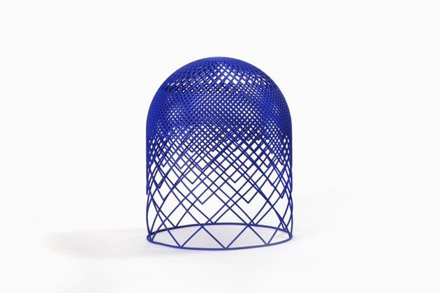
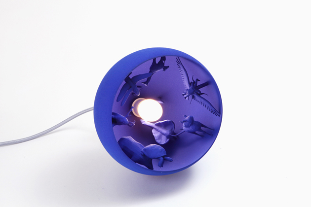
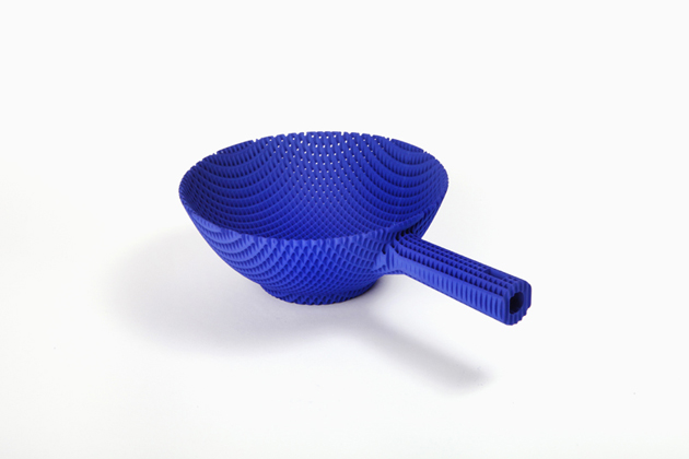
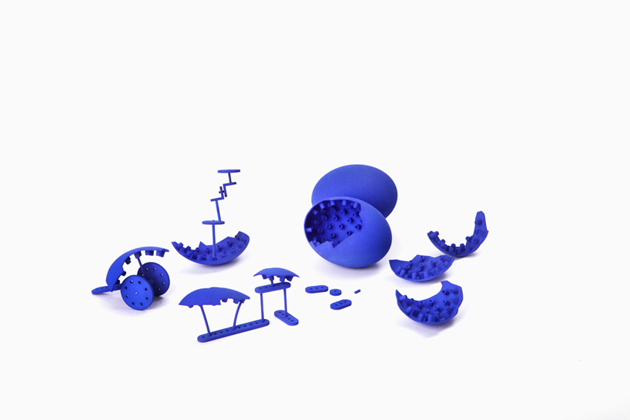
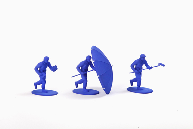
Nevertheless, it’s because of design that a new politique des auteurs comes to life through 3d printing, showing that a beautiful way to express ourselves is at our fingertips even when technologies are still immature. At the latest Salone del Mobile, the “Desiderabilia” exhibition promoted by In Residence – Design Dialogues showcased a collection of fairy inventions describing the emotional relationship between people and objects. Thus, this unpredictable series of 3D printed creations – for example a virtual ikebana (by duo Minale Maeda), a mole mailbox (by Matteo Cibic), a dreams’ dome (by Giorgia Zanellato) – were conceived by curators as a means to tickle designers’ imagination and provide an affordable way of materializing their oddest fantasies.

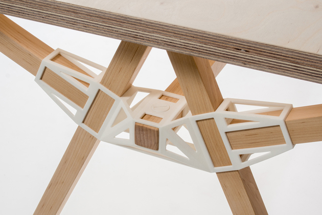
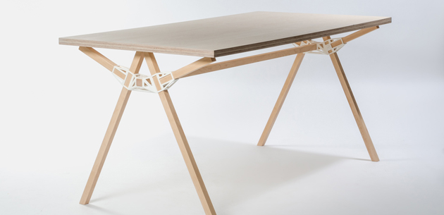
Nevertheless, when it comes to functions, 3D printing has recently been able to accomplish its potential in the broken ground of furniture. Deservedly awarded at the last edition of Interieur 2014 in the “Objects” category, “Keystones”, again by duo Minale-Maeda is the quintessence of a metonymic project, succeeding in rethinking the whole furniture production and distribution chains through the design of a single piece. Per se, Keystone is a simple plastic joint – nor ugly, nor particularly seductive – that through a system of integrated screws dovetails the table components in a stable and replicable solution. From a wider perspective, however, it represents a tangible attempt to concretely rethink the whole furniture supply chain, allowing people to print their joints by themselves, choose favourite materials or finishings, assemble the piece, and possibly involve local artisans in the realization of the piece.

Minale-Maeda’s acknowledgement is the result of a long-lasting research. Started in 2012 as a self initiated project, Keystones is a genuine synthesis of a contemporary mind-set which plausibly integrates in its DNA different elements: from open source inspiration– “from Rietveld’s sketches to the online Lego community”, as designers state – to downloadable design, sustainability and a DIY attitude. All issues that we rarely encounter among furniture and product design, and that has only started to show new, intriguing results.

Giulia Zappa – Images Courtesy of Tullio Deorsola 
Share: Facebook,  Twitter  
20/06/2014

Some Notes On: CSM and RCA Graduation Shows

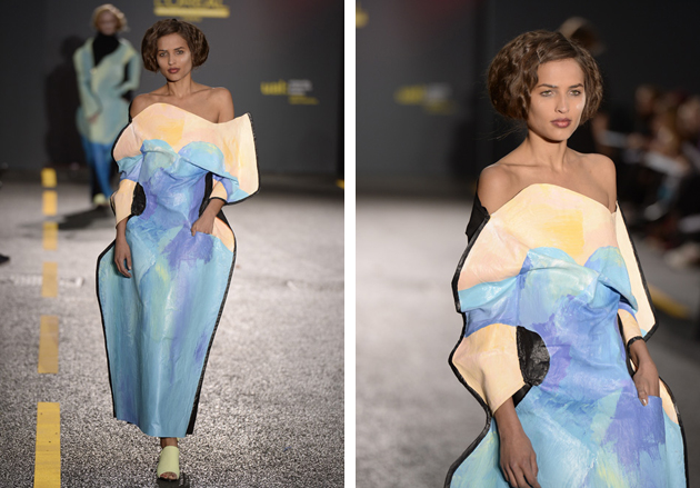
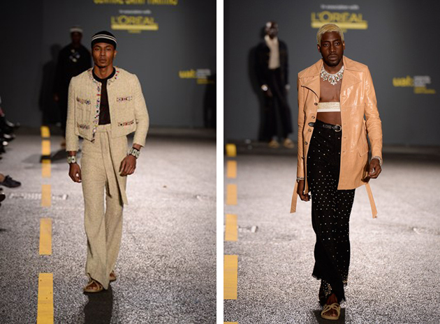
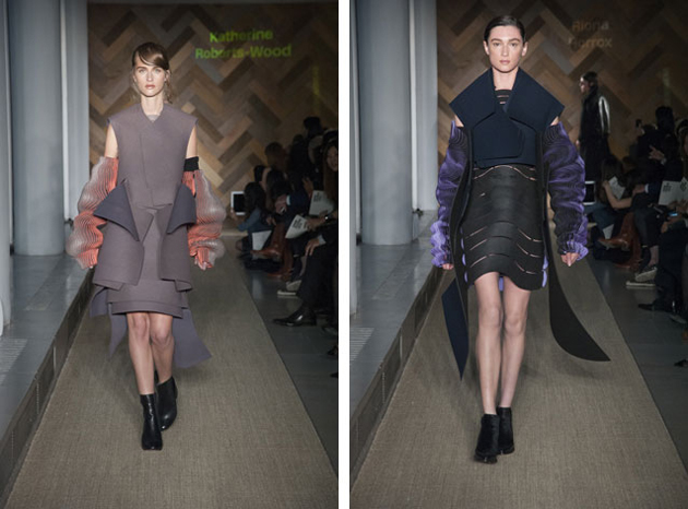
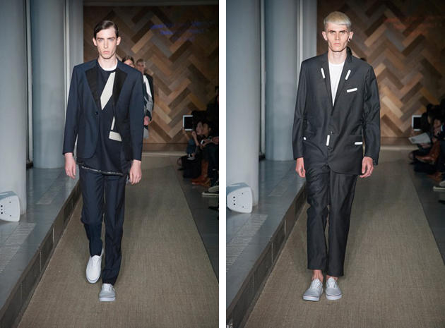
As every year, this is the time for graduation shows. All over the globe, fashion schools unveil their practice to put on stage the results of a year of research, experimentations and hard work. Two of the most celebrated schools, the Royal College of Art and the Central Saint Martins, catalysed the attention of the fashion world, presenting their graduates: 40 for the BA course at CSM and 30 for the MA course at RCA.

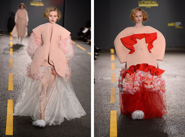
Central Saint Martins’ collections are varied in colours, techniques and shapes; nothing seems left unsaid, and all the collections, while different from one another, share the same loudness. All the messages the students wanted to send are communicated in a clear way and are well unfolded in the sequence of eight outfits. Boldness and clarity might be the criteria used to name Gracie Wales-Bonner winner of the L’Oréal Professionel Talent Award. Her collection, almost an archive of iconic pieces of a classy woman’s wardrobe, was shown worn by brawny black men, all styled with big jewels and headgears. The sharp contrast between dress and wearer wants to put the attention on various themes, such as identity, gender and appearance, and underline the possible discrepancies between the surface and inner feelings. Another collection with a strong communicative power was that of Fiona O’Neill. She based her work on distortion: uncomfortable dresses, hand painted to recreate the image of the body itself, blurring the boundaries between body and dress. Technical and elasticated fabrics are teamed with canvas-like materials, modifying the posture and restricting the movements.

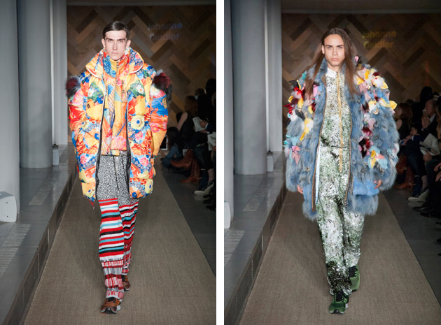
As for the RCA, even though the level of techniques shown by all the graduates was high, menswear collections distinguished themselves visually for their play with dimension and scale. Oversized jackets, plain or with flashy applications, and even full-length furs blossoming with flowers and butterflies: this is what we got from Johanne Dindler’s collection, which played with the ideas of shamelessness and audacity, denying the usual delicacy of some elements in juxtaposition with clashing materials and volumes. In womenswear, discretion was surely introduced as a wholly feminine value: Katherine Roberts-Wood based her collection on the slight contrast between the elegance of colours and fabrics and the three-dimensional embroidery falling from the shoulders and amassing near the hemlines.

Looking at both fashion shows, we can surely pinpoint the main trend behind design practice taught in English schools: the freedom of creativity, disciplined only by the need of having something to say.

Marta Franceschini 
Share: Facebook,  Twitter