07/05/2014

Patrick Kelly: Runway of Love

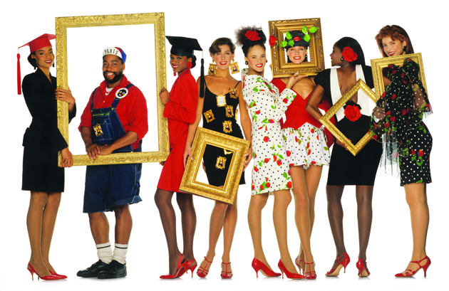
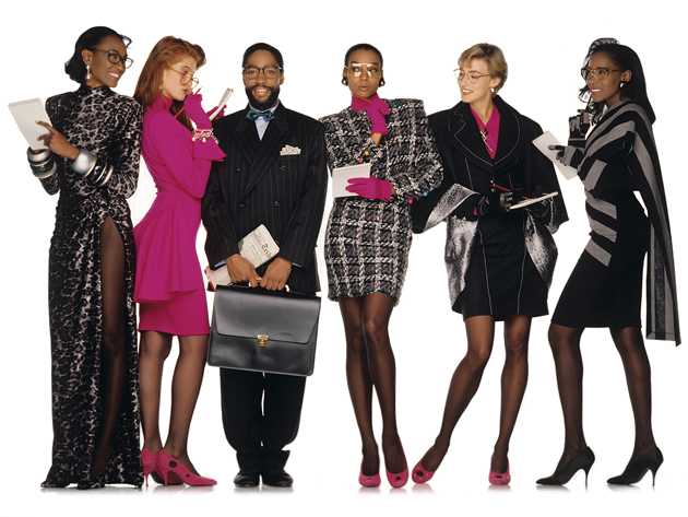
“Wearing your heart on your sleeve” – a common expression used to describe someone who doesn’t hide emotions – couldn’t be more fitting, both figuratively and literally, for fashion designer Patrick Kelly. During the 1980s Kelly was, in fact, a beacon of flamboyance and fun of the fashion world mostly dominated by the concept of “shop til you drop”. At that time, the rules of consumption triumphed over creative production – a fashion game Patrick Kelly would take a stand against.
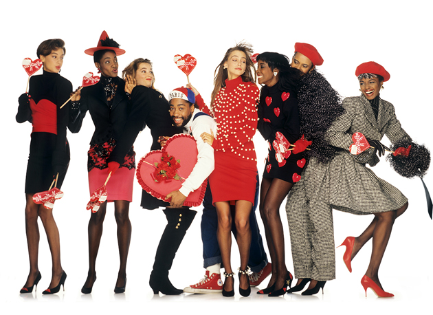
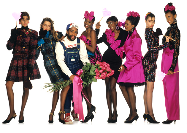
Kelly’s career started as a young teenager growing up in Mississippi, where he worked in boutiques selling high-end designer clothing. Soon after he would move to New York and finally Paris, becoming a highly acclaimed designer and one of the few ‘foreigners’ elected into the Chambre Syndicale. The art of re-design and re-appropriation was something that Kelly learned from his grandmother and which would become his trademark. While working in boutiques he would re-design their high-end clothes selling them on the street under his own trademark. Re-design could be viewed as an ironic comment on what seems to underline all of Kelly’s work: being proud of who you are and making it on your own. Often criticized for using particularly charged imagery, Kelly was unapologetic and believed it was necessary to know one’s history to move forward. From his humble beginnings to the prestigious circles of the fashion world, Kelly developed an aesthetics that mixed his African American and Southern roots and knowledge of fashion and art history with references from the club and gay cultural scenes in New York and Paris.
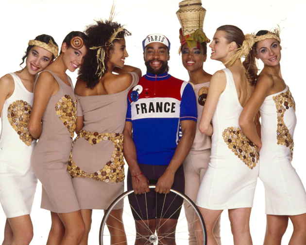
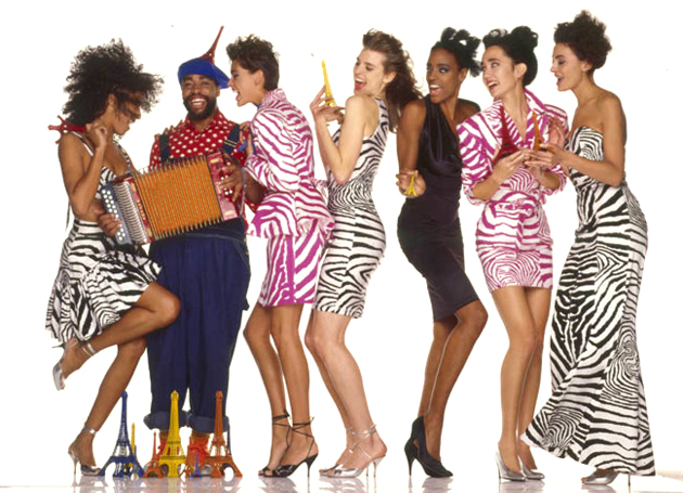
Kelly understood design as a way of making people happy though the creation of wearable clothes, commenting – at the same time – on some of the most stereotypical assumptions of the then society. Designs like a watermelon hat, a golliwog logo or a colorful minimalistic twirl attire for women of all sizes, were all projects that kept people at the edge of their seat for what he would create.
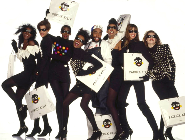
“Patrick Kelly: A Runway of Love” is an exhibition at the Philadelphia Museum of Art celebrating an artist known for his playfulness, rich colors, bold imagery and iconic button-filled patterns, proposing an intriguing intersection of conceptual, cultural and spiritual juxtapositions with fabulous fashion.

Victoria Edman – Images courtesy of Philadelphia Museum of Art 
Share: Facebook,  Twitter  
07/05/2014

Through the Lens of Marina Caneve

Marina Caneve is a young Italian photographer, living and working between Italy and Ile-de-France. Graduating in architecture at IUAV University in Venice in 2013, she developed a thesis under the guidance of Guido Guidi on the topic of photography and the construction of knowledge concerning the urban plan. We asked Marina a few questions about her work, her future plans and project, and her photo-series titled Guardians.

Tell us more about yourself. You have studied under some of the most significant figures of Italian photography, such as Guido Guidi. What was it like?
I had a great opportunity to develop my final master’s project under the guidance of Guido Guidi. Thanks to Guido, I had to question my knowledge about photography and I started to consider it first of all as a cognitive process and a question of choice between options that are never definitive. This kind of work gave me the opportunity to see a lot of photo-books and read many essays on photography and visual culture. I have never looked for mentors who’d go along with me, but rather ones capable of provoking me, pushing me to overcome my limits.

How would you describe your early influences in photography?
I arrived at photography by following my curiosity, my personal and academic interests, as well as my passion for visual culture. In the beginning I felt the need to express my intimate self – I often felt fascinated by authors who work with portraits. I am also particularly interested in the connections and contradictions characterizing the relationship between people and the place they live in, with particular reference to social value of urbanism – how cities are (not) made for people. I am always looking for the ‘Tender cruelty’ found by Lincoln Kirstein in Walker Evans in the 1930s. I have always loved looking at William Eggleston’s work, definitely. I have a great interest for Larry Sultan; I love Jitka Hanzlova, Rineke Dijkstra and Thomas Struth. I often look at the work of Mona Kuhn, Yann Gross and Richard Rothman. It is hard to stop listing names, there are too many photographers I admire for different reasons.

Tell us more about your project, Guardians. What is the inspiration and the thought process behind it?
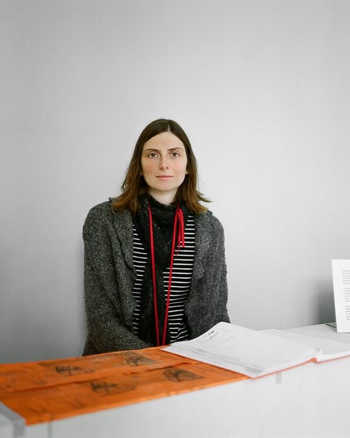
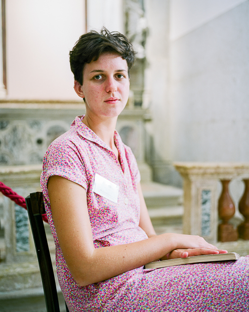
Guardians is an ongoing project initiated one year ago. I started this work after a workshop in Venice titled Portraits, developed under the guidance of Valerio Spada (the author of an amazing self-published book Gomorrah Girl). I have always been fascinated by guardians, their feelings, their suspended aspect, origins and thoughts, their empathy with space, artworks and people. The project/process tells – through the portrait itself – about the figure of who-is-looking-at as well as, in an almost bulimic relationship, about the visitor-photographer’s eye. It is all about mediated looks, where sociological inquiry and intimate investigation are interposed.

What would be your dream project to work on?
I don’t have a particular ideal project in mind, my ideas are always evolving and mutating. Being passionate for what I do, I have to love the topics I work on and when I work I feel completely absorbed and my dream is to have the chance to continue doing exactly that.

Interview by Agota Lukyte – Images courtesy of Marina Caneve 
Share: Facebook,  Twitter  
06/05/2014

Style Suggestions: Sneakers

You can put away the heels and still look stylish and feel comfortable. From hidden wedges to athletic runners, sneakers are the must-have shoe that is recurring season after season, so invest in a great pair because this trend is here to stay.

Clockwise: Comme Des Garçons Play, ACNE, Y-3, Balenciaga

Styling by Vanessa Cocchiaro 

Share: Facebook,  Twitter  
06/05/2014

Fotografia Europea 2014 in Reggio Emilia

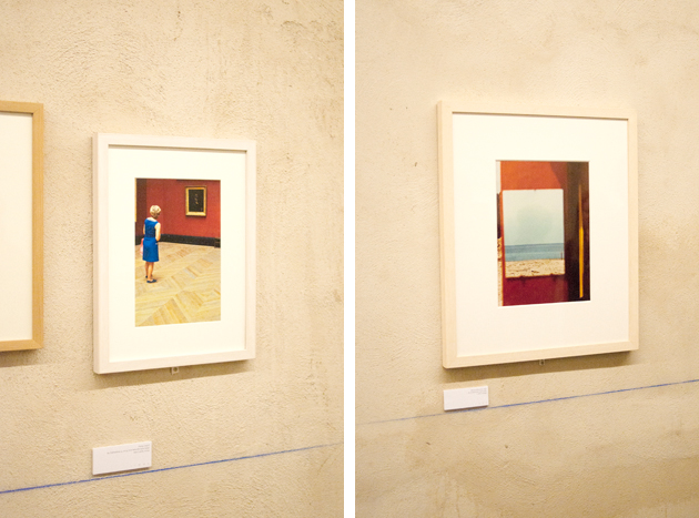
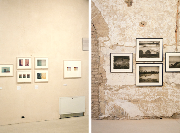
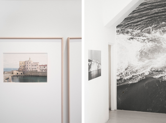
During the long weekend from 2nd to 4th of May the 9th edition of Fotografia Europea, the international photography marathon held in Reggio Emilia since 2006, opened its gates. Dealing with different topics every year, this edition’s well-structured program of exhibitions and installations was guided by a reflection on the importance of the gaze: “Vedere. Uno sguardo infinito” (Seeing. An infinite gaze).

The main event of the festival was the huge retrospective devoted to the Italian master of contemporary photography Luigi Ghirri, entitled “Pensare per immagini. Icone, Paesaggi, Architetture” (Thinking in images. Icons, Landscapes, Architectures), and previously presented in Rome at Maxxi. The exhibition was based on three hundred shots, album covers, mock-ups, books, postcards and magazines retracing the amazing career of one the most eminent observers of our age.

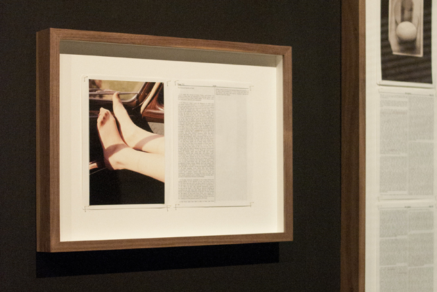
“Divine Violence”, a show by Adam Broomberg and Oliver Chanarin presenting here their latest work – “Holy Bible” – was also definitely worth a visit. Following their personal research that plumbs depths of the recent past to assemble stereotyped images representing conflicts, the photographer duo chose to reinterpret the holy book. The result is a publication which combines words of the original text and images taken from the Archive of Modern Conflict, a London publishing house which released the book, showing violent and illogical periphery of human beings.

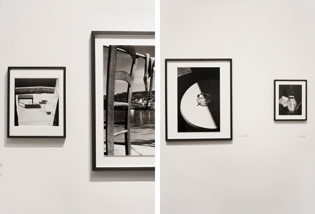
Among other numerous proposals hosted in different venues scattered around the city, the shows by two Magnum photographers Herbert List and Erich Lessing brought the viewers back to a black and white past made of refined still lives, landscapes and images of normal people contributing to the reconstruction after the Second World War.

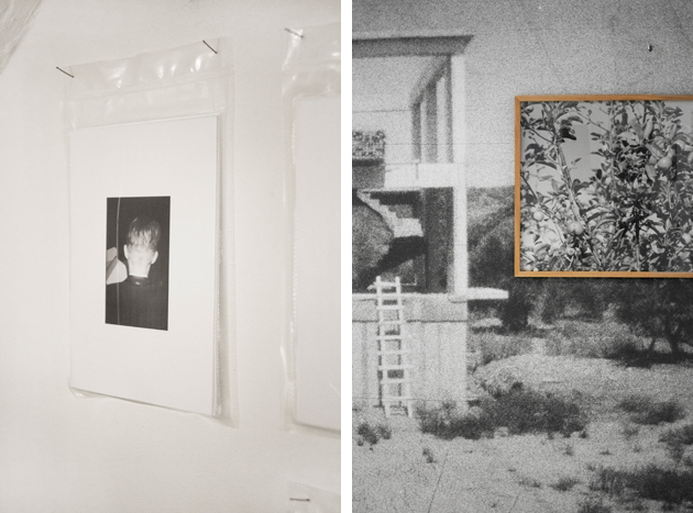
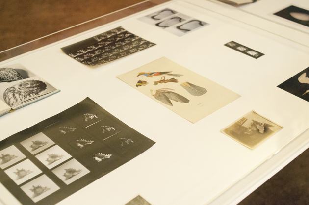
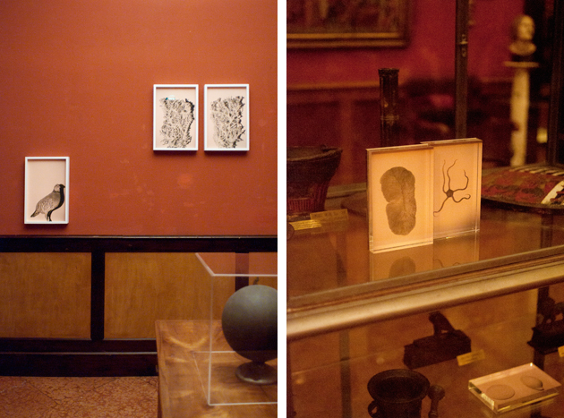
Jumping from past to present, the festival, as usual, kept an eye on the young generations, presenting the gazes of Silvia Camporesi with her ghost places and their poetic desolation, Andrea Ferrari and his animals that observed the observers by blending in with the rich naturalist collection of the Lazzaro Spallanzani gallery, and Massimiliano Tommaso Rezza, who records ordinary things, negligible and ephemeral details of our everyday life through xeroxes glued directly on walls and pictures gracefully arranged in vacuum-sealed envelopes.

Once again Fotografia Europea proved the high quality of its agenda, proposing a series of main shows and collateral events that liven up the pleasantly relaxing town of Reggio Emilia, allowing people from all over the world to discover its charming, and in some cases hidden, locations. See you there next year!

Monica Lombardi – Images courtesy of Agota Lukyte 
Share: Facebook,  Twitter  
05/05/2014

Slippers To Go

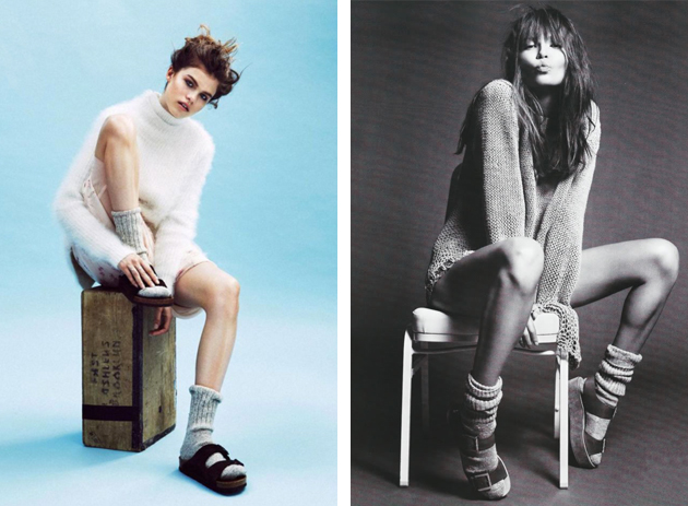
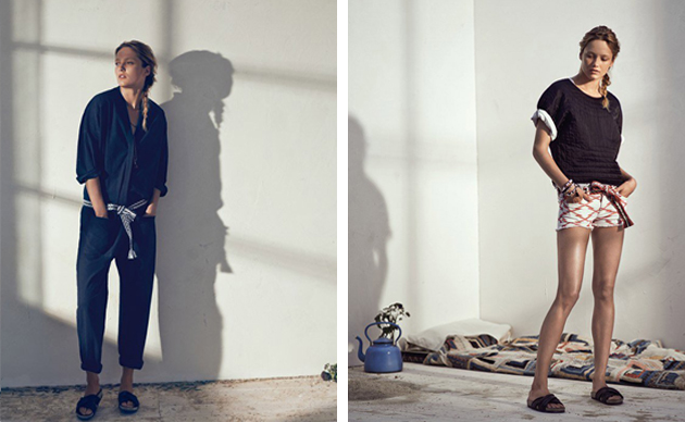
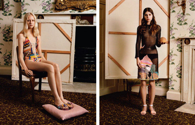
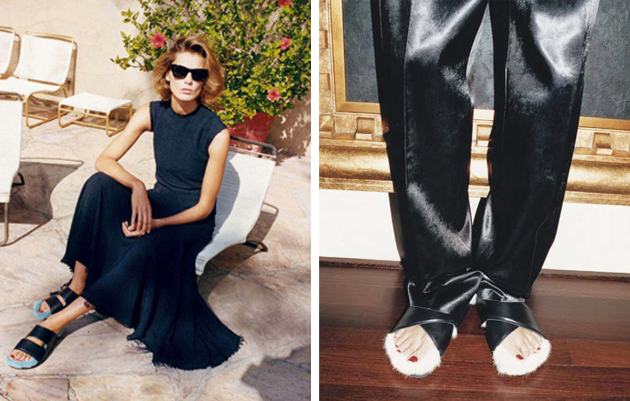
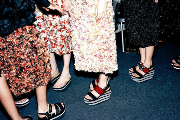
It might sound weird to many, but slippers – those type of unflattering shoes mostly used indoors and usually worn with socks by utterly demodé tourists – are currently in vogue. The trend started, more or less one year ago, when Phoebe Philo decided to send a modern interpretation of the classic Birkenstock, fluffier and definitely cooler, on the Céline catwalk.

As usually happens, from that moment on, each respectable fashion brand has offered their own version: Givenchy with dark flowers, Isabel Marant aimed at a basic one, Missoni played a bit with shapes and Marni just kept re-working its typical sandal produced along the years.

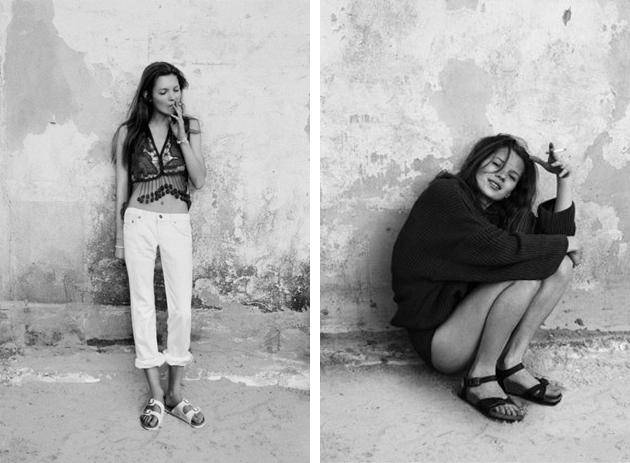
Generally speaking, during the last two fashion seasons there has been a notable increase in the use of comfy accessories, especially related to shoes. This is certainly a crucial point that underlines, in some way, a need for a more relaxed approach in the fashion field, even if it’s not the first time Birkenstock family has been singled-out by the fashion world. In fact, during the 90s, everyone who wanted to look easy and cool used to wear them – a black and white photo of a young Kate Moss sporting a perfectly un-classy pair of Birkenstocks is a case in point.

As for every trend, seeing slippers on the catwalk is only a matter of habit: once we start seeing them everywhere and in every possible variation of style, we automatically accept it as a normal and even desirable accessory. At least slippers are comfortable, aren’t they?

Francesca Crippa 
Share: Facebook,  Twitter  
05/05/2014

Serpentine Pavilion by Smiljan Radic

After Sou Fujimoto, Herzog & de Meuron and Ai Weiwei, Peter Zumthor, Jean Nouvel, SANAA, Frank Gehry, Olafur Eliasson and Kjetil Thorsen, Rem Koolhaas and Cecil Balmond, Álvaro Siza and Eduardo Souto de Moura, MVRDV, Oscar Niemeyer, Toyo Ito, Daniel Libeskind and Zaha Hadid, Serpentine Galleries Pavilion programme returns to its original aim of endorsing younger and lesser known architects by commissioning this year’s project to Smiljan Radic.

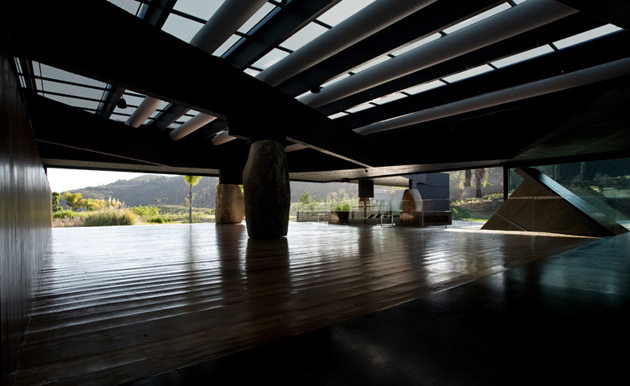
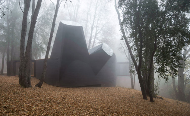
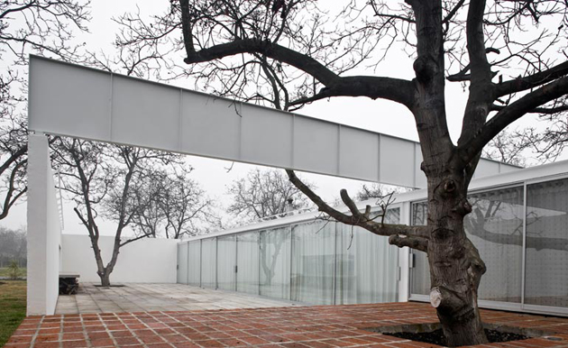
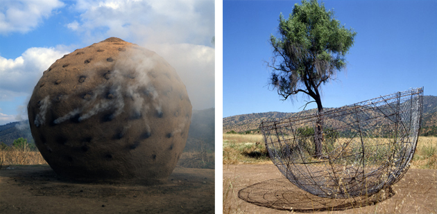
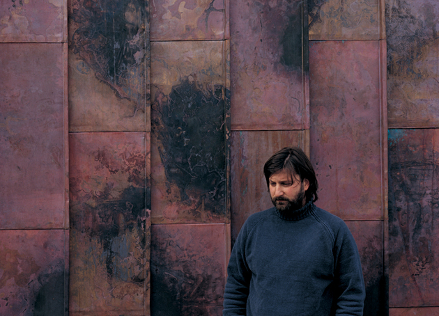
Smiljan Radic (Santiago de Chile, 1965) earned his architectural degree from the School of Architecture at the Pontificie Universidad Católica de Chile in 1989 and later studied at the IUAV University in Venice (1990-1992). One of the youngest and least-known in the Serpentine’s programme, Radic is known for developing buildings which merge elements of natural and artificial, offering a sort of a metaphorical escape from urban reality and civilization. Among his most challenging, yet widely appreciated, projects are the Mestizo Restaurant in Santiago, Chile, the Copper House in Talca, Chile, and the renovation of the Chilean Museum of Pre-Columbian Art in Santiago, Chile.
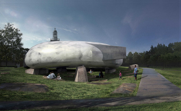
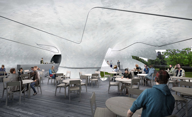
Radic described the pavilion commission as a leap of faith: “They are taking a big risk by choosing me. I’m not inside the common place of the architect, and it is really hard for me to do something so fast. But risks can be exciting.” In fact, his project appears to be one of the most exciting in the programme’s 14-year history. Resembling a primitive structure (one critic even described it as a sort of an alien cow bladder), Radic’s pavilion is structured as a circular, semi-transparent shell made of fibreglass suspended on large quarry stones which give the impression of a floating volume. In line with his previous projects and fascination with temporary, fragile constructions, the pavilion is “part of the history of small romantic constructions seen in parks or large gardens, the so-called follies, which were hugely popular from the end of the 16th century to the start of the 19th”.

Smiljan Radic’s Serpentine Pavilion will open to the public on 26th of June 2014 and will remain in Kensington Gardens in London until 19th of October, hosting a series of eight site-specific events which bring together art, poetry, music, film, literature and theory and three new commissions by emerging artists – Lina Lapelyte, Hannah Perry and Heather Phillipson.
Rujana Rebernjak 
Share: Facebook,  Twitter  
02/05/2014

Style Suggestions: Summer Festivals

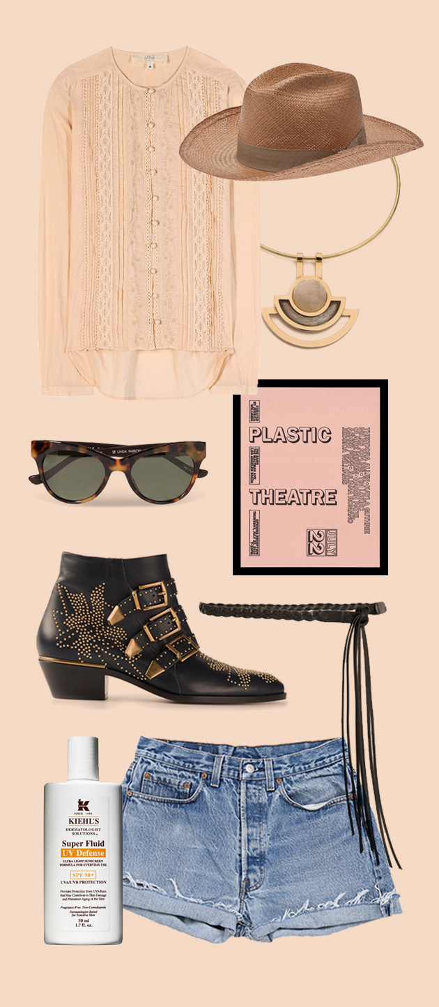
As the Summer season is approaching so are the music festivals. The only rule is there are no rules and you can choose anything that will make you brave the crowds looking and feeling great: from boho floral dresses to T-shirts to denim and head to toe Isabel Marant.
Isabel Marant, Chloé, Vanessa Bruno, Vintage Levi’s, Pamela Love, Stella Jean, The Row by Linda Farrow, Kiehl’s

Styling by Vanessa Cocchiaro 

Share: Facebook,  Twitter  
01/05/2014

The Complex Beauty of Wes Anderson’s World

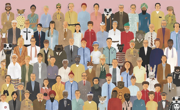
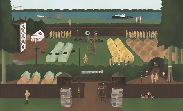
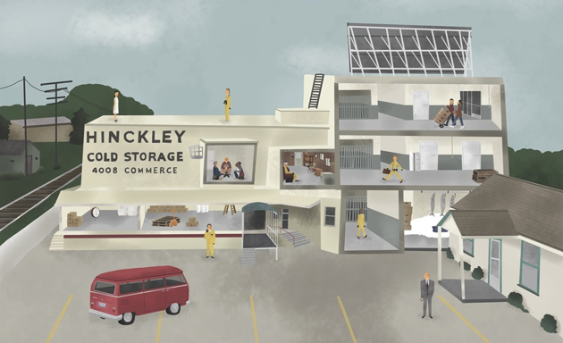
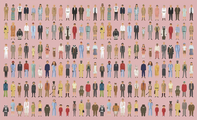
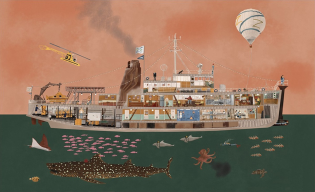
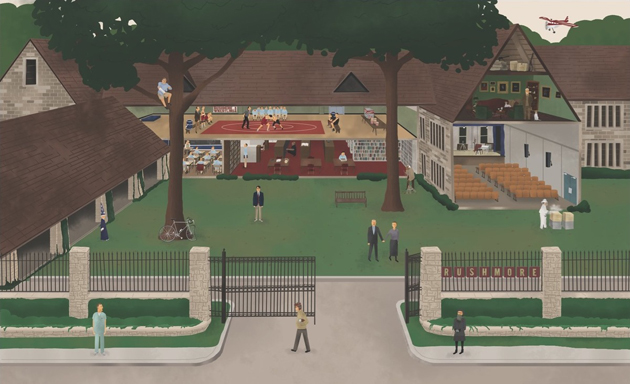
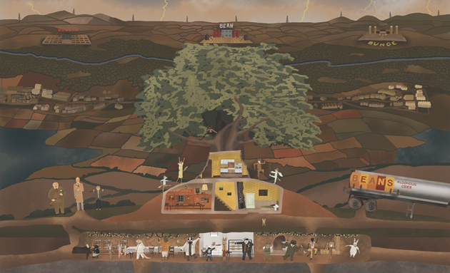
If you had ever seen a Wes Anderson movie, the most obvious feature you remember it by is surely its soft, retro visual feel and particularly melancholic poetics. From the universally loved “The Royal Tenenbaums” to the animated “Fantastic Mr. Fox”, each Anderson’s movie is designed to the last detail. Annie Atkins, the graphic designer who worked on Anderson’s last feature, “The Grand Budapest Hotel”, states that the director “is completely involved in every aspect of his filmmaking”, so much so that he even “wrote all the articles of the newspaper featured in the film, even though, on screen, you only get a chance to read the headlines”.

While Anderson’s overtly controlled and ultimately ‘constructed’ filmmaking doesn’t appeal to everyone, his particular aesthetics has evolved into a complex and recognizable language, characterized by an elaborated visual artistry, inimitable tone, and idiosyncratic characterizations. Even though some elements of his visual code have already been analysed and classified by his loyal admirers, a book released last Summer, “The Wes Anderson Collection” is the first in-depth overview of his work. Bringing together interviews, previously unpublished photos, drawings and original illustrations, it reveals – step by step – the process that guides the creation of each of Anderson’s movies. Meticulous and particularly rich, “The Wes Anderson Collection” perfectly captures the spirit of his films: melancholic and playful, wise and childish—and thoroughly original. “The Wes Anderson Collection” was written by Matt Zoller Seitz and published by Abrams Books.

Rujana Rebernjak 
Share: Facebook,  Twitter