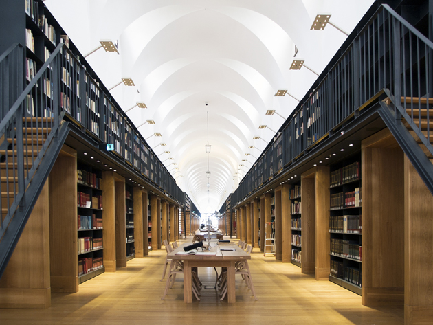
On the quiet island of San Giorgio Maggiore, in front of San Marco square in Venice sits the Giorgio Cini Foundation, an institution whose mission is to promote the redevelopment of the monumental complex on San Giorgio and encourage the creation of educational, social, cultural and artistic institutions in its surrounding territory. In the last decade, the foundation has transformed the old Benedictine dormitory, known as “Manica Lunga” and originally built by Giovanni Buora at the end of ’400, into a modern and functional library that houses more than 150,000 volumes. The “long wing” is an extraordinary space: in the course of time it has housed monks’ cells, military accommodation, public dormitories and classrooms.
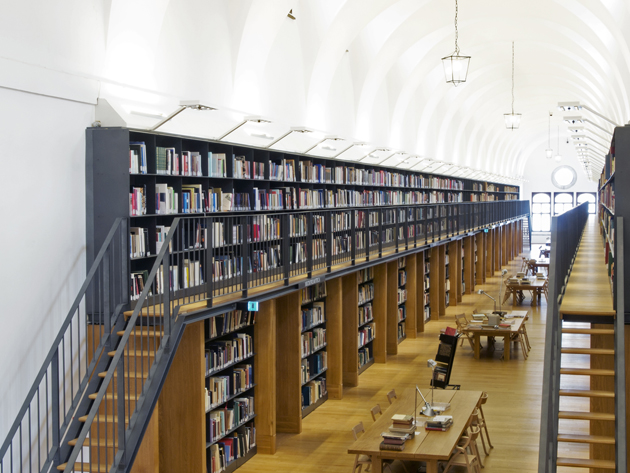
The restorative intervention was developed by architect Michele De Lucchi, who won an international design competition in 2005, transforming the old cells in reading and working areas. The restoration project of the long wing involved the creation of shelving systems both on the ground floor and an added balcony, with reception, workstations for multimedia material, lounge areas, meeting and conference rooms all placed on the ground floor, together with a recovered treasure room, office of the curator and cells used for archival purposes. With over 1400 meters of shelving, including 1000 open shelves, the new long wing is now the heart of the History of Art library complex at Giorgio Cini Foundation.
“What used to be a large living room was transformed into a library taking inspiration from Longhena – explains Michele De Lucchi – with open shelving covering the whole extent of long walls, while tables for consultation occupy the room’s the centre. A second level was added to the space with a balcony easily accessed by stairs placed on northern and southern sides of the central transept. The supporting structure and the shelves are made of metal. The perspective effect is amplified by adding a second line leading to the horizon, without further charging the visual impact of the room.”
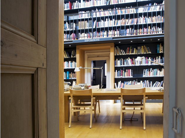
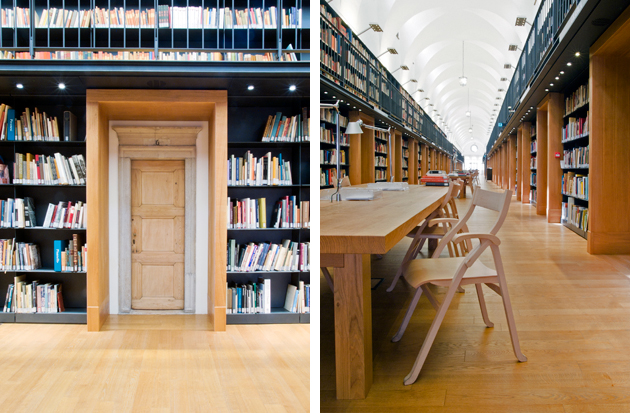
The small doors of the monastery cells were additionally framed with wooden portals, which both support the balcony of the second level and add a curious visual appearance to the portals, where a smaller door seems to be inscribed within a larger one. The central space is thus left empty and plain, with only a few long tables left for consultation: other reading space, together with meeting, conference and event rooms can be found inside the cells.
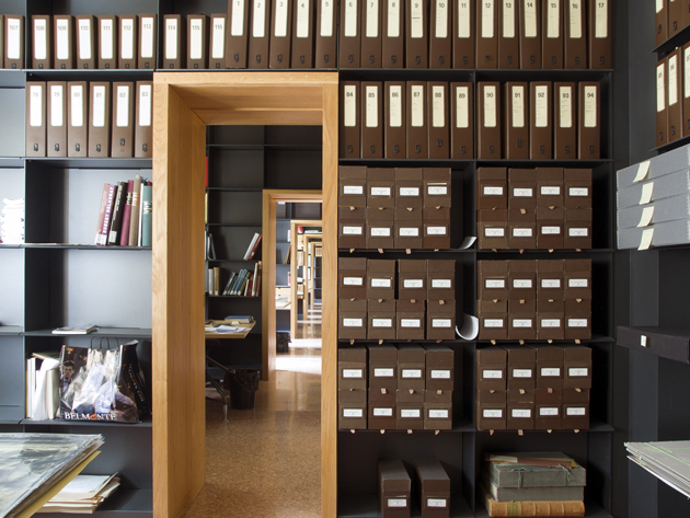
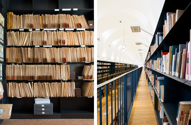
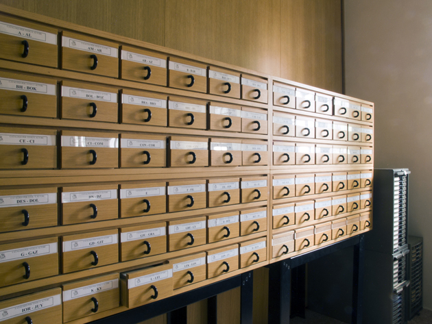
The cells oriented towards Bacino di San Marco host the library’s service functions: librarian’s offices and consultation tables are placed in the central area for obvious reasons of safety and control. The cells are all similarly conceived, leaving the original monastic effect intact, even though they are variously connected according to different needs. Many walls of the cells are covered with shelving as well, leaving only doors and passages bare. The shelves arranged around each room aid a feeling of historical continuity and environmental unity to the space, while also maintaining the architecture’s static balance, since all the weight is placed against the walls.
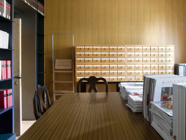
The lighting of the new long wing was designed following the criteria of “territoriality” – adding light only where needed and avoiding direct light that precludes the concentration and study. The LED lighting adopted for the shelving is integrated directly into furnishings, concealing the fire extinguishing system, leaving a comfortable solution for consultation and reading. The restoration of the “Manica Lunga” is a particularly correct project in all of its aspects, respecting both the monastic history of the space, as well as calibrating functional and architectural additions with maniacal attention to details. Starting from an existing space of extreme quality, De Lucchi has succeeded in giving a new functional and cultural life to an architecture that otherwise would not be easily accessible.
.

