30/05/2014

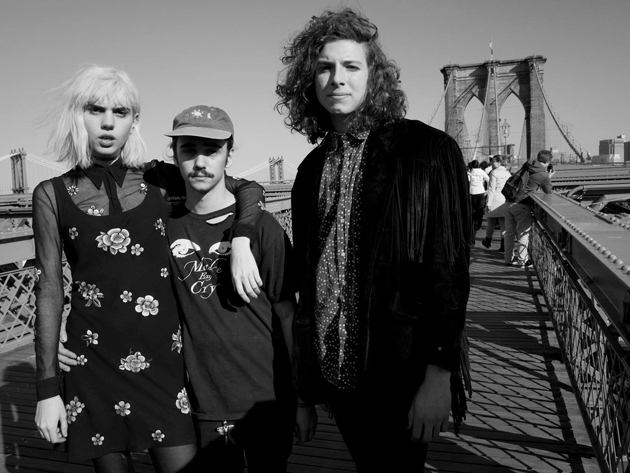
Upcoming Artists: Sunflower Bean

You are very young and the Sunflower Bean were born only a year ago, however, it seems that you know each other for much longer. Maybe you attended the same clubs. Am I wrong?
Yes! The Sunflower Bean is almost a year old, which is on the younger side for a band. We’ve known each other for a little more than a year. We all met through the music scene in Brooklyn, playing shows and hanging out.

Have you found harmony between your musical tastes immediately or do you have completely different preferences?
There’s a harmony between all of our tastes I think, we all love Black Sabbath, NEU!, The Velvet Underground, etc. We share a lot of the same influences.

Now, on your Bandcamp there are only 2 songs, but your sound is already well defined. Do you work hard on this, or just let yourself be inspired by the moment?
Our sound can be a little difficult to describe exactly, but we have dubbed it “neo-psychedelia for the digital age” which actually sums up what we do pretty well. When we write a song, we try to tap into the greatness of our influences without rehashing the past or being “retro.” We are looking into the future by marking the present, like in our single 2013, where we pay homage to the culture that surrounds us, for better and for worse. We record most of our songs at our friend Christian’s home studio, Fox 5 studios. We’ll go over on a Saturday or something and record our new stuff.

Are there any new bands that you really like or someone similar to you style that you appreciate?
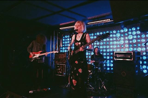
One of our favourite bands around is Tonstartssbandht. They are the most inspiring, most talented, and have THE most fun live show around.

You all live in New York – how’s playing in a big city like? Is it easy for a new-born bands as Sunflower Bean to find a place where to perform? How do you prepare for shows?
Being from NYC and living here is the best. There are always bands to play with, and there are always shows to play at. There’s a really good community here. The problem is that most of the all ages venues are closing, which makes it a lot harder for people under 21 to hear new bands, and sometimes it’s really difficult for venues to let you play, just because you’re under 21. We practice a couple times a week in order to stay well rehearsed for the shows we play.
I suppose that playing in a band is not the only job that you do. What do you do in your “real” life? School? Work?
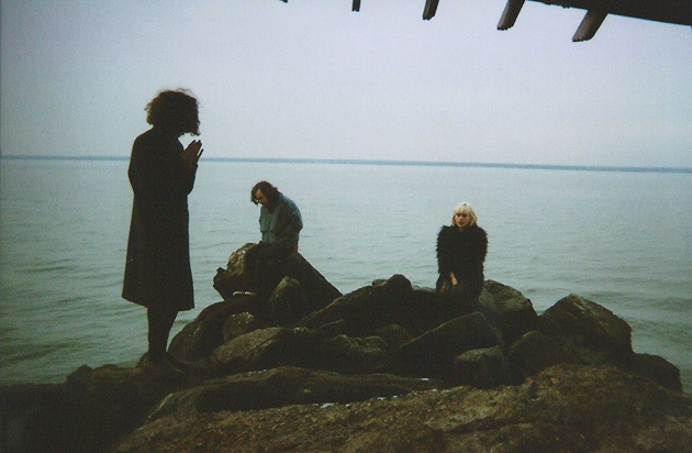
We are all students. I (Julia) am still in high school and I also work at the Museum of Modern Art in Manhattan. Nick and Jacob just finished their first years of college. But music is really what we do everyday, and it is the only thing we really want to do. It’s the dream.

Are you recording new material? Do you have nice surprises set aside for this 2014 ? Releasing an EP maybe?
We have a lot of surprises planned for 2014, new songs, new videos, and hopefully, more shows all over the world!
Enrico Chinellato 
Share: Facebook,  Twitter  
30/05/2014

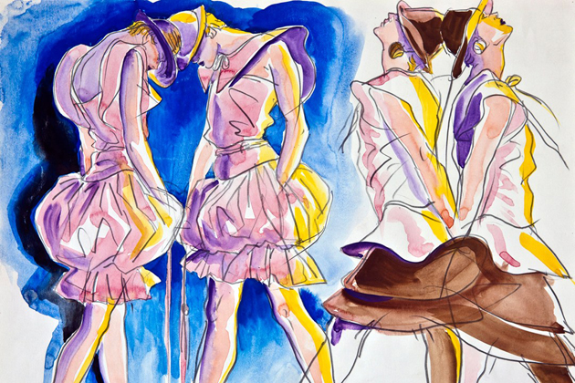
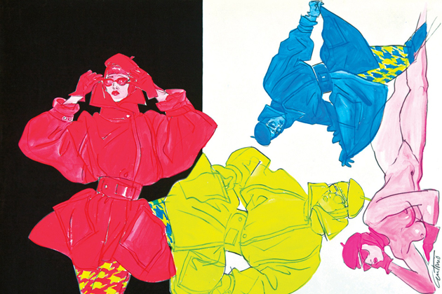
Antonio Lopez Drawing Fashion

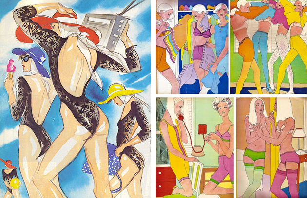
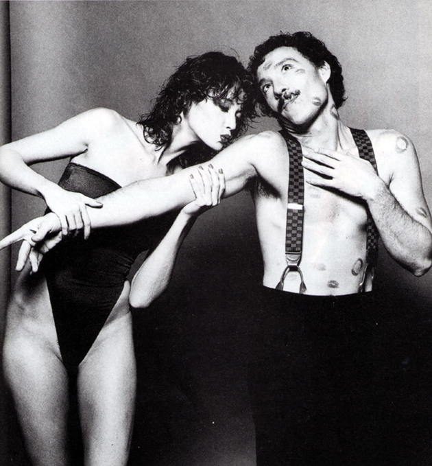
The 70s and 80s were years of experimentation in many fields, but the crossover between art, photography and fashion stands apart for exceptionality and success. Maybe because the favourite (and, of course, shared) subject was life, the kaleidoscopic life of clubs and factories, which was lived as a limitless experience. No boundaries were taken into account: everything was possible.

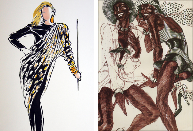
The work of Antonio Lopez can be read as a symbol of this fruitful encounter of disciplines, or better, aspects of life. Antonio Lopez himself can be assumed as one of the heroes of this not so far, yet mythical, past. Calling him a fashion illustrator would be partial to say the least, even if this is the title that characterises him most. Lopez began studying fashion at the early age of twelve, and his career took off quite immediately, since by his twenties he was already a celebrity between the offices of The New York Times, Harper’s Bazaar, Interview and Vogue, illustrating editorials and collections, as he did for Charles James. But the real turning point arrived when he decided to move to Paris with his collaborator Juan Ramos, in 1969: the moment in which Antonio, as he used to sign his drawings, begins to draw fashion, instead of simply drawing fashion. With the eye of the creative director he pervaded his drawings with a strong and explosive style, portraying the women he admired and, in a sense, created as icons, permeating the clothes he depicted of his holistic vision of life.

Rosita Missoni used to say that he was able to transform the clothes he drew. Not only giving them a life for themselves, but creating a well defined environment around them, precise in its references and clear in the message he wanted to get through. Clothes became, at the same time, a central object of desire and a ‘mere’ apposition to a strong personality, both physical and psychological. Even Karl Lagerfeld was said to be led to his next design by looking at Lopez’s ‘postproduction’ work on his Chloé designs, leaping over reality in favour of the force of images and statements. ‘His work was such a fashion barometer’, clearly stated Corey Tippin, a member of the group of friends and performers close to Lopez. ‘What one recognized in his illustrations was, in the end, more than just a dress. It was a state of mind’, said Peter Knapp, a photographer who worked with him. A state of mind that contributed to build a precise idea of glamour, filled with clothes, sex, fun and a bit of folly, glowing in each of his artworks.

Marta Franceschini – Images courtesy of the Estate of Antonio Lopez and Juan Ramos 
Share: Facebook,  Twitter  
29/05/2014

Italo Modern: Post-War Architectural Gems in Italy

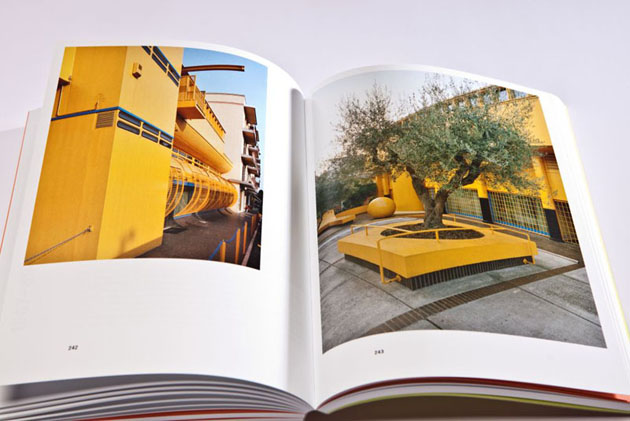
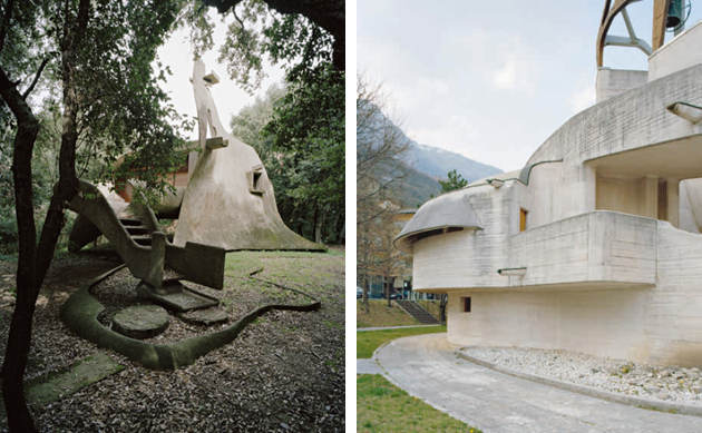
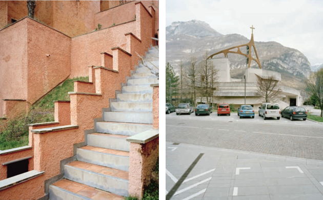
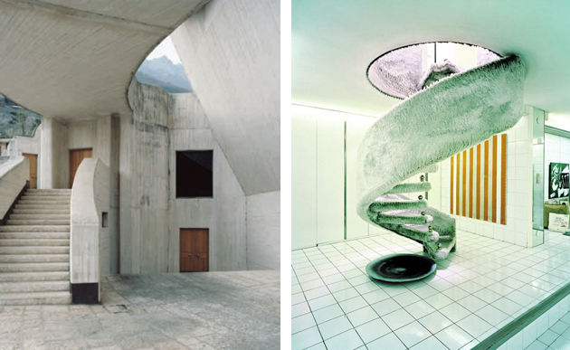
After returning from their Le Corbusier ‘pilgrimage’ in France in 2004, the Feiersinger brothers – Werner, sculptor and photographer, and Martin, architect – came across the austere but magnificent church of Mater Misericordiae. Located near Milan and designed by Angelo Mangiarotti and Bruno Morassutti, in Baranzate in 1956, the church has in the recent years been restored to its original artistic value.

Facing the minimalist white cube of the church, framed with embroidery on the top of the concrete structure, appeared as a real shock to the Feiersingers: it was an utter counterpoint to Le Corbusier’s plastic exuberance as well as an unexpected discovery and the origin of a their research. One brother concerned with the sculptural qualities of the buildings, the other of the spatiality and landscape integration, they systematically began to travel through a considerable part of Italy, in the heart of the country’s post-war reconstruction heritage.

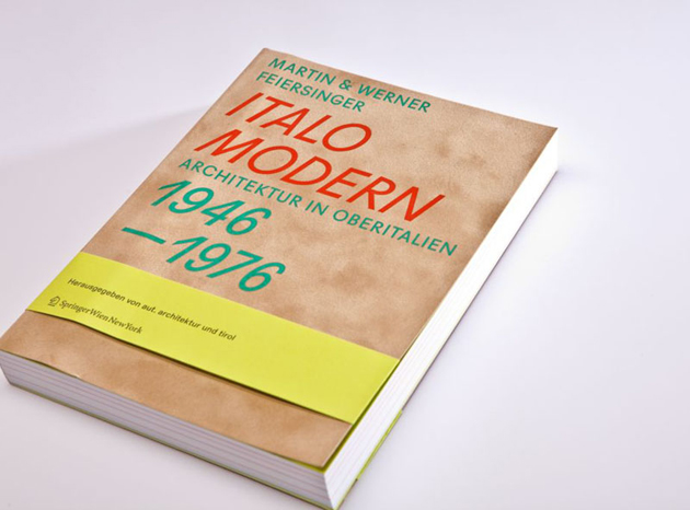
They chose to follow the path of the American Kidder Smith who, in 1955, stunned the world with a guide book, Italy Builds, which showed a defeated country emerging from war, miraculously blooming into a multitude of architectures that anticipated the future rather than nostalgically regretting the past. More than a half century later, the Feiersingers came out with a very striking portrait of the Italian miracle – a demonstration of creativity bordering with anarchy, not attributable to current patterns of international architectural historiography. Their account showed an Italy of separate but interconnected ‘talents’: the exaltation of a series of ‘differences’, constructed with a passion for experimentation that is now hard to beat.

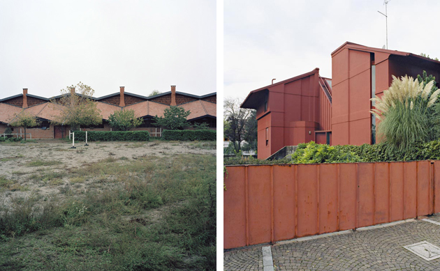
The Feiersinger brothers’ ‘guide’ includes masterpieces – condos in Milan by Magistretti and Caccia Dominioni, the expressionistic vortices of Michelucci, the terse, almost rough, functional elegance of the factories by Gino Valle, the icy obsession of Rossi and Aymonino in Gallaratese – but also a myriad of uncrowded if not unknown ‘goodies’. The houses in ‘cubes’ in Gambirasio near Bergamo, for example, or Pizzigoni’s structural geometry; abstract expressionism of Henry Castiglioni and organic and almost zoomorphic work by Vittorio Giorgini (with a holiday house in Baratti comparable to the American master Bruce Goff); the ease of a master Gio Ponti, who designed the ‘house under the leaf’ in the province of Malo in Veneto, brilliantly liberated from the 60s internationalism. Italo Modern – with Werner Feiersinger’s unusual and beautiful photographs – is a little gem, but also a visionary essay on invisible monuments of the Twentieth century. The result of a meticulous obsession and fascination au pair with academically based research, this book reminds us that we should not forget our responsibility and commitment in continuing to explore.

Giulio Ghirardi 
Share: Facebook,  Twitter  
29/05/2014

The Talented: Nomia

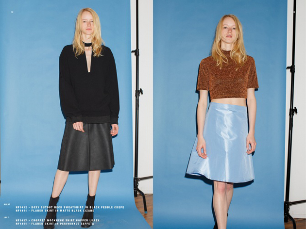
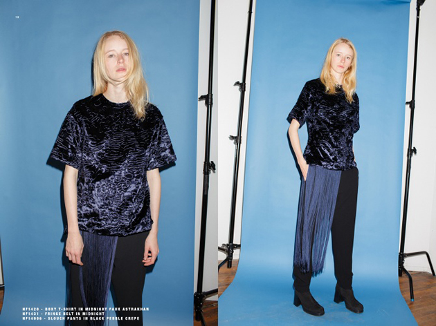
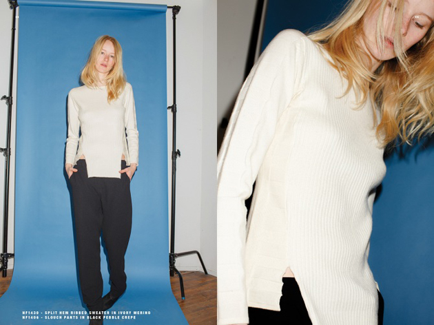
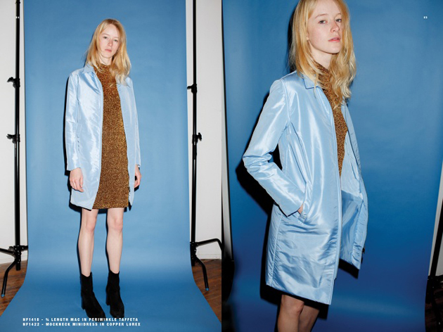
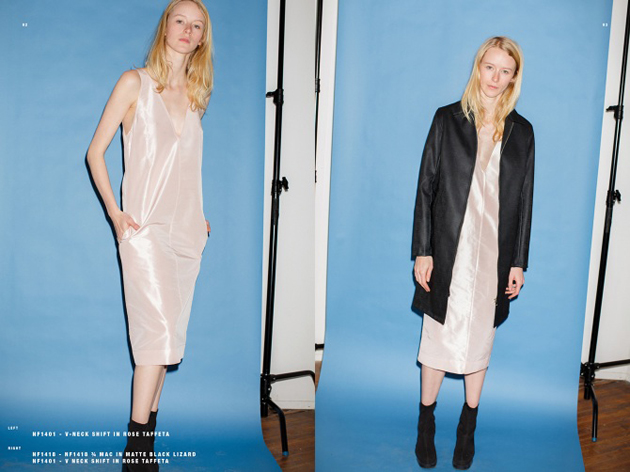
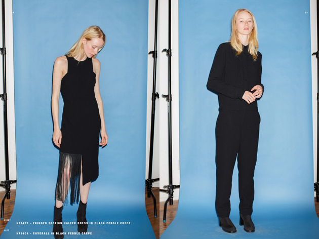
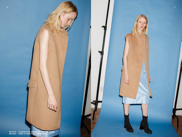
Origins and background story: NOMIA designer Yara Flinn has become one of the hottest appointments during the New York fashion week calendar, only a few years after she began showing there her collections. While still an art college student, Yara started experimenting with fashion in a very conceptual way – making handmade pieces and just messing around. In fact, during that time, she also staged a runway show which was more about a live video projection, than showing actual clothes, but she didn’t really pursue a career as fashion designer until she graduated and started working at the Fondazione Prada. She took the time to make a few pieces and bought some patterns she would later tinker with, discovering to be more of a process driven person. Her unique method came about by draping which helped her visualize what she wanted to make while, at the same time, revealing what she was putting together. That is how NOMIA came about, apparently by accident and pure chance.

Trademark: NOMIA pieces have a real sportswear flair and a minimal aesthetics. Therefore, it might not come as a surprise that one of Yara’s favourite designers is Helmut Lang – known for his concept of making utilitarian things, combining a fashion forward look with sportswear – a smart choice when you are designing for a New York kind of woman – a city where an effortless look is the best choice you can make.

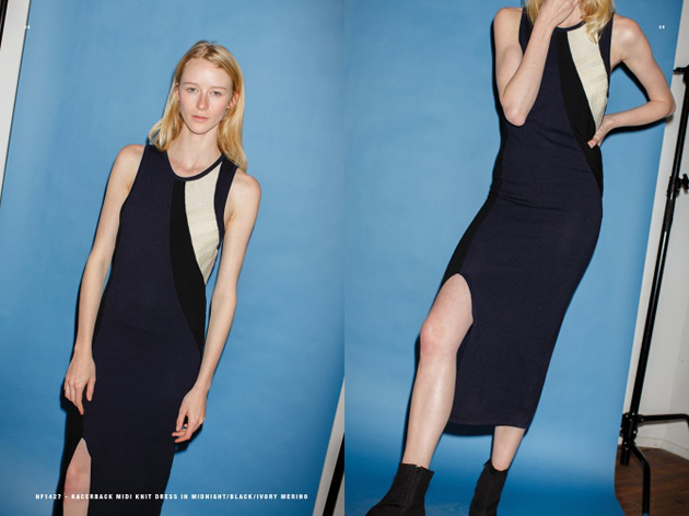
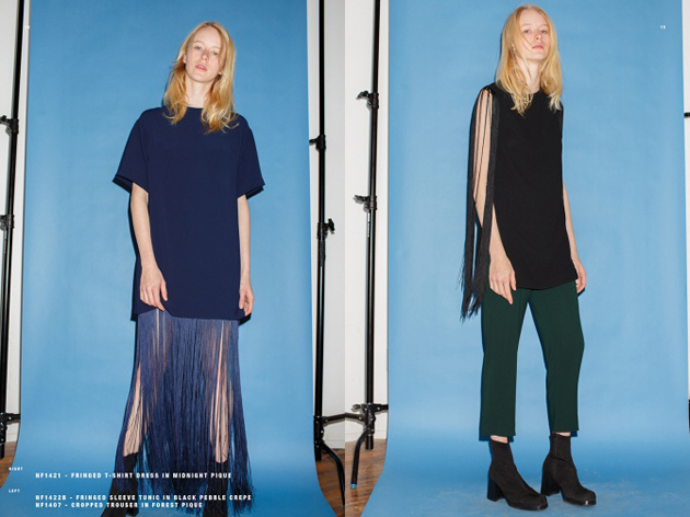
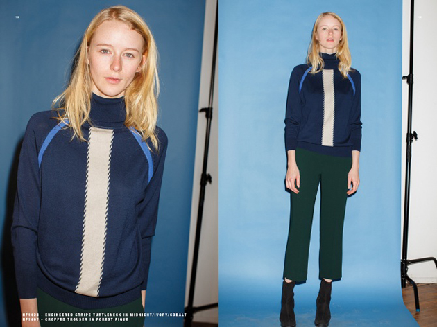
Collections: For this Fall 2014, Yara Flinn channeled her nostalgia in a modern way. She paired Lurex-flecked mock turtleneck dresses with clean parka coats that looked pretty in pastel-coloured taffeta, for example, and matched cropped sweaters with crepe maxi skirts boasting killer high slits. For this collection, the young designer has been more playful in terms of introducing colour and experimenting with special fabrics; she latched on to still-happening fringe, which accented several pieces including a boxy T-shirt dress and split-seam tunics. Other highlights included a bomber jacket that came in plush, Astrakhan-effect velvet, and patch-pocket jumpsuits that gave off a utilitarian vibe.

Chiara Tiso 
Share: Facebook,  Twitter  
28/05/2014

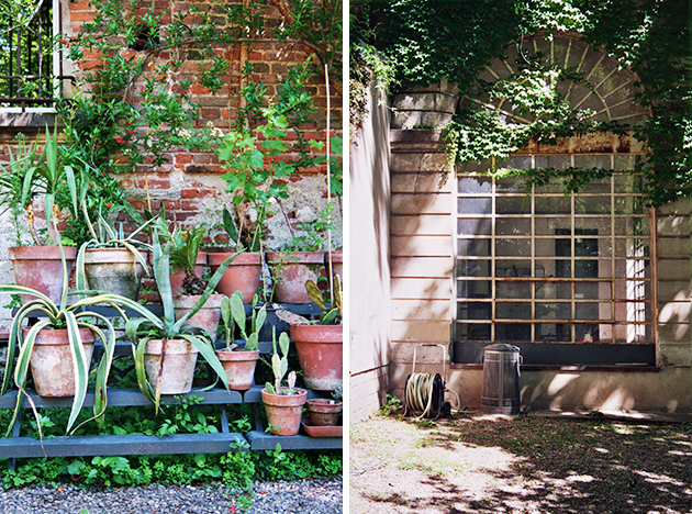
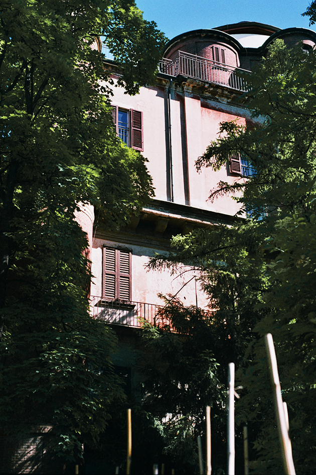
Visiting Milan: Brera Botanical Garden

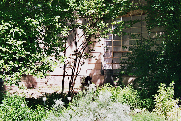
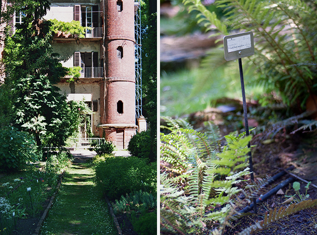
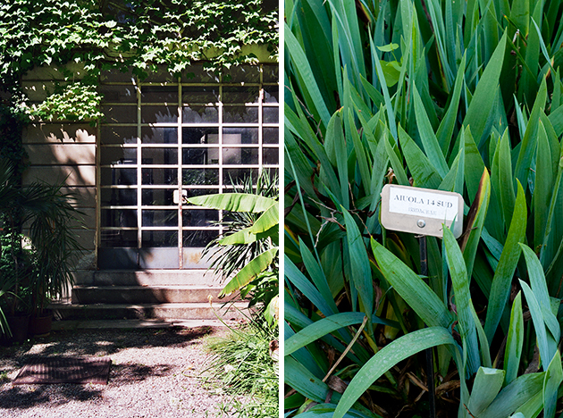
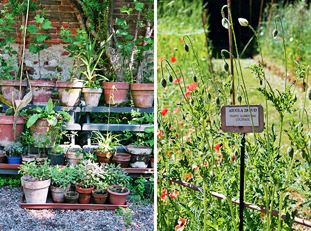
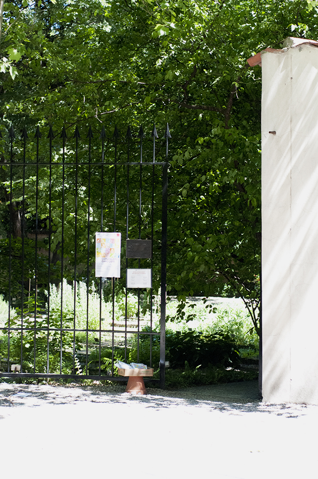
It is always nice to discover something hidden and unexpected in the middle of a big city. If you find yourself in Milan, it might be that just around the corner, there is an old little garden which has been there for a few centuries and preserves a rich variety of botanical heritage as well as many testimonies of the past. We paid a visit to this historical open air museum – the Brera Botanical Garden – part of a large cultural compound housed in the nearby Brera Palace which includes the Brera Art Gallery, the Astronomical Observatory, the “Braidense” Library and the Academy of Fine Arts.

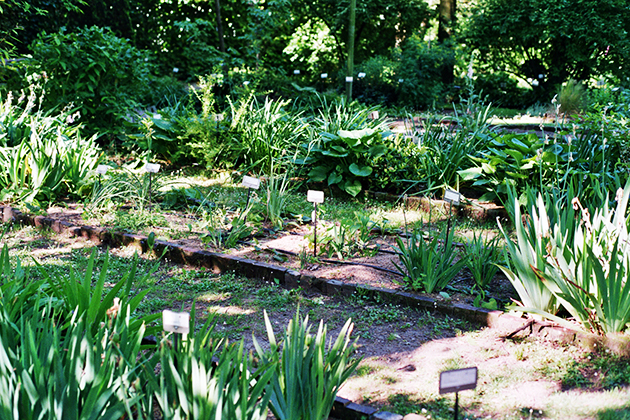
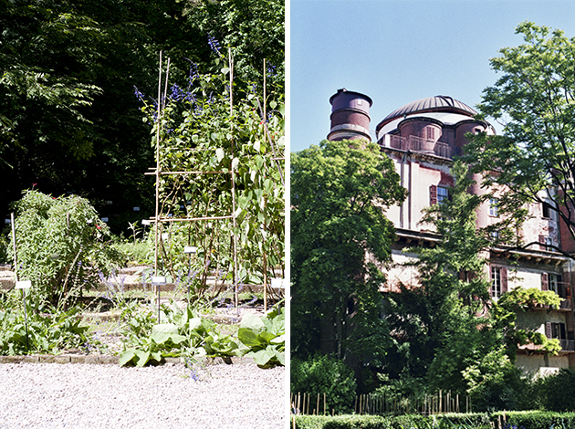
The garden is pretty small and we can trace its existence back to the Sixteenth century. The main purpose of the garden was to cultivate medicinal plants for pharmacy and medicine students at the nearby Brera university. Divided into flowerbeds with original bricks – today restored – you can browse among several hundred species of botanical heritage. In fact, walking through the garden, you may have the impression that it is pretty wild. In fact, the aim is to preserve quite a natural environment for many of the species, like wild herbs. It is also possible to follow different stages of greenery growth in a little vegetable garden as well as chill under the splendid ginkgo biloba tree-couple (yes, these trees are divided into a male and female plant, a rarity in the plant world).

Today the gardens also hosts cultural events like this year’s Salone del mobile, as well as school visits and guided tours for the wider public. It is open from monday to sunday and you can find it hidden behind ‘palazzos’ in Milan at via Brera 28.

Images and words Agota Lukyte 
Share: Facebook,  Twitter  
27/05/2014

When Fashion Meets Boardsports

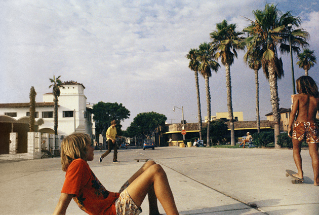
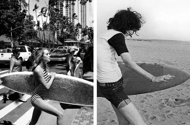
We have already talked about the tricky relationship between skateboards and the fashion world. What we did not yet mention is another, wider, link between boardsports and glamour. In order to frame this highly fascinating trend and uncover its secret language, ideas and origins, we need to travel back in time and start from the very beginning.

Yohji Yamamoto was the first designer who saw beyond clear distinctions between high-end fashion and sportswear and, back in 2000s, started an innovative collaboration with Adidas, breaking down the distance between one world and the other. More than ten years have passed since that first collaboration, a decade where the boundaries have become more and more misty: think about Stella McCartney x Adidas, Alexander McQueen x Puma along with many others.

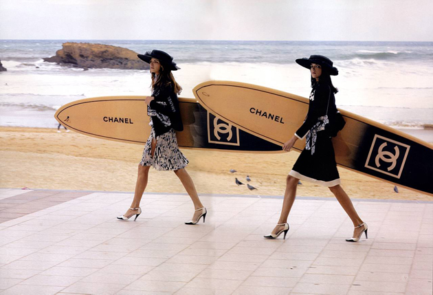
Even though the focus of the last fashion seasons is more on technical fabrics, there is quite a huge trend on boardsports, too. From big names like Marc Jacobs or Isabel Marant to name just a few, who created their own decks, to Missoni’s catwalk, where we saw male models walking in comfy and relaxed surfer looks, up to Chanel’s sport line composed, unexpectedly, of snowboards and ski attire.

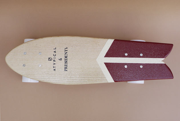
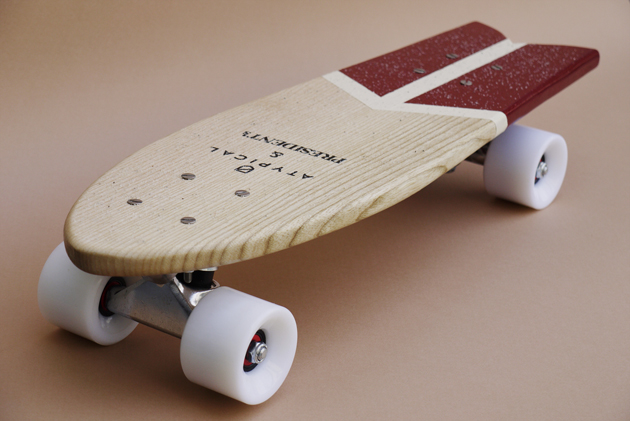
Often, the interpretation of sportswear is only a matter of coolness – fashion brands want to embrace the philosophy and the attitude of sporty people – the way they can be extremely cool without much thought. Other times, they share a very similar vision of the craftsmanship and the authenticity of their labels. This is the case of the last capsule collection created by President’s and Atypical. A high-quality Made in Italy clothing line united its forces with an emerging skateboard brand based on craftsmanship. The final result of their collaboration, aims at integrating a wider concept of quality into the end product, rather than simply mimicking or evoking a far away, distant world.

Francesca Crippa 
Share: Facebook,  Twitter  
27/05/2014

Thread Wrapping Architecture by Anton Alvarez

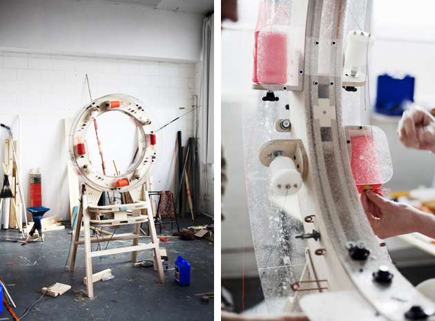
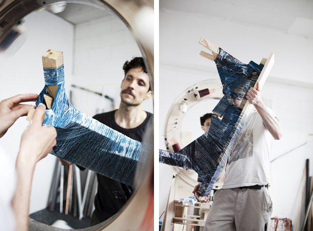
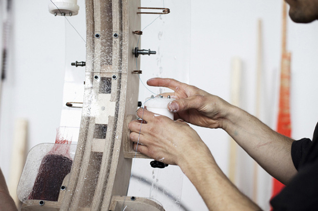
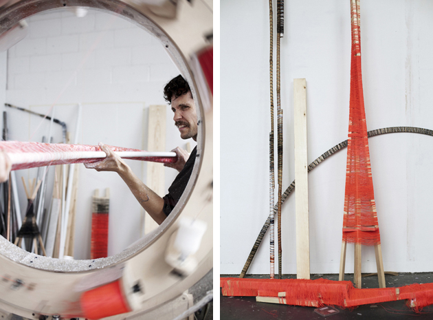
Two days ago an assemblage of strange structures, thread and machines has taken over Gustavsbergs Konsthall in Sweden. What might appear as an architectural playground, a weaving laboratory, a crafts workshop and a design research studio, is actually an exhibition by Anton Alvarez, a Swedish-Chilean architect and designer, known for his bizarre device – a spinning plywood Stargate – which he calls the Thread Wrapping Machine. Titled “Thread Wrapping Architecture”, Alvarez’s solo exhibition at Gustavsbergs Konsthall is based on a new version of his particular machine, able to produce objects and architectural elements on a monumental scale.

The aim of “Thread Wrapping Architecture” is to activate “new encounters between technology, craft skills, design, architecture and art”, questioning their mutual relationships, their influence on our everyday reality and their possibilities for future development. The particular structure of the machine also questions – what happens in the artistic investigatory process and how do alternations between a controlled order and pure chance influence the result.

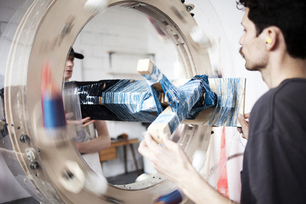
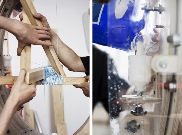
“Thread Wrapping Architecture” is the continuation of Alvarez’s Thread Wrapping Machine project initiated while still a student at the Royal College of Art in London. The Thread Wrapping Machine is a tool to join different types of material with only a glue-coated thread to bind the objects. No screws or nails are used to join the different components of the furniture. By using this construction method, materials such as wood, steel, or plastic can be joined to form objects and constructed spaces, offering both a new way of understanding the use of materials and technological possibilities as well as proposing an unorthodox design process.

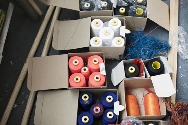
Alvarez describes the project: “The art of using the tool and of practicing the craft is still at an early stage and is in a state of constant development. By working with my invention I am constantly learning new ways of creating objects using the thread-wrapping technique. I can assemble wood, plastic and metal without using nails, screws or traditional methods of assembly. The object is held together by fine yarn which is covered with glue during the wrapping process. Repeated wrappings create strong, load-bearing joints at the same time that the item being created is covered with a decorative surface of differently coloured yarns.”

“Thread Wrapping Architecture” will be on show until September 14th 2014 at Gustavsbergs Konshall.

Rujana Rebernjak 
Share: Facebook,  Twitter  
26/05/2014

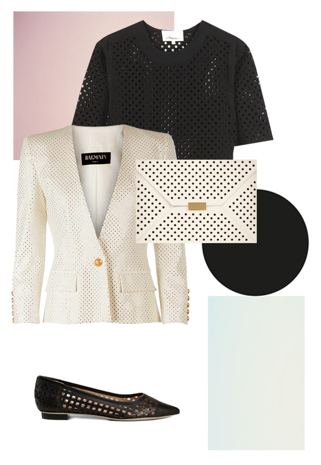
Style Suggestions: Perforated

Whether pierced, hole punched, or laser-cut, perforated clothing and accessories can be seen everywhere this season so here are some of our suggestions so you can perfect the perforated trend.

Clutch: Stella McCartney, Blouse: 3.1 Phillip Lim, Blazer: Balmain, Shoes: Reed Krakoff,

Styling by Vanessa Cocchiaro 

Share: Facebook,  Twitter  
26/05/2014

MIA – Milan Image Art Fair 2014

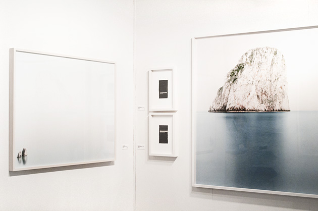
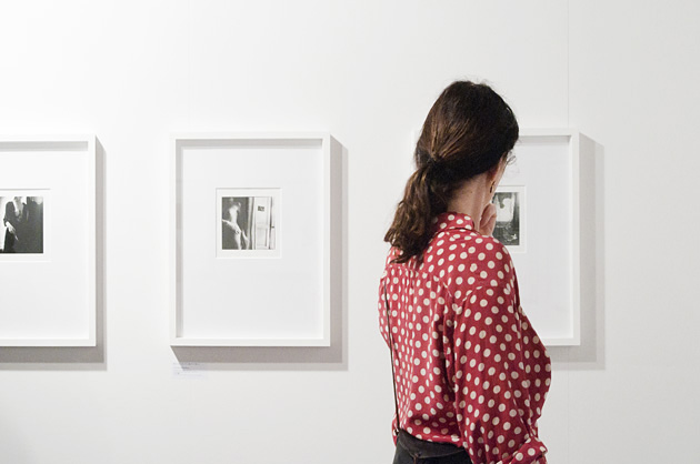
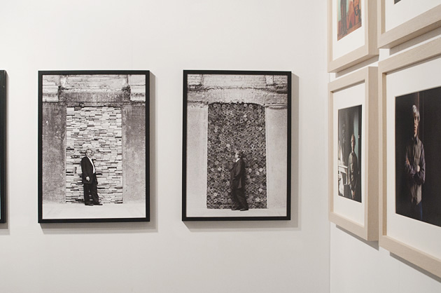
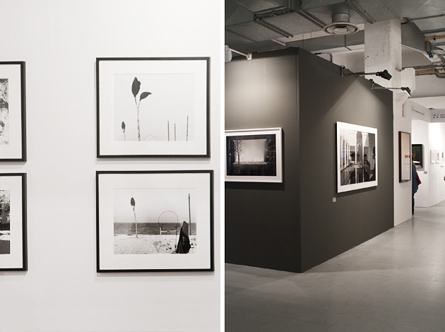
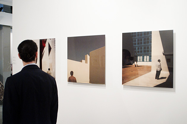
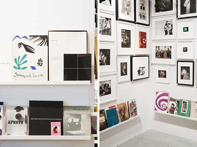
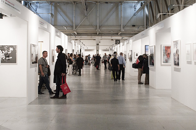
MIA – Milan Image Art Fair, the three-day Milanese event dedicated to photography, just closed its 4th edition with flying colors. The fair, which immediately made a name for itself thanks to the competence of its founder, Fabio Castelli, its scientific committee and its original formula: “one stand to each artist, to each artist its own catalogue” (this year the catalogue is in e-book format), once again reached a successful conclusion in our country and is ready to land for the first time in Singapore from 24th to 26th October 2014. But before leaving for Asia, let’s stock on this experience stressing its highs and lows.

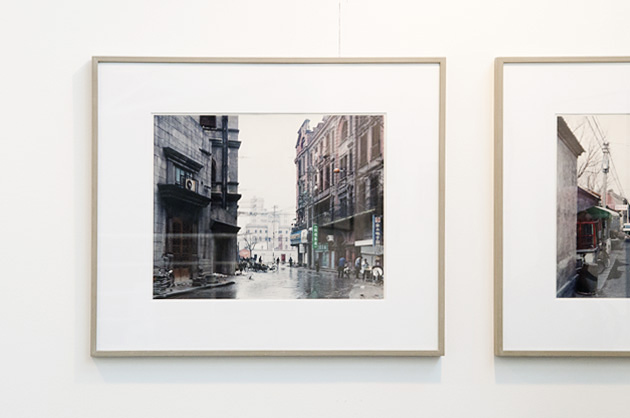
We pinpointed some stands among the 180 international exhibitors – galleries, independent photographers, printers and publishers – which really caught our attention, and also some weak points that left us a little bit disappointed. Walking the numerous corridors of Superstudio Più’s huge building, we could not avoid stopping at the space hosting “Tempo ritrovato – Fotografie da non perdere”, a special prize devoted to private, and most of the time unknown, historical archives. The award this year went to the gems of Tranquillo Casiraghi’s archive (Sesto San Giovanni, Milan, 1923-2005), depicting charming people and landscapes from the genuine northern province.

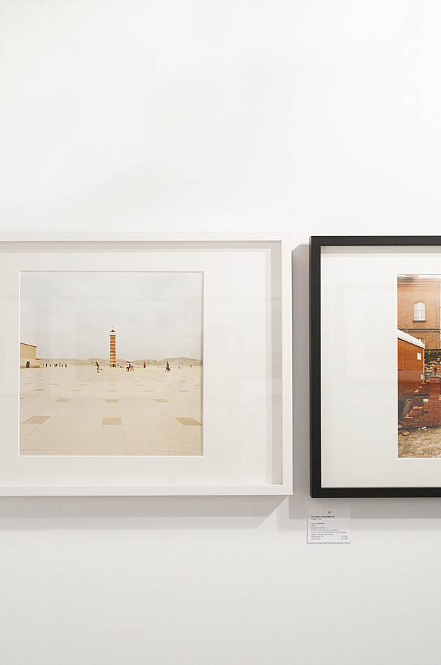
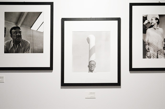
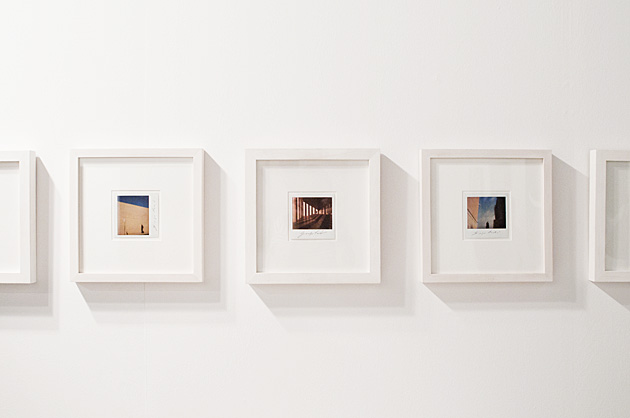
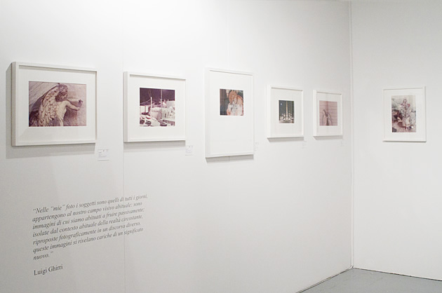
The shots by the master Luigi Ghirri on view at Photographica FineArt were, as usual, beautiful and full of poetry as well the ones by the incomparable Francesca Woodman at Galerie Clara Maria Sels and Mario Giacomelli with his stark contrasts and well rendered grain displayed by Artistocratic.

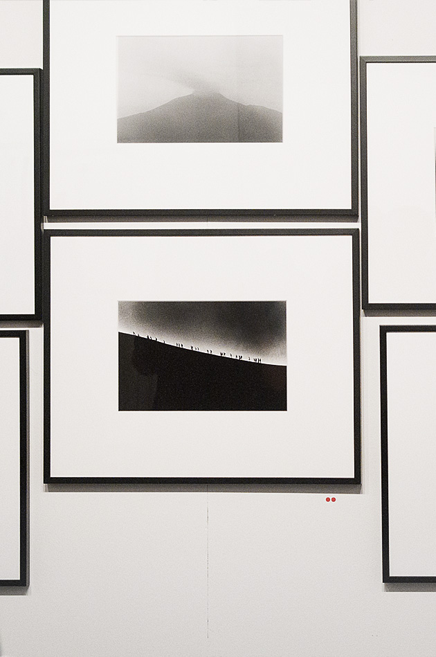
The photos by Charlotte Perriand at ADMIRA were undoubtedly striking, but putting aside the fascination for the past and getting back to the world of still living photographers we were captivated by the delicate colors and strong narrative power of the work by Giovanni Chiaramonte on view at Valeria Bella gallery and the mystery and hypnotism of Michele Zaza at Six Gallery. Podbielski Contemporary, mc2gallery and Galleria Continua deserve a special mention: the first one for its stunning pictures by Francesco Jodice, the second one for the project “Etna” by the young and talented photographer Renato D’Agostin and the third one for presenting the work of the outstanding Belgian visual artist Hans Op de Beeck, maybe the most international touch of the whole fair.

Closing the tour with the exhibition “Verso l’oriente” (with shots by Philip-Lorca diCorcia, Thomas Struth, Nobuyoshi Araki, Yamasuma Morimura, Naoya Hatakeyama, Daido Moriyama and Toshio Shibata) that winks at the upcoming edition in Singapore, we have one short consideration: MIA is certainly one the best proposals related to photography offered by the Italian art system, but to reach its full accomplishment, it would need to complete its domestic peculiarity with a more significant international impulse. Let’s wait for the next edition.

Monica Lombardi – Images courtesy of Agota Lukyte 
Share: Facebook,  Twitter  
23/05/2014

Polish Design, a Model to Refresh European Identity

In the days when Europe is called to rethink its identity through the vote for the European Parliament, we wonder if design could be able to suggest positive models for a new virtuous cycle. Indeed, isn’t design a metalanguage that has always strived for a totalizing influence? And in the midst of the crisis that Europe seems to experience, is it able to engage the users with inspiring attitudes?

The old continent is at the crossroad of multiple legacies. If we were to discard the most authoritative design tradition becoming too international and anonymous (Italy), a leading but trendy language (Dutch), a trustworthy manufacturing tradition that’s not properly heart-warming (Germany), nevertheless, a significant benchmark could be found in a minor player that has recently demonstrated a great potential and renewed energy. That’s how Polish design is seen nowadays: a great source of new talents; a festival, the Lodz’s one, that succeeded to impose itself in the dense calendar of design weeks; and an industry which is ready to respond to the needs of one of the first European gross national products in terms of growth.

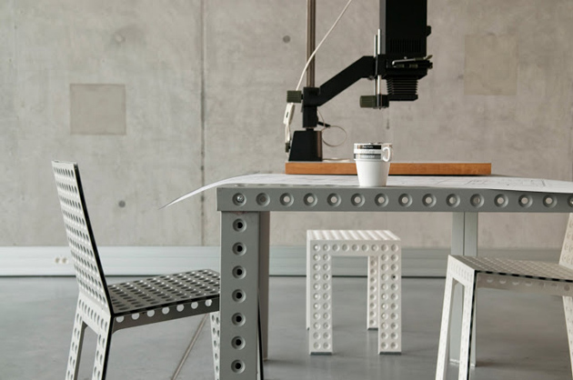
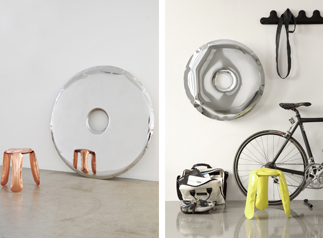
How did this notoriety begin? Oskar Zieta, leading designer, contributed indisputably to attract the spotlights to Poland. His great ability combines the capacity to develop a technical innovation and translate it into a significant transformation of forms and affordances. Zieta’s masterpiece Plopp Stool, a true icon of the ’00 history of design, is the result of a patented technology that inflates a 2d metal sheet into a 3d volume.

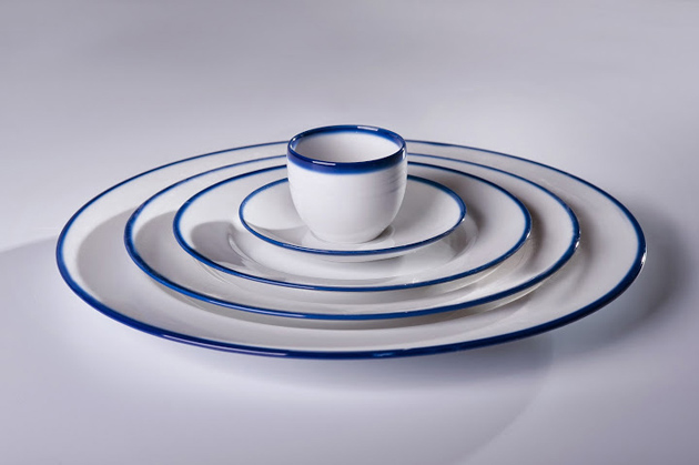
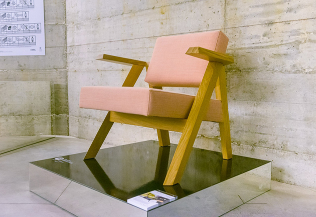
Beyond the influence of its most renowned designers, the contemporary Polish design system has shown the capacity to build a network of competitive players, but also to update its cultural heritage with vitality and genuineness, rather than wallow in nostalgia-oriented stereotypes. The “Polish Job” exhibition, on show at the latest Salone del Mobile of Milan, brilliantly highlighted this approach: the show offered three keys of interpretation – locality, nostalgia, innovation – that could be interconnected and juxtaposed on one single project, demonstrating the ability to go beyond a simple re-release and transforming local dimension into an appealing and original offer. A look at the future, that of “Polish Job”, whose value goes beyond the boundaries of design, able to instil optimism, and inspire a new rejuvenation.

Giulia Zappa 
Share: Facebook,  Twitter