According to statistics and editorials, growing participation and increasing optimism are the two cornerstones of the last Salone del Mobile. This rosy vision encounters, nevertheless, a few cynical but grounded critics: the products on stage at the fair and the Fuorisalone’s events are more and more marketing and communication oriented, and thus design risks to lose its major role as technological evangelist and social innovator.
However, it was still possible to find here and there among Milanese design districts, a reserve full of insights and unbiased calling, browsing in what could be easily perceived as a parallel world: that of universities’ showcases. Voted by definition to research and open-mindedness, the best international design institutes have offered fresh points of view in rethinking functions, materials and needs according to a true social perspective.
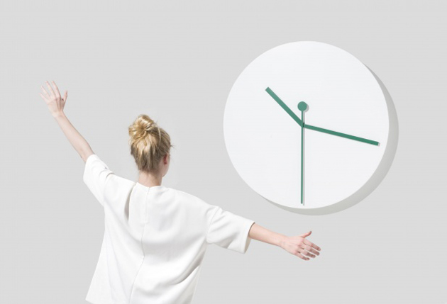
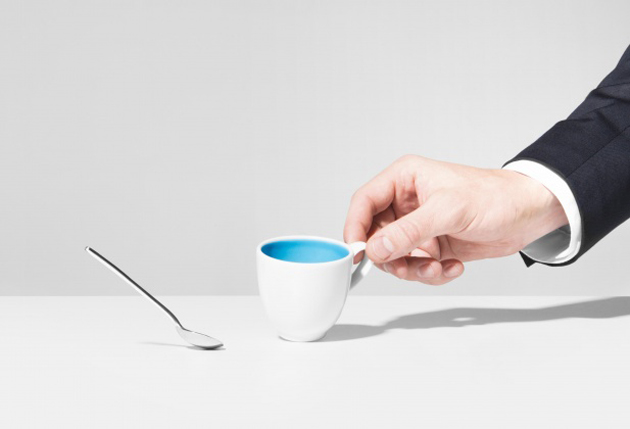
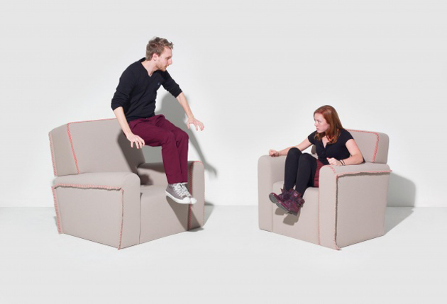
“Delirious Home”, an exhibition promoted by ÉCAL in the Brera Design District, has chosen to take on the issue of smart home and develop it through weapons of irony and grotesque. The results of this investigation are very funny indeed: a spoon follows slavishly the change of position of its small cup, twin armchairs replicate what’s happening to the other one, clock hands respond to the arms movements of those who stand in front to watch the hour. The projects succeed to make us think: at this stage of technology development, the functionalities that interactive furniture should fulfil are still unclear, and thus, being able to identify a wide range of opportunities, even through a sarcastic approach, is very important.
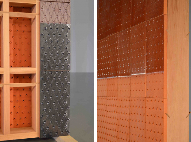
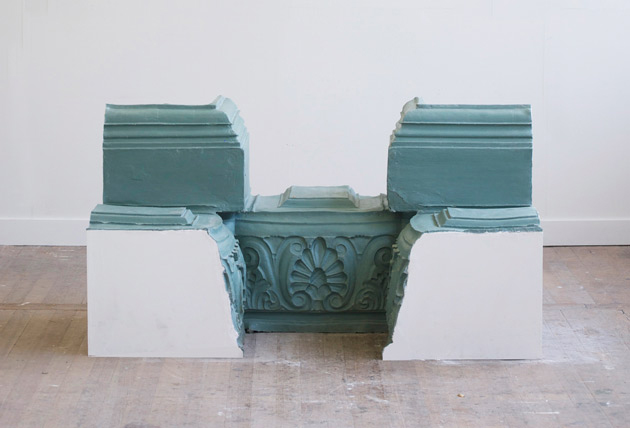
At Ventura Lambrate, the competition among many school showcases is pretty tough. Design Academy Eindhoven has been the leader in the field since a decade: its method, based on a “design in context” approach, is declined this year along the perspective of “Self Unself”, the unselfish vision of design that arises from students’ self-initiated projects. Smart intuitions are not rare, as in the case of “The Importance of the Obvious” by Matthias Borowski investigating materials as false friends, terracotta aired walls and their nice finishings (“Cool Shelter” by Franciska Meijers), or a web platform that transforms information overloading into an artwork (“News from Eternity” by Ward Goes). Nevertheless, when compared to the previous editions this one fails to engage the visitor: the works are less cohesive, and their inspiration is often too close to a pretext than a significant intuition.
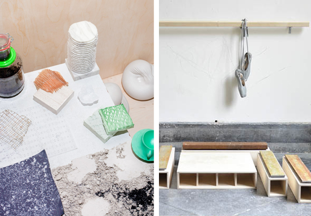
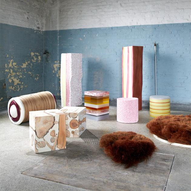
A different approach is that of the Royal Academy of Art – The Hague and its speculative proposal, hanging in between an in-depth analysis and performance. Design, clearly seen as an innovative force, focuses on materials and their new applications: we are not in a R&D of a chemical corporation and thus the profile is necessarily low-tech, but the projects on show – like “Coexist” by Nynke Koster – identify a new aesthetics for the informal living, and the performative way students keep on consuming material surfaces – as in the Morphlab Growth by Morphlab – surpasses a mere communication activity. In the end, it is thanks to fantasy that design is able to open new scenarios: the idea of investigating what would happen if men shrunk to 50 cm is unlikely, but we shouldn’t underplay its imaginative power.
