30/04/2014

Workwear: From Factories To Catwalks

You’ve probably heard it a thousand times, but you’ll unlikely find a more truthful statement than the one stating that fashion always looks back to move forward. Undoubtedly, this is also the case of workwear, a specific type of clothing originally created for the industry – building sites, factories, highways and production lines – and lately picked-up by the fashion world.

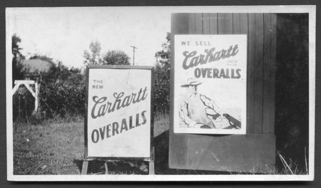
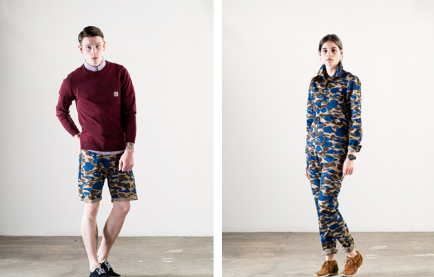
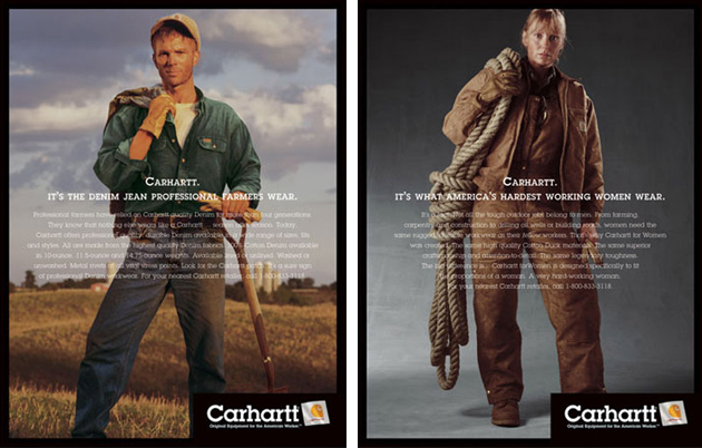
Looking at the work apparel, one can find numerous examples of excellent brands that were originally developed for working sites and eventually evolved into high-street brands, one of which is certainly Carhartt. Smart enough to keep producing their original manufacturing line of clothes for workers, Carhartt has also been creating a second line of fashionable street wear clothes for hip-young people, Carhartt WIP.

But while workwear is part of Carhartt’s heritage, what has made other high fashion brand connect to this type of production? As often happens, subcultures like skaters, surfers and sport-minded, fashion-oriented groups, needed something cool and comfortable enough to wear. Through the years, these trends were brought from street to catwalk, making these simple garments become the ultimate fashionable pieces.

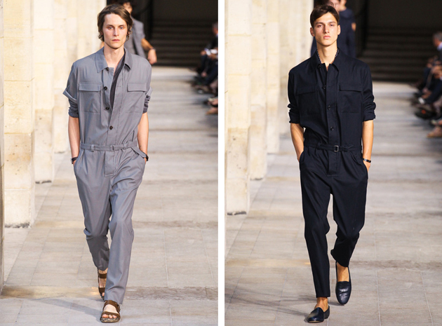
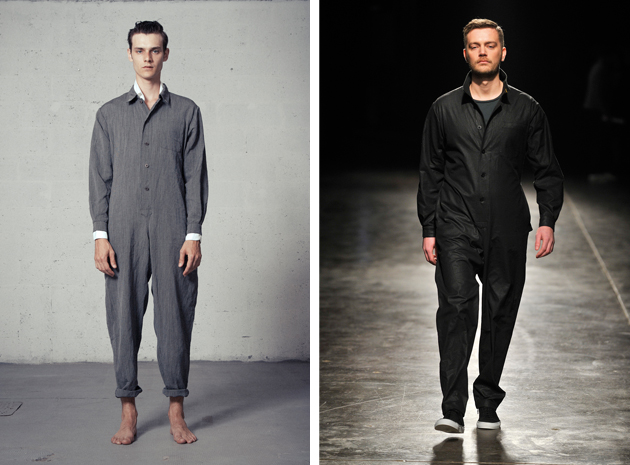
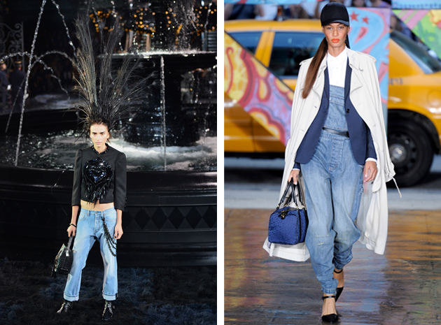
On the catwalk we have seen many adaptations of the trend: the upcoming Italian designer Fabio Quaranta, for example, made the unisex jumpsuit his statement piece, while the elite brand Hermès opted for something similar during its last show in Paris. An increasing interest has been manifested in womenswear, too. While DKNY’s adaptation of workwear may not come as a surprise, that of the historical maison Louis Vuitton is certainly a bold and groundbreaking statement. For his very last collection, Marc Jacobs has, in fact, created comfy turned-up jeans paired with black boots. While in the past workwear might not have been considered a stylish-enough attire, in 2014 people definitely consider it a synonym of durability, quality and craftsmanship.

Francesca Crippa 
Share: Facebook,  Twitter  
29/04/2014

Dalston Anatomy by Lorenzo Vitturi

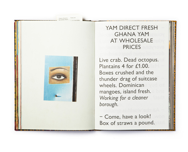
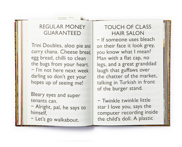
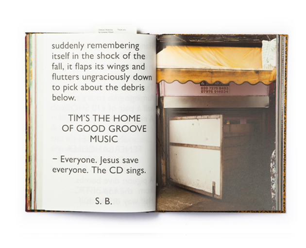
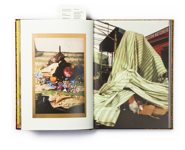
Lorenzo Vitturi is passionate about food. Wherever in the world you may find yourself, he could possibly tell you where to grab that perfect bite. Strangely enough, he doesn’t appear to be as passionate about cooking. His aversion towards cooking wouldn’t be nearly as odd if he hadn’t spent the last couple of years obsessing over a local market. And yet, Lorenzo didn’t visit the Ridley Road Market in Dalston, London, for its rich selection of fresh produce. Rather, the market and its clutter served as the subject and backdrop of his photographic research.

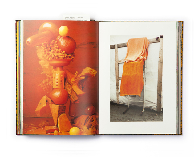
Lorenzo Vitturi is, in fact, a photographer. Born and raised in the picturesque Venice, he studied photography at IED in Rome and Fabrica in Treviso, developing his particular language based on highly constructed and manipulated environments. In the couple of years he worked in advertising, Lorenzo developed some of the most clever campaigns, among which my personal favourite remains the one shot for Freddy. Lorenzo remarks: “Even if I consider myself a photographer – someone who writes with light – in my own practice I take on a much more holistic approach. Playing with the combination of illusion and reality, mixing together different disciplines – photography, sculpture, painting and collage – I build temporary sets made of all kind of materials. The central subject of my research is the ephemeral and transient nature of life, captured through the transformation and decay of objects.”

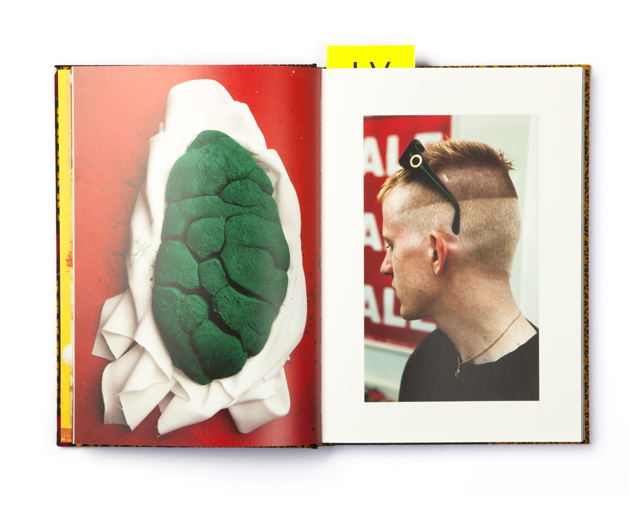
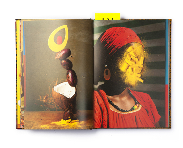
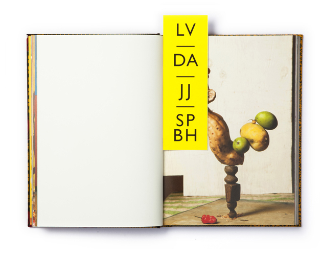
Taking a break from the restrictions of the corporate world, Lorenzo retreated himself to his London studio where, for almost a year, he built sculptures, collages, and strange, bulky compositions from debris collected at Dalston market. The result is “Dalston Anatomy”, a self-published book, designed by his friends Tankboys and each bound with a unique piece of fabric found at the market. Cited as one of the top-ten photography books in 2013 by everyone from Martin Parr to Dazed and Confused, from The Guardian to The New York Times, “Dalston Anatomy” is a photographic analysis of the clutter – colours, sounds, odours, languages, forms and cultures – found at the market. Mixing his three-dimensional compositions with photographs taken at the market and collages of found objects and images, Lorenzo has built a visual vocabulary based on elements of local culture, bits of everyday life and poetics of decay.

To crown an already successful year, “Dalston Anatomy” has recently been awarded the Grand Prix of the Jury at the prestigious Hyères Photography and Fashion Festival. The exhibition showcasing his work, together with other 9 talented young photographers, will be on show until the 25th of May 2014.

Rujana Rebernjak – Images courtesy of Tankboys 
Share: Facebook,  Twitter  
28/04/2014

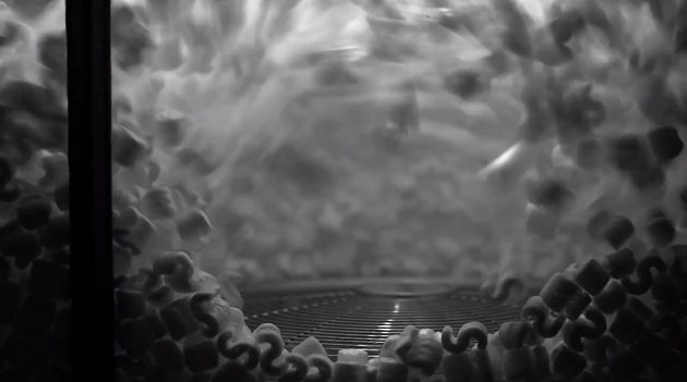
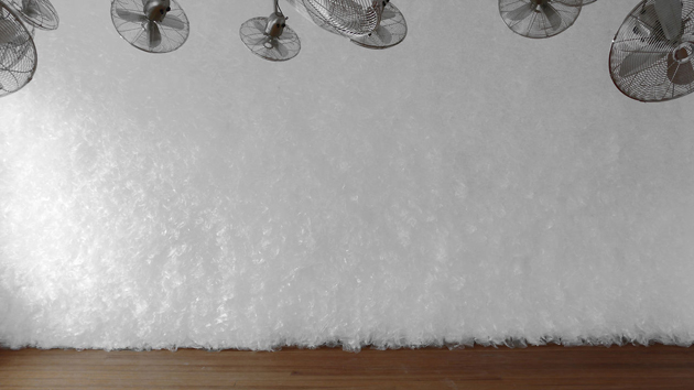
Zimoun | 36 ventilators, 4.7 m3 packing chips

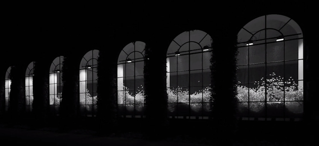
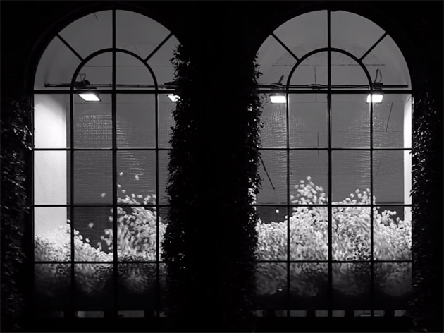
Last weekend we went to Lugano (CH) to see the latest work by the talented Zimoun (b. 1977, Bern, Switzerland), hosted by the Limonaia of Villa Saroli and curated by Guido Comis and Cristina Sonderegger, which closes the series of exhibitions initiated in 2011 by Museo d’Arte Lugano devoted to emerging artists.

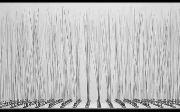
In this occasion the young Swiss artist, one of the most brilliant of his generation, created a site-specific sound installation using five cube meters of packing chips trapped into a wire mesh placed in front of each window of the building and constantly shaken up by 36 ventilators operated by a controlling system. The result is a mesmerizing shower of small, snow-white “s” made of Styrofoam that spellbinds the viewer.

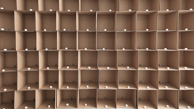
The work of Zimoun is based on simple electronic devices, generating repetitive movements, modular elements and sounds that interact with different environments changing the viewers’ perception of the space.His essential installations turn closed rooms into natural atmospheres where people can be pleasantly surprised by feeling the breeze, the water gurgling, the animals’ calls or the frenzy of crawling beehives or anthills.

«Using simple and functional components, Zimoun builds architecturally-minded platforms of sound. Exploring mechanical rhythm and flow in prepared systems, his installations incorporate commonplace industrial objects. In an obsessive display of simple and functional materials, these works articulate a tension between the orderly patterns of Modernism and the chaotic forces of life. Carrying an emotional depth, the acoustic hum of natural phenomena in Zimoun’s minimalist constructions effortlessly reverberates.» 

The exhibition runs through 11th July 2014.

Monica Lombardi 
Share: Facebook,  Twitter  
24/04/2014

From Salone to Expo: A Green Mimesis

Is there something more artificial than a booth set up? We hardly imagine that these temporary architectures, a fortunate result at the crossroad of contingency and marketing, could be perceived otherwise than the capsizing of a natural, primordial status. Thus, the impulse to integrate green simulacrums into trade shows, with the aim to fulfil, at least at a symbolic level, our desire for a more sustainable environment, is both unlikely and surprising.

The latest edition of Salone del Mobile offered many examples of this trend. Elica, worldwide leader in the production of kitchen hoods, commissioned to architectural studio stARTT the design of an innovative outfitting at the Rho Fair. Their design is a hybrid platform, where trees space out these hyper-technological intake devices and thus induce an implicit, reassuring effect. On the other hand, both the office furniture brand Tecno and Kinnarps have recurred to vegetation in their catalogues proposing an inedited hortus conclusus where furniture is surrounded by “spontaneous” vegetation.

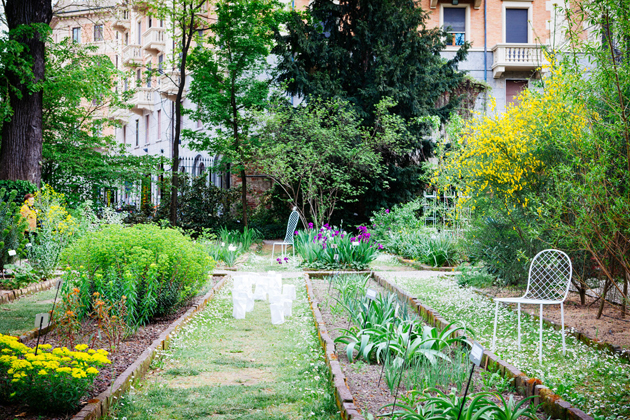
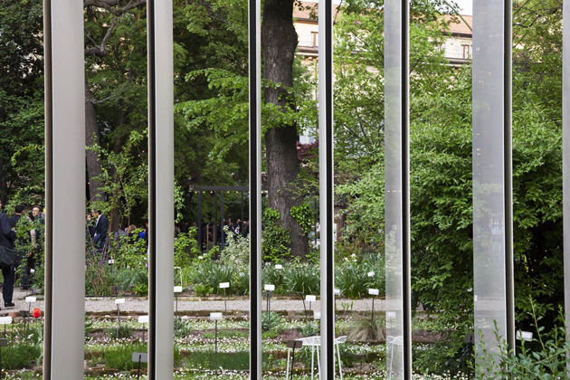
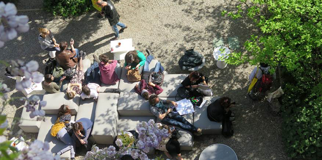
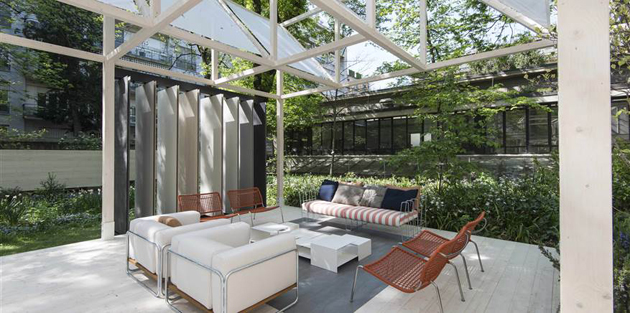
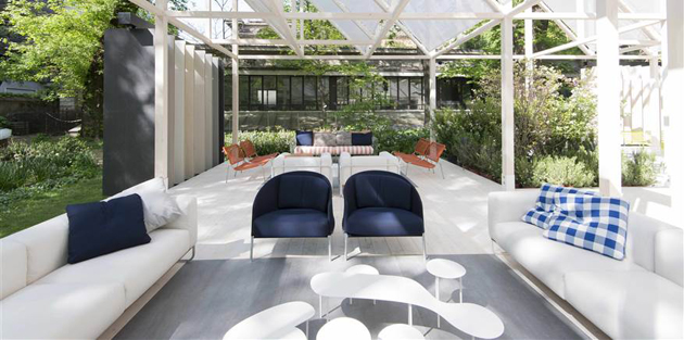
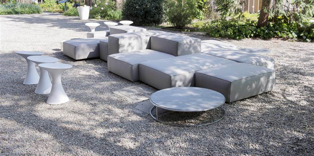
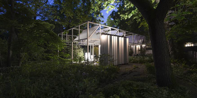
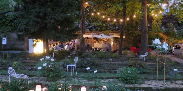
Nevertheless, the “Giardino Geometrico” presented by Laminam and Living Divani in Brera’s botanical garden is by far the apotheosis of this green revenge. Surrounded by buildings and walls and thus protected by indiscreet looks, the garden offers to the unaware visitor a true epiphany: outdoor furniture and ceramic coverings are just an excuse, at most a facilitator to favour new points of view in enjoying the space. Therefore, the undisputed protagonist is the garden itself and its precious balance between natural state and human intervention in the selection and care of plants.

This scenario cannot but anticipate, by analogy, what the 2015 Expo in Milan forecasts to satisfy. What are its future visitors really wishing to get back to? If the Salone is a reliable indicator, the Expo is expected not only to give answers on the issues of food production, but also to offer an erratic contemplation in new green spaces: more precisely, a green mimesis into innovative living solutions.

Giulia Zappa – Images courtesy of Living Divani 
Share: Facebook,  Twitter  
23/04/2014

Through the Lens of Clara Bahlsen

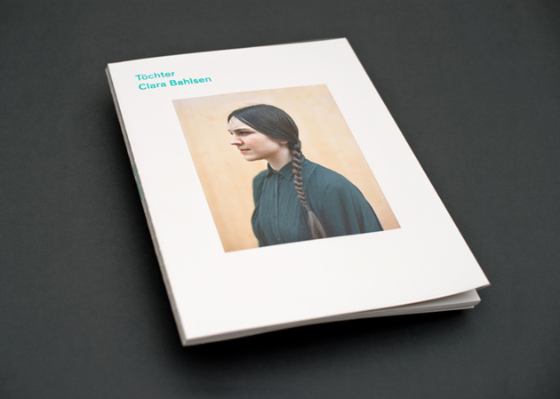
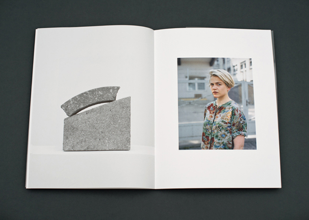
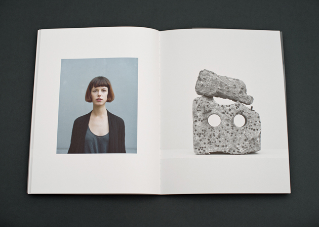
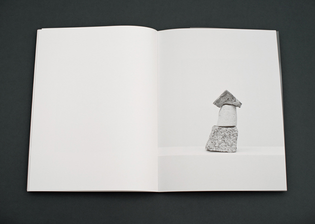
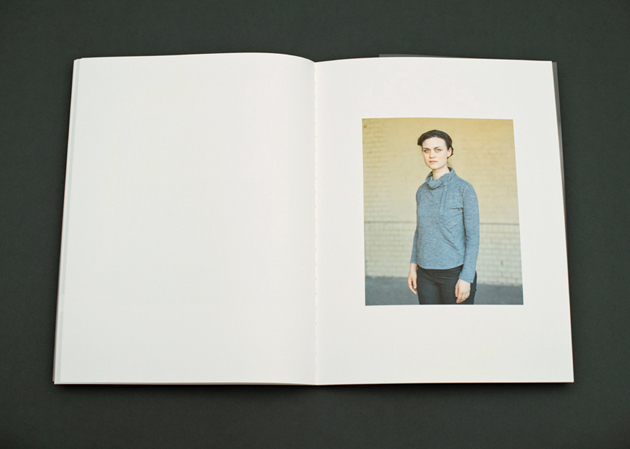
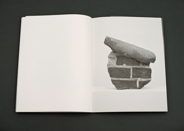
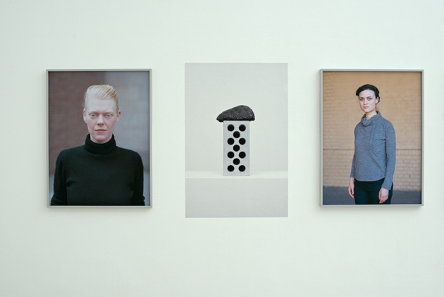
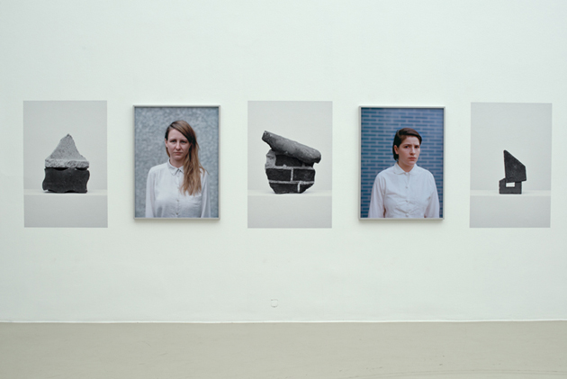
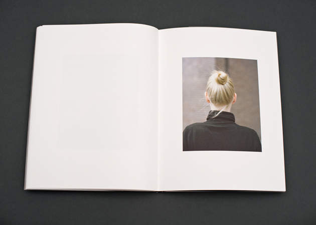
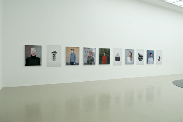
Clara Bahlsen is a Berlin-based photographer. After studying visual communication at University of Arts in Berlin, she undertook a postgraduate course at Ostkreuz School for Photography. Combining photography and design practices she often produces books: “I like the book as a medium of photography because of its fixed format. It is interesting when one has certain rules and guidelines to which you have to obey.” One of her recent book projects is “Töchter” (Daughters), which deals with the question of origins and family, and their individual significance for biography and identity. The work is underpinned by the correspondence between constructed ‘house’ sculptures and the portraits of young women, revealing personal and intimate interior worlds. “Daughters” was exhibited at Kunstverein Hannover in 2013 an won the 10th annual Aenne Biermann Preis.

Clara Bahlsen 
Share: Facebook,  Twitter  
22/04/2014

Ray Eames: In the Spotlight

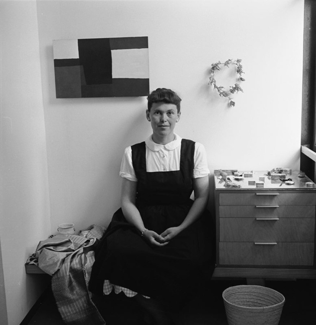
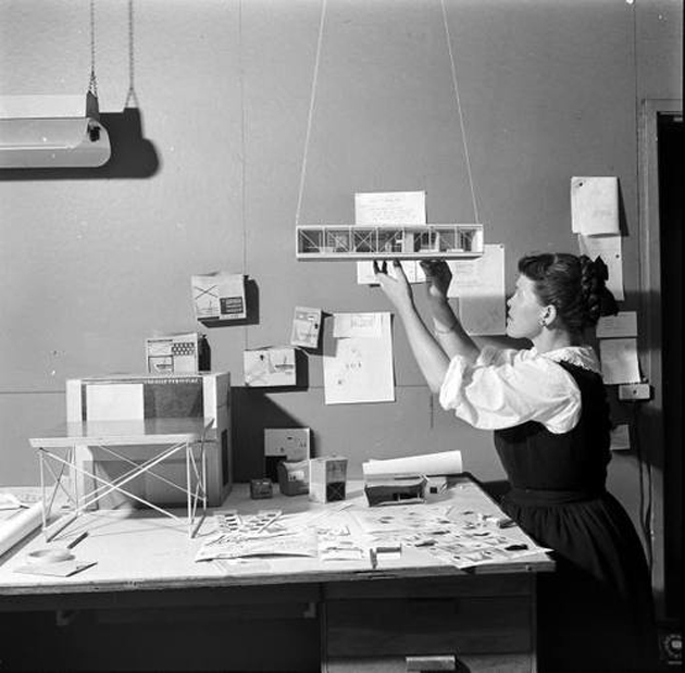
The charm of Charles and Ray Eames, the design power-couple, appears to reside as much in their undeniable wit, intelligence and research, as in the fact that their work and life seemed to co-exist in a particularly seamless flow. Thus, even though the title of a new exhibition at Alyce de Roulet Williamson Gallery seems to suggest otherwise, Ray is inextricable from Charles, as Charles is from Ray.

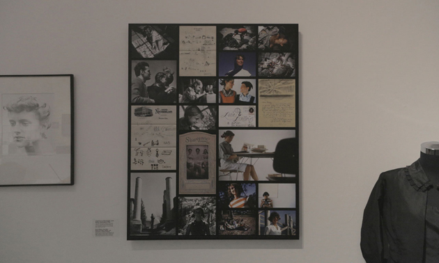
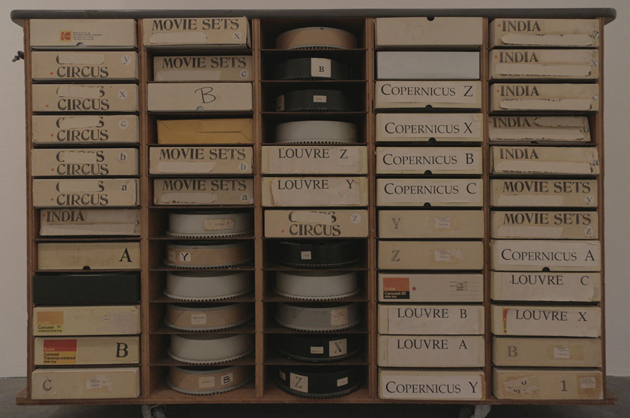
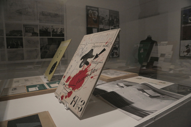
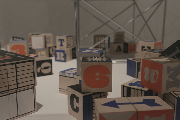
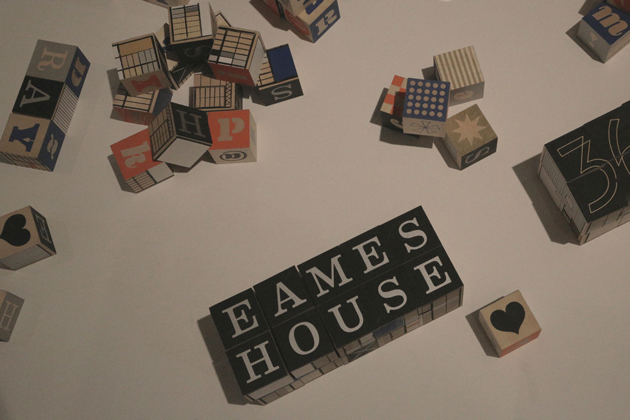
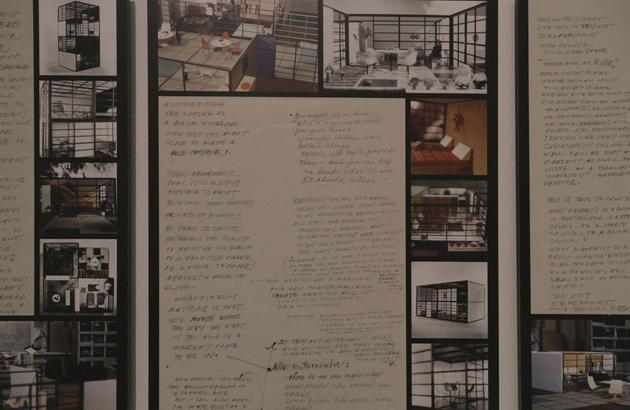
The exhibition dedicated to Ray Eames, titled “In the Spotlight”, is as much an ode to Ray and her incredible creativity as it is an ode to her deep relationship with Charles: a celebration of an artistic union which brought to life some of the most classic and magic pieces of modern furniture. With apparent focus on Ray, the exhibition displays some of the most recognizable Eames’ projects – from their plywood furniture to wall hangers, from their playing cards to their movies – together with sketches, books, drawings and photographs, revealing how Ray’s delicate hand and sensibility complemented Charles’ possibly more ‘technical’ approach.

Other than showcasing the richness of their design production, this exhibition, in fact, traces their personal relationship through a series of letters, photos, personal artefacts, typically hidden in secret drawers, away from the public eye. Displaying this secret treasure appears to be a way of revealing a more human picture of the Eames’ and demonstrating “how that humanness bled into comfortable, optimistic, functional, still-relevant design” that we come to adore.

Ray Eames: In the Spotlight will run until the 4th of May 2014 at Alyce de Roulet Williamson Gallery, 
Art Center College of Design, Pasadena.

Rujana Rebernjak 
Share: Facebook,  Twitter  
21/04/2014

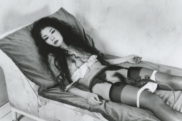
Araki Teller Teller Araki

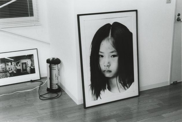
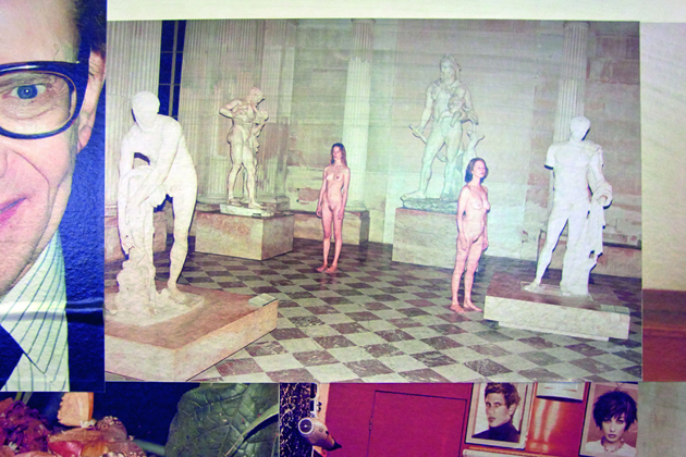
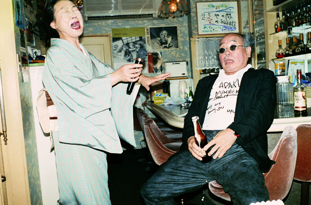
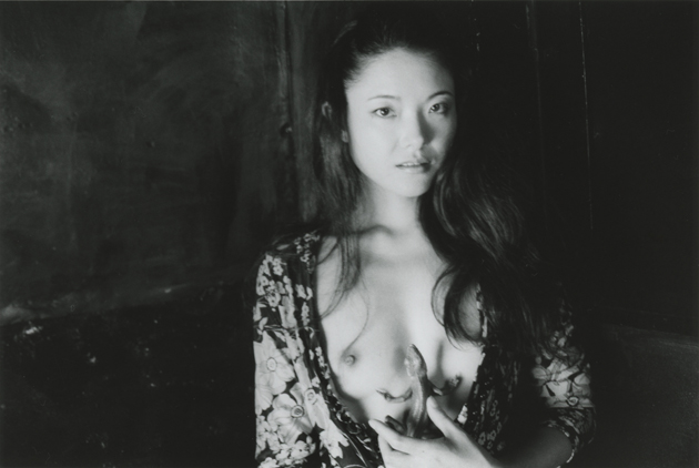
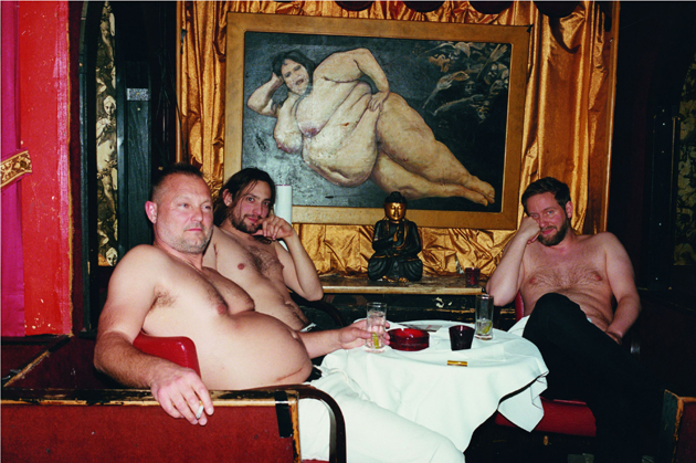
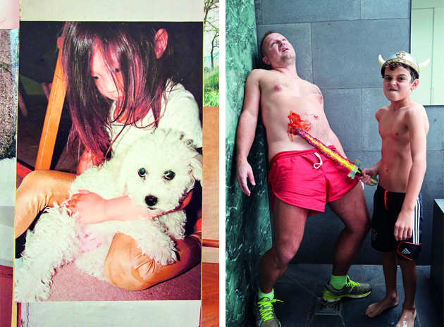
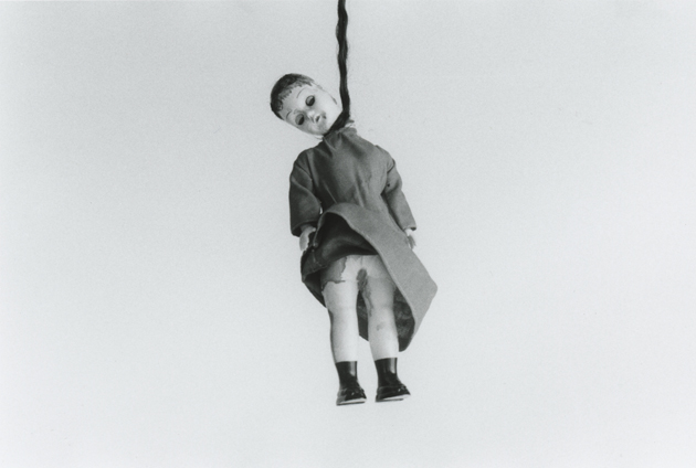
“Araki Teller Teller Araki” is the explicit title of a current exhibition held at OstLicht Gallery, bringing together two of the greatest contemporary photographers: Nobuyoshi Araki (b. 1940, Tokyo, Japan) and Juergen Teller (b. 1964, Erlangen, Germany). Curated by Gerald Matt in cooperation with Hisako Motoo (eyesencia) and Juergen Teller himself, the exhibition features a series of works specifically conceived for this initiative.

The provocative Japanese artist, one of the most prolific of our times, well-known for his portraits, shots of nude women, bondage and still life flower photographs, all characterized by a perturbing and sensual attitude, displays here his project Last by Leica, a visual and intimate diary that continues the previous series Life by Leica and Love by Leica. A controversial and radical approach distinguishes Teller’s research too, who opens the door of his private life through flash images, where colors are overexposed and subjects, spanning from fashion system players to loved ones, are depicted with a personal and instinctive touch that makes his work instantly recognizable.

This exhibition juxtaposes two unrivalled artists, highlighting their mastery of composition, color and tone, sometimes pale and washed-out, other times bright and stunning. Appealing to the explicitness of subject matter and using photographic effects bent to their will, both photographers, each in his own style, create pictures of an extraordinary intensity, which are both genuine and poetic, and, at the same time, brutal and straightforward.

“Araki Teller Teller Araki” is accompanied by an artists’ book, realized and designed jointly by Araki and Teller, which collects 300 photographs (some of them unpublished) and a double text that the artists dedicated to each other. The exhibition will run through 25th May 2014.

Monica Lombardi 
Share: Facebook,  Twitter  
20/04/2014

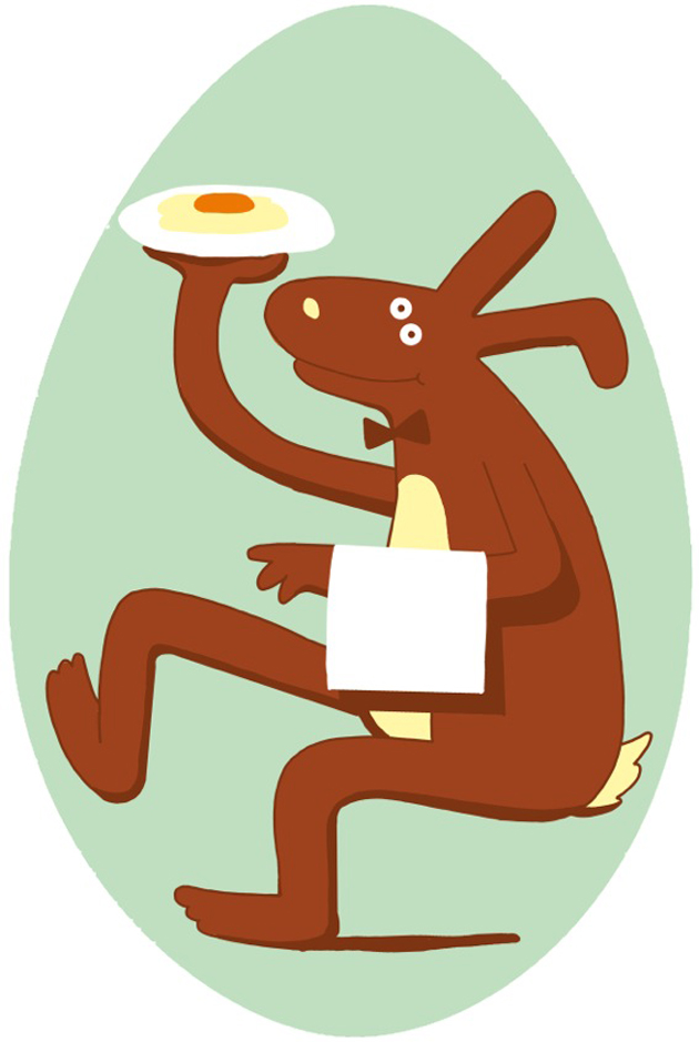
Happy Easter from The Blogazine!

Illustration by Elena Xausa 
Share: Facebook,  Twitter  
18/04/2014

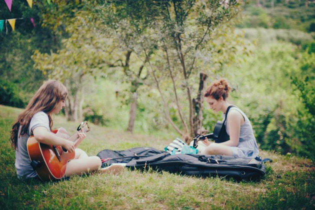
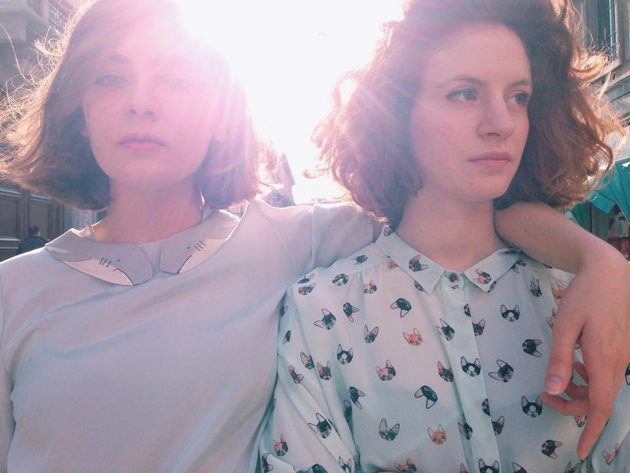
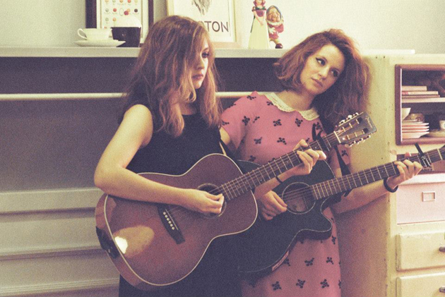
Upcoming Artists | The Lovecats

Cecilia and Adele form The Lovecats: how did you two meet and how did you start working together as a duo?
We’ve met by chance in November 2010, and we’ve immediately clicked music-wise. In fact, that same night, we went to a rehearsal room and started playing together and a few days later we’d already decided we should start playing together. The idea behind The Lovecats was born in a 40km radius separating Legnago and Verona, and now lives in 40 square meters in Milan.

Listening to your music and looking at your appearance and visual flair as a female duo, other similar artists soon come to mind – My Bubba, Pascal Pinon, First Aid Kit (it may even seem to obvious) – do you feel a connection with them or do your influences come from a different sphere?
Yes, we are often compared to those artists, and we feel it’s quite normal to sort of compare female duos. Nevertheless, we don’t only listen to Bob Dylan, Joan Baez or Nick Drake, or other folk-ish artists; rather, we are influenced by punk, hardcore, new wave, emo, shoegaze and many more.

How do you write your songs? Is there a process, a recipe, you follow or is it spontaneous?
Our songs are all written quite spontaneously, since they are tied to specific life experiences and emerge directly from those experiences.
The issue of playing in English rather than Italian, is a long and debated one: why have you decided to play in English?
It was a spontaneous choice, mostly due to the fact that we’ve both listened international rather than Italian music. The Italian language is beautiful but its musical transposition is quite difficult. When you manage to do it, the results are amazing, but you have to be extremely talented to do so. On the other hand, English transposition is quite simple to do, whereas writing interesting texts in English is quite difficult. For us, choosing English was a sort of a challenge, while at the same time it was a conscious choice in trying to reach a broader public.

You are both originally from Verona, but currently live in Milan. What are the differences between those two cities, musically speaking?
Naturally, being much bigger, Milan is much more varied and rich, musically speaking. In Verona, there are only a few places where you can play live and it is one of the main reasons why bands born in Verona try to leave the city – to make their music known to a wider audience.

How did you meet your label, diNotte?
The guys from diNotte have contacted us in the summer of 2012, asking when they could hear us play live. They came to our concert in Brescia, and we’ve immediately clicked, it was a really nice surprise.
Have you ever thought about opening your band to other musicians – maybe becoming a trio or a band?
Well, we’re already doing it in part: we have played on numerous occasions with our drummer friend, Niccolò Cruciani, who usually plays with C+C=Maxigross and with whom we work really well. Anyhow, yes, we’d like to grow and change a our formation a bit, but this is something we’ll discuss further in the future.

How did Mi Ami go? It was the first time you’ve played in front of such a large audience.
Yes, for the first time we could play in front of such a large audience and we were really scared. We’ve had some technical problems with the audio, but since we’ve received a lot of positive feedback, all in all it went quite well.

How did you collaboration with Lazzari store come about?
Alice Lunardi, Lazzari’s stylist, has heard some of our music thanks to a friend we have in common and liked us a lot. Therefore, she asked the permission to use one of our songs for Lazzari’s spot and we were, quite frankly, super happy about it. We love Lazzari and working with them was really nice.

We’re already in April, so this question comes a bit late, but what do you expect from this year, 2014?
We’re hoping for a lot of things. We’ll be playing a lot this Summer in some really nice places. We have some other projects we’ve been working on, but we can’t say anything about it yet.
Enrico Chinellato 
Share: Facebook,  Twitter  
17/04/2014

Salone del Mobile: are schools the last reserve of ideas?

According to statistics and editorials, growing participation and increasing optimism are the two cornerstones of the last Salone del Mobile. This rosy vision encounters, nevertheless, a few cynical but grounded critics: the products on stage at the fair and the Fuorisalone’s events are more and more marketing and communication oriented, and thus design risks to lose its major role as technological evangelist and social innovator.
However, it was still possible to find here and there among Milanese design districts, a reserve full of insights and unbiased calling, browsing in what could be easily perceived as a parallel world: that of universities’ showcases. Voted by definition to research and open-mindedness, the best international design institutes have offered fresh points of view in rethinking functions, materials and needs according to a true social perspective.

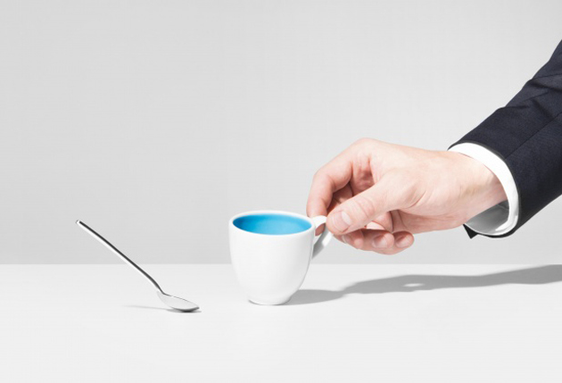
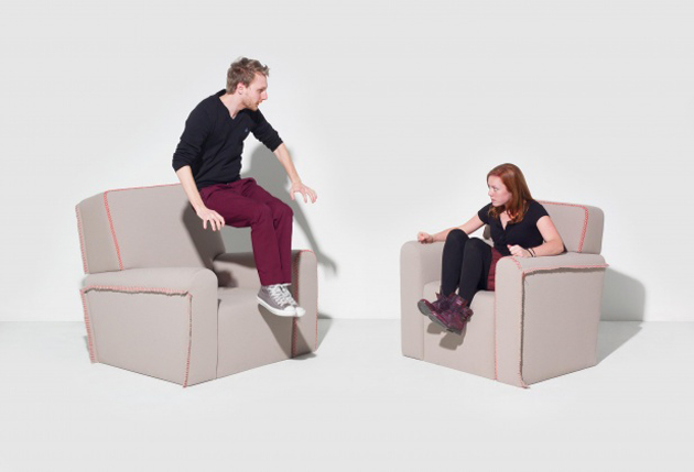
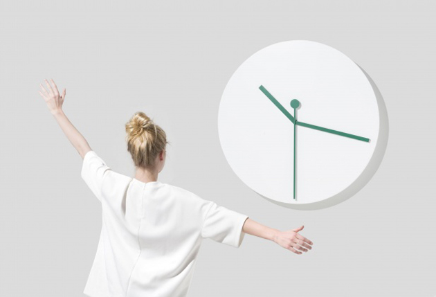
“Delirious Home”, an exhibition promoted by ÉCAL in the Brera Design District, has chosen to take on the issue of smart home and develop it through weapons of irony and grotesque. The results of this investigation are very funny indeed: a spoon follows slavishly the change of position of its small cup, twin armchairs replicate what’s happening to the other one, clock hands respond to the arms movements of those who stand in front to watch the hour. The projects succeed to make us think: at this stage of technology development, the functionalities that interactive furniture should fulfil are still unclear, and thus, being able to identify a wide range of opportunities, even through a sarcastic approach, is very important.

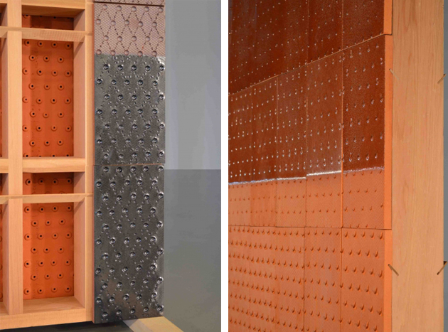
At Ventura Lambrate, the competition among many school showcases is pretty tough. Design Academy Eindhoven has been the leader in the field since a decade: its method, based on a “design in context” approach, is declined this year along the perspective of “Self Unself”, the unselfish vision of design that arises from students’ self-initiated projects. Smart intuitions are not rare, as in the case of “The Importance of the Obvious” by Matthias Borowski investigating materials as false friends, terracotta aired walls and their nice finishings (“Cool Shelter” by Franciska Meijers), or a web platform that transforms information overloading into an artwork (“News from Eternity” by Ward Goes). Nevertheless, when compared to the previous editions this one fails to engage the visitor: the works are less cohesive, and their inspiration is often too close to a pretext than a significant intuition.

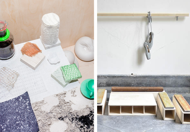
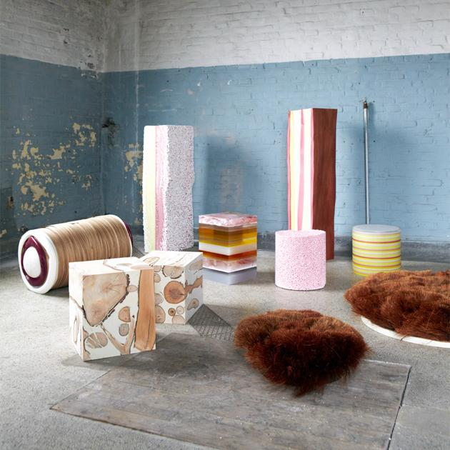
A different approach is that of the Royal Academy of Art – The Hague and its speculative proposal, hanging in between an in-depth analysis and performance. Design, clearly seen as an innovative force, focuses on materials and their new applications: we are not in a R&D of a chemical corporation and thus the profile is necessarily low-tech, but the projects on show – like “Coexist” by Nynke Koster – identify a new aesthetics for the informal living, and the performative way students keep on consuming material surfaces – as in the Morphlab Growth by Morphlab – surpasses a mere communication activity. In the end, it is thanks to fantasy that design is able to open new scenarios: the idea of investigating what would happen if men shrunk to 50 cm is unlikely, but we shouldn’t underplay its imaginative power.

Giulia Zappa 
Share: Facebook,  Twitter