28/02/2014

Style Suggestions: Pastels

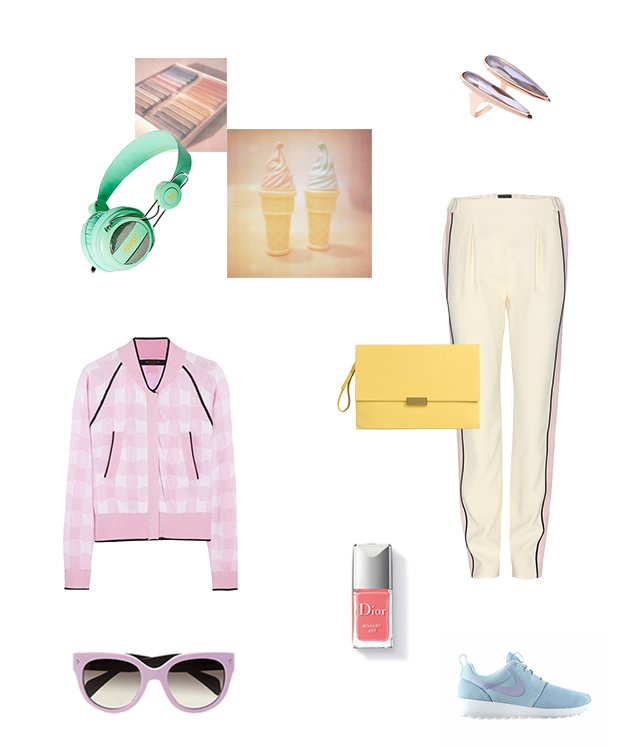
Pastel hues and sherbert shades have crept their way in this season and these exhuberent tones are on trend and easy to wear. You dont have to go the whole hog but it is nice to pair pastels with pastels and add some neutral accesories and jewllery to complete a perfect outfit for any occasion.

Prada, Nike, Fendi, Stella McCartney, Dior, WeSC, Katie Rowland

Styling by Vanessa Cocchiaro 

Share: Facebook,  Twitter  
27/02/2014

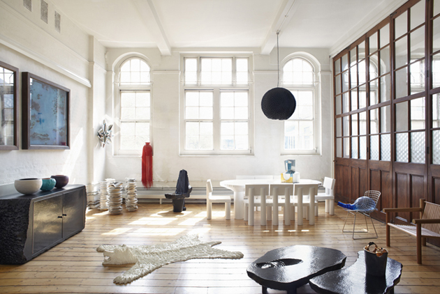
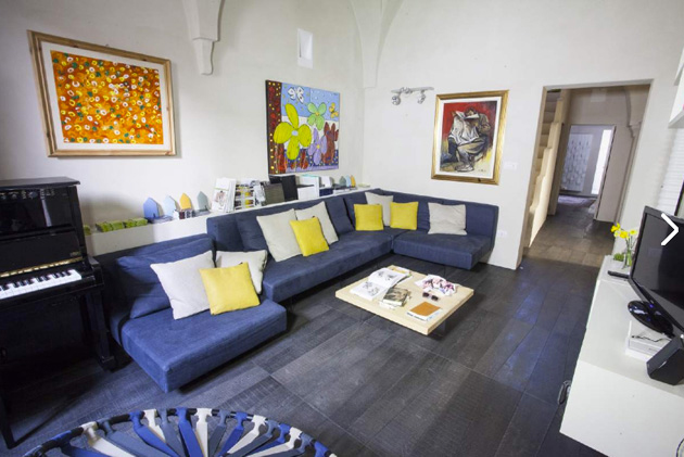
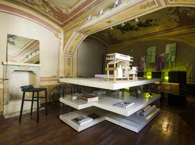
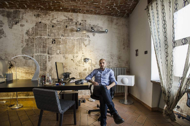
Design Apartments: design collections with an aura

Design in context: is it what end users are looking for? Consumers’ emerging behaviours may be unpredictable, but the ultimate marketing intelligentsia assures that the time of big, impersonal showrooms is finally over. A true design addict, they say, shrinks back from traditional shop windows and prefers to dwell in spontaneous environments such as studios or flats, which have now turned into new epicentres of design on display.

The peculiarity of these new hubs, which have already been branded as “design apartments”, is to be inhabited by real people -both ordinary or members of design studios- who give these spaces a personal touch and offer a genuine interpretation of how new collections should be experienced.

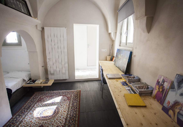
If design galleries led the way to this trend (how not to mention Gallery Fumi?), Lago is undoubtedly the first brand to have actively embraced the new concept. Its network of “Appartamento Lago”, now spread not only in Italy but also in the first European outpost in Alicante, represents the first attempt of a design company going for a systematic and vigorous personalization of their furniture catalogues. Every apartment’s identity is determined by the personality of its inhabitants, but also from a specific genius loci which contributes in the collection’s aura: while each piece of furniture doesn’t cease being a serial product, the different architectural contexts in which they are exhibited – like an old flooring in one of Lago’s apartments near Turin or a groin vault in Salento- revisit and enhance their formal and structural potential.

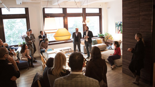
A natural evolution of this concept has recently found a new address in New York, where a network of small but hypercompetitive Italian companies – including Bosa, Elica, Secondome Gallery, Exnovo, Magis – have teamed up in founding a Design Apart, the very first design apartment in New York, located in Chelsea. With the idea of valorising Italian craftsmanship and design through a new narrative and context, this space combines a series of heterogeneous pieces into a new furniture syntax that can be discovered and appreciated with more fun and engagement.

Thus, design apartments finally embody what we started to miss in the era of ubiquitous Behance and Pinterest platforms: finally an exciting new meeting place, a natural hub for the local creative community, an opportunity for building networks and finding new ideas, even without buying that brand new sofa.

Giulia Zappa 
Share: Facebook,  Twitter  
26/02/2014

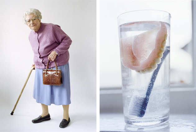
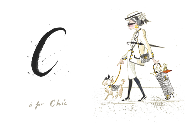
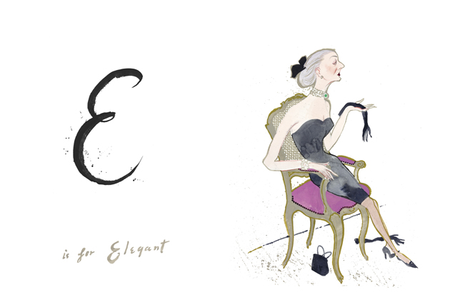
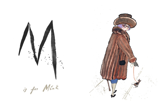
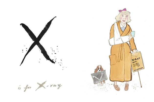
Age and Style in Tim Walker’s The Granny Alphabet

They way people dress, usually influences the way they are perceived. In fact, even the perception of our age can to some extent be influenced by the clothes we put on in the morning. While wearing something drab and unflattering might hide one’s personality and create the illusion of an older appearance, we are less and less restricted by the age-appropriateness of the clothes we wear. The rules of who can wear what are becoming more and more unclear, just as the notion that there is an age limit to fashion.

Finally, the fashion world seems to have grabbed this trend and is being influenced by older generations, both in their search for timeless lines, quality materials and impeccable finishings, as well as by their “granny-chic” flair. Even though it would be naïve to think that fashion has left its search for novelty and eternal youth, the recent trends as well as the use of older women for ad campaigns by fashion houses such as Lanvin, can be interpreted as a positive change of course. It might just demonstrate the effect a bold personal style, regardless of one’s age, has on the development of today’s fashion zeitgeist: it isn’t about what you wear, but how you wear it.

On the other hand, this recent reevaluation of “granny-style” showcases the complexity of fashion industry, adding yet another layer to its already articulated dynamics. It might show that fashion is about having a sense of self, a stronger relationship with one’s personality, which translates into an inimitable style.

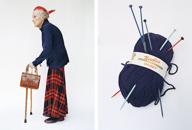
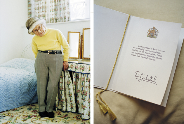
In fact, even the renowned photographer Tim Walker appears to be fascinated by the older age, and speaks about the way it brings back a childlike lucidity which allows for a clearer, more focused view on reality in his recently released book: “To retain a child’s eye when peering through the camera’s viewfinder is to see the world as half magic, half horror”. “The Granny Alphabet”, developed together with Kit Hesketh-Harvey, who wrote a series of gently humorous verses, and Lawrence Mynott, who created an illustrated dictionary of granny-style, is a “part photographic love letter to the elderly and part documentation of the dying breed of little old ladies who live down the lane”. “The Granny Alphabet”, published by Thames and Hudson, is a stylish and fashionable study on everyday life, which reaffirms the saying that style is eternal.

Victoria Edman – Images © Tim Walker and © Lawrence Mynott  
Share: Facebook,  Twitter  
25/02/2014

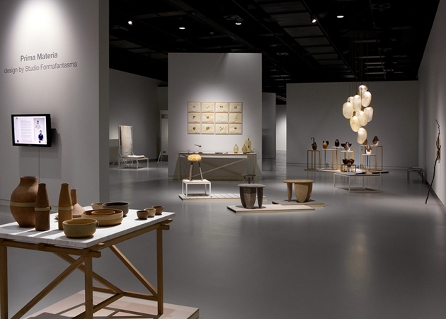
Prima Materia by Studio Formafantasma

How many times have you heard that design was more about the process than the final result? And yet, how many times has the final result influenced the way you viewed, understood and appreciated the process through which it was brought to light? While we can undoubtedly affirm that design is so much more than the physical form of an object, nevertheless, without it, all the social, cultural, economic, technological, productional implications of a designed object couldn’t be brought to light. This is precisely why Studio Formafantasma’s work is so powerful: because it fuses thoughts, ideas, critiques and concepts into an exceptional, intriguing physical form.
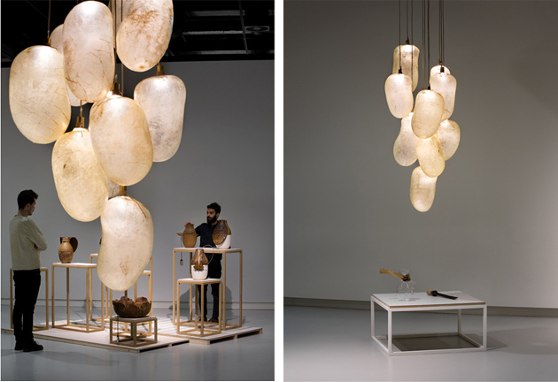
Usually developed for specific events and exhibitions, all of their projects have never been shown together. Thus, the exhibition “Prima Materia” currently on show at the Stedelijk Museum in ‘s-Hertogenbosch, appeared the perfect occasion to analyse their past projects, sense their poetics and delve in their design process. In fact, the title of the exhibition itself is a sort of a key for all of their projects, where “Prima Materia” refers to alchemy, or the transformation of everyday raw materials into precious goods, a method used for their Botanica, Craftica, Autarchy, Baked or Moulding Tradition projects. In revealing the process which glues together all the different project, the designers have divided the show in two parts: videos, sketches and material samples along the entrance corridor give a look at the duo’s thought and work processes before the finished pieces are viewed in the main space.
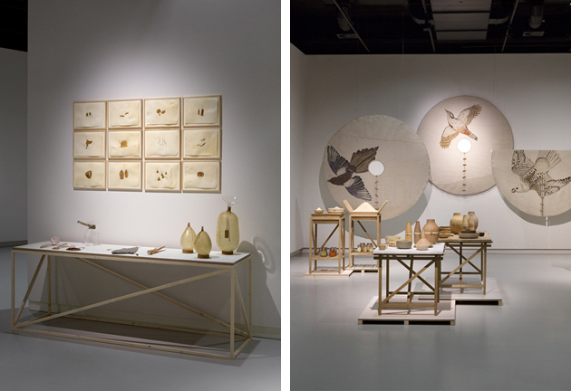
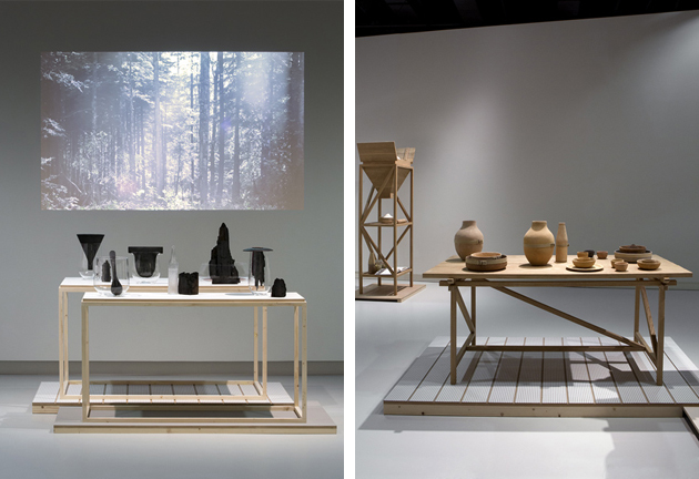
To understand their projects, in fact, one must take into account their personal and professional histories. Andrea Trimarchi and Simone Farresin met while studying in Florence and later went to study together at the Design Academy Eindhoven, the hub of speculative, critical, experimental or socially and politically engaged design, that has characterized Dutch design production in the last three decades. In fact, Studio Formafantasma fits perfectly within this strand of design production, while still developing projects whose subtle poetics might appear the opposite of those explicitly bold objects produced by Droog.
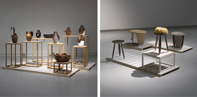
In fact, Farresin and Trimarchi have told us a while ago that they really enjoy not belonging to anything or anywhere: “We always say we’re bastards, because if you put together Dutch and Italian design, it seems like nothing can come out of it or have a strong identity.” On the contrary, all of their projects have a strong identity that informed their practice since the very beginning and which draws on the past and exploration of traditional crafts in “offering an alternative vision to today’s consumer society and the role that design plays in it”.

“Prima Materia” runs until the 15th of June at the Stedelijk Museum in s-Hertogenbosch, The Netherlands.
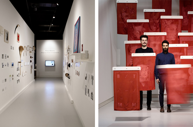
Rujana Rebernjak – Images © Inga Powilleit 
Share: Facebook,  Twitter  
24/02/2014

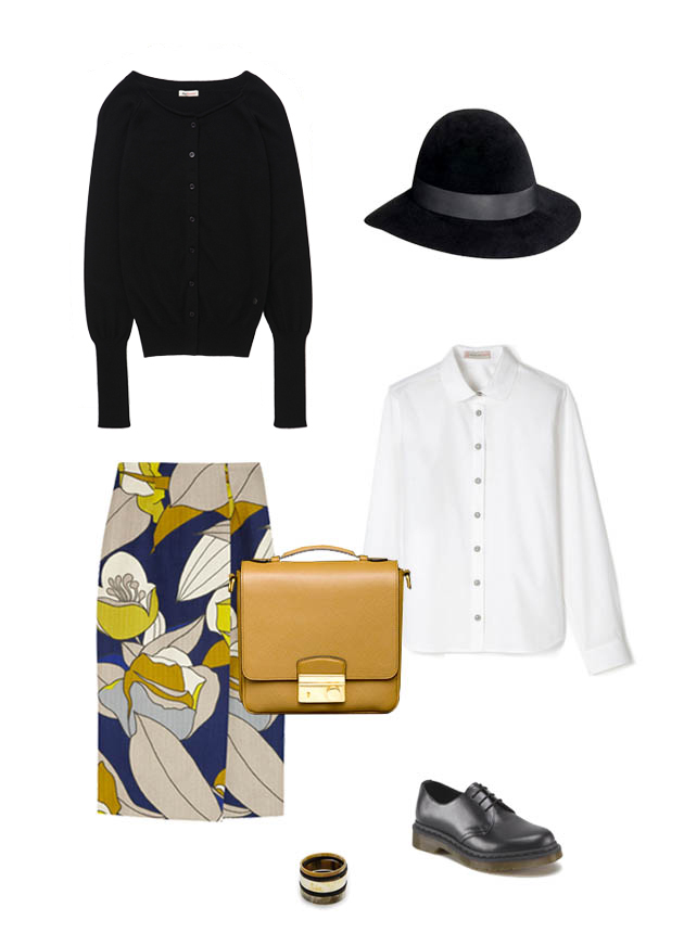
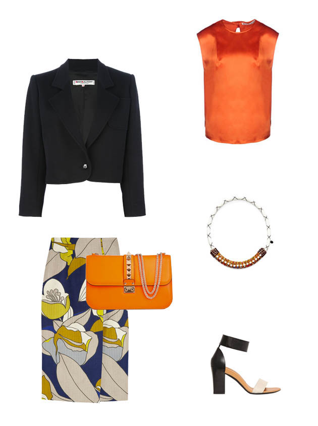
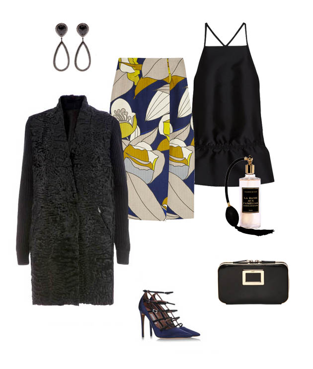
Style Suggestions: Skirts AM to PM

Versatility is the secret to a great wardrobe and when you have those special key pieces you are well on your way to easy, stylish looks. With retro classics making a comeback, sway your style towards cool elegance with an A line skirt. Its architectural shape makes it easy to go from day to night without having to change too much.
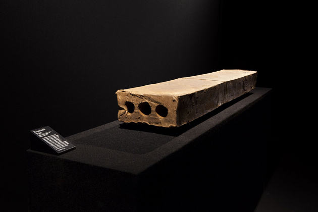
Marni, Roy Roger’s, Paul and Joe, By Malene Birger, Dr. Martens, Prada, Borsalino

Marni, Vintage YSL, Chloé, Valentino, Acne, Masterpeace

Marni, Stella McCartney, Eva Fehren, Tabitha Simmons, 32 Paradis Sprung Frères, Roger Vivier, Jardins d’Ecrivains

Styling by Vanessa Cocchiaro 

Share: Facebook,  Twitter  
24/02/2014

Michaël Borremans – As sweet as it gets in Brussels

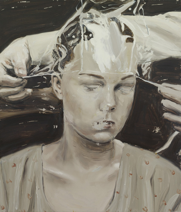
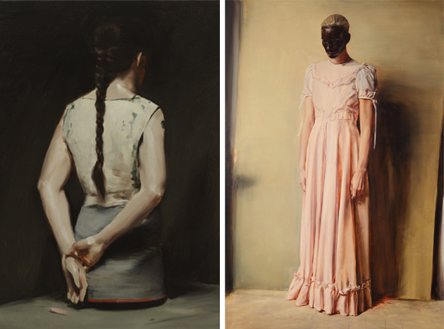
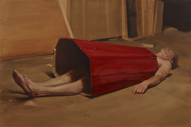
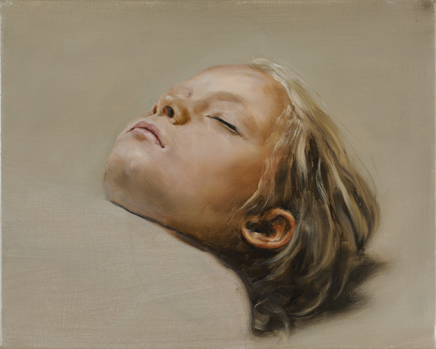
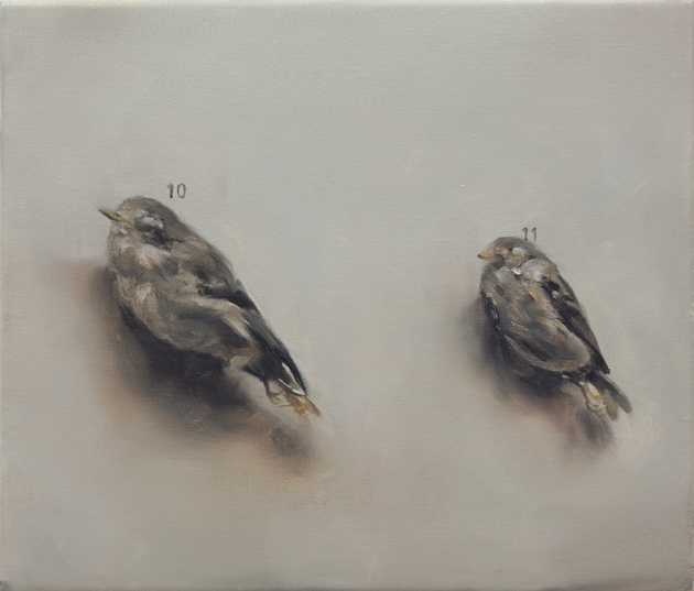
The internationally travelling exhibition on the work of Michaël Borremans (b. 1963 in Geraardsbergen, East Flanders) just started its tour opening at the Centre For Fine Arts in Brussels (aka BOZAR). The awaited show, entitled As sweet as it gets, curated by Dr. Jeffrey Grove, is the first to bring together the contemporary Belgian artist’s drawings, paintings and films from over the last twenty years, retracing his artistic path and collecting around hundred works from private and public collections worldwide.

Dutch and Flemish artists have always played a relevant role in the art history. Past and present painters from this area seem to have an innate ability to go beyond the boundaries of this medium, combining superlative technical skills and vibrant materialism with unique and suggestive atmospheres that always make an impression on viewers. Michaël Borremans is no exception. With a flawless technique and a meticulous realism, he creates subjects who often appear in unclear and doomed states. The sepia and neutral tones of his paintings, along with their incompleteness instill concern and curiosity.

With a poetics that makes reference to historic characters, frequently recalling literature, photography and films, the artist builds austere, weakly illuminated worlds, where ordinary things become weird and unsettling. The melancholic or apathetic people, almost always absorbed, are all depicted in captivating scenarios, undefined by time or space. We should only take a wild guess what they are doing or thinking about. We have to complete the images, but no one could definitely solve their mystery. The only thing that really matters and lasts is the fascination with his powerful paintings, which is something that gets into you.

On the occasion of Borremans’ show, CINEMATEK interrogated the versatile artist about his interest in film and asked him to select 15 of his favorite titles, which will be projected during March and April 2014.

After its closure in Brussels on the 3rd August 2014, As sweet as it gets will move to Tel Aviv Museum of Art and Dallas Museum of Art.

Monica Lombardi 
Share: Facebook,  Twitter  
21/02/2014

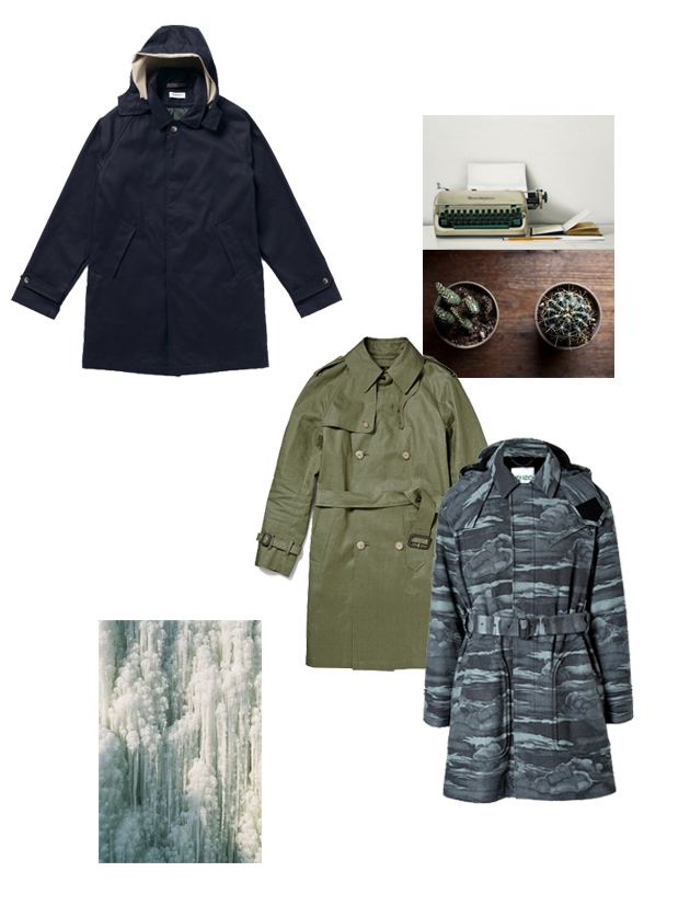
Style Suggestions: Trench Coats for Men

If the rainy weather is getting you down this weekend, at least you know you can still look great. A trench coat is a wardrobe staple that will never go out of style so it is definitely one to invest in.

Trench coats by President’s, Mackintosh, Kenzo.

Styling by Vanessa Cocchiaro 
Share: Facebook,  Twitter  
20/02/2014

Steichen: A Recent Acquisition at the Whitney Museum

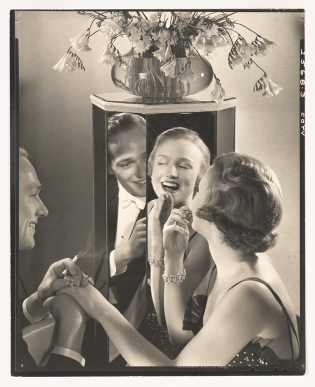
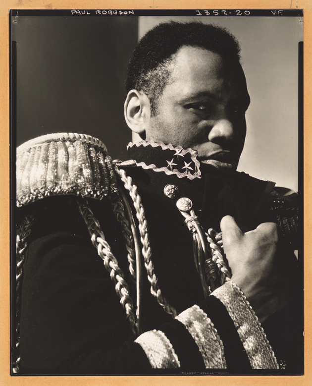
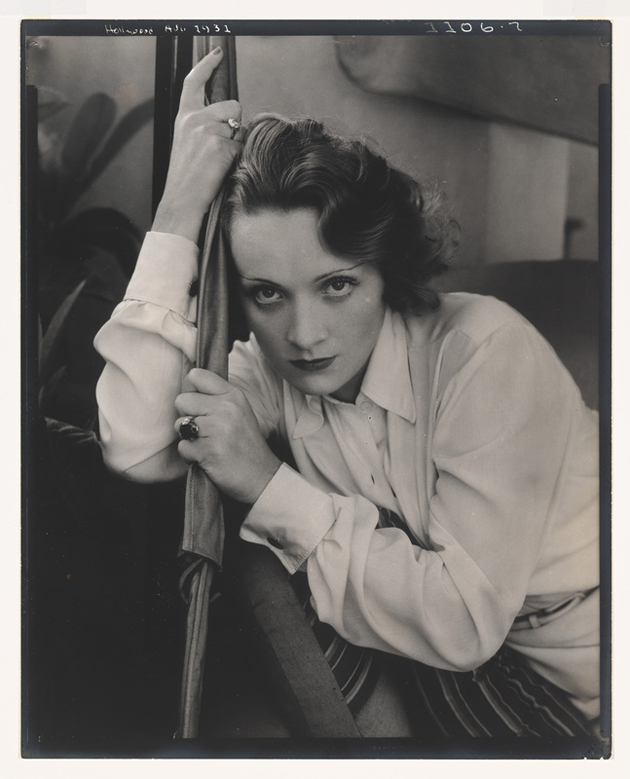
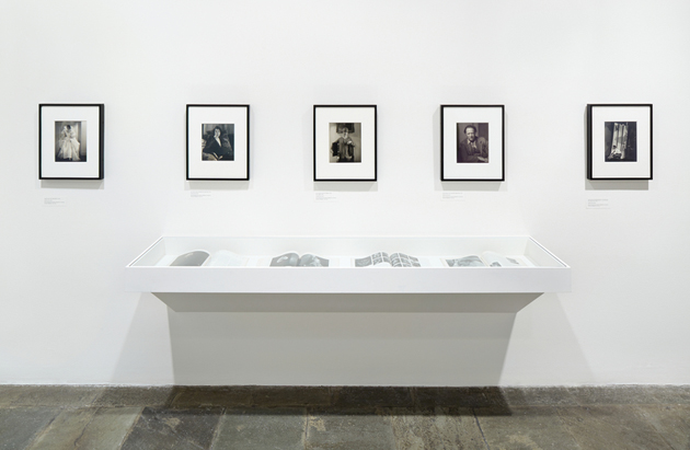
If the greatness of an artist is measured with qualities such as wit mixed with a bit of extravaganza, personal taste and innovation, Edward Steichen must be deemed a great one. By working for Vanity Fair and Vogue during 1900s he brought a change into fashion photography. While the previous chief photographer – Baron Adolph de Meyer – worked with soft focus and painted backdrops to recreate a mood as similar as possible to paintings, the standard goal of the photography of the time, Mr. Steichen brought all the props away and made a dramatic use of lighting. An elegant yet honest way to portrait both celebrities and fashion stories that has definitely helped a new movement to emerge.

After working for the US Army during World War I, his photographic style has changed significantly. He started to focus on volumes and scale that gave his work a more abstract approach, leading him to become one of the most significant authorities in photography, crowned by his appointment as curator of photography at the Museum of Modern Art in New York.

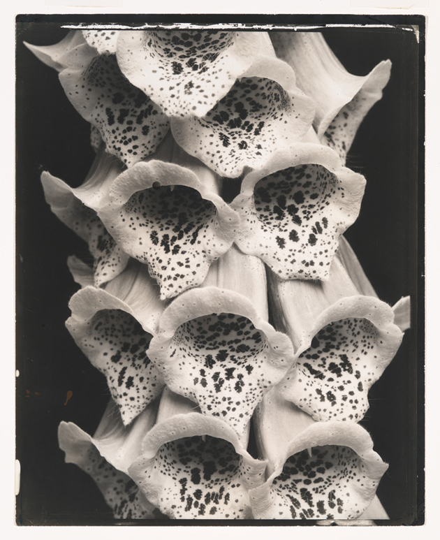
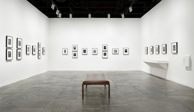
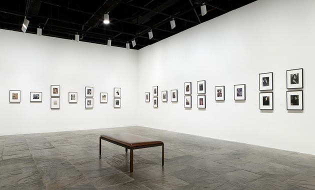
Edward Steichen in the 1920s and 1930s: A Recent Acquisition is an exhibition curated by Carrie Springer for the Whitney Museum in New York, which celebrate the extraordinary donation by Richard and Jackie Hollander, a couple of art collectors. By including some of the most celebrated portraits and fashion photos taken during the time he worked for Condé Nast, images of nature as well as advertising campaigns, the show succeeds in demonstrating the role of Steichen as a leading proponent of photography, both for his research on the aesthetics and language of photography, as well as his uncompromising approach to commercial photography

The show runs through February 23th at the Whitney Museum in New York.

Francesca Crippa – Images courtesy of Whitney Museum of American Art 
Share: Facebook,  Twitter  
19/02/2014

Barber and Osgerby: In the Making at Design Museum

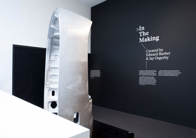
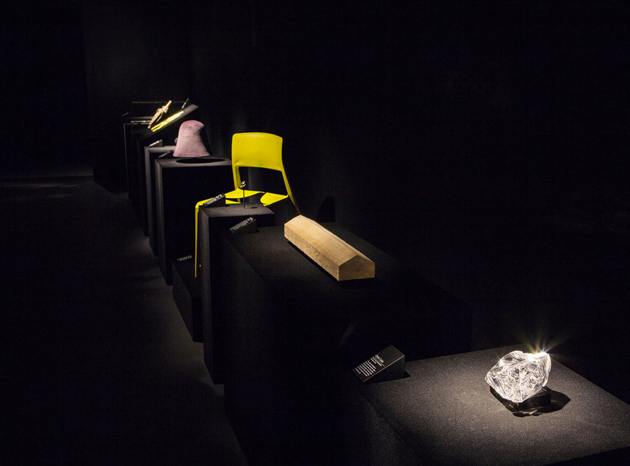
Have you ever wondered how your favourite chair, lamp or simply a mug looked like before they arrived at your home? How many different processes, materials, people or energy was involved in its production? How it looked when it was neither a finished product nor simply a shapeless mass of raw material? Designers Edward Barber and Jay Osgerby apparently ask themselves those very questions quite often and have tried answering some in an exhibition curated for the Design Museum in London.

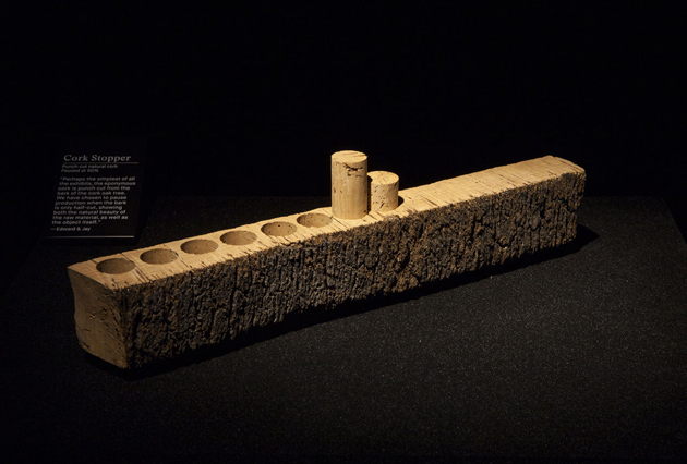
Titled “In the Making”, the exhibition showcases a series of objects in their unfinished state. From cricket bats, felt hats, shoes, boots, marbles or light bulbs, to whistles, pencils, coins, horns, lenses and Olympic torches, these objects are meant to reveal the secret processes that result in their finished form. The objects have been selected because they each have an unexpected quality about them in those moments, hours or days before they assume their final, recognisable form. The exhibition captures points in the making process, a peculiar and unconventional slice of time in the production of everyday objects, while also showing a glimpse of Barber and Oserby’s ongoing dialogue with manufacturing that is so distinctive to their practice.

Edward Barber and Jay Osgerby comment “We have always been fascinated by the making process as it is an integral part of our work. We have curated an exhibition that will provide a platform to capture and reveal a frozen moment in the manufacturing process and unveils an everyday object in its unfinished state. Often the object is as beautiful, if not more so, than the finished product!”

Even though the exhibition shows a surprising side of our everyday material reality, it nevertheless fails to grasp the complexity of the production process, such as the 85 processes involved in the manufacture of a MacBook or the raw reality of an industrial facility, with environmental, economic, social and cultural implications of those simple objects we usually take for granted.

In the Making
22 January – 4 May 2014
Design Museum,
Shad Thames,
London

Rujana Rebernjak 
Share: Facebook,  Twitter  
14/02/2014

Hats by Madame Paulette

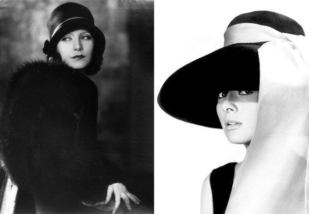
Hats have always been the key element to complete a woman’s outfit, even hundreds of years ago. Back then, ladies used to wear them constantly, not only because of their beautiful and original shapes, but also because of the lack of makeup as a common tool – hairdressers were not so easy to find.

In the beginning of the XIX century, makeup was considered quite vulgar for women who were not actresses. Consequently, the main utilities of the hat were to protect and to adorn. It surely represented the perfect solution to be on vogue and feel comfortable.


After the Second World War things started to change: people became poorer and poorer, Americans moved to Europe and makeup begun to be more commercial as well as hairdressers, whose services became cheaper. From that moment on, hats started to be seen as a superfluous and expensive, almost useless, item for most of the people.


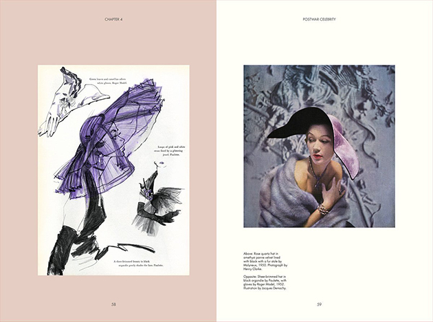
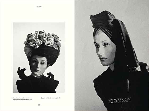
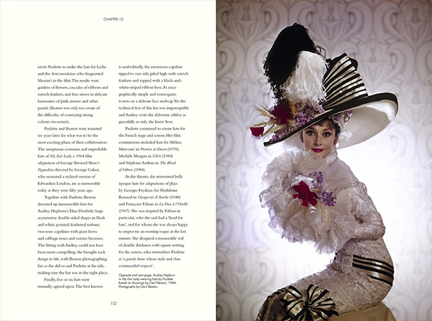
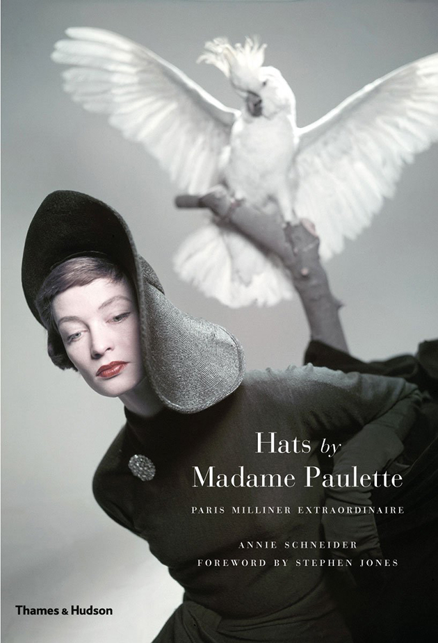
We still have images in our minds of those beautiful actresses playing romantic roles and wearing cool, huge and bizarre hats. But there was a woman in Paris who contributed to make this fashion item really popular, stylish and, above all, part of the history. Her name was Madame Paulette and everybody used to know her special creations. A book about her art will be published on April 22th. Hats by Madame Paulette will trace the creative process of the so-called ‘Queen of milliners’, who grabbed the enthusiasm of Greta Garbo, Marlene Dietrich, Audrey Hepburn and Princess Grace of Monaco, just to name a few. Annie Schneider has curated the tome that aims to be a guide that showcases diverse images and stories. Some pictures taken by acclaimed photographers such as Avedon, Newton, Horst and Klein, will be featured, too.

Francesca Crippa 
Share: Facebook,  Twitter