05/12/2013

The art of Aldo Coppola

Have you ever sensed that feeling of perkiness, confidence and sheer happiness when walking out of a hair salon? Your hair is shiny and silky, you look and feel good, as if you could conquer the world. As simple and banal as it might seem, a haircut can really do all of that, and Aldo Coppola was a master of this (often underrated) art. Unfortunately, Aldo Coppola died last week at the age of 73 leaving behind an incredible legacy.
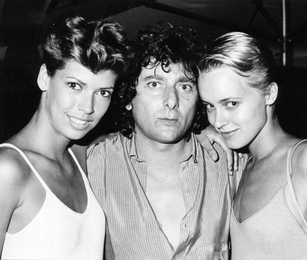
The founder of an entire hair-styling empire, Aldo Coppola dedicated his life to continuous research and innovation. Starting from modest beginnings back in the 60s, Mr. Coppola quickly entered the fashion world, where his designs, which fused aesthetics and beauty with couture, were as requested as the clothes models wore on the catwalk. The year 1966 and the invention of dry cut clearly marked his traits, which promoted a natural look and flair, crafting each cut to individual needs, rather than creating a single, distinct style.

Among his inventions we can count the crouchet, tourchion, sombrero or waves styles, while his latest invention, the shatush can still be seen both on the red carpet as well as on our streets. While Aldo Coppola’s art of hairstyle might not have changed the world, nevertheless it shouldn’t be easily dismissed, not least for its ability to make us feel our best. For only when we do feel so, we might be the ones to actually change it.


Rujana Rebernjak – Image courtesy of Studio Aldo Coppola 
Share: Facebook,  Twitter  
04/12/2013

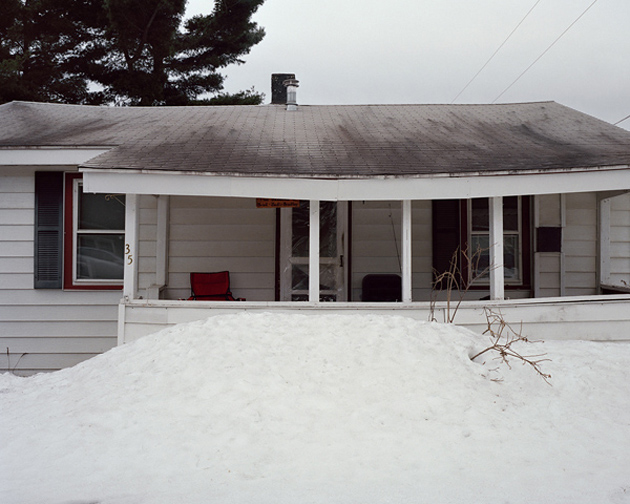
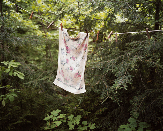
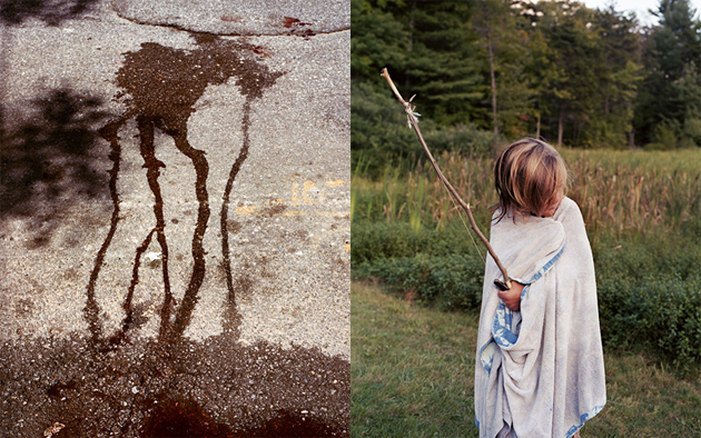
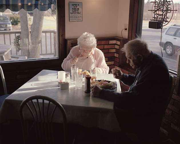
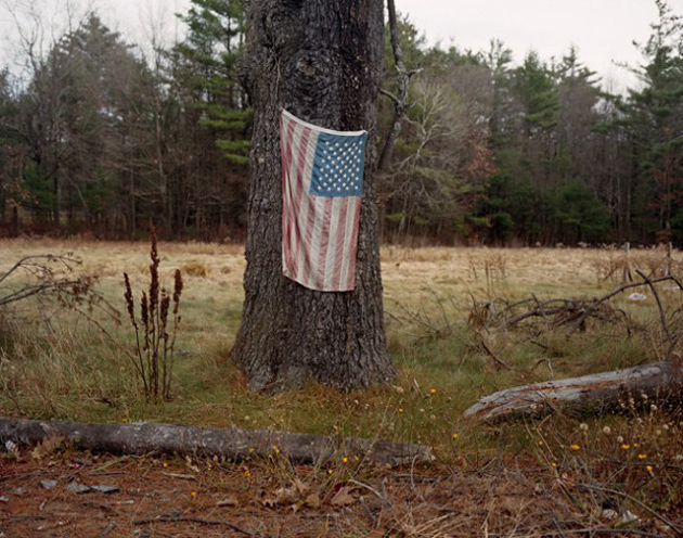
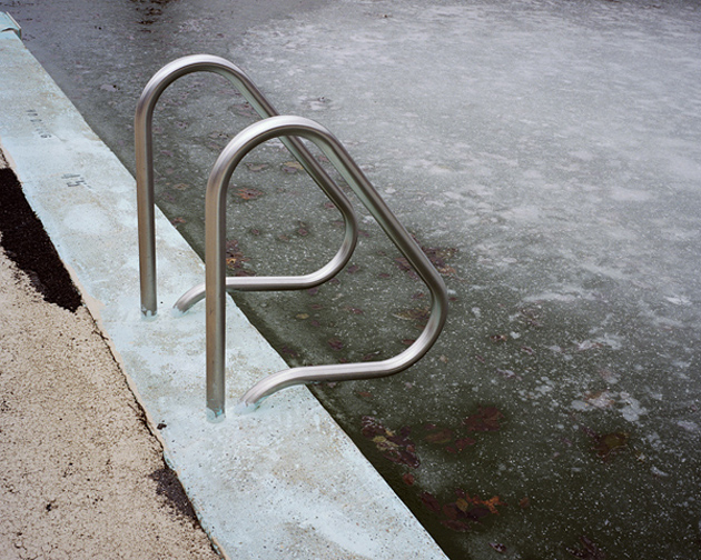
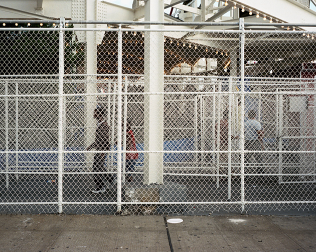
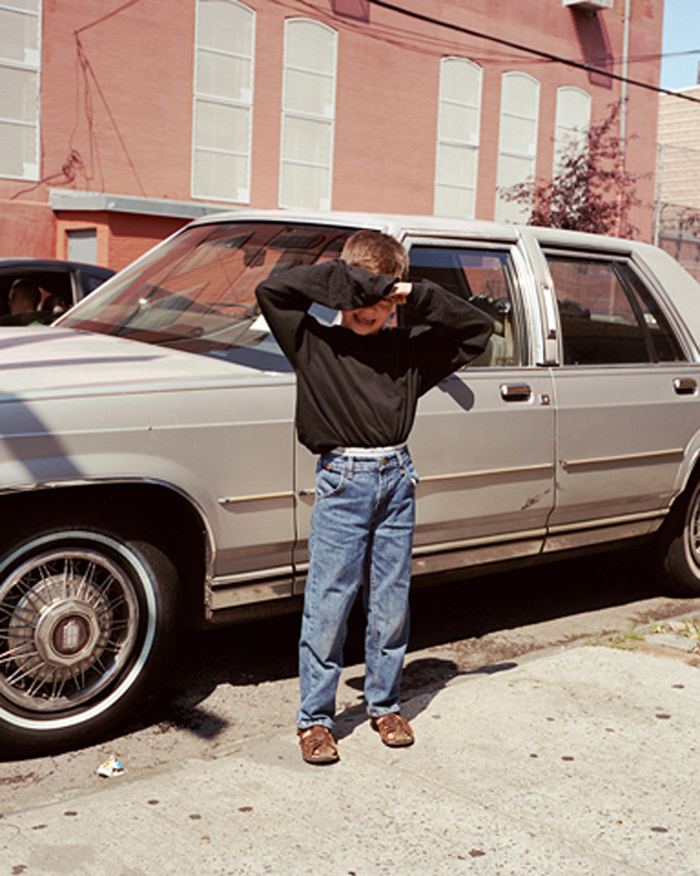
Through the Lens of Shane Lavalette


Shane Lavalette 
Share: Facebook,  Twitter  
04/12/2013

The Disappearing crafts in the North

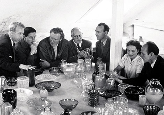
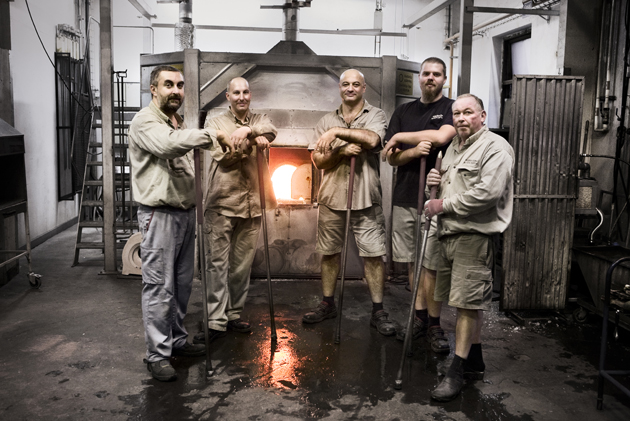
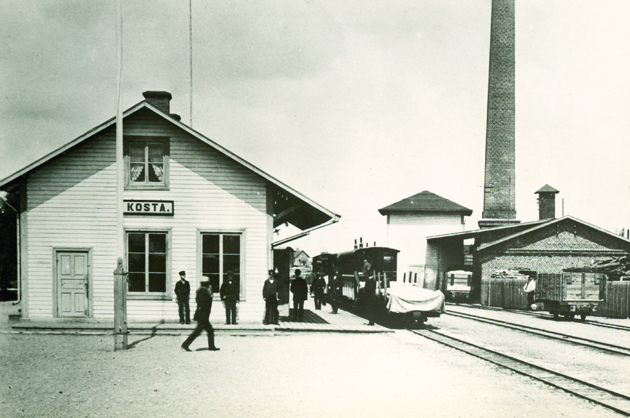
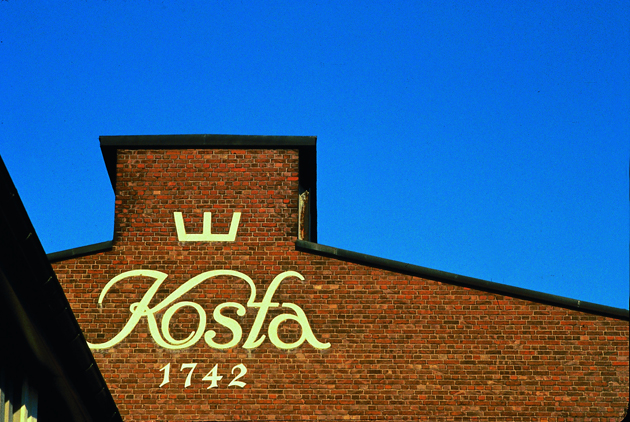
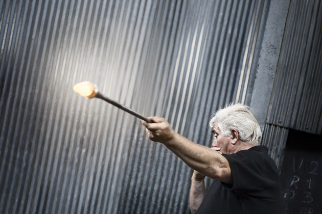
In the beginning of this fall, Form, the popular magazine for Nordic Architecture and Design, informed the design world about “the fall of the Crystal Kingdom” in Sweden. The news, that the centre of the Nordic glass industry Orrefors Kosta Boda has been shut down and that 80 percent of the production will be moved to Thailand, has a sorrowful undercurrent and is discussed with a nostalgic sadness.


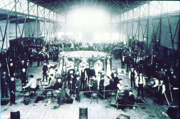
In the south Swedish Småland, Orrefors Glassworks has produced utility glass and crystal art glass since 1898 on the same site where ironworks operations had been run since the early 1700s. In the early 20th century, artists (and designers) became part of the product development process, starting with Simon Gate and Edward Hald in 1916 and recently with Karl Lagerfeld.


However, the craftsmen who have bore the industry are now sent home after the decision to turn off the kilns in the glassblowing shops in Orrefors and Årfors. The once glassmaking region is left behind empty. Now cheap labour in Thailand is considered to be the only way out of the present economic uncertainty of the Swedish glass industry.

Even though there is a trend of re-evaluating the localism and traditional crafts these days, the fall of the Crystal Kingdom is yet another example of disappearing crafts in Northern Europe. So, what does this mean? Isn’t the thought that we are moving all of our knowledge about traditional crafts to Asia a bit frightening? For now this might seem the only thing for companies to do in order to survive financially, yet is remaining with the knowledge, but without the skills, enough for the future? And although crafts are still taught in the North, it seems to be our persistent demand for cheap products what is killing the job opportunities for skilled craftsmen nearby. And with that, we risk to lose generations of wisdom, skills and crafts if we don’t find alternatives to preserve our artisanal industries.


Lisanne Fransen – Image courtesy of Orrefors 
Share: Facebook,  Twitter  
03/12/2013

Serpentine Sackler Gallery by Zaha Hadid

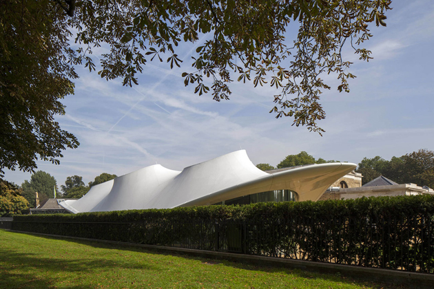
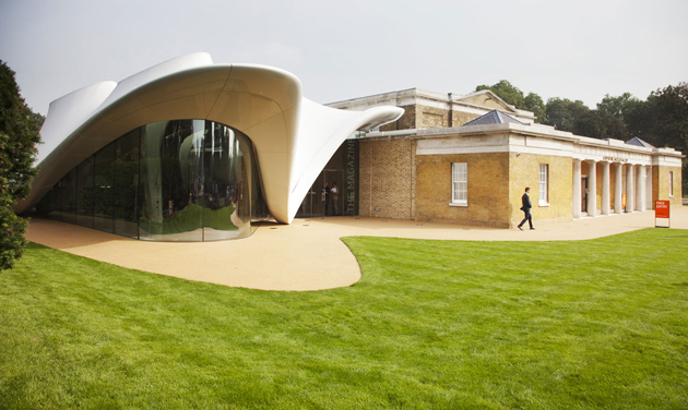
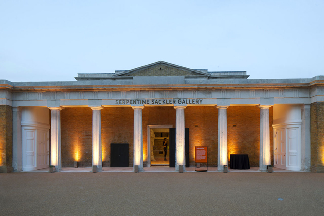
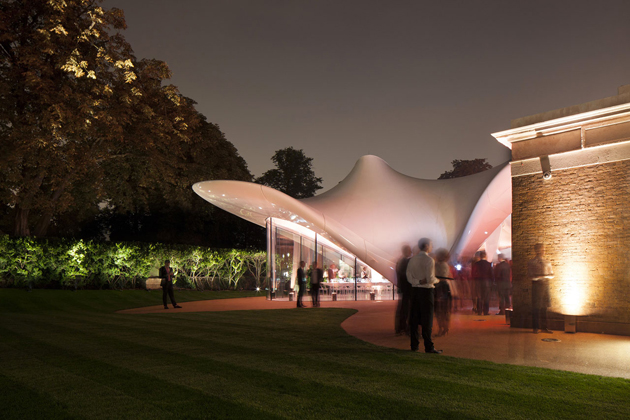
Nearly three months ago, on the 25th of September, Serpentine Sackler Gallery opened its doors in Hyde Park, in London. A short walk away from the main Serpentine Gallery, sitting just across the Serpentine bridge, the Sackler gallery was designed by startchitect Zaha Hadid. More than a simple gallery space in the middle of London, the new Serpentine Sackler Gallery is a bold statement: as much an expression of power as it is a monument to contemporary architecture.


In fact, Serpentine Gallery is widely known for its commitment to architecture through their annual commission of a temporary pavilion, the first of which was designed precisely by Hadid, back in 2000. But while the pavilion is always designed by an architect who hasn’t previously built in the UK, since her first collaboration with the Serpentine, Hadid has completed a few projects in London, such as the Olympic Aquatics Centre and Evelyn Grace Academy, in Brixton.


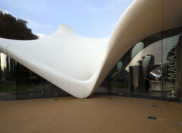
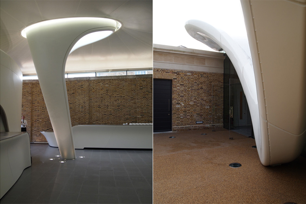
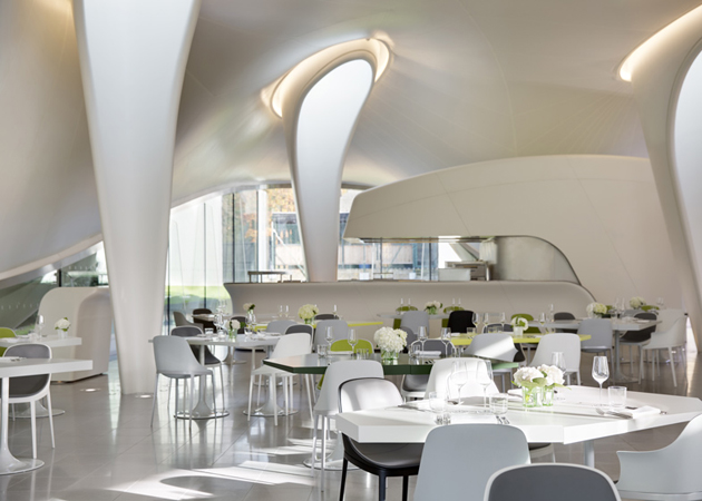
At first glance, it is obvious that the Serpentine Sackler Gallery is a “status symbol of luxury and political posturing”, borrowing Owen Pritchard‘s description of Hadid’s practice. While the main gallery space is situated in a restored former Powder Room, it is the extension added to the 19th century building that sparked all the criticism. It is a classic Hadid piece: a sinuous structure that from far away might appear as a wedding tent, while from up close it changes appearance from every angle. But what strikes the most is not the presumptuous character or the striking dissonance between the two structures of the Sackler Gallery; it is the undeniable feeling that, while the Powder Room building is as contemporary as ever, the extension already seems too old.


Rujana Rebernjak – Image courtesy of Serpentine Gallery and Luke Hayes 
Share: Facebook,  Twitter  
02/12/2013

Style Suggestions: Dressing White

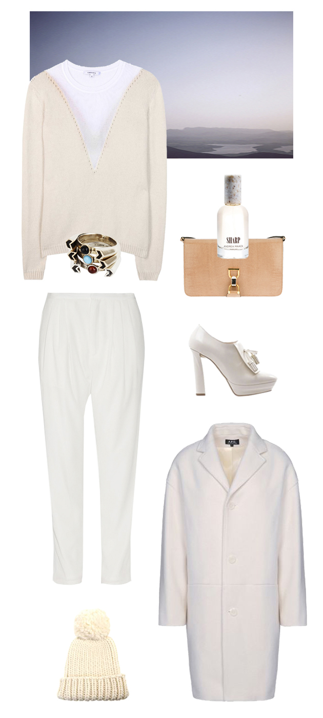
Wearing white in winter doesn’t need to be a challenge. Play around with rich textures and shades of white and with so many wintry hues. We’re sure you’ll find the right style for you. If you don’t feel confident to create a head to toe look, then combine a winter white coat with a colourful or even classic black look.

A.P.C. coat, Carven sweater, Bottega Veneta ankle boots, Eugenia Kim hat, Pamela Love ring, Andrea Maack perfume, Band of Outsiders pants, Gucci Vintage Bag

Styling by Vanessa Cocchiaro 

Share: Facebook,  Twitter  
02/12/2013

Adam Nathaniel Furman’s intimate ceramics

It is quite unusual to think about ceramic as a mean to tell a story. Can we conceive a proper narrative dimension inside a vase collection? Can we see it as an uncommon tool of introspection? If we take for granted that objects have their own language characterized by a specific semantic and syntax, we may be more reluctant to believe that they can be transformed into the vehicle of a fictional self-representation.


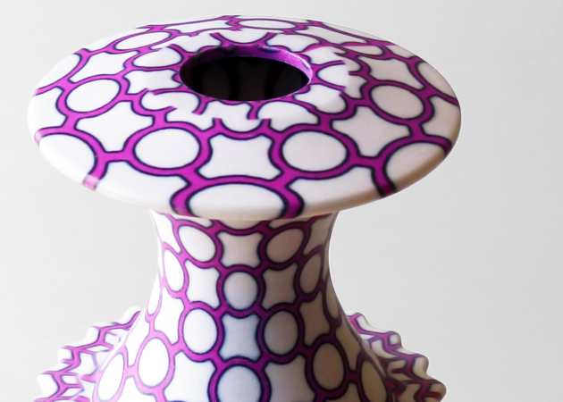
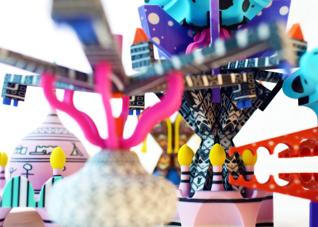
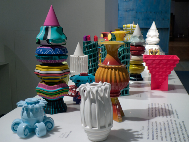
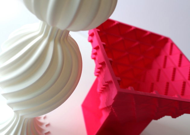
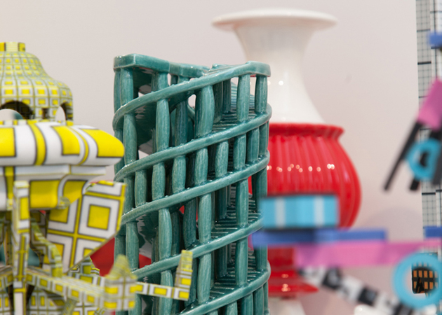
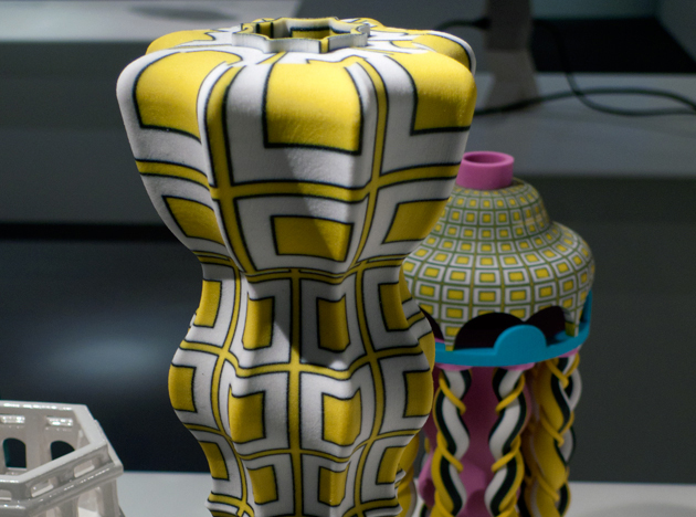
Adam Nathaniel Furman, designer in residence at London Design Museum in 2013, has pushed the limit further trying to express through his creations the variable shadows of his moods and thoughts. The tangible result of his research is an original ceramic collection that transposes his personal obsessions – technological compulsiveness, kitsch, human-driven disasters, convulsed techno and joyous angelic jubilations- into a fluid overlapping of layers and concentric stairs. The intangible dimension, on the other hand, is entrusted to the pages of his digital personal journal entitled Identity Parade, a hypnotic flux of consciousness where he gets himself over a barrel, revealing his bittersweet, fluctuating emotions. The link between these two dimensions is more than deeply interconnected: the physical and the digital worlds share the same ups and downs, the same soarings, the same sinkings.


Nevertheless, what is even more remarkable is the understated attitude that Furman’s works demonstrate from the point of view of technological development. In fact, his vessels alternate the use of traditional cast with that of 3D-printing technologies (such as nylon laser-sintering and 3D-printing) with very homogeneous results: at first sight, it is basically impossible – also thanks to the hand painted cladding- to recognize which of the two techniques has been used. Thus, technology seems to be once again a critical tool to express new aesthetics: only the use of 3D-printing techniques, for instance, offers the chance to recall Maurits Cornelis Escher’s world and his impossible feats of architecture. Then, it’s up to colours and patterns to strengthen what morphologies have already suggested: a dizzy but exalting state of mind.


Giulia Zappa 
Share: Facebook,  Twitter