10/07/2013

Welcome to The Talkhouse

Wading through the internet to find a solid music site can at times be like digging holes in water — tiresome, pointless, frustrating. So imagine our surprise when we stumbled onto The Talkhouse, a new artist-to-artist site that lets artists review each other’s work. It’s pure music-geek paradise: Kanye West’s polarizing Yeezus dissected (and admired) by the ever-polarizing and cantankerous Lou Reed, The Fiery Furnace’s Matthew Friedberger taking a jealous stab at Vampire Weekend’s Modern Vampires of the City, Andrew W.K. eagerly writing about Robert Pollard being a “cum engine” of American songwriting. In an online culture where any dupe with a wifi connection can double as a self-righteous critic, it’s refreshing to see a site devoted to cultivating an engaging dialogue between musicians from different genres, many of whom would otherwise never cross paths. The Talkhouse is engaging and worth every scroll. Where else are you going to get Laurie Anderson talking about Animal Collective?

The Talkhouse is helmed by Michael Azerrad, the author who wrote the book about the 80s American underground (“Our Band Could Be Your Life”) as well as the defining biography on Kurt Cobain (“About A Son”). The concept, he said, was simple: get musicians writing. Here’s how it works: An artist picks an album to review, and the musician whose album is being reviewed has the open invitation to respond to the critique. Sadly, few do. (Kanye West responding to Lou’s review of Yeezus? Yes please.) Many of the writers and musicians on board have never written a review, disdain critics, and write pieces too long to ever appear in print. Thankfully, there are no lists or grades. Often the writers get off topic, which is kind of the point. Randy Blythe, the singer from the metal band Lamb of God, summed up Talkhouse’s sentiment nicely in his recent review of Crime and the City Solution’s American Twilight. “This is my first stab at being a ‘rock critic,’ a profession that normally makes me think of stabbing in an entirely different way.”

Lane Koivu 
Share: Facebook,  Twitter  
09/07/2013

Collaboration-O: Let’s Stick Together

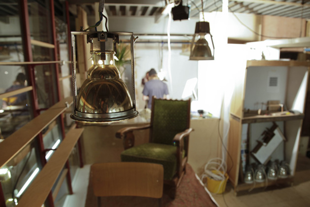
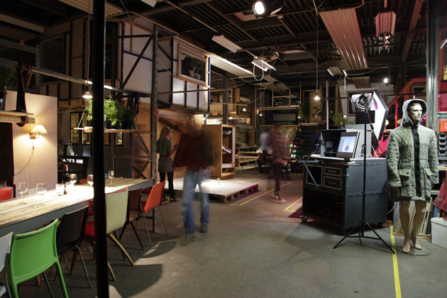
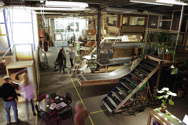
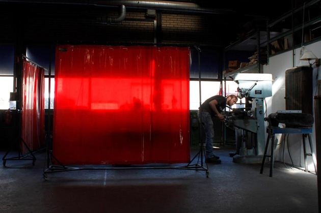
Claiming that the 5-year-old Great Recession we find ourselves in nowadays can have positive effects as well might be strange, but something that the members of Collaboration-O proudly admit. Whereas the creative sector faced a downturn in the market and drastic budget cuts of cultural supportive funds, Collaboration-O built up their collective workspace without a big bag of money from investors or a loan from the bank. They are neither a government-funded project, which means they are not being reliant on anyone but themselves and this makes them a sturdily collective-built and based on the principals of collaboration. This is also exactly what their welcome sign in front of their workspace in Eindhoven tells you: “Big Boys Work Together”.


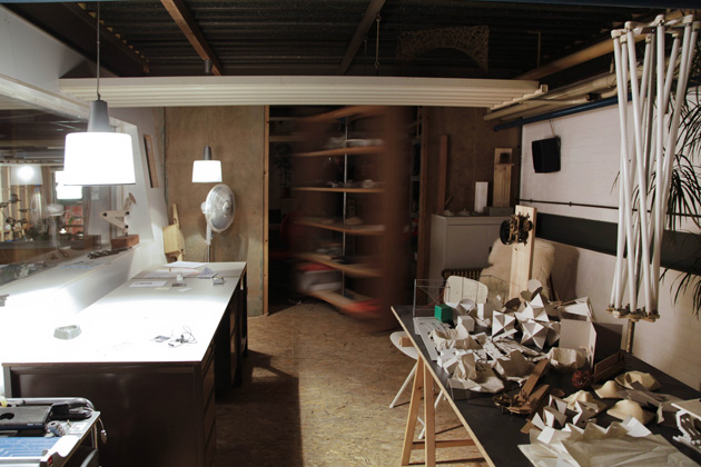
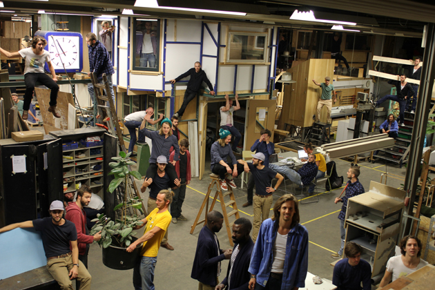
“Big Boys” refers to the 14 starting designers – thirteen guys and one girl – of the Collaboration with the unifying letter O. In an abandoned industrial hall each member works as an individual designer in his or her own-constructed 2-level balancing lofts. But next to their focus on a personal career, they all benefit from their shared investments in the collective: they share a central kitchen, courtyard and co-own heavy-duty machinery, and most notable of all; they often team-up to enrich each other’s projects and divide orders that are coming in for the collective among themselves.

As independent collaboration, they all have their tasks to keep the organically grown collective running. “It’s my responsibility to take care of the machines here, together with Martin Schuurmans and Joost Gehem”, tells Daan Brandenburg, a designer with a passion for wood and mechanics, “and Jelle Mastenbroek is this year the collective’s chairman during our meetings”. Other members have the role of concierge or event manager, or run the financial or communication “department”.


The collective is sticking together for almost 5 years now, which is special since their individual paths are developing in quite different directions. Whereas some specialize in wood carpentry and interior furniture like Brandenburg and Kaspar Eisenmeier, other members like Paul Heijnen, Niels Hoebers or Sander Wassink create far more conceptual works that are (almost) pieces of art, and that were recently showcased in Rossana Orlandi’s Museo Bagatti Valsecchi in Milan and during Design Miami/Basel, respectively. But as long as Collaboration-O keeps its function as a beneficial “springboard to make a career in the creative field”, the members will stick together. Because, explains Brandenburg, “although the individual is central to us, as a group we are much stronger”.


Lisanne Fransen – Photos courtesy of Lisa Klappe, Many thanks to Daan Brandenburg for showing us around. 
Share: Facebook,  Twitter  
09/07/2013

Monthly Reads | Graphic Design: Now In Production

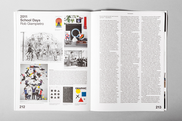
What exactly is graphic design? Who are its most significant contemporary practitioners and why? What kind of activities does it engage with? How does it impact our daily lives? What is the range of human environments it deals with? Is it only a self-absorbed discipline that speaks to a few selected ones or can we all benefit from it? How can it tackle relevant social issues, and using which tools? This is an extremely limited list of questions that might come up thinking about graphic design, and this month’s carefully selected book answers quite a few of them.


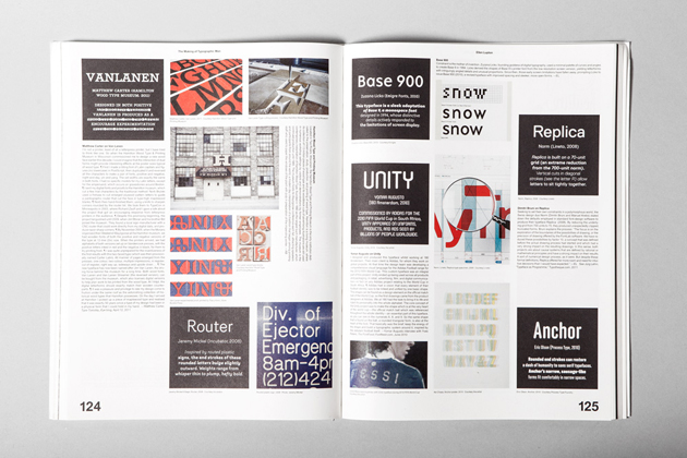
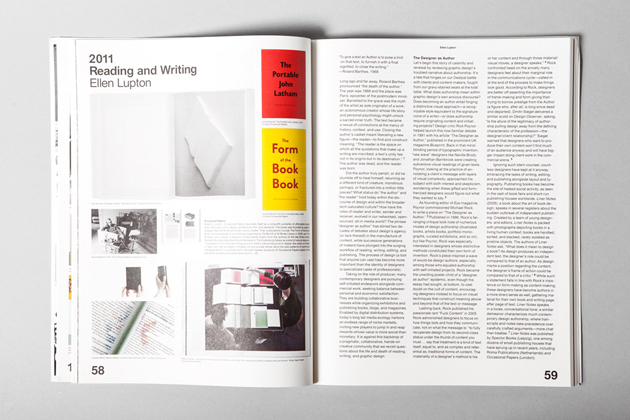
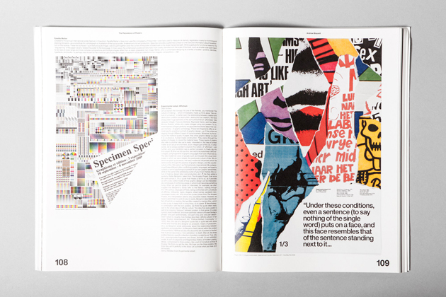
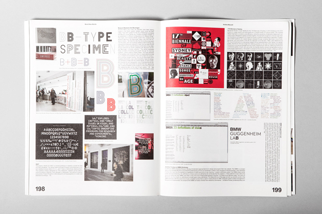
“Graphic Design: Now In Production” is a book born as a catalogue of an exhibition held at Walker Art Center and Cooper Hewitt National Design Museum respectively, back in 2012. Edited by Andrew Blauvelt and Elen Lupton, two of the most prominent design theoreticians and critics, it results quite an appealing compendium of contemporary graphic design practices. Starting with a series of critical articles written by contributors such as Steven Heller, James Goggin, Michael Rock and Daniel van der Velden, it engages in discussion about different, but equally critical, evaluations about contemporary design practice. From the idea of designer as author (or writer), largely debated during the turn of the last century, to the role of research and critical investigation through the graphic design, to the idea of designer as entrepreneur proposed multiple times by aforementioned Heller, these short essays tackle and bring to life how design can become socially, culturally, politically and even economically relevant.


On the other hand, the second part of the book engages in an analysis of different outputs graphic design can be applied to. From the most traditional examples of graphic design excellency such as posters, through magazines, font design, film title sequences, to end with data representation and digital interfaces, it successfully, even though not exhaustively, takes into account the wide range of material artefact graphic design can give shape to. Even though this book might prove as tough summer reads for the not-so-into-design people, it should nevertheless be given a chance, since we might all benefit from a better understanding of what graphic design really is all about.


Rujana Rebernjak 
Share: Facebook,  Twitter  
08/07/2013

The Nocturne Painting By Victor Man

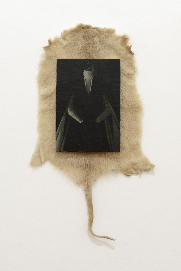
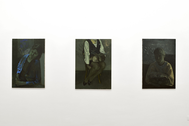
In a period in which art is mainly conceived as three-dimensional sculpture and installation, and painting seems to have lost its appeal, Victor Man (born in Cluj, Romania, 1974) is one of the few contemporary painters, who have been able to stay in the global art loop. ‘Member’ of the so-called Cluj School — a prolific source of up-and-coming artistic experiences that counts artists working with different media such as Adrian Ghenie, Ciprian Mureşan, Mircea Cantor, Şerban Savu, among the others —, Man started his career in 2003 exhibiting at the Israel Museum in Jerusalem and the City Art Museum of Ljubljana and, after several exhibitions around the world, he represented his country at the 52nd Venice Art Biennial.

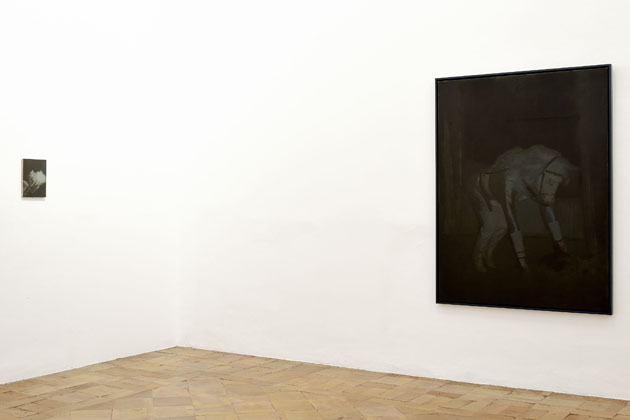
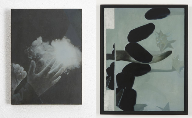
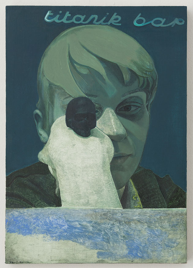
Victor Man’s work is characterized by the fusion of meditative, mainly nocturnal, small size paintings full of mystery, usually exhibited in site-specific installations, which dialogue with the viewers and the surrounded space. Using references and essential elements taken from history and history of art, literature, cinema and archive photography, mixing past and present, the artist creates unique compositions: narrations made of decontextualized objects that analyze the concept of memory and the impact on the world of the passage of time. Reflecting on tradition, nostalgia, eroticism, gender identity, political and social issues, Man’s poetic is related to personal and collective feelings and explores the uncertainty and the ambiguity of human beings through a learned and versatile use of painting.


For those who want to know something more about this Romanian artist, and have the occasion to end up in Rome by the 3rd September 2013, we strongly suggest his exhibition In un altro aprile at the Académie de France à Rome, which presents a series of recent paintings, along with works created by Man during his two-months residence at Villa Medici.


Monica Lombardi – Thanks to Studio Martinotti 
Share: Facebook,  Twitter  
07/07/2013

Sunday Breakfast by Love For Breakfast

When details make the difference. Put some colors on your plate and a smile will naturally shine.

Alessia Bossi from Love For Breakfast 
Share: Facebook,  Twitter  
05/07/2013

Red City Calm

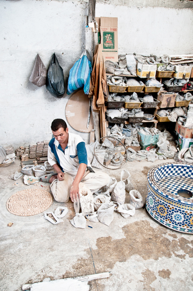
The alternative city of love, Marrakech has infused the lyrics of Crosby, designs of Yves Saint Laurent and tales of Orwell. Found in North Africa, the Red City has hints of Europe and the Middle East and is populated by French and Arab speakers, which all helps to make it an intoxicating pocket of passion, verve and colour.

While the Marrakesh bustle is utterly captivating – hours lost in the ancient Medina’s souks are a noise filled delight – true Moroccan bliss is obtained when you escape the sound and discover something serene. So, while this is a spice-scented city where snake charmers and monkeys rule the square, peaceful escapes are surprisingly easy to uncover.

Your first traditional relaxation option is to opt for a hamam – an ancient ritual of scrubbing and polishing the skin, using Morocco’s famed black soap and an exfoliating mitt that means business. It’s ideally followed by a lengthy massage. This process takes place in an extremely warm room and is alarmingly intimate (they’ll scrub everywhere). But the sweltering bizarreness is precisely why it is so calming – the sheer alien liberation of it all.

If you’d rather keep your clothes on then brave the bustle of New Marrakech and bask in the brilliant blue and perfectly arranged floral, cacti and tortoise arrangements of the Majorelle Gardens. This twelve-acre garden and artist’s landscape was designed by French expatriate Jacques Majorelle in the 1920’s and was famously owned by Yves Saint Laurent (who made the gardens his final resting place.) Tranquil and uplifting, here time slips away and everything, especially the ‘bleu Majorelle’, proves to be impossibly photogenic.


But the ultimate way to unwind and fall in love with all things Moroccan is to discovering the perfect riad – the calm within the exotic storm. The most boutique option of them all is Dar Les Cigognes. Admired by Yotam Ottolenghi and found in the shadow of the Royal Palace, this luxurious haunt began its life as the home of a wealthy merchant and is now filled with quiet corners, opulent rooms and oranges aplenty. While the cooking courses offered are exceptional – and a tad unconventional – the riad’s most idyllic feature is the roof terrace where the call to prayer washes over you and the scent of bougainvillea is everywhere.

Relaxed, indulged and ready to face the city’s craziness, it’s impossible to ignore Marrakech’s ability to rejuvenate and inspire.

Liz Schaffer – Photos Diego Ajassa 
Share: Facebook,  Twitter  
04/07/2013

Child’s Play

There has been a comeback for the one-piece. Different interpretations of the jumpsuit have been seen on the runway, season after season, Fall as well as Spring. How come such a childlike silhouette has become almost a must in our closets?

The jumpsuits in the Diane von Furstenberg 2013 Fall collection tell the story of a comfortable elegance through prints in somber colors and luxurious materials. The construction and use of the fabrics are creating a silhouette that is still young but more feminine and less junior, a key element in elevating the style from the play pen to the runway.

The monochromatic trend has been another vocal trend for many seasons. In the Viktor & Rolf pre-Spring collection for 2014 the LBJthe Little Black Jumpsuit – is exemplified in all its simplicity; the black silk bow and the bottom cut at mid-calf has the look of giving a coquettish wink to a suit a boy in the early 20th century might wear. However the tailoring brings the mind back to the fashionable 2014.

At Maison Martin Margiela the collaboration of a plunging sweetheart neckline with a long wide pant legs give a feminine touch to formal wear without ever really crossing the line, making the garment accurate for both night and day. At Emilio Pucci the black jumpsuit became the canvas for uniting an urban silhouette – like the mid-calf cargo pants – with an Asian print.

The loose fit and the oversized t-shirt sleeves of the one-piece from Stella McCartney’s Spring 2014 collection are resembling the old work clothing from the 1940s, creating an urban feel to the piece and again, the construction and materials give it a modern and fashionable spin instead of a childlike state.


As discussed above, the one piece has – for now – a perfect fit in fashion due to its ease and playfulness, which is always in demand, not to mention its ability to transcend chic to comfort and work in harmony with other trends. It has also given designers a silhouette to a perfect juxtaposition, which is something that can generate unexpected items such as a trenchcoat jumpsuit as seen at the Chanel 2014 Cruise collection in Singapore. Something that is anything but childish.

Victoria Edman 
Share: Facebook,  Twitter  
04/07/2013

From the Beach to the City with Roy Roger’s

Summer is the time when surf enthusiasts take every chance to catch the waves, the city kids catch the air-conditioning and the rest of us catches anything that brings us to the beach. Summer is the time we associate with blue skies, bright sunshine, colourful surroundings, lazy days at the beach or hot days in the city. The fashion associations go to fabrics with prints, an overload of colours, loose fits and comfortable, yet chic, attires. The Blogazine did a dig into the Italian brand Roy Roger’s summer 2013’s beachwear and found denim replicates and hibiscus flowers, working at the beach as well as for a day back in town.

Roy Roger’s is a brand we normally look to for denim, so when we discovered that the denim had sneaked into the beach collection, we had to take a closer look. Denim goes all year around but for summer there is special love. For SS13, Roy Roger’s has taken some of their typical jeans washes and reproduced them on their beachwear shorts, giving them an authentic feel with the right washings and worn out effects. The beach “denim” has also been given a touch of colour when mixed with the brand’s famous flower prints, making the shorts differ from a regular pair of cut-off denim in more aspects than the fitted materials.

Surf Heritage is a collection we already had a sneak-peak at last summer, mixing functional materials and colorful prints with the comfort needed for an active day at the beach. Fabrics like Italian cotton-linen mix, colombian gabardine and Japanese chambray have been decorated with floral prints and the back pockets have been repositioned for a more comfortable fit for the ones who need to spend time on the surf board.

The fact that the beach line – featuring also pants, shorts and several models of shirts – seems to be designed with more than the beach in mind makes the whole concept a lot more interesting. When matching the denim feel or hawaiian prints with something more dressy, the shorts work perfectly as a part of any regular wardrobe selections.

Roy Roger’s will be available worldwide at Sevenbell.com within short.

Lisa Olsson Hjerpe – Illustrations by Jaume Vilardell 
Share: Facebook,  Twitter  
03/07/2013

De Keersmaeker & Charmatz: Partita 2 / Foreign Affairs

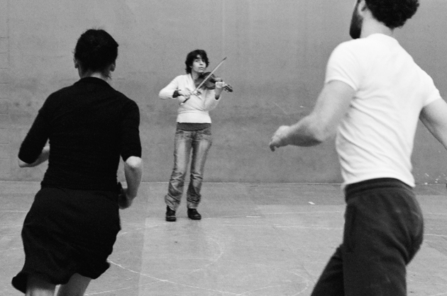
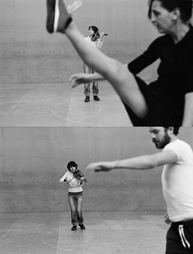
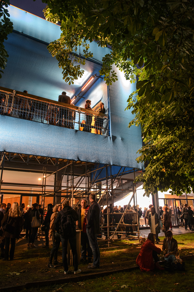
This weekend the second edition of Foreign Affairs, the international festival for theatre and performing arts, kicked off at Haus der Berliner Festspiele in Berlin. Prior to the big opening party on stage in the beautifully light-flooded theatre building by Fritz Bornemann, Partita 2, a dance performance by Anne Teresa de Keersmaeker and Boris Charmatz turned out to be one of the highlights of the opening weekend, competing with other big names such as William Forsythe and Nature Theater of Oklahoma.

De Keersmaeker, the Belgian choreographer who founded ROSAS and has inspired a whole generation of dancers since her debut with the 1982 production Fase, four movements to the music of Steve Reich, is still considered one of the most influential contemporary dance makers. In “Partita 2”, she meets Boris Charmatz from a younger generation of dancers who work between dance and choreography, visual arts and literature, in a duet to Bach’s well-known Partita Nr. 2 performed live on stage by the leading Belgian violinist Amandine Beyer, surrounded by a minimal set design by artist Michel François (whom The Blogazine wrote about here).

Before any of the dancers enters the stage, Beyer plays the score for 15 minutes in total darkness, a powerful introduction that sharps the senses before the dancers enter the naked stage. Running, jumping, skipping and turning, their dance is playful, spontaneous and improvisational yet strictly structured – a follow-the-leader of everyday movements. After an hour and 15 minutes of a three-way constellation of music, movement and space, the ray of light that has been accompanying the dancers in a slowly moving roundabout over the stage, finally flicks and sharply moves across the stage. A small stroke of set design genius by François, to finish off a beautiful and interesting piece.

Partita 2 was performed from 27th to 29th June as part of Foreign Affairs, which is running from 27th June to 14th July in several venues.

Helena Nilsson Strängberg – Image courtesy: Anne Teresa de Keersmaeker & Boris Charmatz: Anne van Aerschot, opening of Foreign Affairs: Piero Chiussi, William Forsythe: Dominik Mentzos. 
Share: Facebook,  Twitter  
03/07/2013

Thomas Hart Benton’s Return to the American Psyche

Thomas Hart Benton may have been the hero painter of his time — he was one of the first artists to grace the cover of Time, in 1934 — but he had become a microcosm on the American scene by the time his old student/friend/enemy Jackson Pollack blew up in the late 1940s. His fame was brief, his legacy faint. “The particular audience he painted for is long gone,” went a recent New York Times review. “The one that has replaced it knows nothing about him.”

Part of Benton’s dilemma was his stubborn commitment to American workers and everyday American life, a scene that forever links him to the Great Depression. His best-known work comes from the era, most notably America Today, a nine-wall mural conceived in 1931 that has just been bought by the Met. America Today portrays Americans across the continent doing ordinary things: riding subways, going to the movies, dancing, pounding iron, working the field. The fact that it so distinctly defines American life in the 30s is likely why Benton remains tied to it.


Benton was a product of the dustbowl: his favorite drink was whiskey, his place rural Missouri. He reflected the culture in that he was often blunt, hardworking, outspoken and stubborn. He was an outsider who preferred saloons and rotary clubs to salons and art galleries. He hated critics, which may be one reason he’s been out of view for so long. The Met’s acquisition of America Today — as well as a long-overdue biography by Justin Wolff — will no doubt stir interest in those who have never had the chance to hear about him.


Lane Koivu 

Share: Facebook,  Twitter