Sunday Breakfast by Love For Breakfast
Bright and shine. A ray of light that embraces, and the perfume of the morning to be enjoyed.
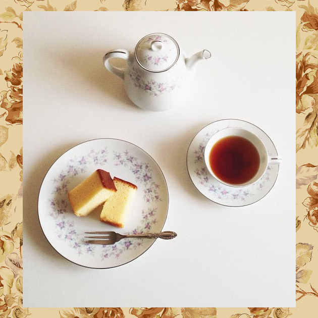
Sunday Breakfast by Love For Breakfast
Bright and shine. A ray of light that embraces, and the perfume of the morning to be enjoyed.

On the Dark Side of Austria
It’s not the first time I hear about a city that for a part of the year stays in the dark, because of its geographical position. Generally, this is not a welcoming detail for the people who would decide to live there, but for a tourist, this represents a motive of fascination. Rattenberg, which with its 440 citizens is the smallest Austrian municipality that can embellish of the name of “a city”, was built in 1393 by Bavarian duke Stefan III in the shade of the mountain of the same name. The mountain defended the city from attacks, but it has always been, and still is, the cause of the almost total darkness that hides Rattenberg for six months in a year. The idea of building rotating mirrors on the rocks to reflect light and direct it towards the city, has never been put to action.
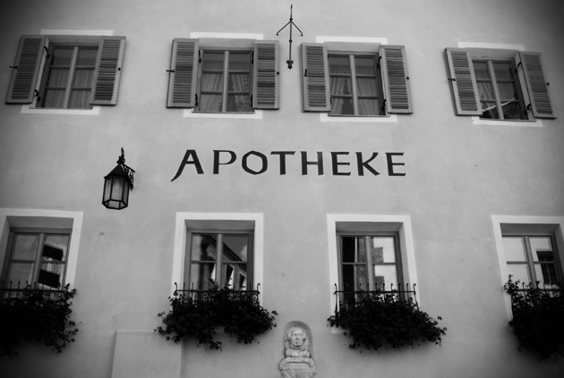
So, especially during winter, Rattenberg becomes a postcard-like venue: it lights up with candles and torches, its shady alleys fill up with snow and make you imagine how the city could have looked like centuries ago, when citizens were in two thousand, the silver mines near were in the whole of their utilization and the hundreds of people were sailing on the river Inn, that runs along the city walls, stopping by and crowding the pubs and brothels of the city.
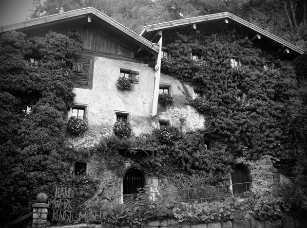
Today Rattenberg is not that alive as it once was, a major part of its 440 citizens are aged but, especially during the summer season they receive groups of tourists who visit the famous small shops in which artisans work glass and walk along the narrow alleys photographing the Inn-Salzach style built houses, that consist of the union of the neighbor houses, creating the appearance of a unique architectural complex. Nagelschmiedhäuser, old private residences transformed today into the Museum of Craftmanship, are the most important evidence of this.
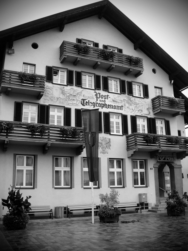
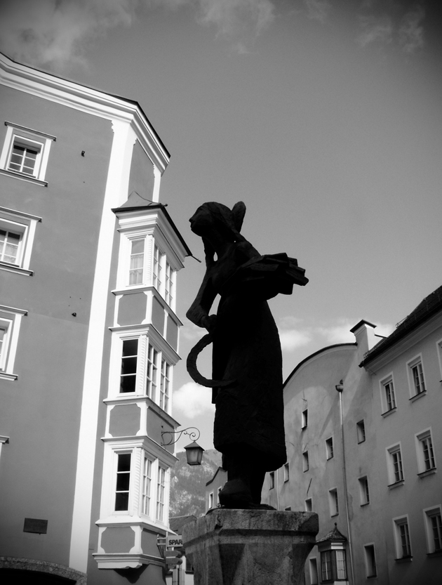
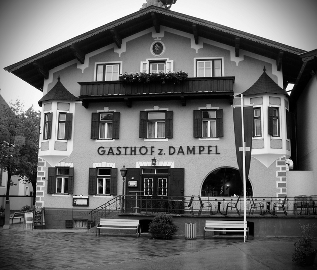
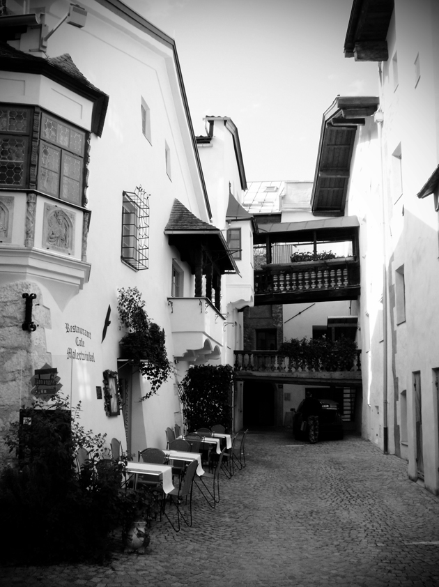
If you want a taste of The Lord of the Rings kind of location, climb on the mount of Schlosseberg Castle (there’s an elevator, if you don’t want to struggle) and enjoy the view, especially the theater used in summertime for outdoors performances. Even if you aren’t that enthusiastic with sacred architecture, enter in the baroque style Church of Saint Virgilio, really large for a small city. I visited it on the eve of the Sunday before Easter, and what attracted my attention, apart from frescoes, was seeing three youngsters who carried in boxes containing music stands that would be used for the concert of the day after. Then, on my way to the hotel, I saw another boy darting on a skateboard under the statue of Saint Notburga, the patron of Rattenberg. Maybe for the contrast between sacred and modern, old and new, I found myself smiling. The boy on the skateboard said hello to me and flied off, while the sun went quickly down in this part of Tirol, and the shutters were pulled down one by one.
Ruby Anemic: “Please take care of me”
The born and bred Berliner artist Ruby Anemic just opened his long awaited solo exhibition entitled “Please take care of me” at Galerie LackeFarben in Berlin. New works of neon, concrete, video, canvas and mixed media are spread across the four small storeys of the untraditional gallery space, which used to serve as a paint shop back in the 1930’s. Since closing his Pool Gallery in Berlin-Mitte, Ruby Anemic has been focusing solely on his artistic practice, and is finally ready to show his interdisciplinary work, all with an ironic and humorous yet critical view on contemporary culture.
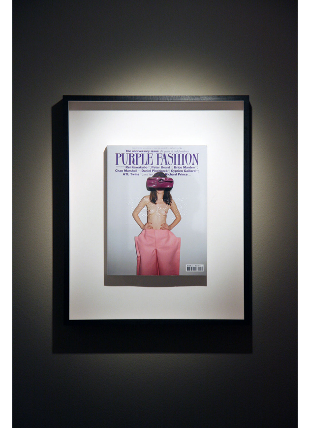
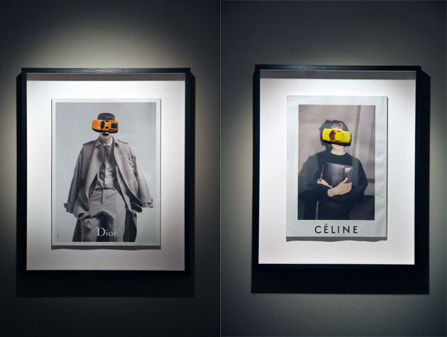
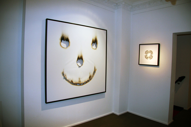
Several of the artworks have been made using fire as a tool – leaving burn marks instead of paint or ink. In Burn for a Smile, a smiley grins at the viewers from a large canvas, burnt holes into the texture as a re-think of Lucio Fontana’s carved canvases. Other works, such as I am a Dreamer consist of Ozzy Osbourne song lyrics burnt onto leather pieces, still smelling of fire and skin.
Downstairs, a large silver curtain (Untitled) is moving back and forth; a kinetic art piece driven by tiny, hidden motors, creating an illusion of flowing water or a mirror in a fun house. A large part of the works are entitled Objects on Paper, consisting of mostly fashion magazines where a small toy car or a book has been placed covering the face of the model. These works are all about composition, the beauty and humour of everyday life and objects, something that Ruby Anemic, the champion of pop cultural references, always does incredibly well.
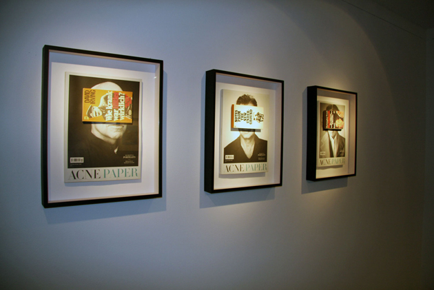
In the dark basement, one single video work, a looped video clip of Brad Pitt (Reiteraction) pretty much summarizes the appreciated show. It is witty, tongue-in-cheek and slightly sarcastic, firmly rooted in pop culture and at the same time just not giving a damn.
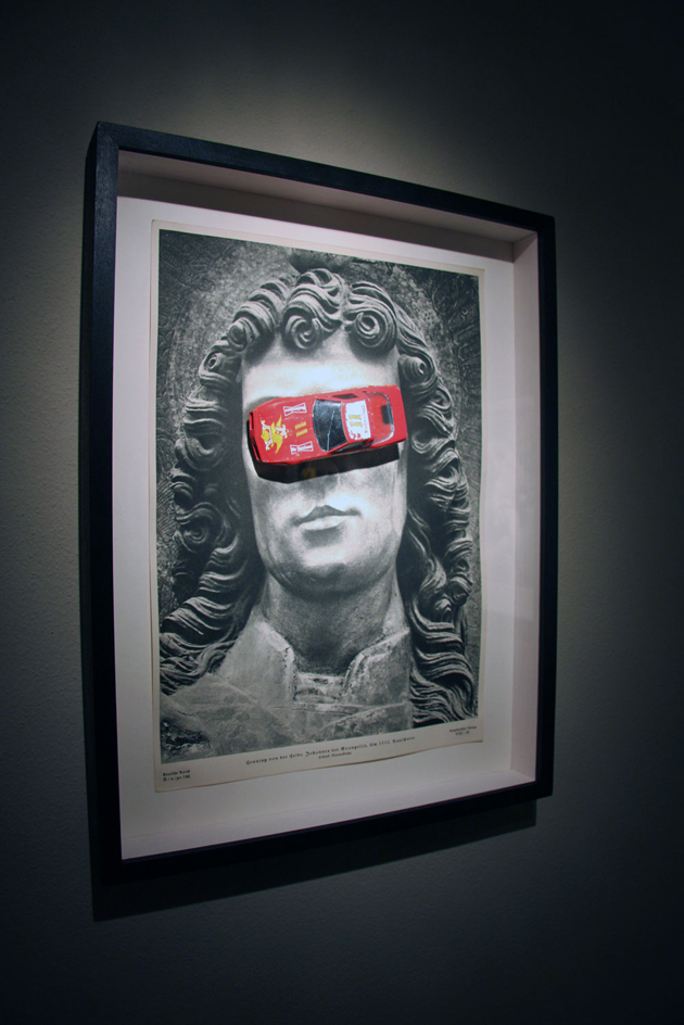
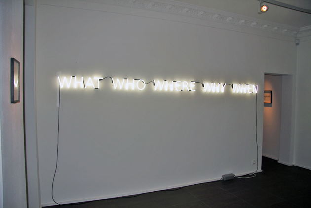
“Please take care of me” by Ruby Anemic is on view at Galerie LackeFarben until April 27th 2013.
Helena Nilsson SträngbergMinimalism at the Very Beginning
They say fashion is the mirror of the society, and if you have a fast look at the last fashion shows, you can easily understand that we are completely into an austerity mood, which is synonym for simple, strict and minimal. Minimalism got its chance to come back one more time on the main catwalks, and become again the way to dress up. Or down.
Majority of people have probably heard about big names such as Pierre Cardin, Jil Sander, Calvin Klein, Donna Karan and many others, but minimalism in fashion started its influence already a lot before these talents. Even if the term was coined around 1960, the real birth of the concept happened at the beginning of last century, before the World War I.
Talking about ancient Greek influences, many are used to indicate Madame Vionnet as the pioneer, although it was Mariano Fortuny y Madrazo, a versatile Spanish-Italian talent, to be the very first one who took inspirations from statues and hieroglyphs. Initially, he became popular for “Knossos” a certain model of scarves he created for a ballet. They were not minimalist as we intend the concept today, but their significance lies in representing an important step in terms of versatility and reuse of clothing.
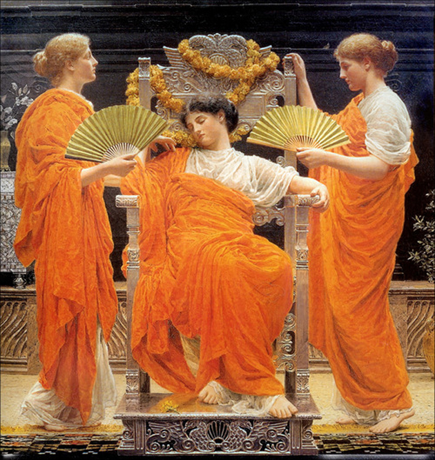
In 1920, while Coco Chanel was creating her revolutionary comfortable clothes for women, Poiret was declining with his exotic way and the World War I was bringing Europe down, Fortuny launched Delphos dress. It was very simple in its own shape, composed of two panels of thin silk, cut out flat in a manner of kimono. Fortuny was the first to practice the all-important cultural fusion he got from sources taken up some decades later by Issey Miyake and Yohji Yamamoto.
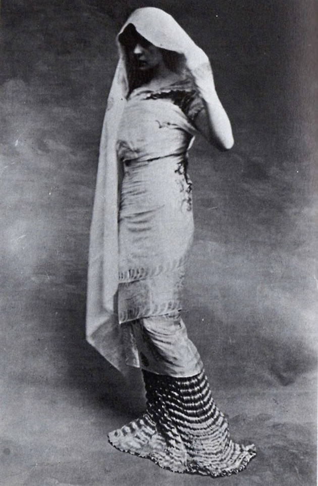
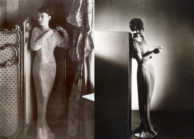
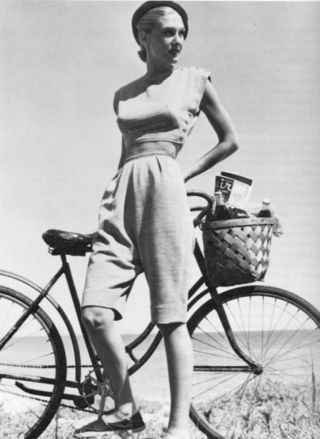
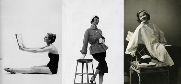
Through 1930s sober fashion made roots also overseas, thanks to fashion designers such as Claire McCardell, Vera Maxwell and Clare Potter who created leisurewear for working class. On one side there were Europeans, who sought to simplify the 20s female look and on the other, Americans, who tried to simplify the whole life of women. The probably most iconic example of this was Claire McCardell’s collection based on six garments, totally interchangeable, with the aim of giving women a complete and practical wardrobe.
In the XX century minimalism has been crucial in the field of fashion, adopting different ways for expressing itself. There is no specific sentence that can define minimalist approach in fashion; you can basically recognize it by the construction in which every single garment element is part of, an abolition of superfluous and functional characteristics. Less being more.
A Delightful Break
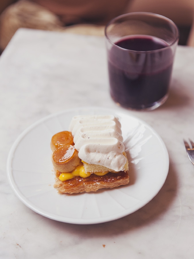
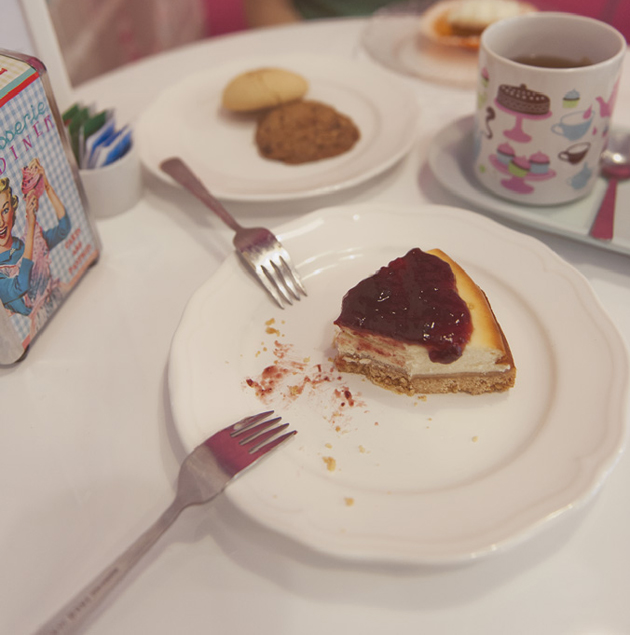
On a rainy day in Milan we had the desire to sink in a comfortable armchair in a warm and cozy lounge. We like the rain in the end of winter, it’s nice to look at, while drinking cherry juice or hot tea. In the center of the city, in an old house used as a location for photo and movie shoots, we improvised a really nice and tasty coffee break.
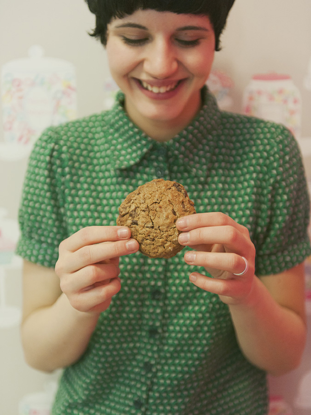
A traditional Saint Honoré gave us the warmth we had lost, tender and fragrant, incredibly good, with its vanilla aftertaste. On the second outfit we tasted a wonderful cheesecake with strawberry jam, a couple of cupcakes with maple syrup and nuts, and cookies with cinnamon, ginger and raisins. To accompany worthily we thought of a pomegranate tea. Here’s what you can do when the sun does not want to come out. The food is very therapeutic at times, rich flavors and a full belly helps us see things in a different way. And when it comes to sweets, we are right on track.

At Home with Mid-Century Designers
Have you ever dreamed about taking a sneak peek at someone’s home? Who’s home would it be? Do you find yourself looking inside people’s houses when taking a stroll around the block? Well, we believe we all do this. If we don’t have a perfect home, by looking at someone else’s house, we dream of living there. If we do have the perfect home, we still like to compare it to others, just to assure ourselves that, yes, our home still is the perfect one.
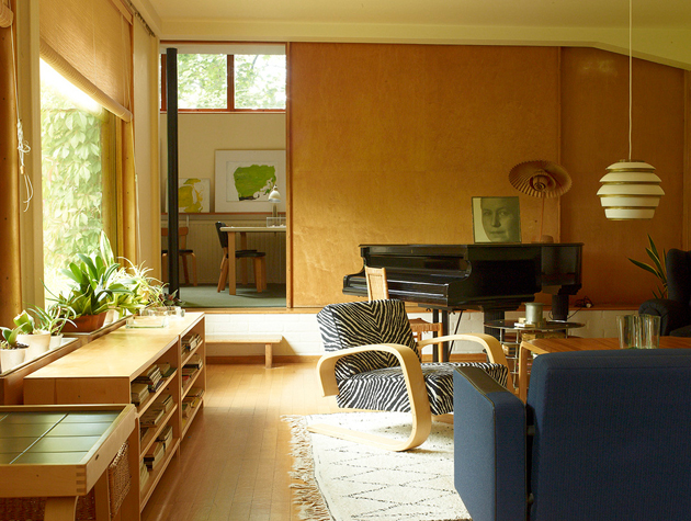
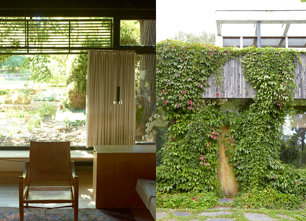
Leslie Williamson has often asked herself exactly those questions and has, thus, created her dream list of homes where she would have loved to visit, immerse herself in and immortalize. Her dream has become a book, titled “Handcrafted Modern: At Home with Mid Century Designers”, published by Rizzoli in 2010, a worldwide best-seller. The book itself is quite simple: it shows and tells the homes of one of the most interesting Modern designers: masters of studio furniture like Wharton Esherick, George Nakashima and J.B. Blunk; industrial designers like Russel Wright, Charles and Ray Eames and Irving Harper; architects Walter Gropius and Albert Frey.
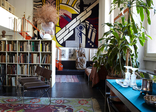
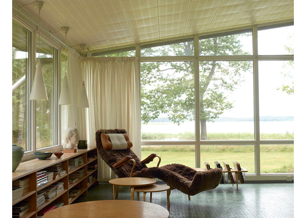
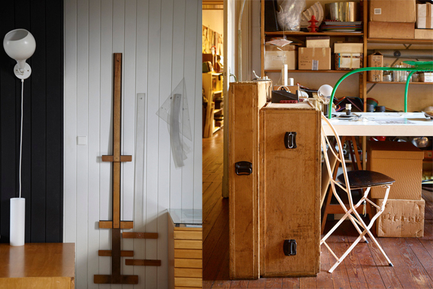
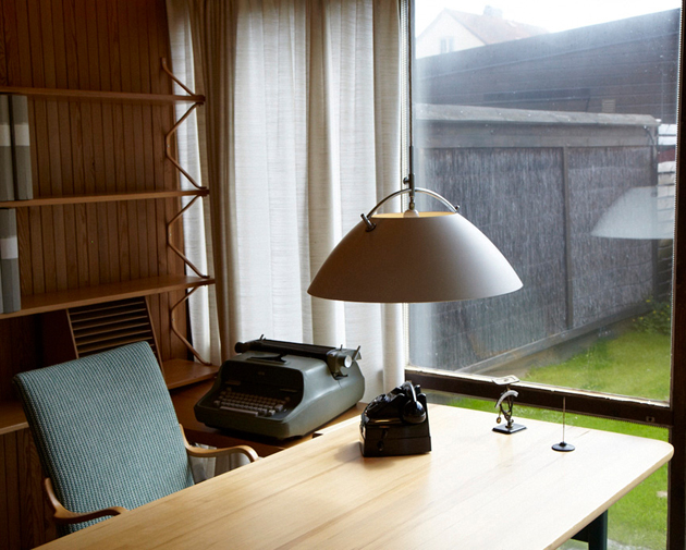
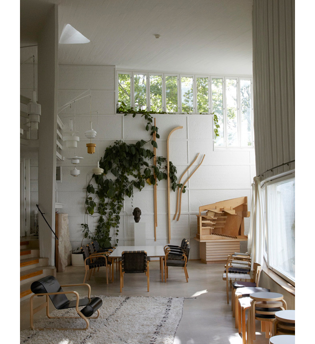
Currently Leslie is working on a new project, a second book with the working title “Handcrafted Modern Europe: At Home with Midcentury Designers”, which explores homes of the grand masters of European design. Even though we are not allowed to know the complete list of designers, we already know there will be 13 names, among which Alvar Aalto, Bruno Mathsson and the Milanese Gae Aulenti. Speaking about her project Leslie declares: “I see homes as a portrait of their inhabitants, so I photograph each space with an eye not only to the architecture, design and wide views of the rooms, but also the small quiet moments that reveal these creative people’s character.” She recently also had to start a fundraiser on Kickstarter to fund her project, which, fortunately has ended pretty well and she is currently working pretty hard to finish the book on time.
Seen the success of her previous book and the positive result of the aforementioned campaign, we must note that it appears that we all want to have a peek inside those houses, too. Who knows, maybe we’ll get inspiration for making our perfect home.
Behind the Shades
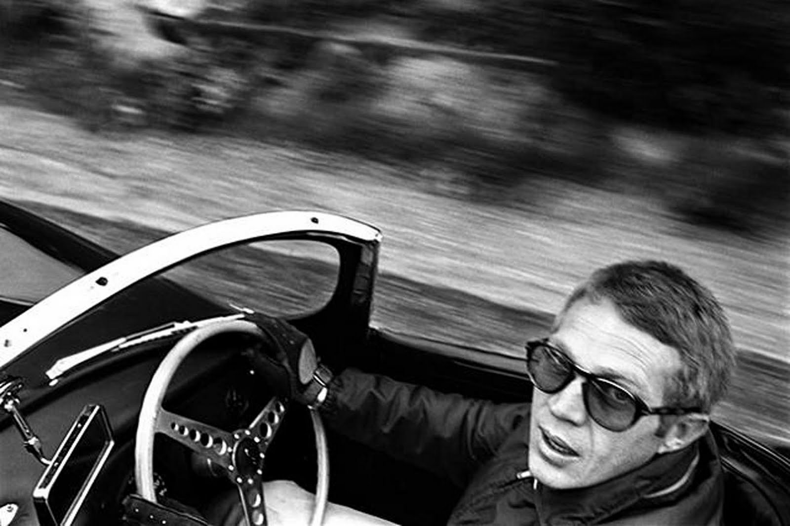
Pastels, metallic or just basic black – even though sunglasses work as a shield from the sun, in today’s society they function even more so as a way to reflect your personality. Choosing shades has become a way of choosing the identity for the season. A pair of Wayfarer’s has been branded classic chic whilst the cat eye pair flirts like the 50’s pin up. No matter the season, people will be seen in their shades and one might ask: why has this piece of plastic become such an important part of an outfit?
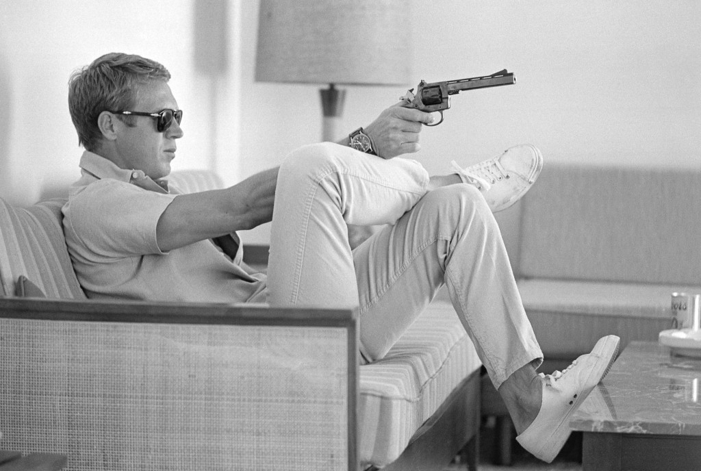
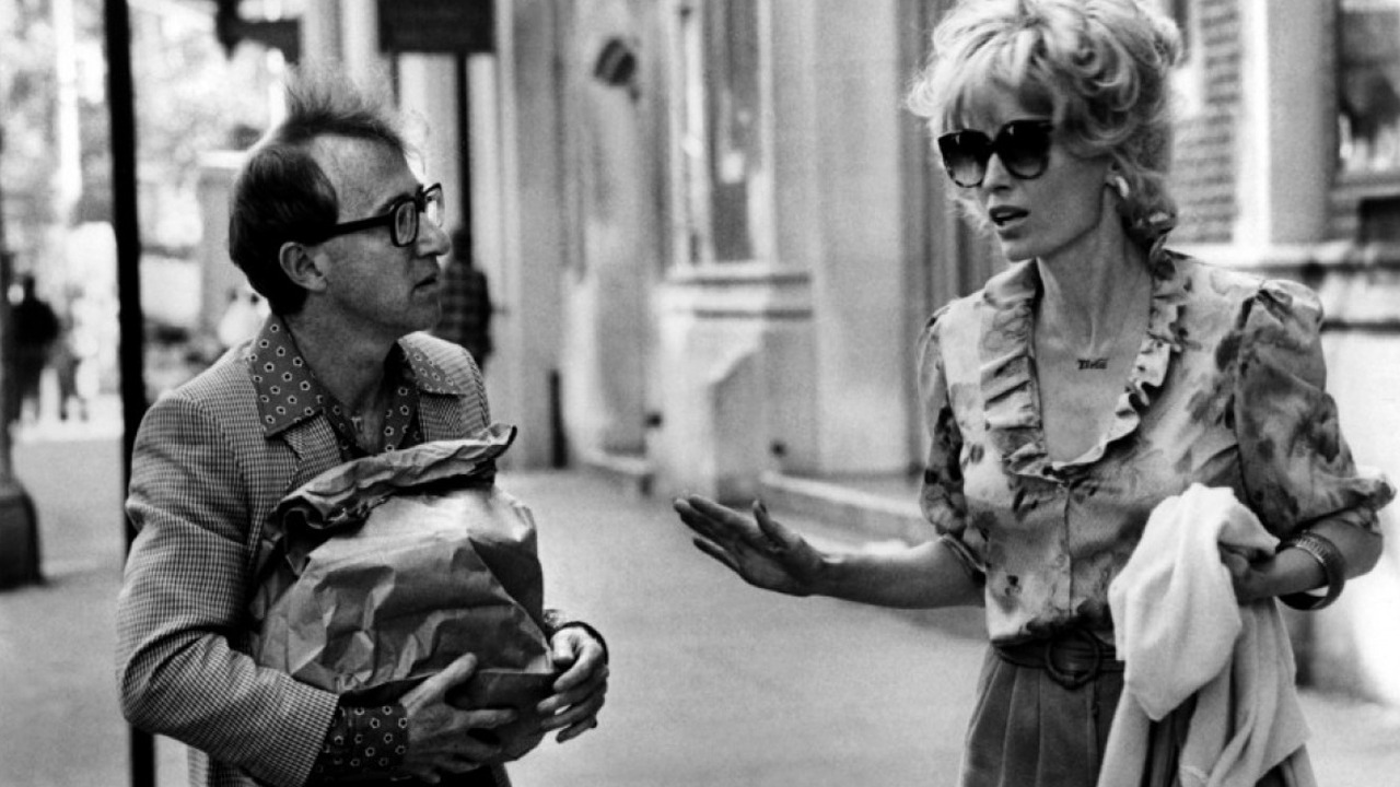
The essence of incognito can be found in any pair of sunglasses. It was in fact a Chinese judges who started to wear smoke colored glasses around the 1300’s to hide their eye expressions. Though, the sunglasses of today were created much later, in 1929, by Sam Foster and had then, as now, the main function of sheltering the eyes from the sun. However, celebrities soon copied the ancient judges and used sunglasses to stay unnoticed when walking amongst the regular ‘mortals’. Shades state to give a sense of privacy while making a fashion statement, putting the exclamation mark – of what a strong wearer can give – between brackets. On the other hand, the right pair of sunglasses can also add a sense of harmony to a bold print or vivid outfit.
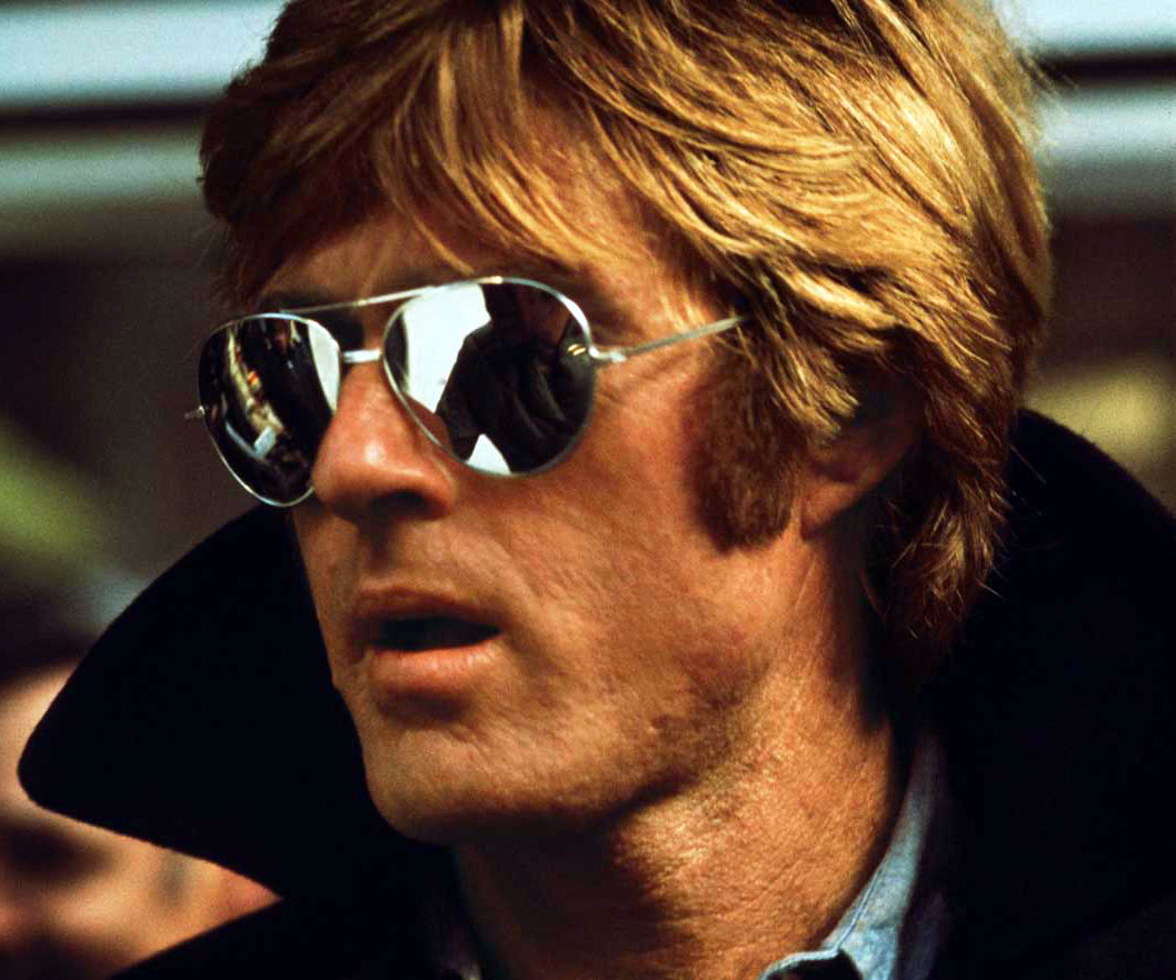
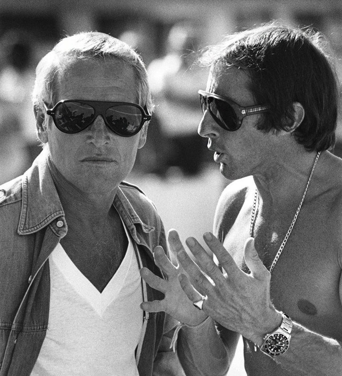
More than putting the wearer at ease, sunglasses have also become the affordable way for people to discover and take part in the world of the fashion houses. Hearing from the red carpet the designer that a celebrity is wearing is probably not going to generate a vast increase in sales at the haute couture department, but more likely it will be the make-up and sunglasses sales that are affected: it is the affordable luxury.
All in all, sunglasses may just technically be a piece of plastic but the meaning to the wearer can be a number of things which makes them a key accessory in anyone’s wardrobe.
Jeff Wall, Actuality
Finally, after numerous exhibitions in the most important museums of the world, PAC – Contemporary Art Pavilion in Milan hosts the first Italian solo show by the Canadian photographer and artist Jeff Wall (Vancouver, 1946). Actuality is the title chosen for the exhibition by its curator Francesco Bonami. The title reflects the artist’s will to set up each of his selected 42 works – among new and already displayed ones – in a conceptual way; in a tangible horizon, contingent to the reality and to the daily experience. Yet, everyone overlooks Wall’s art for the first time can have the double feeling to be in front of images without time; visions, which float vaguely in a recent past (thanks to the photographic medium), and a moment that is about to happen.
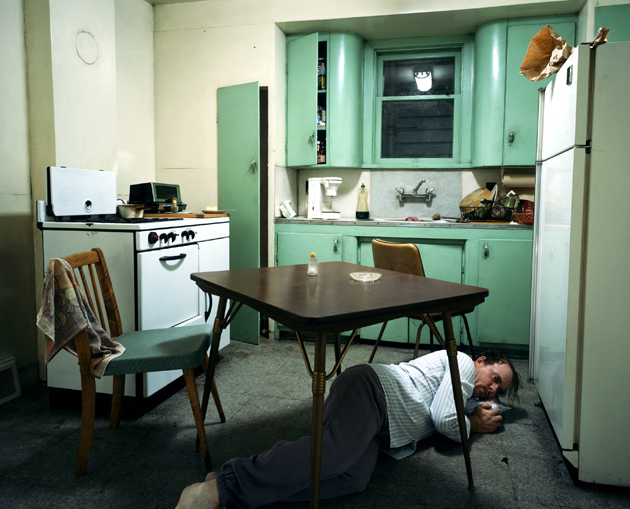
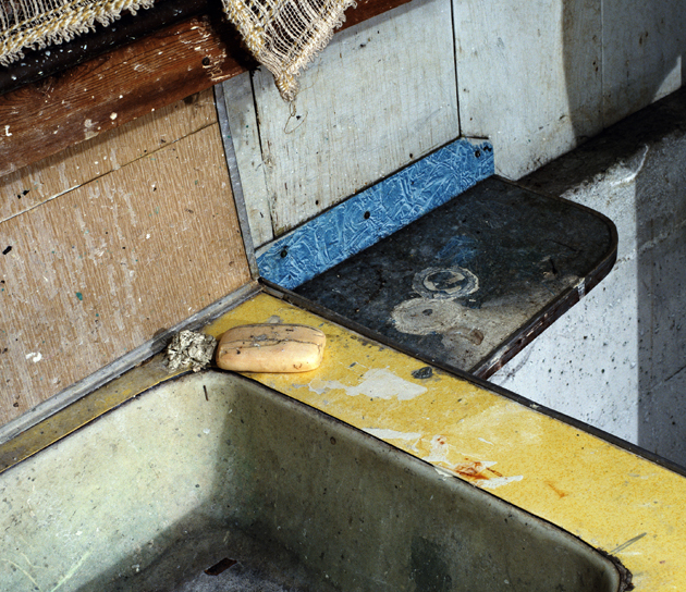
This is mostly related to the fact that his works are made through the use of see-through cibachrome, later assambled and exhibited with a light box. That confers to each work a status that goes beyond the steadiness of the shot to look more like a movie still frame. It’s not by chance that Jeff Wall has many times declared that he looks at his pictures as “cinematography”. They are images, supported by big size format, which aim at becoming out-and-out beaming screens where the artist, as an experimental videographer, suspends a symbolic and incisive frame of a full length movie we’ll never see. A simple still-life, which is not so “simple”, seems to suggest the artist. It contains – in its structure and in its definition as an artistic form and visual system – the history and tradition, which convey from century to century the shared idea about how to look at and depict things.
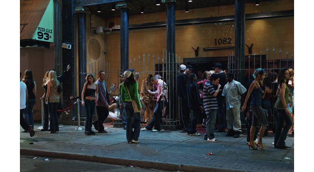
In his production, Wall seems to be interested in post French revolution art and in those masters who redefined visual art in a crucial moment of human history: between the rise of the new social order and the modern and contemporary costume, but above all, that unique moment that gave birth to photography. Delacroix, Courbet, Manet, Renoir, Degas and also the big masters of Ukiyo-e are not used as specious visual references, but as formal structures to confront with. Each single work is a small cosmos into which you can get lost, where the space is analyzed in-depth with a philosophical approach that assimilates Wall to the artists of the Renaissance, sometimes with a slightly hermetic attitude.
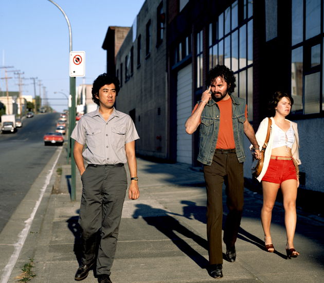
We can feel the awkwardness of the man lying on the kitchen table of Insomnia (1994), but this feeling is not instilled only through the performing skills of the leading actor, it is the geometric break of the composition that underlined his uneasiness. The fundamental work Citizen (1996) tells us about issues such as freedom, democracy and civilization. In a time when the domination of the images – the “iconosphere” described by McLuhan – debase the value of each visual signs, the accurate work by Jeff Wall is a referent artistic and philosophical point to investigate the artistic, social and politic role of our view: we, powerless spectators looking at the pictures of Abu Ghraib‘s tortures, could learn a lot from Jeff Wall’s Dead Troops Talk (1992). The enormous picture which seems to live midway of a photo reportage from the frontline and an episode of The Walking Dead, was analyzed by Susan Sontag who reports at the end of her essay Regarding the Pain of Others: “The figures in Wall’s visionary photo-work are “realistic” but, of course, the image is not. Dead soldiers don’t talk. Here they do.”
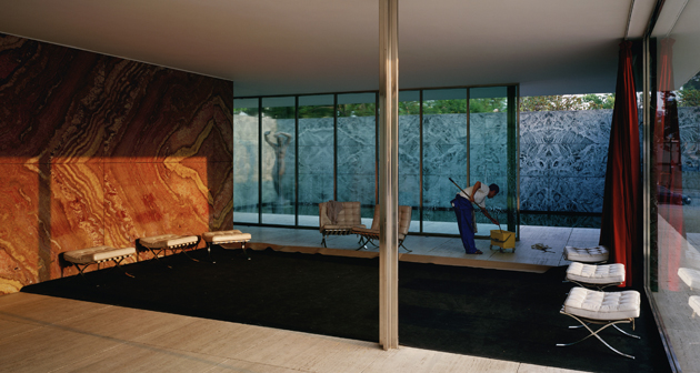
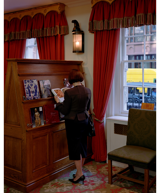
The exhibition will run until June 9.
Riccardo Conti, Editor’s thanks for translation to Monica Lombardi – Images courtesy of Jeff WallSunday Breakfast by Love For Breakfast
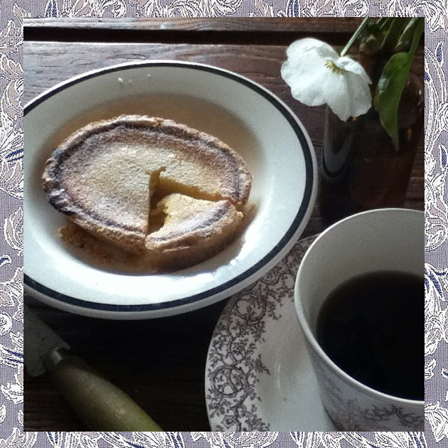
The harmony of a moment that I would love to last all the week long, without putting an end to the one passed.
Dingle Dreaming
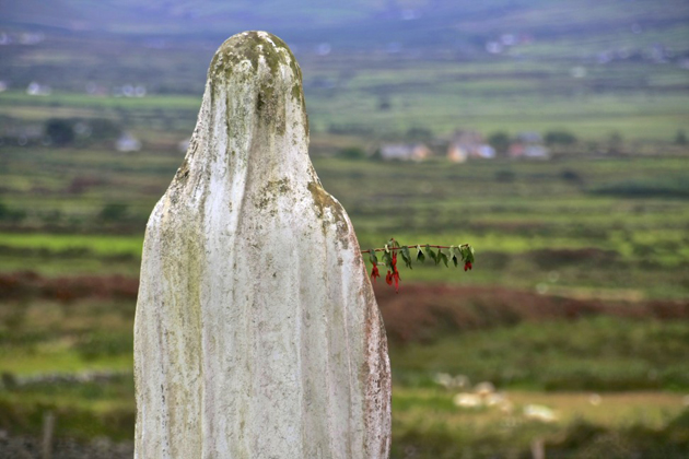
For the ultimate escape flee to a land of historic mystery, literary allure and unique – or should that be rugged – natural beauty. Nestled within the occasionally lifting cloud, verdant fields and subtle charms of County Kerry is the thoroughly enchanting Dingle Peninsula. Stretching 48 kilometers into the Atlantic Ocean, this is a corner of Ireland that seems to have fallen from the pages of a fairy tale. It is after all the home of rainbow-dwelling, gold-hoarding leprechauns.


Fantasy beings aside, the Peninsula is dominated by the Slieve Mish mountain range (home of Ireland’s second highest peak), sea-cliffs, sand splits, endless beaches, eccentric locals and pubs that let county tunes ring out late into the night. And then there’s the history. Visit a ring fort or stone circle to feel the true magic of this area. Often orientated on sight lines for the rising or setting sun, stone circles are thoroughly humbling – and shrouded in local legend. Medieval history runs deep here too. In the deepest, dankest depths of the Dark Ages, when literature looked as if it was set to leave Europe forever, a group of book-loving monks fled from the barbarian raids on the Continent and began their Irish life in isolated stone igloos, known as ‘beehive huts’, working as scribes and keeping the adoration of words alive. Venture into one of these huts and you’re transported. Dark and misty, these spaces helped save literature and still give off an air of dedicated passion. Add to this a mix of archeological sites, Iron Age promontory forts, early Christian monastic sites and seventeenth century tower houses and you begin to understand how rich and varied the history of the Dingle Peninsula truly is.
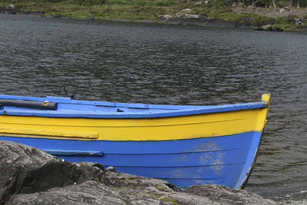

The area still feels slightly removed from the modern world. It’s a place where fishing and farming actually matter; with the boats that sail from the rain-stung harbor in Dingle (the largest town on the Peninsula) giving off a nostalgic whiff of peat and the landscape dotted with farms and houses that come in every imaginable hue. Stay here and you’ll forget to worry, forget to stress and forget that the real world actually exists. This is pure Ireland. And pure Ireland is wonderful.
